|
| Group |
Round |
C/R |
Comment |
Date |
Image |
| 21 |
Jul 20 |
Comment |
Barrie,
I see an interesting composition, with good use of the negative space. The pastel effect works to create a well thought out impression of the balloons. I am a bit distracted by the aqua edge on the lower left balloon, and the slight yellow edge on the upper right balloon. |
Jul 13th |
| 21 |
Jul 20 |
Reply |
Joan, there is no question in my mind that the sky you used was perfect for what you wanted to accomplish. |
Jul 13th |
| 21 |
Jul 20 |
Reply |
Brian, I I thought about your comment, and lightened the foreground, using an technique that I have not seen used, to preserve the 3D effect. I did a "stamp visible" and duplicated it, placed my foreground mask on the top layer. I placed a white fill layer, with the same mask between the two top layers, because I only wanted to affect the foreground. I reduced the opacity of the top layer, and the fill layer, until I saw the luminescence I was looking for. As you can see, It's a tad darker than Joan's, but much brighter than my first try. I can't say whether I saw the "fill" technique somewhere, or just thought of it. I have also used the color fill technique to create color shifts. |
Jul 13th |
 |
| 21 |
Jul 20 |
Reply |
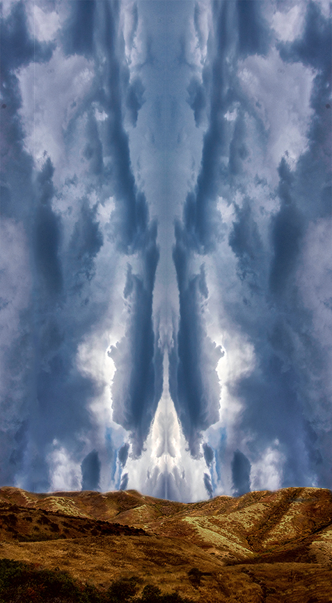
Brian, I can compare this to a Rorschach image. I see a giant squid in the center of the sky, with a humanoid type of being on each side. |
Jul 11th |
| 21 |
Jul 20 |
Reply |
Joan, Thank you for your comments. I tried several types of eyes, but I thought because of all the swirling water, eyes would only be a distraction. I know it could be gruesome, but I left the hand in so that we don't really know what happened to the surfer. I considered some splattered pink, but I preferred the mystery of just one hand, with just a few spots of blood on it. |
Jul 11th |
| 21 |
Jul 20 |
Reply |
Brian, Thanks for your incisive comment. I completely agree with you about the horns, and am playing with an appropriate revision. I have already responded to Phillipa about the eyes. |
Jul 10th |
| 21 |
Jul 20 |
Reply |
This monster may have used echo location. It may not have eyes. |
Jul 10th |
| 21 |
Jul 20 |
Reply |
Brian, Too my eyes the application of the graduated filter takes me away from the left hand side of the image. I guess that's why my box of Crayolas had 48 colors. |
Jul 10th |
| 21 |
Jul 20 |
Comment |
Phillipa, I like the way you produced your creative image. creative image. Your variations on the head create a consistency of theme that creates a relationship, without giving a "gift wrap" effect. Very well done. |
Jul 10th |
| 21 |
Jul 20 |
Comment |
Charles, I think its a clever twist on the nursey rhyme. I agree with Brian's comment on the size of the Moon and cowboy. I would like to see a tad more separation between the cowboy and the Moon, with the cowboy a bit brighter, or less luminance on the Moon, and the fireworks, as they keep drawing my eye away from the cowboy. |
Jul 10th |
| 21 |
Jul 20 |
Comment |
Brian, I personally love your image. It is unique, and shows creativity. I would like to see more "in your face" images. I just hope that more judges learn to appreciate creative abstracts. |
Jul 10th |
| 21 |
Jul 20 |
Reply |
Charles, My former golf club tolerated it when I brought in a stripper as a birthday present for a friend. However, I probably would have been thrown out for wearing pants like that. ;-) |
Jul 10th |
| 21 |
Jul 20 |
Comment |
Joan, I like your image, and agree with the previous comments made by Brian and Charles. I wanted to see if the foreground was a tad too bright and flat. I played with applying curves to the foreground in LAB. |
Jul 10th |
 |
5 comments - 8 replies for Group 21
|
| 65 |
Jul 20 |
Reply |
Thank you for your comment. To get that effect I used the technique as above. While you can get that effect in RGB mode, I have a personal preference for using LAB for some color work because I have to do less futzing. Others may prefer RGB. |
Jul 29th |
| 65 |
Jul 20 |
Reply |
Angela, I am looking forward to seeing them. |
Jul 28th |
| 65 |
Jul 20 |
Reply |
I got around to it, and please see my reply to Charles. I agree with you about the negative space. Sometimes though I do images like that as tension relief. |
Jul 25th |
| 65 |
Jul 20 |
Reply |
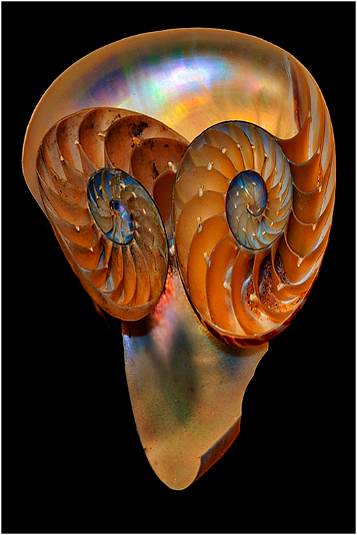
Just for giggles, I removed the third shell, did some free transforms and other pixel manipulations, and found this space traveler.
|
Jul 25th |
 |
| 65 |
Jul 20 |
Reply |
Angela, Thank you. I have a planned revision. Which i will do as soon as I get a:
|
Jul 23rd |
 |
| 65 |
Jul 20 |
Reply |
Hi Charles, I agree that Angela's work is inspirational. However I am not certain that any sharpening would improve her image. To me, a very large portion of the beauty of her work, is the natural soft blurs. |
Jul 19th |
| 65 |
Jul 20 |
Comment |
Angela, I really love the beauty and resulting simplicity of your work. To me it's amazing that so much work is needed to produce a minimalistic looking image, that contains so many subtle complexities. If someone threatened to pull out my fingernails if I don't pick the one I like best, I would lose my fingernails. Beautiful work. |
Jul 19th |
| 65 |
Jul 20 |
Reply |
I see what you mean. |
Jul 16th |
| 65 |
Jul 20 |
Reply |
Thanks, I have not had much success with the color replacement tool. Need to read more.
|
Jul 16th |
| 65 |
Jul 20 |
Reply |
And if you really want to get in close:
|
Jul 13th |
 |
| 65 |
Jul 20 |
Comment |
Vinod,
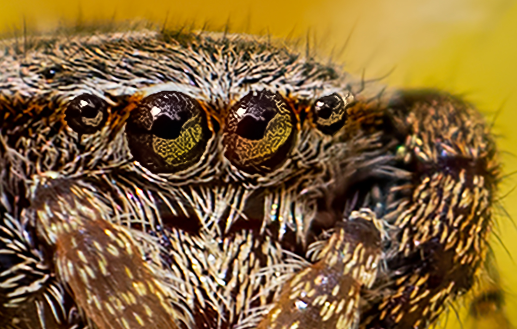
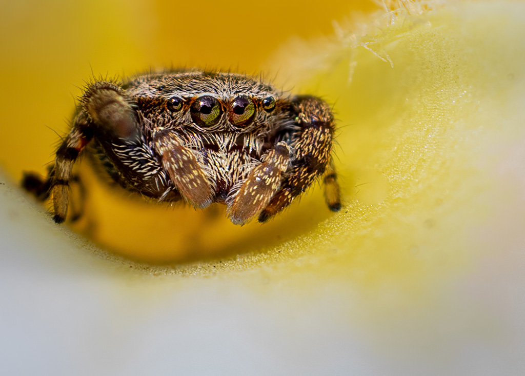
I will start by saying that I agree with Charles that you have a fun shot, and almost everything else that he said. But you need to decide whether you are shooting a spider on a flower, or a flower with a spider on it. If you wanted the latter, his advice is perfect. However, since you only took one shot, and the spider is fairly sharp, with the flower blurry, you might want to try enlarging with Topaz Gigapixel, and cropping down. In this case I made a 4x enlargement, about a 3.5 high pass sharpening, and brightened up the eyes in ACR, which is the same as Lightroom. I did not make any other adjustments, except for a crop and resize down. |
Jul 13th |
 |
| 65 |
Jul 20 |
Reply |
Lynn, Your image is a good example that less is often more. I think your image is well composed, and original.
When using content aware fill, I have found that if I first select the area to be filled in, expand the selection by about 5 pixels and feather about 2 pixels, I am less likely to get a line between the filled in area and the original. |
Jul 13th |
| 65 |
Jul 20 |
Comment |
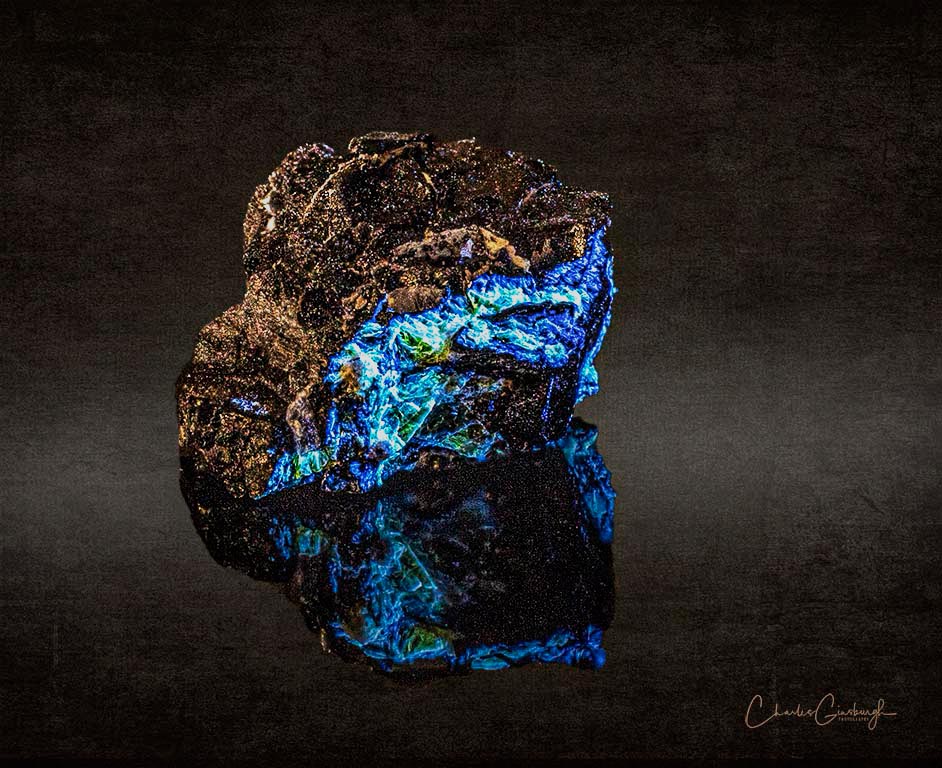
Charles,
Your hard work paid off. I see a beautiful composition. Your angular placement of the rock, combined with the reflection brings life to what could otherwise look like a static rock.
To my eyes the reflection looks a bit dark causing it to become subordinate to the highly reflective top. I too the liberty of noodling in PS, and making some small tweaking to highlights, clarity and vibrancy. I then compressed the color range by about 5% on the bright side. These adjustments added a slight glow to the top and brought out a bit more detail in the reflection. I hope the adjustments helped the look you were seeking.
What do you think? |
Jul 13th |
 |
| 65 |
Jul 20 |
Reply |
Charles,
What did you do to get that image so clear? |
Jul 13th |
| 65 |
Jul 20 |
Comment |
Elaine,
You selected a beautiful subject, but there is a learning curve on the execution. After looking at your image several times and reading Charlie's comments, the only thing I can add is please keep trying.
|
Jul 13th |
4 comments - 11 replies for Group 65
|
9 comments - 19 replies Total
|


