|
| Group |
Round |
C/R |
Comment |
Date |
Image |
| 21 |
Jun 20 |
Reply |
Joan, you just reminded me of the almost 100 lbs. of outdated X-ray film I kept in a freezer, together with my home made pin registration board; and the sheets of glass that I would paint with either watercolor or Vaseline to place on top of the paper before exposure. A simple posterization would take hours. Then forgetting the correct temperature of the developer, caused hours of work diagnosing the problem, when the answer was my own stupidity.
That's far worse then making an adjustment to the wrong layer, or wondering why the computer isn't working, when it wasn't plugged in.
|
Jun 27th |
| 21 |
Jun 20 |
Reply |
Perhaps they think pianos are the key to better photography. |
Jun 23rd |
| 21 |
Jun 20 |
Reply |
As I am playing, I learned that content aware scaling does not always work well. There are times when the procedure "select/edit/transform/scale," does a better job,though I may have to clone to fix issues. |
Jun 23rd |
| 21 |
Jun 20 |
Comment |
Thank you. I am playing with a correction, while learning the new interface for ACR.
|
Jun 19th |
| 21 |
Jun 20 |
Comment |
Joan, I this image is one more example of a the product of your beautifully creative mind. The expression on the boy's face is a priceless example of him, as with many boys his age, trying not to show that he's happy. The colors blend in nicely.
I you work in PS, even at 8 bit space, I have found significantly less pixelization by using "content awat scaling," instead of cropping.
|
Jun 16th |
| 21 |
Jun 20 |
Reply |
I should add: the the background for the image I put up in error, took me several hours in PS. I am one of those nuts who likes to make their own textures. |
Jun 12th |
| 21 |
Jun 20 |
Reply |
Charles,
Corel produces three versions of Painter, which I listed with the highest priced one first: Painter; Painter Essentials, and Particle Shop. All will support PDF & tif, but only in 8 bit mode. All work best with a Wacom tablet, but will also work with a mouse. (my tablet died after twenty years, so the posted image was done with a mouse.)
A short overall summary is below:
Particle Shop is really nothing more than a set of flexible brushes. Essentials is a lightweight version of Painter which works fine for digitally painting photos, as well as for creating digital art. Both of the latter have an automatic painting mode which lets you preselect the type of look you want, e.g. # of strokes, length of stroke, etc. The full version has a lot more flexibility, and is designed primarily for digital art, and has a much steeper learning curve and price. Painter is over $400, Essentials about $50.00. 30 day trial versions are available from Corel.
I used Essentials, for the image, and my workflow is summarized above. BTW: Even though I have all three products, I only update Painter every two or three years. Periodically, Corel has a limited time sales price, and legitimate discounts are available.
|
Jun 12th |
| 21 |
Jun 20 |
Reply |
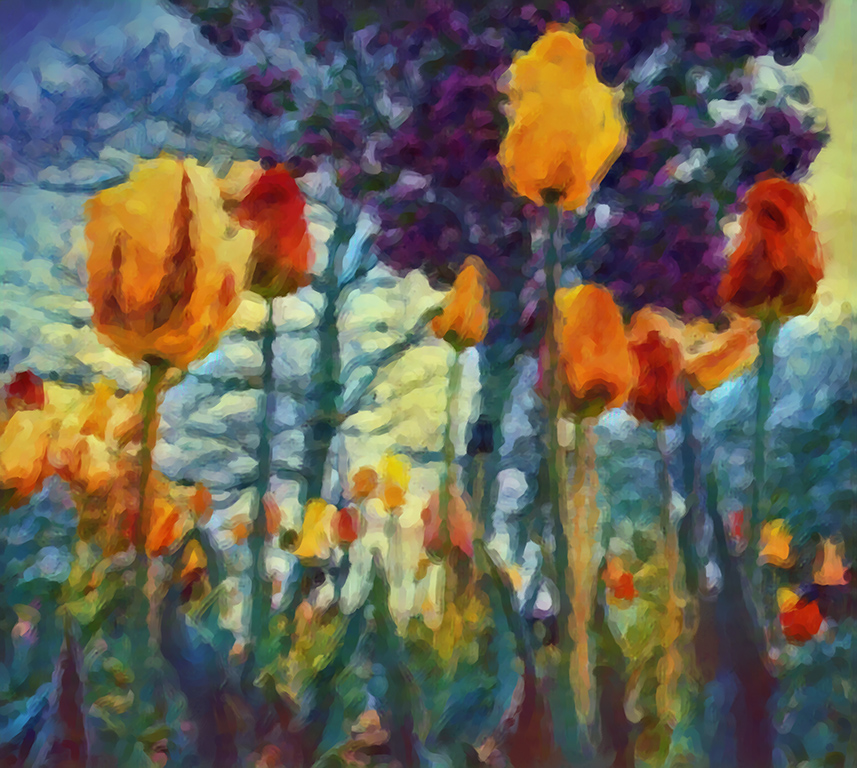
Here is the original:
|
Jun 8th |
 |
| 21 |
Jun 20 |
Comment |
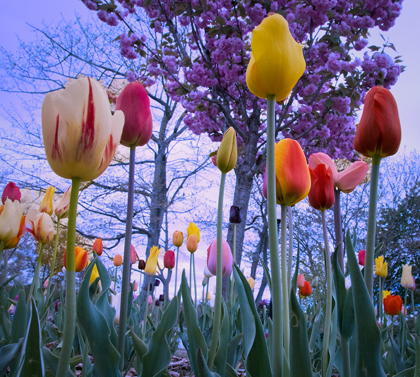
Unfortunately, the wrong image was posted. The description was correct. I sent Joan the wrong images. The correct final image is below:
|
Jun 8th |
 |
3 comments - 6 replies for Group 21
|
| 65 |
Jun 20 |
Reply |
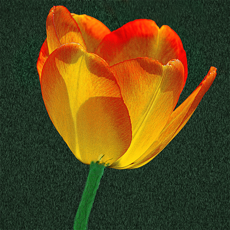
In the newer versions of CC, most of the color work in LAB can be done in RGB. I find that I get more control in LAB and for color control and sharpening, I am used to working in that space. Having said that: I don't think I could get the subtle tonal variations in RGB as in LAB. As an example, in the image below, except for the usual adjustments, by using I was able to show tonal variations simply by applying a curve layer to the individual channels. For a detailed explanation of the theory and why see: Margulies, "Canyons and Conundrums." It clearly explains wat to do, and for those interested, why it works.
|
Jun 27th |
 |
| 65 |
Jun 20 |
Reply |
Lynn, thanks for your comment. I completely agree about the stem. As for the background, not every unconventional treatment works for everybody. I did not want the more traditional look. And I am still uncertain about what I did. That's why I posted the image. |
Jun 27th |
| 65 |
Jun 20 |
Reply |
Angela, thank you for your kind remarks. I lightened the stem and blended it into the flower.
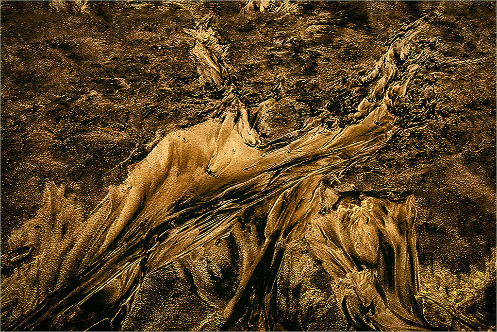
While in theory I can get most of the color effects using RGB, in the newer versions of PS, it is much easier for me in LAB. One example is something like the sand abstract below, where I did not do anything but play with luminescence and tonal variations. Because of the way the LAB color space is structured, by using LAB it was easier for me to get the look I wanted. For a more detailed explanation, see "Canyons and Conundrums" by Dan Margulies.
|
Jun 27th |
 |
| 65 |
Jun 20 |
Reply |
Could you change the aspect ratio, to get both? I you have toe resize, and have PS cc, I would use scaling to maintain the same degree of detail. |
Jun 27th |
| 65 |
Jun 20 |
Reply |
Vinod, Thank you for taking the time to make comments. I agree with both you and Charles about the stem looking out of whack. Even after working with PS since version 4, I think there must be tons of things I don't know. I have some more stem playing to do.
|
Jun 16th |
| 65 |
Jun 20 |
Reply |
Charles, Thanks for your thoughtful reply. I completely agree about the stem. That is the result of not sure which way to present the image, and one of my early attempts to make a multi use background. So far, I can use the basic technique to make a night sky, what you see above. and backgrounds with subtle contours that compliment the subject. When I smooth out some more of the wrinkles, I will be happy to make the technique available to all.
To respond to your last point, I intended to create tension, which is why I didn't simply blur the background and adjust the color. |
Jun 16th |
| 65 |
Jun 20 |
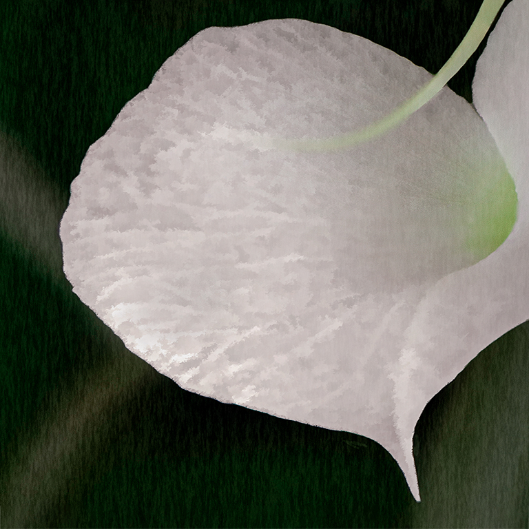
Comment |
Lynne,
I like the unique way you presented this image. Leaving the tendril in the shot at the angle you used, prevented your orchid from looking static. I see a work of art, not a postcard or botanical illustration.
I have some nits based upon my own taste. My VF did not come out as I envisioned because I am still trying to learn how to increase translucency in flower petals without turning them into porcelain. My personal preference is for granular translucency. I increased the space between the bottom petal and the edge, and darkened the the background, while adding some fibers.
|
Jun 11th |
 |
| 65 |
Jun 20 |
Comment |
Charles,
Splendid. I looks as if you have put a lot of thought and work into your image. I think it was worth every second. Unless you created the crystal itself, you have presented us with a perfect example of creating your own image, based on something that was not originally created by you.
I like that your image is centered. While it's color busy, the multiple colors and shapes work well to create a very interesting image.
To my eye I would have warmed and brightened the image, but the tonal range and brightness in your image is purely artist's choice. And judging from what you wanted your image to say, I would not change your image to give it a different look.
Well done!!
|
Jun 7th |
2 comments - 6 replies for Group 65
|
| 83 |
Jun 20 |
Comment |
Hi Judy, I think your image has very strong potential. However I agree with Jose's point. Perhaps you could achieve enough separation by playing with tonality of the sidewalk, the wall, and the dancer's shoes.
|
Jun 11th |
1 comment - 0 replies for Group 83
|
6 comments - 12 replies Total
|


