|
| Group |
Round |
C/R |
Comment |
Date |
Image |
| 21 |
May 20 |
Comment |
Barrie,
I agree with all three comments above. I have used one of these easy methods to accomplish that goal, and I always make the adjustment on a separate layer:
1. I use a mask on the adjustment layer. I pant in the mask at variations of gray. When I mess up, I simply repaint over the mask;
2. I can easily control the opacity of the mask;
3. I use "blend if" in addition to a mask. This method takes a lot of practice to learn, but it seems to give me a lot of control;
4. I use curves in LAB mode. While this method has a very steep learning curve, no pun intended, I doubt if there is a method, that when combined with the others, gives you more control.
Having said the above, I find that a properly used layer mask will fit 95% of most photographers' needs.
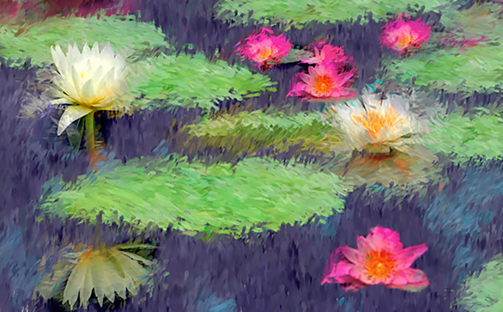
Here is an example just using color enhancement and a layer mask at various shades of black.
|
May 19th |
 |
| 21 |
May 20 |
Reply |
Larry,
Many public libraries subscribe to Lynda.com, which contains hours of tutorials, not only on photography. I have used their videos and think they are no nonsense "how to," compete with printed PDF trans, and the ability to download the exercise files. While the lessons are basic, they cover a lot of points which will stimulate your thinking. In my opinion they are far more concise than the official Adobe materials. I have seen other tutorials where the instructor takes about a half hour to explain something that could be explained in a short paragraph. Others gloss over an item that need a few hours. HTH |
May 19th |
| 21 |
May 20 |
Reply |
Sorry, no! The idea never occurred to me. What I said about the set-up, describes the general concept.
Periodically I do off the beat tings, such as breathing of a clear glass filter to create a variable fog, or soft light filter; smearing Vaseline o a clear filter; strategically placing a drop of colored water paint, to reduce sun exposure. I did all the above when I had my wet darkroom. They make life a bit easier in PS. Besides, it's fun. "... life is like a box of chocolates,..." (Gump) |
May 19th |
| 21 |
May 20 |
Reply |
Joan,
While I agree with your statement, on the quality of Charles' image, I am not certain that I agree with all you said about the use of stock photos, and by derivation, purchased or licensed textures and backgrounds, not created by the maker.
My feelings are more easily said than implemented and I have serious questions on enforcement, I also want to make it clear that the rules for commercial use may be different and I have no intention of going into those, or copyright rules:
1. Under no circumstances should I use any portion of the work of others, without their express or legally implied consent;
2. If I use the work of another under the creative commons license, absent a written agreement to the contrary, I am obligated to give them appropriate credit for their work;
3. If I partially use the work of another in a competition, and the rules of the competition state that all elements of any submission by me, must be my own creation, I must comply. (It is my personal belief that rule is not enforceable, as a practical matter;)
3(a) Because most digital processing software comes with pre-made textures, and both are readily available, I don't understand how such a rule could be enforced. I think the rule should be tied to how the texture, or background affects the image; (Still not really truly enforceable, but more practical;
4. Even if I violate the above and use the image for either hanging on my wall, or winning a ribbon or nominal sum, violation of those rules is the equivalent of cheating at solitaire.
|
May 16th |
| 21 |
May 20 |
Comment |
Steve,
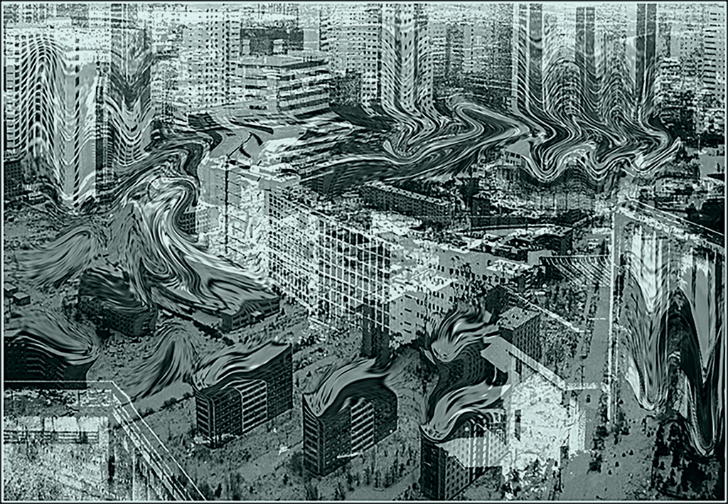
When I first opened your image only the bottom showed, and to me it looked like a turtle. Then, I looked at the rest of your image, but had to fight to get the concept of "turtle" out of my head. Finally it happened, and think your image is both colorful and imaginative. I suspect that you have created a composite with at least four layers each containing an image sections. I like the way you adjusted and blended the colors, so that each color and layer makes a positive contribution to contributes to the whole image. Very nicely done. |
May 16th |
| 21 |
May 20 |
Reply |
Brian, thank for you comment. Do you think it is to busy? |
May 10th |
| 21 |
May 20 |
Comment |
Phillipa, I see a beautiful abstract with strong lines, vivid complementary colors, with appropriate tonal variations. I also like that the spacing of the angled lines keep decreasing as my eye progresses towards the right of your image. I keep wanting to keep looking at it.
I wonder if you cropped the left side to the first line on the left, you would have a stronger image. To my eyes that section seems to disconnect with the rest of your image. |
May 5th |
| 21 |
May 20 |
Comment |
Brian, You have taken an image which could have been too busy, and turned it into an extremely interesting work of art. The curved areas compliment each other, the vertical lines help us enjoy the curves, and the main center of interest, for me, is in the upper right, and follows the rule of thirds.
It is in my nature to play with images just to see what happens. In this case, I'm afraid that I may have removed some of the subtlety of your original. I inverted the image, went into LAB mode and played with a slight curves adjustments to the midtones on the a & b channels. Then I cut back the saturation RGB in RGB. When I enlarged the image I saw some areas of pixelization.
I had an offline conversation with Joan, before your image was posted, and she agreed that pixel count was not a factor, as long as the image met the height and width limitations, and the overall size was not more than 1mg. I took the liberty of adjusting the pixel count, and it seems to have solved the pixel issue. |
May 5th |
 |
| 21 |
May 20 |
Reply |
Nope, while I made several tries, this is the only one that worked. It was only one. Mostly in camera. The only thing I did in post was color saturation and resize. This image was caught just after the paint drop had reached the puddle on the bottom. |
May 5th |
4 comments - 5 replies for Group 21
|
| 65 |
May 20 |
Reply |
I agree with your comment. I made what I thought was a Hobson's Choice:
To my eye, a portrait aspect ratio seems to work better with high key;
Elongating the stems made them look too stringy;
Thickening and elongating the stems took too much away from the flower;
Alternatively, I could use the flower as a texture, or to create additional storage space.
Thanks to your comment I am now thinking of other uses.
|
May 20th |
| 65 |
May 20 |
Comment |
Charles,
Your image is a perfect illustration that less is often more. I don't know how you enhanced the stones and the table. It worked.
I have only one nit. You did too good a job on the stones. I would like to see a few of the original imperfections, between the stone reflections and the table. To my eye that would make the image a tad more realistic.
|
May 20th |
| 65 |
May 20 |
Reply |
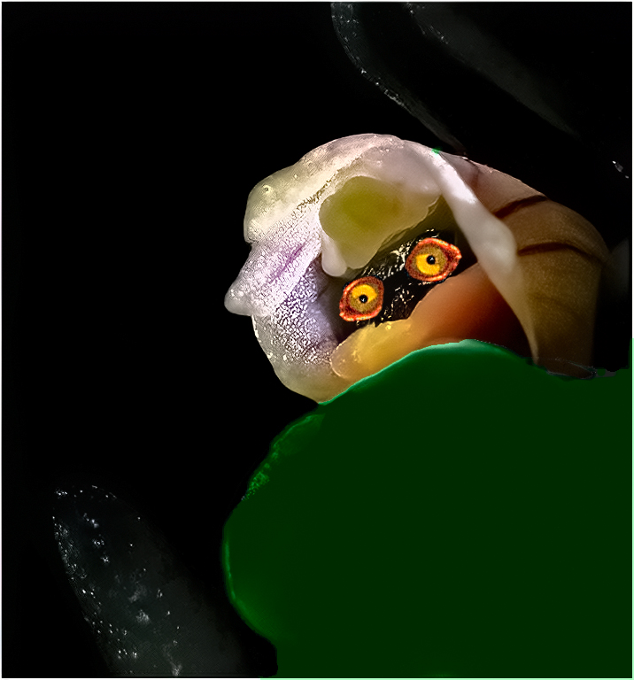
Charles,
I agree that in my first edit, the surrounding leaves came out much too dark. I was noodling around, nd put in the eyes, just for kicks. That concept was not an original plan. I was poking fun at myself. That's just the way my mind works. (One day I'll find that loose wire.) |
May 20th |
| 65 |
May 20 |
Reply |
I have difficulty resisting temptation. After I finished the VF the image reminded me of a spaceman, so I made a very rough representation. Do you see him? |
May 16th |
 |
| 65 |
May 20 |
Comment |
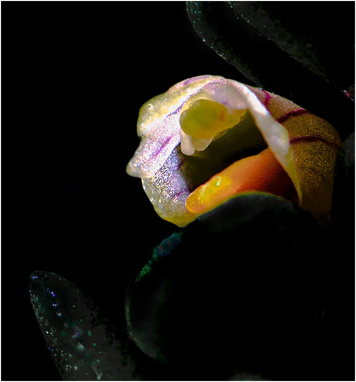
Lynne,
I like the contrast between the small orchid, and the leaves in which it is snuggled.
To my eyes the leaves are too bright and there are too many specular reflections. Also, the front leaf looks blurry. You can cut back the specular reflections, by placing a diffuser between the sun and the subject. I tried to give you an idea of what I mean in my VF. I made the leaves much too dark in my VF, but yu don't hae to make them a dark. |
May 16th |
 |
| 65 |
May 20 |
Comment |
Angela,
I like that you seem to enjoy water splash photography.
To my way of thinking, every time you try one, you get a different image. This month I posted a paint splash image in group 21. That image triggered a massive discussion, mostly offline, concerning what constitutes a creative image. I had originally intended that image to be posted here, but I wanted to get some feedback on one of my first high key images, and my next months close up image is almost ready. |
May 16th |
| 65 |
May 20 |
Comment |
Elaine.
I am glad you are trying something you haven't done before. Since I have never tried focus staking, I will not make comments about focus, other than to say that if you find the time there a lots of free tutorials on focus stacking. Your public library may have access to photo tutorials.
I like the angled placement of yur subject, and that it is off center.
To my eyes it looks as if it was leaning backward. This may be because your film plane it not parallel to the subject. The light streaks on the image can be fixed if you play around with diffused lighting. The dark shadows can be fixed by placing a low output diffused light, or reflector under the image. I would like to see the OOF bright areas on the middle right toned down a bit.
One of the members of my club used an egg to study the effects of lighting. It may be easier to learn basic lighting with an egg, as the surface isn't shiny, and you can always eat it when you are done. |
May 16th |
4 comments - 3 replies for Group 65
|
8 comments - 8 replies Total
|


