|
| Group |
Round |
C/R |
Comment |
Date |
Image |
| 21 |
Jul 19 |
Reply |
Visual feedback. Saves thousands of words. |
Jul 29th |
| 21 |
Jul 19 |
Comment |
I agree with both Steve and Joan. I would have preferred to see the mountaintop showing a softer blend against the sky. |
Jul 27th |
| 21 |
Jul 19 |
Comment |
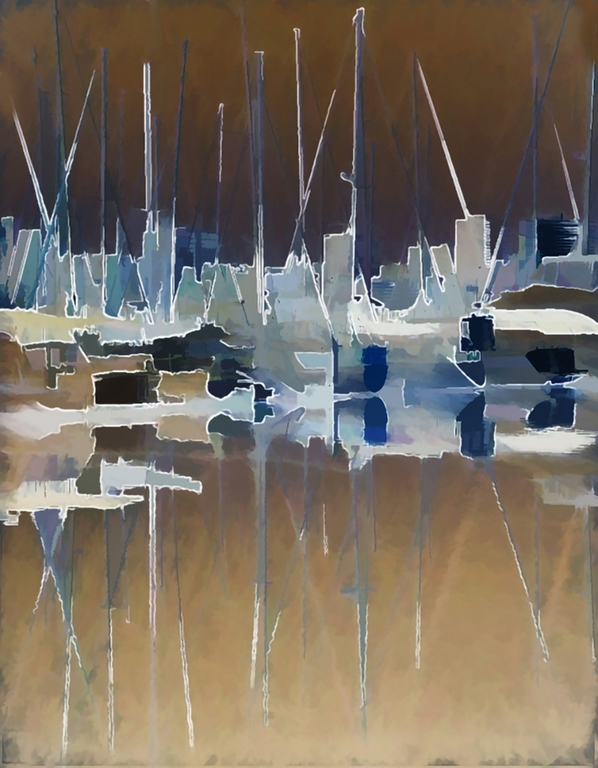
You did a great job of transposing a very busy image into an abstract which maintains the theme of the original. Your use of the color inversion adds a lot of interest. My only nit is that the masts leading out of the image tend to lead my eyes away from the subject. |
Jul 27th |
 |
| 21 |
Jul 19 |
Reply |
Is there a difference in the colors on our side of the pond? |
Jul 27th |
| 21 |
Jul 19 |
Comment |
The first, and most important part of my point is off topic. I hope you recover well and soon. I think you image is interesting in that I am able to look at it as a whole, without ignoring the individual elements. |
Jul 27th |
| 21 |
Jul 19 |
Comment |
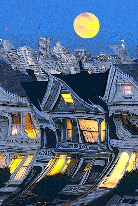
Well thought of concept, and very well executed. One of the nice things about creative, is that there are so many ways of executing the original concept. I am only dong a VF here as an illustration of my point. I am far from making a suggestion. My VF was the first thing that popped into my head when I read San Francisco earthquake. |
Jul 27th |
 |
4 comments - 2 replies for Group 21
|
| 83 |
Jul 19 |
Comment |
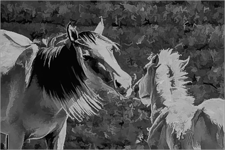
Hi Georgianne, welcome to the group. From your bio I hope you will treat us to a lot of nice images. Your image tells us a nice story of motherly love. My guess is that you could not get too close to the horses. In your image the story is the relationship between mom and the foal. All else is wasted pixels. If this was my image I would have gotten as close the them as possible, to show the relationship. Of course life is not ideal. My VF will give you an idea of what I mean, with the understanding that I don't know how showing the horsehair would be possible. |
Jul 25th |
 |
| 83 |
Jul 19 |
Reply |
Judith, your club's definition is no different than mine. I think that definition applies to most images taken as art photography. There are exceptions, such as forensics, marketing. To my way of thinking, making a portrait tat depicts something about an individual, without turning it into a cartoon, is not at all easy. Your image of Uncle Harry portrays him as a nice friendly and mellow individual. When I was about ten I met an individual, who has had thousands of his images. I always thought of him as just a kindly man, who in some of his images appeared to be slightly eccentric. At. ten, even tough we talked for almost half a hour, I had no real conception of who he was. It wasn't until a few years ago that together with some of my friends we decided to try understand just a small fraction the math and logic supporting hs theory of relativity. |
Jul 25th |
| 83 |
Jul 19 |
Reply |
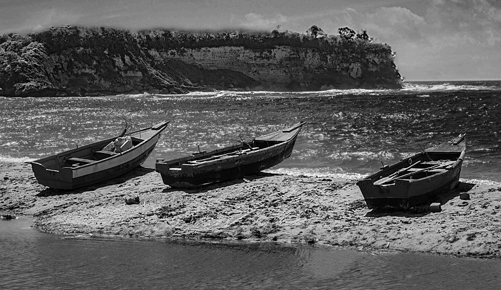
This is an interesting, yet simple image. I can't wait to take my fishing rod and see what's under the water. I think Judith's crop provides a different perspective, I see nothing wrong with your crop. Just a few suggestions: To my eye the sandbar nd the mountain are not quite as sharp as I would like them to be. I brought out some more natural clouds by increasing the blue saturation and reducing the luminescence in the sky. I used a down ad dirty mask so the blue on other objects would not be affected. After sharpening I noticed a white line around the tp of the mountains. I fixed this be running a spot removal brush around the mountain tops. The slight blur this left didn't bother me because of the distance. |
Jul 25th |
 |
| 83 |
Jul 19 |
Reply |
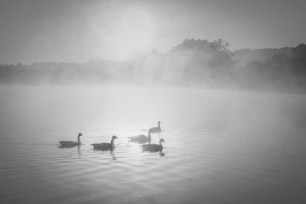
After reading your reply, I like what you did better than my original response. But I still was not happy, so I started over: Adjusted levels about 40%; then a did selective dehaze, black and exposure adjustments and feathered the corner vignettes. These adjustments tend to bring the viewers eye more toward the ducks, while keeping the mood of the image and preserving tonality in the sky. |
Jul 25th |
 |
| 83 |
Jul 19 |
Reply |
I'm happy to see images put up for the purpose of getting thoughts and opinions on how images can be improved. Having said that, I must admit that portraits are not my biggest area of interest. Of image However, I would think that a portrait should tell us something about the subject. (unless it was taken so you have a nice memory of Uncle Harry.) |
Jul 23rd |
| 83 |
Jul 19 |
Comment |
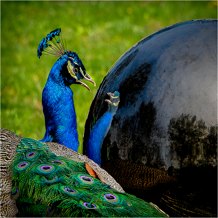
Dirk, We have another image showing the form and shape making the image. It need not be color to be good. I wish I had thought of that when I recently used a peacock I coopetition. |
Jul 23rd |
 |
| 83 |
Jul 19 |
Reply |
Hi jane,
I thank you for presetting us with a nice calming image. Your image is one that brings out the layered tonality that would be spoiled by color. I think that If your image was in color, the color would distract from the mood. understand that Jose ha a good point about the contrast, but It is a matter of taste and what you are showing is. In my VF I darkened the corners, and applied a slight graduated radial filter to the ducks, just to bring them up a smidge. |
Jul 23rd |
 |
2 comments - 5 replies for Group 83
|
6 comments - 7 replies Total
|


