|
| Group |
Round |
C/R |
Comment |
Date |
Image |
| 21 |
Mar 19 |
Reply |
I think the darker gray works better. |
Mar 8th |
| 21 |
Mar 19 |
Reply |
Thank you for your kind comment. BTW I will probably change the title to Struggle for Life. |
Mar 8th |
| 21 |
Mar 19 |
Comment |
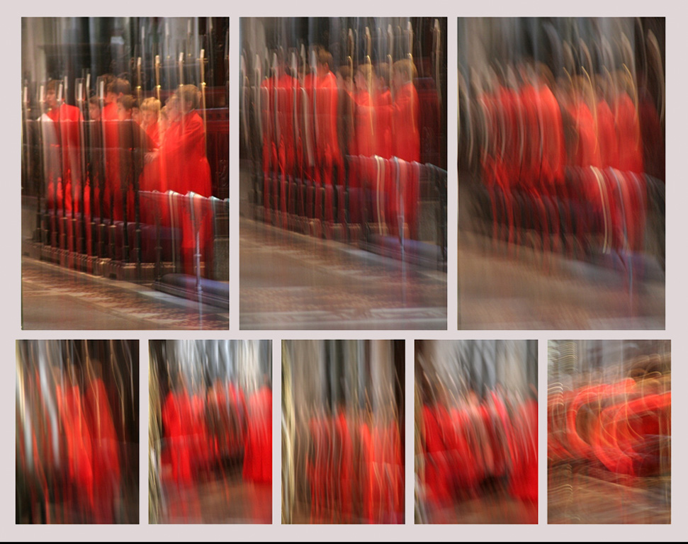
Brian, well done. I like the way each image in the series builds on the prior, for understanding. Had you considered using a light gray border? |
Mar 8th |
 |
| 21 |
Mar 19 |
Reply |
Thank yu Brian. The fish eyes you see, are bubbles from the fountain. Do you think they are too prominent? |
Mar 8th |
| 21 |
Mar 19 |
Comment |
Steve,
You have presented us with an original, well created image. I would not like to visualize that while dreaming. When I see cemetary, I think spook. Did you consider softening the trees to give a bit of motion in the background. To my eye the background is competing with the tombstone for my attention. |
Mar 5th |
| 21 |
Mar 19 |
Comment |
Steve,
You have presented us with an original, well created image. I would not like to visualize that while dreaming. When I see cemetary, I think spook. Did you consider softening the trees to give a bit of motion in the background. To my eye the background is competing with the tombstone for my attention. |
Mar 2nd |
| 21 |
Mar 19 |
Comment |
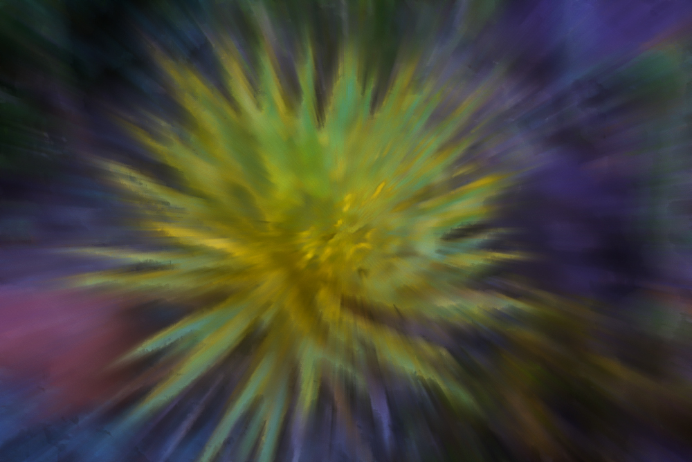
Hi Joan. Thank you for sharing such a beautiful image. If you hadn't told us, I would never have guessed that the original was a succulent. I like the motion lines and gentle feel of the color blends. It is difficult for me to resist a chance to play. Starting with your original: I did a digital panting in Corel Painter; used the bloom and motion blur filters in Topaz Studio, in PS, did a slight sharpening, did apply image on the red channel and cut the opacity on that layer to about 70% . After looking at the images, I can only say that we have different interpretations. But, after all that work, if I could hang only one of them on the wall, it would be your version. Prior to your posting I had never thought of applying motion blur filters to a succulent. Thank you for opening up a new area of play. |
Mar 2nd |
 |
4 comments - 3 replies for Group 21
|
| 83 |
Mar 19 |
Reply |
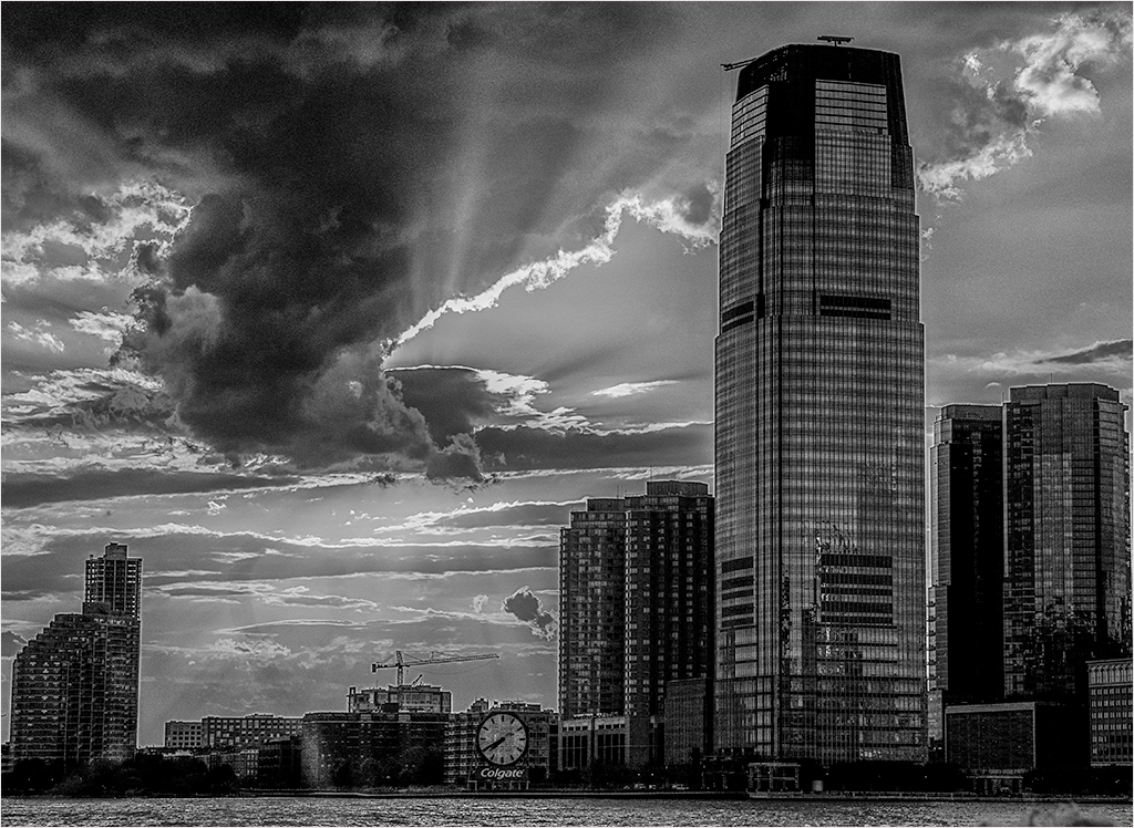
Your latest version adds a lot of strength to the building. Did you intend to posterize the sky? |
Mar 15th |
| 83 |
Mar 19 |
Reply |
It depends on the image. Judicially used Aurora can bring out details that you have to otherwise work a long time to get. |
Mar 15th |
| 83 |
Mar 19 |
Comment |
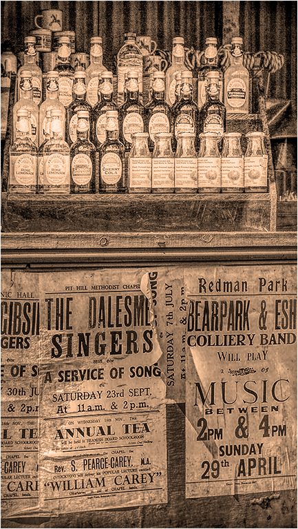
Hi Charles, Good Seeing. I agree that the signs on the bottom draw my eye from the bottles. To keep with the these I suspect you intended, I applied a distressed adjustment in Topaz Studio. Back in PS I slightly darkened the bottom, and brightened the top, using a gray filled layer in overlay mode. Since all the manipulation caused colors to appear, I converted the image back to monochrome and applied an orange photofilter at reduced opacity. |
Mar 15th |
 |
| 83 |
Mar 19 |
Reply |
Hi Dirk,
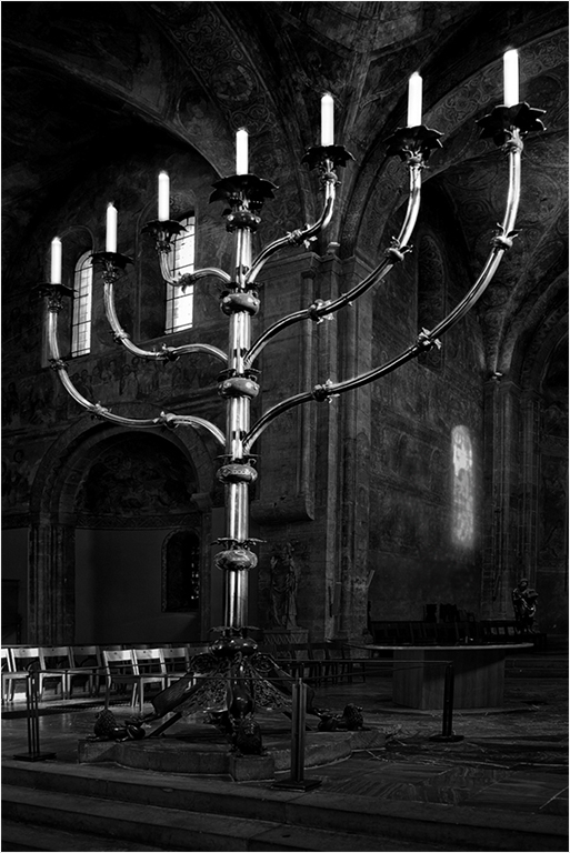
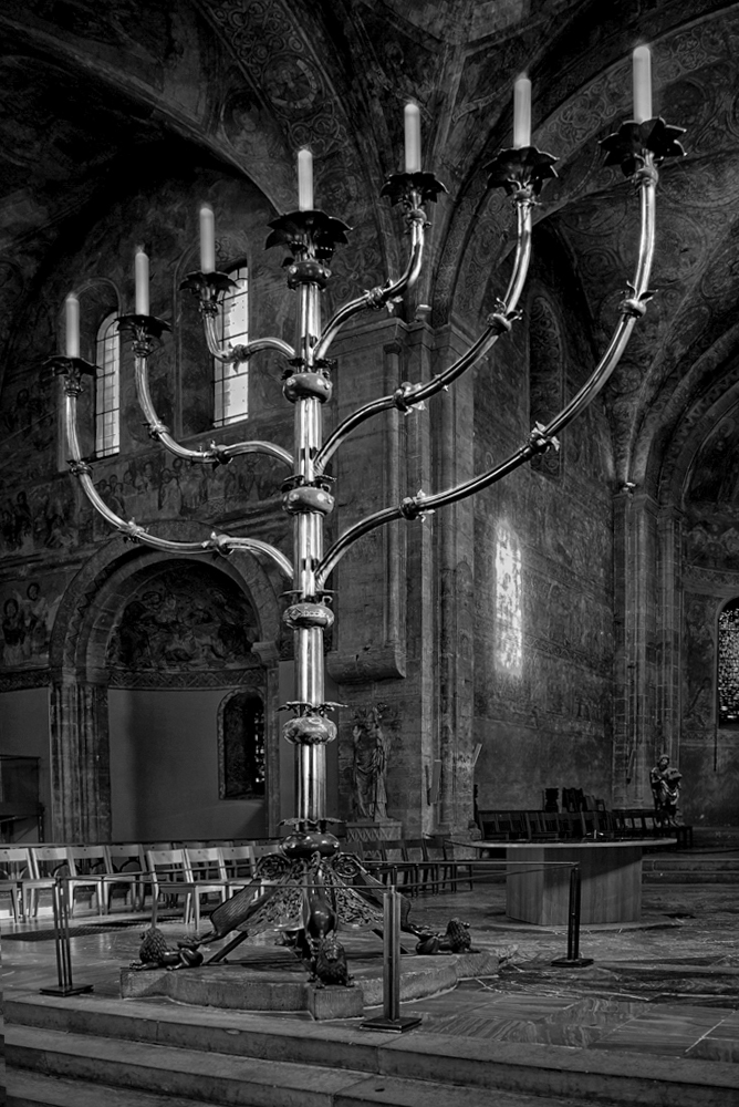
This is an example of why we have so many colors in a box of crayons. To my eye the wall looks too stark without the reflection of the window. I moved it further away to add a bit of balance to that wall, and darkened it so that the reflection would not detract from the candelabra. I did not change anything else, but for some reason that whole wall seems brighter. I freely admit that i don't understand why. |
Mar 12th |
 |
| 83 |
Mar 19 |
Comment |
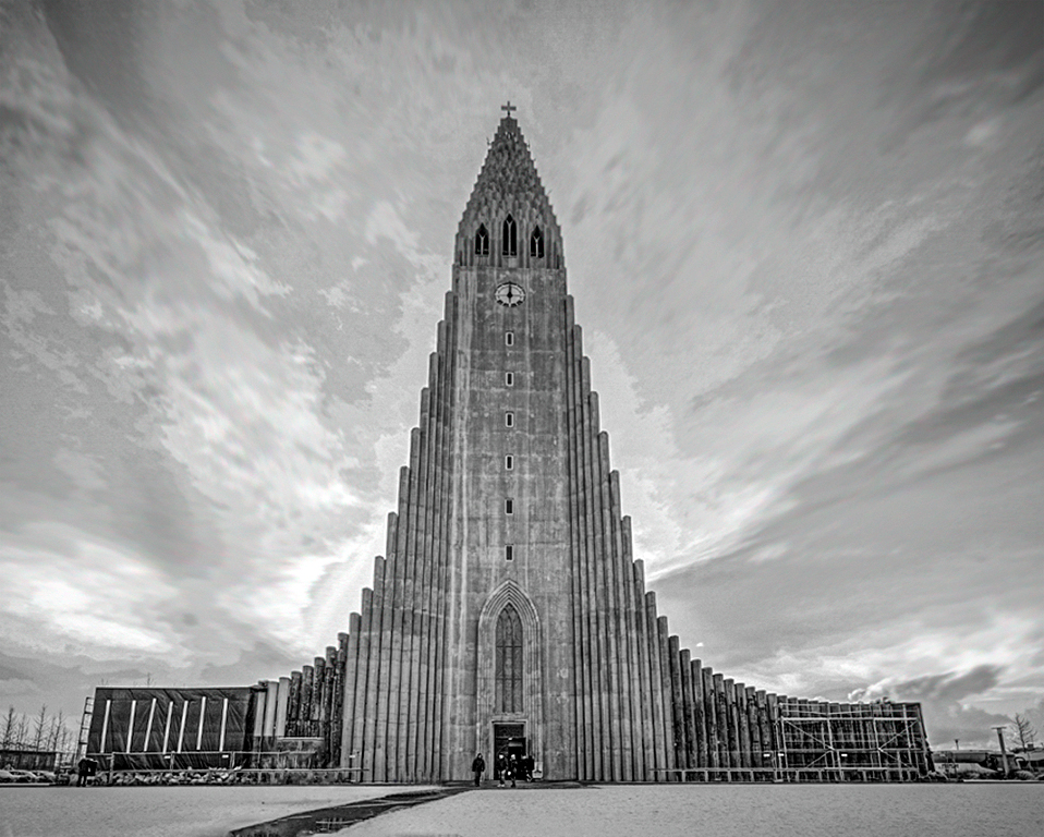
Hi Jane, Your initial capture shows an interesting and unusual building, with a sky full of variegated clouds. My objective was to straighten the building, and try to bring up the detail in the sky, as well as increase the tonal range in the building. I decided to do it the lazy way. I duplicated the layer in PS and ran it through Aurora. In Aurora I started with an architectural preset, that darkened the building. I increased the microstructure and HDR structure, while decreasing the brightness sliders. This resulted in a flat looking image with too much of the Happy Potter look for my taste, so I reduced the opacity of the adjusted layer to about 40%. I stamped the layers, but the clouds still looked too static. I selectively smudged them with a very soft brush at 19% to sow an effect of soaring up at about 30 degrees with the building. Then a levels adjustment was made to bring up the tonal range. Finally, I placed a slight feathered vignette in the corners. While my result is not perfect, and may not be to your taste, it should give you some ideas to play with. Only you can make an image to your taste. |
Mar 12th |
 |
| 83 |
Mar 19 |
Reply |
Hi Judith, Since the amount of contrast and detail is a matter of taste, you did a nice interpretation of Tracy's image. My personal thought is that in adding the detail, some of the ethereal quality has been lost. It's strictly a question of personal preference. |
Mar 7th |
| 83 |
Mar 19 |
Reply |
Hi Tracy, I knew and know a lot of people who were in WTC on 9/11, or were affected. (e.g. My friends daughter had assigned some people to go there. They died in WTC, and she never recovered from her feelings of guilt.) My daughter was watching the buildings collapse from across the river, she has survivors guilt at losing some of her co-workers.) I am usually considered as having a pretty thick skin. A few years ago I went on a field trip to WTC with my CC. I was emotionally unable to take any pictures. I just sat down on a bench, in a stupor. |
Mar 4th |
| 83 |
Mar 19 |
Reply |
Hi Tracy, There are multiple ways to do lots of things in PS. To expand an image I simply click image | canvas size, there is a diagram that lets me select the part of the canvas I want to enlarge. In the case of your image I clicked the top center arrow, to add canvas only to the bottom. I usually pick a bit more than I need so I have enough expansion, use a unique background color. I use the magic wand to select the expansion area, increase the selection by one pixel, and apply a content aware fill. (On a PC, shift f5.) If the fill area has an unwanted area, I clone it out. The process takes less time than it will take you to read this. |
Mar 4th |
| 83 |
Mar 19 |
Reply |
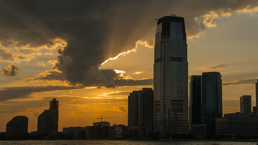
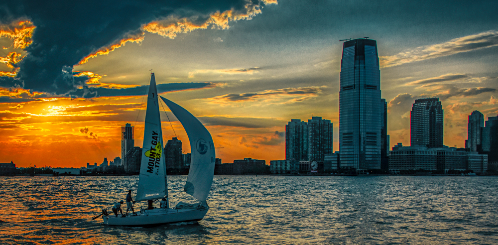
Judith, I agree. My original purpose for taking the image was the interesting sky. Indeed that was the reason I went on that sunset cruise.
|
Mar 4th |
| 83 |
Mar 19 |
Reply |
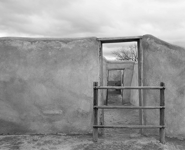
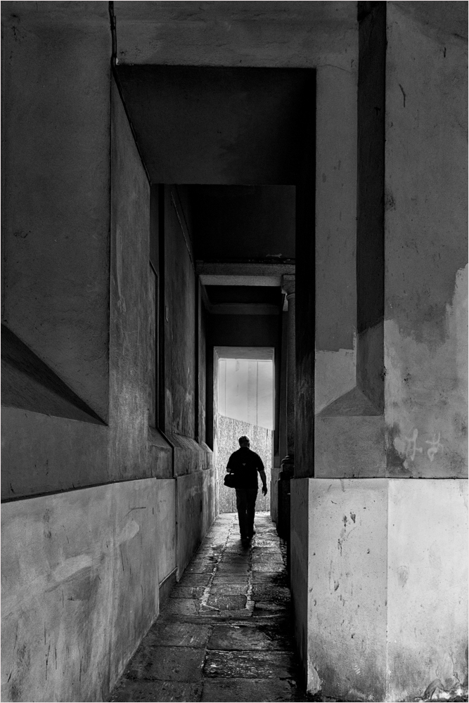
Hi Jose, I usually like to see tight crops. In this case I think the image needs room to breathe. It does not bother me that there is no true black point. Your version would be correct if Tracy was intending a study of the doorway. To my eye your version looks a bit cramped and static. |
Mar 4th |
| 83 |
Mar 19 |
Comment |
Hi Tracy, Thank you for presenting us with nice a soft painterly image to enjoy. This is one that I would gladly hang on my wall. Although, as Jose pointed out, you have not used the full tonal range, there is enough tonal variety for the wall to be interesting. My only suggestion is to create a bit more space at the bottom of the image. To my eye the bottom of the vertical post on the left looks a bit cramped. I used the burn tool set at 8% flow to cut back a bit on the bright sky |
Mar 4th |
 |
| 83 |
Mar 19 |
Reply |
Hi Judith, I was referring to the part in front of him. In particular the upper part of the opening. I used original 2 as the starting point for my suggestion. There are several was of doing this. For my suggestion I created a new layer with a blend mode of overlay, with gray fill. I then simply ran a black brush at 5% flow over that area. That way if I darkened too much, I can simply cut back on the opacity of the layer, and/or use a low flow eraser, or white brush to correct. |
Mar 4th |
| 83 |
Mar 19 |
Reply |
Hi Judith, Here is a jpeg version of the original file, otherwise unedited. After I looked at this file, I see that the monochrome conversion was done with Silver Efex Pro.
|
Mar 2nd |
 |
| 83 |
Mar 19 |
Comment |
Hi Dirk, Very nice image with great perspective. The shot from below the candelabra taken at 28mm, gave a dynamic look to what otherwise would be a static image. I do not see any lens distortion, which I might see from a different lens. I like the rich tonal range in the background, and the chairs provide a nice balance. My only issue is that when I first looked I thought the candles were windows. I tried to correct this by slightly darkening them. I also toned down the highlights a bit, adjusted the contrast at the top of the candelabras to give a bit of separation from the background. |
Mar 2nd |
 |
| 83 |
Mar 19 |
Comment |
Hi Judith. I tend to agree with Jose that original 2 is a stronger image, and for just about the same reasons. I prefer the darker tonal gradations, that bring out the age of the walls. That being said, I also would like to see the white portion in front of your husband a bit darker.
|
Mar 2nd |
 |
| 83 |
Mar 19 |
Reply |
Judith, Thanks for taking the time to critique the image. The reason I selected it, was because while I thought it had potential, I had ambiguous feelings. I suspect it is one of those images that is not suitable for BW conversion. Or if it is, a proper conversion is beyond my ability. After reading Jose's and your comments I understand why I had reservations. Additional eyes are often helpful. In making this image, it was not my intention to emphasize either the boat, or the buildings. The sunset and sky was intended to be the subject, with the boat and skyline as location indicators. I took a series of shots at that time. Perhaps this image represents more of what I was trying to show. It is a simpler image. |
Mar 2nd |
 |
| 83 |
Mar 19 |
Reply |
Jose, thanks for your comment. I agree that I should not have inserted the plane. I appreciate your comment about the blur. In the original I felt that the choppy water with its specular highlights, was distracting. As you can tell from the original color image, the reflections from the water lights up the front of the buildings. I also wanted to preserve the window details. |
Mar 2nd |
 |
| 83 |
Mar 19 |
Comment |
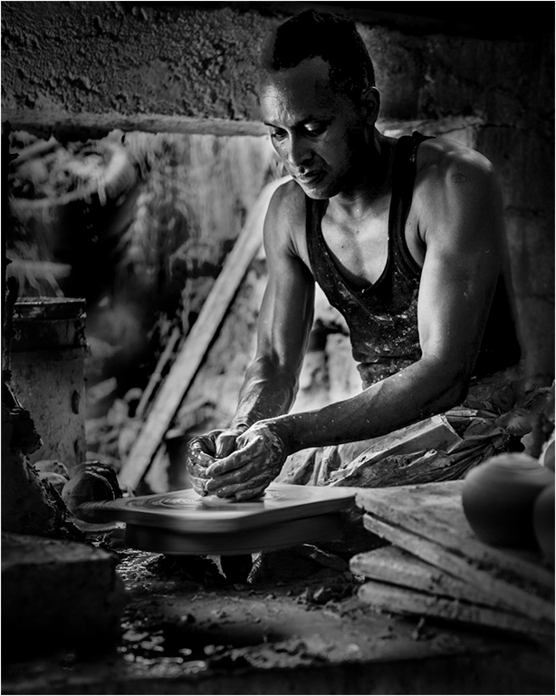
Hi Jose,
You have presented us with an interesting study of this man at work. I would like to be able to see more of him. If this was my image I would have cropped out the bottom half, which competes with him for my attention. I also would have toned down the outside, and tried to separate his head from the background. |
Mar 2nd |
 |
6 comments - 12 replies for Group 83
|
10 comments - 15 replies Total
|


