|
| Group |
Round |
C/R |
Comment |
Date |
Image |
| 21 |
Feb 19 |
Reply |
Thanks for your comment. It certainly is a valid point. I do not disagree. When doing an image of that type, sometimes the choices I make are more difficult than when having my vision tested. ("which looks better? A or B?") In this case it's about the opacity of the layer. I frequently leave the image open, come back the following day, and make a change. What I do often depends on my mood at the time. If we all had the same taste, it would be a dull life. |
Mar 2nd |
| 21 |
Feb 19 |
Reply |
Thanks Joan. Your title suggestion is definitely appropriate. Although we do have the preconceived notion that all bubbles are round, those from the fountain were not. I did nothing to change the shape of the bubble. That is what intrigued me. Though perhaps I should have referred to the bubble as a splash generated bubble. |
Feb 27th |
| 21 |
Feb 19 |
Reply |
Brian,
I too worked for the gubmint, but only for several years. When I first got there, when we needed forms we would go to the forms window, and pick some up, and also get forms for our co-workers. One day we were informed that we had to requisition forms and were not permitted to use the forms window. Of course this meant that a case that was ready to be closed could be held up for weeks. I decided to take matters into my own hands. I wrote an urgent, "immediate action needed" memo to the District Director, of course to be forwarded up the line through channels, that essentially said that we ran out of forms to requisition forms. The forms window was opened about ten minutes after I handed the memo to my group chief.
|
Feb 21st |
| 21 |
Feb 19 |
Reply |
Brian,
I agree, and prefer the toned version, which does indeed look more realistic. I guess you don't have a propensity for understatement.
BTW I was not aware that Man Ray had authorized such a version. |
Feb 20th |
| 21 |
Feb 19 |
Reply |
H Brian, Have you seen Man Ray's photographs of dust? I recall they were on exhibition in London about two years ago. |
Feb 19th |
| 21 |
Feb 19 |
Comment |
Hi Steve,
You have certainly given a different look to what would otherwise be an ordinary street scene. While I agree with Barrie about the light areas drawing the viewers' eyes away from the central areas, I would not turn them gray. Think about using a darker shade of a blending color. |
Feb 16th |
| 21 |
Feb 19 |
Comment |
Nice creative concept, and well executed. Because I have taken pictures of people looking at the art work in museums, my first impression was that is what you did. i must add several kudus for your originality and execution. |
Feb 16th |
| 21 |
Feb 19 |
Comment |
Hi John,
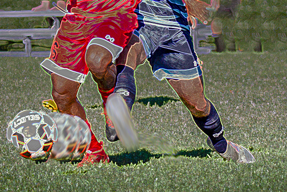
I see an interesting interpretation of a football game. I have a problem with trying to figure out what you want me to look at. As a PJ shot it's a nice treatment. However, to my eyes, it looks busy and static, at the same time. I played, brightened up the image, cropped to show just the ball and attempted tackle. I also added a little motion blur, to additional layers containing only the ball, and the tackler's foot. While it's crude, I did it so you can tell what I am talking about. |
Feb 16th |
 |
| 21 |
Feb 19 |
Reply |
Thank you Barrie, I think you are right. I will have to play with her eyes. |
Feb 16th |
| 21 |
Feb 19 |
Comment |
Hi Brian,
It sounds trite if I say it's a beautiful and creative image, but I don't know what else to say. Your image has inspired me to try some permutations using clouds, waterfalls and possibly beach scenes. |
Feb 16th |
| 21 |
Feb 19 |
Comment |
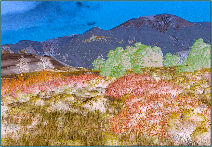
Hi Barrie, You have presented us with a nice painterly looking landscape. The rising flow of the mountain tops, mimicked by the flow of the other elements, creates a pleasant and dynamic image. Did you consider adding a bit of pop? See my suggestion, where I applied an automatic color adjustment in ACR. You could make a similar adjustment using a levels adjustment layer.
|
Feb 10th |
 |
5 comments - 6 replies for Group 21
|
| 83 |
Feb 19 |
Reply |
Hi Jane, I am answering from memory. IIRC I duplicated the layer, changed the blend mode to overlay, and reduced the opacity. |
Feb 25th |
| 83 |
Feb 19 |
Reply |
Hi Jane, I am answering from memory. IIRC I duplicated the layer, changed the blend mode to overlay, and reduced the opacity. |
Feb 22nd |
| 83 |
Feb 19 |
Reply |
Judith, There are probably more ways to do things in PS, than Carter has liver pills. Katrin Eisman once asked me to take her and her husband out for a round of golf. She promised me a PS tip on every hole. Somehow, we could not get our schedules together, but we have remained friends. I like the way you implemented my suggestions, but I am bothered by the cloud in the upper right. Something looks bit artificial in that area. |
Feb 20th |
| 83 |
Feb 19 |
Reply |
Judith,
I thought I answered your question. Sorry for taking so long. Smudge is a tool in photoshop. I use it as a brush, at a low intensity, often under 10%, it is easier for me to smudge twice, and can be a PITA to un-sumdge and then resmudge. I also try to apply the smudge on a separate layer, os I can further adjust the effect, using different blend and opacity modes. |
Feb 20th |
| 83 |
Feb 19 |
Reply |
Judith,
I was referring to the dark images in the forest. To my eye I simply like them a tad darker. |
Feb 20th |
| 83 |
Feb 19 |
Reply |
Hi Judith,
Many years ago I used the Nik software. I bought the whole suite a few months prior to the sale to Google. I happily used it until I got my 4k monitor. Then the menus were too small to read, as I could not adjust the font size. I started using Topaz and OnOne. most of the thing I did in NIK, I can now easily do using just PS & LR. I subscribe to CC for photographers for about $10 a month. For that I gety LR, both versions, and PSCC 2019, with telephone support. Even though the price was very low, I try not to do business with DxO. I have used their other products in the past, but I have to beg for support, and I think their upgrade policies are unreasonable. for example, a few months after they purchased NIK, I asked whether they had solved the scalable font size issue on Windows. As of today I have not received an answer. One of my friends purchased the NIK suite from them and found it to be identical to the prior free Google version. To my mind they practice caveat emptor, to the extent that makes snake oil salesmen look honest. |
Feb 20th |
| 83 |
Feb 19 |
Reply |
Hi Jane,
White clouds blue sky. Decrease luminescence of the blue, it gets darker, adding contrast. Gray clouds are rarely solid gray. This sounds counterintuitive, but I first decrease the contrast of the clouds to bring up the cloud details. I them adjust the HSL of the blue channel to darken the sky. when there is overall fog, I often will try to keep the mood and just decrease contrast to increase tonality variation. Please don't get the wrong impression. For me it's like golf. I sometimes know what to do, but can't always do it. Greg Benz has some good info on lumenosity. I subscribe to his blog. |
Feb 20th |
| 83 |
Feb 19 |
Reply |
Hi Judith,
I was a fairly decent navigator. I completed a course in sailing, but preferred my 5 ft inflatable, with a 4.5hp engine. I rigged it to be a great platform for night diving. Although capacity was limited to two divers. When you go out in something like that one has to be instinctively aware of tide and weather conditions.
BTW, I use an iPhone app, "Clear Outside." It tells me the predicted high, low & overall cloud and fog conditions at various locations. In addition to the obvious, I use it as a location guide to sunsets, as an adjunct to TPE. (The Photographer's Ephemeris.) I have been told that Photo Pills is easier to use, but this combo is working well for me. |
Feb 20th |
| 83 |
Feb 19 |
Reply |
Hi Isaac,
Your version creates a totally different mood image. To my sick mind, the log from which the fungi are growing looks like a dead alien. |
Feb 20th |
 |
| 83 |
Feb 19 |
Comment |
Hi Jose,
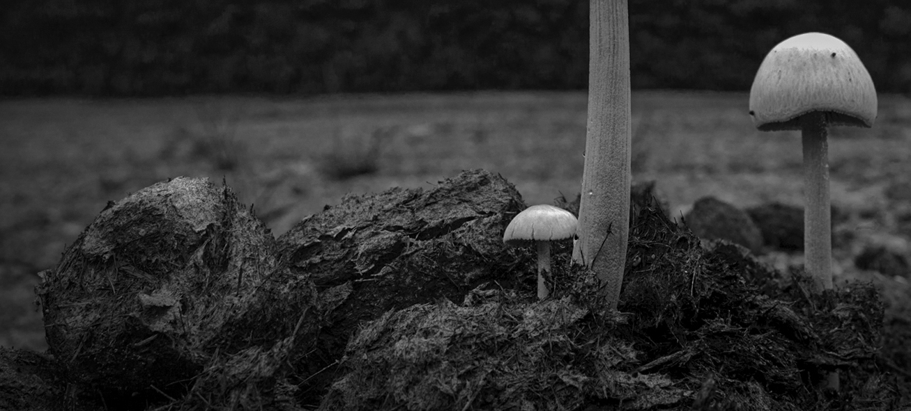
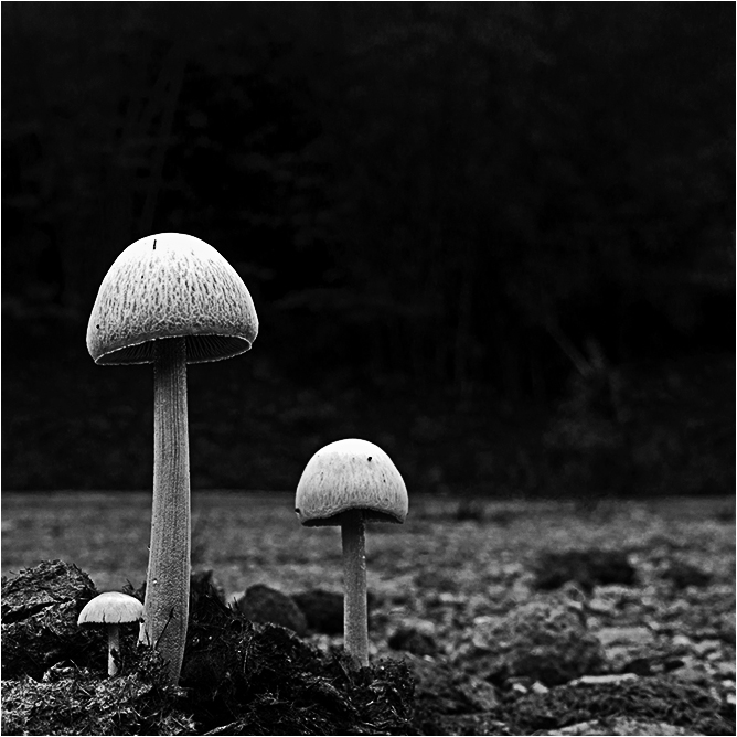
Your low angle shot gives the mushrooms a nice dramatic look. The negative space is part of the image and enhances your subject. I played around because that is in my nature: to my eye the space to the left of the 'shrooms was not contributing to the overall image; a 1:1 crop was used to preserve your concept of dominance of the 'shrooms; I fixed a blown highlight in the larger mushroom by moving the white exposure slider in ACR a smidge; in an attempt to sharpened the OOF mushroom the image was sharpened using the high pass filter at 2.7; since to me the detail in the forest detracted from the main subject I added a layer, changed the blend to overlay, and reduced it's opacity by 50%. Note that when I submit any dark image to a PID competition, I put a very thin white stroke around the image so that a judge can easily separate the image from a dark background. |
Feb 20th |
 |
| 83 |
Feb 19 |
Comment |
Charles, Old boats can make for interesting images. I agree with most of Judith's comments, Except that my personal preference for images of old boats is monochrome. That being said: since in this image there is so much to look at, I would like to see an image consisting of just the detail of one area that is interesting to you. |
Feb 20th |
| 83 |
Feb 19 |
Reply |
Hi Stephen, If someone asked if I would sail on that boat, my reply would be: "I'm a frayed knot."
(Sorry, couldn't resist.) |
Feb 20th |
| 83 |
Feb 19 |
Reply |
Jane, I did a quick Google search photoshop light beams. The results turned out a bunch of u-Tube videos. |
Feb 19th |
| 83 |
Feb 19 |
Reply |
Jane, I did a quick Google search photoshop light beams. The results turned out a bunch of u-Tube videos. |
Feb 19th |
| 83 |
Feb 19 |
Reply |
Hi Jane, i am flattered that you like my crop. Do you think the sparkle light enhances your image. To my eye the starburst creates a conflict in mood. I can understand the star as representing a good outcome from the storm. |
Feb 19th |
| 83 |
Feb 19 |
Reply |
Hi Jane, I am sorry to hear about your ankle. Of course, that you were sent a lemon, you have a great chance to make lemonade. ;-)
|
Feb 19th |
| 83 |
Feb 19 |
Reply |
Thank you. The background I use, depends on the image. I sort of let the image tell me. With a lost of the equipment we use today, I see little need for a black cloth. I can get an almost black background using high speed sync, with the camera in manual mode. The concept is to let the strobe be the only light in the scene. I adjust the shutter speed and ISO so that just enough light hits the sensor, to show only the subject. |
Feb 16th |
| 83 |
Feb 19 |
Reply |
Jose,
You are absolutely correct. However, I think that there are many ways to help the viewer's eyes concentrate on the subject: The background can be a contrasting tone; blank; blurred to various degrees; contain leading lines; etc. Though, in some images, such as scapes, abstracts, impressions, etc. the entire image is the subject. (Think Norman Rockwell, Jackson Pollack, Klee. |
Feb 16th |
| 83 |
Feb 19 |
Reply |
Judith,
Some of were talking him at a CC meeting last Monday. Sherm's philosophy was, if you are having issues with the exact color, print it in monochrome. |
Feb 16th |
| 83 |
Feb 19 |
Reply |
Hi Tracy, Thanks for your incisive comment. Fairly often, I have the problem of when do I stop. While many folk believe in only simple images, There are times I feel like producing a multiple image. i.e. If you look several times, you will keep noticing more images, within the image. (That applies to many other things in my life, but in this discussion I am only talking about photography. The only reason I said something is that for me art is an expression of life.)
thanlk |
Feb 16th |
| 83 |
Feb 19 |
Reply |
Hi Stephen,
You bring up an interesting point. I would think that whether the human figure is left in depends on what Dirk wanted to convey. If he intended a pure study i am neutral about the human figure, because it is not that prominent and provides a sense of scale. If Dirk intended a mood, than the human figure certainly provides a lonely mood, while providing.
BTW: Some of my artistic views are frequently in the minority. As I have often said, that is why Fords are made in colors other than black. I see no need to apologize for differring views. They make the world more interesting. |
Feb 13th |
| 83 |
Feb 19 |
Comment |
Hi Dirk
I pretty much agree with Jane's comments. However after the perspective change was made, to my eye the image looks a bit busy. if this was my image, I would not have made the perspective change. I would have a personally preferred it had you simply converted the original, To my eye you would have had a stronger image had you noot made the perspective change, and put a mild Gaussian blur on the background. |
Feb 13th |
| 83 |
Feb 19 |
Comment |
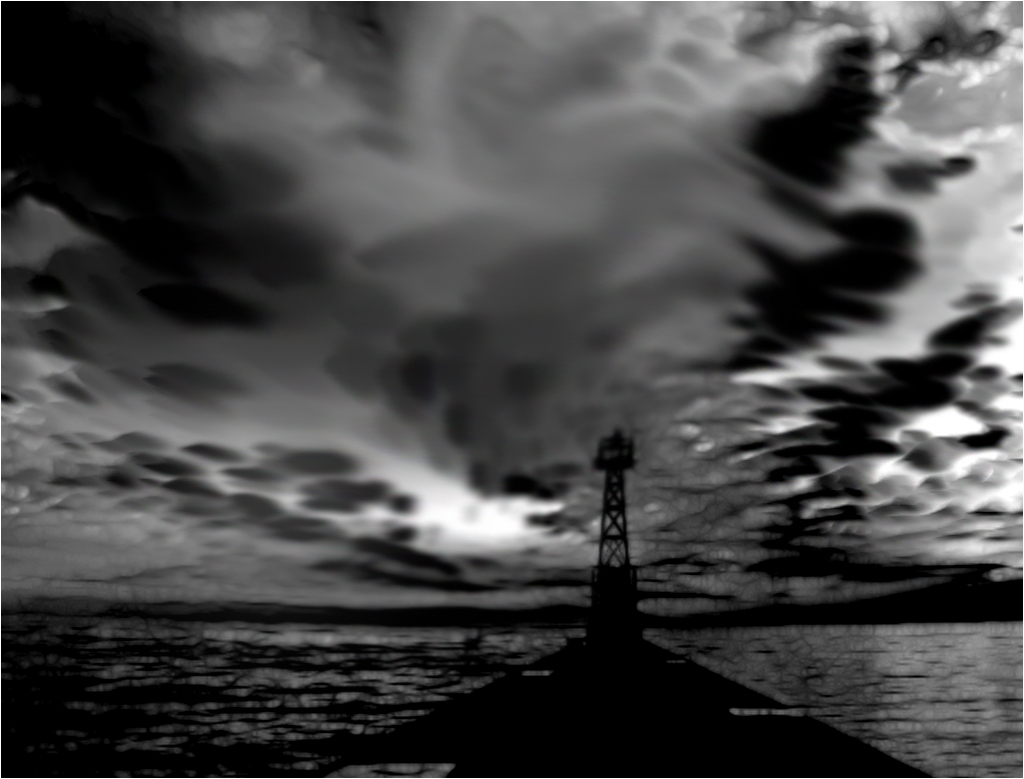
Hi Jane. Storms make for dramatic images. Your image is no exception. I am one of those people who has to fight an urge to tinker. In the case of your image, While I tinkered, i am not clear on whether I improved it. I saturated and lightened the blue and orange, and cut back the luminosity contrast to increase the tonal range in the clouds. Brightened the mid range in levels. I also changed the crop, and applied a levels layer to get a little more pop in the image. With images that are dark around the d=edges, I am in the habit of putting a thin white border around the image, so a judge can easily tell were the image ends. |
Feb 13th |
 |
| 83 |
Feb 19 |
Reply |
Hi Judith, I have been getting decent tonal range, by processing in LAB mode. See "Canyons and Conundrums" by Dan Margulies. I have is NOT read the book from cover to cover, but use it a a technique reference. |
Feb 13th |
| 83 |
Feb 19 |
Reply |
Hi Tracy, I agree with you that a bit of motion would compliment the image. As you can tell from my version, I feel the motion should be in the clouds. The wind blows stronger at higher altitudes. |
Feb 13th |
| 83 |
Feb 19 |
Comment |
Hi Judith, your image is a beautiful composition. I like the way you have paced the sweeping lines from lower left to upper right. I used your color version to create my interpretation. After adjusting the overall colors in ACR, I applied an HSL filter to increase the blue saturation, and decrease luminescence of the blue, to create more contrast in the sky. I then did he monochrome conversion in PS, using the basic dark blue contrast, and playing with the sliders. To my eyes there was too much sky, so I did a pano crop. To create some motion in the clouds, I used a amidge of smudge on the clouds. unfortunately I had an issue cleaning up the JPEG artifacts.
|
Feb 13th |
 |
| 83 |
Feb 19 |
Reply |
Hi Jose, Thank you for making a close observation and your comments. The reason I tok the original image was that the juxtaposition of the three bees made the sunflower look like a face. I made the first selection using the color selection tolls in PS. I made further adjustments using select and mask, saving the selection to another layer. I elongated the petals by making them longer, before using the twirl filter. I agree there are some extra petals, but that did not bother me on this image. If I turn a sunflower blue, it can have some extra petals. I decided that in this particular image, my preference was sharp edges on the petals. I tried it with a soft edge, and even a slight motion blur, but I preferred this look. Of course others may have preferred a different look. We used to have a judge who was also a serious amateur agronomist. He would lower the score on any flower that was a few degrees off color. One day I had a quiet conversation with him, resulting in him teaching me color printing in a wet darkroom, and more importantly, he accepted the concept of creative coloring of flowers. (of course, accidently off color flowers was, and should be downgraded for technical errors. We remained friends until about a year ago, when he passed. |
Feb 10th |
| 83 |
Feb 19 |
Reply |
Judith,
Thank you for your comments. I had not noticed the bright areas in the foliage. The three spots in the center are bees. I tried to get better separation, but the results were not great. I would appreciate any suggestions. |
Feb 2nd |
5 comments - 23 replies for Group 83
|
10 comments - 29 replies Total
|


