|
| Group |
Round |
C/R |
Comment |
Date |
Image |
| 21 |
Jan 19 |
Reply |
Thanks for your kind comment. You gave me an idea, I will soon be playing around with my new toy, Flame Painter. |
Jan 23rd |
| 21 |
Jan 19 |
Reply |
Thanks for your comment. I will play with your suggestions, and see what I get. As with many images, especially in the creative category, there can be many incarnations of the original image. |
Jan 23rd |
| 21 |
Jan 19 |
Reply |
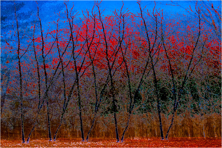
Brian, Thank you for your comment. I decided to play around a bit more, and after the inversion did a color burn; and apply image/multiply. This created an entirely different image. I'm gad you mentioned infra red. Years ago I converted an old P&S to IR by simply removing the filter. I am thinking about converting my D300 to IR that will show faux IR colors.
On a different note, I am puzzled because the EXIF file shows that the image was processed on a Macintosh. While I occasionally play with a Mac, I have no recollection of processing this image on one. |
Jan 23rd |
 |
| 21 |
Jan 19 |
Reply |
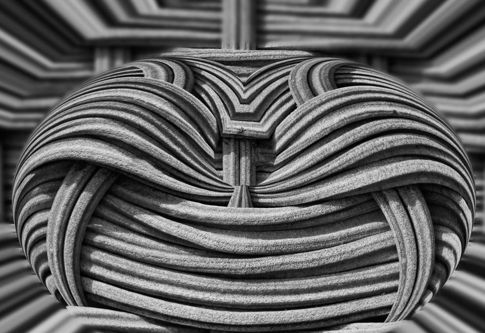
I cannot resist adding that you and Thomas Edison have something in common. Edison found the cotton thread filament for the light bulb in his wife's sewing basket. You have turned your wife's sewing basket into a work of art. |
Jan 15th |
| 21 |
Jan 19 |
Comment |
Nicely done. I like the way you have taken a simple object and turned it into a work of art. Have you considered a slightly different cropping to move the sharp image slightly off center, and remove the blur at the bottom, which tends to draw my eyes away from the sharp portion? |
Jan 15th |
 |
| 21 |
Jan 19 |
Reply |
I used to use Fractalius, but find that The Topaz glow filter is a lot more versatile. Also, my version of Fractalius will not work on 16 bit images, and is snail like in performance compared to Topaz Glow. You can get a free 30 day trial at the Topaz website. You can get a discount code at Tony Sweet's or John Barclay's website, if you decide to purchase. |
Jan 15th |
| 21 |
Jan 19 |
Reply |
Steve, I do not understand why an additional light would not draw a viewer's eyes away from the image. I think that the negative space amplifies the image. |
Jan 15th |
| 21 |
Jan 19 |
Comment |
Nicely done. You have used, but not overused Fractalius. The colors are subtle. The movement of the subject from lower left to upper right creates a nice dynamic image. |
Jan 15th |
| 21 |
Jan 19 |
Reply |
Indeed it does. That your image looks good in the various incarnations inspired and presented here, speaks well for your creativity concept. |
Jan 15th |
| 21 |
Jan 19 |
Comment |
Hi Susan, The composition is terrific. If I was judging it at a competition, I would have been deprived of the continual looks I have been giving it. Each time I look, I see more, and am letting my imagination run wild with it. I think that is exactly what a superior creative image can do. e.g. to my eyes, the cave looks more like a large white fish; the white spotted fish on the right, bottom center and upper left center, could be octopi. Its like looking at clouds. A lot of people will see the same formation as different objects. In the original I see different abstract images. I would classify the blue version as a different image, despite the mere color reversal. I cannot say one is better than the other. They are both well done. |
Jan 15th |
| 21 |
Jan 19 |
Reply |
I will be the first to admit to being intellectually blind to grain and noise, in photos. There is a good reason Ford makes cars in colors other than black. I just saw your final image in Group 68, through a crude stereo viewer, I understand what you did. I think your stereo image is amazing. |
Jan 6th |
| 21 |
Jan 19 |
Comment |
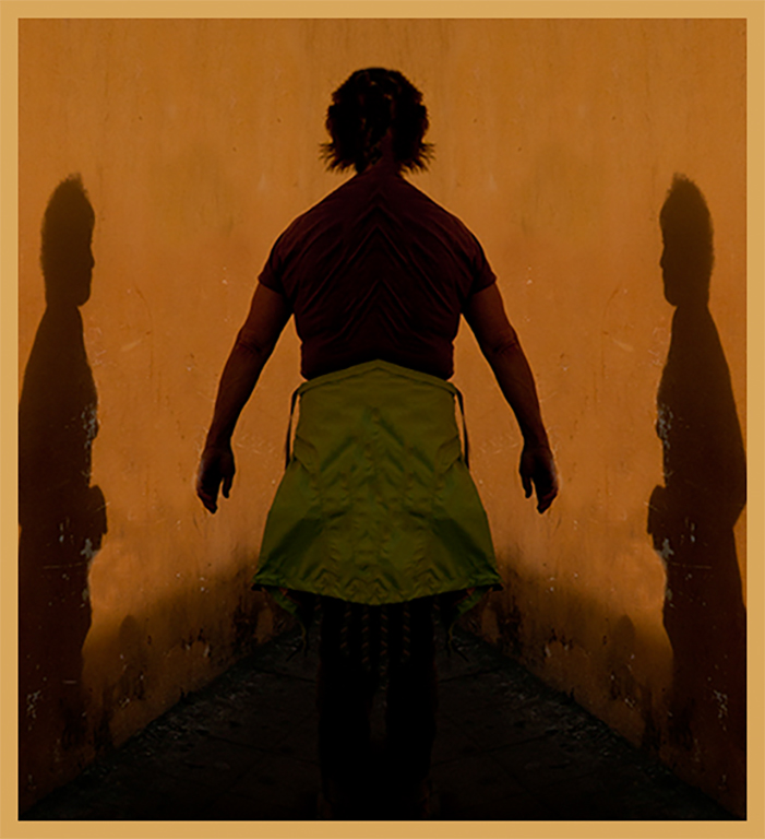
Joan,
Less is more. I have done some of my better work under pressure, because I am forced to concentrate. I like the graphic quality you have treated us to. The thick pyramidal shadow at the bottom creates a nice lead into the people shadows which are interesting and mysterious image. While the color of the light walls on both sides compliments the graphic quality of your image, it keeps drawing my eye away from the image. I redid the image, removing the light walls, but because I think the color is complimentary, I put a large frame around the image, using that color. |
Jan 6th |
 |
| 21 |
Jan 19 |
Comment |
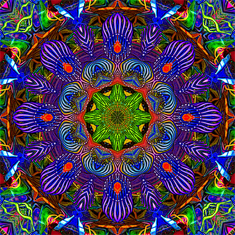
Steve,
Before I begin, I should say that we had a collection of almost thirty kaleidoscopes. I have a strong prejudice in favor of kaleidoscopic images. I could not resist playing in Topaz Studio, using AI Clear I sharpened the image a bit, and using the Glow module added just a touch of glow around the lines, and reduced the effect by 50%. To my eye those slight adjustments increased the tonality variation within the colors, especially in the center where there is more color differentiation. But then my adjustments are simply a matter of taste, and your judgement is final. |
Jan 6th |
 |
5 comments - 8 replies for Group 21
|
| 83 |
Jan 19 |
Reply |
I ran into that same issue. One way around it is to select the horses, place the selection on a different layer, them put that layer on top, after you have adjusted the background. |
Jan 29th |
| 83 |
Jan 19 |
Comment |
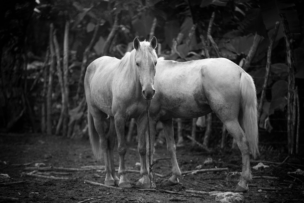
Hi Jose,
Welcome to the group. You have presented us with an intriguing and realistic image. The horses are trained so that when the rope is dropped to the ground, they do not usually wander off.
Did you consider backing out some of the white spotted areas that are not part of the horses? I also would like to see the horses a tad sharper. In my version I was unable to put some feathering in the vignette, to create a more subtle transition line. I ran your image lightly through Topaz AI Clear, to reduce the JPEG artifacts, and bring up a touch more detail in the horses. Also may I suggest that you put a very thin white border around the edge. If a digital image is submitted for a competition, a judge can easily see where the image ends, and it will not confused with the screen's background. I usually do it as the last step, after resizing. I use edit| stroke|in white, usualy one pixel centered. There are other ways of doing that, but i have settled into that method. |
Jan 29th |
 |
| 83 |
Jan 19 |
Reply |
Hi Tracy,
Thank you for your incisive comment. I attempted to redo the image as you suggested. Unfortunately, the image was a heavy crop from an old camera. The facial detail just was not in the RAW image. :-) When I present some of my newer images I will certainly try to follow your advice. |
Jan 13th |
| 83 |
Jan 19 |
Comment |
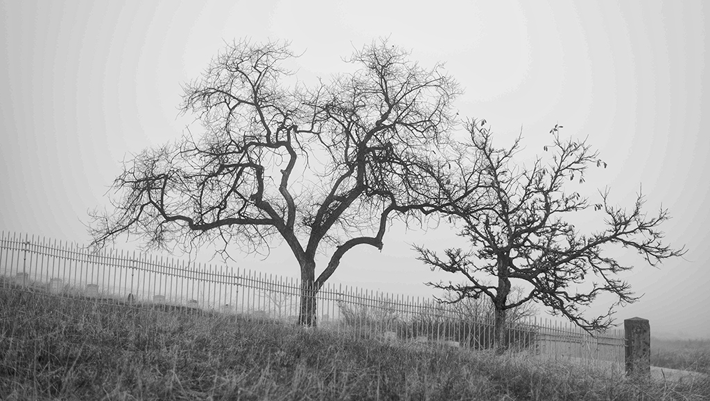
Hi Tracy, Beautiful image well composed. There is a nice feel to the trees running from right to left, with the smaller tree being on the right. If this was my image I would have darkened the trees, and brought up some more detail in the trunks. The sky has a soft dreamy feel to it. There is a bit too much of it, as I also see the same problem with the grass. |
Jan 13th |
 |
| 83 |
Jan 19 |
Comment |
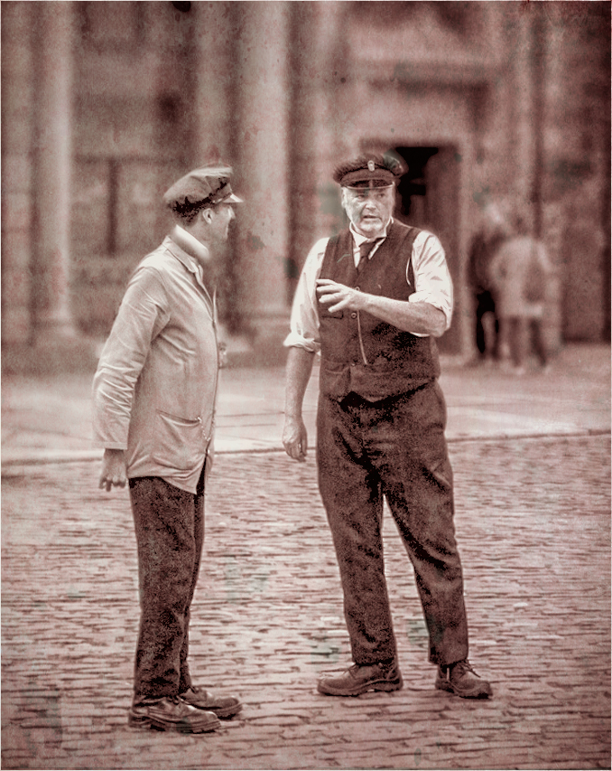
Hi Charles. I like your concept. Too bad the conductors do not seem to relating to each other, as they are talking. I basically agree with with all of the above comments. I this was my image in addition to adapting their comments, I wondered how the image would look if I gave it an old fashioned look, with a touch of grunge. The grunge look seems to make the conductor on the right to look somewhat dominant. |
Jan 13th |
 |
| 83 |
Jan 19 |
Reply |
Dirk, you did a good job of removing the tree top. It makes the eye stand out more. I do have a question about your conversion, in that to me I do not see the gradations in gray and white, that I expected. As to flipping, please see my comment. |
Jan 13th |
| 83 |
Jan 19 |
Comment |
Judith, Great seeing. When I first looked at your image I was immediately drawn to the eye. I think you did a great job in maintaining the tonal gradations when doing the color conversion. I agree with Dirk, that the tree should be removed from the eye. I am ambiguous about the reversal. If I was making the image for a local camera club competition, I would reverse the image. However a lot of folk in PSA are part of a culture where they read from right to left, instead of left to right. |
Jan 13th |
| 83 |
Jan 19 |
Reply |
Judith, I think that your first version was more pleasing. The arm holding the bowl created a dynamic element. To my eye the second looks too static. |
Jan 13th |
| 83 |
Jan 19 |
Comment |
Hi Dirk,
You have treated us to a very creative image. I like the ovals on the right, but to my eye they did not look like part of the image. I did not look at Judith's comment before I made my adjustment. I moved the upper and lower ovals so they would be part of the picture. I considered the lower to be almost a reflection of the upper, so I selected the upper and put on a seperate layer. I duplicated that layer flipped it vertically, and reduced the opacity. After I flattened the image I used On1 AI Clear, in the Studio, to remove some JPEG artifacts. |
Jan 13th |
 |
5 comments - 4 replies for Group 83
|
10 comments - 12 replies Total
|


