|
| Group |
Round |
C/R |
Comment |
Date |
Image |
| 21 |
Dec 18 |
Comment |
Joan, A very nicely done abstract. Your image has inspired me to spend some time at John Paul Caponigro's web site and subscribe to his blog. my further comments on your image would pretty much duplicate Brian's, except that I see a rocket ship. |
Dec 27th |
1 comment - 0 replies for Group 21
|
| 83 |
Dec 18 |
Reply |
Hi Jane. I did all in Photoshop CC. using the ACR filter. If I remember I noodled around with exposure, contrast, clarity, dehaze, and the strength of withe, lightness and dark. I then put a slight & feathered vignette. I don't remember exactly how much of each adjustment I made, as I kept adjusting the sliders until the image told me to stop. I then made some minor touch ups with the exposure adjustment brushes. I looked at the XMP file for details of my changes, but only your original adjustments appeared. |
Dec 30th |
| 83 |
Dec 18 |
Reply |
To my eye the sky detracted from the graphic building. I played a bit and go rid of the sky. It gives a different look to your image. I am not saying it is better, just different. |
Dec 15th |
 |
| 83 |
Dec 18 |
Reply |
Hi Angela, I am sure that everybody in the group agrees that you are always welcome to join in the fun. Your suggested technique is one that I will keep in my bag of techniques. Had I looked more closely at the posted image after the color space conversion, I would have made the appropriate adjustments.
I think that most images should be considered as to how they would look in monotone. I find it far more difficult to make a good monotone image than a color image. |
Dec 15th |
| 83 |
Dec 18 |
Reply |
Thank you for your comment. After reading what you said, I revisited your point. In the conversion I posted the top of the head does indeed almost match the tonal white of the water. I did not notice that on my posted version. In post my workflow is to work in prophoto RGB, which is a much larger color space. Prior to the change in space to sRGB, There was a more noticeable difference. I appreciate that you pointed out the effect of the color space change. I have to relearn monochrome conversions. |
Dec 15th |
| 83 |
Dec 18 |
Comment |
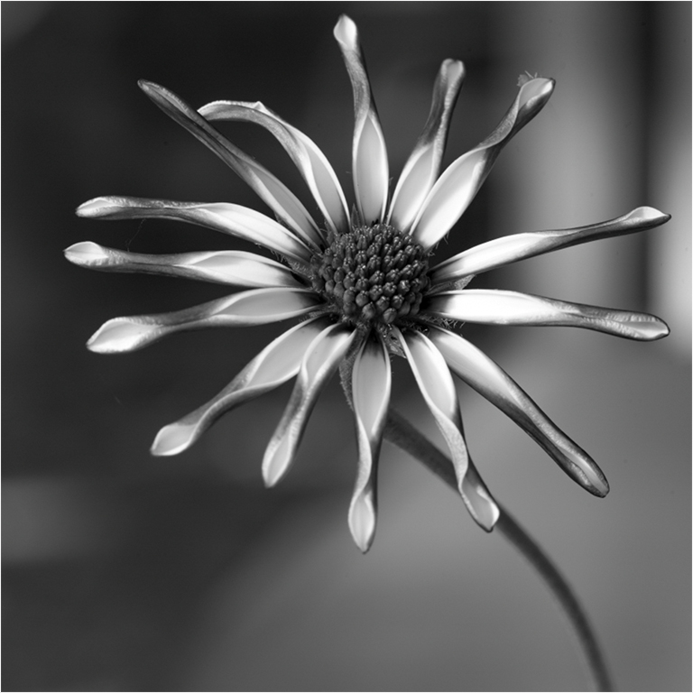
Hi Tracy. You have made a nice image, and proven that every flower must be tack sharp. It is very difficult to convert a flower to monochrome, and keep it looking good. You have done a fine job with your conversion. The stem is placed at a nice angle and leads my eye straight to the subject. At my first look, I thought it was a sculpture, because it had such a nice tonal range. If this was my image I would have cropped out the entire left side, because to my eye it detracts from your image. |
Dec 4th |
 |
| 83 |
Dec 18 |
Comment |
Hi Graham. I like the tonal range in your image and reflections. Unfortunately, I do have a problem that the logo is centered and static. To my eye the rest of the bumper does not add anything. If you do not have a macro lens, you can use a set of extension tubes. The are very inexpensive, and allow you to get in a lot closer, without any distortion, or image quality loss. |
Dec 4th |
| 83 |
Dec 18 |
Comment |
Nicely done. The interplay of shadows creates a lot of interest. I am glad that you left the bars in. I agree wit Tracy that some more contrast would have increased the definition of the bricks.
|
Dec 4th |
| 83 |
Dec 18 |
Comment |
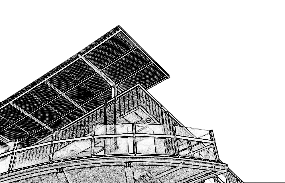
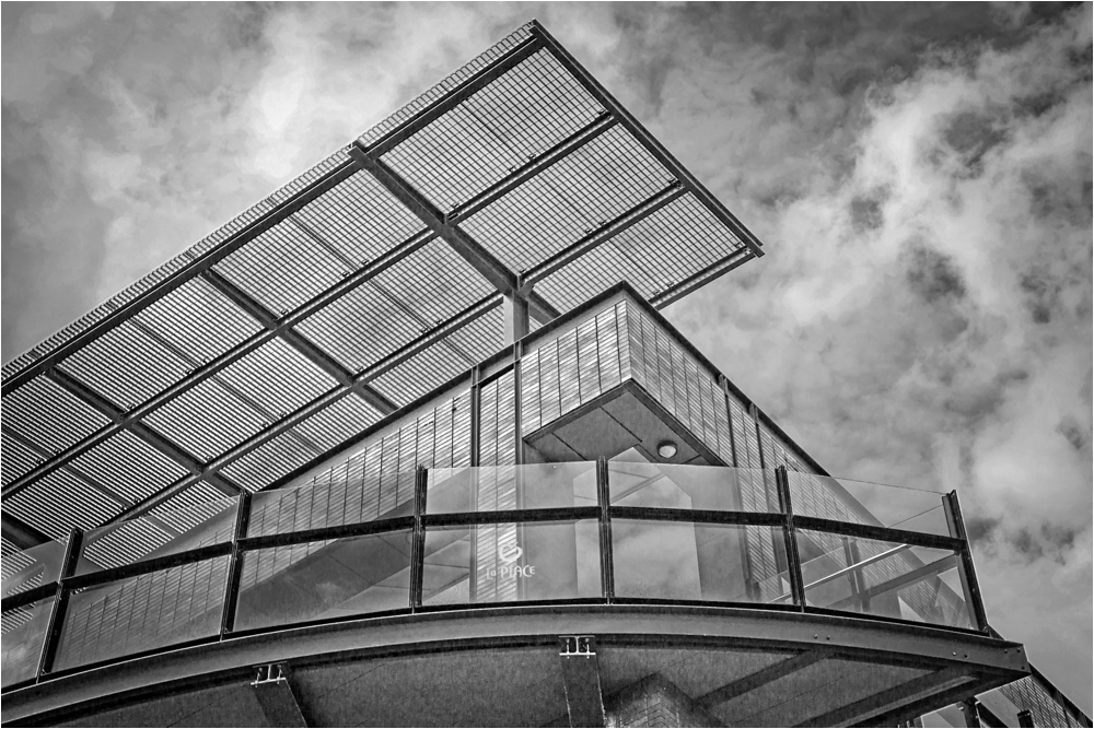
Hi Dirk. The building makes a strong graphic image. I agree with Jane about the clouds, and prefer your revised version. In my VF I increased the contrast a tad, with levels. And put a slight vignette at the edges to bring the viewers eye more into the image. |
Dec 4th |
 |
| 83 |
Dec 18 |
Comment |
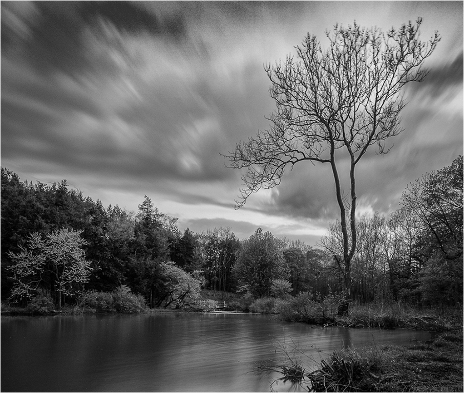
Hi Jane, You have produced a very nice image, with the softness and feeling similar to images produced by the Hudson River School artists. To my eye the shadow areas are a tad too dark. I adjusted that and cropped similar to Tracy's crop. |
Dec 4th |
 |
| 83 |
Dec 18 |
Reply |
Hi Tracy,
Thank you for your comments. I am attaching a jpeg of the original RAW file. After reading your comment, I looked more closely at the image. I may be wrong, but think what you called "pixelation" is actually JPEG artifacts, caused by my being laziness, and making an error in processing. Instead of redoing the image from my original RAW file, I used a JPEG that was 750 pixels and resized it to 1024, horizontal. To add to the storm, I oversharpened the original image. Not that it's an excuse, but I was so caught up in the patterns, that I messed up the details.
I and many other members of my camera club have been using Nik software for BW conversion for many years. Nobody has ad issues with pixelazation, unless they either bring up too much structure.
You are absolutely correct in pointing out my sloppiness. |
Dec 1st |
 |
5 comments - 5 replies for Group 83
|
6 comments - 5 replies Total
|


