|
| Group |
Round |
C/R |
Comment |
Date |
Image |
| 21 |
Jul 18 |
Reply |
Thank you for your comments. From what I have seen of the work in this group, there is a lot for me to learn, and I hope to be able to contribute something. |
Jul 28th |
| 21 |
Jul 18 |
Reply |
Try it, and see which you prefer. If you think it should be enlarged, how much would you enlarge it. The image is yours, and it is your thought that is being expressed. |
Jul 28th |
| 21 |
Jul 18 |
Reply |
I recently advised a brand new photographer that the best way to learn photography is to visit various museums, preferably in person, but if not feasible, visit online. I explained that the craft portion is the easy part. |
Jul 28th |
| 21 |
Jul 18 |
Reply |
Congratulations. |
Jul 27th |
| 21 |
Jul 18 |
Reply |
It would be nice if more judges had your perspective. Too many stringently follow the "rules," without explaining the reason for the rule, or why the image may be an appropriate exception. About thirty five years ago one of the very first images I submitted received the lowest possible score. The judge's comment was in effect that it was the worst image he had ever seen, because it broke all the rules. I liked the image. several years later I was in the salon group, and submitted the very same image. It was runner up for print of the year. Anecdotal proof, that judging should be objective, not subjective. I personally believe that it woud be a very dull world if we all liked the same thing. But when commenting, i feel an obligation to state why I like, or dislike an image. |
Jul 27th |
| 21 |
Jul 18 |
Reply |
I agree with your comment, completely. |
Jul 27th |
| 21 |
Jul 18 |
Comment |
I like the placement of the ring. Your application of the oil point filter adds a lot of impact to the ring. For some reason the radial filter seems to bother me, though. i appreciate your reason for using it, but for me it is a bit distracting. |
Jul 27th |
| 21 |
Jul 18 |
Reply |
John,
I understand what you are saying, but do not agree. To my eyes the whit trails against the blue background make for a more dynamic image. |
Jul 27th |
| 21 |
Jul 18 |
Comment |
Sorry, I thought I responded, but something went wrong, This happened with other images too.
I like the way the trails seem to follow the tree lines. It makes for a very interesting composition. If this was my image I would have placed some object or person on the right side of the one trail that ends almost in the middle of the image. That would give the implication that the trails are leadig lines to something.
|
Jul 27th |
| 21 |
Jul 18 |
Reply |
My exact steps, using PS CC:
In ACR Sharpen using the mask about 85%.
sharpen 150, radius 3, details 100;
open image;
fine edge filter;
invert image;
Convert to BW, using infrared preset.
The reason for sharpening is to create more edge contrast.
At eh end you can play with the sharpening and contrast filters to your taste.
|
Jul 27th |
| 21 |
Jul 18 |
Reply |
Thanks Nancy, I wish the judges at NECCC agreed with you. |
Jul 24th |
| 21 |
Jul 18 |
Reply |
Brian, Thanks for your comment. I agree that I should have reduced the opacity on the other two spirits. It was really sensitive of you to pick up that I had intended the spirit on the left to be female, watching over her sons. |
Jul 24th |
| 21 |
Jul 18 |
Comment |
Nancy, I got a very calm and comfortable feeling when i first looked at our image. The flowers give a feeling of freedom from restriction. To my eye, your use of slightly blurred subject, curved lines, complimentary colors, varying opacity, with the right amount of negative space, contribute to a very nice image. I cannot think of anything I would change. You have produced one very fine image. I have gotten some inspiration for creative blurs from Denise Ippolito. You will have to google, to get her blog.
Note to Brian: While I don't intend to impose on your preferences for blurs, and do like blurs, I think that there are some images that should be sharp, and others that should be a combination. Usually the image tells me what to do. |
Jul 24th |
| 21 |
Jul 18 |
Comment |
I see this as a very interesting image. the green dandelion, coupled with the green on the moon adds a nice ethereal touch. To my eye the bug is a distraction from the mood of your image. I have very mixed feelings about flipping an image in a PSA setting.
My conflicted feelings are, with the first being most important to me, and the others important to the artist:
The artist should feel comfortable with the image;
in our western culture we read from left to right, therefore we usually expect eye movement in viewing an image to also go from left to right;
other cultures, typically read from right to left;
if an image is intended for competition in an international venue, such as many PSA exhibitions, it's the artist's choice. |
Jul 24th |
| 21 |
Jul 18 |
Comment |
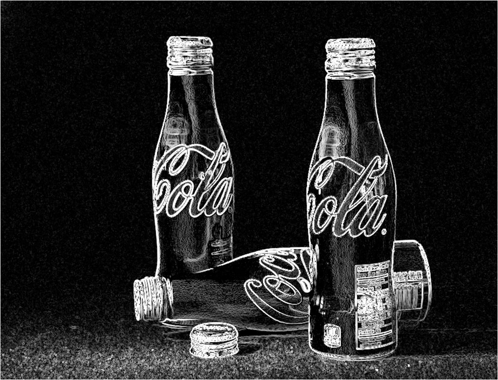
I like the concept of one horizontal Coke bottle, with the others vertical. The idea of turning then into a monochrome jigsaw puzzle is indeed a creative concept. I certainly agree that it would be evil to give someone that puzzle to solve. (unless of course you did not want them to bother you for a long time.) I'm not sure that I would be quite that evil. My old eyes were bothered by the merger of all the black. In my version I separated the bottles using the find edge filter. A new BW layer was created ad modified for the infrared effect. I then inverted the image, and moved the bottles a bit off center. For purposes of my commentary, I did not think it helpful to use the stained glass filter, as that might have confused the point of my comment. |
Jul 16th |
 |
| 21 |
Jul 18 |
Comment |
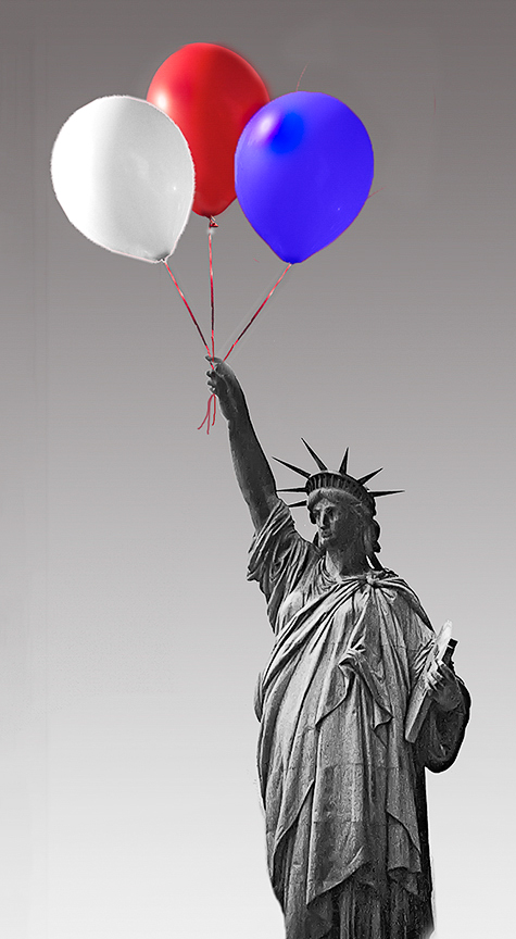
Joan, I like your concept of adding color to a monochrome image. I also like your light source matching and the gradient sky. The highlights on the balloons kept drawing my eye, so I darkened them a smidge. While I was playing I tried to bring out some of the shadow area in Lady Liberty. That had the effect of slightly sharpening her. I don't know if you wanted that type of change. |
Jul 11th |
 |
| 21 |
Jul 18 |
Reply |
Thx for your valid comment. My intent with the second figure was the illusion of it moving through the tree limb. Therefore, that portion of the limb is a bit lighter than the rest of the limb. Do you think I was too subtle in my presentation? Upon further thought, should I have made the spirit on the right a touch more translucent? I am not 100% sure. There are so many possible variations on this theme, I tried to show a variation that conveys my feeling. The original concept hit me, when I saw the street. I admit to illegally parking for almost half an hour to try for the best shot for the image. However, I spent a lot of time at my computer, playing with different fountain shots, and trying different executions. I still cannot make up my mind, which approach most effectively conveys my initial feeling, which is why I am here. |
Jul 11th |
6 comments - 11 replies for Group 21
|
6 comments - 11 replies Total
|


