|
| Group |
Round |
C/R |
Comment |
Date |
Image |
| 62 |
Jan 19 |
Reply |
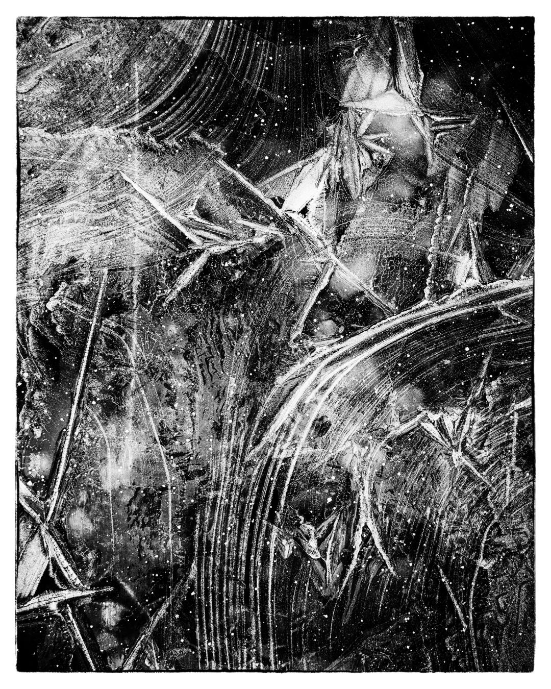
Thanks Paul, although I understand you idea of including a reference to ice in my titles, I prefer to let the viewer choose to see what their eyes and mid want to interpret rather than have me direct them. |
Jan 13th |
| 62 |
Jan 19 |
Comment |
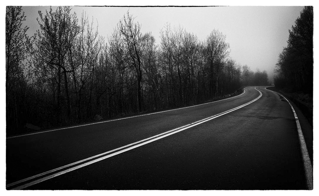
One last note: I agree about the border, simple black or no border would be better. |
Jan 10th |
| 62 |
Jan 19 |
Comment |
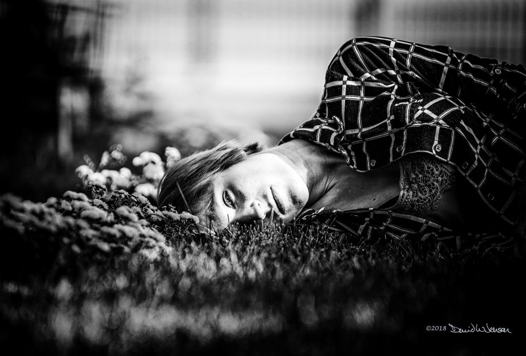
I also think this is a wonderful document of the two companions sharing a moment. Other than the above thoughts from the others, I have nothing to add. |
Jan 10th |
| 62 |
Jan 19 |
Comment |
Nude photography is a challenging genre and can be very subjective. I've a bit and agree that the model's comfort and involvement are an important part of making it successful. If she is not comfortable, that discomfort will be transmitted to the images. I have a preference for softer, more natural skin tones with my nudes. That applies to both color and B&W. Your image, for me, comes across as almost waxy with its highlights. I also agree that the flower adds nothing and that she could be a bit further from the background. Please keep working on your technique, when it all comes together, it can be very rewarding. |
Jan 10th |
| 62 |
Jan 19 |
Reply |
https://northernvisionsmedia.wordpress.com |
Jan 10th |
| 62 |
Jan 19 |
Comment |
It sounds like you were in a very beautiful location and I can appreciate the workflow you used to arrive at the final print. I come from a film background and have been slowly digitizing my negative and slides with a scanner with pretty decent results. As far as you image goes, I find it on the busy side and my eyes can't quite decide what to focus on. The scale is not immediately obvious, my eye first goes to the ridge line and then has nowhere to go at the top. I would be tempted to include more of the left side of the image thereby drawing the eye up the space between the rock on the left edge and the larger one you've focused on. Just a thought. |
Jan 10th |
| 62 |
Jan 19 |
Comment |
I do like the treatment you've given the image. And I don't know that implying he's a gangster matters, but him on the bench in front of this historic building along with the toning and grain make it seem like a period piece. That said, I keep wanting to tilt the image a bit counter-clockwise. |
Jan 10th |
| 62 |
Jan 19 |
Comment |
I do enjoy the contribution of the rope to the image, but like LuAnn mentioned, I think bringing up the sky a bit would account for the glare on the rope. It's seems odd to have that much light under a dark sky. |
Jan 10th |
| 62 |
Jan 19 |
Comment |
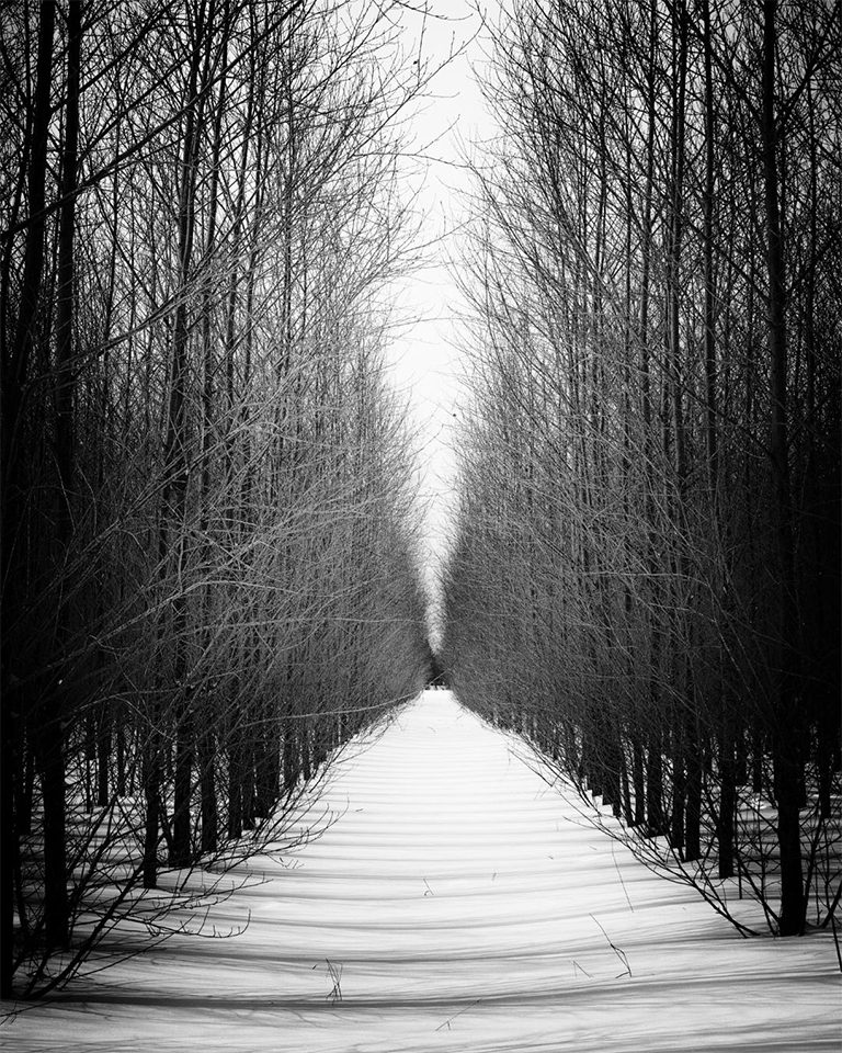
Thanks to all for your generous comments. It is often a challenge to decide which of the images I prefer, color or B&W and I have presented both in some cases. In this case however, I feel that the color of the rocks peeking through distracts more than it adds to the image. And, my goal when I go out to capture them is to imagine them as B&W for the final presentation. I have an entire set of these and am working to collect more as part of an exhibition in the future. I also have been working on window frost, one of which will be on my blog site tomorrow morning. |
Jan 10th |
7 comments - 2 replies for Group 62
|
7 comments - 2 replies Total
|