|
| Group |
Round |
C/R |
Comment |
Date |
Image |
| 21 |
Jul 19 |
Comment |
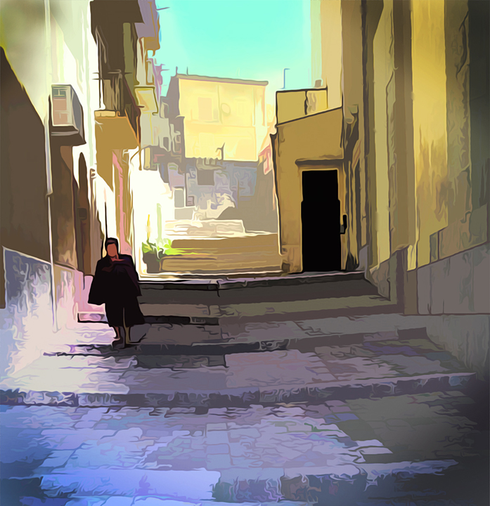
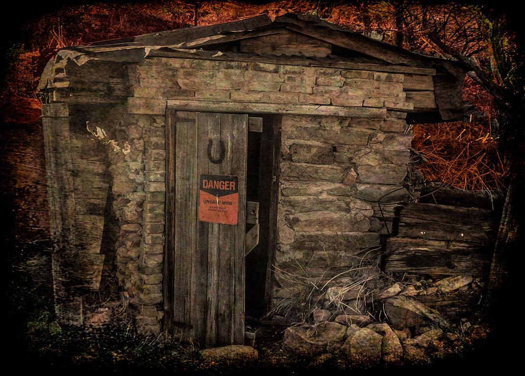
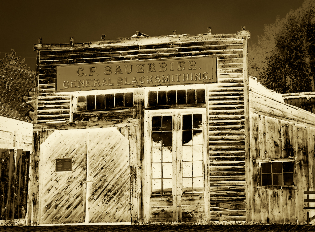
Hi John, Great atmosphere with these old buildings. I decided to try the sepia thing and I boosted the contrast as well. See what you think. We all have different tastes in these things. I think boosting the contrast simplifies the look. Awesome! |
Jul 28th |
 |
| 21 |
Jul 19 |
Comment |
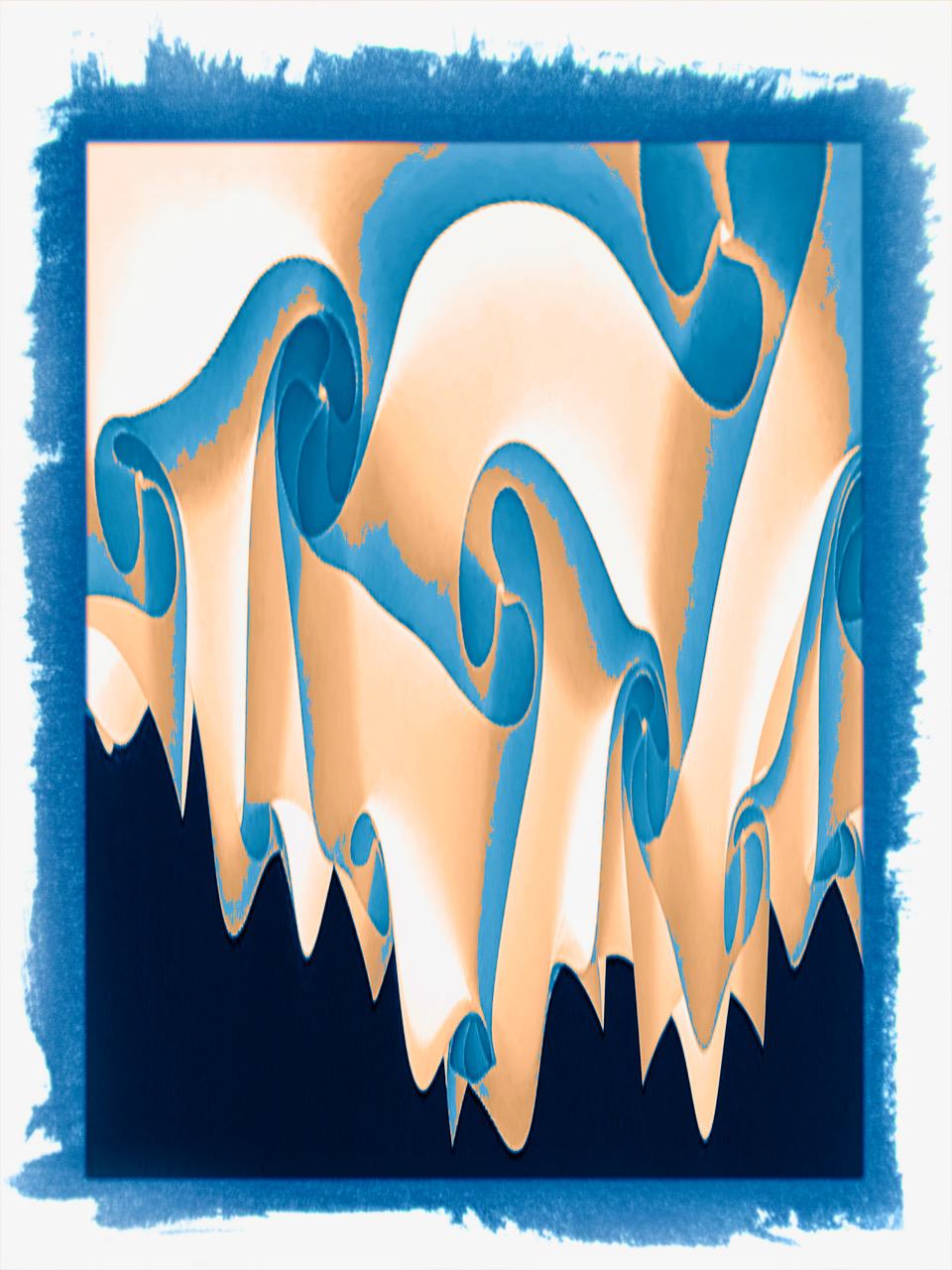
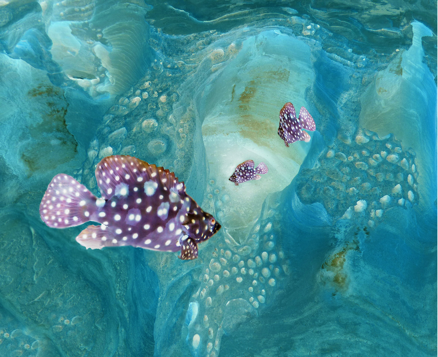
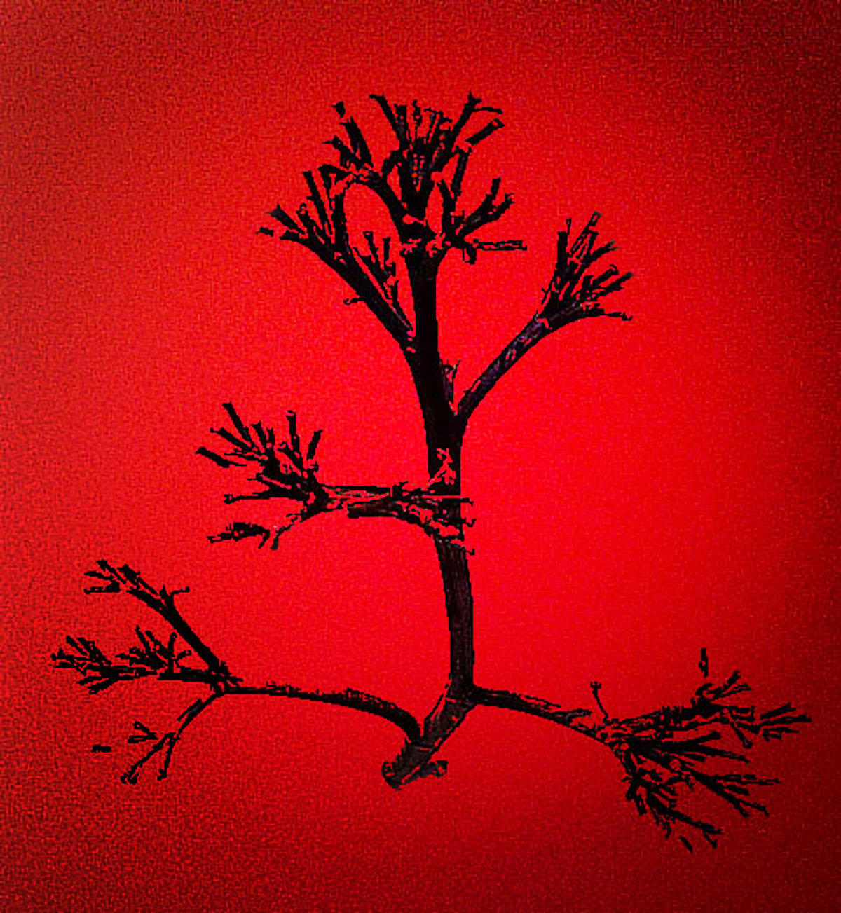
Drug Tripping? Looks like a fun project. I am inspired to do more with hand-held movement in some of my shots. Adding a very strange colored sky to this would really take it out of the real world. Nice job! |
Jul 28th |
| 21 |
Jul 19 |
Comment |
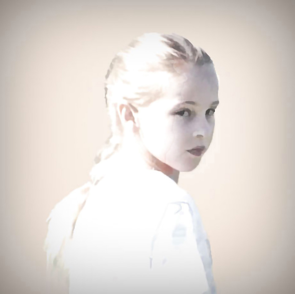
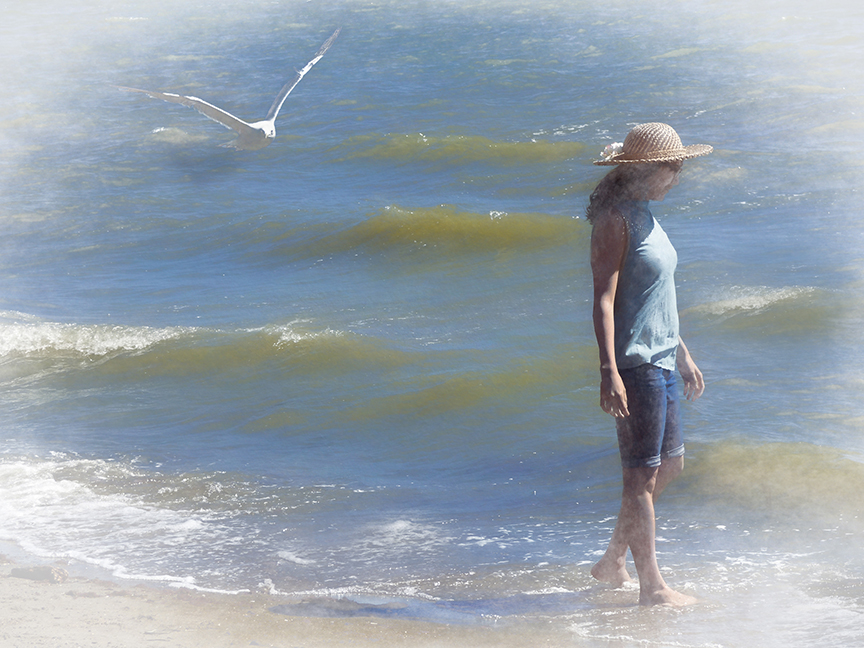
Nice concept, and great pastels. I find the top half of the photo has stronger lines (find edges) than the bottom half. And thinking how you could make that work for you. It seems like the foreground needs a little more work to integrate it. I think John's suggestion of cropping would help. Love the painterly effect. |
Jul 28th |
| 21 |
Jul 19 |
Comment |
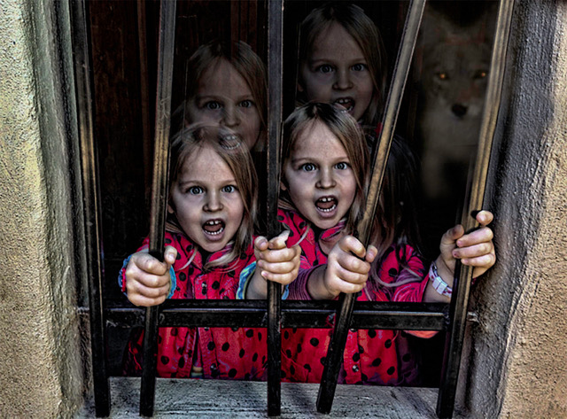
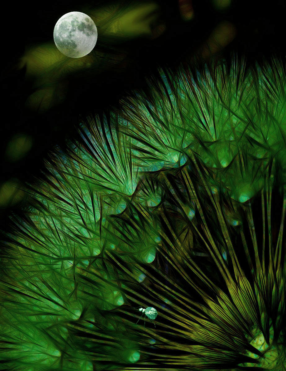
Halloween is coming! Thats what I was thinking with that bright moon and windows. I've never used the displacement maps so I'm going to learn the tool. I love picking up new tools and processes from these images, so thank you for sharing that one. Your colors are well chosen. |
Jul 28th |
| 21 |
Jul 19 |
Comment |
Brian, I always learn something from your work. Thank you for detailing your steps and your filters. The colors immediately invoke a nationalistic feeling, I guess because they are the US colors as well. I am not sure I understand the message the billboard was conveying, but thats not the point here. I like the balance of three images. Great job. |
Jul 12th |
5 comments - 0 replies for Group 21
|
5 comments - 0 replies Total
|
