|
| Group |
Round |
C/R |
Comment |
Date |
Image |
| 21 |
Apr 19 |
Reply |
I love that you sharpened the eyes Brian!!! And its amazing what cropping does. I feel I should have several different crops of all my competition photos. It would get me to open up to more possibilities for an image. |
Apr 26th |
| 21 |
Apr 19 |
Comment |
At first I felt the strong colors were going to put me off, but the treatment helped to make them work in the picture. I think the tomatoes would benefit from a little more texture, but the squash is right on. |
Apr 26th |
| 21 |
Apr 19 |
Comment |
Love what you did with this snapshot image to mold it into a dynamic visual. The two dominant colors are so satisfying, and the lit green elements are a knockout. Well done!! |
Apr 26th |
| 21 |
Apr 19 |
Comment |
|
Apr 26th |
 |
| 21 |
Apr 19 |
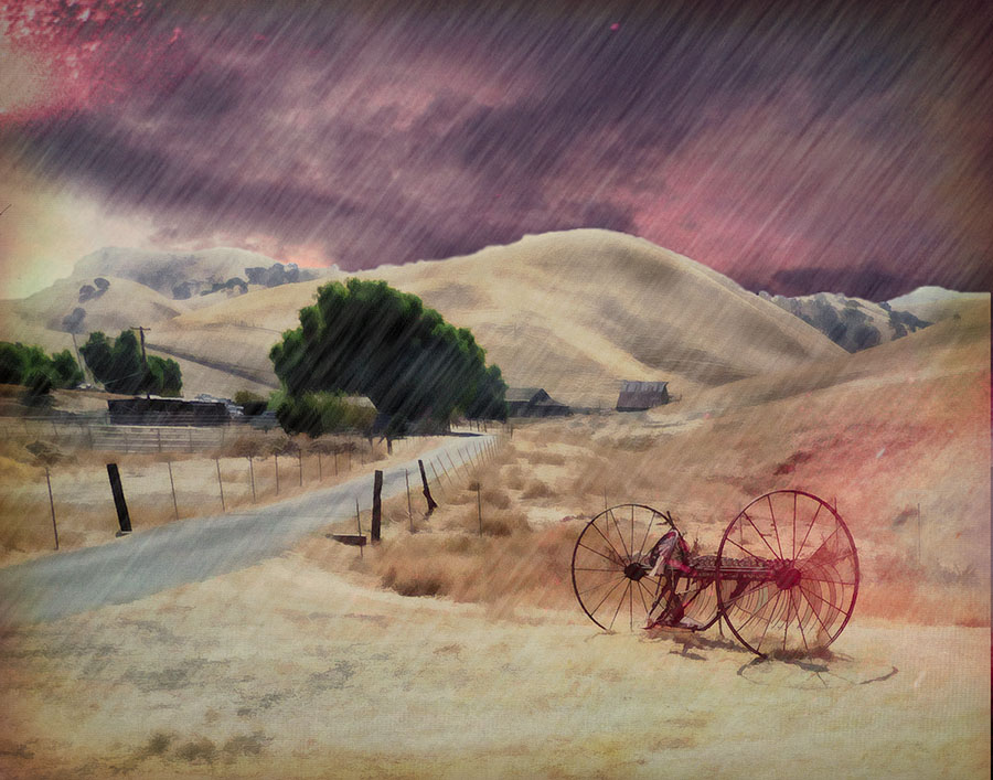
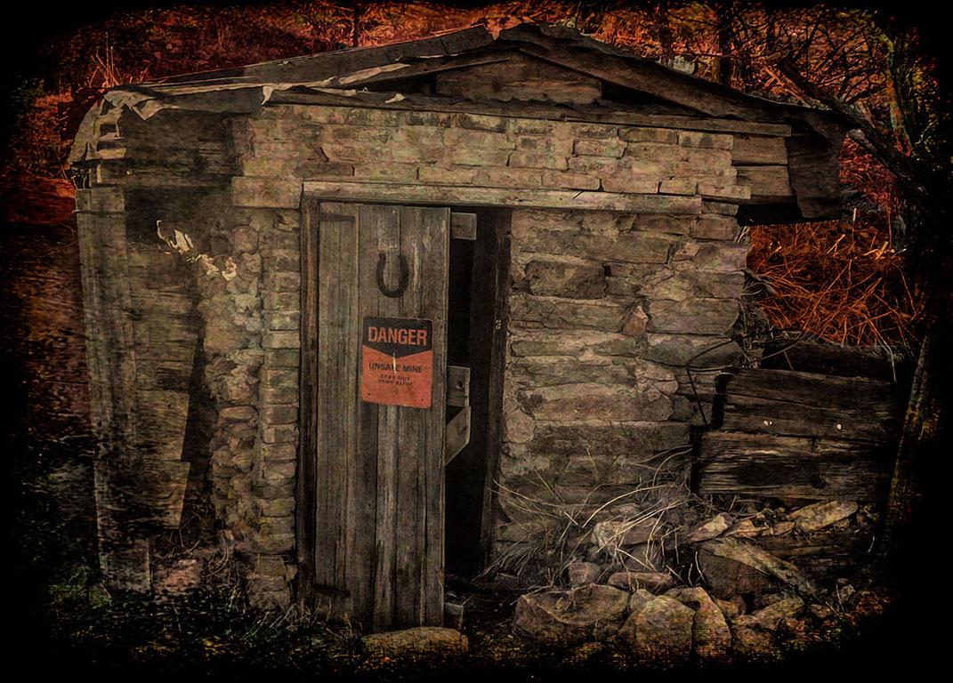
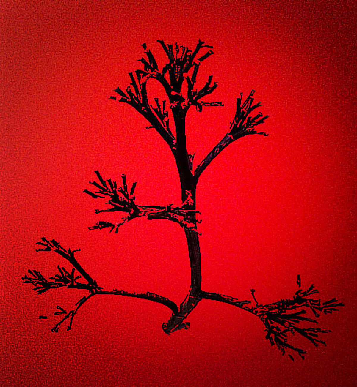
Comment |
I love rust and decay photos particularly. And this one has much to take in. I wondered if the colors were too strong for a more integrated impact. I fooled around with the color palate a bit and came up with this combo which helped me to dissect the parts of the image. See what you think. |
Apr 26th |
| 21 |
Apr 19 |
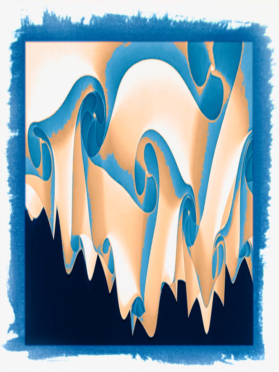
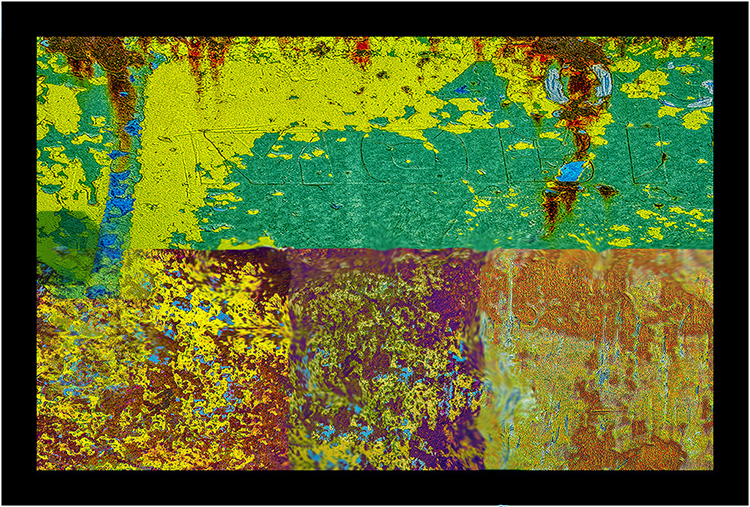
Comment |
Find the Edges is a trick I haven't used. So I found this a novel approach to isolating the center hills/mts from the trees and sky. I appreciated Peter's color changes, but I would keep playing with the colors. Somehow the three sections seem to need more differentiation, but I'm not sure what it is. Making different statements with coloring the sections might help a clearer statement. |
Apr 26th |
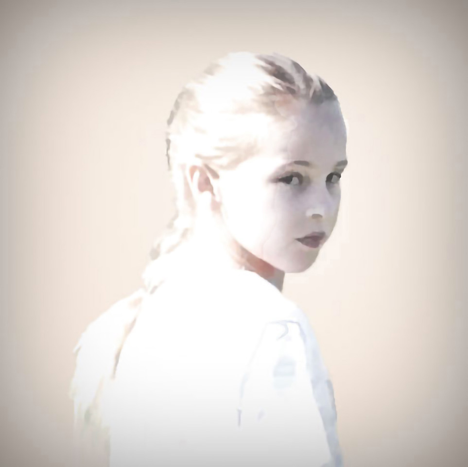
| 21 |
Apr 19 |
Reply |
I see what you mean Steve. It just shows that even in High Key, where so much has been taken out, there may be even more to remove or finesse. I find that I get tired of looking at an image like this really blown up, and looking for problem areas. I tend to give up on it after awhile. So this kind of feedback is very helpful. |
Apr 26th |
| 21 |
Apr 19 |
Reply |
Its interesting for me to look at mine and the crop that Brian did. More imaginative than the studio approach I took. I'm going to ask Leslie's parents too and see which one they like. I had fun with the soccer to studio approach! |
Apr 26th |
| 21 |
Apr 19 |
Reply |
Thanks for your feedback Barrie. I tried your suggestion and it improved the look!! |
Apr 26th |
| 21 |
Apr 19 |
Comment |
Do you consider this a creative photo? |
Apr 11th |
| 21 |
Apr 19 |
Comment |
I think the orange is too strong in the color photo, but I'd love to see the color image toned down. I like the Dahlia popping out of its frame. Not so sure about the bubbles. But they give the image the 3 foci that it needs. |
Apr 10th |
| 21 |
Apr 19 |
Comment |
I've become addicted to Meerkat Manor on TV, and I find it hard to be objective about Meerkats! :-)) . But I like the interaction of the three principals, with the fabulous backdrop of the park rocks (Maybe Arches?) . The boy is fascinated with the oncoming, and threatening egret, and the Meerkat is on lookout, and would be very wary of an egret nearby. Kind of goes with a balancing act!
|
Apr 10th |
8 comments - 4 replies for Group 21
|
8 comments - 4 replies Total
|