|
| Group |
Round |
C/R |
Comment |
Date |
Image |
| 21 |
Jan 19 |
Reply |
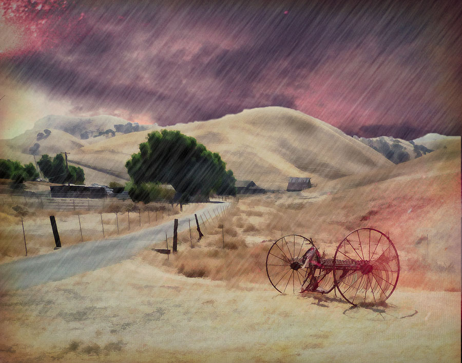
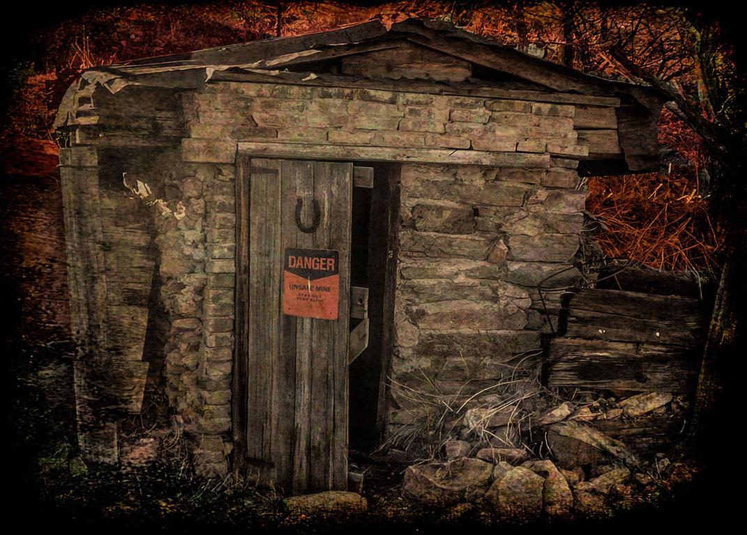
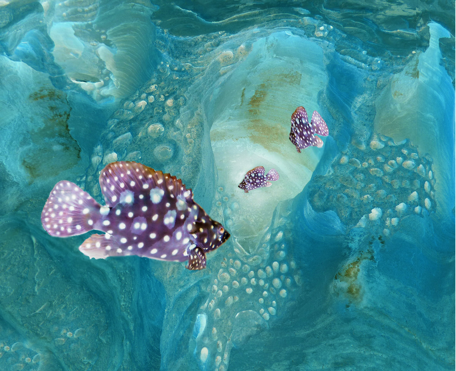
Well, I tried adding some "bubbles" to make the fish more "in the water", but I don't think that came across. I loved the way the holes in the rocks became bubbles when I inverted the color. The great thing about creative is that we don't have to try to make it look natural. |
Jan 23rd |
| 21 |
Jan 19 |
Comment |
This is a great example of how some of our more routine shots can be exploded into something fantastic. With imagination and the great post-processing tools we have. Terrific work Peter. It really inspires me to see more in many of my photos. Your processing description is helpful, and I must admit I like the flaming sky version. For us here in California that is an emotional trigger for trees burning. But the colors evoke a lot of different emotions - and ultimately the force and beauty of nature. Love this! |
Jan 23rd |
| 21 |
Jan 19 |
Comment |
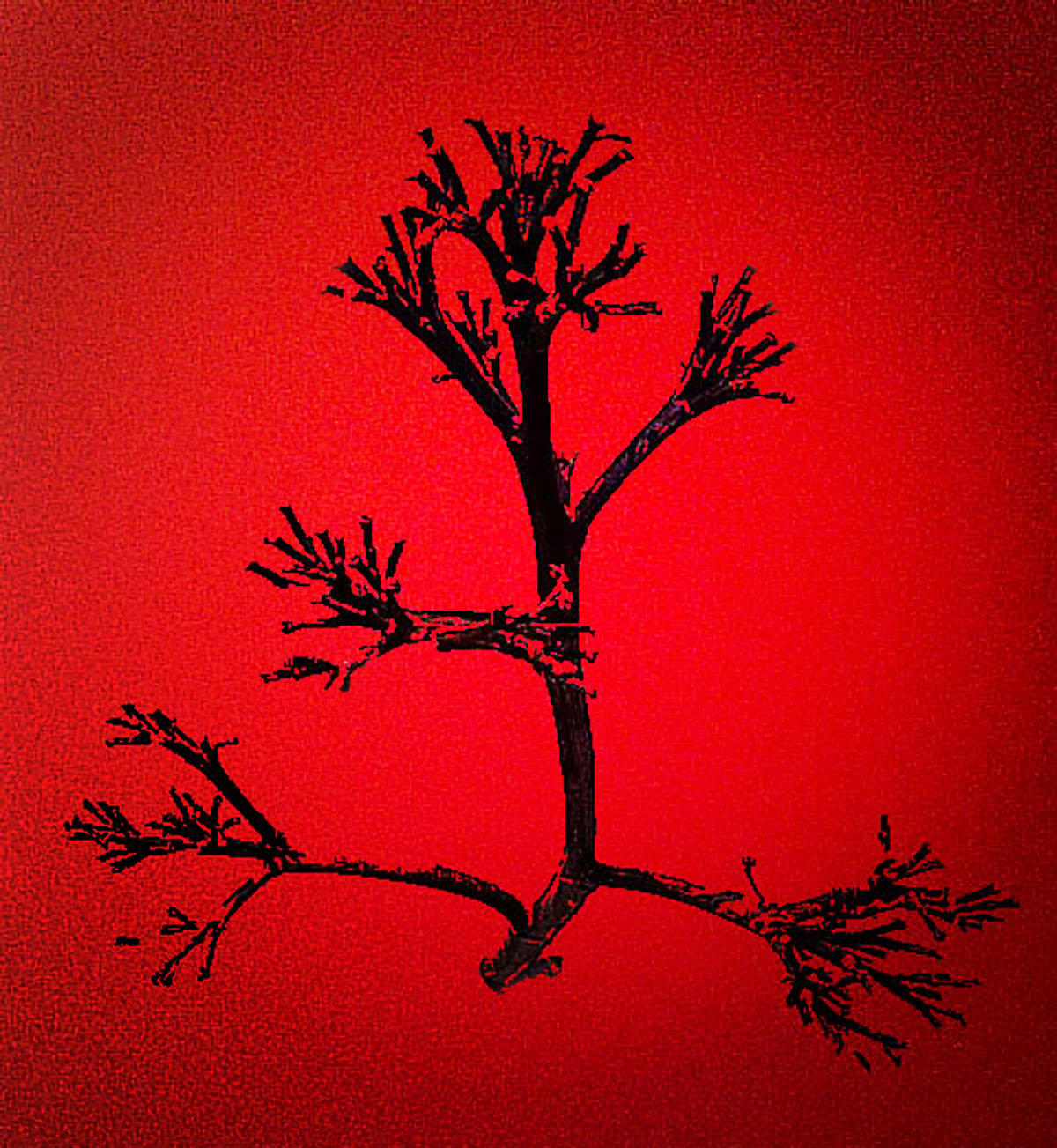
Thanks Peter for all your kind comments. I also think using reverse (against reality) colors is maybe even more creative. I learn so much from these monthly images and comments. I am finding Steve Wessing's RED rendering to be terrific. With a BLACK HOLE in the middle. I am learning more about filters and techniques from your images and comments. |
Jan 16th |
| 21 |
Jan 19 |
Comment |
You've made it hard to find suggestions for this picture Brian. It is very elegant, and the Fractalius Filter rachets up the interest. I immediately tried to get this filter! But discovered it isn't available for Macs. But I think Topaz has something like it. Anyway, the blend of colors is subtle and effective. If I think of a great improvement, I will be on it!! :-)) |
Jan 11th |
| 21 |
Jan 19 |
Comment |
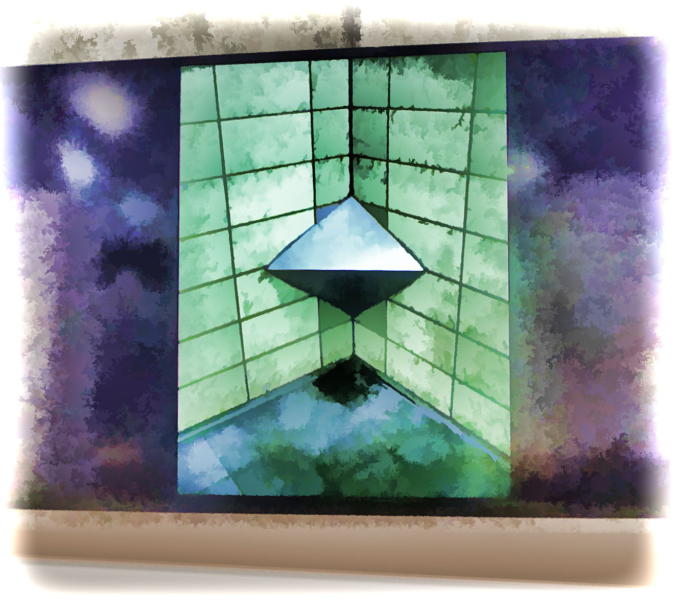
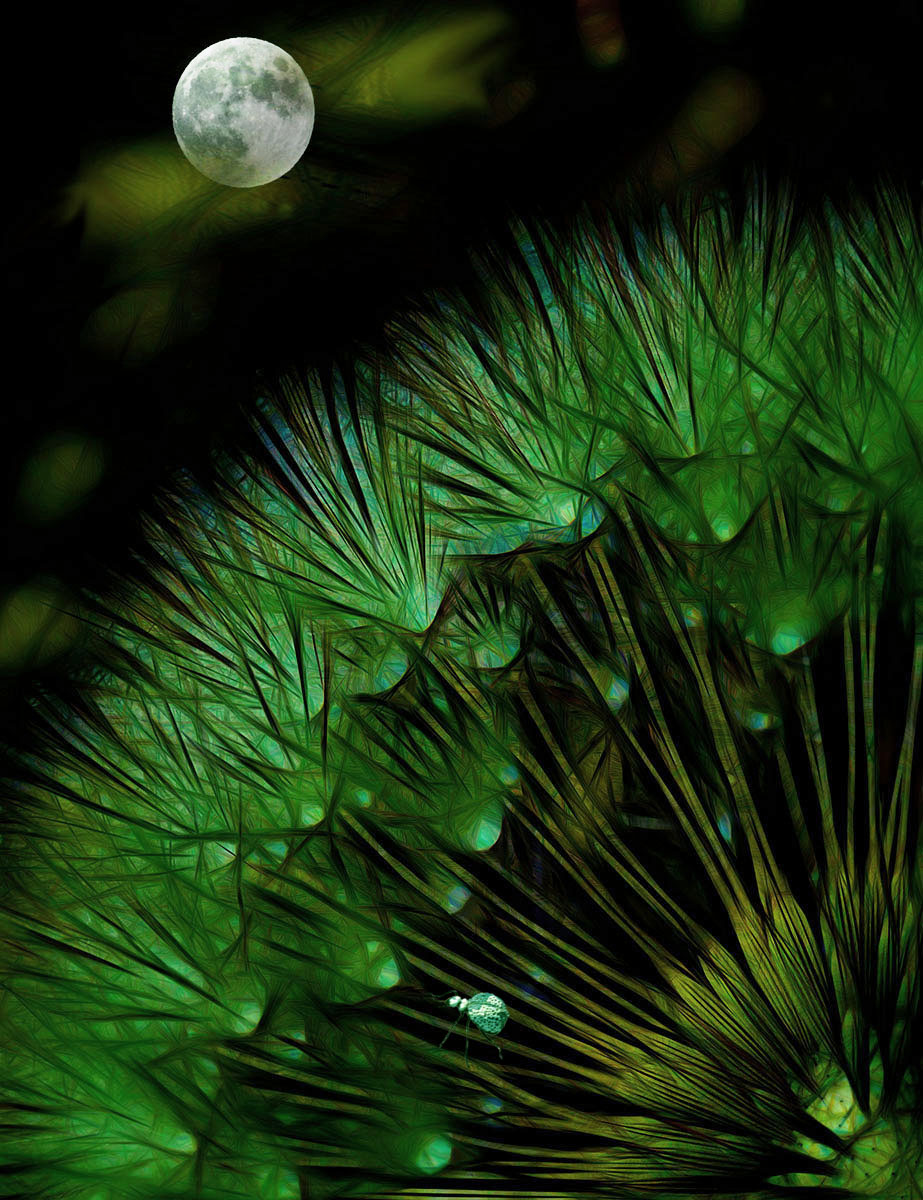
Amazing how simple patterns can be manipulated. When I first saw the image I saw a bug's face. Fanciful of course. I think the pattern works well both in monochrome and color. The blur in the background is subtle but helpful for the eye to focus. |
Jan 11th |
| 21 |
Jan 19 |
Reply |
I've never used GIMP, but those results are also fascinating. Strong color is such an impact. I made a presentation to our club about a feature in Photoshop, and then I found that so many use other tools! So it is hard to find common processes. Thank you for experimenting! It opens up the creativity. |
Jan 11th |
| 21 |
Jan 19 |
Comment |
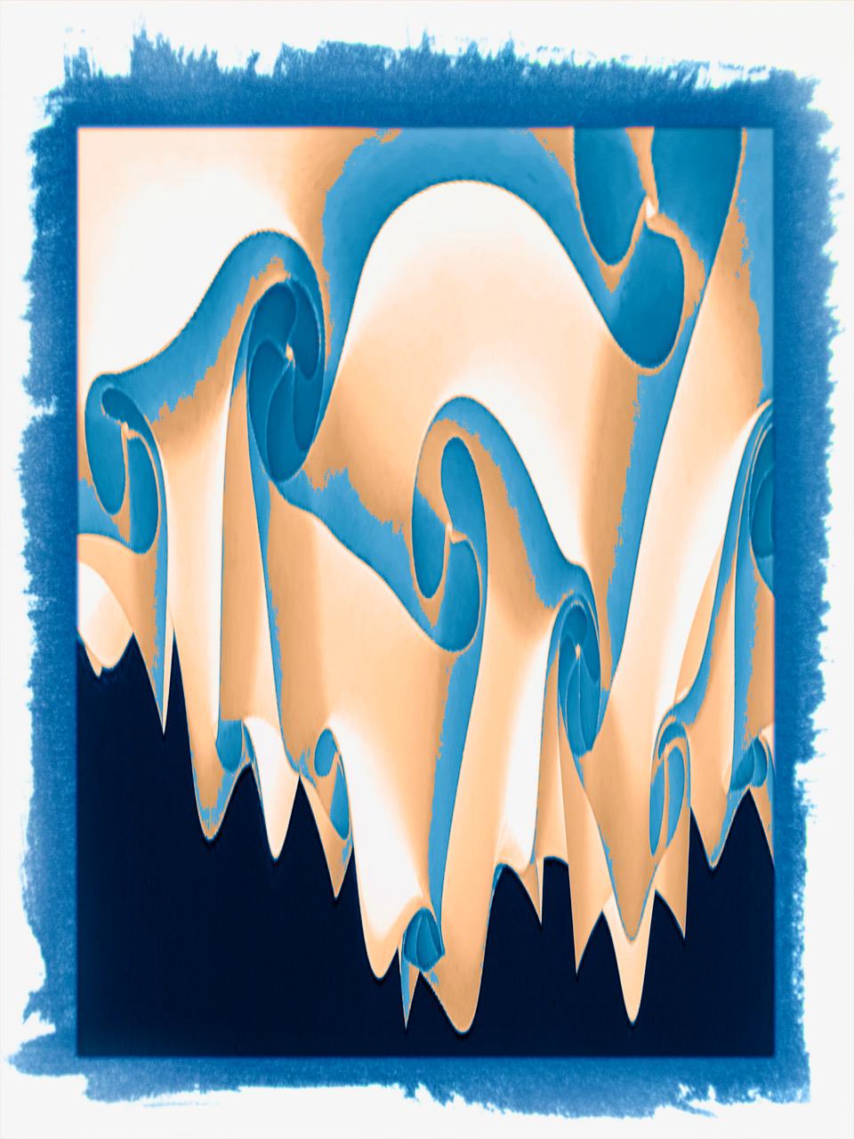
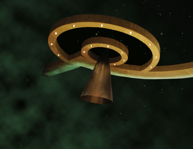
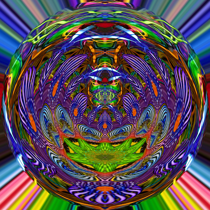
Gorgeous colors, and almost energizing! I usually don't care much for "pattern" pictures because they often have no center of focus. But this one is an exception. Its funny that my first reaction was "what would this look like with Polar Coordinates. Would not have been a good choice. But I tried it anyway, just for fun. |
Jan 9th |
 |
| 21 |
Jan 19 |
Comment |
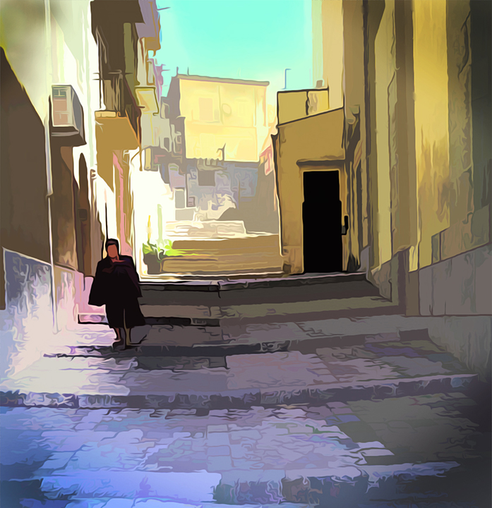
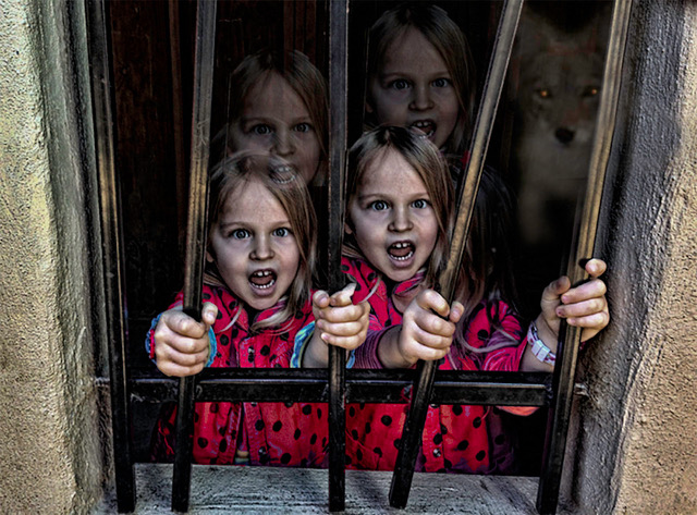
I love shadow pictures, and this is interesting how the mirror image expands the perspective of this picture. I like the ambiguity of the shadow "situations". Are the people on the sides threatening? Are they ready to assist this main character? And what is that garment he/she is wearing? I think the image has high impact and interest. |
Jan 9th |
| 21 |
Jan 19 |
Comment |
Also I tried to create a 'cave' for the fish with light. |
Jan 9th |
7 comments - 2 replies for Group 21
|
7 comments - 2 replies Total
|