|
| Group |
Round |
C/R |
Comment |
Date |
Image |
| 56 |
Mar 26 |
Reply |
Thank you, Cisco. |
Mar 14th |
| 56 |
Mar 26 |
Reply |
Thanks, Gerhard. I had to crop close to the one shoulder and head because there was a large area of street in the top left corner that was a distraction. Again, the tight crop, the arm at left very close to the edge, and the slant of the image all add to the sense of tension. I also wanted to erase the legs and the shoes of the protester behind her. |
Mar 14th |
| 56 |
Mar 26 |
Reply |
Thanks, Marevi. Although presented as a solo image here, it is one of several from a protest, so the context will be implied when presented with the other images. |
Mar 14th |
| 56 |
Mar 26 |
Comment |
Martin,
Who hasn't been in this exact moment while eating out? That everyday familiarity is what pulls me into the shot right away.
I'm curious about your choice not to use the window as a natural frame. You mentioned it twice in your notes, so it clearly factored into your thought process. I'd love to hear more about what led you to leave it out.
There's a nice circular flow to the viewer's eye here: from the woman to the menu, from the menu down to the man's leg, then up his arm to his face, and finally his gaze brings us right back to the woman. It keeps the whole scene moving.
And that poster on the wall adds an extra layer of story. It makes me wonder if they are grabbing dinner before going to that show?
|
Mar 14th |
| 56 |
Mar 26 |
Comment |
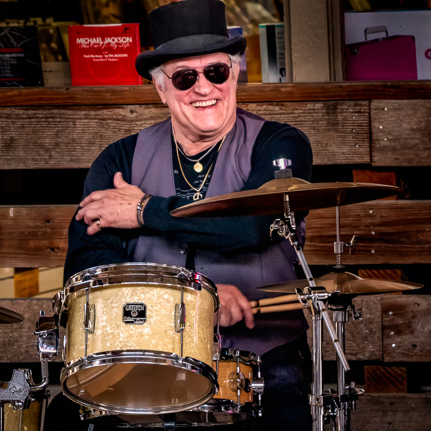
Tom,
You've captured a fantastic moment here - the drummer's expression really pulls the viewer in. The strong vertical lines work beautifully, and the drums and cymbals create a nice visual rhythm around him. The way the light hits his face and hand is especially well done.
If you're looking to refine the image even more, you might consider toning down the brightness of the top drum. Right now, it competes a bit with the drummer's face, which feels like the true focal point. I'd also invite you to think about the lower part of the frame - is it adding to the story, or pulling attention away from it? For me, the heart of the story is the drummer himself; the drums help set the scene, but they're not the star (see the attached crop).
And I have to say - the Michael Jackson CD sleeve in the upper left is such an intriguing touch. It adds a little mystery to the narrative, especially since his outfit suggests he might actually be more of a Prince fan!
|
Mar 14th |
 |
| 56 |
Mar 26 |
Comment |
Marevi,
What a delightful Carnival moment you've captured - there are so many great expressions here! Your choice to go with black and white really works well; it pulls the viewer's attention straight to the faces and energy of the scene instead of the clothing. The tighter crop also helps highlight that central triangle created by the outstretched arms, which adds a nice sense of movement.
If you're looking to refine the image further, you might try gently darkening the top left corner, including the women's faces there - especially the third woman from the left. At the same time, slightly lightening the three women on the right and the gentleman's face could help balance things out. I wouldn't crop any more off the bottom, though; keeping the man on the bike visible helps the moment make sense. Otherwise, the left-hand position might read a bit confusingly. Your crop on the right side of the original was nicely handled.
You could also experiment with deepening the blacks just a touch to give the front two women a bit more contrast.
Overall, you've done a wonderful job capturing the fun and spirit of the celebration - this image really holds my attention! |
Mar 14th |
| 56 |
Mar 26 |
Comment |
Gerhard,
I get the sense - especially from Marevi's expression - that this frame may be holding more than one story. To me she's a social media influencer as she's using a tablet.
The composition is anchored by strong verticals and horizontals, and the placement works well: the woman and the yellow arrow sit cleanly on the right third, balanced nicely by the car on the left. The subtle darkening along the bottom adds depth without calling attention to itself.
One meaningful improvement would be to crop out the shoreline at the top. The darker water already provides a natural, unobtrusive upper edge, and removing the shoreline would strengthen the overall cohesion. Another helpful adjustment would be toning down the highlights, particularly the window glare and the bright area above the front wheel well, to keep the viewer's eye from being pulled away from the main narrative.
|
Mar 14th |
| 56 |
Mar 26 |
Comment |
Cisco,
This image works because of its strong visual impact. Framing a quiet street moment beneath a glowing pharmacy cross reading "SEX" creates an immediate, eye catching contrast that draws the viewer in. That playful tension between the sign and the elderly figures below adds a touch of irony and gives the scene real storytelling depth.
The black and white treatment suits the documentary style, letting gestures and expressions shine. The tender moment of one man adjusting the other's shoe grounds the photo emotionally, while the passerby with shopping bags adds a nice sense of everyday life.
The LED sign is powerful but a bit overpowering - softening its highlights and contrast would help it support, rather than dominate, the frame. Strengthening tonal separation in the lower half through gentle dodging and burning would bring more attention to the interaction. A light crop from the top and right could also tighten the composition around the key elements.
|
Mar 14th |
5 comments - 3 replies for Group 56
|
| 76 |
Mar 26 |
Reply |
I too, like the pastel; however, please keep in mind that I shoot in RAW, and that has a tendency to make things, shall I say, bland. There is great variation in the Wild Geranium, and it's always a challenge for me as to what to push and what not to in flowers. Sometimes I have to ask myself, "What would a buyer like, just not you?" I have defined my photography as documentary art photography, starting out with what's truly there and then refining it in post-processing with my style. Make sense?
|
Mar 24th |
| 76 |
Mar 26 |
Comment |
Henriette,
Your image makes a strong first impression. Centering the fountain against such a recognizable skyline gives the photo instant clarity and a great sense of scale. The black and white infrared look adds luminous foliage and crisp separation between the water, sky, and buildings, which really supports the overall balance and contrast.
The skyline creates a steady horizontal base, while the fountain's tiers pull the viewer forward. Including the reclining sea horse sculptures in the foreground was a smart choice - they add depth and guide the eye smoothly from the water to the main fountain and then into the city beyond.
A few refinements could help the image read even more strongly at competition size. The midtones feel a bit compressed, especially across the stone and water cascades, which softens the texture. Some targeted contrast or micro clarity would bring that dimension back. The sky appears a little uniform, and cleaning the dust spots plus adding a gentle gradient would enhance the finish.
Bright fountain highlights slightly overpower the foreground sculptures, so a touch of dodging on the figures and burning on the brightest water would rebalance things. A small crop from the right and bottom could also tighten the composition.
Overall, it's a thoughtful, well-aligned image with great potential.
|
Mar 14th |
| 76 |
Mar 26 |
Comment |
Gordon,
This image makes a strong first impression. The choice to spotlight a tiny farmhouse perched on a hill, floating in a sea of fog, instantly creates mood and a great sense of scale. The layered flow - from fog to hill to forest to the distant snow covered peaks - beautiful depth, and the clean blue sky helps the mountains stand out clearly.
Technically, the image is very well handled. The distant ridges hold detail, and the fog feels natural rather than pushed. Placing the farmhouse just below center works nicely, letting the expansive negative space enhance its feeling of isolation. The fog doubling as both foreground and midground is especially effective, gently guiding the eye from the dark lower trees up to the house and then to the mountains.
A small top crop would improve hierarchy, and light dodging on the farmhouse would help it pop. Slight contrast shaping in the mountains and a warmer tint in the fog could also refine separation. Overall, it's a beautifully crafted scene with strong storytelling.
|
Mar 14th |
| 76 |
Mar 26 |
Comment |
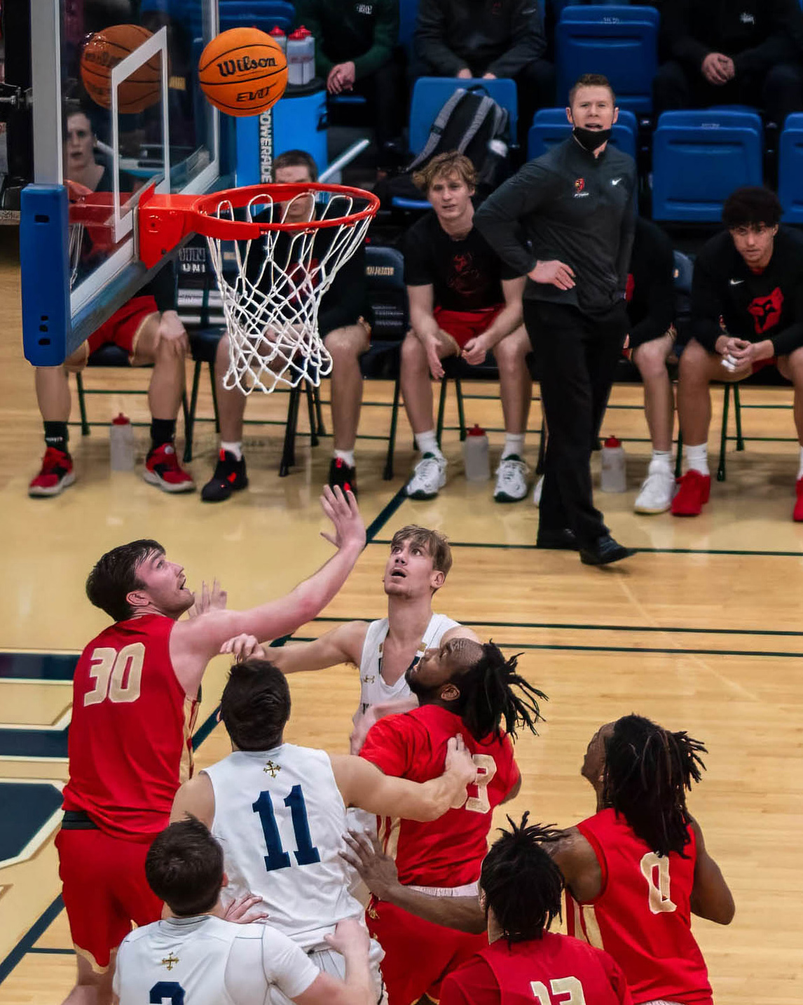
Jay,
The decision to capture the ball hovering over the rim with multiple players converging creates recognizable game tension and a strong sport narrative. Technical control is solid. Exposure, color, and shutter speed hold detail in faces and jerseys while freezing the action. Storytelling is supported by the upward eyelines of nearly every player, which directs attention toward the ball and reinforces the rebound battle. The decision to include several competing hands and bodies adds authenticity to the moment and communicates physicality in the paint.
As a former newspaper sports photographer, a key rule is to "shoot out" so you have room to crop in. You crop into the action.
You can improve your original image by cropping in (see my example). With a 4x5 crop, you call more attention to the coach and players in the background. By cropping out the player at right, you lose nothing.
A tighter crop from the left that removes most of the backboard support and the reflected player in the glass would strengthen visual clarity.
A modest crop from the top brings the ball closer to the upper edge would compress the action vertically and intensify the moment.
Selective background control would help separate the play from the bench area. Darkening and slightly desaturating the seated players and blue chairs behind the hoop would reduce their visual weight.
Local dodge and burn around the key subjects would refine the visual hierarchy. Lightly brightening the ball, rim, and the faces of the two central players while subtly burning down the lower foreground jerseys would guide the eye directly to the peak action.
The capture shows strong timing and awareness of where the play is developing. The upward gaze of the athletes and the suspended ball create a believable competitive moment.
|
Mar 14th |
 |
| 76 |
Mar 26 |
Comment |
Sanford,
This image shows thoughtful intent, strong lighting control, and an engaging sense of place. The warm spotlight nicely isolates the subject, while the choice to frame the scene from behind two patrons adds a natural, observational feel. To strengthen the impact, consider refining the center of interest and balancing tonal weight. Slightly brightening the foreground silhouettes and softening highlights on the bottle and counter would guide attention more clearly to the subject's face. A tighter crop from the top and subtle dodging, burning, and cooler color grading in the foreground would further enhance separation and reinforce the story's focus.
|
Mar 14th |
| 76 |
Mar 26 |
Comment |
Ian,
You've created a wonderfully calm and contemplative image here. The harmony of color and the overall stillness give the photograph a soothing visual presence. Your choice to use a long exposure was particularly effective - the softened clouds and glass-like surface of the water work together to reinforce the mood and atmosphere. The repetition of the vertical tree trunks and their reflections add a strong compositional rhythm, and the warm light on the trunks offers just enough contrast to play gently against the cooler sky.
You also handled the time-lapse aspect well. Part of the joy in long-exposure work is exploring how the scene evolves over different durations, and here you found a moment when the water becomes a perfect mirror. The clouds sweep across the frame with elegant motion.
One area I'd encourage you to think more critically about is the crop. Ask yourself: Is all this sky and all this water actively contributing to the image's story? A tighter 16:9 crop, aligned with the Golden Ratio, could bring the shoreline down to the lower third. This framing would maintain enough sky and reflection for balance - especially from top right to bottom left - while placing the tree line along a powerful visual path. That added density would concentrate the viewer's attention and strengthen the photograph's impact.
Speaking of impact, consider how the image functions without a clear visual anchor. The serenity is beautiful, but the viewer may search for a point of emphasis. You can help guide the eye through subtle refinements. For example, the reflection contains a noticeable magenta streak across the midsection. Neutralizing that color through selective hue or saturation adjustments would keep it from pulling attention away from the otherwise natural palette.
The long exposure gently softened the tree line, and a touch more local contrast - using clarity, structure, or micro contrast - could help individual trees separate from one another. This small adjustment increases depth and texture without compromising the overall tranquility.
Finally, some targeted dodging and burning along the shoreline could establish a clearer entry point for the viewer. Slightly brightening your central group of trees, while letting less important edge areas fall back, creates an intentional hierarchy. This tells the viewer exactly where you want them to land first.
You've already built a strong foundation with mood, color harmony, and compositional flow. With a few refinements in framing, tonal control, and local contrast, this image can become even more compelling.
|
Mar 14th |
5 comments - 1 reply for Group 76
|
10 comments - 4 replies Total
|


