|
| Group |
Round |
C/R |
Comment |
Date |
Image |
| 56 |
Jan 26 |
Reply |
Thanks, appreciate it! |
Jan 19th |
| 56 |
Jan 26 |
Reply |
Thank you! |
Jan 19th |
| 56 |
Jan 26 |
Comment |
Armen,
This photograph, taken in the vicinity of Toledo, Spain, skillfully incorporates tourists as subjects - a classic approach for capturing authentic moments in popular destinations. The expression you captured on the woman to the left is particularly effective and adds a narrative element to the image, enhancing the overall storytelling quality.
Regarding composition, while the 16x9 aspect ratio provides an expansive view, it results in an excess of sky. Although the clouds are visually appealing, they don't contribute significantly to the story you're telling. I believe a 4x5 crop would better focus attention on the main subjects and strengthen the image's impact.
The placement of the mother on the rock along the left third of the frame is well considered, and the visual connection created by her purse leading the viewer's eye down to her daughter - who is actively photographing - creates a pleasing flow and movement throughout the scene.
However, the photographer within your image appears a bit too close to the right edge of the frame. To balance the composition, I would recommend using generative fill or a similar technique to extend the image on the right, matching the distance present on the left side.
Finally, enhancing the contrast by selectively burning the shadows, especially on the rocky sand foreground, would add greater depth and drama to the scene.
|
Jan 19th |
| 56 |
Jan 26 |
Comment |
Martin,
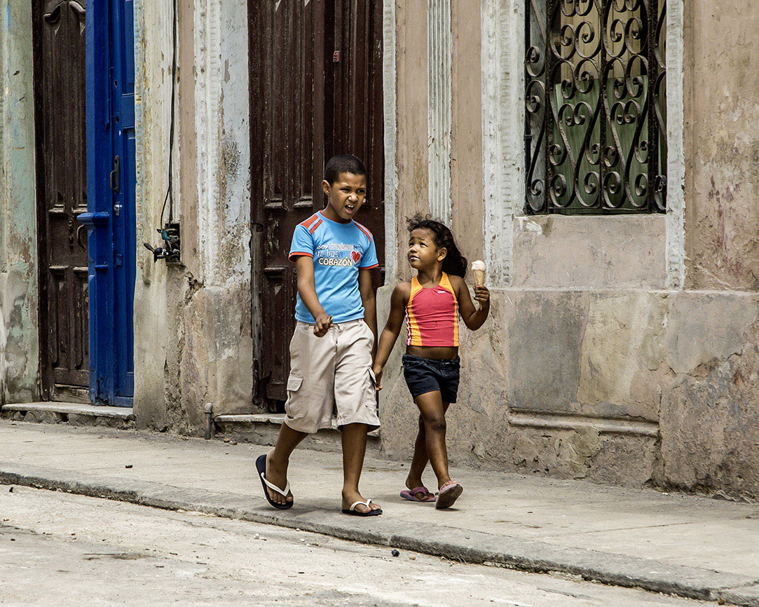
This photograph beautifully captures a fleeting moment in time, offering a strong sense of place and atmosphere. The two children serve as expressive focal points, their features rendered in crisp, sharp detail that draws the viewer in immediately. Including the dark blue door in the composition adds depth and interest, as Marevi mentioned. I experimented with a 5x4 crop, and honestly, both the wider and tighter crops have their merits - it really comes down to the story you want to tell. The wider crop provides additional context, enriching the narrative within the frame.
The image stands out for its use of prominent vertical and horizontal lines, which add structure and balance to the composition. The curb stone acts as a compelling leading line, guiding the eye naturally through the scene. I also appreciate the placement of the white vertical element directly behind the girl with the ice cream cone, which helps frame her and adds visual interest.
For further improvement, I would suggest burning the curb stones and the lower left corner of the concrete. Enhancing the contrast in these areas would help anchor the image and add even more depth, making the overall composition even stronger.
|
Jan 19th |
 |
| 56 |
Jan 26 |
Comment |
Tom,
This photograph presents a striking scene: a woman positioned along the left third of the frame, walking away from a grand gateway. The architectural elements are particularly engaging, with the stonework on both sides offering strong geometric contrasts, and the gateway's arch featuring intricate mini arches that draw the eye. Her dark clothes under a grey coat parallel the shade on the archway door.
The composition is well-executed, balancing the subject and the architectural details effectively. To further highlight the woman and strengthen her presence in the image, I recommend cropping diagonally from the bottom right corner. This adjustment would reduce some of the bottom margin and help balance the visual weight of the stonework on the right with that on the left.
Additionally, consider selectively burning the darker stones and shadowed areas. This technique will enhance the contrast and add depth, making the textures and architectural features stand out even more.
Overall, this is a solid and evocative image with a strong sense of place. With these small adjustments, the photograph could become even more impactful.
|
Jan 19th |
| 56 |
Jan 26 |
Comment |
This photograph masterfully showcases a series of striking contrasts, both in subject and in composition. Each figure within the frame is distinctly separated, allowing viewers to appreciate their individuality and presence without distraction. The image excels in guiding the viewer's gaze through a seamless circular motion: the front barber's downward glance leads us naturally to his customer, whose patterned cape directs attention to the window woman's poised hand. From her, our eyes are drawn to the back barber, whose orientation subtly returns focus to the front, completing the visual journey.
Another notable element is the pervasive use of red, which threads through the scene and unifies the various components, lending depth and vibrancy. The crop of the photograph is tight and intentional, focusing precisely on the heart of the action and enhancing its impact. Overall, this image is a well-crafted testament to expert composition and thoughtful visual storytelling. Well done!
|
Jan 18th |
| 56 |
Jan 26 |
Comment |
Gerhard,
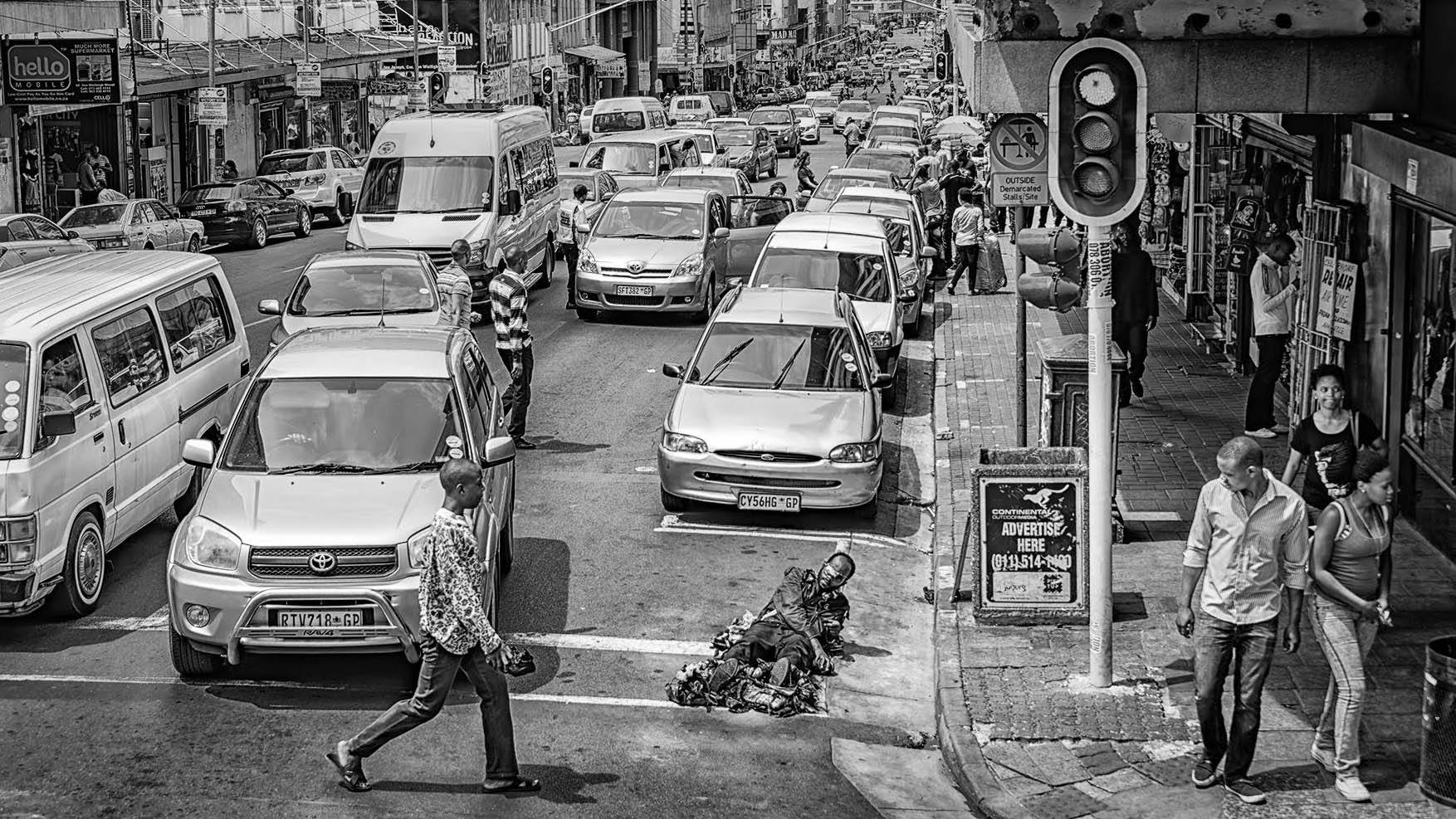
The decision to present this photograph in black and white is both deliberate and effective, lending a timeless quality to the bustling street scene in Johannesburg. The composition is dynamic, with a palpable sense of movement. The figures in the foreground are thoughtfully arranged, each occupying distinct space without overlapping, which maintains clarity and visual interest.
However, the image could be strengthened by a more refined crop. By aligning the pedestrians on the left with the left third of the frame and situating them at the intersections of the top and bottom thirds, as well as within the Golden Spiral, the composition would achieve greater balance and draw the viewer's eye more intentionally across the scene.
The photograph excels in providing context, effectively narrating the story of a homeless individual who seems to be overlooked by those around him. This subtle storytelling invites viewers to reflect on the social dynamics depicted, particularly as only one person in the foreground acknowledges the homeless man, prompting questions about awareness and empathy.
For added impact, consider burning the highlights and midtones to introduce a gentle vignette and deepen the contrast, especially within the shadow areas. Enhancing the midtones of the homeless figure would help him stand out more distinctly from the street, emphasizing his presence and the narrative at the heart of the image.
Overall, this is a compelling and socially resonant photograph that not only captures a vibrant moment but also encourages meaningful reflection on urban life and human connection.
|
Jan 18th |
 |
| 56 |
Jan 26 |
Comment |
Cisco,
A Table for Six, Please!
This photograph is anchored by strong horizontal elements, each offering a distinct color contrast that energizes the composition. The central horizontal band draws the viewer into the reflected lively movement of the street, while the lower horizontal remains still, grounding the scene. Above, the uppermost horizontal is punctuated by verticals, which work in harmony with the table and chairs to create visual balance. The sharp white stripe running along the table's surface acts as an additional horizontal, reinforcing the image's structure.
Intrigue is added by the reflected figure in the bottom left corner - his presence raises questions. Is he about to join the table, or perhaps meet someone here? What kind of cuisine might be offered at this inviting spot? The table itself clearly stands as the focal point, inviting speculation about its purpose and the story behind the scene, reminiscent of a typical sidewalk table outside any café. This image beautifully encapsulates a moment in time, preserving the present for future viewers to ponder.
|
Jan 18th |
6 comments - 2 replies for Group 56
|
| 76 |
Jan 26 |
Reply |
That is correct, Ian. I also find that when others share their perspectives with me, I sometimes see things I hadn't. Alternate perspectives make each of us pause and reevaluate, and either substantiate what we did or improve upon what we hadn't. Seeing others' perspectives is important in life and allows us to, ever so briefly, walk in someone else's shoes. That's why I like groups like this! |
Jan 20th |
| 76 |
Jan 26 |
Reply |
Thank you! |
Jan 20th |
| 76 |
Jan 26 |
Reply |
Alas, Gordon, the sky wasn't that impressive, and my "juicing" up the autumn foliage wouldn't have stood out as well. It's not uncommon to see such storm clouds in October, so it isn't unrealistic. Chalk it up to artistic license, I guess!
I am working on a book of historic barns in the county in which I live. I have about 50 such images, so it has been quite the project.
Why Round Barns?
They were more efficient
Greater structurally stability
Curved walls withstood strong winds better
Greater volume to surface ratio and thus less building materials required
Walls supported the roof so no need for pillars, allowing for greater storage capacity |
Jan 19th |
| 76 |
Jan 26 |
Comment |
Rusty,
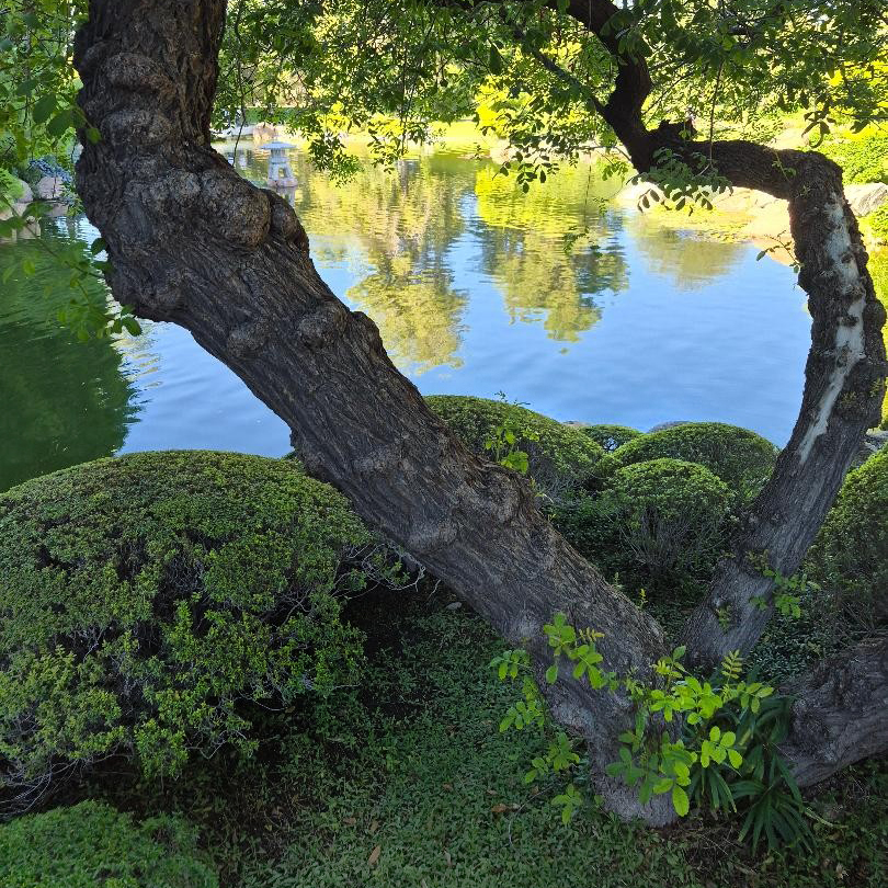
Rusty, I appreciate your effort and creativity with this image. Building on Gordon's suggestion, I agree that stepping slightly to the right would allow the right tree trunk to have more space, giving the composition a bit more balance and breathing room.
To further refine the image, consider using the spot healing tool to remove the white branch (or object) in the bottom right corner. This small adjustment can help keep the viewer's focus on the main subject without distractions.
There are some bright green leaves at the base of the tree, located near the intersection of the bottom and right thirds - an area that naturally draws attention. The top third of your photo features the tree top, which adds vertical interest.
In terms of composition, you might want to try a square crop. By cropping down from the top and up from the bottom, you can further emphasize the key elements and create a pleasing, balanced frame.
For post-processing, I found that using dodge and burn techniques on the foliage and rocks helped to darken the bottom of the image, making the highlighted vegetation on the midground rocks stand out more. Dodging the bright green leaves in the bottom right and some selective dodging on the tree trunks also added depth and visual interest.
Overall, these adjustments should help strengthen your composition while showcasing the beautiful elements you captured. Keep experimenting and refining your technique - the results are promising!
|
Jan 18th |
 |
| 76 |
Jan 26 |
Comment |
Well done, Henriette! I agree with Gordon, burn some of those blacks in the waterfalls and downriver to create more contrast without sacrificing the mist. |
Jan 18th |
| 76 |
Jan 26 |
Comment |
Gordon,
This month's photograph is another standout. The composition is particularly strong: the boxer is thoughtfully positioned just off center, with his head perfectly placed at the intersection of the right and top thirds, creating a visually compelling focal point. His right glove aligns skillfully with the lower left intersection of the rule of thirds and the Golden Spiral, enhancing the dynamic flow of the image.
The sharpness of the boxer's eyes, accentuated by the subtle catchlights, draws the viewer in and adds a sense of immediacy. There's a pleasing circular motion that guides the eye throughout the frame, keeping the composition engaging. The choice to present this image in black and white is excellent, lending a timeless and dramatic quality.
For an added creative experiment, it might be interesting to introduce more grain, emulating the classic texture of film for a nostalgic effect. Overall, the image is pin-sharp and beautifully executed.
|
Jan 18th |
| 76 |
Jan 26 |
Comment |
Jay,
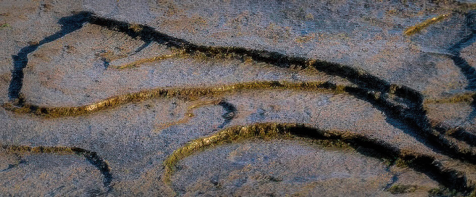
As with many of my own photographs, I often find that I need to study the image more closely to truly recognize what initially drew me in. Looking at your photo, I can see why you selected the rock in the foreground - it stands out with a unique pattern that sets it apart from the surrounding concrete blocks along the breakwater. The narrative here isn't really about the lake itself, but rather about that particular stone and the role it plays as the central subject.
In my own edit, I chose to crop in tightly on the rock's design, transforming the composition into a more intimate and abstract image. I applied some dodging and burning to enhance the blue tones and deepened the blacks for stronger contrast. Additionally, I increased the depth of field and sharpened the details to really bring out the texture of the stone.
When I review a photo on my camera's monitor, I often ask myself, "What makes this scene compelling? What is the true subject that captured my eye? Is there anything within the frame that distracts from focusing on the main subject?" Living in Wisconsin, I find that January is the perfect time to revisit my archives and process images from the warmer months - a great way to reflect and refine my work during the winter season.
|
Jan 18th |
 |
| 76 |
Jan 26 |
Comment |
Agree. |
Jan 18th |
| 76 |
Jan 26 |
Comment |
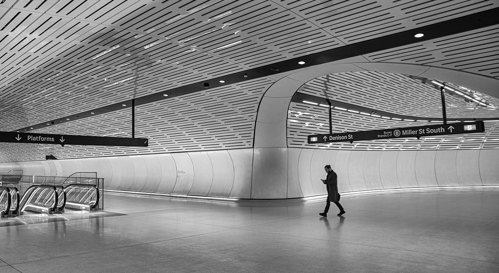
Ian,
This photograph suggests a promising future in street photography. Captured inside a station, the composition demonstrates thoughtful placement, with the pedestrian positioned precisely at the intersection of the right and bottom thirds - an effective use of the rule of thirds that draws the viewer's attention.
To further elevate the image, consider applying dodging and burning techniques to the midtones and highlights. Even subtle adjustments in these areas can significantly enhance depth and visual interest, bringing out important distinctions in the scene.
For compositional refinement, cropping the top of the image is recommended. By aligning the dark line in the roof so it meets the top right corner, you create a dominant leading line that guides the viewer's gaze through the photograph. This structural element adds strength to the overall composition.
Addressing minor technical imperfections, the glare or lighting inconsistency in the black line above the man has been removed, resulting in a cleaner and more polished look.
This image stands out for its evocative atmosphere. The expansive station surrounds a solitary figure, emphasizing the contrast between the vast, empty space and the individual within it. The setting's concrete and metal elements evoke a sense of isolation, while the man - absorbed in his cellphone - appears to be momentarily escaping this urban solitude. The artificial lighting casts ambiguity over the time of day, which further enhances the feelings of loneliness and sterility present in the scene.
Overall, this is a compelling shot that captures both mood and narrative. You should be proud of your work, as it powerfully conveys the emotional complexity of urban life through keen observation and effective photographic technique.
|
Jan 18th |
 |
6 comments - 3 replies for Group 76
|
12 comments - 5 replies Total
|


