|
| Group |
Round |
C/R |
Comment |
Date |
Image |
| 56 |
Nov 25 |
Comment |
Armen,
Welcome to our photography community! Your image from Portugal is a compelling addition, and I'm eager to see more of your work in the future.
The angled composition of the photograph immediately draws the viewer's eye and creates a palpable sense of tension. By photographing the homeless woman and her dog near the entrance of a hotel, you have skillfully used perspective to emphasize the unease (i.e., tension) of the scene. The choice to present the image in black-and-white further intensifies this emotional impact, stripping away distractions and focusing attention on the relationship between subject and environment.
Compositionally, your photograph is well-planned. The woman occupies the left third of the frame, and her face aligns with both the intersection of the top and right thirds and the center of the Golden Spiral, guiding the viewer's gaze toward her. Her dog is positioned at the lower intersection of thirds, adding balance and narrative depth. The presence of an English-language sign at the bottom of the image provides a subtle juxtaposition, highlighting the cultural context of Portugal while suggesting broader themes of displacement or globalization.
Strong black lines originating from the bottom right corner effectively lead the viewer's eye back to the main subjects. Similarly, the architectural lines of the hotel doors at the top right help contain the viewer's gaze within the frame, reinforcing focus on the woman and her dog. These elements demonstrate a sophisticated understanding of visual flow and how to direct attention within the image.
Overall, this is an excellent example of documentary street photography. It captures a moment of real life, inviting viewers to reflect on social issues and personal stories. However, it's important to acknowledge that photographing vulnerable individuals raises ethical questions. Some photographers may choose not to capture such moments out of respect for their subjects' dignity and privacy. Ultimately, this is a personal decision, and each photographer must weigh their own values and responsibilities when documenting the lives of others.
Your photograph stands out as a thoughtful and powerful portrayal of street life in Portugal. It skillfully combines compositional technique with social commentary, making it both visually and emotionally engaging. Thank you for sharing this image with our group.
|
Nov 24th |
| 56 |
Nov 25 |
Comment |
Martin,
This image captures a dynamic moment, with impressive action and a striking symmetry in the walkers' legs. The juxtaposition of movement and mirrored poses draws the viewer's eye and adds energy to the scene. The decision to use a vertical crop is interesting and highlights the subjects effectively.
However, I agree with the suggestions to consider cropping more from the top of the image. Switching to a 6x4 horizontal crop could enhance the composition by making the image more impactful and balanced. In the proposed crop, there's a compelling leading line in the pavement on the right that guides the viewer's gaze directly to the walkers' front feet. Additionally, a subtle line just off-center points toward the pigeon, which adds another focal point and strengthens the visual narrative. This approach maintains the context of the location while minimizing distractions.
Presenting the photo in black-and-white could be a strong choice, emphasizing contrasts and textures while focusing attention on the composition and action. Either way, the image has strong compositional elements that would stand out in both color and monochrome formats.
|
Nov 24th |
| 56 |
Nov 25 |
Comment |
Tom,
This image presents a compelling interplay between darkness and light, primarily showcased through the archway's frame against the brighter background. While the composition is well thought out, the colors within the scene do not appear particularly dynamic or engaging. In fact, converting this photograph to black-and-white might enhance its overall impact. Removing the distraction of the magenta clothing worn by the main subject - positioned near the intersection of the right and bottom thirds - would allow viewers to focus more on the compositional elements.
The foreground features strong leading lines and geometric shapes that would be accentuated in a monochromatic version, providing a striking contrast and directing the eye through the frame. Adjusting the blue slider in post-processing could further dramatize the sky, lending additional atmosphere to the scene. Thoughtful application of radial filters would help to emphasize key subjects, thereby adding depth and dimension.
The separation between groups and the solitary figure crossing the road in the background is effective, naturally drawing the viewer's attention toward the intersection of the right and bottom thirds. Additionally, the placement of the church steeple at the top right thirds intersection contributes to a well-balanced and harmonious composition. With a few selective filter adjustments, this photograph has the potential to become a truly remarkable image.
|
Nov 24th |
| 56 |
Nov 25 |
Comment |
Street musicians always bring energy to a scene, and adding a dog makes this photo an instant attention-grabber! The saxophonist is perfectly positioned at the intersection of the right and top thirds of the frame, which also aligns with the center of the Golden Spiral - an effective compositional choice. In the top background, you'll notice people gazing at the musician, along with a window poster of a woman looking in the same direction, which draws the viewer's eye further. The lighter gutter area acts as a leading line, naturally guiding us through the composition. There's a pleasing contrast between the geometric shapes of the sidewalk and street and those of the surrounding buildings. Overall, this is an excellent image! My only minor wish would be to see the dog's entire tail; however, I understand there may not have been an opportunity to include it in the shot.
|
Nov 24th |
| 56 |
Nov 25 |
Comment |
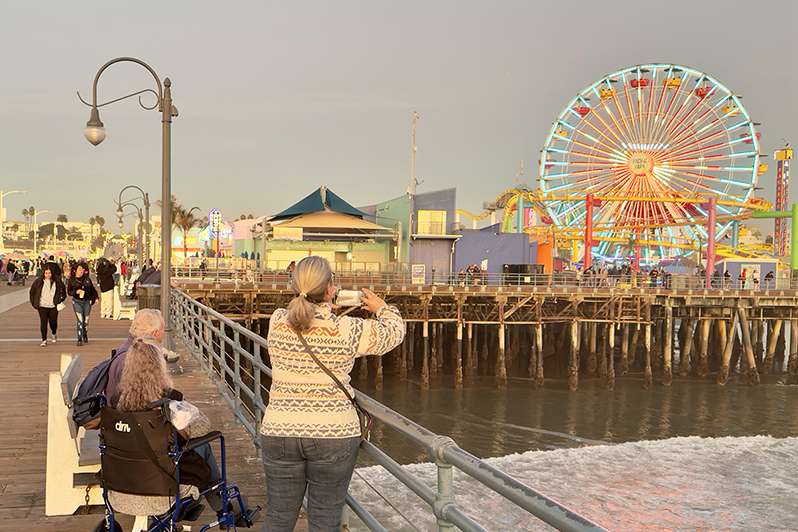
This image has great potential! I share Marevi's perspective that a tighter crop would significantly enhance its impact. I've attached a 4x6 version as a suggestion for the revised composition. By using this 4x6 crop, the amusement ride is strategically placed along the right and top thirds of the frame and aligns with the center of a Golden Spiral. Similarly, the woman photographer and the two people sitting on the bench are positioned to draw the viewer's attention naturally.
The visual journey starts at the large Ferris wheel, then moves left across the buildings to the lamp post, which conveniently directs the eye downward toward the pier. From there, the fenceline guides the viewer back to the group of people in the lower left corner. There's no need for additional post-processing on this phone image-just the cropping does the trick. Well done on capturing a compelling scene!
|
Nov 24th |
 |
| 56 |
Nov 25 |
Comment |
One of the photograph's key strengths lies in its thoughtful composition. The watch repairman's head is positioned at the intersection of the bottom and right thirds of the image, aligning with the center of the Golden Spiral. This placement creates a strong anchor, naturally drawing the viewer's eye to the subject and establishing a clear focal point within the photograph. While the cart is a central element of the image, the story extends beyond it to encompass its surroundings. The broader context - where the cart is located and the ambiance of BlokMall - is integral to the narrative. Cropping from the top and right edges, as sometimes suggested, would risk losing these contextual details. Such a crop would isolate the subject, transforming the photograph into a portrait of the cart rather than a documentation of its place within the environment. Preserving the full scene ensures that the viewer understands not only what is happening, but also where and when it is occurring.
A central challenge in street photography is minimizing distractions without sacrificing context. In this image, the only notable visual element that detracts from the composition is the presence of tree branches and leaves on the right side. Removing these would reveal more of the rectangular wall pattern behind the subject, further emphasizing the geometric designs present throughout the image. The signs at the top of the frame also contribute geometric interest, reinforcing the visual theme. Ultimately, this photograph serves as an effective documentary image, capturing a specific moment in time and place. The careful positioning of the subject, combined with the contextual details and geometric emphasis, makes for a compelling visual narrative. With minor adjustments to reduce distractions, the image would achieve an even greater sense of clarity and compositional harmony.
|
Nov 24th |
6 comments - 0 replies for Group 56
|
| 76 |
Nov 25 |
Comment |
Henriette,
This photograph is a truly inspirational example of geometric abstraction, where shadows and light interact beautifully with the architectural elements, particularly the shape of the doorway and the light fixture. The way sunlight transforms the wall with its gentle illumination is simply captivating and draws the viewer in.
The color palette, which reflects vibrant Mexican influences, adds a spirited energy to the composition. The decision to use lighter tones for the walls is masterful, as it enhances the natural light and ensures the space feels open and inviting. Meanwhile, the boldly colored fixture serves as a perfect counterbalance to the expansive wall on the left, preventing the composition from feeling empty and instead offering a striking focal point.
Overall, the harmonious blend of geometry, color, and light elevates this image. There is little to critique beyond offering sincere praise - this is a wonderful photograph that deserves a heartfelt "Kudos!" for its artistry and execution.
|
Nov 25th |
| 76 |
Nov 25 |
Comment |
Gordon,
This photograph of the Bilbao Guggenheim Museum is an expertly composed and thoughtfully processed image. From a compositional standpoint, the image achieves a strong sense of balance, meeting high professional standards.
The division of the frame into thirds is particularly effective: the bottom third features the reflective water, the middle third showcases the museum and surrounding buildings, while the top third is dedicated to the sky. This clear structuring lends the image a sense of harmony and order.
The illuminated vertical artwork, strategically placed along the right third of the frame, serves as a compelling focal point. Its position creates visual interest and draws the viewer's eye across the image.
Overall, the image is center-weighted, with the left two-thirds providing a visual counterbalance to the right third. The crop is wisely chosen, allowing the water's reflections to offset the weight of the sky, further enhancing the equilibrium within the composition.
In summary, this is a well-executed photograph that demonstrates technical skill and creative vision. Well done!
|
Nov 25th |
| 76 |
Nov 25 |
Comment |
Jay,
Ahh, a view from the Canadian Caribbean!
This photograph features a compelling arrangement of five vertical lines, which collectively create a strong sense of depth of field. The visual layering draws the viewer into the scene and establishes a clear spatial relationship between the elements within the frame.
The inclusion of the barrier rocks serves as a focal point and prompts reflection regarding their purpose in the image. As presented, the rocks emerge as the central subject, with other elements relegated to the roles of foreground and background. This compositional choice invites a question: what was your intention in leaving the rocks in the scene? If your goal is documentary - to capture a specific moment in time and place - retaining the rocks is effective. However, if you are pursuing a more artistic interpretation, you might consider removing or deemphasizing them to shift the focus elsewhere.
Research into the scene reveals that the concrete and rock barriers along Cleveland's shoreline play a vital role in preventing severe erosion caused by Lake Erie's powerful waves, storms, and ice. Notably, these barriers are composed not only of natural materials but also of construction debris such as bricks and concrete from old buildings and streets - a legacy of historical and sometimes illicit shoreline protection practices. The so-called "mystery of bricks" found on the local beaches further enriches the narrative potential of this subject.
Given this context, the rocks are more than mere compositional elements; they are protectors with a story to tell. You might consider renaming the image to "Protectors" to underscore their significance and invite viewers to engage with their history.
The depiction of waves in the water complements the narrative, illustrating the forces that necessitate the presence of the barriers. The choice to include the waves is effective, as it visually reinforces the rocks' protective function. If you wished to alter the mood, a long exposure could have softened the water, lending a more tranquil or abstract quality to the scene. However, as it stands, the dynamic water adds to the authenticity and storytelling of the photograph.
Overall, this image successfully balances compositional strength with narrative depth. The vertical lines, focal rocks, and contextual waves coalesce to offer viewers both visual interest and a compelling story. Thoughtful consideration of your artistic intent - whether documentary or interpretive - will guide future choices regarding the inclusion or exclusion of key elements like the barrier rocks.
|
Nov 25th |
| 76 |
Nov 25 |
Comment |
Sanford,
As the saying goes, one good tern deserves another … (groan!)
Though the birds are sharp, there's too much out-of-focus area in the foreground. Were you seated when taking this and used the boat rail to stabilize the camera? The bokeh background is well done and serves as a fine backdrop for the birds.
|
Nov 25th |
| 76 |
Nov 25 |
Comment |
Ian,
This image immediately evokes a sense of futurism, primarily through its masterful use of lines and perspective. The leading lines originating from both the bottom right and left corners guide the viewer's gaze through various levels of the station, ultimately converging at the far end of Sydney's Metro transport hub. This strong geometric structure not only organizes the frame but also creates a compelling visual journey.
The inclusion of people on the platform is a crucial compositional choice, as they provide a relatable sense of scale and proportion within the otherwise vast architectural space. Their presence grounds the image and adds life to the scene, preventing it from feeling too sterile or abstract.
The primary action within the image is centered - both literally and figuratively. The gathering of people on the platform and the distant escalator at the station's opposite end serve as focal points, naturally drawing the viewer's attention. The remainder of the composition is dominated by lines, enhancing the sense of depth.
While the original image employs a brown-dominant color palette in a documentary style, converting it to black-and-white could significantly heighten its dramatic impact. Monochrome processing would allow for fine-tuning of whites, blacks, and grays using color sliders, enabling you to emphasize the architectural forms and mood while still retaining the documentary essence.
To further elevate the image, the application of radial filters centered on the main action area is recommended. This technique can enhance depth of field and more intentionally direct the viewer's focus, adding a subtle yet powerful sense of dimensionality.
Overall, this is an outstanding photograph that expertly leverages lines and perspective to create a futuristic atmosphere. With a few refinements - particularly in tonal processing and selective focus - the image could transition from excellent to truly exceptional.
|
Nov 25th |
5 comments - 0 replies for Group 76
|
11 comments - 0 replies Total
|


