|
| Group |
Round |
C/R |
Comment |
Date |
Image |
| 56 |
Apr 25 |
Comment |
Tom, the abundance of phone and electric lines crisscrossing the top of the image adds many triangles. The white street stripes add leading lines towards the mountain. Good foreground, background, and midground. A well-composed travel shot. For my taste, I would burn the greenery on the top of the mount to add more contrast. Did you do any color adjustments to the sky, or was that natural? |
Apr 21st |
| 56 |
Apr 25 |
Comment |
Gerhard, I like the DOF in the image, and the countryside wall treatment adds to that. Why did you leave the folding gate on the right in the picture? Sometimes you have to deliberately ask, "What are the distractions in the image?" and "What increases attraction within the image?" I think this image would be good in color or b&w, depending on the story you want to tell. Very interesting photo and invites the viewer to look at many aspects in it. |
Apr 21st |
| 56 |
Apr 25 |
Reply |
Indeed, well done! |
Apr 21st |
| 56 |
Apr 25 |
Comment |
Martin, a very nice capture, and you're right about fishing from this location. The poster model looks down to the couple and the man at the woman, and the woman back to the right. giving the image a nice circular rotation for the eye. The image would benefit from some dodge and burn, especially the left to darken the background and the shadow portion of the poster. Since the light comes from the right, perhaps some dodging at the top right would bring more contrast to the image. The image also has that magical "3" to it! |
Apr 11th |
3 comments - 1 reply for Group 56
|
| 76 |
Apr 25 |
Reply |
Thank you! |
Apr 21st |
| 76 |
Apr 25 |
Reply |
Thank you! |
Apr 21st |
| 76 |
Apr 25 |
Reply |
Gordon, I don't really get much into image competitions these days, but I will keep your ideas in mind should I ever submit this. This is one of many, many images I will have in a book for the Skunk-Foster State Natural Area. |
Apr 21st |
| 76 |
Apr 25 |
Comment |
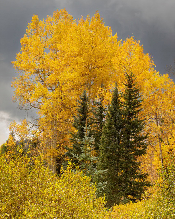
Henriette, I love the clouds, and they provide a wonderful backdrop for the foliage. We must ask ourselves, deliberately, "What are the distractions in the image?" and "What are the attractions in the image?" I agree with the comments above that the green tree on the right of the image is a distraction. I also agree that the verticals should be adjusted. I think that the image would benefit from a 4x5 crop to cut off some of the bottom of the image. All-in-all, a really good capture and composition. |
Apr 21st |
 |
| 76 |
Apr 25 |
Comment |
Gordon, a good blending of images to capture an image of the church that I have not seen. The clouds and horizon are wonderful. To my eye, the cross at the top is lost in the darkness of the cloud, so I would lighten that gradient a smidge. As to how you may want to treat the bottom black boulder area for competition or just aesthetics is a choice that you have made. The steeple sits at the Golden Third. For aesthetics, I'd prefer a 16x9 and get rid of the black boulders. A wonderful tourism photo no matter which way you go! |
Apr 21st |
 |
| 76 |
Apr 25 |
Comment |
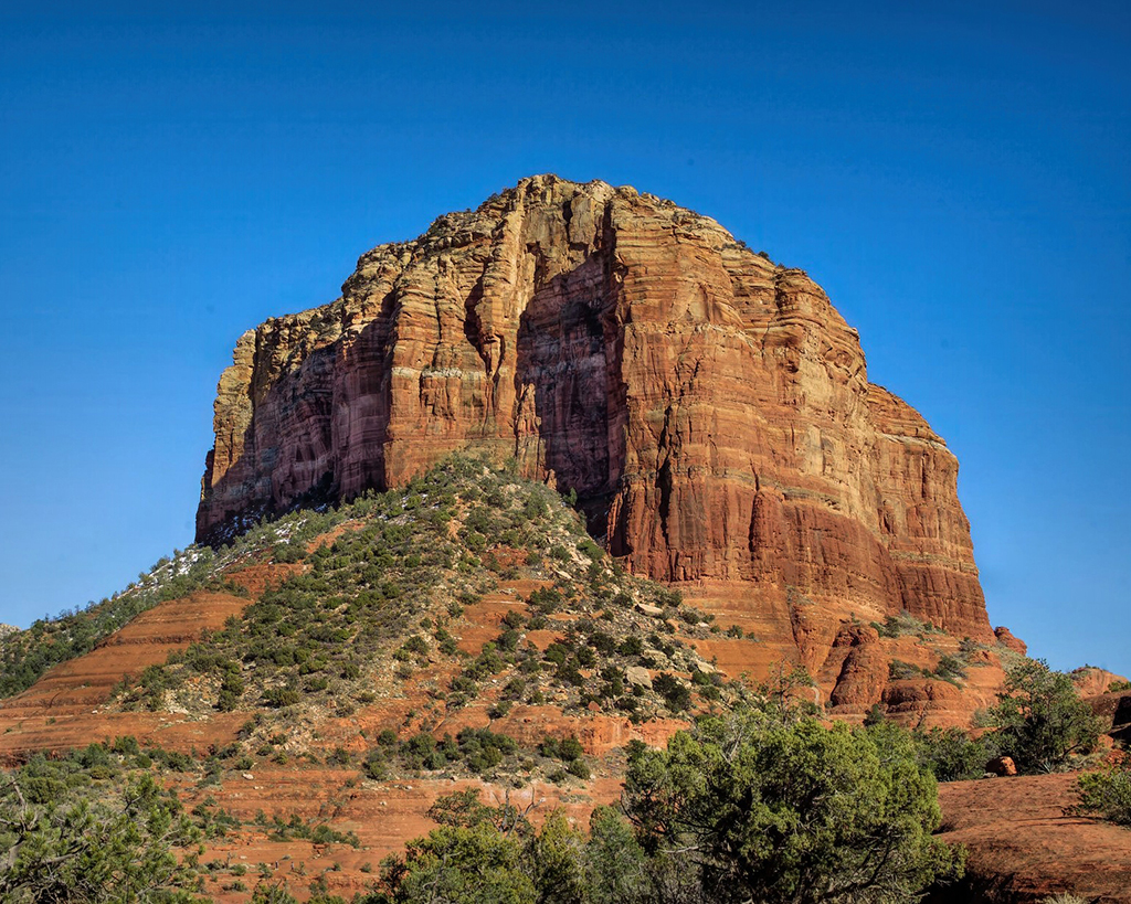
Jay, when you're traveling, you get what you get with the sky! The only thing you could do is replace the sky, which you tried, and we have to listen to our wives! As to spot removal, I have found Luminar NEO an excellent program for that and other enhancements. I think that more dynamic range (see my attached image) would enhance the image. To my eye, I think a square crop would be beneficial because the vegetation at lower left starts a leading line toward the summit, as does the one above it at the left side of the image. This also focuses the eye on the shaded area of the mountain. I like the colors, the contrasts and the adjustments you did. |
Apr 21st |
 |
3 comments - 3 replies for Group 76
|
6 comments - 4 replies Total
|