|
| Group |
Round |
C/R |
Comment |
Date |
Image |
| 56 |
May 24 |
Reply |
Thank you for your suggestion about going with a less vibrant image. I will use that to create something as I explore the "realm of the abstract"! |
May 27th |
| 56 |
May 24 |
Reply |
Thank you for your suggestion about going with a less vibrant image. I will use that to create something as I explore the "realm of the abstract"! |
May 27th |
| 56 |
May 24 |
Reply |
Thank you for your suggestion about going with a less vibrant image. I will use that to create something as I explore the "realm of the abstract"! |
May 27th |
| 56 |
May 24 |
Reply |
Thank you for your suggestion about going with a less vibrant image. I will use that to create something as I explore the "realm of the abstract"! |
May 27th |
| 56 |
May 24 |
Comment |
So glad you have joined our group, Heidi! It seems that you could have gone a couple of different routes with this image. I agree about the "fight" between the areas in focus and out of focus. As I often say, you are getting the opinion of a guy here so keep that in mind. The eye zeroes in on white areas and in this image that's from the kitten's chin south. With most of the cat out of focus, I would concentrate on the chin and north and make the face jump out with texture and sharpness, The chin could be more white, and then I would darken the whites and highlights from the chin south so the brightest white was in the face. I love that the whiskers are very strong and sharp! The light, according to the eyes, is coming from the top left, so you lightened top left background fits with that. My question is, why did you leave the white light reflections in the eyes? IMHO it is a distraction especially since this is a painting. The background is a nice contrast in texture with the cat. |
May 24th |
| 56 |
May 24 |
Comment |
Cindy, I'm glad you included the original image so I could detect the horse coming out of a river. My first impression wasn't that. I thought it could be ice. The bottom of the image I saw as ground and the background as a wall. But hey, I'm a guy! Your work on the horse is impeccable and I believe you should not have introduced the texture over its right quarter area. Don't change a thing because of my perceptions because what you intended to achieve fits the bill. Sometimes altered realities can be very inspiring, so thank you for posting this! |
May 24th |
| 56 |
May 24 |
Comment |
Martha, this tugs at my heartstrings! I am a landscape and nature photographer, so I love the woodlands and trees. My logo incorporates a tree! I like the way you closed up the foliage to the top right to minimize the sky coming through. I would suggest making the trail a leading line from the bottom left to the tree and making the trail more recognizable - it looks like ground but not a trail to me. I would add more definition to the mid-left area that is muddied as it is, IMHO, a distraction. Your paint strokes for the foliage is very pleasing but IMHO you could create more contrast if you had the fir tree more pronounced like the Original image included here (did I mix up your Original and Original 2 images when I posted them?). With a little refinement, this will be a beautiful painting! |
May 24th |
| 56 |
May 24 |
Comment |
Gerhard, you captured a wonderful sunset! For me, there are two parts to the image: the sky and the foreground. I think your sky painting is lovely and rich. In LR, I would have separated the sky with a mask, inverted it to get the foreground, and then processed the foreground a bit differently because it's not the sky. The hills at the left and on the horizon suffer in your image and if you separated the sky from the background this area would be improved, IMHO. Masking in LR does just a great job these days and you can even get the fine branches of the tree against the sky to render well. It's a fine start toward a better image! The balance of the tree at the left and the open sky at the top right is wonderful. |
May 24th |
| 56 |
May 24 |
Comment |
Nancy, this is a gorgeous still-life painting. The reflective foreground adds much to the image and the background is very well done. Kudos! |
May 24th |
| 56 |
May 24 |
Comment |
Ditto on what Cindy and Peggy mentioned. In PS, you can compensate for the shadows in faces. Go to IMAGE, ADJUSTMENTS, then LEVELS, and move the center slider for Midtones. You can also adjust more if you go to IMAGE, ADJUSTMENT, then SHADOWS/HIGHLIGHTS and adjust the shadows. I like going the abstract route on this image and it makes it unique from a typical shot of the event. |
May 24th |
6 comments - 4 replies for Group 56
|
| 76 |
May 24 |
Comment |
Sophie, your bird is sharply focused and the eye, beak, and wing feathers are all in focus. Nice capture! You've set the bird on the right third of the image, so it has enough space to fly into. I wonder what it would look like if you used the Object Selection mask in LR and isolated the bird, inverted the mask, and then either darkened or brightened the background to provide more lighting contrast to showcase the bird? Great start on what I am sure will become a magnificent image! |
May 27th |
| 76 |
May 24 |
Comment |
Henriette, I love your choice of background! The shadow lines provide a wonderful contrast to the bodies of the mother and child. Makes the viewer wonder where they are going and there's breathing room in from of them to boot! The child looking back is wonderful and his/her's arm flows to the leg, the leg to the towel, the towel up to the mother's head and back again - wonderful circular movement. Kudos on a very fine image! |
May 27th |
| 76 |
May 24 |
Comment |
Jay, way to get out and give it the ol' college try! I think you were successful because you got a shot - many photographers didn't. You'll be ready with a better lens if you save your money over the next 420 years �� Hard to tell if your image is a 4x6 or square or �� ? If you want it more "defined" you might put it into Topaz Photo AI and see what turns out. Thanks for sharing this wonderful image! |
May 27th |
| 76 |
May 24 |
Comment |
Sanford, your young man is certainly struttin' his stuff with attitude! I agree with cloning out the hands at left but besides that, I like what you have done with processing and cropping. There's space for him to walk into on his right and breathing room to his left. Nice street photography! |
May 27th |
| 76 |
May 24 |
Comment |
Ian, a nice double exposure. The center of the flower appears sharp, and I like how the flower is offset from the middle. The only distraction is the large space at the top right; it would have been nice to have leaves fill that area too. The multiple exposure makes a nice impact on the flower itself. Keep up the experimentation! |
May 27th |
| 76 |
May 24 |
Comment |
Gordon, brisk wind. Normally I'd focus stack. It was one shot, you get what you get and don't throw a fit. I am finding in viewing YouTube vids on flower photography, a lot of the flower parts aren't necessarily in focus. I opted for most of the stamens, the center portion and the back petals. The "hair" was also important to get in focus as it brings the eye back into the photo. That's the logic I used to shoot this. A nice photo but not competition quality - might sell as a small matted print. |
May 8th |
6 comments - 0 replies for Group 76
|
| 88 |
May 24 |
Reply |
Mark, The challenge with the top of the images was the house that was there. In retrospect, I should have used the GenFill once I had cropped it to add more breathing room at the top. Thanks for the reminder! The lower right side is darker because it is slightly out of focus, so I'm hiding that. |
May 27th |
| 88 |
May 24 |
Comment |
Sanat, I'd first make the snow white and then crop off the bottom so the bottom to the snow at the bottom of the hill was all in the bottom third. The ski trails at right are on the right third. The people at the bottom left lead you into the image. But you need something like some skiers holding their skiis. I think you had to get closer to where the action was on the hill for a tourism photo - it's not how high the mountain is in this case, it's the fun experience people are having on it that make it a travel photo. |
May 27th |
| 88 |
May 24 |
Comment |
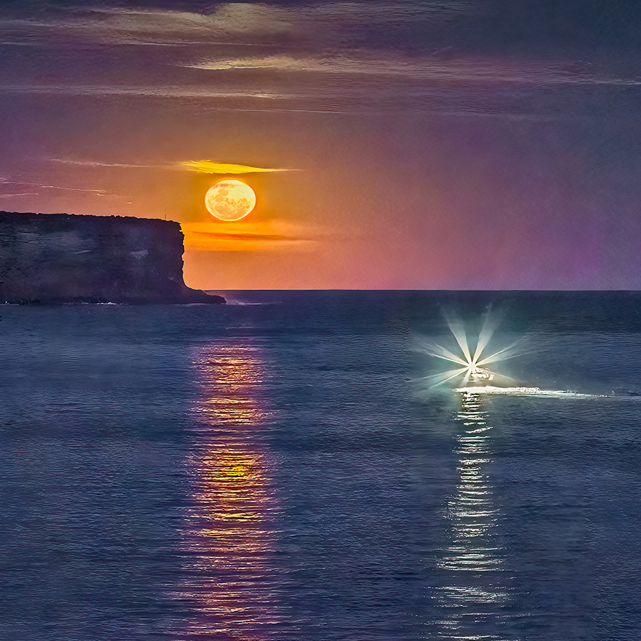
Brian, nice being in the right place at the right time! The action of the image is pretty much in the top half, so I would suggest a square crop to delete some of the ocean in the bottom portion. That would align the moon and the trawler on the third lines. Your horizon the straight and I think you have a wonderful image here. Kudos! |
May 27th |
 |
| 88 |
May 24 |
Comment |
Charles, "older camera! The D750 is my main camera and a D300s my sports body. Well, I'm no spring chicken either haha! I like your "up close and personal" approach to the shot. Glad you used Gen Fill to give more breathing space at the top. The killer texture here is the wood of the boat and I'd experiment with lightening it and using the Texture slider in LR. Since the boat is so dark, I would lighten the blue in the sky and clouds for more contrast in the image. Nice find! I'd also ask if you need all the background on the left - since it is so large, crop it for a "in your face" impact and see how you like that. |
May 27th |
| 88 |
May 24 |
Comment |
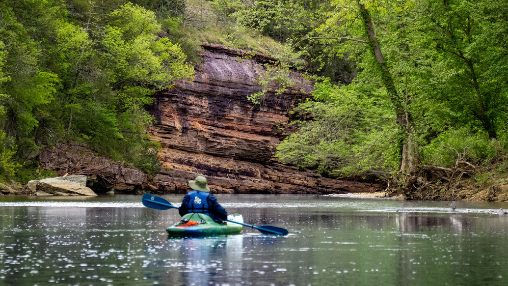
Brian, what a deal you have with your model (wife)! I guess I should travel more with mine �� on second thought �� Your kayaker gives a sense of perspective and contrasts manmade with Nature. To my eye, the image is not balanced - the sloping layers of rock visually tip the image to the right. I have attached a 16x9 crop where the kayaker is off to the left and counterbalances the weight of the rock face and gets rid of some of the distractions. I learned from sports photography for newspapers that you crop to the action. Love your location! |
May 27th |
 |
| 88 |
May 24 |
Comment |
Mark, first attend to the horizon line. Second, there are colors in the sky, so try a few masks in LR to enhance it. The foreground isn't bad, but you need to bring that darker green down the peninsula, so the trees contrast more with the light on the grey rocks. From there I'd Burn the peninsula point and Dodge the white waves crashing into the rocks. The final aspect would be to match the ocean color with what you have done to enhance to sky. I know you can make something out of this! |
May 27th |
5 comments - 1 reply for Group 88
|
17 comments - 5 replies Total
|


