|
| Group |
Round |
C/R |
Comment |
Date |
Image |
| 56 |
Feb 24 |
Comment |
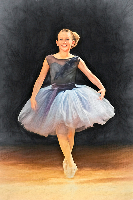
Another grand slam Cindy! The only suggestion I would make is to extend the right edge of the image so there is more breathing room for the beak. |
Feb 25th |
| 56 |
Feb 24 |
Comment |
I agree with the suggestion for a longer stem on the large orange flower at the center. Your background creation is wonderful, like the way you got rid of a lot of clutter in the original image. I like the placement of the purple flower at the top right, but I feel it doesn't "fit" with the purple flower at the bottom left. Is it supposed to be a different kind of flower? It would be nice to see that second image, so we have something to compare your final to. The orange and yellow flower petals have lovely tones and shades. Is the front one slightly more in focus than the smaller one in the back? Was this a conscious choice? You certainly have progressed far in a short time, kudos to you for that! |
Feb 25th |
| 56 |
Feb 24 |
Comment |
Gerhard, I'll make a threesome about the cropping. You hade some great background with the out of focus low aperture shot. The colors are vibrant and the bird's eye and beak are sharp. I like your image very much! |
Feb 25th |
| 56 |
Feb 24 |
Comment |
I have taken hundreds if not thousands of photos of cars since my hometown has a major car show every year. I also have many "rusted and ruined" images of cars for their grunge and tonal qualities. I think your drawing is good, but I would offer some suggestions from a guy's point of view. Rusted = grunge. Cars are made principally from metal, so a b&w rendition needs a sense of being "heavy". Classics have many curves to the body and clean and clear lines. I know why you use the cross-check pattern, but those patterns should mimic or emulate the verticals and curves of the car, i.e. at the top of the image. Your hashmark angles create tension with the car's window structures - did you intend this? Vertical lines should follow the car structure, ditto horizontal lines; this creates less tension and a softer "feel" to that portion of the image. You want to have the background car darker, as you have, but the light grey of the window area draws attention to it. Did you want to do that? In the original, there are more grey tones on the hood which you didn't transfer to your sketch. Why not? Those contrasts provide drama and tell a better story about the vehicle, in my opinion. I think you have remarkably come a long way in your sketching/drawing and I'm sure you'll progress more to create some wonderful images! |
Feb 25th |
| 56 |
Feb 24 |
Comment |
It's always interesting to have a challenge, change up things and use an iPhone instead of our usual gear. Though the softer shadows work with your intent, the heavier ones do not, in my opinion. I agree with Gerhard's procedure to isolate the subject and drop in a different background, whatever that may be for your intent. When I use my iPhone, I don't make any alterations via it rather choose to make them in LR or PS. Here is a link to iPhone photography for flowers, maybe it can help you. https://www.youtube.com/watch?v=s9I_9QOGfZg
|
Feb 25th |
| 56 |
Feb 24 |
Reply |
Thank your for the insight about the darker tone son the arms, legs, and face. Here is a revamped edit done in LR where I used a Subject filter and then made the adjustments. |
Feb 25th |
 |
5 comments - 1 reply for Group 56
|
| 76 |
Feb 24 |
Reply |
Heck with PSA, look for someone or some group (Realtors) that put out magazines, brochures, etc., and sell it to them! |
Feb 25th |
| 76 |
Feb 24 |
Comment |
Nice action shot Sophie! I like the background lines mimicking the flower stems against which the moth cuts in a contrasting line bringing tension to the image. As Gordon said, practice makes perfect! Did you use burst mode to shoot this or was it a single shot? |
Feb 23rd |
| 76 |
Feb 24 |
Comment |
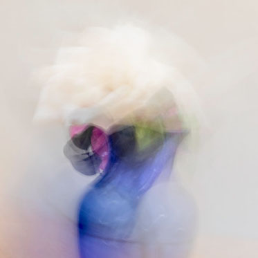
Abstracts are always at the back of our minds, aren't they? It's great to have opportunities to try our wings out on something different and challenging! Henriette, I think you have achieved your goal with this image. I like the vase's tones and hues contrasted with the whiter hues within the image. It is a very pleasant image. But while you are experimenting, I wonder if you have experimented with various crops to the image and what each may do to tell the same story better or a different story (see below). ICM is very challenging and you have to have patience and a very different creative eye, which you have! |
Feb 23rd |
 |
| 76 |
Feb 24 |
Comment |
Gordon, I think the cloud and its color in the sky and reflection add to the image contrasting nicely with the blue hues. The left side has a nice border with the tree and its reflection as do the grasses at the bottom right. The clouds are centered and the repeating triangles of the hills/mountains in the background are wonderful. The sloping hillside coming in from the right helps keep the eye inside the image. The swan (at thirds intersection) takes up space in what would be a horrible void if it weren't there. I don't think it is the "subject" of the image. Gradient ranges at the top and bottom are good. IMHO this would be best thought of as an excellent travel photo, a different genre but an important one. For my title, I would have chosen "Cool, Calm, and Collected" hahaha! |
Feb 23rd |
| 76 |
Feb 24 |
Comment |
Jay, I agree with the tighter crop (see below) and you can adjust the brightness of the snow, lighten up your midtones and darken your blacks by using the Levels in PS to bring in more contrast to the image. Besides that, I think you have a really good image! |
Feb 23rd |
 |
| 76 |
Feb 24 |
Comment |
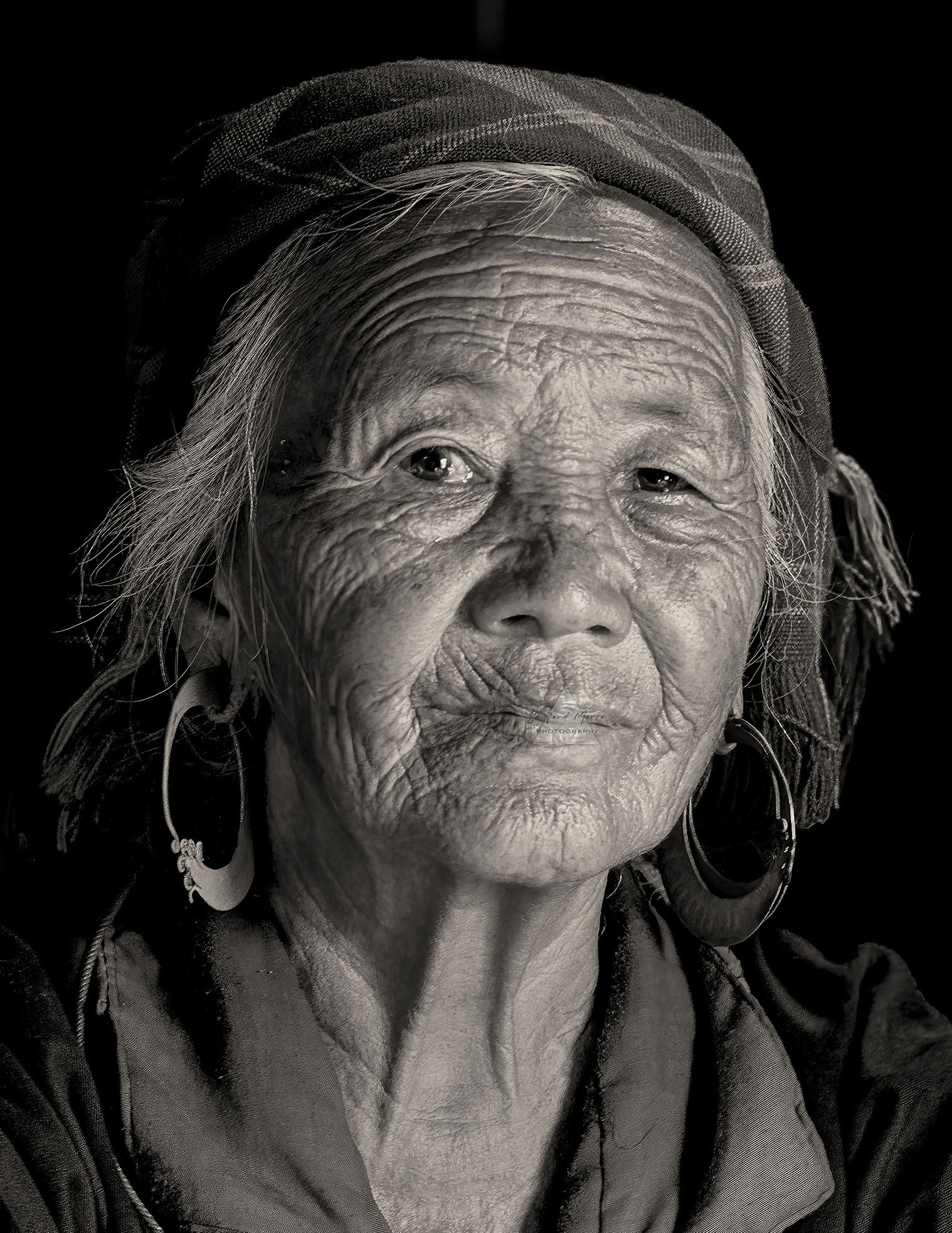
Sanford, you have captured a wonderful portrait that tells a story. If I were to choose a color image, I would opt for the Original 2 as it has the flowers in the background and relates more to the story of the woman. For the b&w, the use of light and dark relates to the story you want to tell. That light and dark is to emphasize or deemphasize. No woman I know likes her neck emphasized (personal first-hand knowledge!). The story here, IMHO, is her face. Also, the background at the right is distracting with the white break between boards. IMHO a crop closer to her face (see below) centers attention on the face and with some burning of the neck highlights and dodging around the eyes would be a better presentation for the b&w. I understand why you'd want to include her necklace, but that is better left in the color version. Powerful b&w Sanford! |
Feb 23rd |
 |
| 76 |
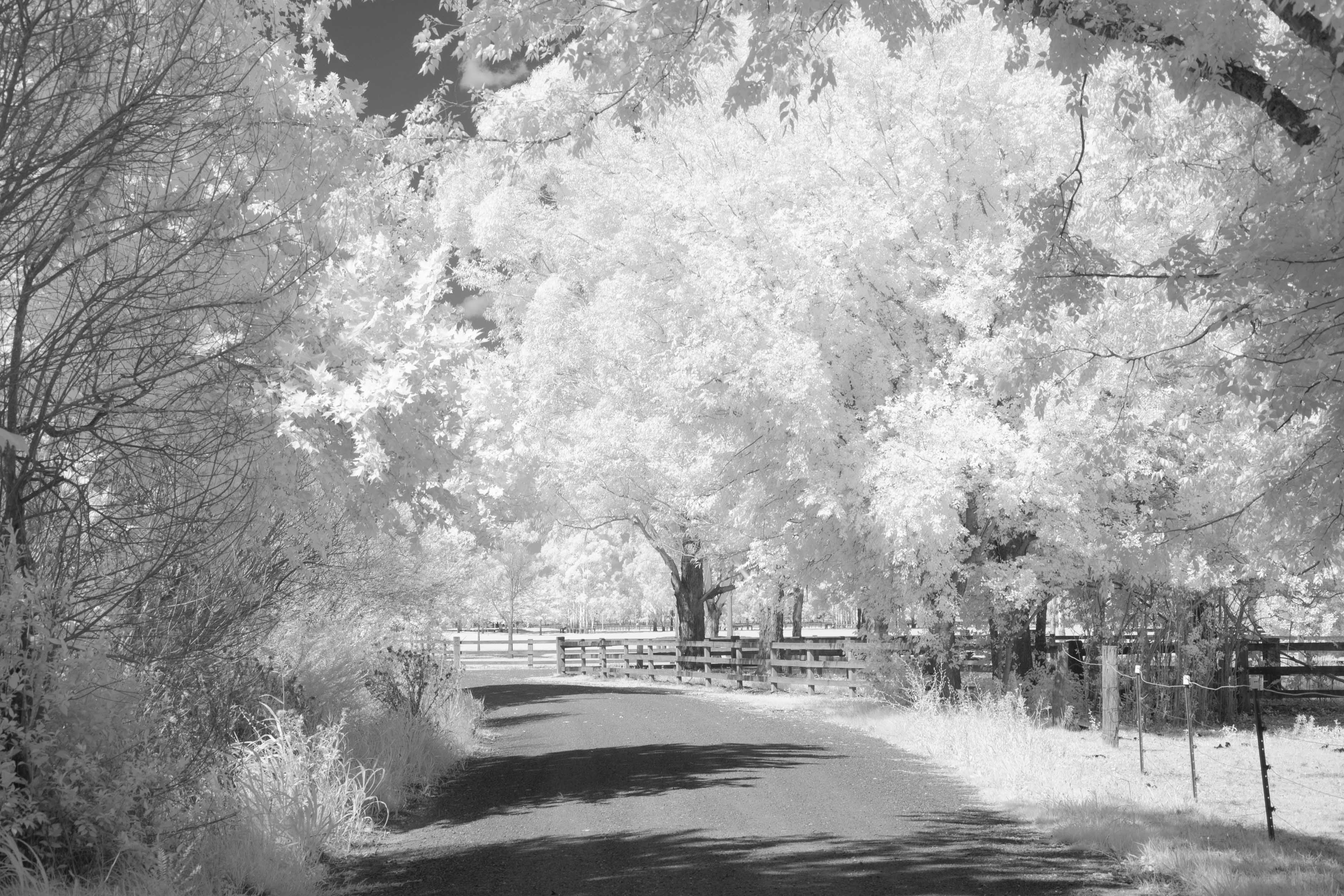
Feb 24 |
Comment |
Infrared is a perfect choice for this image, and you have presented a good composition. IMHO some cropping could do away with the distracting top right corner. Though the sky at the top left mirrors the grey color of the pavement of the drive, I would ask if the sky is necessary or if the image should be cropped down from the top to remove most of it (see below). The tonal contrasts are wonderful, and the road serves as a leading line through the image. The tree branches at the left point back into the image, which is good. Overall, an impressive infrared composition! |
Feb 23rd |
 |
6 comments - 1 reply for Group 76
|
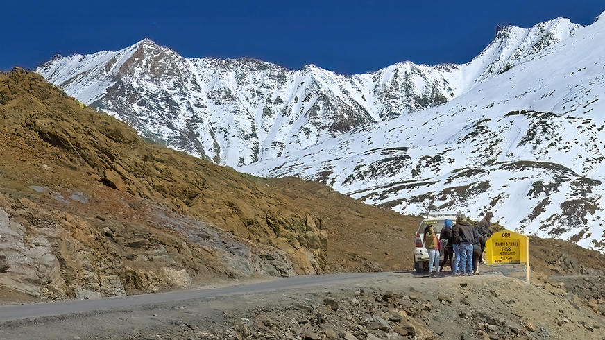
| 88 |
Feb 24 |
Comment |
Sanat, after reading your explanations I quite understand why you have left the tourists in and the sign. This becomes a travel photography image and different "standards" should be applied when discussing its pluses and minuses, which I have done. I think you have captured a wonderful image that relates to a story. My suggestion would be to crop in from the left side (see below), which emphasizes the tourists and sign more and put that focus at the intersection of the bottom third and right third. The road is the leading line from the bottom left and the brown foreground hill returns the eye from the snowy mountains behind to the tourists. |
Feb 23rd |
 |
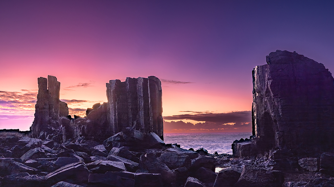
| 88 |
Feb 24 |
Comment |
The transition of colors from the top to the horizon line is wonderful! Then I wondered about where the light should be reflected on the rock pillars with the sun's placement. The large rock face at the right has a proper reflection. However, the two at left seem to have a lighting source that's back behind you somewhere. IMHO I would shade those backsides. Next, I wondered about the abundance of boulders in the foreground and if an aggressive crop would improve the image (see suggestion below). I agree about the tidal pools being too bright and are distractions and with an aggressive crop you can get rid of two of them and then burn out or clone out the smaller one. Once done, I would suggest making this a metallic print! |
Feb 23rd |
 |
| 88 |
Feb 24 |
Comment |
I like the placement of the sunbeams and the position of the sun at the top right for a directional aspect. However, I would ask whether you need that sky across the top and that the image wouldn't be better served by cropping it to the trees in the background. Also, you may want to crop in from the left to match your cropping on the right. Your trunks are well separated where they can create those vertical lines to contrast with the horizontal lines of the water and land. A nice serene scene to capture while out for your hike. |
Feb 23rd |
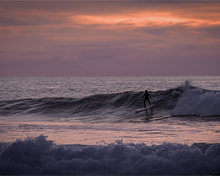
| 88 |
Feb 24 |
Comment |
Charles, you certainly enlivened this image! I love the colors in the sky. Your decision to silhouette the surfer works well for a contrast between him/her and the white of the wave to the right. You also have a contrast of bright/dark from the front to the back creating horizontal areas across and through the image. The wave at the right is balanced by the wave at the bottom left. The horizon line looks level. I would suggest dodging the top of the wave areas where there is reflective light to bring a little more contrast into the image. I understand your wish to have a 16x9 expansive crop but I think an 8x10 crop would better suit this image, so the bottom left wave points the eye back to the surfer instead of tempting the eye to wander off the image to the left. I haven't shot surfers much at a beach as I'm only near a Great Lake! |
Feb 23rd |
 |
| 88 |
Feb 24 |
Comment |
The trees as a border work well here. The two blue chairs draw the eye and the point of land between them directs the eye to the storm. The horizon line looks level. However, the brightness of the top clouds draws the eye up and away from the dark storm "action". I would suggest cropping down from the top and adding a gradient filter to darken what's left above the underlying darker storm clouds. Must have been quite the experience! |
Feb 23rd |
5 comments - 0 replies for Group 88
|
16 comments - 2 replies Total
|


