|
| Group |
Round |
C/R |
Comment |
Date |
Image |
| 56 |
Aug 23 |
Comment |
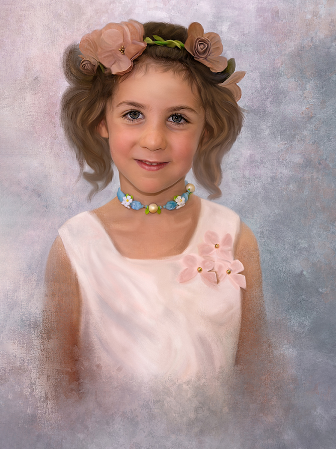
Cindy, I don't think you did an injustice to the hair, I like it - buy I'm a guy, so there's that! The only suggestion I would make is to put some space at left with Content-Aware Fill because the girl is facing straight on so you don't need that much space at right as if she were facing to the right. The face is adorable! |
Aug 28th |
 |
| 56 |
Aug 23 |
Comment |
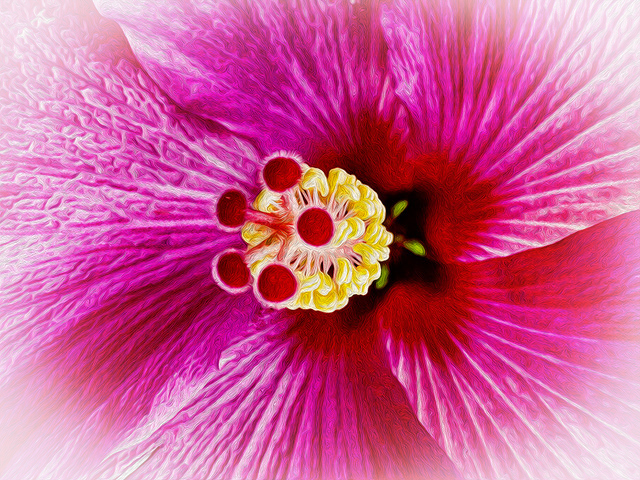
Martha, I've been out this month trying to get water lilies and was glad to see your image. You've done a marvelous job is cleaning up the distractions from the photo. The water lily is nicely positioned off-center and near the top and bottom left thirds. The interior glow is nicely done. If I had to be picky, there seems to be a red/pink tinge to the background white petals that could be lifted so they're more white, but that's artistic taste. If I hadn't been out shooting these flowers, I might not have such a image in mind! I agree with Cindy's suggestion for a crop - but there are several other crops you might want to play around with including 16x9 and square. Use what you think best conveys your story, I don't think you can go wrong. Very nice painting! |
Aug 28th |
| 56 |
Aug 23 |
Comment |
I agree with Cindy that your additions make this a better image. The eye flow is so much better! I can't decide if an aggressive crop would make the attention grabber standout more or a white vignette. At first I thought the highlights at right were too pronounced and then realized what you were trying to do with light direction coming from the left. The action is in the middle and I think you did an excellent job there. |
Aug 28th |
 |
| 56 |
Aug 23 |
Comment |
I agree with Cindy that your additions make this a better image. The eye flow is so much better! |
Aug 28th |
| 56 |
Aug 23 |
Comment |
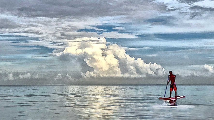
Never thought about how easy it might be to merge 2 images when dealing with an ocean sky! You did this well. IMHO this would be better if you added more area to the bottom by using Content-Aware fill in PS and then cropping down to a 16x9 format. The eye is drawn to the white clouds (which you might bring down the Highlights on so as to not to look burned out) so most of the clouds on top of that formation is clutter - the darker cloud serves as a natural top border area keeping the eye within the image. By cropping to 16x9, you make the paddleboarder more integral to the image. The horizon line needs to be adjusted slightly. A good start a wonderful image! I have attached a quickly adjusted image below. |
Aug 28th |
 |
5 comments - 0 replies for Group 56
|
| 76 |
Aug 23 |
Reply |
Thank you for your comments. No snipping allowed! I have attached a desaturated image. I struggle with brighter/darker lighting when doing prairie and woodland backgrounds, if dark I feel it might appear darker on the wall of a room. I also added to the stems as Jay suggested. |
Aug 28th |
 |
| 76 |
Aug 23 |
Reply |
Jay I agree with your suggestion. I will try and use come Content Aware fill to see what I can create! |
Aug 21st |
| 76 |
Aug 23 |
Reply |
Henriette, I apologize for not proofreading my comments a 2nd time. The word "buring" should have been "burning" as in dodging and burning. I will start writing my comments in a Word doc for better proofing in the future. My apologies for sending you down a rabbit hole you didn't need to go! As to the blurring approach I use, I select a gradient filter in LR then tone down the Texture and Sharpness sliders. |
Aug 21st |
| 76 |
Aug 23 |
Reply |
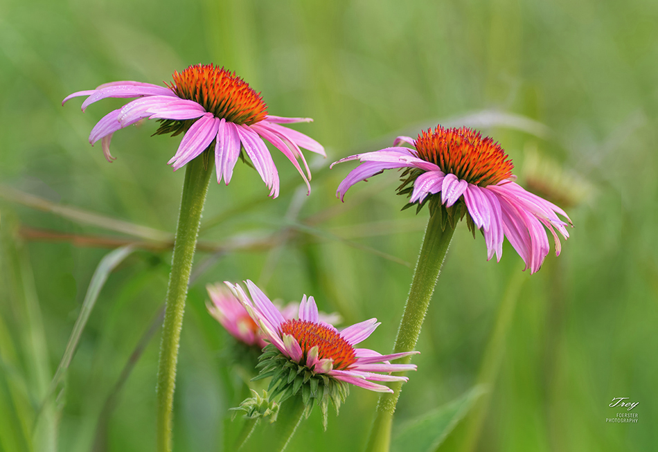
Ian, WHERE I took this will help explain some of your questions. These were taken in a natural prairie preserve for which I have done a lot of work and coordinated funding for through our Rotary club and the local Lions club. (1) three coneflowers are in focus. I could have called it Puple Coneflowers but I feel I must promote treys where I can, two flowers are more mature and the lower third one is a newer bloom. There are 5 coneflowers in this image BTW. (2) Ultimate purpose is to document for (a) educational signage for the preserve and (b) for cards and artwork and possible calendar for preserve fundraiser, not to enter any competitions (which I have soured on at my age). (3) as far as rules, if they fit and enhance the image to my eye, why not? They make the image "comfortable" to the viewer's eye and if they like it they might buy it. One person may not like an image alone on a wall, but put it in a calendar and they love it. My dad had a saying: "Concerning taste there's no dispute," said the Old Lady as she kissed the cow. An old Yale MBA furnitue store owner taught me a lot about marketing when I worked for him for a summer while in college. What is background distractions for you in this image, are background references to people who know the prairie preserve and therefore IMHO provide reference and setting.
Hope this answers your questions! |
Aug 20th |
| 76 |
Aug 23 |
Comment |
I like your corrected version per Henriette's ideas. the descending frame in nicely at the left 3rd vertical and two of the acrobats are along the right 3rd vertical. The lines draw the eye into the action and position of the people gives this image excellentg eye movementg within the image. My suggestion would be to add more drama to the background sky with some dodging. A very nice action shot that you should be proud of! |
Aug 20th |
| 76 |
Aug 23 |
Comment |
An image with a lot of contrast in it so a perfect choice for a b&w whith the tonal qualities you have in it. The peaks are near the upper 3rd intersections. The question is if you need the lower 2/3rds of the image to be the mountain bowl. You may want to try a 16x9 crop to see if that enhances the impact of your story. I think you could add some buring on the bottom 2/3rds to incraese the contrast and thereby the drama of the image. You sky definitely adds drama! You should be proud of this image! |
Aug 20th |
| 76 |
Aug 23 |
Comment |
I love what you have done with the background and the smoke effect. The drama you interjected thru converting to b&w white with b&w dancers was a good move. The tonal quality of the black skin and clarity of face is outstanding. I love this image. But, I also hate to waste red in an image! I wonder what this b&w would look like if only the dress were in color? This image is sharp and soft where it needs to be. Kudos! |
Aug 20th |
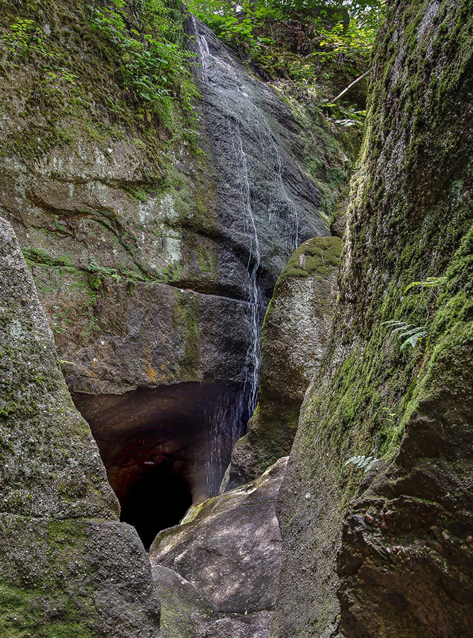
| 76 |
Aug 23 |
Comment |
Jay, so much to work with here. These small falls present a challenge but isn't that why we're doing this? The sharpness due to stacking is wonderful as is the subject. I'm sure there is more water in the spring, and if you didn't take this then, you might want to revisit in that season. The textures of the rock contrasted with the lichen and plants tells such a great nature story. Use that story to make decisions on how to dodge and burn areas to add contrast. To my eye, the story would be improved if you were to crop it as the bottom portion is cluttered. Use the edges of the rock formations to direct the viewer's eye (sample attached). You are refining your eye to Nature and I can see the difference it has made in your image! |
Aug 20th |
 |
| 76 |
Aug 23 |
Comment |
Way to set the background as black, genius! The eyes are close to the 3rd interestions on top and the nose the mouth are centered. Not only a nice capture, but your processing hit the nail on the head. Kudos! |
Aug 20th |
| 76 |
Aug 23 |
Comment |
Kudos Ian, I would change a thing! Hang it on a wall. The peace and tranquility exudes from the image. Did you hear any birds? |
Aug 20th |
6 comments - 4 replies for Group 76
|
| 88 |
Aug 23 |
Reply |
Honken is the family name of the people that own the farm. |
Aug 28th |
| 88 |
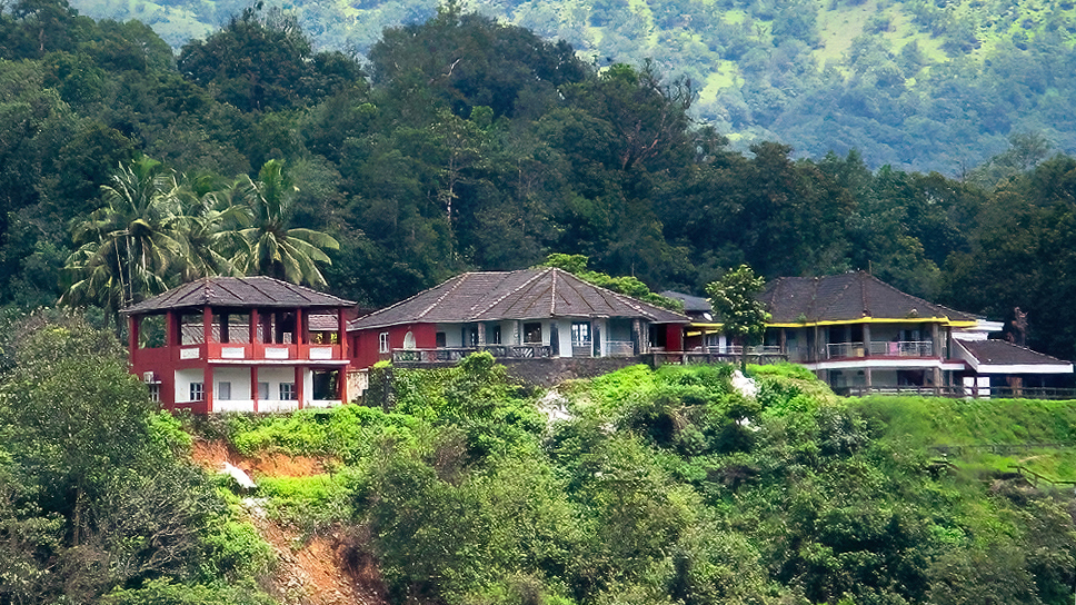
Aug 23 |
Comment |
Your processing certainly gave the image more DOF. This is a horizontal balanced image with the buidings in the middle 3rd. The buildings appear sharp as do the palm trees at left. The story is about the buildings because they dominate the image, as such I would crop to a 16x9 and adjust it so the sky would be cut off. Very interesting informaion about the location! |
Aug 20th |
 |
| 88 |
Aug 23 |
Comment |
Epic image! The contrast of Nature with Man is obviuous and you handled the lighting exceptionally well. The fog area is well placed adding mystery to the image and better contrast to set the ice flow against. This is a horizontyal balanced image with the sky being the top 3rd, the "action" in the middle, and the ocea in the bottom 3rd. The sall ice flow at bottom right is a nice balancing touch. The only thing I wold suggest is to clone out the dark spots on the large ice flow on the white edge below the blue. Kudos! |
Aug 20th |
| 88 |
Aug 23 |
Comment |
With those wheels, these Amish have sport buggies! Their counterparts around me in Wisconsin are more traditonal in their wheels! The buggy sits atop the vertical right 3rd between the 3rd horizontal intersections. I love how youprocessed the landscape. The road takes me down to see an Aish wagon and then down to the hills. From there my eye comes back the telephone/power lines to the buggy. The image also contrasts the "horse power" against the "electrical power" available but not used. You did a fine job on the clouds. Nice action photo from a carriage BTW! |
Aug 20th |
| 88 |
Aug 23 |
Comment |
How are you liking the D7ii?
The sky work here is fabulous and I like how you have separated the foreground from the arched extension. Perhaps you couldn't get the sea stack at top right separated like wise because of certain chellenges where you set up. You have brought out the water color well. This image is more horizontal balance with the sky being in the upper 3rd, the outcropping with the arch in the middle 3rd, witht he 3rd intersections being on the outcroppping, which makes the arch dead lower center and that gives the image its balance. My olny question is why did you darken the massive outcropping so much? |
Aug 20th |
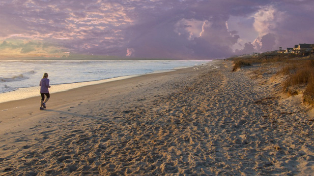
| 88 |
Aug 23 |
Comment |
I wish that you included the orignal so we could look at that to see how you've processed the image. I love the clouds and the hole beckoning the runner. However, I would have used a 400 ISO so the runner wasn't slightly blurred (to my eye at least). I also think that the lower portion of the image is distracting with all the foot prints/ridges and holes. May I suggest a 16x9 cropping (included below)? That cropping would have the sky in the top 3rd, the runne rn the middle 3rd, and also make the smooth sand the leading line. The colors in the sky and water are intriguing and I think you clould bring out more contrast in the clouds. I like the colors of the sky at left above the horizon line. Without the runner, this image would be ho hum, that's how important that element is, so congrats on catching that! |
Aug 20th |
 |
5 comments - 1 reply for Group 88
|
16 comments - 5 replies Total
|


