|
| Group |
Round |
C/R |
Comment |
Date |
Image |
| 56 |
Apr 23 |
Comment |
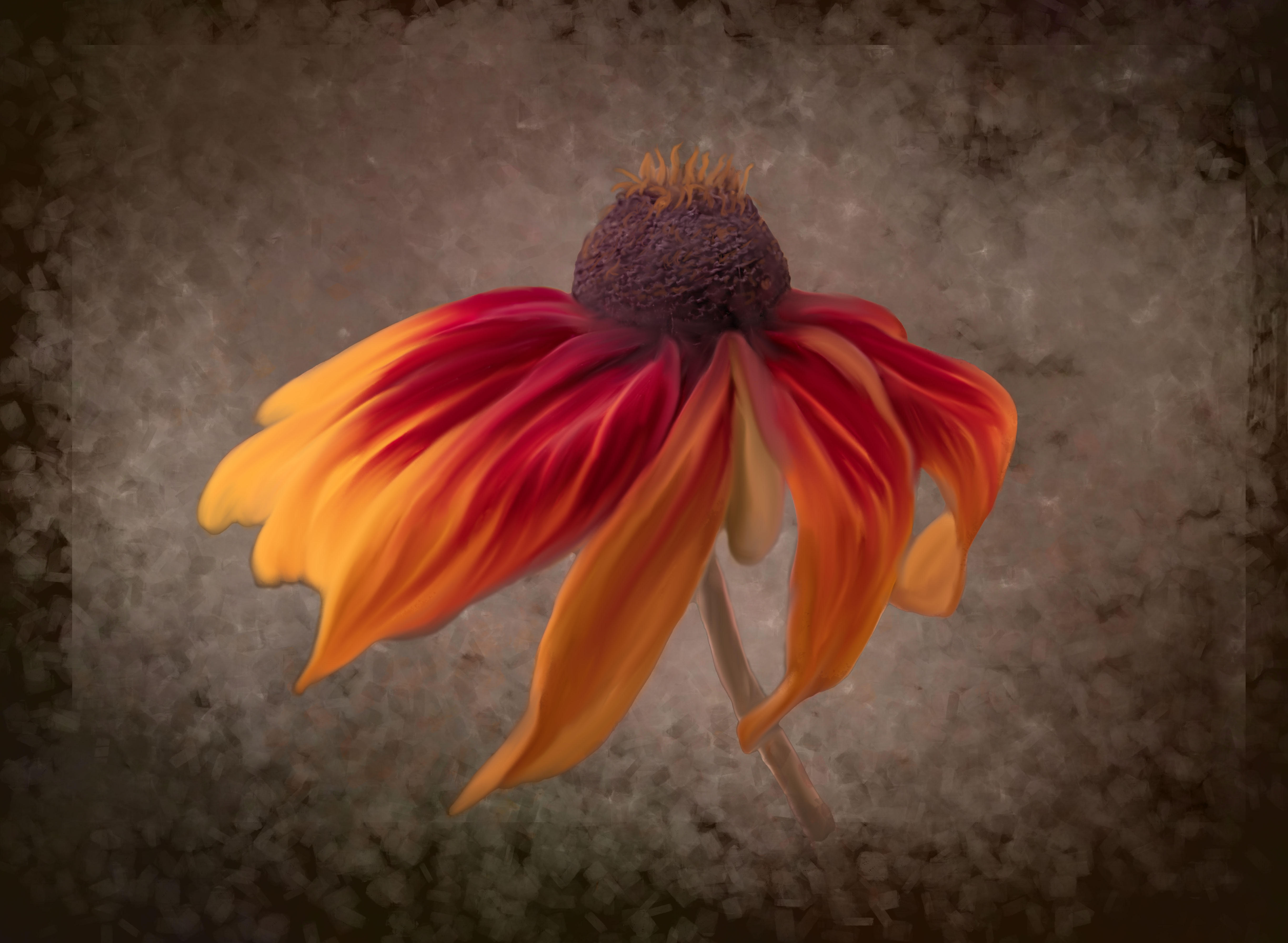
Spray painting artists try to make their "paintings" look like photos, and we photogs try making our images paintings. Cindy, this is a high-impact WOW image - balance, colors, textures, contrasts. Hang it on a wall! |
Apr 23rd |
| 56 |
Apr 23 |
Comment |
Lovely, peaceful, wonderful! Your final image is fantastic. So happy to see how you are advancing in your technique. |
Apr 23rd |
| 56 |
Apr 23 |
Comment |
Love what you have done here! The sky replacement is well chosen. The bottom right "structures" I interpreted as benches so I think they can remain as this is a public square. As far as the flagpole, there's no doubt what it is so it's a personal choice to save or remove. I don't think it detracts. A very nice transformation! |
Apr 23rd |
| 56 |
Apr 23 |
Comment |
Talk about thinking "out of the box"! Very well done. What do you think about the blotch area above your shoulder? Also, congrats on 25 years in PSA!!! |
Apr 23rd |
| 56 |
Apr 23 |
Comment |
This is the second image, Wellbeing 1. |
Apr 12th |
 |
| 56 |
Apr 23 |
Comment |
Martha, I could not get the images to post since it is past the 10th of the month. So I am including them below in 2 postings here. This is the Original image. |
Apr 12th |
 |
6 comments - 0 replies for Group 56
|
| 76 |
Apr 23 |
Comment |
Sophie, there's so many positives about this image: faces sharp and smiling, clothing sharp, each skater has leg lifted with the woman's showing a slight motion blur. The only imperfection - which may not be your fault - is that there is no separation between the women's left arm and the male skater. Your shooting position or timing on your burst shooting could be the culprit. Perfect, no, but to get four nods from judges says a lot! Congratulations! |
Apr 23rd |
| 76 |
Apr 23 |
Comment |
I agree with George's cropping and darkening of the background. Brought back memories of a shirt pattern my mom got me many, many decades ago during "groovier" times. I like the backlighting and think that all of the plants are overwhelming but narrowing it down to 1, or 3, and really get the detailed focus with backlighting would make it snap more. Like anything else, take more photos like this and you're eye will start seeing more opportunities. Great start! |
Apr 23rd |
| 76 |
Apr 23 |
Comment |
LMAO! What a great comic composite. Beautifully done and the enlarger binoculars with subjects on the glass is a hoot! I take my hat off to you Gordon. I might have darkened the upper right "dead" background OR cropped the image from the right to near the brown ferns. But I'm sure you'll play with this one again. Thanks for lightening up my day! |
Apr 23rd |
| 76 |
Apr 23 |
Comment |
Frame it, perfect! |
Apr 23rd |
| 76 |
Apr 23 |
Comment |
This is sooooooooo cool! Both trunks up, the birds trying to land on the tusks, you did a good job of brushing out the elephant trunk and tusks at far right, eyes in focus. Kudos! My only question is: the ground and background of the original are darker, so why did you lighten that element? I would also lop off a portion of the sky as it would enhance the dominance of the elephants. |
Apr 23rd |
| 76 |
Apr 23 |
Comment |
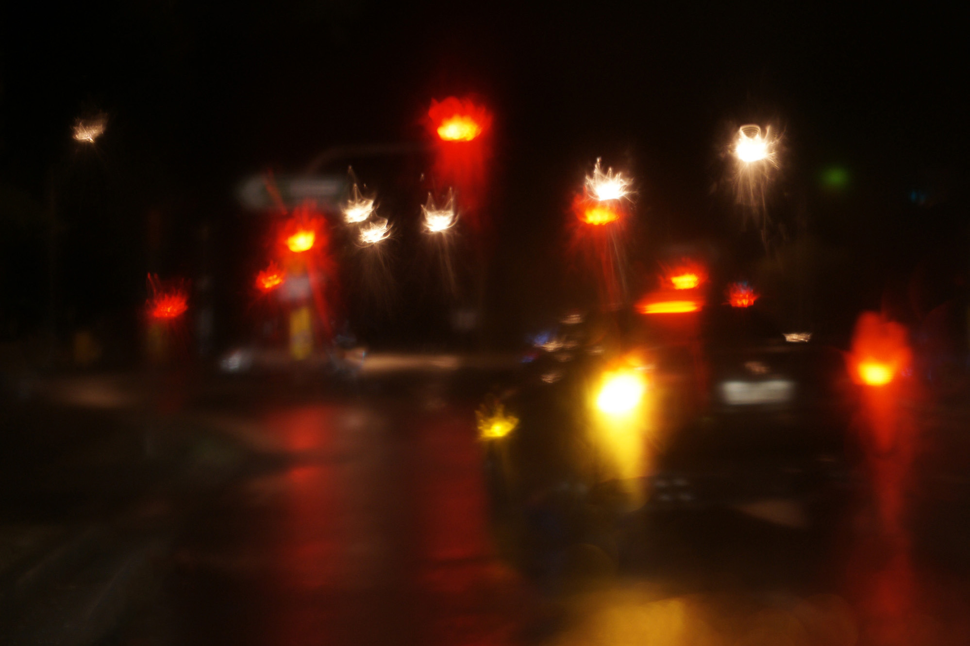
Sitting in a car, alone, at night, in a parking area. Who wouldn't think it was a photographer?! This was a successful experiment and I like the "mood" because it is ingrained in us as something out of a cop show/murder mystery where a car is involved. Why is the car seemingly stopping? What's going on in the darkness of night? Ahh, the mystery of it. My eyes go to the bright lights on the right side first, and so I think are distractions to the subject oof the image. Ditto bright white at lower left. I've attached a cropped version with the left taillight on the 1/3 intersection. I'm going to have to try something like this downtown in our village. |
Apr 23rd |
 |
| 76 |
Apr 23 |
Reply |
Thanks, that's quite a compliment! |
Apr 15th |
6 comments - 1 reply for Group 76
|
| 88 |
Apr 23 |
Reply |
Mark, what was your purpose in including the fence? Did it add to the story you're trying to tell? |
Apr 23rd |
| 88 |
Apr 23 |
Comment |
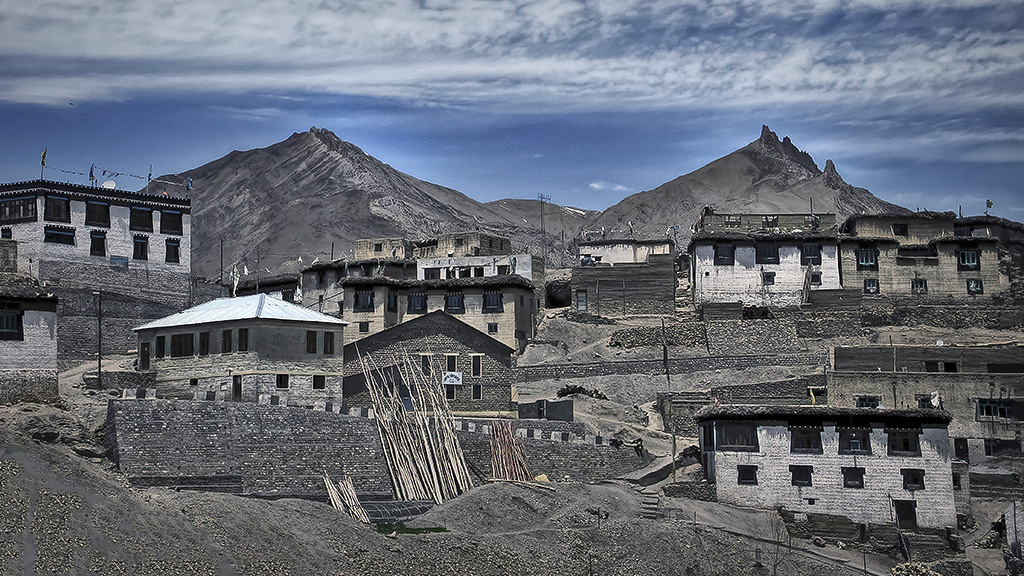
Sanat, you sure get to see some amazing places! There is so much here and you've done a fine job of showing all the contrasts in textures, lines. Like Jacky said, it is flat and I think it can benefit from some dodging and burning so the there is more contrast in lights and darks. The rock edge at bottom left is a distraction so I'd clone that out. Finally, I'd had a bit of hdr for DOF and then crop it to 16x9. I've included an example. Have fun playing with it because this can be a really amazing image! |
Apr 23rd |
 |
| 88 |
Apr 23 |
Comment |
What a great example of thinking outside of the box. Always wonderful to experiment and see what you can get. Besides the noise, as mentioned above, I'd crop in from the right so that bright area is removed - bright spots draw eyes. Then the Washington Monument would be the the draw. Nicely done! |
Apr 23rd |
| 88 |
Apr 23 |
Comment |
You're dealing with direct light, reflected light, and shadow - and the challenge to contrast them to set the mood for what you want to depict. Add to it the grunge of the ceiling and walls. IMHO if you add blue to the skylight, then the light on the floor beneath should have a blue tinge to it. Blue also makes the scene colder. So much to play with here. I think you've done a good job with the framing and horizontal and vertical lines. It fits the story you want to tell! |
Apr 23rd |
| 88 |
Apr 23 |
Comment |
What a gorgeous view - Connecticut's Cow Country. Used to catch ice cream and burgers at Litchfield Farms franchise when I was in high school. You went for a center-weighted image with the fir tree in the middle. Wonderful vista image but the dark fence is a distraction. But if you lighten it up, it can be a good contrast to the shapes of nature. I think you should crop off the right side (bringing the fir tree to the right 1/3, and tone down the higlights and bring up the shadows like the sample attached. Jacky's idea of cropping off the fence entirely is also good advice. |
Apr 23rd |
 |
| 88 |
Apr 23 |
Reply |
Jacky, thank you for your CC, I appreciate it. The 1/3 horizontal line is right on the heavy yellow corn strip just below the farm buildings, which occupy the middle horizontal third. I got the silo as close to the intersection of the right and upper third lines. I often ponder how much corn stubble to include in an image. It offers texture and contrast, but it's not the most pleasant thing to look at. |
Apr 18th |
4 comments - 2 replies for Group 88
|
16 comments - 3 replies Total
|