|
| Group |
Round |
C/R |
Comment |
Date |
Image |
| 56 |
Mar 23 |
Comment |
WOW! Steampunk was what I first thought of. Extremely well done and the background you create is phenomenal. I agree with Nancy, exceptional eyes and face. Kudos! |
Mar 25th |
| 56 |
Mar 23 |
Comment |
Sharp eye, check. Facing right, check. Your treatment of the head is very well done. Though not using the Rule of Thirds, your diagonal and triangle overlays converge on the body of the bird. A very nice painting with the tonal cohesion. |
Mar 25th |
| 56 |
Mar 23 |
Comment |
Gerhard, I like the way you zoomed into the subject in this image. There is great contrast with the vertical hair of the mane, the patterns of brown, and the background texture. I agree with the more square crop by Nancy and the suggestion about the eye. The bird also sits on the left and bottom third, which is great placement. A nice painting! |
Mar 25th |
| 56 |
Mar 23 |
Comment |
I really appreciate the DOF you achieved by use of the Topaz preset. It also helps draw attention to the subject. I would add more space to the top of the image so the subject isn't crushed by the border of the image. When you mentioned he was writing "peace", the first thing that came to my mind (guy thinking) is that the red represented blood splatter. You can imagine the subsequent questions someone would ask about the man - was his killed in some foreign land that suppresses free speech, critcism of government, etc. Does the viewer know this was at a Lunar Asian Festival - we all do in this group, but not the public-at-large. I do like the process and end result of the composition as it showcases the subject well.
Maybe I watch too many cop shows and murder mysteries ... |
Mar 25th |
| 56 |
Mar 23 |
Reply |
Great suggestion Cindy, thanks! |
Mar 13th |
| 56 |
Mar 23 |
Reply |
Thank you so much Marge! |
Mar 13th |
4 comments - 2 replies for Group 56
|
| 76 |
Mar 23 |
Reply |
Ah, foregrounds in farm country in the snow are a hard thing to find! Some of the countryside has contours, which show up nicely in the morning or evening. This was taken across a flat field. Below to Ian's comment, I think that lopping off half of the bottom would be appropriate and mitigate the question about texture. |
Mar 25th |
| 76 |
Mar 23 |
Reply |
I can't imagine my wife's reaction to me asking her for pantyhose! As to the bottom of the image, you asked a pertinent question. Scenes like this pander to the high key photography side and the bright snow field at bottom helps gives perspective to the cloud coloration at top. Perhaps half of the bottom could be lobbed off without any loss to the image's impact or balance. Thanks for pointing that out! |
Mar 25th |
| 76 |
Mar 23 |
Reply |
You're correct about the exposure compensation - I forgot about it. Thank god for LR and PS! I also have shot with WB on flash without actually using the flash and that seems to work. With snow, I tend to overcompensate so that I don't blow out highlights. |
Mar 25th |
| 76 |
Mar 23 |
Reply |
Great lens for the price. |
Mar 24th |
| 76 |
Mar 23 |
Comment |
Nice capture of this "biblical" image! I say biblical because it fosters within me the occurence when God would speak from on high. Nice foreground, I like the white of the water contrasted with the dark rocks. As far as the clouds, less is more as suggested above. If I had a wish, there'd be a ship on the horizon in the middle of the left third line, but sometimes wishes can't come true! Well done! |
Mar 24th |
| 76 |
Mar 23 |
Comment |
Dahlia flowers are the best to photograph! They have so many stages to their bloom and this week I just processed one too! Great minds think alike. The image looks like you gave it a canvas or concrete texture, which fits the mood. The softness is also very nice given the colors of the flower. I like the way you processed this image, it is so delicate! The middle is off-center, why? Would a tighter crop to minimize the green background be beneficial? Would a square crop have a better impact? Does the center ball of the flower need to be strategically sharpened to provide additional contrast? These are questions I asked as I processed my image, which I have shared so you can see my take on a mature blossom. Different tastes as to texture, but both softening from the center out. |
Mar 24th |
 |
| 76 |
Mar 23 |
Comment |
Outstanding pano nd excellent PP. I agree, clone out the cars and dim the city lights and maybe burn the horizon maountain line to create more DOF. A very well done image! We have Nortthern Lights here last night, nothing like this though. The foreground rocks don't bother me but I'd dim the reflected light on them a tad too. |
Mar 24th |
| 76 |
Mar 23 |
Comment |
WOW!! Kudos! No suggestion for imrovement. What brand is your 14mm lens? |
Mar 24th |
| 76 |
Mar 23 |
Comment |
A very action-packed image that tells an interesting story. The lion is at the intersection of the left and bottom thirds. If you made this into a 16x9, you'd chop off a chunk of the sky without losing anything. I'd burn the bottom foreground and the line of the trees on the horizon to create more DOF. In PS, add more space on the left so the animals legs have room to breathe. By blurring the beasts, you have told the viewer that the story is about the lion. You can also dodge the lion's shaded portion a tad to bring out more texture. |
Mar 24th |
| 76 |
Mar 23 |
Comment |
Very good job in shooting to get that sharpness. I would have gone up to 1200 if neede but 640 seemed good. Ditto on the colors of the sails brodered by white ones, nice touch. I'd burn the tress a tad in the background left to create more DOF. Yes, play with the sky but you might want to lob a portion of it off from the top - the action isn't there but on the water so it's not really important to the story. Excellent capture for the conditions in which you shot! |
Mar 24th |
| 76 |
Mar 23 |
Reply |
Thank you, I went to the website, I don't know if it is in business any longer. |
Mar 15th |
| 76 |
Mar 23 |
Reply |
Henrietta, I did get out of the car and used a tripod. What is the name/model # of the window device thazt you use? |
Mar 14th |
6 comments - 6 replies for Group 76
|
| 88 |
Mar 23 |
Reply |
Mark, as in a response above, on my computer the sun is not blown out (no red in it on the histogram). This brings up the question of how "dull" such an object has to be not to be seen as "blown out". I reduced it with a radiant gradient in RAW. There is no "definition" to be regained in such an instance, so what is the measure? I struggle with that. |
Mar 28th |
| 88 |
Mar 23 |
Reply |
Thank you Sanat! I rather liked the deer trails in the snow and felt it added some texture to the snow. |
Mar 26th |
| 88 |
Mar 23 |
Reply |
There are two barns in the image, one with a silo on the right. It's rare to see such a setup in my neck of the of the woods and that's why winter is the best time to capture this particular locations. You, Brian, and Jacky both indicated that I should have left the cornstalk stubble in the image. What does that add - a more definitive foreground, a contrast of shapes, or just a border? Corn stubble isn't appealing to me a country boy. As to the sun and "blowout", that's something I have been watching so highlights are not blown out - despite what some judges may see in competitions! I did reduce it with a circular gradient in RAW but it's always hard to determine how much of the light you want to diminish. How do you decide? |
Mar 26th |
| 88 |
Mar 23 |
Reply |
There are two barns in the image, one with a silo on the right. It's rare to see such a setup in my neck of the of the woods and that's why winter is the best time to capture this particular locations. You, Brian, and Jacky both indicated that I should have left the cornstalk stubble in the image. What does that add - a more definitive foreground, a contrast of shapes, or just a border? Corn stubble isn't appealing to me a country boy but I am interested in why urban dwellers may find it adds to the image. As far as a crop, I intentionally wanted the 2 triangles of the roof lines and the cylinder of the silo adds to the contrast of shapes. Unfortunately, there is a road to the right of the image that I didn't want to show. I am interested in the your thoughts of crop. Thank you. |
Mar 26th |
| 88 |
Mar 23 |
Reply |
There are two barns in the image, one with a silo on the right. It's rare to see such a setup in my neck of the of the woods and that's why winter is the best time to capture this particular locations. You, Brian, and Jacky both indicated that I should have left the cornstalk stubble in the image. What does that add - a more definitive foreground, a contrast of shapes, or just a border? Corn stubble isn't appealing to me a country boy but I am interested in why urban dwellers may find it adds to the image. Thank you. |
Mar 26th |
| 88 |
Mar 23 |
Comment |
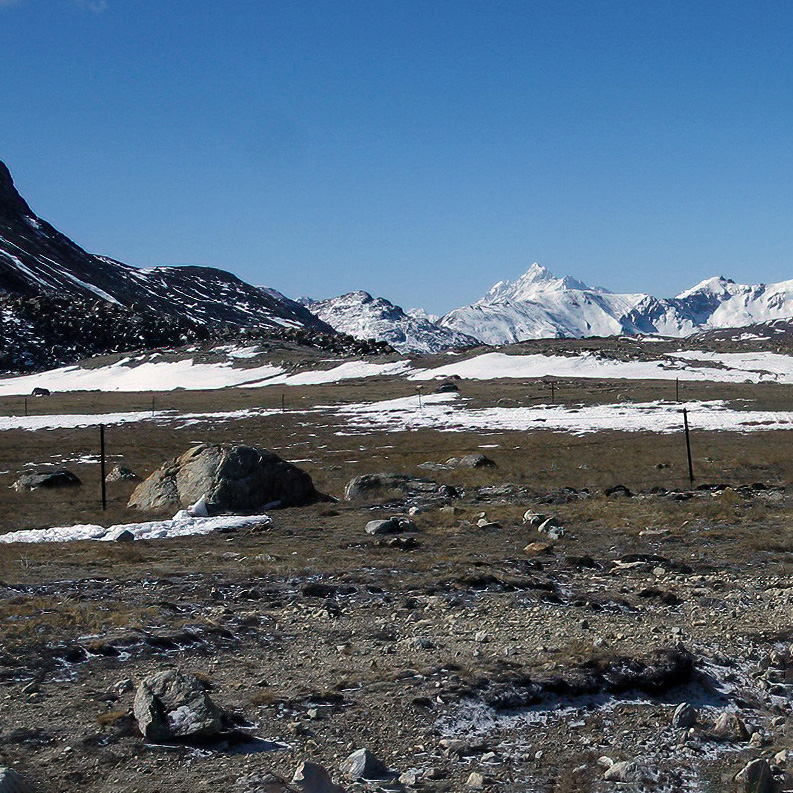
This is a documentary photograph. It is what it is. The roadway at right is a distraction and it would have been better to position yourself so it wasn't in the photo. Perhaps you could have gotten down closer to the ground to zero in on the vegetation as that seems to be what this ecoregion and your story is about. Perhaps and 8x10 or square crop would be better to focus in on the ecosystem. In this square crop below I put the third lines at left on the bouler and at right on the snow-capped mountain. |
Mar 24th |
 |
| 88 |
Mar 23 |
Comment |
What a wonderful experience, made it worth the hike! I love the textures of the rock walls and the sfats of light have that mystical element to them. Keep in mind where your light source is coming from - in this immage its to the front by the rays. Wall faces reflecting that light is where the image should be light. Wall faces on the backside of that shouldn't be so light. The foreground face at left IMHO should be darker, ditto down that lefthanded side. Contrast of light and dark is so very important in creating the drama of time and place in this story. It will also emphasize the rays more. In the orignals, the water is more placid, why did you add texture to it for the final? I love the green reflected light in the water! Finally, I'm not sure about the large muddied black at top right - can you pull out any detail there a lighten it a tad? Your image is spot-on sharp! Such a wonderful image to have captured, I'm jealous. |
Mar 24th |
| 88 |
Mar 23 |
Comment |
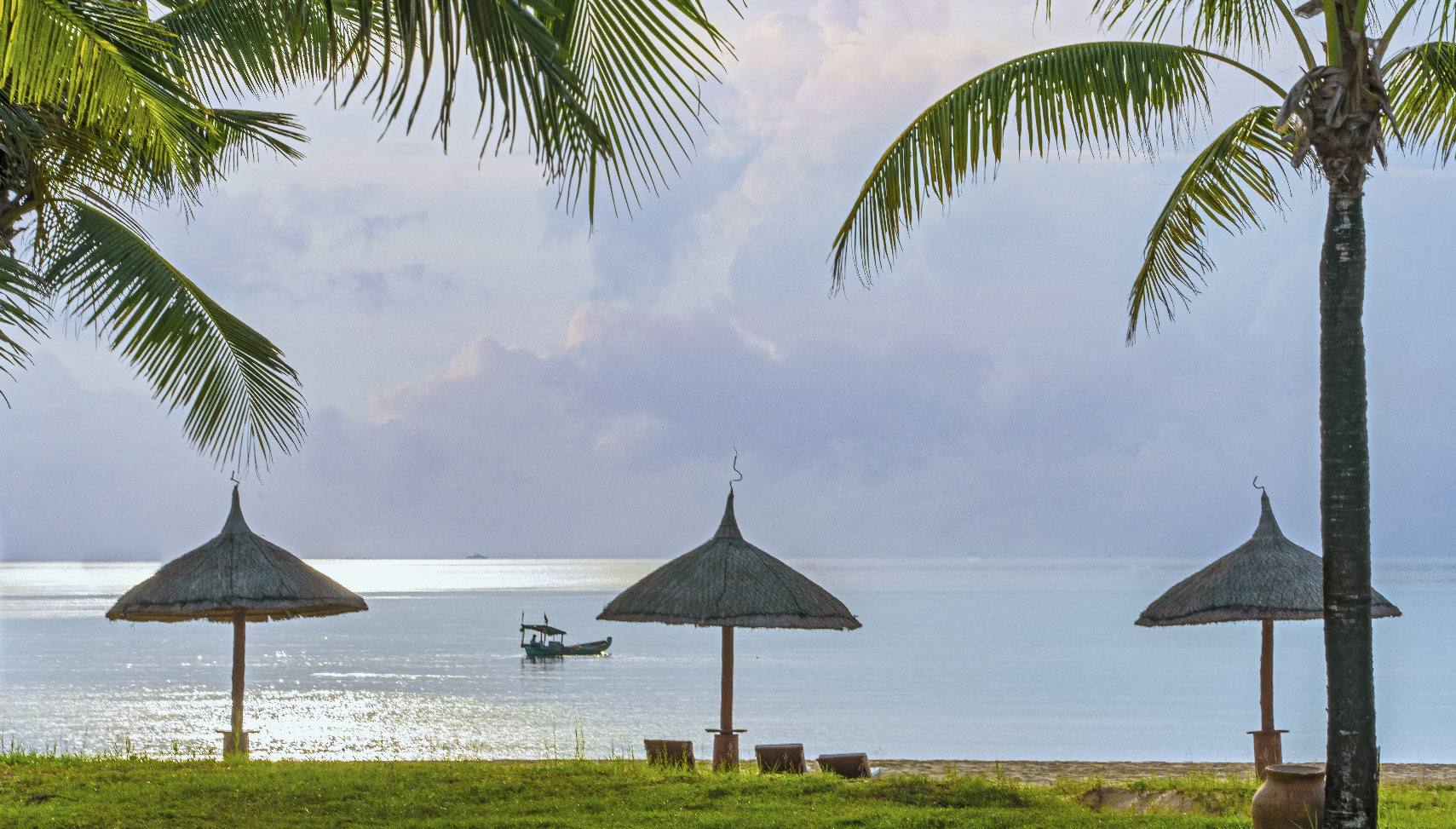
Very good choice to change from a silhouette! I like the magical number of 3 umbrellas and the fishing boat under one. The tree palms nicely pprovide a top border. I have attached an image where I have added drama to the clouds and taken out the distratcions of the other boats on the water. The center umbrella even has 3 chairs under it! Magical, magical! Your travels sure take you to intersting areas. |
Mar 24th |
 |
| 88 |
Mar 23 |
Comment |
My first impression of looking at the image is tha it's about the trees and the sky is a background to it. But your poem deals with the sky. I think your PP is wonderful. What is the light in the lower third from? Seems a tad too bright to my eye and I think reducing the brightness/luminance would be less distracting because it calls attention away from the stars in the sky. I think a 9x16 crop lopping off the right of the image would emphasize the sky a lot more and the trees below would more strongly push the viewer's eyes to the stars. I do like the blues and greens. |
Mar 24th |
4 comments - 5 replies for Group 88
|
14 comments - 13 replies Total
|


