|
| Group |
Round |
C/R |
Comment |
Date |
Image |
| 56 |
Jan 23 |
Comment |
Hilarious! Very well done. I love the various angles in this image and the circular motion with the bottles and chimney. Maybe don't send out a Christmas card next year, send out a post for Twix Week!!! Kudos! |
Jan 17th |
| 56 |
Jan 23 |
Comment |
Ditto on what others have suggested. Remember, this is a journey and we all are still learning and growing in the application of this art form. Your water textures are very good! |
Jan 17th |
| 56 |
Jan 23 |
Comment |
B&W certainly brings out the texture of the skin of the elephant. I also agree about the background. Since Africa has a lot of flat land, perhaps leave the foreground reflections in the water. Then in LR choose your Subject for a gradient, then reverse, mask out the water below and then adjust the background to make it much lighter and mimick heat waves off the ground. Just a suggestion. |
Jan 17th |
| 56 |
Jan 23 |
Comment |
I like the desaurated tone of the image and agree with Cindy about the red object - since it is about a lady and her oranges, maybe make that color orange? I also agree with Gerhard about the statue's hands, and as I am not sure hw you could have moved either right or left or down, I don't know if the angle could have been better. For me the image is a contrast of lines, so the star at left adds to that contrast. The preset you chose was very good for this story. |
Jan 17th |
| 56 |
Jan 23 |
Comment |
I really like the finished product. It's a great cross between photogrpahy and art, truly paintography. For food art, I think the vignette works well if this is intended for a brochure or window posted or perhaps a Facebook advertisement. I especially like that the front cup's foam, whipped cream are sharp and makes sure to the viewer that this is the story, the focus. Kudos! |
Jan 17th |
| 56 |
Jan 23 |
Reply |
As to the brush I used, Martha I use presets in Topaz Studio and add these in layers with some masking. |
Jan 17th |
| 56 |
Jan 23 |
Reply |
Your suggestion for rule of thirds puzzled me since the bee is on the intersection both the regular rule of thirds and golden rule of thirds. Glad you included the cropping to better envision what you were saying. This then leads tgo a discussion if a square or 8x10 crop would be better. |
Jan 15th |
5 comments - 2 replies for Group 56
|
| 76 |
Jan 23 |
Comment |
For what you intended to capture this is a success. The blurred rider gives a sense of action and the rider with thunmbs up is sharp as it the tunnel. Nice contrasts with light/dark. |
Jan 27th |
| 76 |
Jan 23 |
Comment |
The result is what makes/breaks ICM. Did you fulfill your artist's eye? The colors are vibrant and I think this is successful. No suggestions for improvement. |
Jan 27th |
| 76 |
Jan 23 |
Comment |
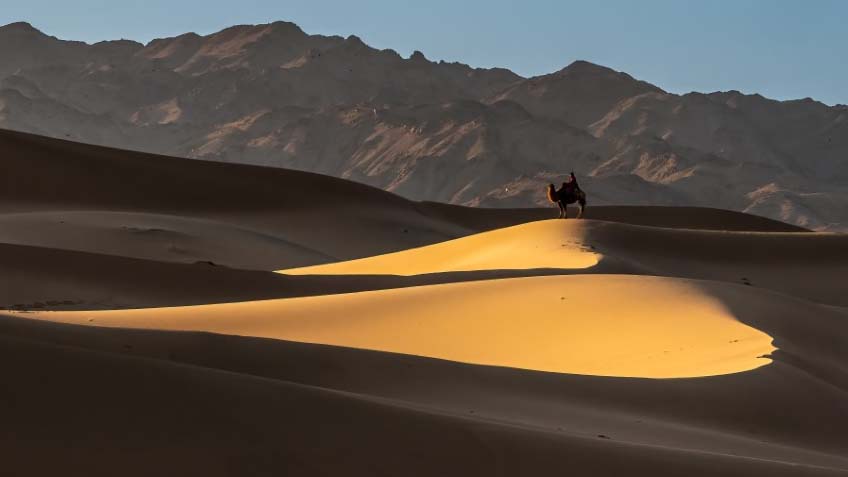
The light/dark contast here are epic and the camel and rider for perspective is fantastic! Sky, schmy - crop it off! Place the camel at the interestion of the top and right 1/3 lines (see image). This cropping is also close to the the beginning of the bright light and emphasizes the the many hill diagonals creating more DOF. Your tonal range for the sands is right on, kudos! A magnificent compsition. |
Jan 27th |
 |
| 76 |
Jan 23 |
Comment |
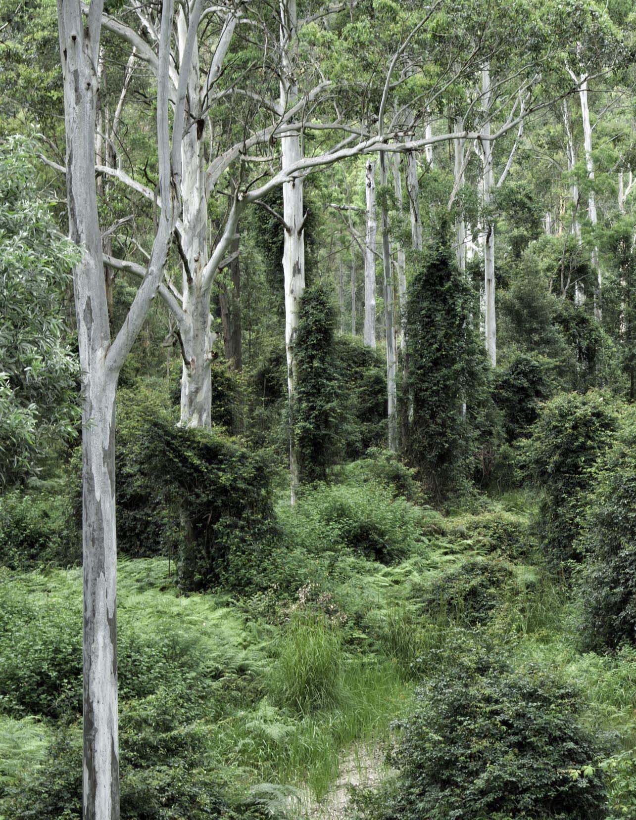
The "biggest thing" to overcome in this image is the large foreground bush. The white tree trunks and the very dark green shrubs in the back create a nice contrast of light/dark and also linear/conical. In the color versio, the light green provides another contrast and in your b&w version I think could be lightened a bit for more contrast. Successful b&w is the contrast between white, grey, and black plys some important doging and burning al la Ansel Adams. You may want to try a verical crop. Fun image to play with, gives me an idea or two for some shooting in woodlands! |
Jan 27th |
 |
4 comments - 0 replies for Group 76
|
| 88 |
Jan 23 |
Comment |
I watched Bull diving competition off this structure on TV a couple of years ago. You chose to grunge this image up a tad because of the concrete and that certainly adds more texture to the image. The image is about the modern lines, their intersections and conflicts. Since the background is reflected in the windows I would have opted to have that background blurred more - much like taking a photo of a reflection in water and detailing the reflection rather that what is reflected. This would bring out that portion of the window more dramatically, but that's my eye/vision. Your main background building benefitted from some dodging for the highlights on its face. The buildings behind it and the street, in my opinion, should be more shadowy to create more of a contrast area beetween the background building and the foreground building. A very well composed shot! |
Jan 27th |
| 88 |
Jan 23 |
Comment |
The DOF is excellent and the contrast between the foreground and midground is good as well. The tree at left could benefit from some more breeathing room but perhaps there was something you chose to crop out, as is so often the case! The pine trees and mountains both have triangular shapes, which contrtast with the horizontal rectangle of the foreground. The ski is what it was. However, I think you can burn the shadows in the mountains to create more contrast, especially behind the tree at left. A wonderful capture. |
Jan 27th |
| 88 |
Jan 23 |
Comment |
Very interesting image and I think picking out the classic car was a great choice. The car, street light, and cloud behind counter balanced the monument on the Golden Thirds. I agree that you darkened a tad bit more - which bring forth the question, were you trying to silhouette everything but the car? If so, perhaps making the background b&w while retaining the color of the car might be an interesting option. I really like inclusion of the reflection. You may also weigh cutting off that building at far left and the light in front of it, then crop in from the right to about the first light. So many contrasting geometric shapes! |
Jan 27th |
| 88 |
Jan 23 |
Comment |
The large observation decks are at the 1/3 vertical and horizontal intersection and the red stands out well and the desking gives a sense of perspctive to the image. To my eye, the top of the falls looks good but the whole middle of it needs some more contrast, similar to what you would do with clouds to separate the mist from the fall water. The birds are a nice added touch! |
Jan 27th |
| 88 |
Jan 23 |
Reply |
Mark, I used a Nikkor 18-200 1:3.5-5.6 G ED DX. It's my standard lens. The "softness" is achieved via a painting preset in TopazStudio that I used at about 10-15%. |
Jan 24th |
4 comments - 1 reply for Group 88
|
13 comments - 3 replies Total
|