|
| Group |
Round |
C/R |
Comment |
Date |
Image |
| 56 |
Dec 22 |
Comment |
Just beautiful as always! I like the difference in coloration of the large bell with the smaller, lighter bells surrounding it, then darker bells behind to create DOF. The evergreen accents around the base provide nice contrast to the round shapes of the bells. Kudos! |
Dec 20th |
| 56 |
Dec 22 |
Comment |
A wonderful subject and the contrast between man and nature tells a good story. I have a few questions: (1) Why did you choose to make the truck blurry? (2) Why did you choose to make the flowers blurry? The story is about the truck, so having it blurry as opposed to clear tells me what? If its a statement about how nature and man historically aren't align and in focus/concert with one another, then you have achieved that result. Why did you choose the canvas look rather than the painted look to tell this story?
|
Dec 20th |
| 56 |
Dec 22 |
Comment |
Extremely well done, from the eyes to the claws and the lizard! My only suggestion wold be to leave more space around your image at left so the wings feathers are scrunched in. The clouds add a nice touch too! |
Dec 20th |
| 56 |
Dec 22 |
Comment |
Nancy, I really like what you have done. The bird sits at the intersection of the top third and right third of th eimage, and the limb is the leading line into the image. The dark brown at bottom left balances nicely with the bird at top right. |
Dec 20th |
| 56 |
Dec 22 |
Reply |
The image sent was 8.77K in size. Submitted images should ideally be about 500K to enlarge and magnify for viewing. |
Dec 20th |
| 56 |
Dec 22 |
Comment |
Another out-of-the-box view this time of holly and berries, nicely done! I like the cartoon background chosen and it contrasts nicely with the original holly and berries at center. Very creative. |
Dec 20th |
5 comments - 1 reply for Group 56
|
| 76 |
Dec 22 |
Comment |
This is a very strong image with contrasts of color, shapes, and light. Yes, there are many images within this image and that will be a fun thing to play around with. The bright color is the weight of the image so you need more on the left to compensate for it, so 'd be against cropping that side. Very well done! |
Dec 20th |
| 76 |
Dec 22 |
Comment |
Nothing wrong with looking at the south end of a bird! Ever look at the back of a car? Lots of design goes into it. I can't say as I've ever seen an Egret from this angle. Your image tells a wonderful story no matter what color the sky is - that's for you to decide. The feathers are strong, you can see the eye of the femal, and the foliage makes a nice border. |
Dec 20th |
| 76 |
Dec 22 |
Comment |
Very well composed, the church is on the Rule of Thirds. The sun at right doesn't bother me - my eye s attracted there, goes down tot he reflection, the rocks point to the church, and the clouds bring me back to the sun. That's circular movement. I would however ask you to look if you can crop the seaweed residue off the bottom and a corresponding amount off the top and it would clean up the foreground IMHO. I don't know the rules of the competiton, but if allowed I'd dodge the church a tad, the tweo rocks in the foreground reflecting the light. |
Dec 20th |
| 76 |
Dec 22 |
Comment |
A nice colorful composition that contrasts the shapes of nature against the shapes of man. Cropping is very subjective and you can play with what's been suggested above. IMHO I would have juiced the colors either in Luminance or Saturation a bit more. The dangling blue rope doesn't bother me as it is in it's natural setting and is part of the story, IMHO. Along with that I'd lighten the shadows a tad so as to enhance the colors. This also offers a future abstract next time you're at this location by getting up close and getting 3-5 hulls in the frame with the curves, shoot both vertical and horizontal. |
Dec 20th |
| 76 |
Dec 22 |
Comment |
Nice action shot. The 3 birds form a triangle that point to the main subject. I agree with Gordon about the yellow tone - did you intend to warm it up? Main subject is on the Golden Rule of Thirds. |
Dec 20th |
| 76 |
Dec 22 |
Comment |
Ian, very well composed. The rock ledge points out toward the sun, the horizon is level, rocks at right point toward the sun, the clouds are well presented. Did you use a polarizer? |
Dec 20th |
| 76 |
Dec 22 |
Reply |
Which leads us to the purpose of a vignette: To direct the eye to the subject of the image. It should also fit the concept of dark and light rotation through the image. I get what you see. |
Dec 12th |
| 76 |
Dec 22 |
Reply |
Gordon, it was focus stacking: forerground, mid ground, background. As to the strength of the vignette, it was at the suggestion of a landscape photo instructor I took a course from. |
Dec 12th |
6 comments - 2 replies for Group 76
|
| 88 |
Dec 22 |
Comment |
What a cool scene to be able to photograph! You have triangle shapes, slope lines, contrast between light and dark. There is so much going for this image and you have improved on the original. I would suggest going with a vertical crop "to the action" and then apply more contrast through Curves or Layers for the white and black, then adjusting for the middle. It would put more drama into it. |
Dec 20th |
 |
| 88 |
Dec 22 |
Comment |
A very well composed image. Foreground structure at right third, but the lower right roof line is too close to the right side. Nice to lighten the shadows of the foreground so we can see the trees. The whiteness of the cloud and top of Fiji are excellent and I like the sun glow at left and darker sky for contrast. Why did you brighten the city below so much? The mountain is sharp. Wonderful image! |
Dec 20th |
| 88 |
Dec 22 |
Comment |
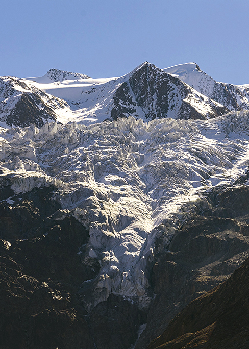
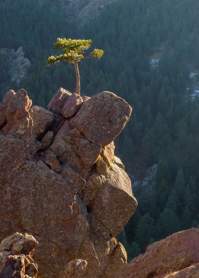
Wonderful subject! There are so many great elements about this image, the light, the contrast with the background, the DOF from front to back. However, the balance of the image is off as a horizontal - no rule of third, diagonals, triangles, etc. Since the story is the lone tree, I would suggest a vertical crop and then clone out the backpacker at lower center. |
Dec 20th |
 |
| 88 |
Dec 22 |
Comment |
You achieved what you set out to do! Nice PP especially iin the water of the falls. Here's a link to change to color of anything in PS that might be a little easier than the process you went through (https://www.youtube.com/watch?v=baW9jj0gs0w)
The person also gives that sense of scale. Kudos! |
Dec 20th |
| 88 |
Dec 22 |
Comment |
The Lake District is the most over photographed square mileage on the planet I think! Beautiful and so many vistas. This image has the most the buildings at the intersection of the right and lower thirds. Your horizontal thirds are pretty good too. The contrast of light to dark going up the image is well done. The star of the processing was bringout out the pasture with hay bales in it. Nicely composed and processed image! |
Dec 20th |
5 comments - 0 replies for Group 88
|
16 comments - 3 replies Total
|