|
| Group |
Round |
C/R |
Comment |
Date |
Image |
| 56 |
Nov 22 |
Reply |
Thanks Pat! |
Nov 26th |
| 56 |
Nov 22 |
Comment |
Cindy, this was a success! Do you know that there are painters who try and make their paintings look like photos? The eye especially is better than the original. Paintging adds a softness, fluffiness to the feathers, so it's better than a photo. And your background is wonderful too. Kudos! |
Nov 20th |
| 56 |
Nov 22 |
Comment |
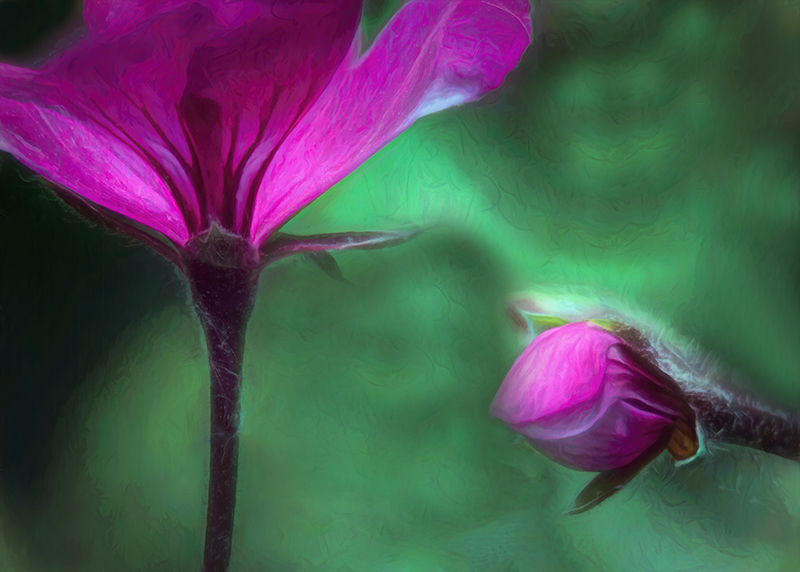
Martha, welcome to our group, so happy to have you!
Ther have been some solid CC made above so I will keep mine short.
The last adjusted image crops nicely tot he action and the main flower sits nicely on the horizontal 3rd line. You've created nice DOF for an ICM piece. The touches of magenta flower petals adds a nice color contrast to the yellows.
Do "edge patrol" and get rid of that spot of yellow at top right with Spot Healing.
The lower left dark corner I have a question about. Lighten up the yellows by dodging? Hmmm ...
A very nice image indeed. |
Nov 20th |
| 56 |
Nov 22 |
Comment |
Gerhard, agree with the CC mentioned above. I think you have now develped your personal art style! There's good balance of the Eagle within the frame. Nicely captured and composed and painted! |
Nov 20th |
| 56 |
Nov 22 |
Comment |
The background presents itself as concrete to my eye and the middle streak the result of drainage stain. That provides a stark contrast to the flowers, the opposite of the drabness of manmade. The contrasts to me are obvious. The use 3 flowers is good. My only question is the green of the leaves of the flower: should they be darker so as to stand out against the background, I don't know. Lovely piecxe nonetheless! |
Nov 20th |
| 56 |
Nov 22 |
Comment |
What fun processing! I would think this would end up on the wall of an upscale bar against a black wall. It's definitely "electric". I think you have shown me that sometimes I should have some fun, experiment out of my comfort zone, and see what comes of it. THank you! |
Nov 20th |
| 56 |
Nov 22 |
Reply |
I have taken a crack at those dark areas. |
Nov 20th |
 |
| 56 |
Nov 22 |
Reply |
My thought on the black holes was to create tension in the contrast between light and dark. The "neon" coloration adds a sense of drama, other wordly feel toward "the dark side" (maybe Halloween got the best of me in this creation!). |
Nov 7th |
5 comments - 3 replies for Group 56
|
| 76 |
Nov 22 |
Comment |
What I say is from my experience as a photojournalist.
First, I would have shot it to have more space at right that she looks into.
The red shoe actually points up, it takes the eye up the chair to the red cushion and the actress with red lipstick. The red shoe should stay in the image IMHO.
The white slippers complete a white pillar of the actress, and this pillar is contrasted by the white light beams, this creating tension within the image. Then there's the cage behind, which creates more tension.
I wouldn't do a thing to her face: it's a theatrical performnce and it should express the rawness of the moment.
Other than touching up some of the white debris on the floor, I think this is a fabulous image!
|
Nov 20th |
| 76 |
Nov 22 |
Comment |
This is really a cool shot and I agree with the lightening of the dark area as per Gordon above. You can do this with LR gardient intersected with luminance and adjust the black. The contrasts are classic. Very well done! |
Nov 20th |
| 76 |
Nov 22 |
Comment |
You opted for a Blue Hour image rather than sunrise. Either the blue or brown version is nice, depending upon one's taste.
The chapel is on the left 3rd vertical and the buildings in the middle. The top third of the image is sky, the middl 3rd thedistant hills and the nearer hill with the buildings, and the bottom third fog hidden.
If you cropped it 16x9, you'd get rid of most of that brighter spot at bottom left and you could clone out the rest or use a gradient filter to darken that corner.
A wonderful image from a fantastic spot on earth!
|
Nov 20th |
| 76 |
Nov 22 |
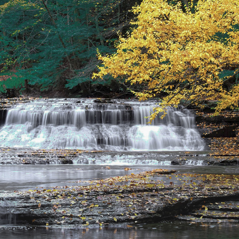
Comment |
I think that you can have a wonderful image if you lop off a good chunk of the right side. I have attached what I mean. I'd use the rock ledge in the foreground to point to the right side of the waterfall. In LR use some linear gradients for the bottom to darken it, for the top with an intersect for color and adjust the greens. The yellow leaves are wonderful! Can't do much for the blown highlights. Did you use a polarizing filter? If not, try that and use a shutter speed of 16-22 to slow the water to where you want it. |
Nov 20th |
 |
| 76 |
Nov 22 |
Comment |
Sanford, an almost perfect image and I would suggest using a heaing brush in PS to get rid of that white spot above the camel's front right leg. Other than that, marvelous!
BTW, I know you can mix up Jay and me since we both have the same hairline, but he's a dentist and my wife's a dental hygienist. I'm sure there are other obvious differences ... hahaha |
Nov 20th |
| 76 |
Nov 22 |
Comment |
This is a happy image, from the colors to the smiling candy. The hospital usually puts up vibrant colors to lift the moods of children there. This is a winner IMHO! It also brings to home that I need to do some fun stuff with photography that's out of the zone just for the heck of it. Thank you for that! |
Nov 20th |
| 76 |
Nov 22 |
Reply |
Sophie I understand. It's not only what goe sinto the image, but what distratcions you can compose out of it or delete in PP. This has to do with the storytelling, what needs to be included to tell the story of the place, the time, nature, etc. Each of us is subjective in what elements of the story come across to us. I included the large rock to show that the stream was at a lower level, which you can see by the watermark on the boulder. The boulder also offers a frame and is important to the circular eye flow within the image. One shoold ask, is the image a story about the tree or the stream or the inter relationship between? |
Nov 15th |
| 76 |
Nov 22 |
Reply |
I think you're right about the details on the rock, thanks. It's always a question of how much you want fall colors to pop without lookng oversaturated, I struggle with that often. |
Nov 14th |
| 76 |
Nov 22 |
Reply |
Gordon, I do sincerely appreciate all constructive criticims and having a perspective tha's different from mine makes me look at things presented and then can make a better judgement. Your input is sincerely appreciated! |
Nov 12th |
| 76 |
Nov 22 |
Reply |
Thanks Gordon. To your Rule of Thirds point, I used the Golden Spiral on this image and it goes up the rapids, then follows the the limb from rock to tree, and ends at the broken area of the branch. I did lighten the background area behind the tree limbs to create DOF, so our perspectives differ there. I needed to lighten the area in order to have a better contrast between the tree limbs and the background. To my eye, the large rock counterweighs the tree trunk area and the whiteness of the rapids on the right. Also, the arching tree limbs reach out to the rocks for a circular eye motion in the image that also works with the leading line of the stream. |
Nov 12th |
6 comments - 4 replies for Group 76
|
| 88 |
Nov 22 |
Comment |
Sanat, the foreground points the viewer toward the mountains. The side slopes add contrasting lines. Light should also work as contrast in an imaged, light to dark to light. With a lighter foreground, I would have left the unsnowed slopes darker to contast with the snow-coverd areas and the light foregound. I agree with others about the sky and would ahve used the clouds and bvrought out the drama in them.
As far as the noise, use a denoise app and make your life easier! I suggest Topaz Labs Denoise as it does a wonderful job (see sample on your image attached). |
Nov 21st |
 |
| 88 |
Nov 22 |
Comment |
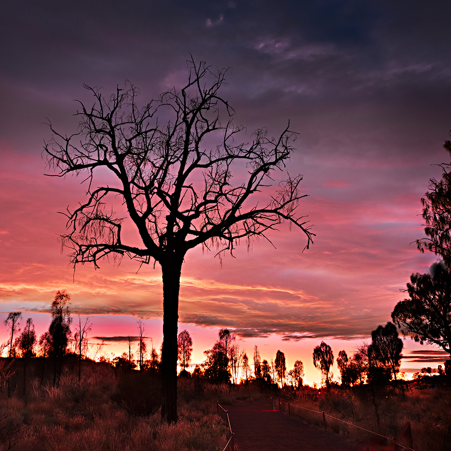
Welcome tgo the group Brian!
You stated that the tree with the subject of the image and the sunrise was the "leading lady".
I like the processing on the clouds and the silhouette of the ground.
Since the tree is the leading subject, I would suggest placing it on the left third of a Golden Thirds (see image). The crop I suggest also allows the pathway to be the leading line. It also crops off some of the not-so-interesting bottom of the image.
As far as brightness of the foreground, how bright was it that morning? If it looked like this, I'd leave it as is. The story isn't about the foreground, it's about the tree silhouette.
Look forward to having you in our group discussions! |
Nov 21st |
 |
| 88 |
Nov 22 |
Comment |
A very nice captue and I agree with others abougt the left side. I would propose lopping off the left side just t the right the light pole. It's a lot easier than cloning out and zeroes in on the trees and the leaves on the ground. The left sid eof the foreground tree isn't that impressive so it won't be missed in a cropping. The image makes me think of the smells I have had on days like this, so you are successful in capturing the essence of this time of year. The subdued colors are perfect for a foggy setting. |
Nov 21st |
| 88 |
Nov 22 |
Comment |
A very wonderful capture and nice PP. This image has Golden Spiral with the church's face and steeple being two points of that spiral. I like the way you cleaned up the left sid eof the image. I would disagree with Quang's "geometry" as it pushes the roof line back down into the hillside. The horizon on buildings is almost always the roof life and with that the viewer has a better idea of what the landscape is. Also, the spire needs to be perfectly straight as it "points to heaven". The contrasts in this image are epic. Kudos! |
Nov 21st |
| 88 |
Nov 22 |
Comment |
A wonderful place to visit to get an experience of what life was 2,000 years ago.
I have many questions:
Why did you crop it the way you did? On the original, the street curbstone construction is the leading line that goes to the people and then to the mountain. In the cropped version, there is an immediate wall blocking the curbstones. You change the leading line to the street itself and there are paving rocks that are lined across the street.
Why did you darken the image and brighten the sky with a purple tone? That attracts the eye immediately and makes the sky the subject of the image.
What is the story of the image? From your description its supposed to be the buildings, the edifaces where everyday life took place. IMHO the original told this story better.
What role do the pople play in the image? The final elevates their importance but the context of that importance is missing. In the original, the size of the people served to give the image perspective and nothing else.
You have a wonderful image to create something that tells a dramatic story. All you need to do is work with it and on it.
|
Nov 21st |
| 88 |
Nov 22 |
Reply |
Yes, light is coming from left as you can see the shadow of the silo on the barn, which is on a hill. |
Nov 15th |
5 comments - 1 reply for Group 88
|
16 comments - 8 replies Total
|


