|
| Group |
Round |
C/R |
Comment |
Date |
Image |
| 56 |
Jun 22 |
Comment |
Thanks for joining our group Jaci and you'll find that we are all very supportive of each journey's through photography. I agree with Cindy's two points above. The key of photography for me is contrast between light and darkness, which means dodging and burning to create that drama and you have that on the red petals. Your choice of strokes is wonderful. I would lighten up via dodging the area of the stamen so the eye goes to it. The eye naturally goes to the brightest or whitest area of the image. |
Jun 25th |
| 56 |
Jun 22 |
Comment |
Outstanding and what a memento for the parents! Great concept, exceptional result. |
Jun 25th |
| 56 |
Jun 22 |
Comment |
I really like what you have created and your choice of painting strokes and textures all add a lot to the impact of the final image. Put on canvas then pout on wall! |
Jun 25th |
| 56 |
Jun 22 |
Comment |
This was a lovely painting of a well composed photo. I like your decision to lighten the shaded hill at left. I was pleasantly suprised by your white vignette. My only negative is the black rim on the left side of the white ball. |
Jun 25th |
4 comments - 0 replies for Group 56
|
| 76 |
Jun 22 |
Reply |
Jay, I try and keep "little suprises" now and then! |
Jun 24th |
| 76 |
Jun 22 |
Reply |
Thank you, quite the compliment! |
Jun 24th |
| 76 |
Jun 22 |
Comment |
I like a lot about this image and I think the sky you chose presents a mood, helps to tell the story. Was it sunset at the time you took this? The only improvement would be to remove the halo around the baby's head and the pony tail of the father. Did you use a flash? If not, where was the primary light coming from? |
Jun 19th |
| 76 |
Jun 22 |
Comment |
I love what you've achieved here. The only thing I'd do for my taste is crop from the bottom to the bottom of the center purple tulip - just so it conforms to what you have at the top of the image. But that's just for my taste. Otherwise, a really nice rendering of ICM. |
Jun 19th |
| 76 |
Jun 22 |
Comment |
I love the processing and sharpne4ss of this image! The eyes are bright, sharp and the dog's personality comes through. There shoul be two fingers of blank space on left side of the image, and a little more space at right so the ear has some breating room. Wonderful keepsake of this pet! |
Jun 19th |
| 76 |
Jun 22 |
Comment |
Nicely captured and cropped Ian! Love how the texture of the rock is also on the lizard. To position is at an agle in the final image is masterful. To my taste, I'd brighten the lizard up so slightly so the greys on it are almost matching the rock it is on. |
Jun 19th |
4 comments - 2 replies for Group 76
|
| 88 |
Jun 22 |
Comment |
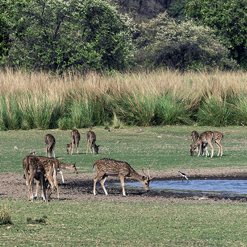
This is a tough one, Sanat. The focus should be on the deer herd. The herd is mostly butt end towards the camera. I think the story is on the buck at the watering hole. Much of the background should be cropped off so we can focus on the buck. In this image's case, less is more. I have attached my idea so you can better understand what I am trying to convey. |
Jun 19th |
 |
| 88 |
Jun 22 |
Comment |
YOur crop is well done, with the leading line coming from the left illuminated ground cover to the white sdpot opposite, up the hillside and from the crescent down toward the sea and back again to the white spot. I would suggest darkening the clouds a tad tyo balance off the shadow at the bottom of the image. There's also a coupple of spots at the horizon line in the water and sky that need to be cleaned up. Very nice image. |
Jun 19th |
| 88 |
Jun 22 |
Comment |
I like everything about this image: the textures, the lines, the colors. Set against a blue sky you have nothing fighting the mountains for attention. Kudos! |
Jun 19th |
| 88 |
Jun 22 |
Comment |
Very nicely post processed. I like what you've done to the shoreline in cutting back on the shadows. IMHO I'd use a gradient filter to tone down the red a tad but would keep the top 1/3 of the sky the way it is. The foreground of choppy water is something for one's taste - some wold favor of more glossy water area. What's the story here? How the hand of man is strk compared to the richness of Nature? At the bottom right of the pillar I'd get rid of the cyan. Nice moody image, makes me think of Stranger Things. |
Jun 19th |
4 comments - 0 replies for Group 88
|
12 comments - 2 replies Total
|