|
| Group |
Round |
C/R |
Comment |
Date |
Image |
| 56 |
Jan 22 |
Comment |
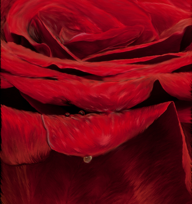
Your rose is lovely and the painting reminds me of a waterfall with the churning waters atop and the rock face below. I have a love for waterfalls and rapids so pardon me for transferring that to this image and my comments transfer that eye to your painting. I have cropped it somewhat differently, from the top as well as the bottom. The flaring strokes of the petal below the major drop is too good to crop out, IMHO. I would have also kept more of the water droplets on each tier of petals so as to replicate a waterfall. But that is because both your original and final images are so inspiring and many versions are possible. Thank you! |
Jan 24th |
 |
| 56 |
Jan 22 |
Comment |
What a great way to see multiple images within the original! I very much like the one you pulled out of the original and you did what I've done too: get the horizon line level and forget to adjust it when the horizon line isn't in the small segment image I cropped to. Nancy was correct in seeing this. Ahh, the S-curve road is to die for in images! Ocean water colors are subjective; I've seen water that blue. Your choice of water color fits the scene well IMHO but if you want the emphasize the land then you should soften it a tad. Beautiful image! |
Jan 24th |
| 56 |
Jan 22 |
Comment |
I really do like how you have converted this image to a painting! Your choices of colors are bold. Ditto on what's said above for improvement with the background. The repositioning of the two birds was genius and I so enjoy them! Kudos!! |
Jan 24th |
| 56 |
Jan 22 |
Comment |
I am impressed by this image especially considering how you had to enlarge it significantly. Yes, sharpen the eye as that's what important in wildlife imaging and I'd sharpen the feather in that area too. I love the white vignette. I'm not offended by the grass blade by the raised leg; it looks like it is part of the environment which it is in. For me, an amazing painting! |
Jan 24th |
| 56 |
Jan 22 |
Comment |
I've always wanted to go to one of these events and snap away! I really like your choices of images to use and agree with above of the pasted look. It may be a degree of feathering around the dancer and also at the tee pee line which may resolve the issue. I'd simply fill the sky area with more tree leaves before I went to paint the composite. |
Jan 24th |
5 comments - 0 replies for Group 56
|
| 76 |
Jan 22 |
Reply |
You may be correct about that, thank you! |
Jan 26th |
| 76 |
Jan 22 |
Comment |
For street photography, pocket cameras are preferred because they don't intimidate people like DSLRs do. Black-and-white gives a documentary look to the image, which is more impressive than color - unless the contrasts in color provide a better story and make for a better image. Look at the background of the image, does everything there now have to be included in the story or does it distract from the story? Would a tighter crop be better? His eyes are sharp! |
Jan 23rd |
| 76 |
Jan 22 |
Comment |
Wonderful DOF and the way it is achieved through the colors and textures! If anything, I would burn the shaded areas at the very top a tad to create more contrast within the image. Beautifully done! |
Jan 23rd |
| 76 |
Jan 22 |
Comment |
Jay, I love taking photos of milkweed. There's so much you can do with the pods and the seeds and silk, etc. I think you achieved what you set out to do and I agree with your choice of flipping the image and your b&w treatment. IMHO I think the silk has to be whiter (as attached) to bring more tonal contrast to the black-and-white image. |
Jan 23rd |
 |
| 76 |
Jan 22 |
Comment |
Very well composed. I like how the path goes to the mountain's gorge which leads the eye to the top of the mountain! If you wish, you could use a circular gradient filter to put more drama into the major cloud cluster. I also like the tonal qualities with the shade and sunlit areas. |
Jan 23rd |
| 76 |
Jan 22 |
Comment |
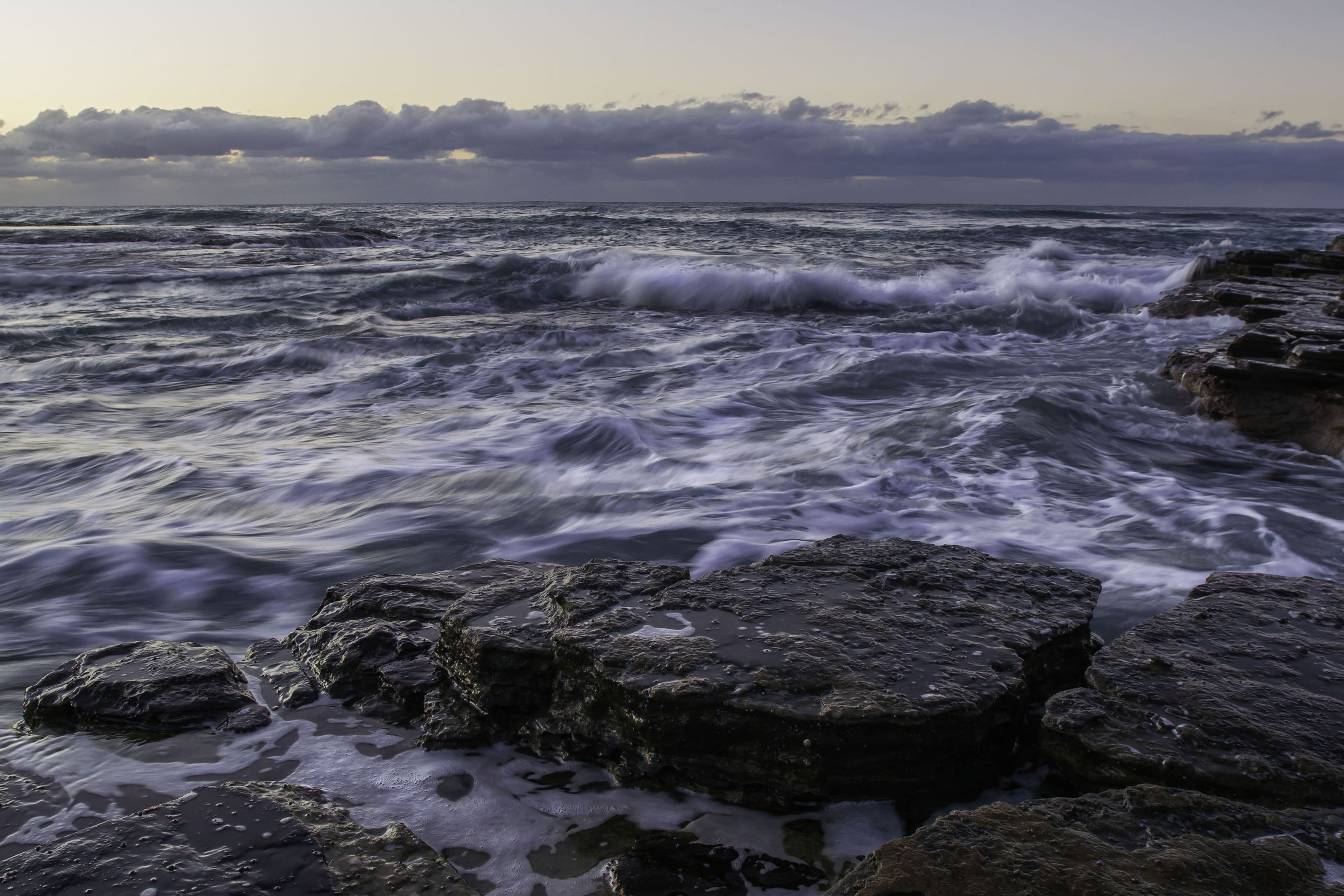
What a grand opportunity to shoot this! Wish I was closer to an ocean - Lake Michigan just isn't the same. You have wonderful rocks creating a bottom border and foreground and I get the feeling it is protecting me from getting soaked! IMHO I would add some more contrast to the image with burning the white caps/foam, streaks in the water and also the tip of clouds so it mimics the water. The action in the image is the wave coming at me and makes we wonder how big it will be by the time it hits the rocks in the foreground. Then there are the subtle waves that are at 45 degrees to the big wave to add more tension to the image. I think if you cropped it a tad you would crop to the action. Really like what you captured! |
Jan 23rd |
 |
5 comments - 1 reply for Group 76
|
| 88 |
Jan 22 |
Comment |
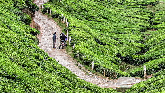
Sanat, There are a couple of stories about the tea plantation here: the buildings and the two people on the road. Which is more interesting, more intriguing? I have cropped the image and attach it below to show how I would present the story of the people on the road. You could further enhance this by some burning and adding a vignette to direct the viewer's eye even more. |
Jan 23rd |
 |
| 88 |
Jan 22 |
Comment |
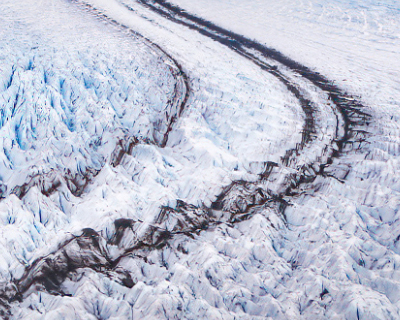
What a wonderful image to develop an abstract image by playing with the subtle blue color, the black, and the textures within. I have cropped the image to give you an idea of what I see. There are dark curved lines giving you that slight S shape, but they lead nowhere of interest - had there been a sun or sunset it would have been different. |
Jan 23rd |
 |
| 88 |
Jan 22 |
Comment |
A very fun project and you achieved the results you were seeking! |
Jan 23rd |
| 88 |
Jan 22 |
Comment |
Excellent minimalist image that tells a story. Nice use of the rule of thirds in this image. You vastly improved the sky and the wispy clouds are wonderful and contrast in texture and tone with the rocky ground. |
Jan 23rd |
| 88 |
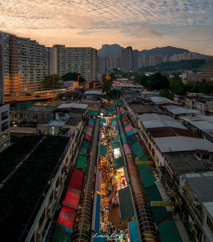
Jan 22 |
Comment |
Excellent PP on this image especially the strong lighting down the length of the market. I agree that cropping out the building on the right made the image better. I do believe that since the market is the main focal point you can cutoff a good deal of the sky and make the image even stronger. |
Jan 23rd |
 |
| 88 |
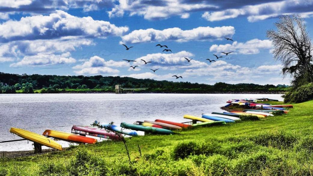
Jan 22 |
Comment |
John, I think some of the foreground challenges can be rectified with a 16x9 crop as below. I used the spot healing brush in PS to get rid of some of the overlapping plant onto the canoes and also brightened the image a tad so the structure at the opposite side of the lake stand outs and draws the eye. In an area such as this, I don't think there would have been any restriction on walking around and just banding that solitary sapling or wood plant down to the ground. Problem solved before you take the photo. I would also suggest increasing the vibrance of the boats and decreasing the vibrance of the grass/ground cover. I love the addition of the bird sin flight and think your sky replacement works here. |
Jan 23rd |
 |
| 88 |
Jan 22 |
Reply |
Thanks Gary! My only problem with cutting more off the bottom is where I put my watermark? |
Jan 11th |
| 88 |
Jan 22 |
Reply |
Couldn't walk closer as it's a fenced off pasture area, which was filled with geese before I stopped. |
Jan 11th |
6 comments - 2 replies for Group 88
|
16 comments - 3 replies Total
|


