|
| Group |
Round |
C/R |
Comment |
Date |
Image |
| 4 |
Aug 21 |
Comment |
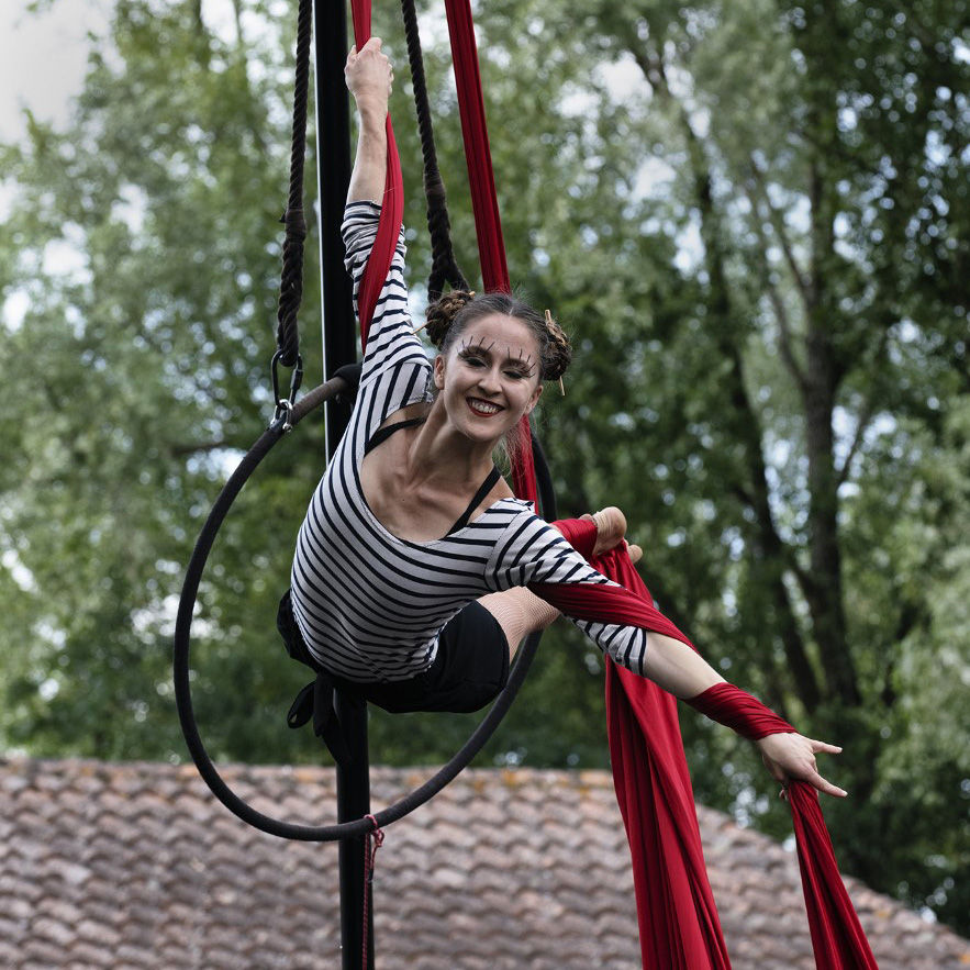
You'll be a photojournalist in no time flat! Reminds me of 50 years of photos I took in the newspaper biz. Tells a story. On the right edge lower half, get rid of the bulges coming into the photo. |
Aug 21st |
1 comment - 0 replies for Group 4
|
| 56 |
Aug 21 |
Comment |
Everything is so well done and since I have granddaughters in dance I really appreciate the subject! I wouldn't change anything but I have a question: Why the space at left and the brightness of it? My eye is drawn to the light and is suspended there. Very masterfully painted. |
Aug 28th |
| 56 |
Aug 21 |
Comment |
A very nice treatment and I agree with the positives above. The watercolor presentation is a great choice. My only comment would be to have the blue of the sky more reflected at bottom right. |
Aug 28th |
| 56 |
Aug 21 |
Comment |
Very well done! I love the contrast between the feathers and the background in texture. Very colorful image. My only suggestion would be to add more space at the bottom so the tail feather isn't so close to the edge. |
Aug 28th |
| 56 |
Aug 21 |
Comment |
This is just lovely! You maintained the sharpness of the eye and the head area while softening everything else. The background you chose is fantastic. Kudos! |
Aug 28th |
| 56 |
Aug 21 |
Comment |
I love what you did on this composite to create a wonderful painting! The circular flow you create by positioning the horse and the fence is wonderful. The laundry line is an added plus and splash of color. My only suggestion would be to clone out the line from the back of the horse to the right edge. |
Aug 28th |
5 comments - 0 replies for Group 56
|
| 76 |
Aug 21 |
Comment |
You caught the action well and the smile is a killer. I was a sports photographer and rule of thumb there is to crop to the action (see example attached). A square cropping would cut out a lot of the distractions and why not showcase that smile!! |
Aug 19th |
 |
| 76 |
Aug 21 |
Comment |
"Ah, the beauty of an x-ray" was my first thought. Then I read the title. I live on the darkside so to my eye you've lost a lot of the shapes in the bright areas and I would bring them back so it doesn't look like a x-ray. I have attached my take on your original, so the tones go from very dark to very light but all the shapes are retained. But that's my interpretation, which can be completely different from everyone else's. Nice decision to go impressionistic with this image! |
Aug 19th |
 |
| 76 |
Aug 21 |
Comment |
I think you have done well in your conversion to monochrome. The three extended petals have a soft out-of-focus element to them to enhance the center in-focus element. However, the yellow areas on the original image didn't translate well in your final and would have provided a nice tonal element to the image. Your decision on the black background was an excellent one. |
Aug 19th |
| 76 |
Aug 21 |
Comment |
Your leading line of the white pole and barrier lead your eye to the smaller iron bridge and had you left the two smaller dominant boats in that area, they would have led my eye to the largest boat. A 16 wide 9 high crop would be beneficial to crop tot eh action in the image. What is your focal point? The sailboat, largest boat, the bridge? To my eye it should be the largest boat, but for you it could be the wider story of this area. I think you need some drama at some part of the image and bring that out to dominance. I have included a cropped image with the 2 boats left in the image so you can seen the circular eye motion it creates. |
Aug 19th |
 |
| 76 |
Aug 21 |
Comment |
Love your image of Alaska and this makes me want to go back to my negatives from my 2000 trip there. Ditto on the positives above. IMHO I would crop this 16 wide and 9 high (like Heidi suggested) so the boat, which gives a sense of scale, stands out better Also, I'd burn the clouds to make them darker or use a gradient filer in LR to do the same. If you want the boat and glacier to be the focal point, I'd also have you consider a vignette. |
Aug 19th |
| 76 |
Aug 21 |
Comment |
How exciting for you to have gotten this shot! I like your blue image and the way you brought out the rock out on the mountain edges. From looking at the image, you have given predominance to the foreground clouds, so that is the focal point. The close ridge line is an excellent backdrop and the furthest ridgeline should bring you back to the dominant ridge at left and then into the pool of clouds. The large amount of sky pauses my eye looking for something in the distance. I think eye flow would be improve if you lopped off a good deal of the sky, which has little drama in it so IMHO wouldn't be missed. |
Aug 19th |
7 comments - 0 replies for Group 76
|
| 88 |
Aug 21 |
Comment |
I like the action you caught at this place. I think the lighter background helps the eye to see the flying birds better and presents a better DOF. I'd also remove the birds at bottom right. You must have gone crazy shooting all those flying birds! |
Aug 19th |
| 88 |
Aug 21 |
Comment |
What a wonderful capture at a wonderful place! I like Quang's suggestion. The DOF creates by the mist is to die for. Well done. |
Aug 19th |
| 88 |
Aug 21 |
Comment |
I like your eye on this image and the people give a size perspective for the viewer. The only thing I'd suggest to improve the image is to get rid of the light pole at left the lamp of which has been cutoff. I wonder what this shot would like like if you had gotten lower to the ground and used the right rail and concrete to cutoff the shoreline behind while retaining the bridge elements at left? |
Aug 19th |
| 88 |
Aug 21 |
Comment |
Ditto on the positives above and the S-curve is to die for! My only time in Iceland was coming back from a year abroad in college and I only saw the airport! Love what you've done with this in b&w. My only suggestion would be to crop from the bottom as that first upright stone fights with the sand mound for a foreground focus. Maybe 16 wide and 9 high in crop? You don't lose any of the S-curve and only a portion of the tial pool. |
Aug 19th |
| 88 |
Aug 21 |
Comment |
Looks like you had a lot of fun with this trip! Ditto on Quang's idea of having the model's upper torso break that tree line (like she does in the reflection). If the story is about the Milky Way, IMHO I'd lose the stairway to heaven at right ... unless you put the model just left of the sign and remove that sign from the image. Lighting of the model is a good idea and brings more drama to the image. |
Aug 19th |
| 88 |
Aug 21 |
Comment |
Ditto on the positives above. I prefer your sky replacement. My only suggestion would be to darken the foreground water so as to enhance the contrast with the land and structures in the middle. Your addition of the birds was wonderful. |
Aug 19th |
6 comments - 0 replies for Group 88
|
19 comments - 0 replies Total
|


