|
| Group |
Round |
C/R |
Comment |
Date |
Image |
| 56 |
Jun 21 |
Comment |
Wow, a stunner! Those eyes draw the viewer into the image and the facial expression. I can't think of anything that would improve the gorilla, the grass, or the background. I would suggest more space at left and top so the gorilla isn't cramped - especially if this is framed. It is truly a beautiful image! |
Jun 27th |
| 56 |
Jun 21 |
Comment |
I truly appreciate the way you have rendered the parts of the image and then softened everything except the eyes. The background colors have been changed to match those in the dress, which gives the image continuity. Beautifully done! My only question: why the yellow-orange line along the left edge? |
Jun 27th |
| 56 |
Jun 21 |
Comment |
Gerhard, as you have read, there are many ways you could crop this image so you have multiple options - which is wonderful with any photo you take! Nancy did a fine job of cropping and altering the image to frame it with the side trees. Texture is a matter of taste and the one you chose might do well on a canvas. The circular motion is enhanced with Nancy's crop too. I would also suggest some more sky at the top as to not crowd the cross atop the steeple. This find is fantastic! |
Jun 27th |
| 56 |
Jun 21 |
Comment |
An amazing rendition given what you started with! The red frame I had to look twice at since my first impression was that it was a growing cage, so it was nicely integrated into the image. The frame also helps with the circular flow of the artwork. DOF can also be achieved by darkening portions of the image to help the lighted areas stand out more but overall I don't think your DOF in this image needs improvement. I like it very much! |
Jun 27th |
| 56 |
Jun 21 |
Comment |
A very patriot image and appreciated as we go into the 4th of July holiday in the US. I really like the way you "juiced" the image which make the flags IMHO more alive in the wind. Your choice of what to do in the reflective water was excellent. For my eye, I think the blue in the upper left corner should be lightened a tad to match the light blue at the right of the fir tree but not the grey that Nancy illustrated. When painting, why did you choose the grass color you did? |
Jun 27th |
5 comments - 0 replies for Group 56
|
| 76 |
Jun 21 |
Comment |
You were successful in getting the bird in focus and the detail of the feathers is outstanding. If you want to improve on the presentations of wildlife images I'd suggest watching Matt K's videos on YouTube (https://www.youtube.com/c/MattKloskowski/videos)
The bird and the branch is a great start and Matt will show you how to cut those out and create wonderful backgrounds, if that is what you want for your forte.
|
Jun 27th |
| 76 |
Jun 21 |
Comment |
Ditto on the comments above about softness and the Lensbaby. Ethereal is a good way to describe this beautiful image. My small suggestions would be to reduce the highlights at the top of the middle and perhaps darken the image slightly overall (but I am a child of the darkside, so take that into consideration). It is a successful final image! |
Jun 27th |
| 76 |
Jun 21 |
Comment |
The detail on the final image is wonderful. Original 2 versus final image is a choice of mood and message. IMHO the b&w sets a sullen mood, while the Original 2 captures the naked beauty of the flowers and is more delicate to behold. Either image is well done and I think you could use both. You light painting has developed well! |
Jun 27th |
| 76 |
Jun 21 |
Comment |
The lily is definitely the focus of this image, and a very lovely one at that. Ditto on the polarizer as per above. To my eye, it would be improved if you cropped closer to the lily, maybe putting in on the lower 1/3 and left 1/3 intersection. That crop would take some of the "crud" out of the image and make the lily much larger. Why minimalize that beautiful flower? |
Jun 27th |
| 76 |
Jun 21 |
Comment |
Minimalist to the Nth degree. I don't know how to comment on this one. |
Jun 27th |
| 76 |
Jun 21 |
Reply |
Kudos in North America means compliments or congratulations. Thanks for you kind words! |
Jun 7th |
5 comments - 1 reply for Group 76
|
| 88 |
Jun 21 |
Comment |
What a cool area of the earth you live in! I like the idea behind the image with the rivers. What is the focal point, I asked. For me it was where the 2 rivers merge and the stairway that goes down to it. There is a person in white standing there for a sense of proportion. I believe a square crop to the "action of the image" would improve the impact and tells a story to me. The haze is okay IMHO as that area is not "in the spotlight" rather a background element that adds depth. |
Jun 25th |
 |
| 88 |
Jun 21 |
Comment |
Very successful abstraction and the graduation of the colors is well done. My only question: what is the subject of the image? For me, it's the fire at top and the skyline serves as an anchor. |
Jun 25th |
| 88 |
Jun 21 |
Comment |
A very well conceptualized and executed image. I like the painted feeling and textures and you achieved the mood you set out for. The birds were a nice addition. Kudos! |
Jun 25th |
| 88 |
Jun 21 |
Comment |
Great job on this image, you have done a splendid job in cleaning it up, just the right sharpness and that flag replacement is genius! You don't want to over sharpen an image such as this as you want it to be still dreamy and the wisps of clouds add to the mood. Rather than cut sky, I would add some water below as the boat seems cramped to the edge there. Masterfully done! |
Jun 25th |
| 88 |
Jun 21 |
Comment |
A marvelous shot and the ribbon road leads to the highest skyscraper along the 1/3 line. IMHO I would darken the area around the lights of the ribbon road because it is a leading line to the skyline and the brightness you have keeps my eye there. I believe you want the eye to go to the skyline. There is good eye movement from the ribbon road to the tallest building, then to the next tallest at right, then down to the glistening ponds and back tot he road. |
Jun 25th |
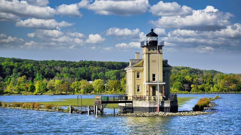
| 88 |
Jun 21 |
Comment |
What a nice structure and I like the three-quarters angle view of it. The structure cuts through the hill which is good. Your sky replacement is a good idea and I find some may like it, others may not - do what you think looks good. I think you have been successful there. There are many signs in this image from the orange one at left and four metal ones at right - I would eliminate them. Another distraction is the small piling or people at far right by the metal sign. I'd also eliminate that. Finally, I believe a 16x9 format would suit this image. A wonderful capture that has high potential! |
Jun 25th |
 |
| 88 |
Jun 21 |
Reply |
Thanks for your kind words Charles. As to Topaz vs. PS, it depends on which you are comfortable with. I got into Topaz years ago when it was head-and-shoulders over PS so I have remained with it and with their AI improvements it just makes things a lot easier - but carries that addition price. I know of "painters" that use PS a lot so I'm sure it is comparable. |
Jun 7th |
6 comments - 1 reply for Group 88
|
16 comments - 2 replies Total
|


