|
| Group |
Round |
C/R |
Comment |
Date |
Image |
| 4 |
May 21 |
Comment |
Like what you've done with architecture. The lines of the building and spirals of the staircase have a nice contrast to one another. I appreciate you adding the extra sky at the top and lopping off the bottom where you did - all adding to the impact of the image. The shadows of the staircase on the building are an added plus. Nicely done! |
May 2nd |
1 comment - 0 replies for Group 4
|
| 56 |
May 21 |
Comment |
Instant fave! I love barns and come from barn country Wisconsin. I wouldn't change a thing about your final product. The flowers and fenceline post all add flavor and the hay door with the exposed roof behind is to die for! Congratulations! |
May 23rd |
| 56 |
May 21 |
Comment |
Didn't know UnderArmor made running shoes! There is excellent balance to the image as there is one foot down, two feet are almost level at middle, then there is one in the background to add balance. The downward horizontal lines of the pavement also provides a nice contrast with the shapes of the shoes and vertical legs. A very pleasant image. |
May 23rd |
| 56 |
May 21 |
Comment |
WOW! That was my initial reaction, definitely out of the comfort box and you were successful. Great way to make a statement pro/con on a community/neighborhood issue I would think. This modern rendition is inspiring for me and I will try it this summer during my boredom period because it is so challenging. I very much like the inner red frame. Would you put this on canvas since the art goes to the edges or maybe metal? |
May 23rd |
| 56 |
May 21 |
Comment |
I really lie your choice of darkening at the top and removing some of the distractions. Why didn't you remove that red post at right opposite the stairway? Why did you change the texture/look of the brick wall at the top of the stairway (artistic license I suppose)? I love the strokes on the cobblestones and stairway and I'm glad you didn't crop off the red ones at the bottom. You could do a little edge cleanup at top left. A very nice rendition of the image. |
May 23rd |
4 comments - 0 replies for Group 56
|
| 76 |
May 21 |
Reply |
Thanks Jay, I was out of my comfort zone when I trekked into the woods, but I think I've become addicted to woodland decay! |
May 21st |
| 76 |
May 21 |
Reply |
Thanks Ian, glad you like it! |
May 21st |
| 76 |
May 21 |
Reply |
Thank you |
May 21st |
| 76 |
May 21 |
Comment |
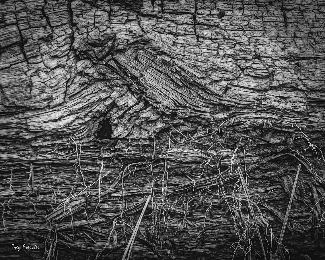
Henriette, let me say your original is wonderful with contrasts, lines, and textures. It was a challenge making it a b&w and I applaud you going in that direction when you have an outstanding original in color. B&W is all about tones with the interplay between black, grey, and white. I think you are successful in the tonal area and with a few touches could really enhance the eye movement throughout the image. I'd bring down the highlights/exposure of the brightest area to bring back the texture/lines. Then I'd lighten up the greys going up the rock face at mid to upper left in the foreground so it optically meets up with the lighter fingers in the background that connect with the central "white flow". I'd also toned down that bright area just above center right on the rock face so it isn't a distraction. I've included an example of what I'm trying to say above so you can "picture" it. A very impressive image both as an original and a b&w! |
May 21st |
 |
| 76 |
May 21 |
Comment |
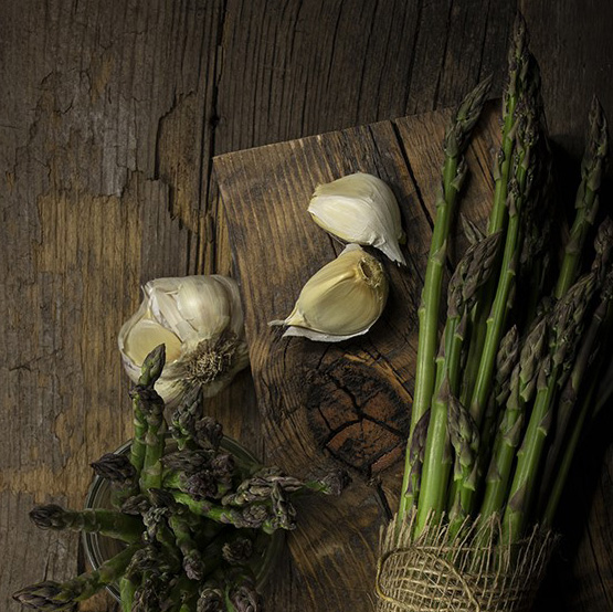
Light is the essence of an image. Go where the light takes you and improve on it. Then only odd spear for lighting is the one at far right; I'd get rid of it. The all the other spears are "kissed" by the light. The spears in the glass or cup at left had me puzzled for a second as to what it was, which keeps me looking longer. The spears at the top and bottom of the glass literally point giving direction to the eye to create the circular movement. The eye gravitates toward white/bright and in this case it is the garlic cloves and herein is the conflict for me: is it a story about the garlic or the asparagus? I think the wood texture of the background is wonderful for this image. My crop makes the story about the garlic (which I favor more than asparagus in my dietary life!). |
May 21st |
 |
| 76 |
May 21 |
Comment |
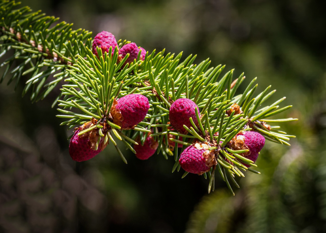
What a wonderful subject for an image! You did a fine job of focus and the lower branch doesn't really bother me. You might want to add a vignette so your corners are darker and bring the focus to the middle of the image. It intrigued me what Henriette mentioned about getting rid of the lower branch, so I used PS Patch Tool to cut it out and LR to add a gradient filter to darken the background and a vignette to further emphasize the branch and its red new cones. At least you have a visual image of what it could look like. I'm 50-50 on yours versus my crop, depends on your artistic taste. Either way a very nice image. |
May 21st |
 |
| 76 |
May 21 |
Comment |
Ditto what's been said above. I like how fence post figure draws the eye, then the roadway leads you to the trees at right, and those to the sky and clouds (which are nicely done), then then the eye goes down to the trees and the fence line brings you back to the post figure. I like the way you warmed the image up in coloration. |
May 21st |
| 76 |
May 21 |
Comment |
What amazes me about the image is the contrast in the sky left and right on either side of the prominent rainbow. The sharpness from foreground to back rock jutting is right on. Your leading line of crashing wave at bottom left leads to the rainbow but fights with the latter as to prominence - maybe a square frame cropping off a left portion of the image at left? When you have a beautiful rainbow, the eye doesn't want to wonder off it! |
May 21st |
| 76 |
May 21 |
Reply |
Thanks and here is a b&w of it. |
May 12th |
 |
| 76 |
May 21 |
Reply |
Thanks |
May 12th |
5 comments - 5 replies for Group 76
|
| 88 |
May 21 |
Comment |
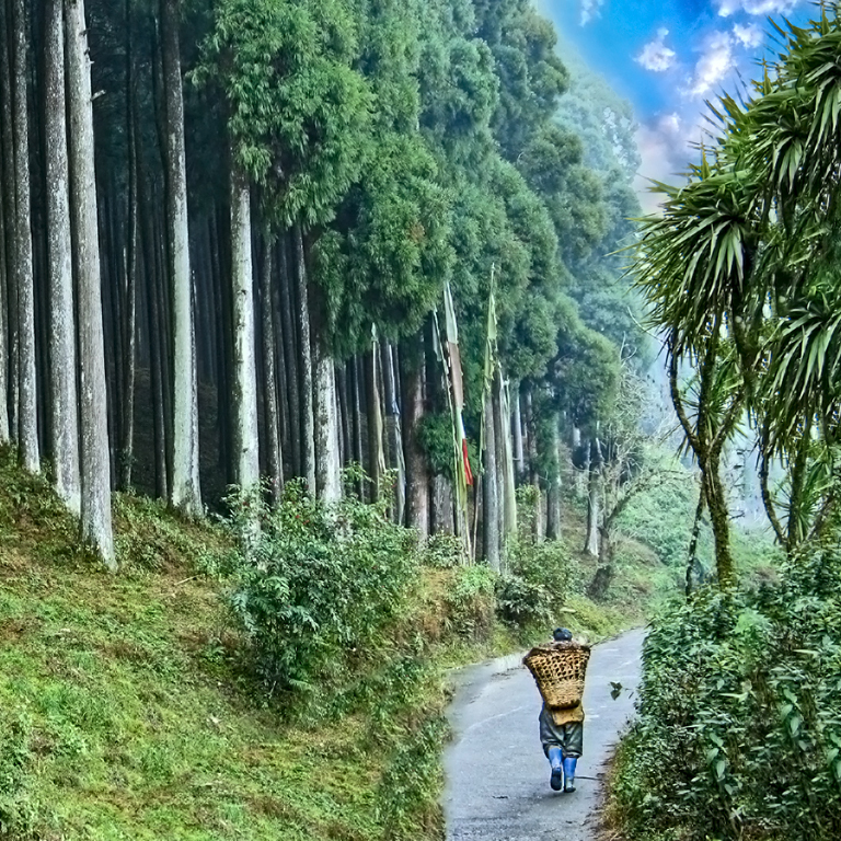
I like the way you have lined up your trees, which adds order to what is natural chaos. But alas, there are too many trees at the left and I think you can solve that by cropping differently. The sky does look unnatural and I would play around with other options in skies to match the mood of the image you want to convey. I have opted for more of a square crop so the trees direct the eye to the path, the man is set on the 1/3rd line. I like how you added foliage to the right side. The PP is very nice to my eye. If you solve the sky, you've got quite the image! |
May 19th |
 |
| 88 |
May 21 |
Comment |
Really nice choice with monotone! You can tell a nice image when many person see other images within the image. Ditto on what is said above about the cyan lines. I have also attached a cropped version that put the shadow more on the 1/3 line to the left because I see the shadow as the story - but that's what I see. I don't think you could go wrong on how you crop this image! |
May 19th |
 |
| 88 |
May 21 |
Comment |
For me, the leading line is the white water of the waves along the rocks, which brings me to the cliff face, then left along the cliff face and the rounding of the pool to the people. People add dimension to the image. I'd crop both right and left edges as seen in attachment, which emphasizes the leading line from the bottom right. I wonder what a black vignette would do to center the eye to where you want it focused? |
May 19th |
 |
| 88 |
May 21 |
Comment |
Good choice on the sky, I like what you did. The reflection of it on the water is well done, though I would offer that the water could be blurred "to taste" via brush with negative sharpening, clarity, and negative texture. I like Gary's idea about the buildings under the bridge. Definitely a moody image and I think your "risk" in positioning the shot was well calculated! |
May 19th |
| 88 |
May 21 |
Comment |
A wonderful image and I think you achieved what you set out to do. There is good circular movement in the image for the viewer: from the sun, to its reflection, along the rocks to the right to the waves. I think the moon is lost because the waves are larger and the peninsula point stops the eye and brings the viewer to the central image. Your PP is very good. |
May 19th |
| 88 |
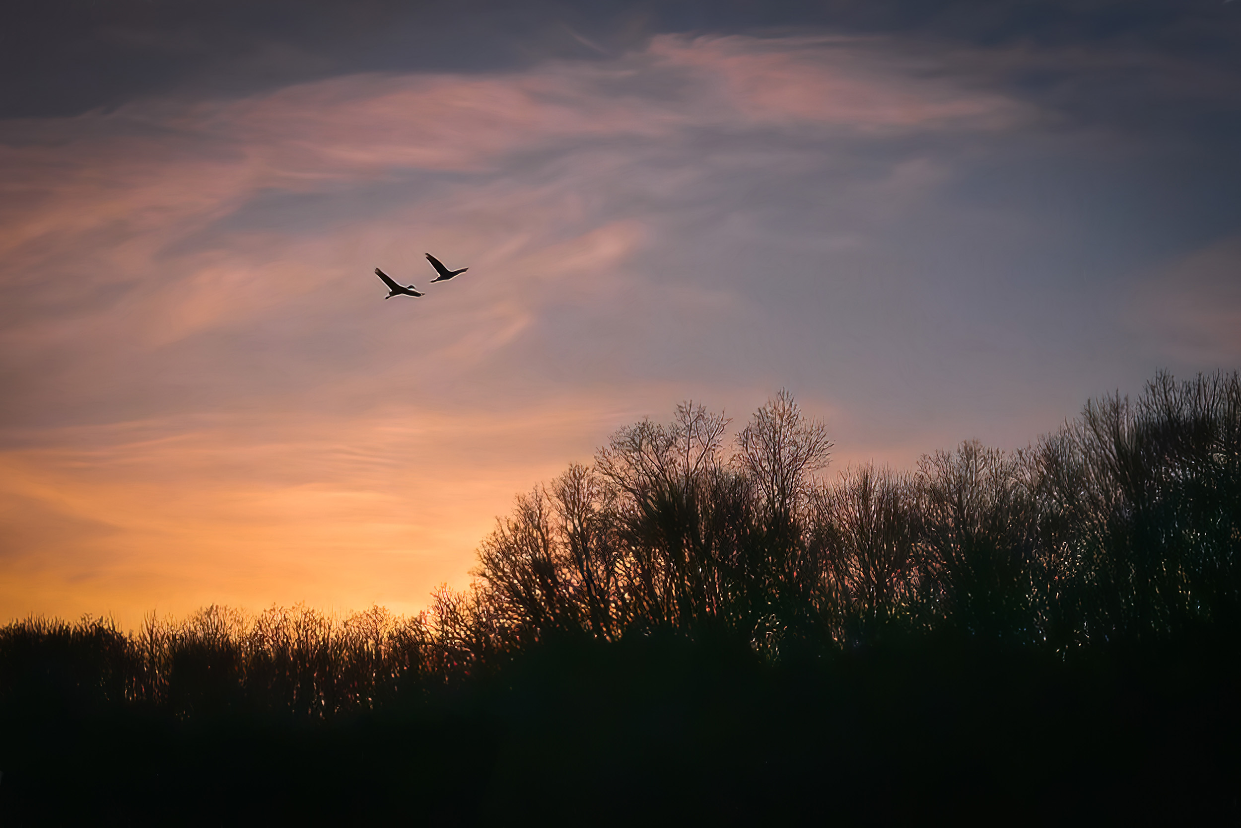
May 21 |
Reply |
You're right. They flew into the scene when I was already shooting so all I had time for was hitting the shutter again and not zooming. I've enlarged as much as I could in attachment here. |
May 2nd |
 |
5 comments - 1 reply for Group 88
|
15 comments - 6 replies Total
|


