|
| Group |
Round |
C/R |
Comment |
Date |
Image |
| 56 |
Feb 21 |
Comment |
As a hunter IMHO, I think that if you are conveying a "kill" there needs to be some coloration of it. No matter how the wolf brings down its prey, it always goes for the jugular on the throat. But that's just me being a guy! I love what you've done to the wolf especially the face but its paws seem suspended rather than blended into the ground like in the original. I agree with Nancy about burning the doe and the background to make the wolf even more dominant. Very well done and a great concept here. In Wisconsin, the DNR may open a season on the wolf so this kind of image my have a good market for sales! |
Feb 20th |
| 56 |
Feb 21 |
Comment |
Wow, you did an amazing amount of work on this image and the result is definitely a pensive piece. I like the conversion of the fishing boat to a row boat, more traditional. The removal of the house was another good choice. Grey is a sullen and depressive choice, and if the boat is to "make you free" would the boat be better in another color, red or green or ? to project that sense of liberation? I like the painterly choices you made for the peninsula. |
Feb 20th |
| 56 |
Feb 21 |
Comment |
Your technique reminds me of scratchboard images. Nancy's cropping puts the calf at center, which is good as it is the focus. Very well done with the calf body in the white area under the cow, whose body gives an amazing wrap-around frame. Well done! |
Feb 20th |
| 56 |
Feb 21 |
Comment |
Thank you for sharing the process. Looks like a wonderful challenge lies ahead of you in developing this technique. |
Feb 20th |
| 56 |
Feb 21 |
Comment |
I like the CC of Cindy concerning the background distractions. You have nicely balanced out the weight of the image with the foreground and that you can see so many faces. Unless you are going to provide this image to a number of those skaters, I would opt to blur the faces. A very nice action shot that translates well to painting. |
Feb 20th |
| 56 |
Feb 21 |
Reply |
Thank you! I use about 4 presets all the time, but this time added a few more but didn't jot down which. |
Feb 20th |
5 comments - 1 reply for Group 56
|
| 76 |
Feb 21 |
Comment |
I agree with Ian about the second triangular sign as it points the eye towards what? Plus by stepping to the right and moving the angle up the roofline would be a V toward the work sign and also not include the square distraction at the right of the sign. That would make only one focus: the sign. Cool lens and you ought to have a lot of creative fun with it! |
Feb 20th |
| 76 |
Feb 21 |
Comment |
Great choice in cutting out the orchid and the background you created for it. You've improved greatly on the coloration and texture of the flower from the original. An amazing result! |
Feb 20th |
| 76 |
Feb 21 |
Comment |
Texture and contrast study in b&w! I'd bring the highlights back a tad in the brightest element but you've nailed it elsewhere. Perhaps in the future you might play around with focus stacking so all elements are in focus to bring it to the next level. You have a great eye for this! Very well done. |
Feb 20th |
| 76 |
Feb 21 |
Comment |
I don't think you could loose with choice of b&w or color, very impressive creativity (thinking out of the box)! I like the way you positioned the shot so the hat and head were free of the branches from the bush at left and the trees at right bring the eye to the head. The bench is the leading line that brings the eye to the statue. For my taste, I would brush out the two thin twigs at bottom right. I'd enter this in an art show competition if I were you! |
Feb 20th |
| 76 |
Feb 21 |
Comment |
The focus on the owl is fantastic and I really like the clarity in the eyes. I wonder if a vertical crop may have been a better choice, but maybe that's my eye as a photojournalist that says crop to the action/focus of the shot. Maybe if you move more to your right you could have caught all the tailfeathers? The out-of-focus lower limb is distracting but the others are in sharp focus providing contrast to the owl's feather pattern. You did a great job in capturing the moment! |
Feb 20th |
| 76 |
Feb 21 |
Comment |
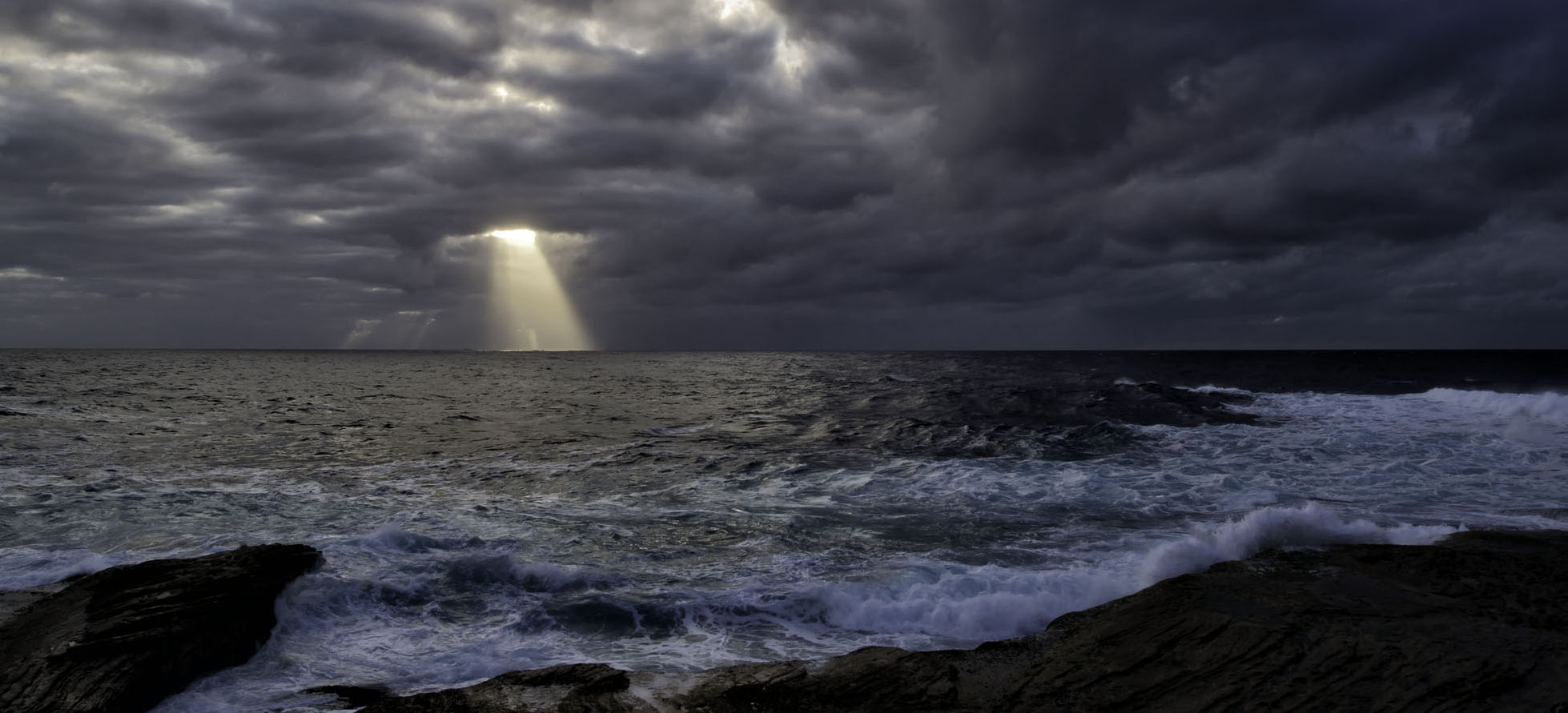
What a wonderful image from being in the right spot at the right time! The clouds are fantastic and that sunbeam hole is priceless. I like the darkened foreground as it isn't that dynamic if you lightened it up and the blue waves washing ashore are the real lace on the fabric. IMHO, I would suggest that you place the sunbeam hole on the rule of thirds at the upper left as attached here. |
Feb 20th |
 |
6 comments - 0 replies for Group 76
|
| 88 |
Feb 21 |
Reply |
Sanat, I do like the sky work as an option as it does have some appeal. However, the rose tone to the snow and ice is not realistic. The snow and rime ice in Wisconsin is VERY white and an overcast day is the best time to shoot it since it's not blue under a blue sky. Thank you for the kind remarks and taking the time to share your vision of the image, it is appreciated! |
Feb 25th |
| 88 |
Feb 21 |
Reply |
I went into LR used the brush tool and decreases the clarity and sharpness to -3 and brushed over the silo. There's a difference! Thanks. |
Feb 22nd |
| 88 |
Feb 21 |
Comment |
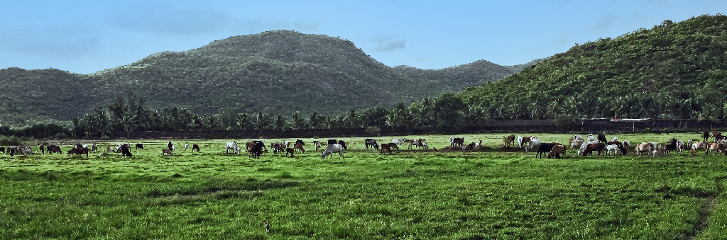
Sanat, I'm a country boy and really like your love of the rural landscape! I agree with what's been said above. Since the cattle are the focus of the image I would suggest a tighter crop. |
Feb 21st |
 |
| 88 |
Feb 21 |
Comment |
There are so many wonderful things about this image: the clouds, the sands and shapes and lines within, and the stump. One rule of thumb here would be to have the stump's upper trunks cut through the horizon. Also, if you moved slightly to the right and were lower, you would have covered the background distractions and have the V of the trunks embrace the dark clouds, which would V into the trunks. I have included a 4x5 crop where the V of the trunk is on the 1/3 line and IMHO there is more drama of the leading lines from the bottom right. But that's my eye that sees less as more. |
Feb 21st |
 |
| 88 |
Feb 21 |
Comment |
What a wonderful result for a travel photo! The colors are rich and inviting and the sky is to die for! With my ews eye I don't mind you chopping off the fence as it's not part of the "action" not subject of "the story". One tip from a photojournalist: I had to get photos of groups after ballgames and often had to hold my camera over my head to get shots inside of huddles. Now with the flipping viewing panel on the back of cameras it has made the effort so much easier! In this case I'd flip that panel down so I could see it as I raise the camera up over my head to get more water into the scene and using a high ISO 400-800 you wouldn't increase noise all that much. |
Feb 21st |
| 88 |
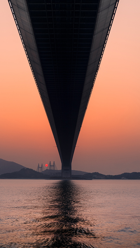
Feb 21 |
Comment |
Super, super shot. Ditto on what's said above. I think some content aware replacement and a 9x16 format with some dodging to lighten the upper bridge structure and burning to make the inside blacker adds a little more drama. I also put the sun at the 1/3 line. Here's the image so you can see what I mean. Really, really like the tones in this image! |
Feb 20th |
 |
| 88 |
Feb 21 |
Comment |
What an amazing spot and your timing was right. The sky is exceptional with colors and textures. The bridge nicely frames the waterfall with the arch mimicking a rainbow. The fall coloration looks good to my eye. I think the two gorge sides need to be contrasted by some burning of the right side since its the opposite of where the sun is. And IMHO some burning on the trees above the vapor plume of the fall in order to bring it out a tad. The tree on the right sets a nice frame to the image and perhaps IMHO a slight burning of the left side of the image in the dark underbrush would give a balance to to tree. An exceptional image and your PP was terrific. |
Feb 20th |
5 comments - 2 replies for Group 88
|
16 comments - 3 replies Total
|


