|
| Group |
Round |
C/R |
Comment |
Date |
Image |
| 56 |
Jan 21 |
Comment |
Once you explained the arms and legs it makes the image more understandable. I'd probably rename the image "All Arms and Legs"! Another very wonderful painting and those eyes are killers and that face is on the 1/3 line. |
Jan 24th |
| 56 |
Jan 21 |
Comment |
I like the way you warmed up the image in PP. I think I would soften the rocks a tad as their texture appears over sharpened. This would also bring out the texture of the wood more. The change in the wood coloration works well. |
Jan 24th |
| 56 |
Jan 21 |
Comment |
This reminds me of a scratch board etching. I think that the top of the elephant could be burned slightly for greater outlining against the white background. Very well done. Would make a great greeting card! |
Jan 24th |
| 56 |
Jan 21 |
Comment |
How cute is this?! The background goes well with the children and you certainly did a very fine job on the child facing us. Often we look at an image so very close and forget that most people will view it from a distance away. IMHO don't sharpen it. |
Jan 24th |
| 56 |
Jan 21 |
Comment |
Very nicely done, like the color and what you did for the background. You have a way of seeing things I cannot. Both images tell stories but different ones. I don't think you could go wrong. |
Jan 24th |
| 56 |
Jan 21 |
Reply |
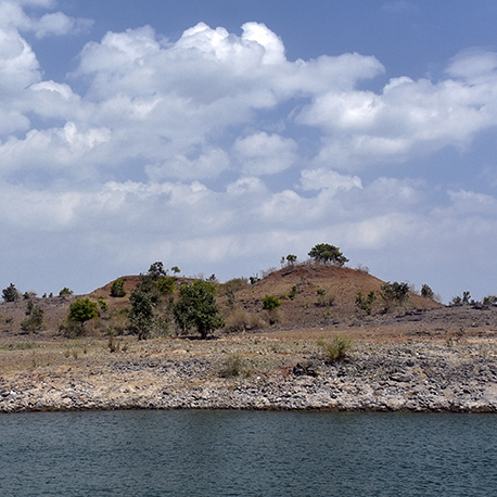
Cindy, I thought about that. 50% of me said to clone it out, 50% of me said leave it because it has a mystery element to it and makes one ask what it is. Of course it's a lake. I also thought the brightness of it drew the eye into the image. So what do others think? |
Jan 11th |
5 comments - 1 reply for Group 56
|
| 76 |
Jan 21 |
Comment |
That Orton effect does its job! Very well done as usual and the dodging and burning sell it. |
Jan 17th |
| 76 |
Jan 21 |
Comment |
You have truly found your niche in still life! I appreciate the arrangement of the pear stems and the leaves too! |
Jan 17th |
| 76 |
Jan 21 |
Comment |
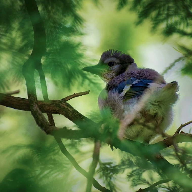
Ditto on what has been said. I really like the way you have captured the head and its eye is sharp (a very important detail). Shooting into trees has its challenges but the colorful wing came out well. I have included a cropping that I think would be beneficial, hope you like it that gets rid of the side distractions IMHO. |
Jan 17th |
 |
| 76 |
Jan 21 |
Comment |
What? No one mentioned the two-man crew and sculling, which adds so mush to the image! I love the contrast between the New (bridge) with the historic. These provide a lot of contrast. The original is indeed sharper but what do you want the image to convey: a study in sharp contrast or an image that is soft and more emotional? I really like the DOF you have int he image too. |
Jan 17th |
| 76 |
Jan 21 |
Comment |
Nice capture and ditto on the white area distractions in the trees at left. You might want to play with the Dehaze slider in LR to make the blacks darker. If the Highway 80 sign is important I'd sharpen it a tad, otherwise I would get rid of it. Nice image to capture and play around with! |
Jan 17th |
5 comments - 0 replies for Group 76
|
| 88 |
Jan 21 |
Reply |
I have included a 1/4 second image in reply to Gary's comment above. I think you would favor that one. Thank you for your constructive comments. |
Jan 17th |
| 88 |
Jan 21 |
Reply |
My trees are usually slightly blurred because to my eye they are distractions and I try and paint them slightly. This also compensates for any wind. |
Jan 17th |
| 88 |
Jan 21 |
Reply |
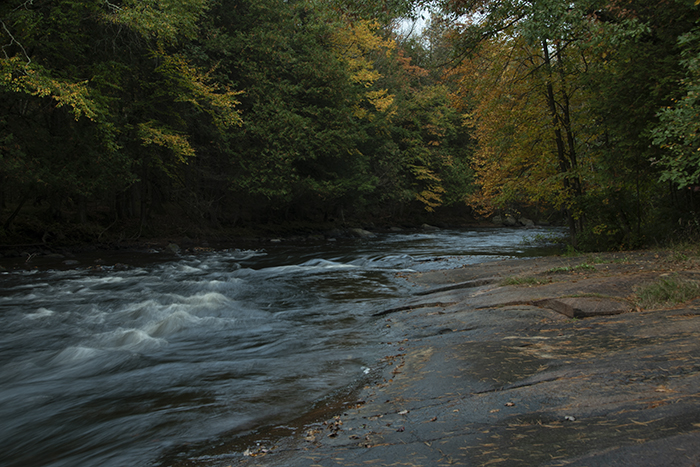
Gary, it's taken me almost 2 weeks to find where I filed that day's images! I don't have an 8 second but I have included a 1/4 second exposure that shows more lines in the water but not blur. |
Jan 17th |
 |
| 88 |
Jan 21 |
Comment |
Sanat, sometimes less is more. I think a square crop is beneficial to this image and I pit the highest hill and its trees on the 1/3 line and emphasized the sky with its beautiful clouds. I would suggest that this be a study in textures: the water below, the rocky shorelines, and then the hills. These elements can be enhanced in LR and I think give you the image that you seek. Those clouds are crazy! |
Jan 17th |
 |
| 88 |
Jan 21 |
Comment |
I agree with many of the constructive ideas above the make the image better. I would also suggest that the waterfall itself should be whiter as in the original and you can get that by burning it. There seems to be discussion about silky smooth water or water with some line sin it. That's up to your personal taste and what you want to convey in the image. I think the foreground focus would have been improved if you focused stacked the image. Since the image is about the waterfall and rainbow I would personally favor a 4x5 or square crop, but that's the photojournalist in me speaking! |
Jan 17th |
| 88 |
Jan 21 |
Comment |
There are a lot of nice elements to this image. I agree with the distraction of the cars and the pathway leads to nowhere. I agree with Gary that perhaps a different angle could be more effective in composition. This is when I look for an image within an image and I found one and have included it here. I use the algae pond as a line into the bridge and cottage and removed the background cars and the building at top right. I hope you like it. |
Jan 17th |
 |
| 88 |
Jan 21 |
Comment |
Well, I'll be the "drama queen" in the group! Sometimes it's not about what you see but about what you want to convey, the mood. Red is not only the color of aggression but of love and here you have conveyed the love you have for the image and the piece of landscape. Instead of the higher contrast, I would soften it a tad, making it "dreamy". After all, this is a fond memory come to life to share in an emotional way with others. You might also crop 16x9 to see if that is more conducive to what you want to convey. |
Jan 17th |
| 88 |
Jan 21 |
Comment |
I agree with the constructive comments above, and I would add that perhaps burning some of the buildings would add more contrast to the sky and water. Overall a nice minimalist image. |
Jan 17th |
| 88 |
Jan 21 |
Comment |
Well Gary, this was an instant fave for me. I really like how you have transformed the image into something that has impact. Of course, I favor the colored version. The hand-painting is very well done with the red very natural. My only suggestion would be to paint (since you have painted the image) the large barn red to put more of that color in the image for great impact of the overall image. This is very well done! |
Jan 17th |
6 comments - 3 replies for Group 88
|
16 comments - 4 replies Total
|