|
| Group |
Round |
C/R |
Comment |
Date |
Image |
| 56 |
Dec 20 |
Comment |
Amazing. That was my first impression. I like the suggestions above for refinements but your process on this image is wonderful. Your original ain't too shabby either! |
Dec 20th |
| 56 |
Dec 20 |
Comment |
I truly appreciate the vibrant coloration you opted for in this image. I am confused as to what is the focus: apparently others feel it is the crow on the tree and not the sunrise sky. Would the image have more impact if you darkened (burned) the mid ground area just before the first tree line and thereby add more depth and contrast? The original just has that feeling of depth. I also like the mid ground "fog" though in the original it may be ground. This adds some mystery to the image. |
Dec 20th |
| 56 |
Dec 20 |
Comment |
Texture. You have been successful in displaying the texture within this image and I really like the contrast of the muddy water being sprayed by the elephants. Even the ground now has dimension. The background does well to make the elephants standout. |
Dec 20th |
| 56 |
Dec 20 |
Comment |
You really created a fantastic frozen moment with such loving expression between the sisters. Your use of painting and a new background really sell the image. Very well done and emotive. |
Dec 20th |
| 56 |
Dec 20 |
Comment |
I love the sky and the buildings on the hilltop. I think the crop Cindy did was good. I like the color you put into this painting to enliven it and make it so inviting. |
Dec 20th |
5 comments - 0 replies for Group 56
|
| 76 |
Dec 20 |
Comment |
Ditto on what Ian related, which was very well done. The only thing I don't like in the image are those distracting white bars across the top as it takes away from the impact - I find myself asking what those are several times. |
Dec 20th |
| 76 |
Dec 20 |
Comment |
Setup is impeccable. I don't think you could lose either way: b&w or color. To balance out the bright at top right, I'd slightly brighten the small disc at far left then burn the top right slightly till a balance between the two was achieved. The sharpness is right on and the reflection gives a very different but nice DOF. I also think you should add more black to the top and bottom as the black to the left makes the image "crunched" to my eye. You have a very nice style to your images! |
Dec 20th |
| 76 |
Dec 20 |
Comment |
I saw the Cuyahoga River on fire 40-50 years ago when I visited my brother in Cleveland. It's a lot cleaner now I understand! I agree with Ian about the building at right and the gradient for the sky. The Great Lakes water levels are at historic highs and the pilings around the lighthouse are a testament to that. I think you did everything you could to this image considering you were on a tour boat so find the exact precise angle to shoot was something you couldn't do. It is nice that the lighthouse is just off center. |
Dec 20th |
| 76 |
Dec 20 |
Comment |
Sanford, you know what you've started? Yep, a travel log of your car here and there or even images of portions of your car! Looking forward to them. In this image the rays of light are perfect. The traffic is perfectly positioned but what was your ISO? A faster ISO would give the motorcycle more clarity as it appears to be the only aspect of the photo out of focus. Did you want your car sloped to the right? I'd level the image on the rear horizontal lights bar because the car is the obvious focus: discoveries when driving a Porsche. |
Dec 20th |
| 76 |
Dec 20 |
Comment |
A wonderful sense of depth in the photo and the capture of the spray is to die for! My eye tells me there is some dead space at far left as the rocks counter balance the weight of the spray at right. The foreground is nicely focused and the contrasts there are super. |
Dec 20th |
5 comments - 0 replies for Group 76
|
| 88 |
Dec 20 |
Reply |
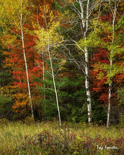
This grouping of trees was on the edge of a farm field, so a horizontal shot just didn't present itself IMHO. And the sky was overcast on this day so in my composition I chose to cutoff the sky. |
Dec 20th |
| 88 |
Dec 20 |
Reply |
Like all woodland sometimes things aren't perfect. If I tilted the image to get more at the top I got sky, which was overcast, so I cropped it off when I composed the shot. Thanks for your kind comments. |
Dec 20th |
| 88 |
Dec 20 |
Reply |
Gary, thanks for your eye on this. I agree with you. |
Dec 20th |
| 88 |
Dec 20 |
Reply |
You know, I downloaded an image used for gift cards so it is the 4x6 size. Here is an 8x10 crop that does what you suggested. |
Dec 5th |
 |
| 88 |
Dec 20 |
Comment |
Very nice DOF and I like the way you captured the misty clouds on the ridges of the mountains. The clarity of the closest ridges is well done and I like the way you "greened" up the trees. My only suggestions would be to burn in some of the darker clouds at top to provide more drama and contrast and allow those columns of whisps to stand out more. I sure envy people who have mountains close to them to shoot and shoot from! |
Dec 4th |
| 88 |
Dec 20 |
Comment |
The sharpness and DOF is very good in this image. There is a wonderful contrast of colors here and the rock cropping points to the mountains in the distance. I do believe that you took some of the drama out of the sky by lightening it so much. Very nice scenic overlook! |
Dec 4th |
| 88 |
Dec 20 |
Comment |
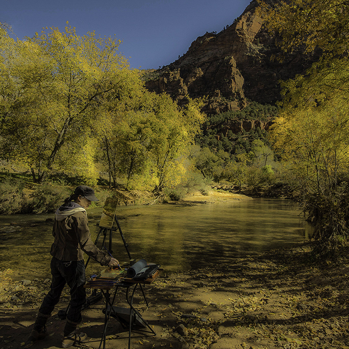
I did use the link to Michelle Conradt's website and her paintings are abstract, which this is not. You did a good job lightening her face and painting area. The golden glow certainly warms up the image. I think more intimacy in the image might be to use a square crop (see below) so she isn't fighting with the scenery for attention and it creates a more obvious circular eye movement from her, to the river, to the mountain, down the mountain to the dark tree limbs and trunks and back to the artist. It must have been a very cool experience to chat with her! |
Dec 4th |
 |
| 88 |
Dec 20 |
Comment |
Pictures like this always remind me Fruit Loops cereal with the colors! Some great leading lines in this image all taking the eye into the sun, which is a beautifully captured starburst. I like what you did with the sky in bringing color back into it compared to the original. And that rock shelf really adds to the grandeur of the setting. The river is a nice contrast to the foliage on both sides of it and provides another leading line. Kudos! |
Dec 4th |
| 88 |
Dec 20 |
Comment |
Very successful night photo image! The warmth of the golden glow of the bridge sets it apart from a lot of other blue-sided images you see in similar photos. The bridge road leads the eye into the image but then right off the photo a right. Perhaps brighten the city element you have at the end of the support towers and then burn the roadway darker that takes you off the image? |
Dec 4th |
5 comments - 4 replies for Group 88
|
15 comments - 4 replies Total
|