|
| Group |
Round |
C/R |
Comment |
Date |
Image |
| 56 |
Nov 20 |
Reply |
Thanks so much Terry! I was lucky to catch it without wind. Three hours later there was a brisk wind! |
Nov 21st |
| 56 |
Nov 20 |
Comment |
This image is just so much fun! I like the blue atmosphere and the foreground contrasts with the tombstones behind. Did you intentionally create the outline of a building at top left? That adds to the spookiness. Very cool image! |
Nov 21st |
| 56 |
Nov 20 |
Comment |
Very nicely done and I like the coloration of the final! I didn't know that at left on the shack is a door, so perhaps refine that a tad to make it stick out just a little more. The way you framed it with the trees at right and then the colors at bottom left hold it together. Kudos! |
Nov 21st |
| 56 |
Nov 20 |
Comment |
I agree with all that's been said. The flip gives the leading line emphasis for the western eye. The oil paint filter you used was appropriate because everything in the image is "rough": the rocks, the water, the wreck. I also like the change in coloration of the sea and sky. To my eye, I would darken the rock pile at bottom right so it isn't fighting with the wreck for attention. I really like this image! |
Nov 21st |
| 56 |
Nov 20 |
Comment |
This is very well done and I'm sure Virginia absolutely loves it. The stepping out of the center frame is wonderful and I like the "ironing" you did on the fabrics. |
Nov 21st |
| 56 |
Nov 20 |
Comment |
This image is all about tonal contrasts with primary colors to add another contrast. The red suit on the rider at right draws the eye through the image from the "sea" of black, from which those colored helmets all point. My question as I look at the image is what is the story? My eye goes instantly to the colored helmets, not the bikes or the riders. Then I ask, why the helmets? As a gear brain, I look for the bikes not the helmets. Sports is about action, so what's the "action" story here? It certainly isn't the helmets. I do like what you did with the b&w background and the white bordering. There again, maybe the nondescription is what you wanted such as a background image for something like a hallway wall or behind a wall of trophies, where it would work well. |
Nov 21st |
| 56 |
Nov 20 |
Reply |
Thanks Pat! The Bluebell can be touchy at times but when you want that canvas look, I really like it. I toyed with a 16x9 crop but that took off too many clouds to my eye. I also thought of removing the pontoon boat at right but I thought it gave some perspective. |
Nov 21st |
| 56 |
Nov 20 |
Reply |
Thank you, autumn in Wisconsin is a special time of year and the morning I took this was windless and I couldn't believe the clouds. |
Nov 21st |
| 56 |
Nov 20 |
Reply |
Thanks! |
Nov 21st |
| 56 |
Nov 20 |
Reply |
Thank you so much for these wonderful remarks! |
Nov 21st |
5 comments - 5 replies for Group 56
|
| 76 |
Nov 20 |
Comment |
Nice capture and you have a lot of wonderful stuff in this image! First, I'd remove the tower jutting into the sky. You have 9 horizontal lines comprising this image and a pano crop below the reflection of the bird at right would bring these lines into balance. All but two of the vertical areas are rough, so the smooth water in which the birds stand compliment the sky. I think you have a nice image illustrative of contrasts here. |
Nov 21st |
| 76 |
Nov 20 |
Comment |
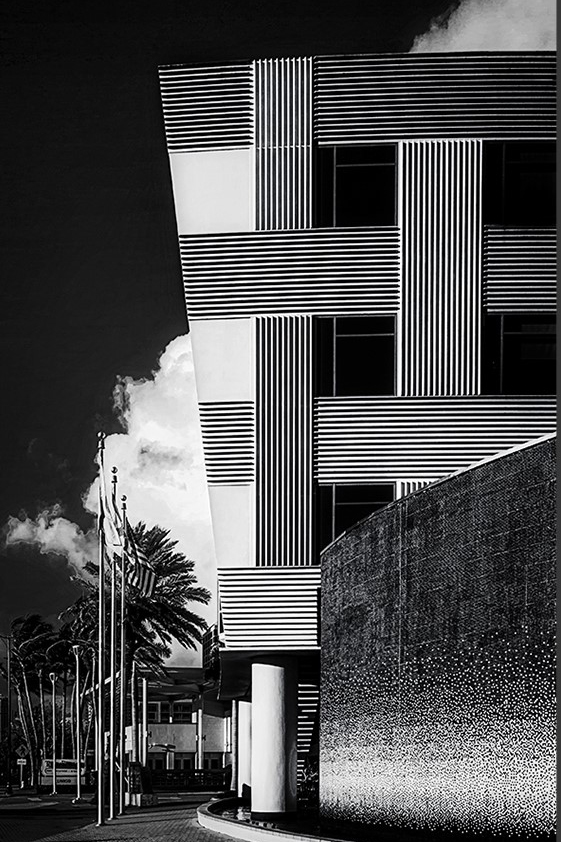
I like your eye on this image Cyndy and I think a little cropping could get rid of the distractions (see attached). The cloud for me is what ties all the lines together and brings out a tonal contrast as a background piece. By cutting off the buildings at the left you are left with vertical lines from palm tree trunks and flag pole and supports columns on the building behind. The US flag adds more lines. The foreground contrast of the arched wall is wonderful as a leading line. Of course, the choice of b&w is excellent. |
Nov 21st |
 |
| 76 |
Nov 20 |
Comment |
You did a very good job cropping to the "action" in the image. I like the coloration of the PP. The focus point in the image are the sharp edges of a few petals and though strong I would sharpen a tad bit more to make them "obvious" as the "catch" for the eye. The dark center is like a black hole to my eye so the petals around it need to compete for attention so adding a glow IMHO would be appropriate. I also wonder what "mood" you want the image to state with the image and that would allow you to burn and dodge a bit to set that mood. |
Nov 21st |
| 76 |
Nov 20 |
Comment |
The sky and autumn reflections are what sells this image and I like the "V" of the shoreline and treeline to guide the eye into the image. I hope you went back in a week to see better colors! Very well done and it could be a page in a calendar for October! |
Nov 21st |
| 76 |
Nov 20 |
Comment |
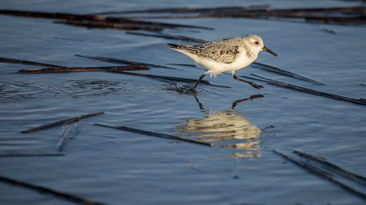
I must disagree with some observations here and live up to my reputation as a contrarian! The bird and reflection are good. I very much like the ripples behind the bird that add a geometric contrast to the lines of the reeds/stalks so abundant in the image. For me, the story isn't about where the bird is going but what its path has done to set about a contrast of shapes, one of which is the bird and its reflection. The contrast between the white of the bird and the darkness of the water is also excellent. The only thing I would do differently is the crop (my photojournalist eye) as seen here. |
Nov 21st |
 |
| 76 |
Nov 20 |
Comment |
Way to think out of the box! This is a nice effect, kind of like ICM but not. The choice of b&w makes it surrealistic. I also like reading the ONE WAY sign and how the blurred area isn't going in that direction and the signs for travel, which is what the people are doing. This makes me want to do some ICM at parades this summer (if they ever can happen again!). |
Nov 21st |
| 76 |
Nov 20 |
Reply |
That sounds like an interesting book, I'll have to check it out. Thank you. |
Nov 21st |
| 76 |
Nov 20 |
Reply |
Thank you! |
Nov 21st |
| 76 |
Nov 20 |
Reply |
Thanks for your comments! My rule of thumb is not to print anything for my wall until a year after I process it. If it endures that long with me, then it's worth it. I have too many framed art prints and photos as it is haha! |
Nov 21st |
| 76 |
Nov 20 |
Reply |
Thank you! |
Nov 21st |
| 76 |
Nov 20 |
Reply |
Thanks Cyndy and congrats on the PSA Showcase, you deserve that recognition! |
Nov 17th |
| 76 |
Nov 20 |
Reply |
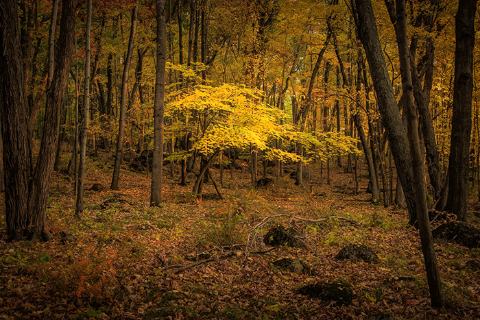
Quite right Cyndy, Topaz. Ian included my message to him so here's the lead and the tech stuff: The bark texture on the oak tree's trunk and limb interplays with the oak and birch leaves and birch tree trunk and limbs giving a unique glimpse into what a woodland's canopy looks like in autumn alongside a Central Wisconsin lake. Standard PS and LR processing, then put into TopazStudio for a couple of sharpening/texture presets. Tech stuff: ISO 100, f/11, 1/5 second, pattern metering, 170mm. |
Nov 9th |
6 comments - 6 replies for Group 76
|
| 88 |
Nov 20 |
Comment |
Ditto on comments above and I think if you take multiple exposures next time you shoot this vista you will capture a wonderful image! |
Nov 21st |
| 88 |
Nov 20 |
Comment |
A very cool image and the DOF and sharpness of the rocks is right on. Why did you favor adding a golden glow to the rocks? I think either the original or final look is fine, but wondered why you favored the golden glow. |
Nov 21st |
| 88 |
Nov 20 |
Comment |
Beautiful color but I favor the original deeper yellow. I agree that the sky at right is distracting so I would have opted for a vertical image of the left side, which would center the eye on the bench and the pathway through the trees behind it. IMHO, a square image lopping off the closest and dominating branches at top would give you a delightful fall image and cutoff most of the sky. What a wonderful place! |
Nov 21st |
| 88 |
Nov 20 |
Comment |
This is outrageous! All the symmetry and straight lines, then POW squiggly lines to break up the monotony. I like all your choices in this image. As a second image from the original, you might want to do a vertical of the center element and that would be a totally different feel and impact. The zoom was a good choice for lens too. |
Nov 21st |
| 88 |
Nov 20 |
Comment |
There are a lot of neat things about this image and I agree with some of the remarks above and especially Gary Butler's point about a little more detail in the wooded areas. The snake-shaped road to the weather station is the leading line that continues to the round ball over the radar and into the sun. I love the saturations of the sky and sea. I'd darken the bottom right corner of the image. Very cool image! |
Nov 21st |
| 88 |
Nov 20 |
Comment |
There's so much here to please the eye. Interesting comments about the PP. Everything in the image works so well together! I have been playing around with Clarity and Dehaze and Texture in combination and often use Texture and Dehaze, the latter "enriches" the saturation. If I owned one of these homes, I'd have to have this for over my mantle! |
Nov 21st |
| 88 |
Nov 20 |
Reply |
Like this? I used the dodge tool in PS. |
Nov 2nd |
 |
6 comments - 1 reply for Group 88
|
17 comments - 12 replies Total
|


