|
| Group |
Round |
C/R |
Comment |
Date |
Image |
| 56 |
Oct 20 |
Comment |
Normally I walk on the dark side, but in this case I must go with the lighter version. The "action" is the interchange between adult and child and in the darker version that is obstructed. The lighter version emphasizes the simplicity of life, which is a beautiful thing. The circular motions within the image is wonderful with the adult's neck providing a nice contrast. The title's use of "Tender" makes me choose the lighter version because the darker is "Stark". So, it appears from the comments that either version is a winner! |
Oct 22nd |
| 56 |
Oct 20 |
Comment |
The cropping makes the image as the yellow brings the eye in and then it goes to the faces of the two people. You made a great choice in replacing the background and in the tilt of the image to remind us of the g-force of the ride (who hasn't gone for a ride on one of these?). Why did you change the color of the girl's hair? |
Oct 22nd |
| 56 |
Oct 20 |
Comment |
I agree with comments above. As a former photojournalist, I like the way the image goes right to the action of the image. I favor the original color of the eyes, which you have captured in focus, and I wouldn't have the painted effect over them because that's where my eye goes and keeps me. Really neat image. |
Oct 22nd |
| 56 |
Oct 20 |
Comment |
When I first saw this it reminded me of images from an Old West mag that I was once acquainted with. So for nostalgic reasons I like what you've done with BuzSim. My eye goes to the fan tails (maybe the hunter in me) so the 4th jake doesn't bother me because the tail is the important element for me and provides a bridge to the turkey in the back. IMHO it would be cool to put a wooded or prairie scene with this (also increase the demographics for interest in image) and still make it appeal to people like my wife who have me hang turkey decor for this season! Can't wait to see the final painting. |
Oct 22nd |
| 56 |
Oct 20 |
Comment |
This image is very cool and I love the "action" of it. Your choice of Cave Dweller was very appropriate and I agree with Nancy's addition of space at right. The contrasts of light within the image are also very good. |
Oct 22nd |
5 comments - 0 replies for Group 56
|
| 76 |
Oct 20 |
Reply |
I bought a screw-on Pro Master variable ND filter 1.3-8 stops $180 https://amzn.to/2T46Ki9 |
Oct 15th |
| 76 |
Oct 20 |
Reply |
Yeah, but the water here is tinged, farm country. I do prefer the white too, so I will backtrack and see if I can "get the stain out". |
Oct 8th |
| 76 |
Oct 20 |
Comment |
The tonal ranges for b&w are good in this image and I think the use of an Orton effect was a good choice. I think the image may have been over sharpened a tad or too much Clarity added, which is apparent at the light globes on the street. What a neat place! |
Oct 5th |
| 76 |
Oct 20 |
Comment |
Extremely well setup and processed! Your choice of b&w was perfect and the result is wonderful. The off-center position of the vase is offset nicely with the glass topped in the foreground. How did you set up the lighting and background for this effect? |
Oct 5th |
| 76 |
Oct 20 |
Comment |
I really like the shadows and tree branch lines interplaying. The center of thee flower is nicely focused. The square crop is a good choice that could be improved with a vignette. The bokeh background serves the image well. |
Oct 5th |
| 76 |
Oct 20 |
Comment |
Nice DOF and contrast between tones. I think that the image could benefit from cropping so the 2nd tree clump in front of the island is on the 1/3 line. The b&w tones are very good. |
Oct 5th |
| 76 |
Oct 20 |
Comment |
I think you were successful in your capture. The various colors are all good and the horizontal levels contrast nicely with the vertical figure. I'd take it one step and add an impressionist painted effect to see where that would go. I'll keep this in mind when I'm trying to figuring out what to try over the winter! |
Oct 5th |
5 comments - 2 replies for Group 76
|
| 88 |
Oct 20 |
Comment |
Awesome! I really like everything you did here. |
Oct 5th |
| 88 |
Oct 20 |
Comment |
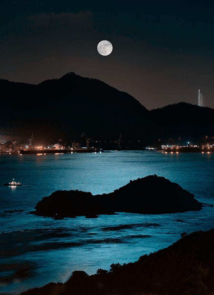
I really like the mood of the upper portion of the image. I would cutoff the lights at the bottoms and extend the dark foreground down (as in the image below I quickly altered). There's such a nice interplay between the moon ,the small boat, and the lighted tower at top right, with the foreground island helping with the flow within the image. |
Oct 5th |
 |
| 88 |
Oct 20 |
Comment |
You are so darn talented! What a great shot, wonderful colors, and what you did with crayons was brilliant! The flow of the lines in the background architecture keeps a circular movement in the image. The flowering fruit tree sure benefits from this kind of balancing! Very well done. |
Oct 5th |
3 comments - 0 replies for Group 88
|
13 comments - 2 replies Total
|