|
| Group |
Round |
C/R |
Comment |
Date |
Image |
| 56 |
Jul 20 |
Comment |
I really like the softness of the hair and agree that the eyes should be softened down a tad. I like the shadowing at right and the light coming in from the left to give it some DOF. Just a very cool image to me. |
Jul 16th |
| 56 |
Jul 20 |
Comment |
Fairybook illustration! I love the golden tone, which brings out the light and shadow contrast so well. The choice of painting filter was brilliant. Definitely makes the viewer ask questions about why this is where it is, what is the story to be unveiled behind this fence. Kudos on a wonderful image! |
Jul 16th |
| 56 |
Jul 20 |
Comment |
I really, really like what you did with painting this image and softening everything. The oval mat is the vignetting that brings the eye right to the story of the image. I think both images are very good and your subjects would be please with both! |
Jul 16th |
| 56 |
Jul 20 |
Comment |
You sure did an amazing composite with these two images! For me, the trees' height in the background is distracting and I would cutoff about 2 inches and above the roofline and that would bring my focus right to where it should be. The interplay of the colors brings joy to me, it is a fun image! |
Jul 16th |
| 56 |
Jul 20 |
Comment |
I am stumped as to how to switch the two images!
The Final is actually the Original, so to see the real Final larger, click on the image dubbed Original.
I apologize for the err, my bad!
|
Jul 11th |
5 comments - 0 replies for Group 56
|
| 76 |
Jul 20 |
Reply |
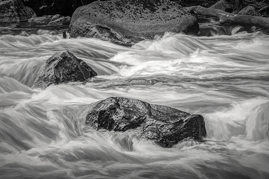
Here is my take on the b&w. It does lighten up the water. |
Jul 16th |
 |
| 76 |
Jul 20 |
Comment |
Classic minimalist image with great contrast between light and shadow with geometric interplay that makes the viewer stay for a long time. Definitely a wall hanger! May I suggest that you cleanup up the 3 dots (birds?) in the upper right panes over the outside chimney? |
Jul 16th |
| 76 |
Jul 20 |
Comment |
Wow, what can be done with a grocery store flower is amazing! I like the use of negative space and the flower sits at the third line. Your PP is excellent. I'd like to see more background on the left side so when it is framed the flower isn't sitting right on the far left edge. Always a pleasure to view your photos! |
Jul 16th |
| 76 |
Jul 20 |
Comment |
Very nice image, nicely processed and very geometrical. The contrast between the building and reflected buildings is wonderful. My only suggestion would be to trim some of the right side of the image and add a vignette since 3 of four corners don't have a reflection in them. |
Jul 16th |
| 76 |
Jul 20 |
Comment |
Ian, I like the way you softened the face color and brightened the shadows and the sharpness of the face and hat make the image. Everything else is window dressing! The background provides a nice contrast to the foreground model. Would she be spooky in b&w? |
Jul 16th |
| 76 |
Jul 20 |
Comment |
Thanks so much for all the comments, I appreciate them. Yes, the river is brown, it meanders through Wisconsin farmland. Doty, I'll try the b&w on my end, thank you for thinking of that. My "test" with this shot was to get the water right and it was challenging. I did take several images and the location is about an hour from my house so I plan on returning again in the fall. |
Jul 16th |
5 comments - 1 reply for Group 76
|
| 88 |
Jul 20 |
Reply |
Interesting. Do you prefer the image flipped? |
Jul 17th |
| 88 |
Jul 20 |
Reply |
Wow, that really was a project! Thanks for explaining. Not easy to do a pano in this case. |
Jul 17th |
| 88 |
Jul 20 |
Comment |
Ditto as all mentioned above, a wonderful image. I like the ice flows at left for leading line, and scale with the people and boats, and most of all the blue in the ice. I didn't have the luxury of going into a smaller boat closer to the glacer when I went there. Makes me want to dig out my Alaska trip negatives now! Really cool image (no pun intended!). |
Jul 16th |
| 88 |
Jul 20 |
Comment |
You have done an outstanding PP job here. The DOF is wonderful. An image one can get lost in! |
Jul 16th |
| 88 |
Jul 20 |
Comment |
There's so much a like about this image. There is a definite direction from foreground to background, a bowing limb over the top, the reflection which starts the circular eye flow around the image. My suggestion would be to add a vignette as to bring the attention to the center of the image.I would also trim off the right and left sides a bit to further push the viewer into the middle of the image. |
Jul 16th |
| 88 |
Jul 20 |
Comment |
I think you achieved what you had set out to do. I'm okay with juicing images, as you know, and sometimes some images just shout to us for that. For me the water at left fights with the blue of the bridge for dominance and I would rather see the bridge win. For me, the obvious focus screams from left to right, so the sharpness of the first couple of columns is where I end up. I don't look at the top of the bridge against the sky so people up there would be a distraction. Remember the Latin maxim: quit tu recipitus ..., the received receives that which they are capable of receiving. Fancy way of saying, beauty is in the eye of the beholder. It's okay to make art for ourselves and you have succeeded here. Enjoy it. |
Jul 16th |
| 88 |
Jul 20 |
Comment |
A wonderful and impressive image! The color and reflections are very good. The coloration of the foreground and clouds are inviting. I also wonder like Gary B. why you cut off the left side of the island. If you moved to the right you could have made more use out of the water line to be a leading line into the mountains, but given the popularity of the site I'm sure 100 other photographers were in that position!Kudos on the pano. |
Jul 16th |
| 88 |
Jul 20 |
Comment |
This image made me smile! You did some wonderful things to make this image pop and have the viewer ask herself some questions - which is important. I really like Sharon's idea about making the background b&w/monochrome and leaving the art in color. You live in a neat city! |
Jul 16th |
| 88 |
Jul 20 |
Comment |
This is GREAT discussion! |
Jul 15th |
| 88 |
Jul 20 |
Reply |
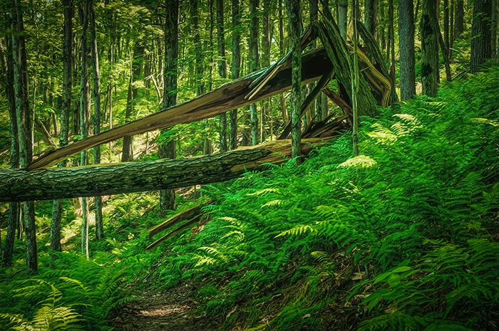
Well, here's a whack at the colored version. I have flipped like Gary suggested. Now you have a comparison. |
Jul 13th |
 |
| 88 |
Jul 20 |
Reply |
I didn't think about flipping it, thinking out of the box Gary! I'll wait to see what others say, but it makes me ponder. Yes, I use a tripod for my woodland. |
Jul 8th |
| 88 |
Jul 20 |
Comment |
I forgot to add the following to my description: Shot at ISO 100, f/16, 1 second, manual focus, 32mm lens length. I processed through PS and LR then put it into TopazStudio and much to my surprise as I looked through my Favorite presets the b&w presets jumped out to me with the drama displayed so I pursued that thought in applying presets. |
Jul 4th |
8 comments - 4 replies for Group 88
|
18 comments - 5 replies Total
|