|
| Group |
Round |
C/R |
Comment |
Date |
Image |
| 5 |
Aug 20 |
Reply |
You know Pete this is what is so good about DD, I never noticed the puddle until you pointed it out. Thanks. |
Aug 21st |
| 5 |
Aug 20 |
Reply |
such a clever reply Pete this made me laugh as much as Nick's image. |
Aug 16th |
| 5 |
Aug 20 |
Reply |
Bob don't forget when replying to use the indent, it is less work for our webmaster when tallying comments, see in red below. |
Aug 7th |
| 5 |
Aug 20 |
Reply |
When enlarging the pic. I see what you mean, actually I don't have too many scanned slides so probably won't happen again, but thanks for bringing it to my attention. |
Aug 6th |
| 5 |
Aug 20 |
Comment |
The addition of the darker sky certainly made a huge improvement as did the cropping on the RH side. The sweep of the FG takes my eye around to the building. It's a lovely image , well done! |
Aug 5th |
| 5 |
Aug 20 |
Comment |
Another fun image of your imagination. I always enjoy the fact that you don't forget to include the shadows. I would like this more if the huge sunset wasn't in the picture. |
Aug 5th |
| 5 |
Aug 20 |
Comment |
A beautiful landscape Mark. it is such a lovely image; the FG has an interesting pattern in it. The pp really brought out the glow. I cannot find anything to say to improve this image.
Good work! |
Aug 5th |
| 5 |
Aug 20 |
Comment |
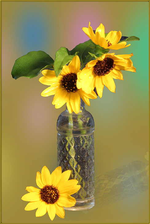
A very ingenious idea Pete. The insect stretching out its ?claws?on the peanut is so good. The reflections in the glass and the OOF handle do not bother me. I can't see anything to add/change. Since you have a variety of insects can we expect to see more? |
Aug 5th |
| 5 |
Aug 20 |
Comment |
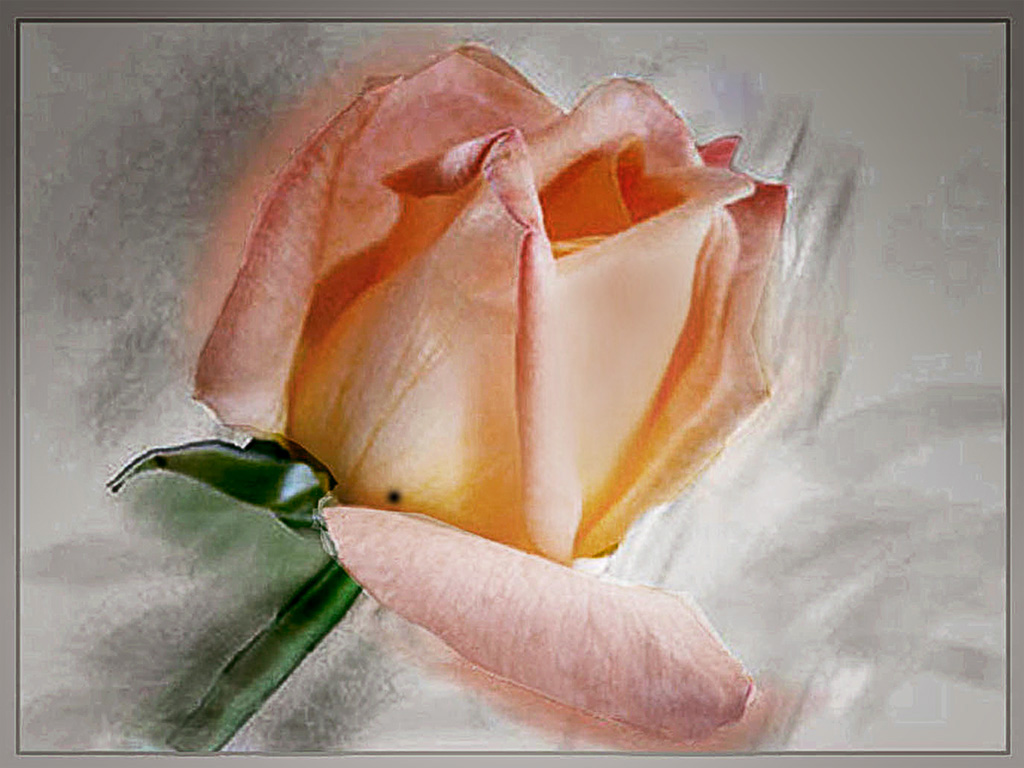
The curve curve in the stem certainly adds to the image and the sharpness is spot on Only thing I would have added is very small frame to set it off. Not too important but I would have painted over the very small protuberance between the two lower LH petals. Well done! |
Aug 5th |
| 5 |
Aug 20 |
Comment |
An impressive story to the image Stephen--what one will do to get a picture! It is a great image; the woman off to the RH side asks of the other two --'are you coming?' The bent back of the one shows the burden. I was thinking that I would prefer the sky to be more blue, then I decided that would make a happier picture and this is certainly not so, it shows a strenuous duty. Good work! |
Aug 5th |
| 5 |
Aug 20 |
Reply |
Is that slide debris on the side of the house at the LH side? I though it was part of the neglect of the house. |
Aug 1st |
6 comments - 5 replies for Group 5
|
| 23 |
Aug 20 |
Comment |
Shirley I think this is a stunning image, yes it is better with more room at the top. Good work! |
Aug 7th |
1 comment - 0 replies for Group 23
|
| 75 |
Aug 20 |
Comment |
The colours in the Original 2 are so interesting, the variations of beige and blue, but your finished image has an air of mystery so it stands out from the norm. I tend to agree with the others in that the the light across the top could be cropped, I don't think it adds and it is somewhat distracting, but all in all, a lovely image, good work! |
Aug 15th |
1 comment - 0 replies for Group 75
|
8 comments - 5 replies Total
|