|
| Group |
Round |
C/R |
Comment |
Date |
Image |
| 5 |
Aug 18 |
Reply |
Oliver, you and David make a good point, by all means take advice from others and see your images through another's eyes and perhaps they make a good argument for change but in the end it is YOUR image and yours to present as you see fit. |
Aug 28th |
| 5 |
Aug 18 |
Comment |
Well done John! I do agree with Nick this image needs a frame, partic. because of our black BG. |
Aug 18th |
| 5 |
Aug 18 |
Comment |
Once again David your bringing up an interesting image from that which most of us would walk past. This I see as a creative image. Your mind's eye obviously sees the possibility of the finished image when you took this very mundane pic. Nothing to add David but congrats on another remarkable presentation. |
Aug 18th |
| 5 |
Aug 18 |
Reply |
I couldn't see the frame either Nick |
Aug 18th |
| 5 |
Aug 18 |
Reply |
I would assume so, but my friend Barbara is the expert on all things with wings. |
Aug 18th |
| 5 |
Aug 18 |
Reply |
Border? see my last sentence. this happens often Nick, it shows on two sides but not the others. I'm just using a plain stroke, nothing fancy. |
Aug 18th |
| 5 |
Aug 18 |
Reply |
Agreed, this is a great improvement to my eye. |
Aug 7th |
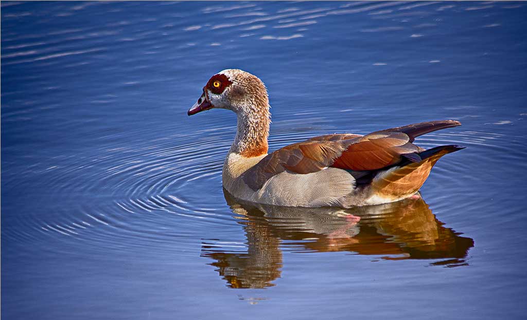
| 5 |
Aug 18 |
Reply |
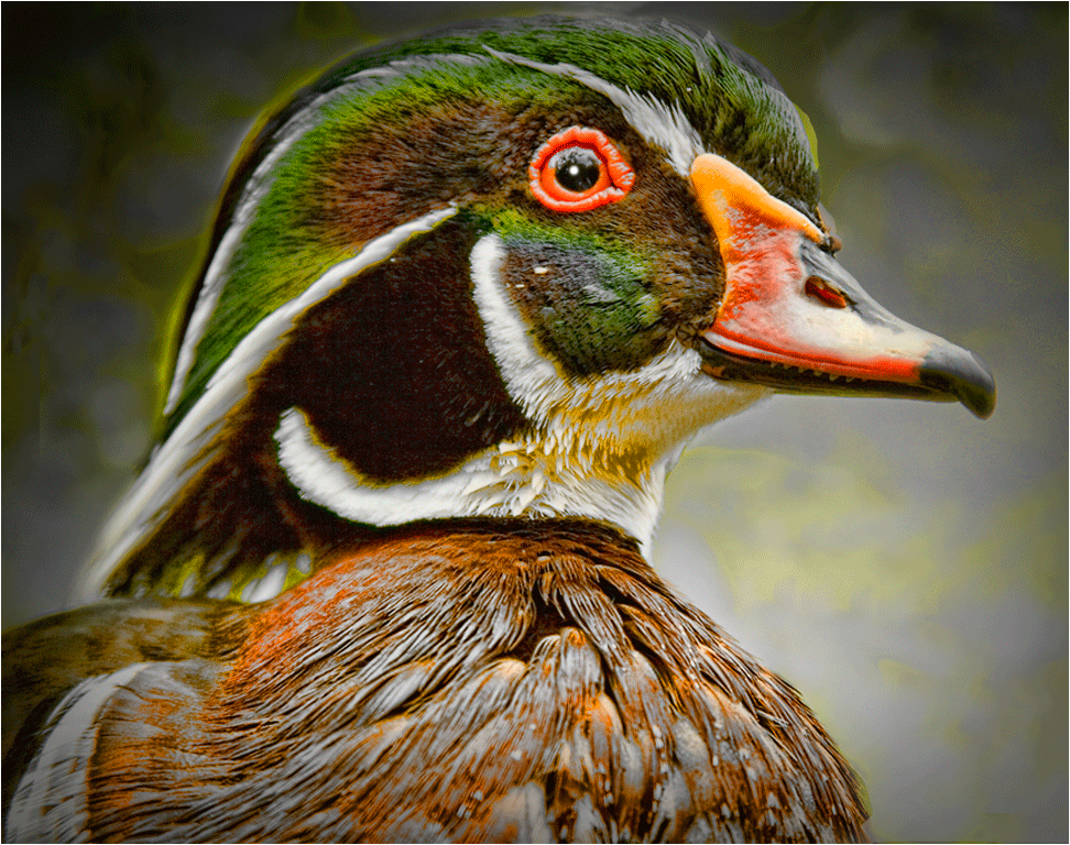
Thanks Barbara. Whoops on the name eh? goose not duck, like calling a turkey a chicken! |
Aug 6th |
| 5 |
Aug 18 |
Reply |
Yes, I thought of that, but it cuts off a bit of the swirl on each side, and I did cut the RH side somewhat. I do agree with Rick that he would be better placed coming towards me. |
Aug 5th |
| 5 |
Aug 18 |
Comment |
All the intensity of the struggle is mirrored in the faces--it is a super shot with such great sharpness. I thought at first glance the chap on the R was John Kennedy, I suppose it is the hair likeness. If you could possibly clone out the man between them (with something in his eye? or a whistle in his mouth?) to me it would make this image even more outstanding. A great human interest image Rick. |
Aug 2nd |
| 5 |
Aug 18 |
Comment |
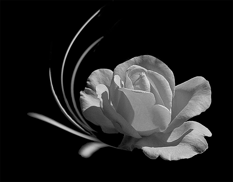
This lighting is so good Oliver and taking it from the back makes an even better image; the petals are just exquisite. To my eye it needs a little bit of cleaning up. I would darken, or just paint with black, to get rid of the pesky leaf in the top RH corner and part of the one below it. Ditto the leaf on the LH side and the partial one on the bottom R. Frame it and WOW! |
Aug 2nd |
| 5 |
Aug 18 |
Comment |
Nick, this has to be one of the best you have done in a long time. I am sure there is a good explanation and I am just not seeing it, but what is the crack representing and what is beneath it? |
Aug 2nd |
6 comments - 7 replies for Group 5
|
| 13 |
Aug 18 |
Reply |
This is not the place to write this, but-- I deleted a lot of email lately so am not sure about receiving yours. Do this: write me between 7 and 8 pm tonight and at 8:30 I will let you know if I rec it. |
Aug 2nd |
| 13 |
Aug 18 |
Comment |
An interesting shot Tim, but I don't see that it fits the requirement of 'fill the frame', Barbara's 'Fiery Lily" is an excellent example of the month's choice. Filling the frame would be to my mind a good subject for a macro shot. |
Aug 2nd |
1 comment - 1 reply for Group 13
|
| 34 |
Aug 18 |
Comment |
The painterly effect suits the image well Candy but I do agree with the others that the trees could be brighter since that is an important feature of the birch. Am I the only one who thinks that although the dark bottom gives a base to the image it could be a fraction lighter? |
Aug 14th |
| 34 |
Aug 18 |
Comment |
It did indeed give me a chuckle, well done Jan. |
Aug 1st |
| 34 |
Aug 18 |
Comment |
Georgianne what a wonderful step by step method, I notice you do this often, I wish others would, it is so informative. Thanks.
For an interesting tattoo, actual not contrived, you might want take a look at my July group member Oliver Morton
http://psadigital.org/group05/image.php?iid=27906
Your image is interesting and imaginative as behooves ' Creative' but to me the tattoos around and almost in her eye go a step too far, but I applaud your imagination. |
Aug 1st |
3 comments - 0 replies for Group 34
|
| 41 |
Aug 18 |
Comment |
Good eye Lisa, I am always impressed when I see someone make something out of what many of us would walk by. The idea of flipping and duplicating made it well worth while. The colours are great enhancing, the orangey tones add much to it. |
Aug 13th |
| 41 |
Aug 18 |
Comment |
Kathy, this is a super image and the colours are magnificent. The bird doesn't add anything for me. I have used Flaming Pear often and I have seen it used by others and frequently it is over done but here you have used it so subtly. Excellent work! |
Aug 13th |
| 41 |
Aug 18 |
Comment |
So good to see you have joined in Yolanda but you forgot to add the "how I did it" which is important to the members when they are commenting. You can still email it to Brad and he can add it.
You did an excellent job on transforming the BG from boring black to something light and airy, removing the cactus and bringing the pods into the main focus. Well done! |
Aug 13th |
3 comments - 0 replies for Group 41
|
| 80 |
Aug 18 |
Comment |
You know Colin it is marvellous that we all comment and mostly see things differently (that is the purpose of DD) and it is good to take advice and too, not to be offended by another's remarks, but what it finally comes down to is what YOU like! |
Aug 29th |
| 80 |
Aug 18 |
Reply |
You are correct Bill in that should this image be entered in a PJ comp it would rule out any changes, but here in DD we don't abide by the rules for PJ or Nature, it may be changed as the maker wishes, add/delete or ...? |
Aug 9th |
| 80 |
Aug 18 |
Comment |
Bill this is a bit too much of a blur for me. I like the concept of the outside and inside people, it is a marvellous idea, but sorry to say it strains my eyes. |
Aug 7th |
| 80 |
Aug 18 |
Comment |
A good story telling image Colin. Well done! The BG is interesting; at first I thought it was musical then I realised the hand was holding chopsticks. One can almost hear the woman's feet tapping to the music. I like the accentuation of the brick wall. I would make one slight change, since it can't be cropped,clone in the blue/green far LH side, to my eye it doesn't add anything to the image. |
Aug 7th |
3 comments - 1 reply for Group 80
|
16 comments - 9 replies Total
|