|
| Group |
Round |
C/R |
Comment |
Date |
Image |
| 5 |
May 18 |
Reply |
Yes, Stephen i see that now, will see what I can do with it.. strange isn't it how we present an image and think we have covered it all and another eye spots the imperfection. Thanks for your input. |
May 15th |
| 5 |
May 18 |
Reply |
the original Bev was just the centre image although I had worked on that too, I'll paste it onto the file so you can see it clearly |
May 10th |
| 5 |
May 18 |
Comment |
Another ordinary image made into a great image. I do agree with the others about the doors but it's not a big distraction. Such good work again David. |
May 7th |
| 5 |
May 18 |
Comment |
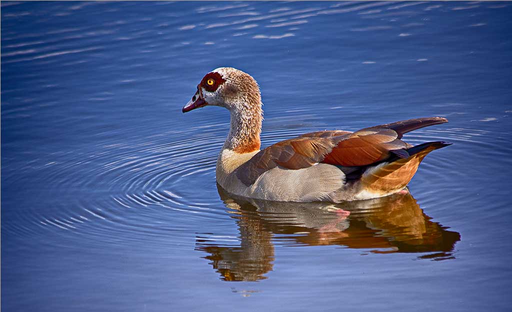
Nick you always do great things with your giraffe files. The reddish trees on both the R and L side bother me and what is the khaki colour on the fender in the FG? But no doubt about it it is clever--you have a great sense of humour, and one thing you NEVER forget to add a shadow. |
May 7th |
| 5 |
May 18 |
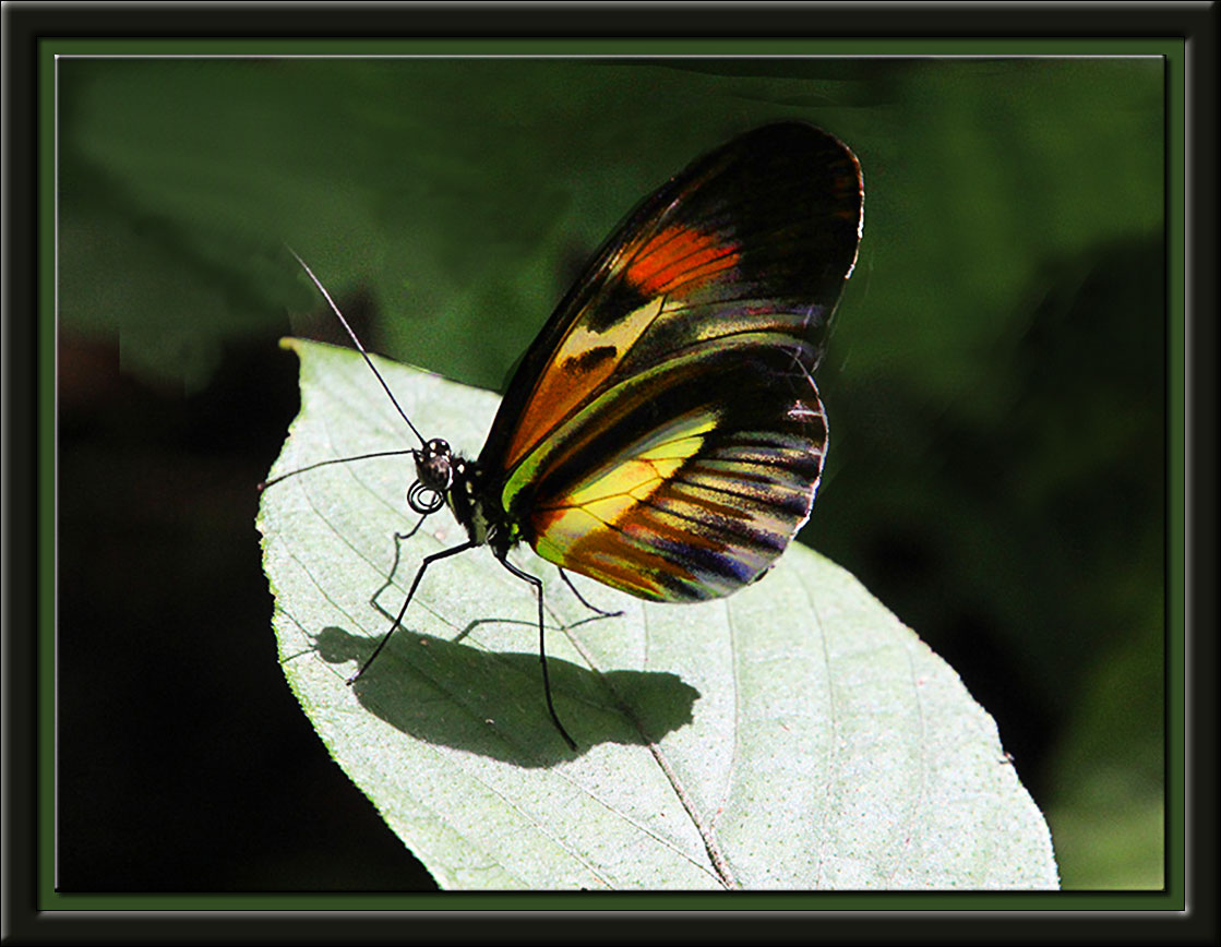
Comment |
I certainly do like what you did with this image. I might have lessened the lines on her face and neck a trifle. I don't think the brush is important at all--the face, the dress, the BG (the temple is a great choice) all contribute to make this a winner. Well done! |
May 7th |
| 5 |
May 18 |
Reply |
I think the toaster idea is a winner, particularly if you get get the bread far enough out of the toaster to show the black burn and it would not need to be a old toaster, I can burn bread very well in mine if the setting is too high! |
May 7th |
| 5 |
May 18 |
Comment |
Oliver, my friend Mark Southard has been playing with smoke. Look up his image for January
http://psadigital.org/group18/index.php?rid=1801
This is such fun playing with smoke and adding the coffee pot was a bonus.I think I might have lightened the smoke little to make it stand out |
May 7th |
4 comments - 3 replies for Group 5
|
| 6 |
May 18 |
Comment |
Tom, its a marvelous play on words. will you please share how you did the ?sparkle? I used to be able to do this but can no longer find the method. TY. |
May 8th |
1 comment - 0 replies for Group 6
|
| 18 |
May 18 |
Comment |
Congrats Mark, this image took first place in camera club this month. Good work. |
May 8th |
1 comment - 0 replies for Group 18
|
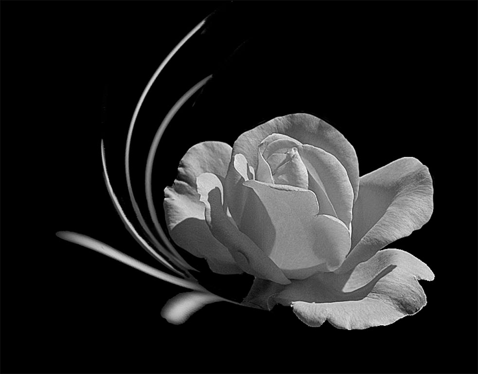
| 25 |
May 18 |
Comment |
Nicely placed Ruth and a brilliant red. I think the BG could be a little softer it is a little too harsh for the delicacy of a rose. As I recall you always liked to photograph flowers--and my recollection goes back quite a way! I believe you and I are the longest participating members in DD (or EID as it was then) You joined my group no. 5 and I don't know how many years ago it was, do you remember? You are one of the few members who rarely miss a month. |
May 12th |
1 comment - 0 replies for Group 25
|
| 29 |
May 18 |
Reply |
The following hint of Bob's is well worthwhile, I cannot tell you how many times I have lost my comments by merely switching to look for something else. I use word always now. |
May 15th |
0 comments - 1 reply for Group 29
|
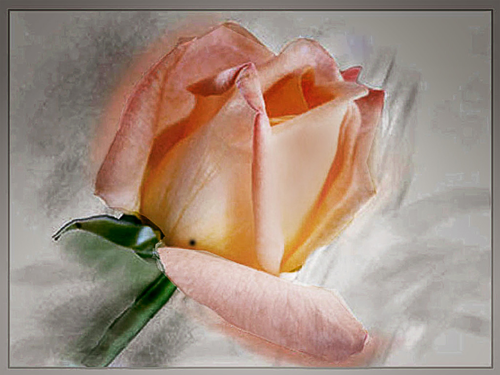
| 32 |
May 18 |
Comment |
Have to confess I have never heard of Picassa, I have had Photoshop since no.3 (even before CS3) and have stopped at CS6 and no longer subscribe to its outrageous monthly (or whatever it is) cost. If Picassa is as good as you have made "Jim" look I will give it a try. As with Diana I would darken the building and blur it a little. BTW Stephen reading your bio what is a 'cloud security consultant'? |
May 15th |
1 comment - 0 replies for Group 32
|
| 42 |
May 18 |
Comment |
Diana has a good point Stu, the composition of this shot could be improved by cropping--anywhere! Michael's comment on the white is spot on, there does need to be some detail in the feathers, even if the whites are correct. However I would have used a very, very soft grey with a low opacity to reduce the glare. This is a favourite technique of mine whenever ever I find the whites in any image are overpowering. |
May 29th |
| 42 |
May 18 |
Comment |
This is a good monochrome image Diana, but a little more information is necessary to really critique the image. I agree wholeheartedly with Stephen this is a case where the before image is essential to give a valid comment on it. In all the groups I suggest a 'before' image helps for quality comments. I would urge group 42 to consider this. |
May 29th |
2 comments - 0 replies for Group 42
|
10 comments - 4 replies Total
|