|
| Group |
Round |
C/R |
Comment |
Date |
Image |
| 5 |
Feb 18 |
Reply |
Stephen certainly makes a good point--I hadm't noticed this until he pointed out what is really quite obvious. |
Feb 22nd |
| 5 |
Feb 18 |
Reply |
It's good Oliver but somehow I think it could well stand as you originally presented it but with just the two yellow spots darkened, as I mentioned first. |
Feb 21st |
| 5 |
Feb 18 |
Reply |
I agree Richard it shows better with the hint of colour in his shorts |
Feb 17th |
| 5 |
Feb 18 |
Comment |
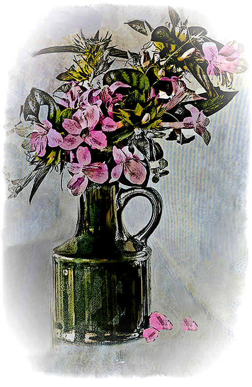
Yes, Nick the change does make a difference. I admire your imagination--as always. One thing I would do is to crop off the object on the LH side. |
Feb 12th |
| 5 |
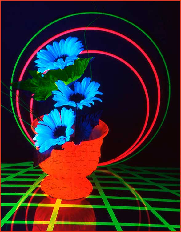
Feb 18 |
Comment |
John you have a very good image here but I believe it needs some additional work. The vase has lost the texture as seen in the reflection. (I see that Oliver noticed this also). There is a line leading from the middle flower up through the circles--this needs to be removed. The leaves being dark blue are lost. I don't have the time to do more but I have made a rough change to what I see would make an improvement. I used the filter craquelure for the vase and then I changed one leaf using H&S and a narrow border was added using stroke. |
Feb 12th |
 |
| 5 |
Feb 18 |
Comment |
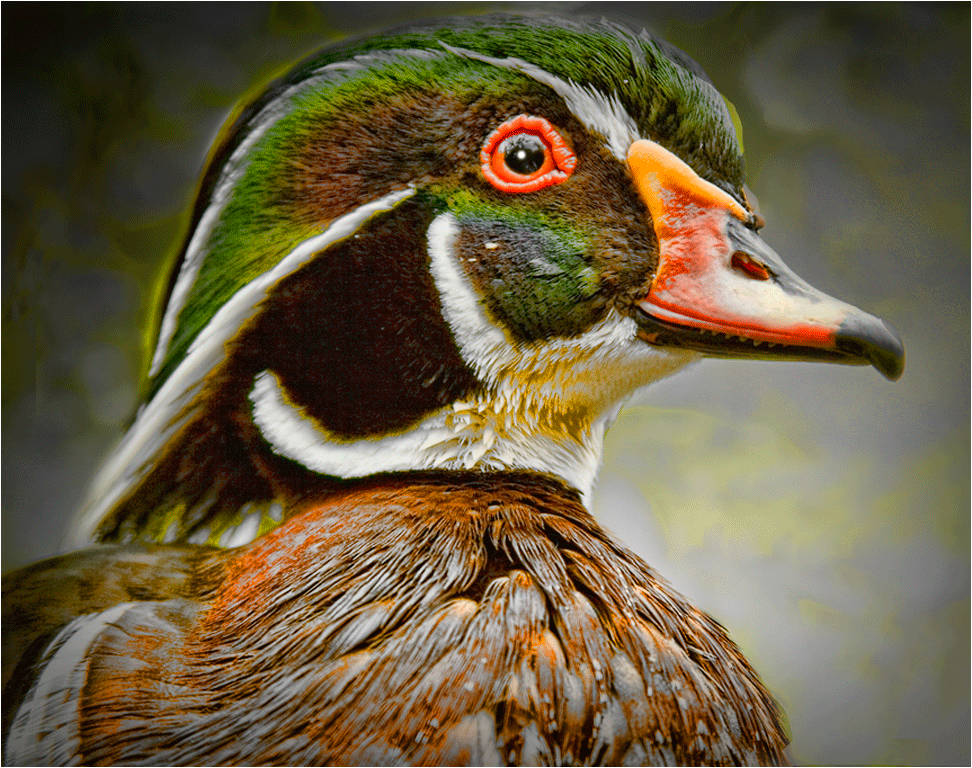
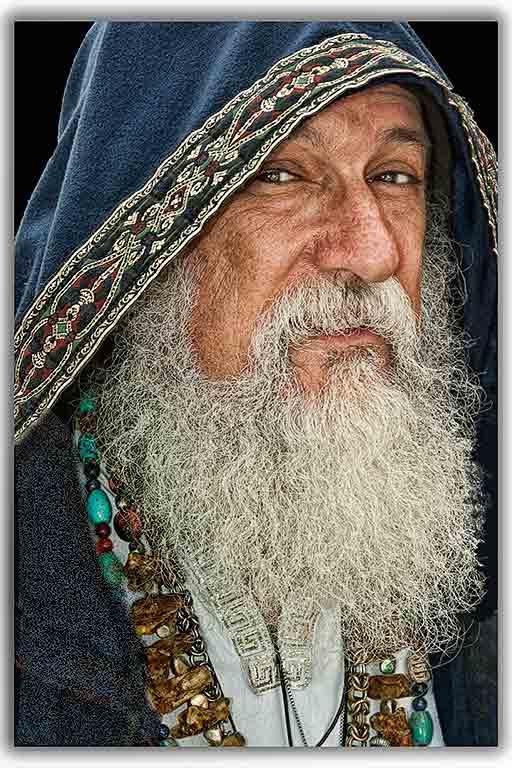
A marvellous capture Oliver. I see such sorrow in the gentleman's eyes and the fact that he has lost a limb makes the image even more poignant. You did an excellent job of lightening the image without losing any of the drama. A very minute change-- darken the two yellowy spots to the left of his eye. Only one thing to say--I wish I had taken it! |
Feb 4th |
| 5 |
Feb 18 |
Comment |
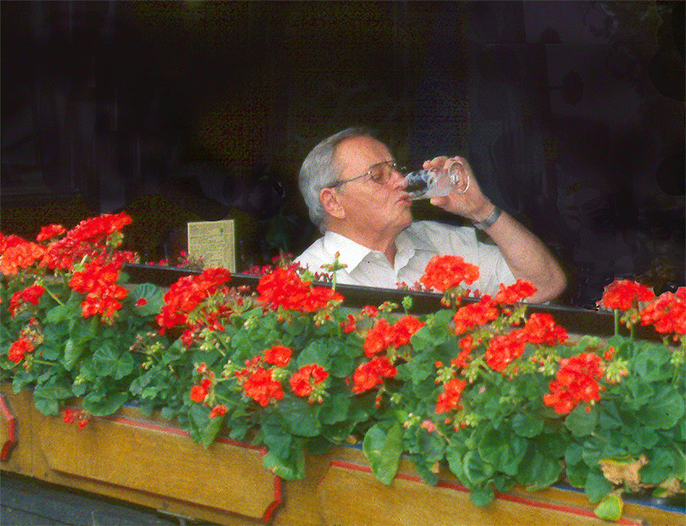
It always amazes me David at the amount of post recessing you do which includes so many filters--used wisely! On my monitor it is not tack sharp, but considering that it was taken from a moving vehicle... Despite the lack of colour, except his shorts, this makes for a much more vibrant image than the original. Well done David! |
Feb 4th |
| 5 |
Feb 18 |
Reply |
Yes Tom, thank you, the leaf was much too bright and I toned it down as I showed in (original, although wasn't) image no. 3 but I foolishly forgot to enlarge the image to search for errors therefore had parts to be dealt with. You did much better than I! |
Feb 3rd |
| 5 |
Feb 18 |
Reply |
Yes thanks, I do prefer the crop you made. |
Feb 2nd |
| 5 |
Feb 18 |
Comment |
Got to thinking about the leaf and tried an HDR effect (from the Nik collection) I thought it was an improvement (see image no.3 on the side) but enlarging it I see the wings and part of the BG need work--back to the drawing board! |
Feb 1st |
5 comments - 5 replies for Group 5
|
| 18 |
Feb 18 |
Reply |
Great improvement Tom |
Feb 8th |
| 18 |
Feb 18 |
Comment |
It's marvellous Tom, but I would like to see her eye a little more defined and some separation (a line?) between the arms. Without looking at the original, I would be confused by the amount of yellow. |
Feb 3rd |
| 18 |
Feb 18 |
Comment |
Thanks Mark. |
Feb 3rd |
2 comments - 1 reply for Group 18
|
| 20 |
Feb 18 |
Comment |
Shirley, I have Topaz glow but haven't yet used it finding nothing that I thought would fit, you have inspired me to give it a go. Great image, you took a simple scene and made it pop Well done1 |
Feb 3rd |
1 comment - 0 replies for Group 20
|
8 comments - 6 replies Total
|