|
| Group |
Round |
C/R |
Comment |
Date |
Image |
| 5 |
May 17 |
Reply |
Agree with Nick --much improvement |
May 23rd |
| 5 |
May 17 |
Reply |
It just came to me --POV --point of view |
May 16th |
| 5 |
May 17 |
Reply |
Would ask too, what is POV? |
May 16th |
| 5 |
May 17 |
Reply |
I am going to look up focus stacking and find out how to do it. When i learn it I will try this same shot again and see what the diff. is. |
May 16th |
| 5 |
May 17 |
Reply |
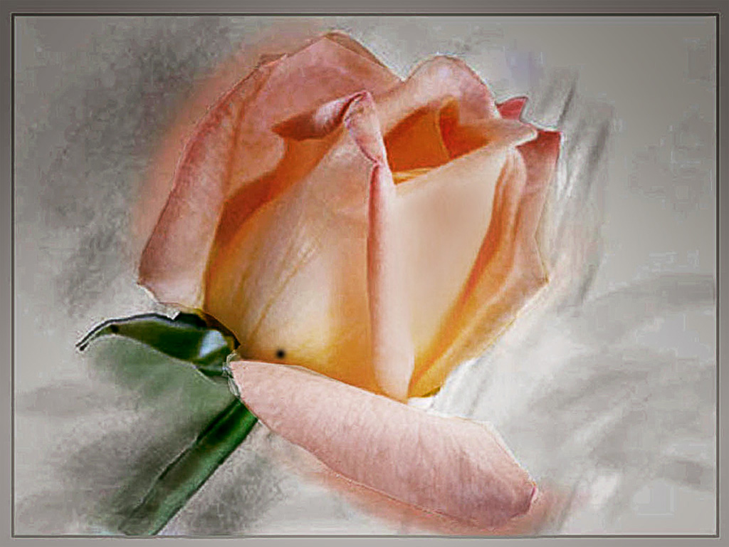
Yes Oliver this comes over as much softer on the eye The red was too heavy. |
May 13th |
| 5 |
May 17 |
Comment |
Welcome to our new member Oliver Morton from Maryland. I questioned Oliver about the differences in the original and the edited image since I could see very little He answered:
The differences are subtle. Probably the most obvious one is the cropping. I usually work with prints so I do a lot of "minor tweaking" that isn't very noticeable on the web.
Given that explanation I can only say I dearly love that which I learned in school of the great god Pan of Greek mythology, the guardian of shepherds and their flocks, I do see the the top and the RH side is cropped which does bring the statue into more of a central image but I truly cannot see the reduction of the highlights. |
May 13th |
| 5 |
May 17 |
Comment |
I have to disagree with John on the centring of the image. In competition 'bullseye" images are often criticised harshly by the judge but I do think there is a place for them and in this instance, for me, it works. |
May 12th |
| 5 |
May 17 |
Reply |
I think John that the red border is a bit over the top but the closeup you can view as a macro shot. |
May 12th |
| 5 |
May 17 |
Comment |
The BG is too prominent for my taste and although it would take some work to blur it I believe the image is so unusual that it be well worth it. |
May 12th |
| 5 |
May 17 |
Reply |
thanks Nick that was fun to watch, it took no time at all to load. I felt as though as I was in a car speeding down a road. I'm going to watch it again and take in the side views. |
May 11th |
| 5 |
May 17 |
Comment |
Nick's time lapse video "Cruise to the Panama Canal."
The video is about 1 min, 45 sec. long.
Pictures were shot every 2 seconds for about 1-1/2 hours.
It is large so, it may take a few minutes to start to play.
This is a about a 3-4 mile trip in the canal to the locks; The Time lapse video simulates our ship traveling over 100 miles/hr
http://photographybuynick.net/videos.html |
May 11th |
| 5 |
May 17 |
Reply |
Richard has enlarged the original and it is posted supplanting the one he first sent. |
May 9th |
| 5 |
May 17 |
Comment |
I've never been through the Panama canal Nick but have fond memories of being on a river cruise in Germany experiencing these lock changes. Wish we could see the time lapse that would really be a bonus. |
May 9th |
| 5 |
May 17 |
Comment |
John I took this same picture when the conference was in New Mexico two years ago and I didn't get it right either, but I have seen some beauties that did. I think you would have to use perspective on the LH window to line it up but I am sure there are those who have a better idea and can advise you. It's wonderfully sharp and something surely could be done with it. |
May 9th |
| 5 |
May 17 |
Comment |
Phil, welcome to no. 5. I like this image very much indeed, and the idea of using a crystal ball to shoot through is so original. A great shot and I can offer no suggestions on its improvement, it stand well as is. Well done! |
May 9th |
| 5 |
May 17 |
Comment |
Once again you are telling a story that can be interpreted so many ways. The despair on the man's face with his phone in his hand--priceless. You have an eye for this type of image David and how you have presented it leaves me me nothing to say that could improve it in any way. Excellent. |
May 9th |
| 5 |
May 17 |
Comment |
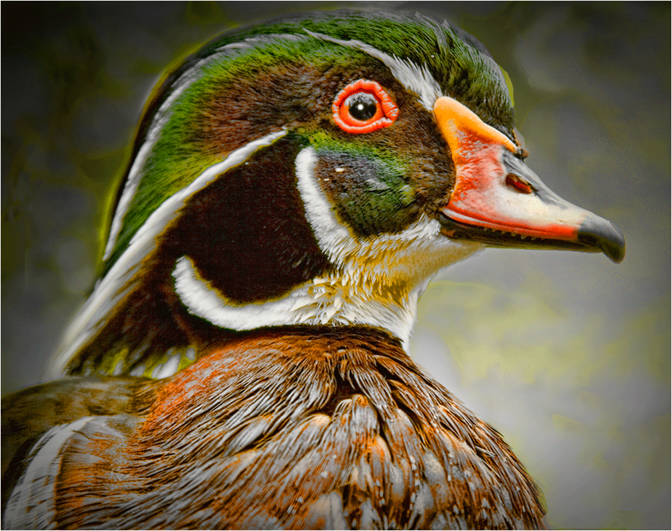
I had to concentrate on this image for awhile since it is such unusual sight of a bird. I like the one wing coming toward me even though out of focus it suggests movement.
The original you sent to me is only 246 x 183 pixels and I would have liked to see more of it. if you wish you can send it again, enlarged and I will post it. I think we would get a better idea of what you worked from. I will comment further if you wish to resend it. |
May 3rd |
9 comments - 8 replies for Group 5
|
| 21 |
May 17 |
Comment |
Joan, what a talented group you have here. Kudos to you all--such beautifully creative work! |
May 18th |
1 comment - 0 replies for Group 21
|
| 24 |
May 17 |
Comment |
I remember this Marie. It comes across well as a monochrome. The paint filter approach is different but for me it doesn't work here. The foliage in the front of the building is too blurred and dominates the scene taking me away from the dilapidated shack which it the central feature. Looking again at the colour image, on 2nd thought I see shades of colour that make it unusual so I believe it looks better than the mono. |
May 7th |
1 comment - 0 replies for Group 24
|
| 41 |
May 17 |
Comment |
Carol what a talented group you have, all this month's images I have seen so far are superb. |
May 6th |
| 41 |
May 17 |
Comment |
Speaking of an 'artistic eye' as I did with Carolyn... WOW! And thank you so much for the documented steps you provided. This is truly what I wish for in all the DD groups. Excellent work! |
May 6th |
| 41 |
May 17 |
Comment |
Carolyn this is quite amazing--you truly have an artistic eye. I wouldn't have seen this no matter how I tried and too I have Topaz Glow and have yet to put it to good use. Well done my friend |
May 6th |
3 comments - 0 replies for Group 41
|
| 42 |
May 17 |
Comment |
Interesting image Michael but a little more info on the post processing--if any-- would be helpfpul |
May 12th |
1 comment - 0 replies for Group 42
|
| 47 |
May 17 |
Reply |
Yes indeed Ed this brings the child sharply into focus as the important subject and the story involved with her questioning look. This type of image, aka David Cooke, is so appealing one can read so much into it. This is a winner of any exhibition. |
May 9th |
| 47 |
May 17 |
Comment |
Darrell, a great image with the boat so beautifully dominant in the FG but I would liked to have known more about the scene, the specs are fine but it doesn't tell us enough. Although I suppose it isn't necessary I feel that details would offer us more on which to comment and give us an insight into the scene. |
May 7th |
| 47 |
May 17 |
Comment |
A great image Ed. I like the concentration on the child and to have included (in some way) the father would have diminished the image. The sombre look is good but perhaps you could lighten the child, just a fraction, too much would be an overkill and would spoil the overall feeling. This reminds me somewhat of the work of David Cooke in my group 5. Take a look at his May image and some of his previous works. http://psadigital.org/group05/
|
May 7th |
2 comments - 1 reply for Group 47
|
| 51 |
May 17 |
Comment |
Jerry as always you come up with something new--a great instructor! |
May 30th |
1 comment - 0 replies for Group 51
|
| 54 |
May 17 |
Comment |
Please don't apologise for a lengthy comment--that is marvellous--just what is appreciated by the members
Your image is, at first glance, quite startling but well thought out and excellently presented. Well done! |
May 21st |
1 comment - 0 replies for Group 54
|
| 63 |
May 17 |
Comment |
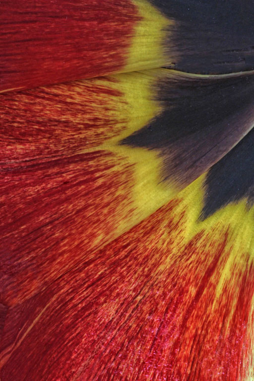
This is an excellent Macro shot Priscilla; the composition is very original including all three colours of the petal. I tried adding more contrast as per Lisa's suggestions but it didn't make a great deal of difference but you might tempted to use one or more of the filters to achieve this. I did however flip the image horizontal to conform with the oft-heard judges comments that we read L to R and therefore.... |
May 6th |
 |
1 comment - 0 replies for Group 63
|
| 64 |
May 17 |
Comment |
Once I have introduced you to your admin, John Roach, you no longer need to include me in the monthly emails, but since you did and this is such a strong image I feel obliged to comment
Some judges may find the hand of the woman in the FG too dominant but to me it tells a story: strength of character, and, with the facial expression, perhaps despair. Although I do not object to it I do not believe that the bamboo wall needed to show more detail. A marvellous image. |
May 3rd |
1 comment - 0 replies for Group 64
|
21 comments - 9 replies Total
|