|
| Group |
Round |
C/R |
Comment |
Date |
Image |
| 5 |
Mar 17 |
Comment |
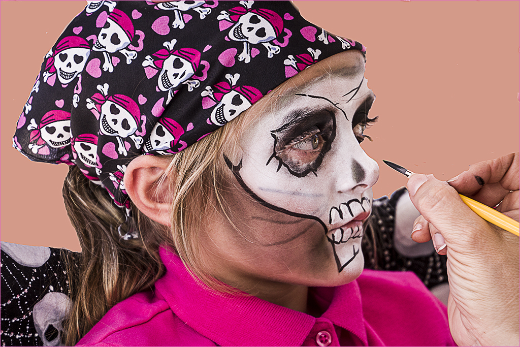
I see the BG as an ad for a car; the font tire is blueish rather than white--too much reflection from the body? And what happened to the shape of the moon Nick? |
Mar 21st |
| 5 |
Mar 17 |
Comment |
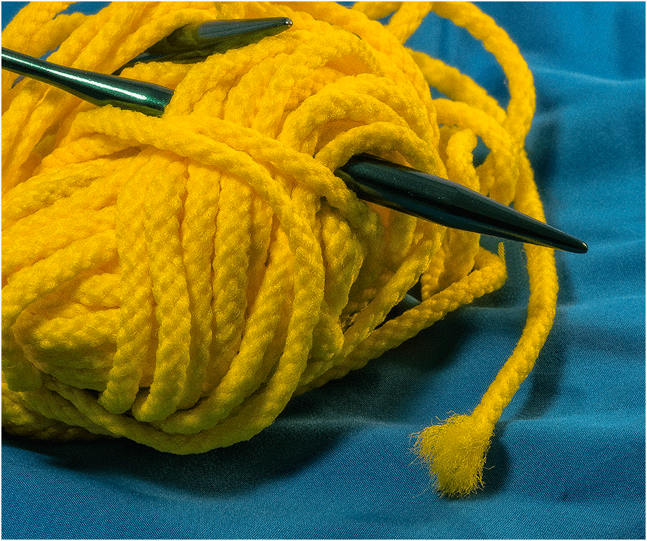
Without the rope the image would be almost an abstract The form with the three cavities is interesting but I would have cropped the top, eliminating the top two holes, to make a more interesting composition. I can't see this as a competition image; I feel that it is more a shot of a place that you enjoyed the challenge of seeing what you could do with it--and I applaud you for that. |
Mar 21st |
| 5 |
Mar 17 |
Comment |
SiFi is the explanation for this, but I do prefer the original. I like NIck's idea of making the insect's eyes red. The red blotches under the feet were a stroke of imagination. |
Mar 21st |
| 5 |
Mar 17 |
Comment |
A good image Joyce but I do believe that it is slightly out of focus, I prefer the two branches as in the original although the BG is well blurred in the finished image. I know how easy it is when walking to find when one gets home the image isn't as sharp as one would wish--but it is still a good capture. |
Mar 20th |
| 5 |
Mar 17 |
Comment |
I do see the green tint that Ken mentioned but for me it doesn't detract from the image, in fact I rather like it. Once again you have made a marvellous image out of the mundane. No changes as far as I can see David, excellent work.
Clicking on the image doesn't produce a white BG, it flashes momentarily but immediately goes to black, I will have to check with our webmaster and ask him about this |
Mar 20th |
| 5 |
Mar 17 |
Reply |
You are correct Rick, but it was a rough job--I should have taken more time, but my main concern was correction of the BG. |
Mar 18th |
| 5 |
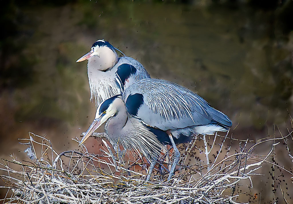
Mar 17 |
Comment |
John this is lovely but the BG need some attention, particularly to the top right of the birds and between the beaks.I took the liberty doing a rough modification by blurring the BG and using Topaz simplify to add a vignette to bring the focus more on the birds. |
Mar 12th |
 |
6 comments - 1 reply for Group 5
|
| 22 |
Mar 17 |
Comment |
Marti you are such a terrific administrator. Your ideas, your newsletters all help to make Digital Dialogue unique. I know your group appreciates you as much as I do. xxx |
Mar 5th |
1 comment - 0 replies for Group 22
|
| 24 |
Mar 17 |
Comment |
Tom, I find it interesting but I have to mention that all of the Photographic exhibitions that I know of rule that the finished image must originate from a photograph, no matter how it was taken. I will add that we do not have this rule in DD so one is free to explore and show one's creative juices to the fullest. |
Mar 3rd |
1 comment - 0 replies for Group 24
|
| 38 |
Mar 17 |
Comment |
Sorry i couldn't have joined you for this field trip. Excellent image Art, I have seen many of these jumps but yours is super in the way the hooves are all tight and perfectly placed above the bar. You have the horse in focus, the rider and even the time on his watch is almost visible, and the BG is perfectly out of focus. One tiny detail I believe you missed, part of the top of the rider's jacket on his left side (up by his shoulder) needs to be cloned out. A marvellous image Art, well done! |
Mar 7th |
1 comment - 0 replies for Group 38
|
| 43 |
Mar 17 |
Comment |
This provokes such a beautiful mood. Although the sepia toned original is lovely I prefer it as you changed it For such a hot area this is indeed 'cool' |
Mar 4th |
| 43 |
Mar 17 |
Comment |
Super job Harley! It exemplifies the 'less is more' statement. You must have had something of the idea in mind when you took only a part of the car exaggerating its front. Well done! |
Mar 4th |
2 comments - 0 replies for Group 43
|
11 comments - 1 reply Total
|