|
| Group |
Round |
C/R |
Comment |
Date |
Image |
| 4 |
Feb 17 |
Comment |
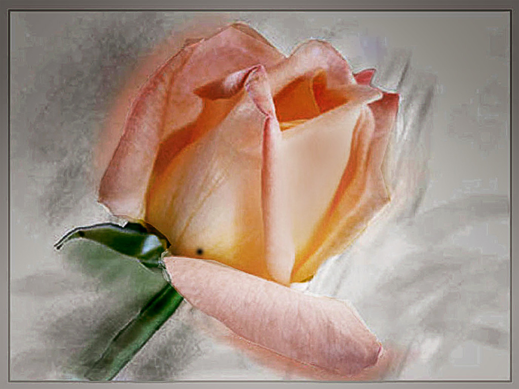
Erik, this indeed a great image. I concur with Bill Buchanan, the red does indeed contribute to make it outstanding. Well done! |
Feb 28th |
1 comment - 0 replies for Group 4
|
| 5 |
Feb 17 |
Reply |
Went back and looked at 9/15 David and it is a good explanation of the settings. Thank you. |
Feb 22nd |
| 5 |
Feb 17 |
Comment |
I think this is a superb image Richard--it tells a story (God forbid) the BG is excellent with all the distractions removed; you have a tiny catch light in his eye, I can offer no suggestions for improvement, it is perfect as is. Well done! |
Feb 20th |
| 5 |
Feb 17 |
Comment |
As Nick said David once again you turned the mundane into the outstanding. I do believe that Joyce found the only weak spot and NIck's preference for frames is valid since the images are shown on a black BG and at times there is little separation. I noticed the IOS was 1250 a number I hesitate to use but I can see where using the BG you did it is of little consequence to the finished image.
Excellent work David! |
Feb 20th |
| 5 |
Feb 17 |
Comment |
On further reflection Ken I tried flipping it L to R to lead the wave into the frame |
Feb 5th |
 |
| 5 |
Feb 17 |
Comment |
Nick I always admire your shadows you get them just right, but here, in order to plonk the car down on the tiles perhaps they need to be a bit heavier. I do agree with Joyce that Ann looks a bit too big when her face is compared to the steering wheel. I am not too keen on the ragged edge here, but as far as the overall image goes it's a fun one. |
Feb 4th |
| 5 |
Feb 17 |
Comment |
A fine job on removing the green part of the image. The texture might be a tad overdone but you have chosen an interesting BG. Well done John. |
Feb 4th |
| 5 |
Feb 17 |
Comment |
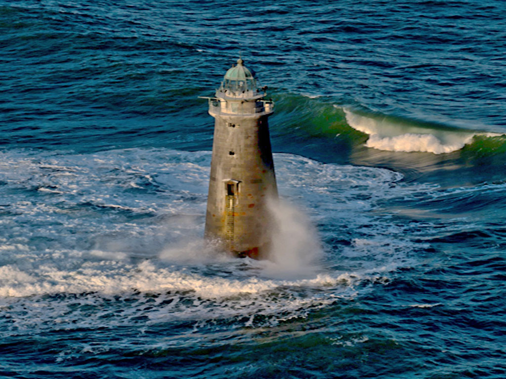
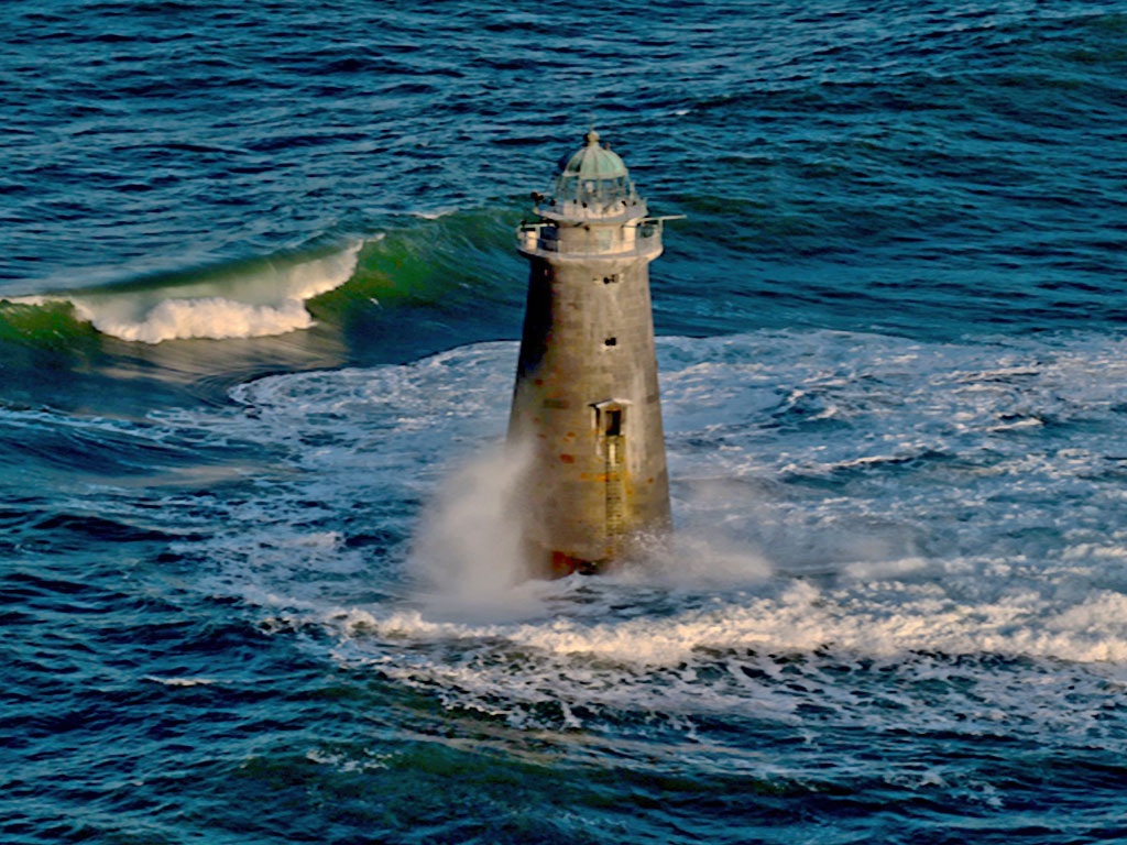
The LH wave in the original is interesting so that I feel its cutoff in the submitted image is a pity. Although the lighthouse demands a vertical image I find the waves appealing that I would like to see this as a horizontal--or perhaps even better as a square. The golden lighting you produced on the lighthouse is lovely. |
Feb 4th |
 |
| 5 |
Feb 17 |
Comment |
Joyce you did a lovely job on this image, NIK obviously worked very well in bringing in the FG so detailed. One small criticism--one that is so often heard from judges--the horizon line is dead centre. I like the green on the LH side and cropping the bottom might eliminate that so I would sacrifice a bit of the sky. |
Feb 4th |
| 5 |
Feb 17 |
Reply |
Yes Joyce I thought of that but afraid my photography skills are dragging this month as you can see from description of 'how I did it" |
Feb 4th |
7 comments - 2 replies for Group 5
|
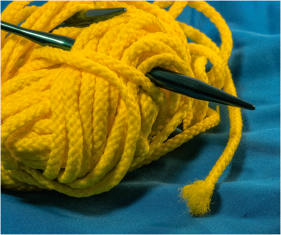
| 6 |
Feb 17 |
Comment |
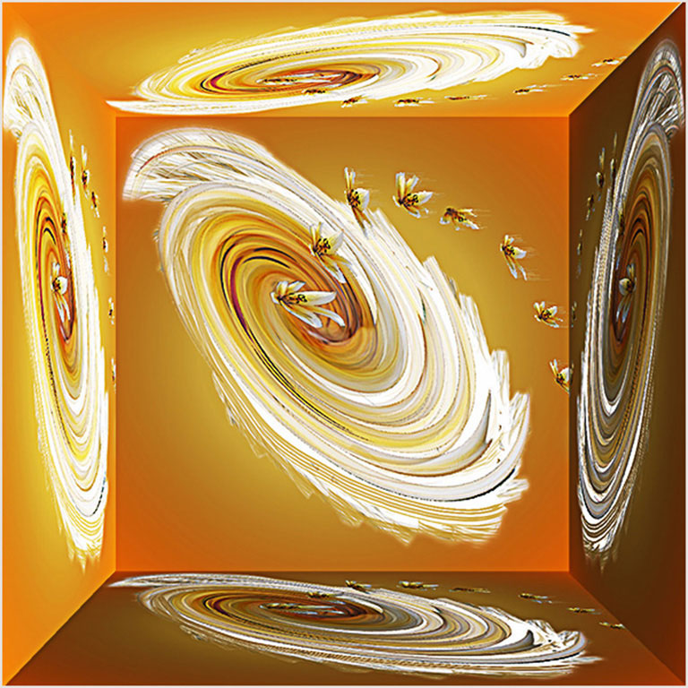
Hmm! On my monitor this is not sharp Tom, it seems like a good experiment but it lacks that something to make one look again. The WOW factor? Off the top of my head--would a button added having the same sort of weave in the holes of it bring it to life? |
Feb 11th |
1 comment - 0 replies for Group 6
|
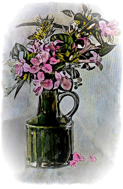
| 7 |
Feb 17 |
Comment |
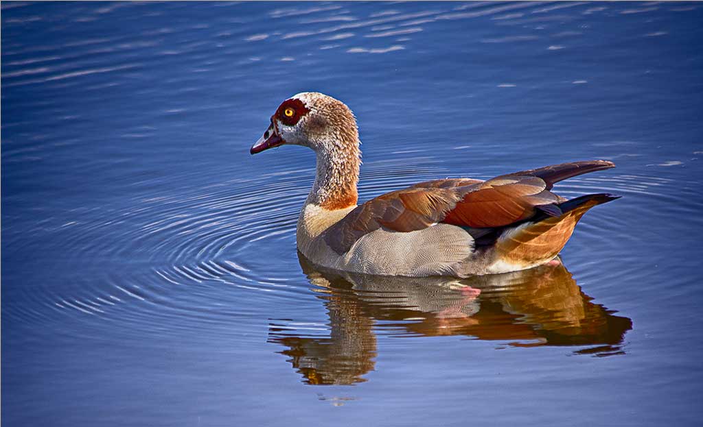
Barbara, the wiggly shadow is what makes the image different causing a lovey leading line to the bird. |
Feb 9th |
| 7 |
Feb 17 |
Comment |
Tom this is a foxglove, very common in UK also called digitalis. The entire plant is toxic, but(strange!)it is also used for heart failure--this is probably more than you wanted to know! I have taken many pics of this flower but none as nice as this. |
Feb 5th |
2 comments - 0 replies for Group 7
|
| 20 |
Feb 17 |
Comment |
Betty this is so striking but would agree with Cindy and Nellie the bird is superfluous. I enjoyed Nellie's bird views and quite accurate too I believe!
Well done Betty. |
Feb 5th |
1 comment - 0 replies for Group 20
|
| 24 |
Feb 17 |
Comment |
It is lovely Marie, but agree with Ian and Jerry that the bottom part needs to be removed as well as the line in the top LH corner. Good work! |
Feb 10th |
1 comment - 0 replies for Group 24
|
| 39 |
Feb 17 |
Comment |
I love this type of image Kit and you have certainly captured it beautifully. I like Paul's interpretation, yet I think the objects removed did add somewhat to the story (other than the foil). The beer and the cigs (?) fit well. I have a chap in my group 5 http://psadigital.org/group05/ David Cooke, that does this sort of image, take a look at this month and previous, his work is so good. |
Feb 16th |
1 comment - 0 replies for Group 39
|
| 42 |
Feb 17 |
Comment |
Sohel, the problem here is that you have submitted 3 different unrelated images. We may only present one image each month although it can be shown 3 different ways as you have worked on it.
Take a look at http://psadigital.org/group03/ and click on Ruth Sprain as an example of this.
I would advise the members to comment on your main image since this seems to be the primary one. |
Feb 10th |
| 42 |
Feb 17 |
Comment |
I don't object to the greenery Glenda but the flower going beyond the frame on each side bothers me. It is a lovely image and the angle is just right but I believe it should have been shot at a different focal length |
Feb 10th |
2 comments - 0 replies for Group 42
|
16 comments - 2 replies Total
|