|
| Group |
Round |
C/R |
Comment |
Date |
Image |
| 41 |
Jul 25 |
Reply |
Nadia,Thanks, a simple and helpful suggestion. |
Jul 19th |
| 41 |
Jul 25 |
Reply |
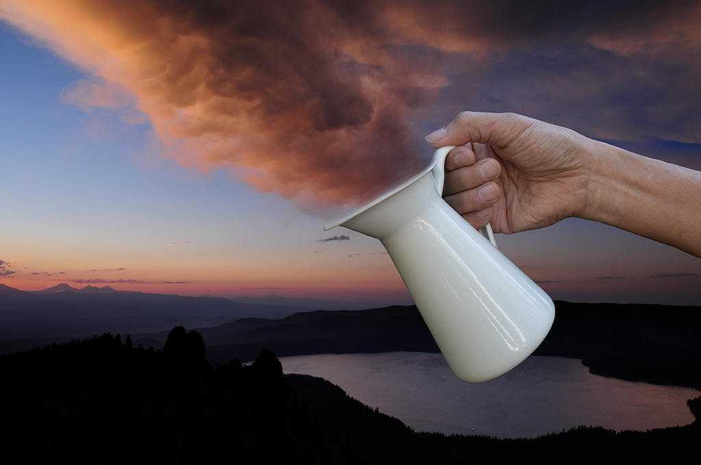
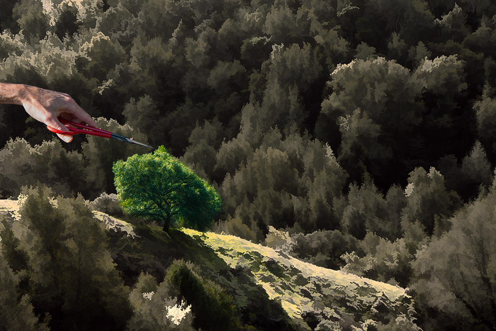
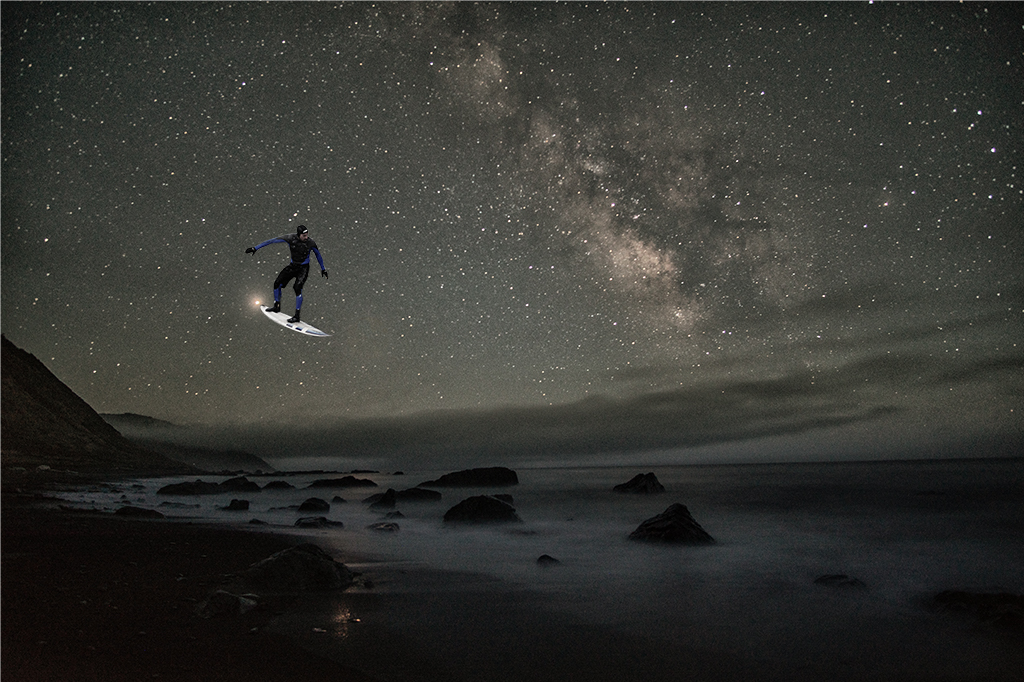
Tom, I added the light to create a magical link between the images as his hand without it seemed oddly positioned given it held a carrot in the original and even removing that still made it seem odd. Any suggestions for how to have the hand integrate better? |
Jul 12th |
| 41 |
Jul 25 |
Reply |
Hazel, Thanks. It's hard sometimes to decide on a favorite right after completion. I do like the depth of field in the one of my daughter too on a second viewing. |
Jul 12th |
| 41 |
Jul 25 |
Comment |
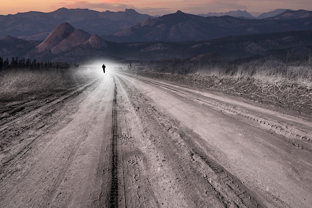
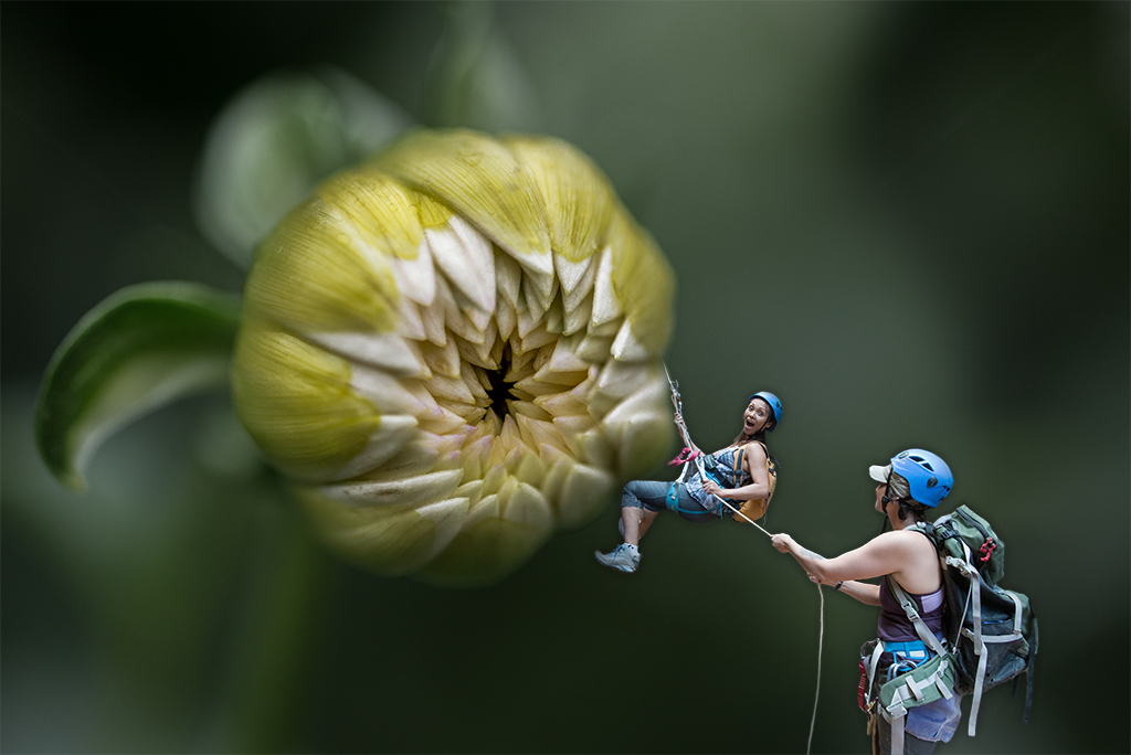
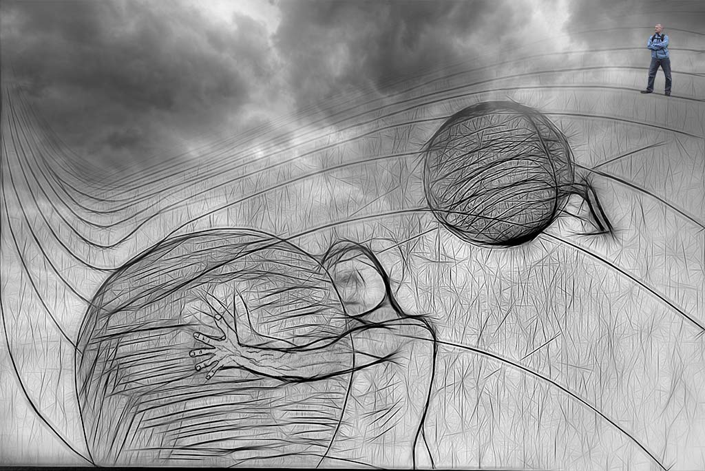
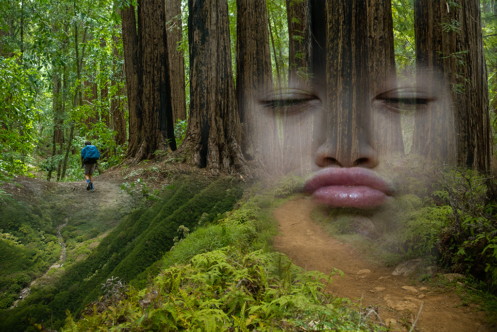
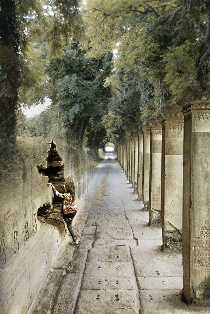
Nadia, I'm not sure your message is perfectly communicated but it doesn't matter given the thought provoking image you've created. Although technically a bit of work, changing the titles at the top of the book could be a nice vehicle for subtly suggesting a deeper message in the image as the Bobbsey Twins evoke one idea and "the iceboat crash" doesn't resonate with your theme or images chosen. If you wanted to develop the image further I would play with brightness and contrast more to enhance the portal dimensionality, possibly flipping conventions and making the area he is walking into more real, leaving the foreground more fantasy with muted colors and textures. |
Jul 12th |
| 41 |
Jul 25 |
Comment |
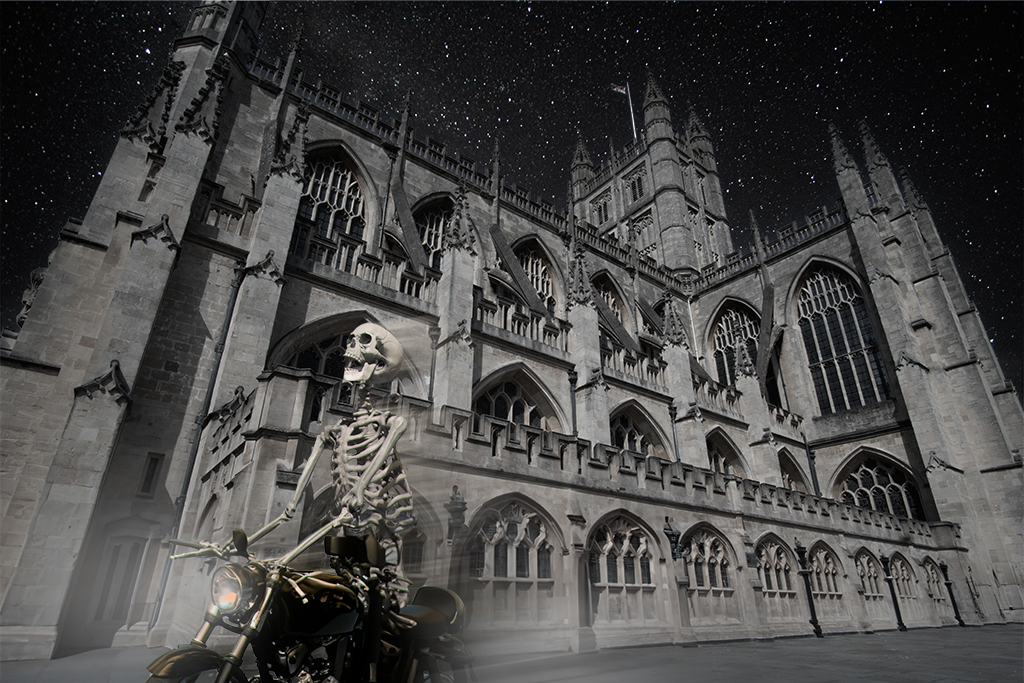
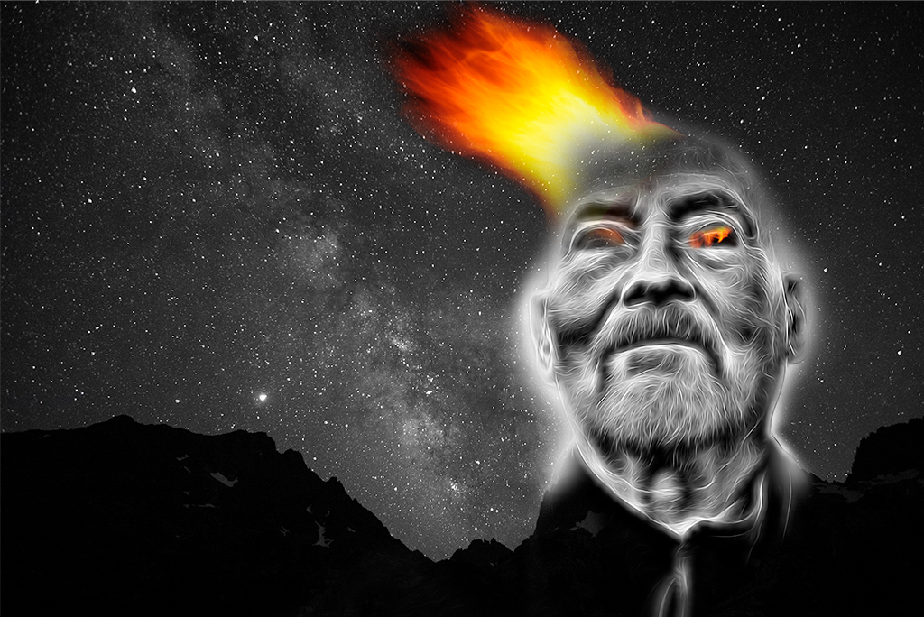
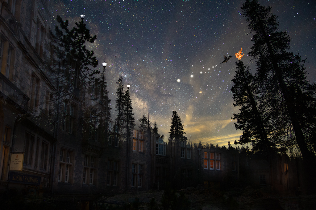
Tom, As usual this impeccably handled from the mirroring of the buildings, size and position of the moon and the placement and size of our favorite "Hatman". I wonder if you were to add some highlights of reflected moonlight to the rim of your jacket and side of your face if it might subtly draw attention more to the subject although the understated handling is masterful. |
Jul 12th |
| 41 |
Jul 25 |
Comment |
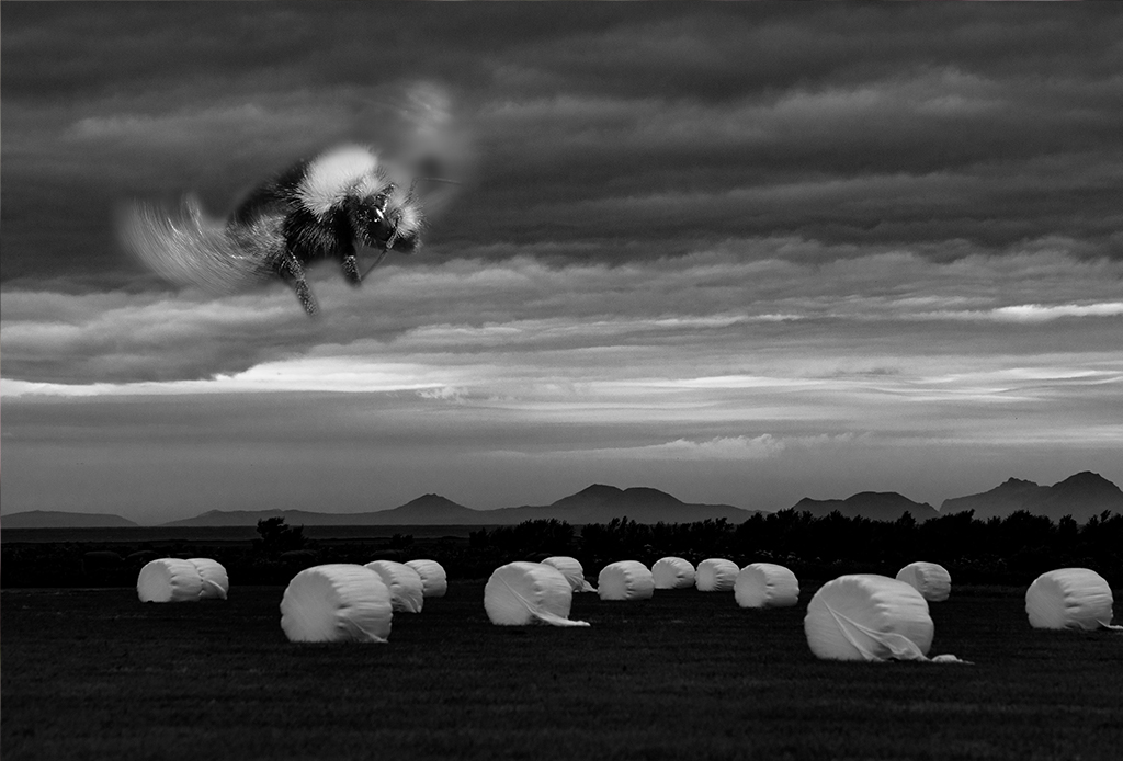
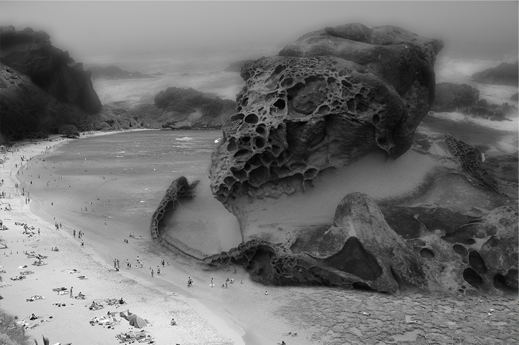
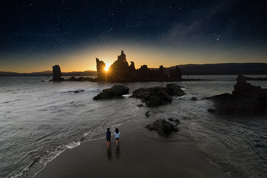
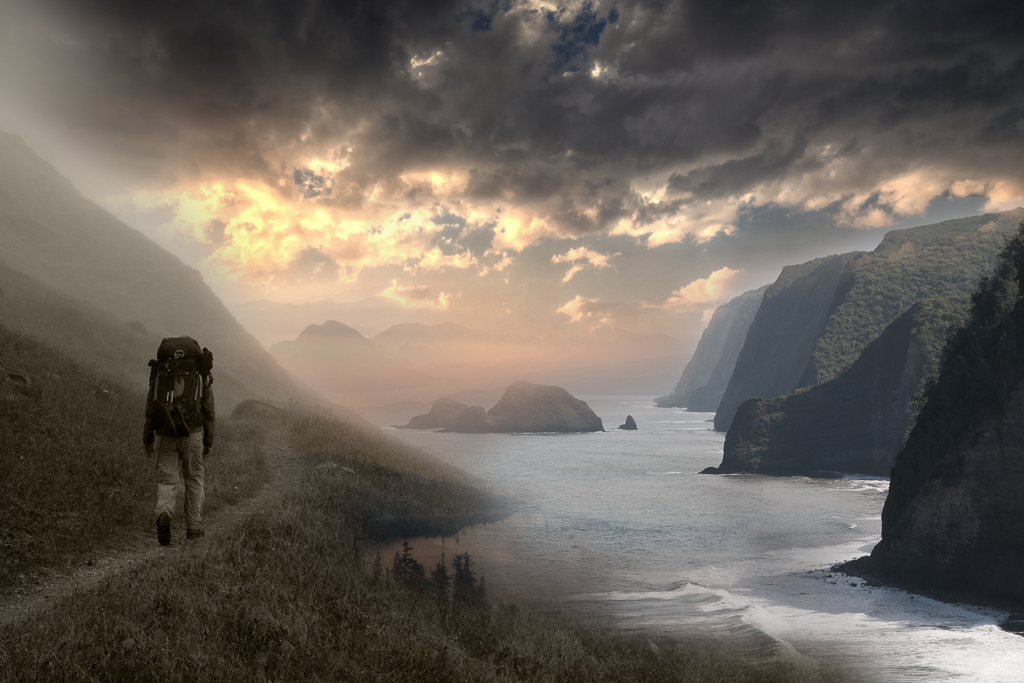
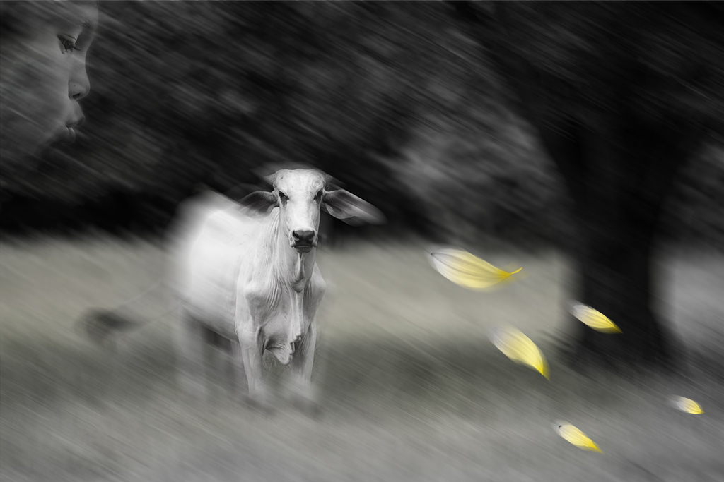
Melissa, You've nicely handled adding the boy to the cairn. Given we don't have your base pictures I couldn't tell, a sign of good work, that the cairn was 7 inches tall. I agree with Tom's suggestion and would also recommend dialing back the color intensity and brightness of the lady bug as it seems unnaturally intense relative to the other "realistic" objects. |
Jul 12th |
| 41 |
Jul 25 |
Comment |
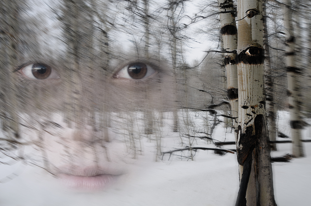
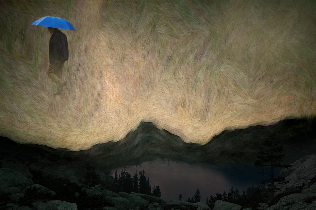
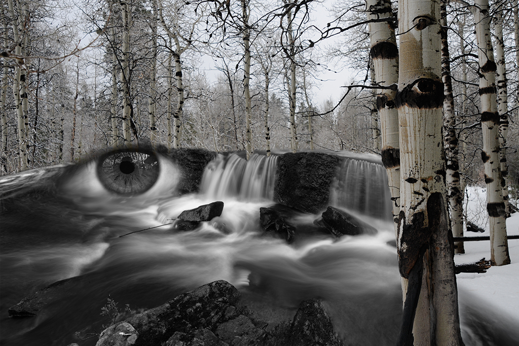
Hazel, I also felt you captured the feeling of rain in a convincing way. You have also done a great job of telling a story. With regards to areas for development should you desire to keep working on the image, I find the image very flat in both contrast and tone. Although a rainy day lighting is pretty flat, I think there is some room to play with contrast and tonal range. Additionally the shadow under her feet, that triangular dark area at the bottom of the image feels over stated, particularly on the right side. |
Jul 12th |
| 41 |
Jul 25 |
Reply |
Melissa, Thanks. It's not my son, just a random kid who was playing with the deer but I appreciate your comments. |
Jul 11th |
| 41 |
Jul 25 |
Comment |
Karen, thanks for visiting our site and for your kind words. |
Jul 6th |
5 comments - 4 replies for Group 41
|
| 54 |
Jul 25 |
Reply |
Maria, Thanks. I was afraid people would be too disturbed by this image. Glad you found it interesting. |
Jul 16th |
| 54 |
Jul 25 |
Reply |
Kirsti, Very cool. I like both versions. This version has a slightly different message. Well done! |
Jul 16th |
| 54 |
Jul 25 |
Reply |
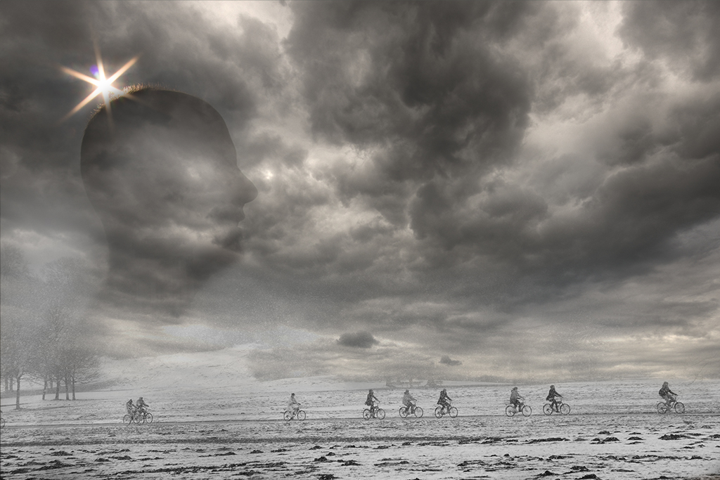
Thanks Kirsti. I am not a huge fan of dark and ominous images although I enjoy the process of letting the images emerge on the screen without a huge mental filter. |
Jul 12th |
| 54 |
Jul 25 |
Reply |
Peggy, Thanks for your feedback. I would be interested in hearing your thoughts on the "meaning" of the image. You can share here or by email if you prefer. |
Jul 12th |
| 54 |
Jul 25 |
Reply |
Matt, Thanks for your supportive comments |
Jul 12th |
| 54 |
Jul 25 |
Reply |
Alan, Thanks for the feedback and suggestions. |
Jul 12th |
| 54 |
Jul 25 |
Comment |
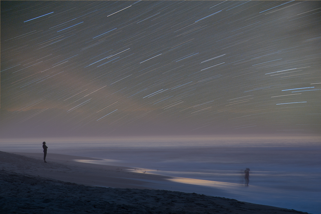
Alan, I like this image very much. It has a calming and mesmerizing quality. My only feedback is the 4th sphere doesn't seem to have a matching shadow. There is some type of shadow but it doesn't look proportionally placed, suggesting it may be associated with the dunes. The 5th sphere doesn't have an obvious shadow either and I suspect that was intentional given the distance, although given how strong the shadow is for sphere 2 I'd expect 4 and 5 to have shadows. |
Jul 12th |
| 54 |
Jul 25 |
Comment |
Maria, I will join the others in my appreciation of your handling of this exquisite image. All the elements come together beautifully creating a complex and compelling image that draws the viewer back again and again. I like Kirsti's title and actually enjoyed it being "untitled" as it left me completely open to take it in. I have no suggestions as this feels perfect as is. |
Jul 12th |
| 54 |
Jul 25 |
Comment |
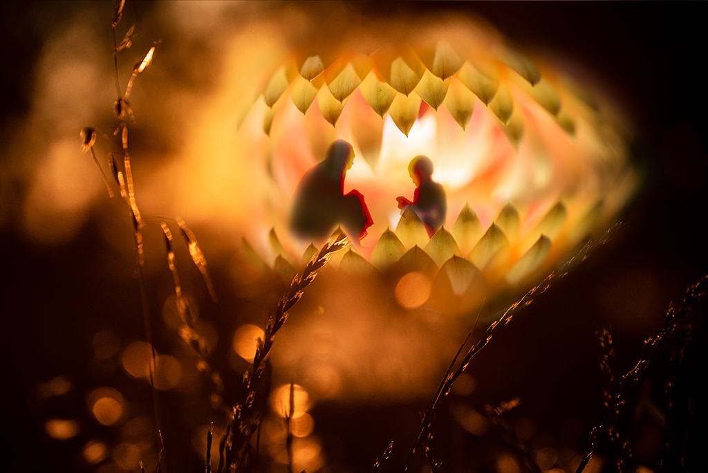
Kirsti, This is such a rich and compelling image. I agree the red image is interesting too but the color range in the blue/purple one pops more. The story is a harder one to take in on a first viewing. It's not really a critique as I am so drawn into reexamining the image to understand it. I agree with your idea of making the color on the box more yellow. If your goal is creating an anomaly, some odd scientific portal generated by the converging lights the white holographic image is fine as is. |
Jul 12th |
| 54 |
Jul 25 |
Comment |
Matt, I haven't been to Miami in 40 years, your image and description has peaked my curiosity on the current look. I also like your composite and can think Peggy and Kirsti's handling have a different and also interesting vibe. |
Jul 12th |
| 54 |
Jul 25 |
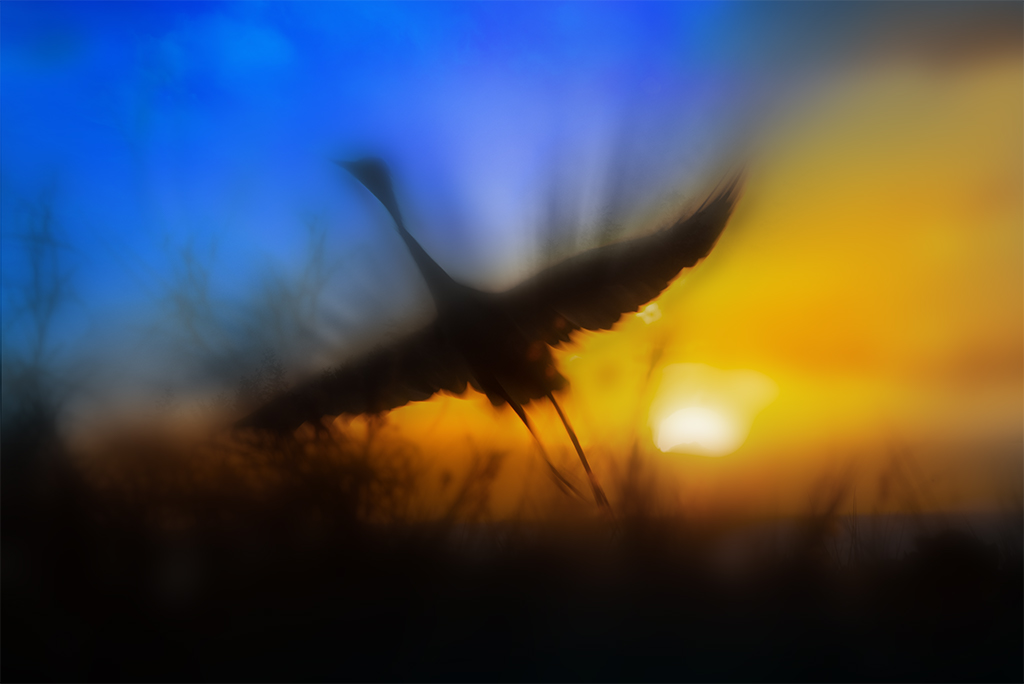
Comment |
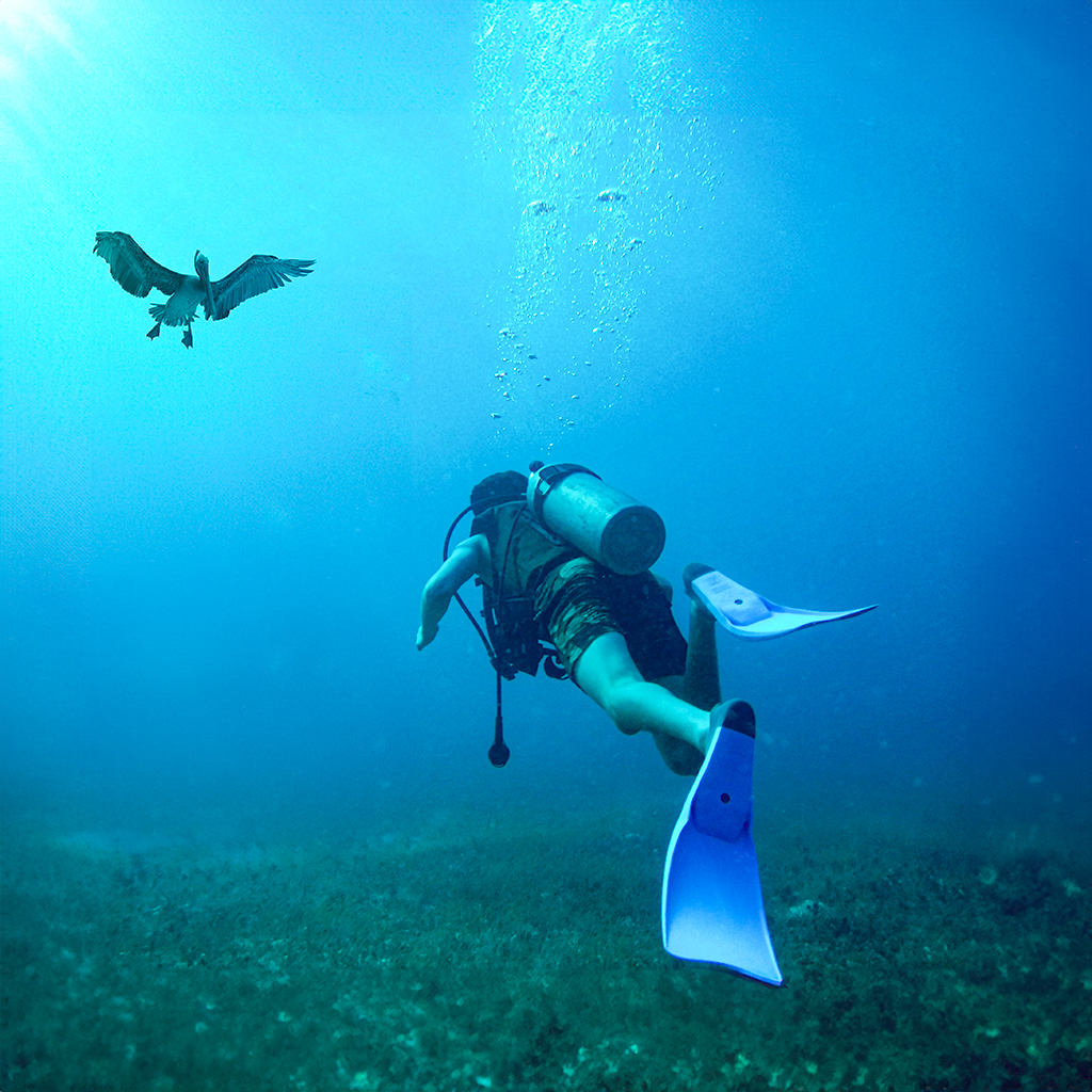
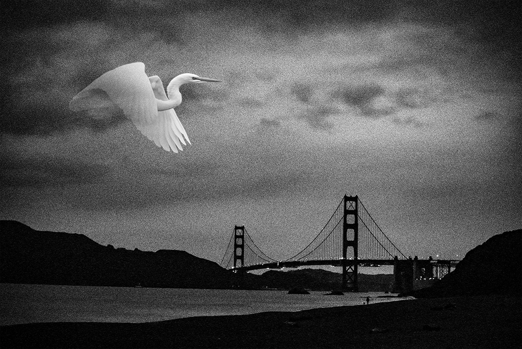
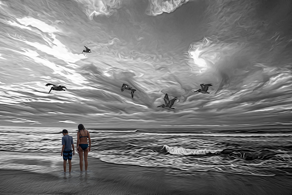
Peggy, I thought "YES!" when I saw your image. Living in California I often admire the pelicans flying soaring in the evenings before sunset. Your handling of the motion is perfect. This feels like an iconic image, nicely done. |
Jul 12th |
5 comments - 6 replies for Group 54
|
10 comments - 10 replies Total
|