|
| Group |
Round |
C/R |
Comment |
Date |
Image |
| 41 |
Jun 24 |
Reply |
Nadia, I like your revision. I also like Brian's suggestion about opening the left door slightly. All of your tweaks are making this image more and more compelling. |
Jun 19th |
| 41 |
Jun 24 |
Reply |
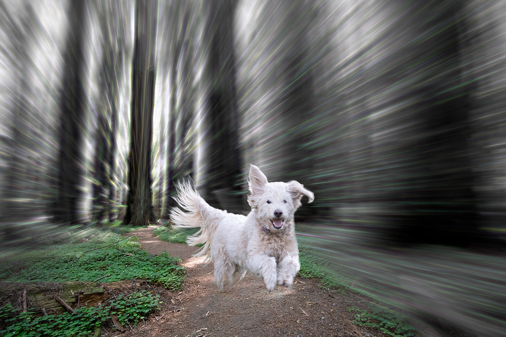
Hazel, Thank you for your feedback. I agree with your assessment regarding the dog proportion not working. There are some images, like this one, which can take quite some time before I settle upon the final message. |
Jun 19th |
| 41 |
Jun 24 |
Reply |
Nadia, Your version and title certainly work better. I do lean in the direction of surrealism but do hold myself to a high standard to make it make sense when I can. |
Jun 19th |
| 41 |
Jun 24 |
Reply |
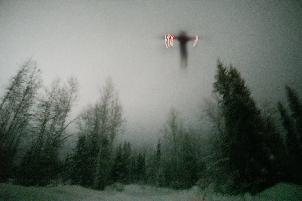
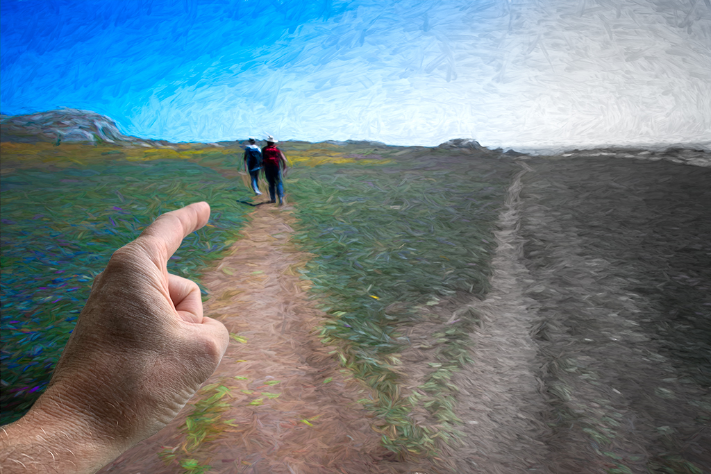
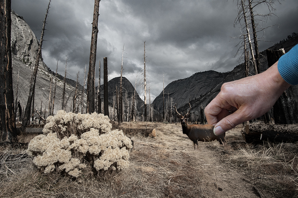
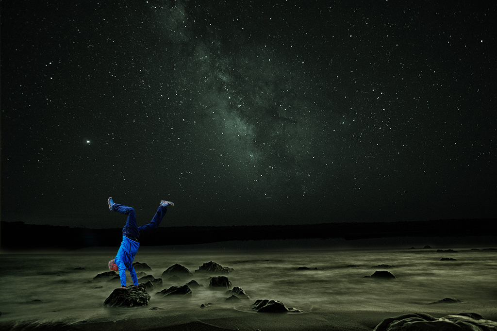
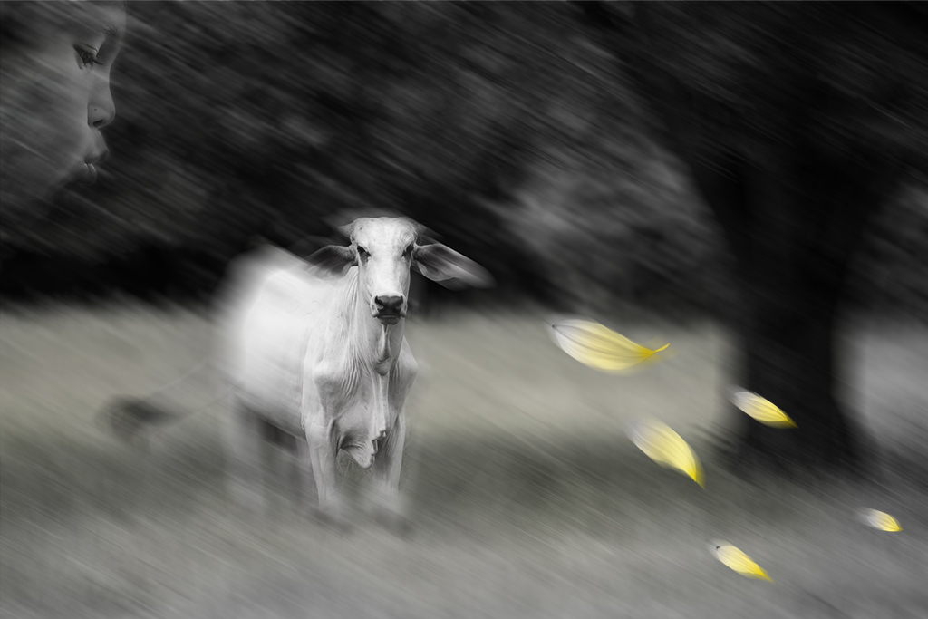
Brian, Thanks for the helpful feedback. I wish I had thought to suggest he pose his fingers that way too. The dog was not the only element that hasn't stuck. I had some police, a cow and a few other elements. I'll figure it out eventually. |
Jun 19th |
| 41 |
Jun 24 |
Comment |
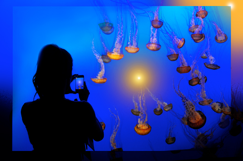
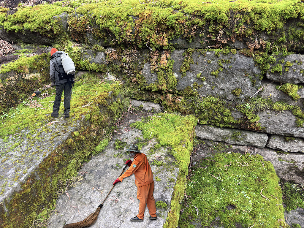
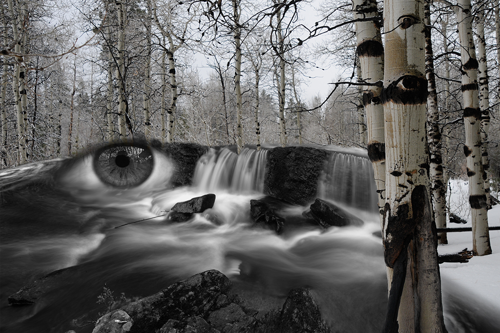
Lisa, This is a very interesting composition. I don't fully understand how you did this. Any more details you can share would be helpful. |
Jun 9th |
| 41 |
Jun 24 |
Reply |
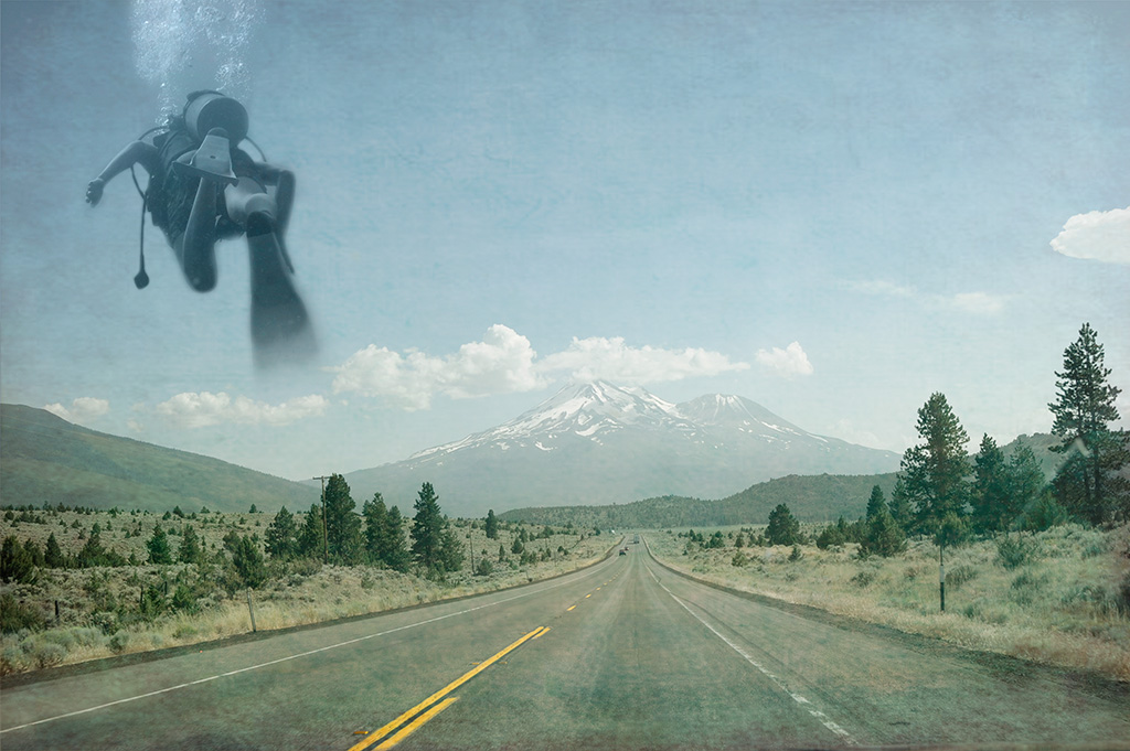
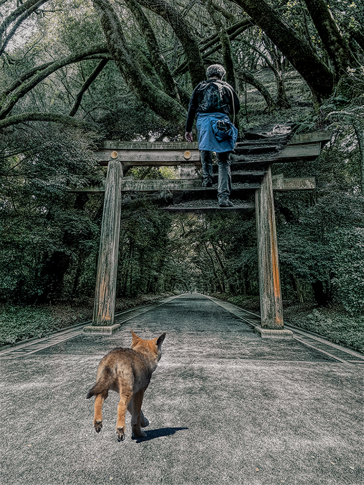
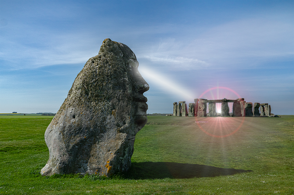
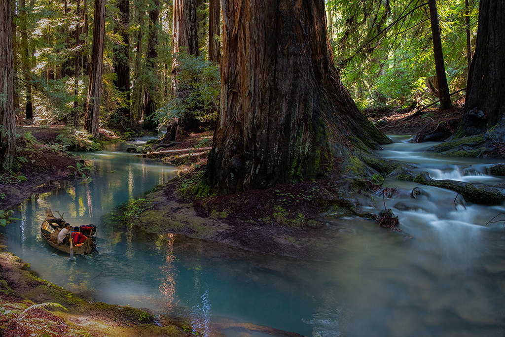
Melissa, Thanks for visiting group 41. I like your suggestions. After reading your suggestion about placing a person further down the hill I realized the stone wall does appear as if it is composed of a distant landscape, a departure I will definitely explore, thank you! |
Jun 4th |
| 41 |
Jun 24 |
Comment |
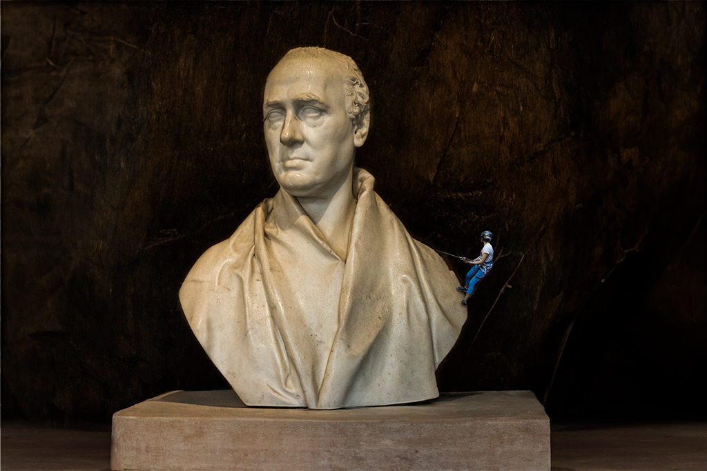
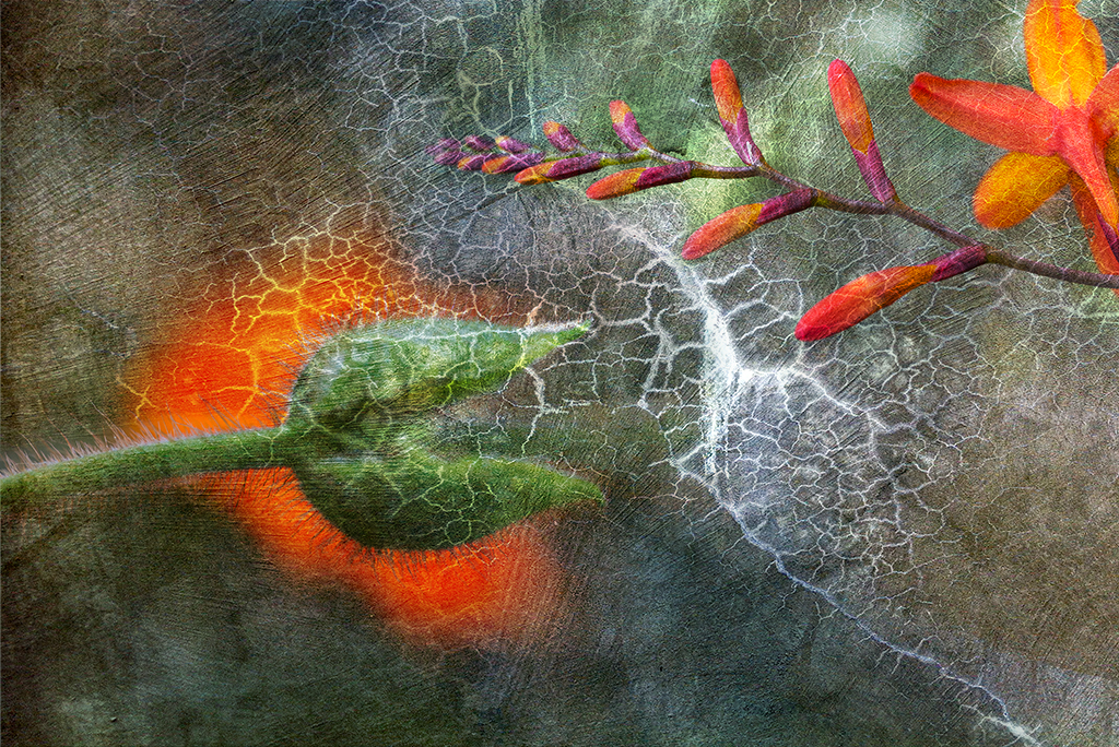
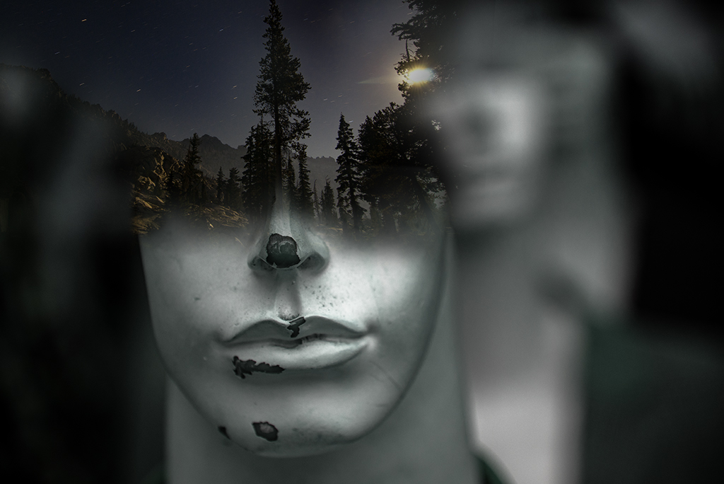
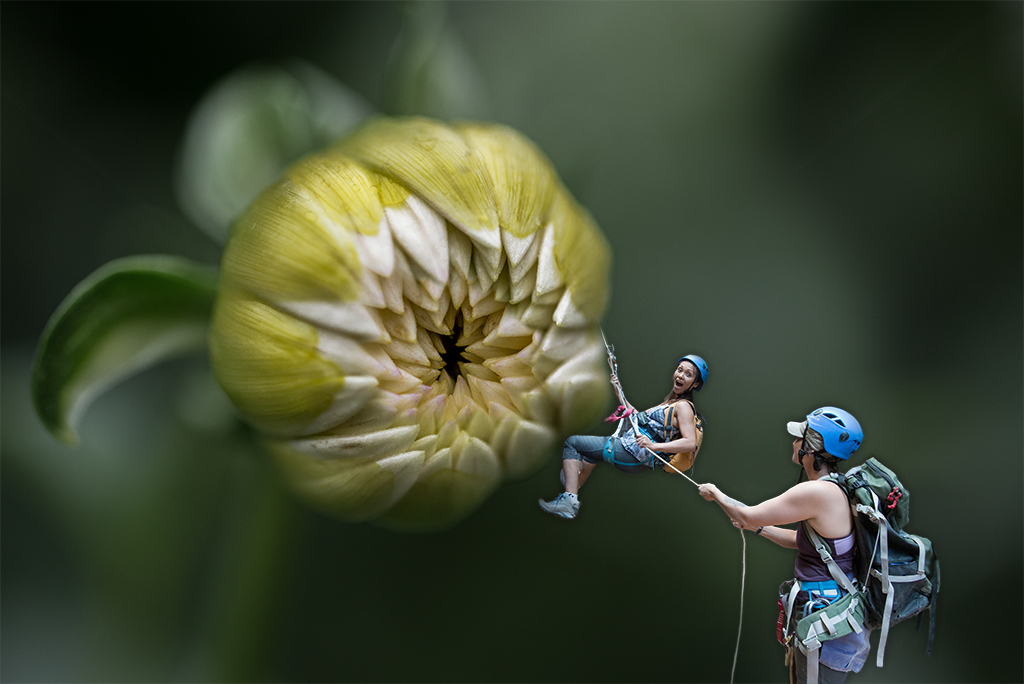
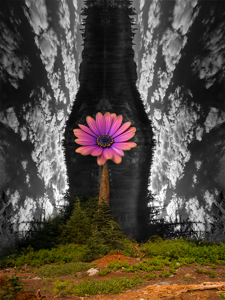
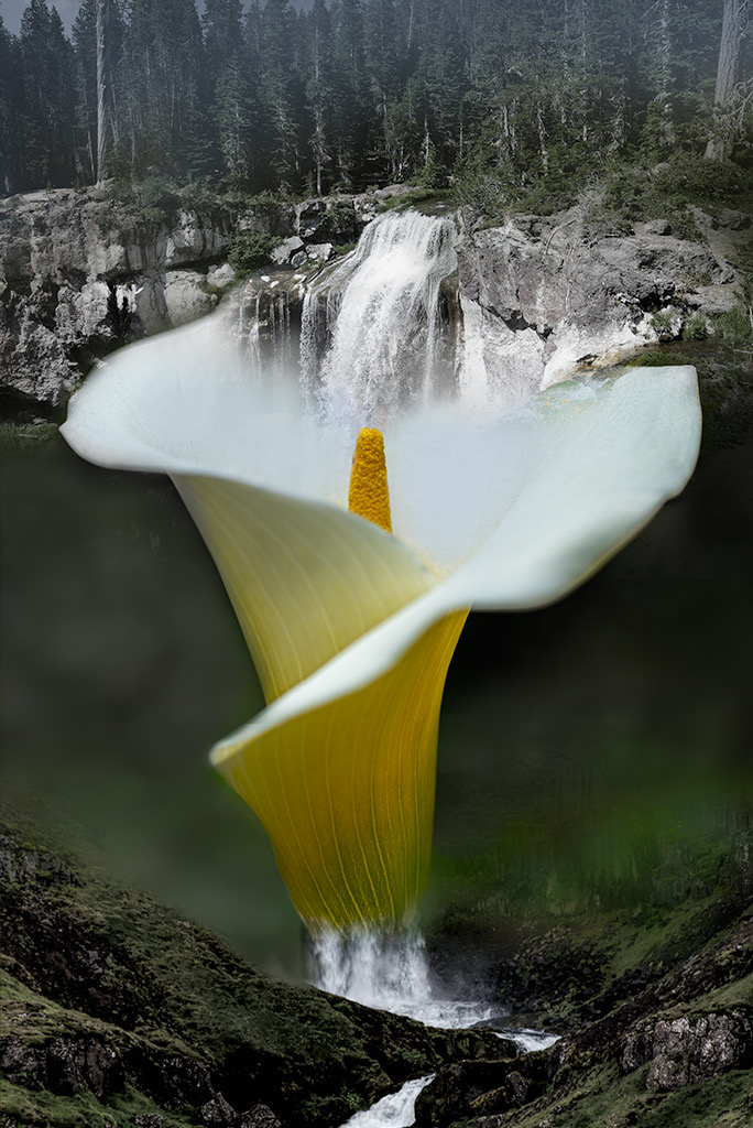
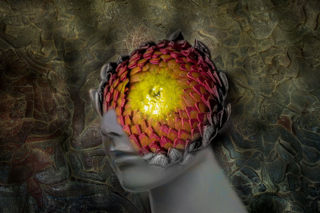
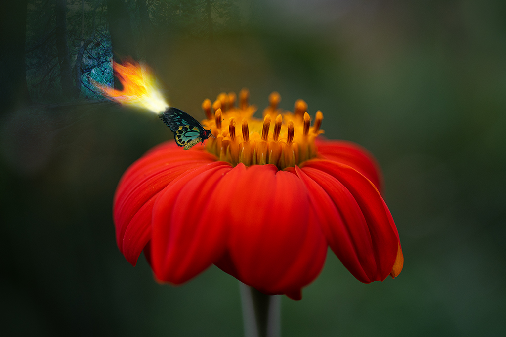
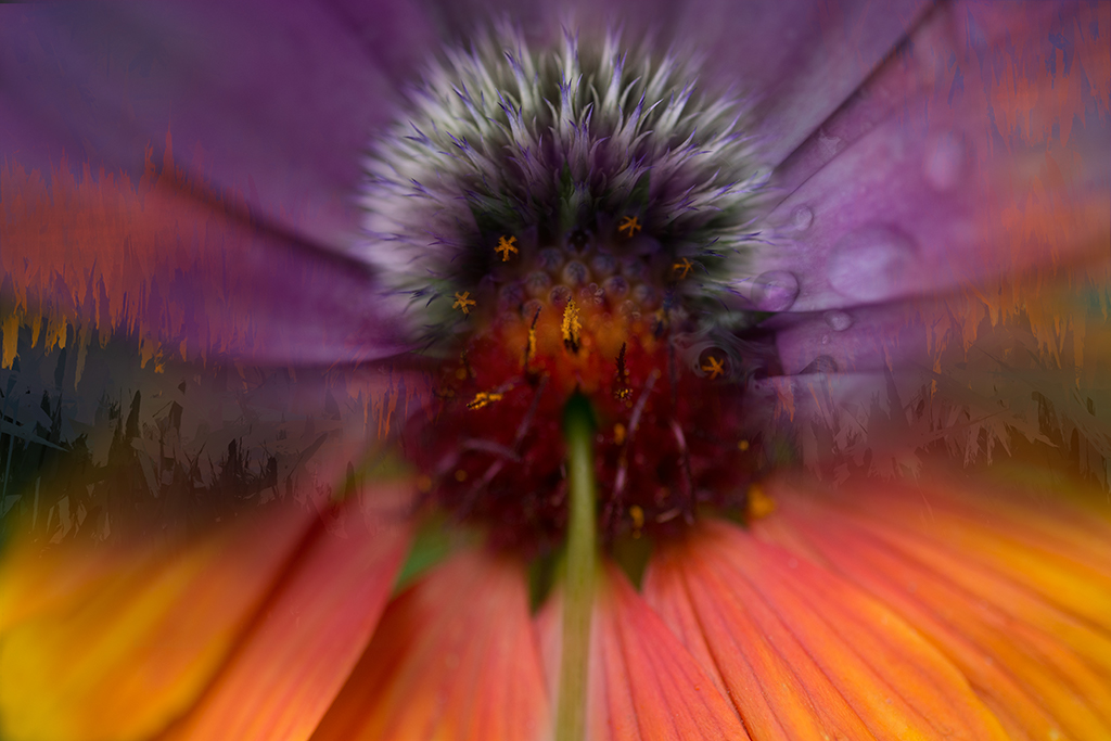
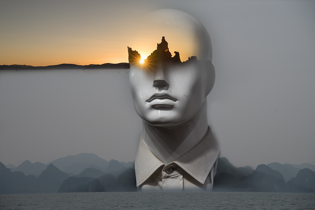
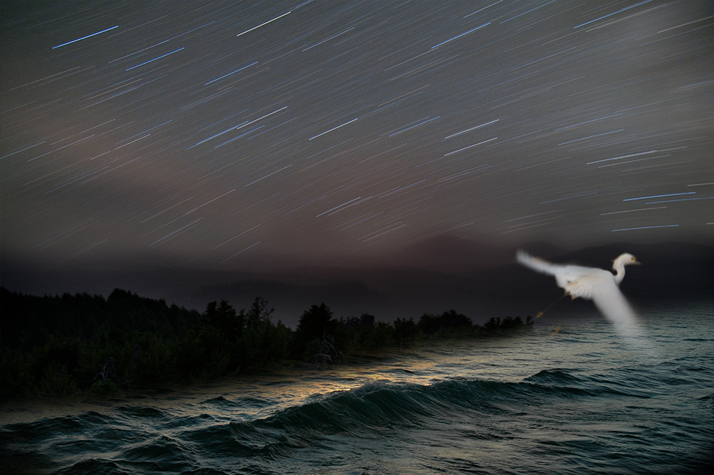
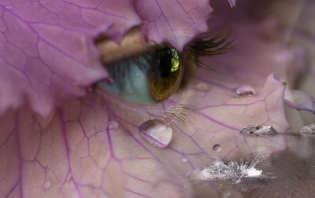
Brian, You've created an interesting art piece here. I wouldn't have known this is a stone statue of a naked female without your description. This image works for me in its abstraction. I like the tonal range and placement of the forms as they create interesting resonance. I find the blurry vignette a little distracting as it is and wonder if it could benefit from additional tweaking. I also find the sharp rim around the flower a bit unnatural, not sure if your intention is to emphasize the sharp edge. |
Jun 4th |
| 41 |
Jun 24 |
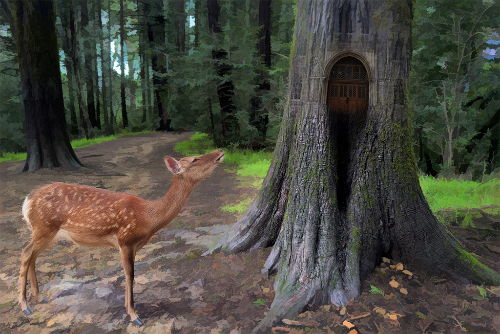
Comment |
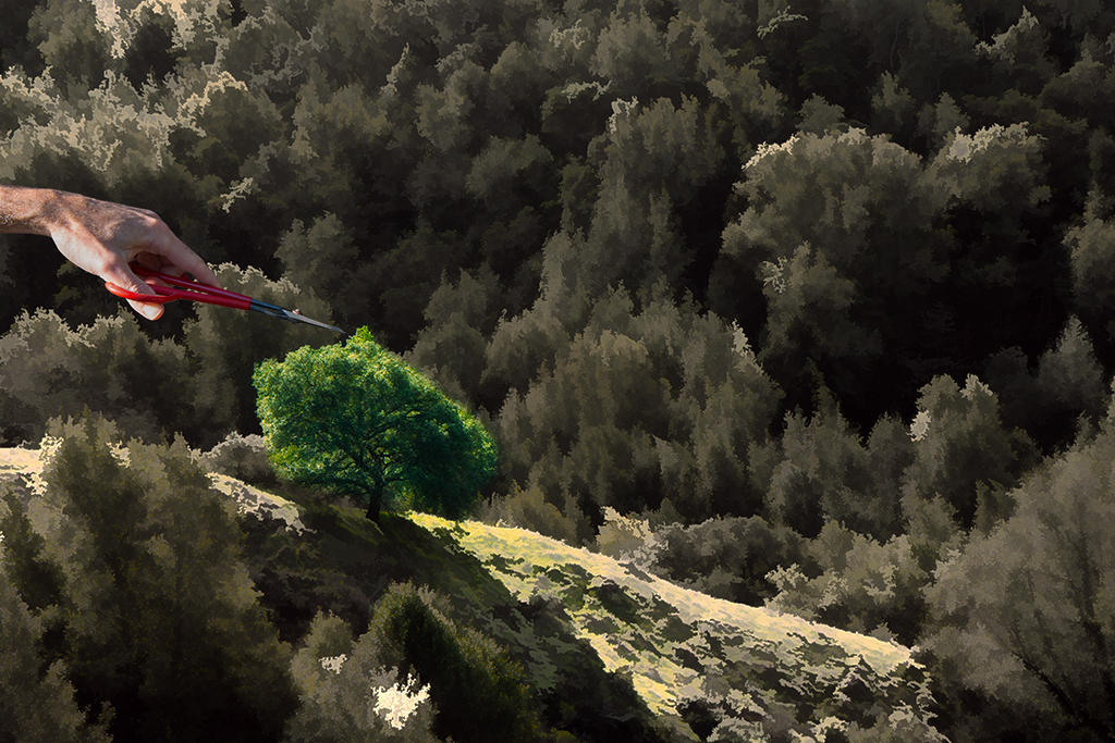
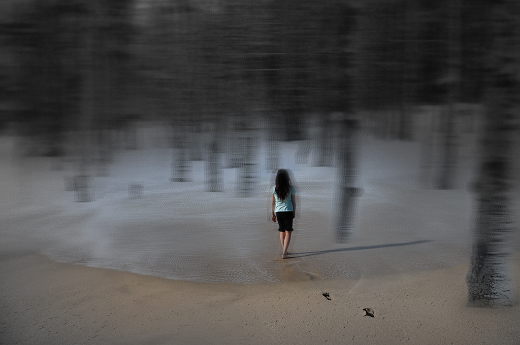
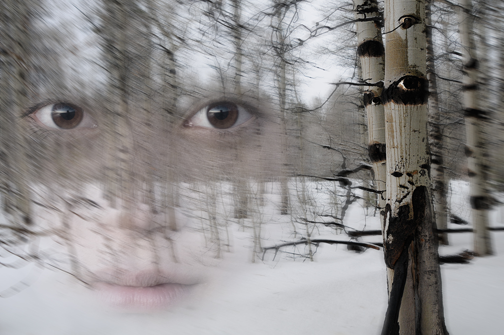
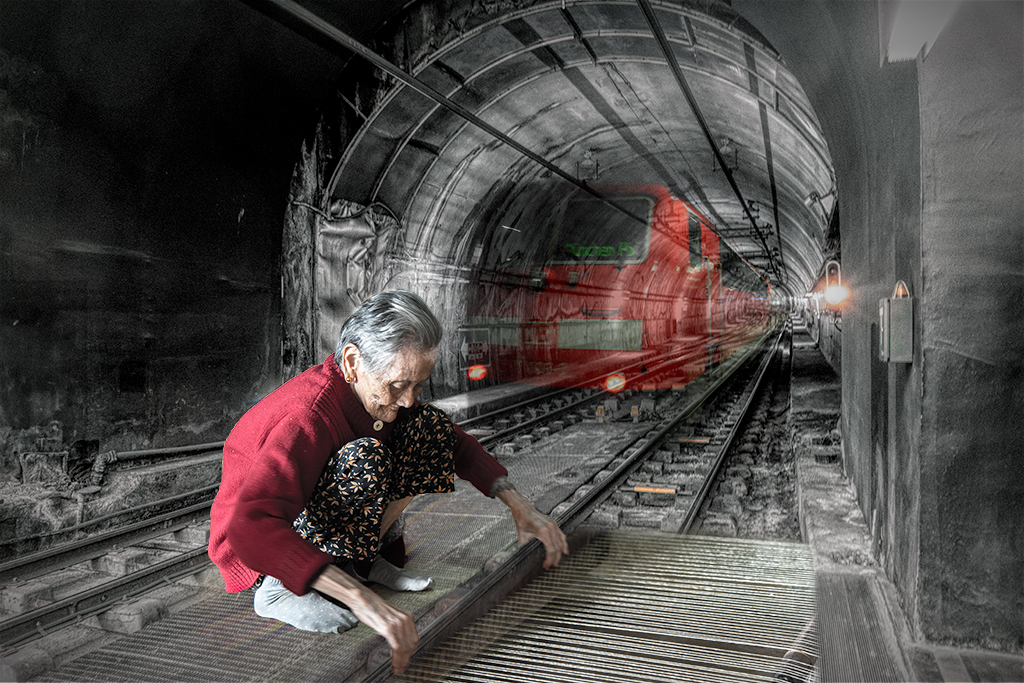
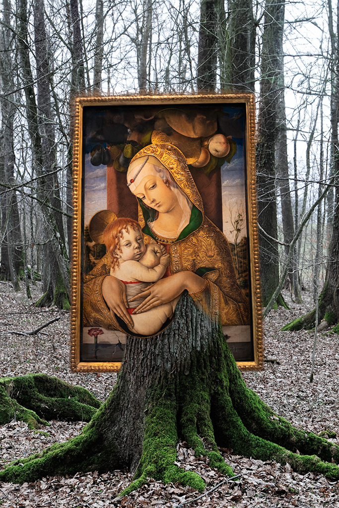
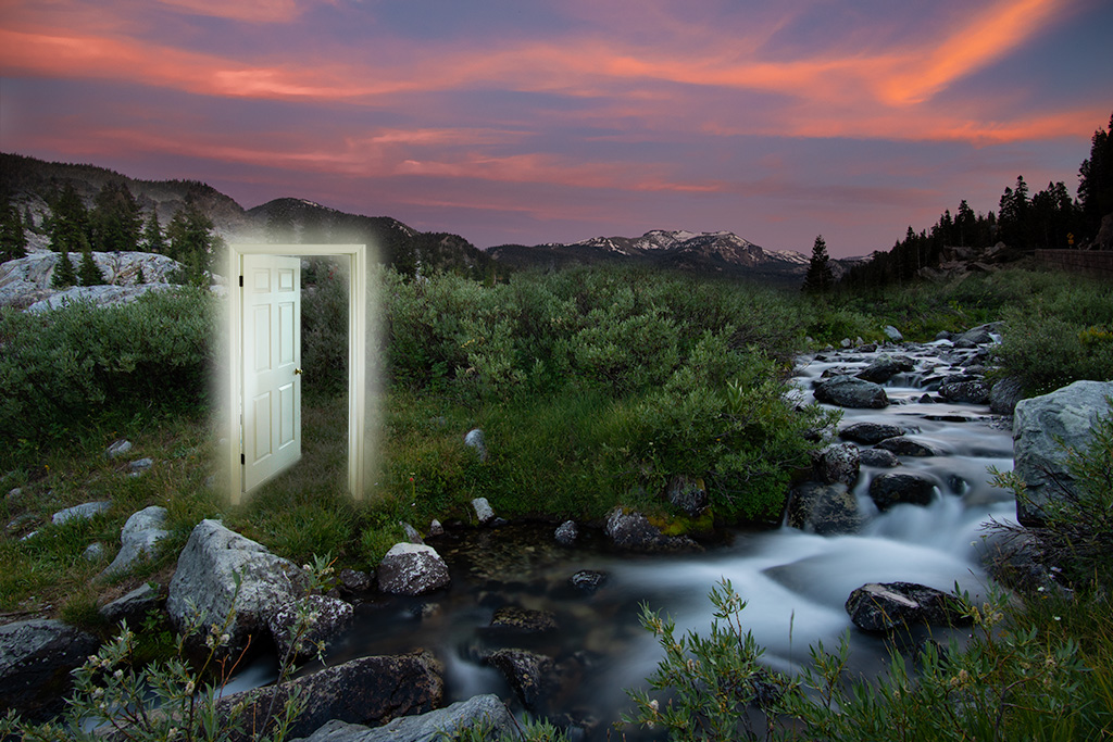
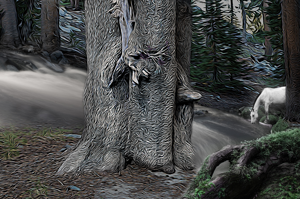
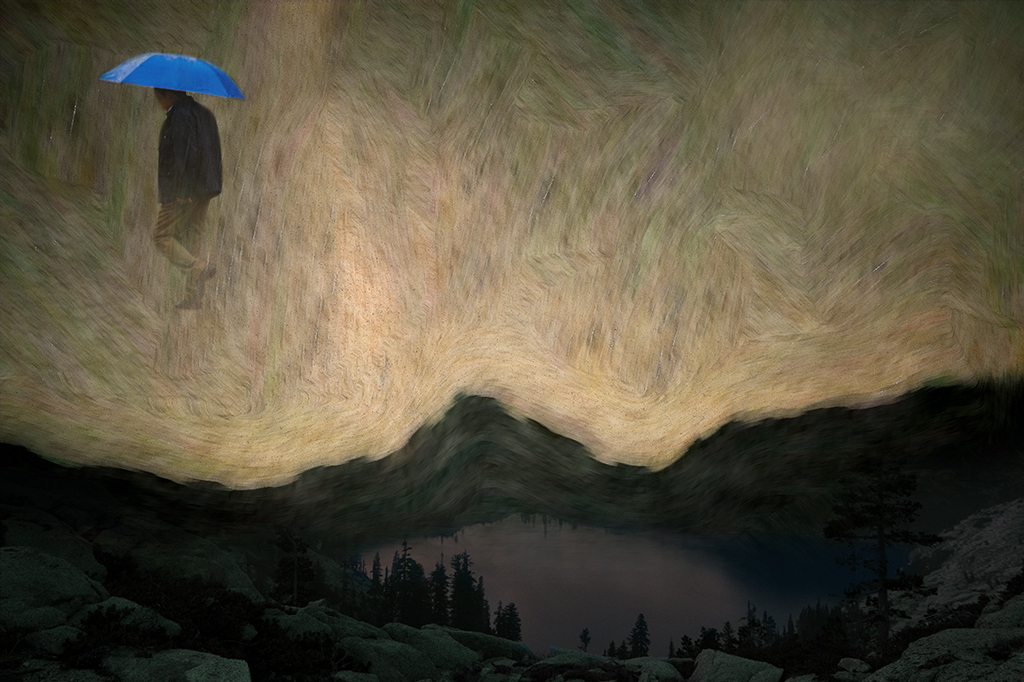
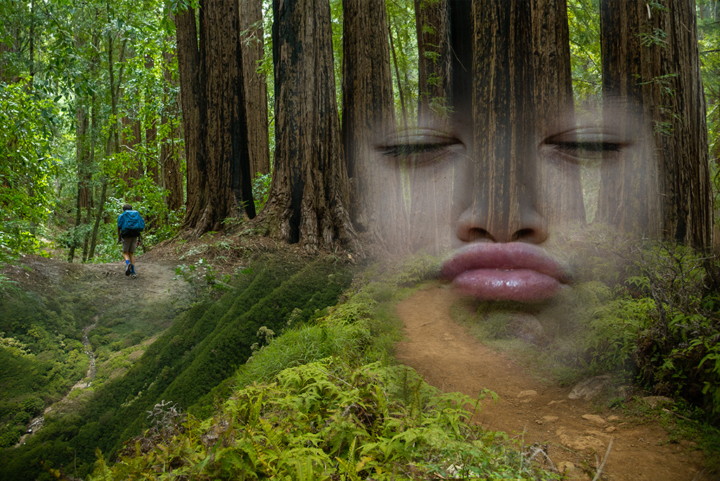
Nadia, You've done a great job integrating the doors into the trees. To my eye the image appears somewhat flat, not sure if that is your intention. I wonder if you were to remove some of the green cast from the foreground ground and play with contrast some to further separate/integrate the forest from the door trees. As a last thought after viewing your title I thought you could take this in a different direction by renaming it Witch door and have elements of a black cat or some other element to tell a story. |
Jun 4th |
| 41 |
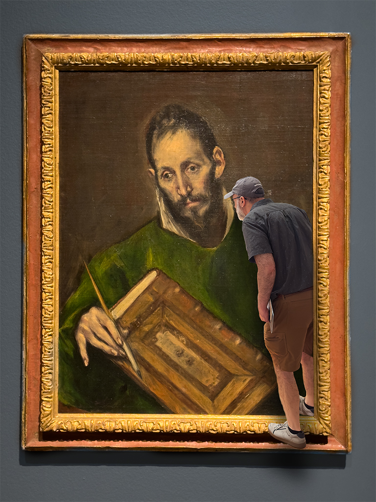
Jun 24 |
Comment |
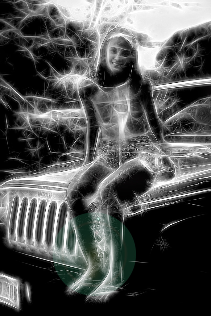
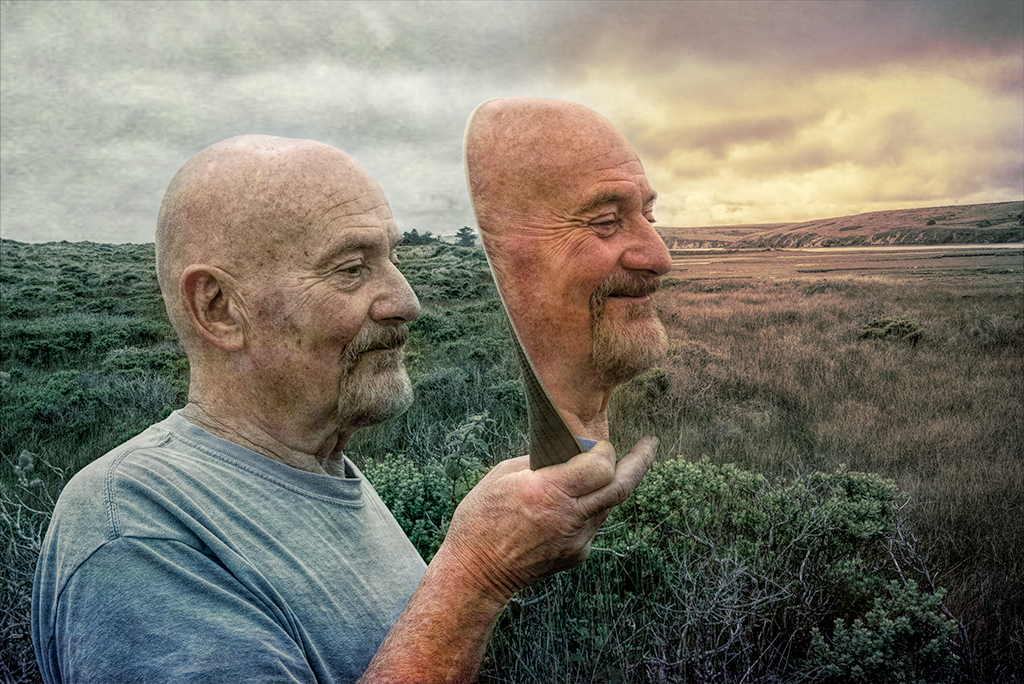
Tom, I really like your handling of this image. All of the enhancements you've outlined work incredibly well. Your choice of cropping works nicely to make this a very intense and intimate portrait. |
Jun 4th |
| 41 |
Jun 24 |
Comment |
Hazel, These are all lovely. One further exploration might be to remove the texture from the edge of the bowl to give the bowl to add more depth to the image. This could further be enhanced by adding a shadow to the bowl. |
Jun 4th |
5 comments - 5 replies for Group 41
|
| 54 |
Jun 24 |
Reply |
Kirsti, Now that I see the modification I am not 100% convinced it is an improvement over your initial handling. One thing I do love about photoshop is you can try different things and keep what works. |
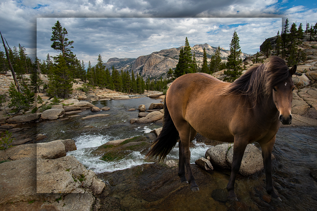
Jun 19th |
| 54 |
Jun 24 |
Comment |
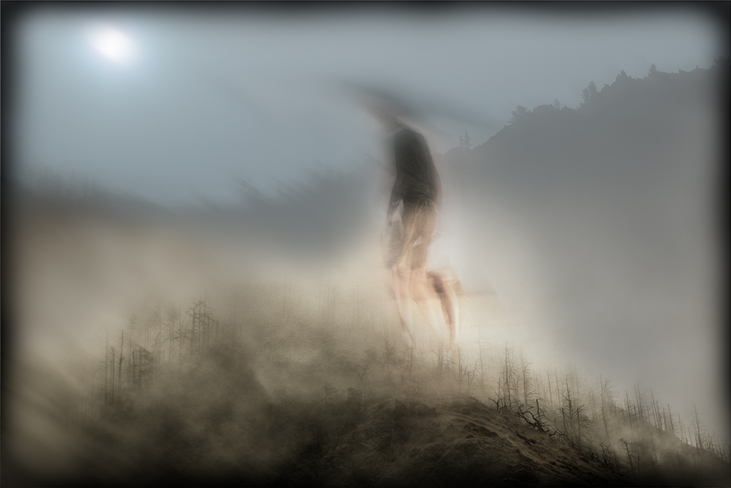
Alan, Thanks for taking the time to be creative with this image. Straightening the tree is a great idea. I like the idea of having a figure emerge in this surrealistic way. "Future musings" is a great way to put it. |
Jun 14th |
| 54 |
Jun 24 |
Reply |
Peggy, I fully understand how images created for this site are often constructs and may not add to an already powerful image. I was called out on that by Bruce this month for my image. Your subtle adjusts work for me. |
Jun 9th |
| 54 |
Jun 24 |
Reply |
Bruce, Thank you for your feedback on how these images may be received. I agree this composite is weak. I often do share completed images I'm pleased with, this was not one of them. The original was fun to create as I only worked with the light present at the time the photo was taken, no funny business. Congratulations on your multiple awards. You are a talented artist, happy to have you join our group. |
Jun 9th |
| 54 |
Jun 24 |
Reply |
Peggy, I love how your handling has a more naturalistic feel and creates a very different vibe. I always appreciate your careful considerations. |
Jun 9th |
| 54 |
Jun 24 |
Reply |
Kirsti, Thanks for these suggestions. I love having new ideas to explore and its fun seeing how others handle my images. |
Jun 9th |
| 54 |
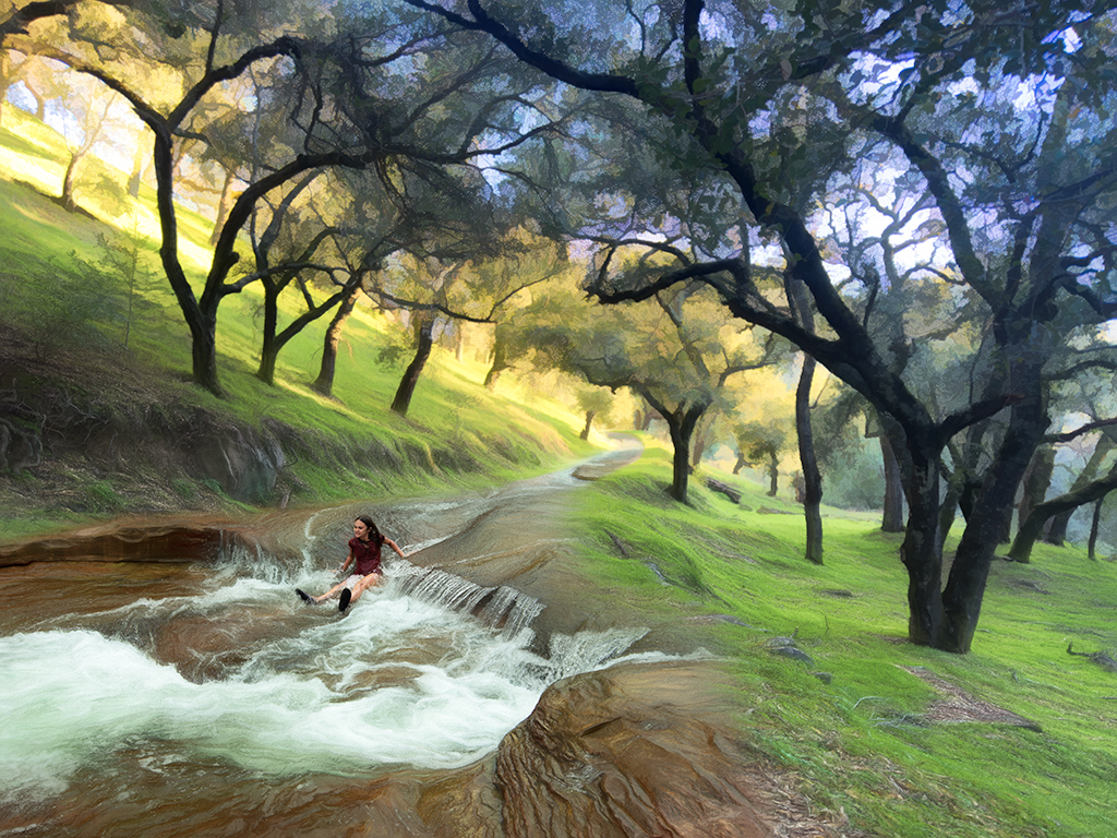
Jun 24 |
Comment |
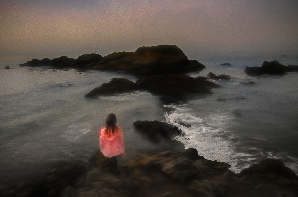
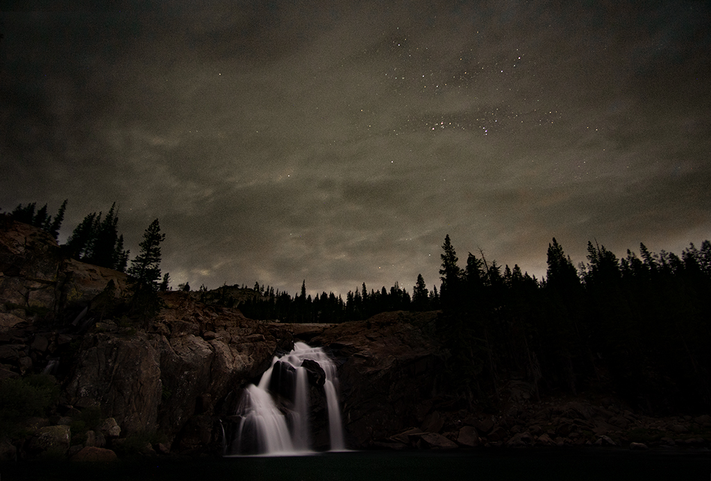
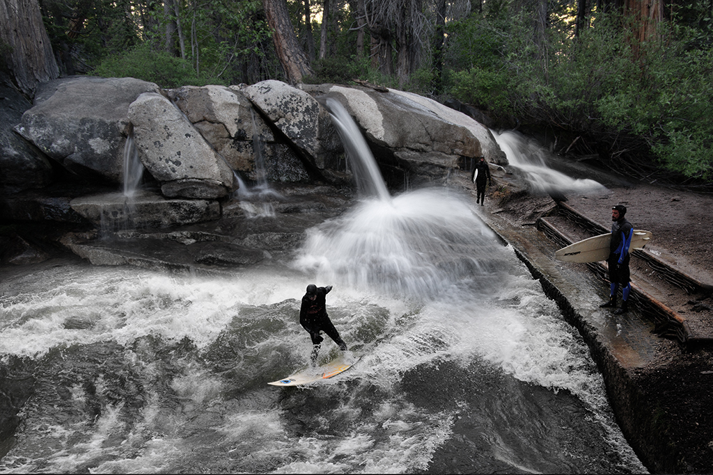
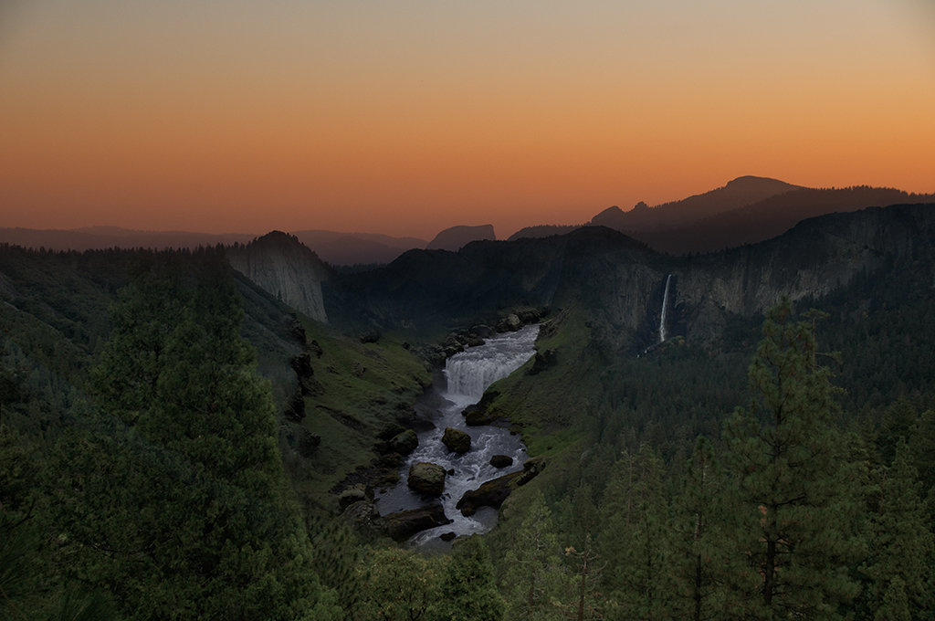
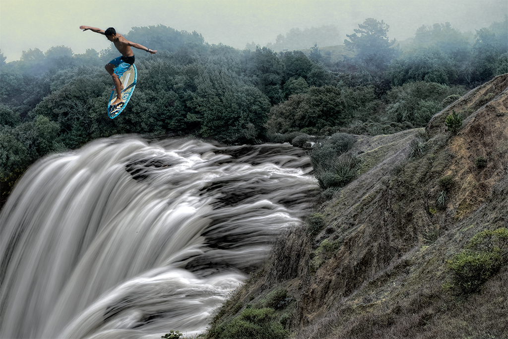
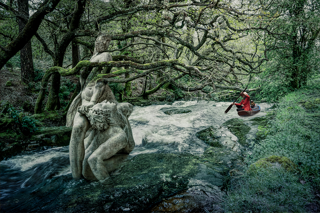
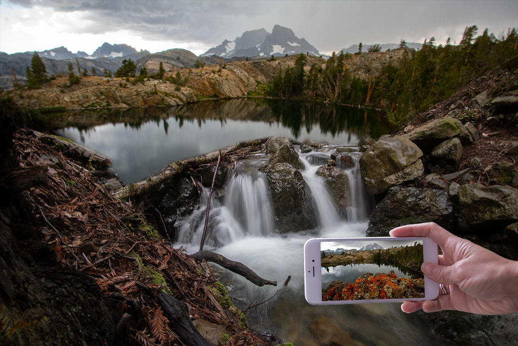
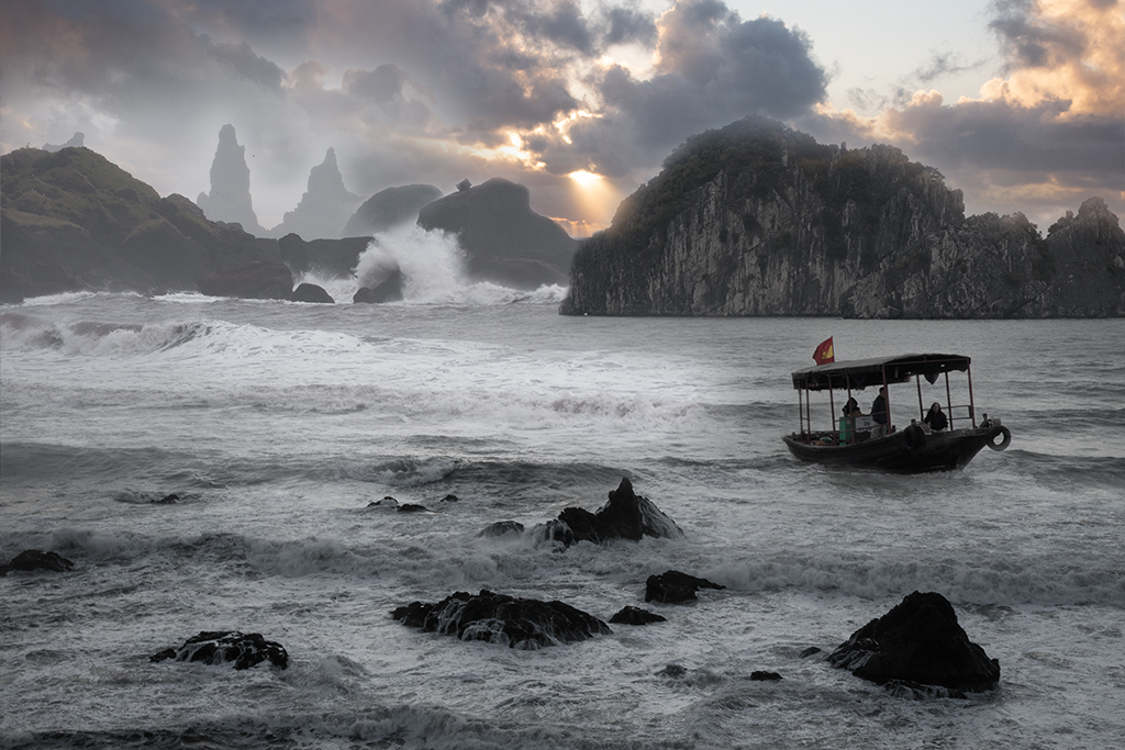
Powerful. That's the one word that comes to mind if we are limited to one word but this image deserves more words! I love your waterfall image, it is spectacular. The woman in red adds a very nice subject to balance the image even more. My personal preference would be to reduce the light vignette as the darker contrasty waterfall and ominous sky feels more powerful in the original. |
Jun 4th |
| 54 |
Jun 24 |
Comment |
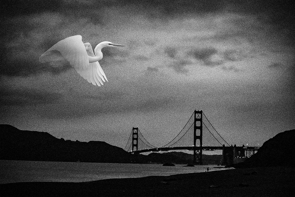
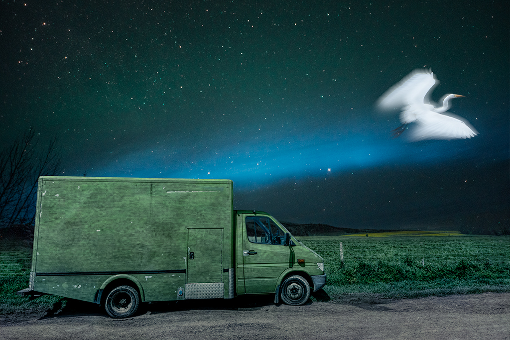
Alan, Another strong simple image that works on many levels. I have no suggestions this month |
Jun 4th |
| 54 |
Jun 24 |
Comment |
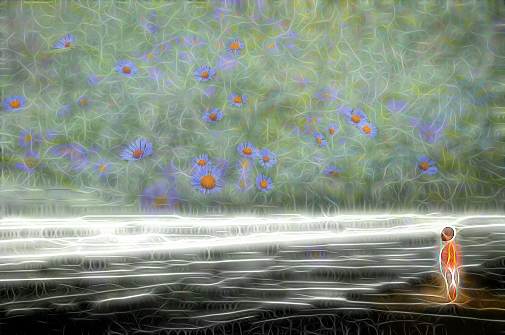
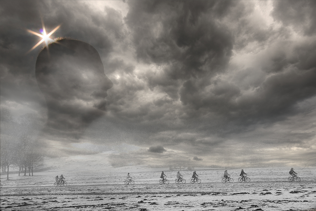
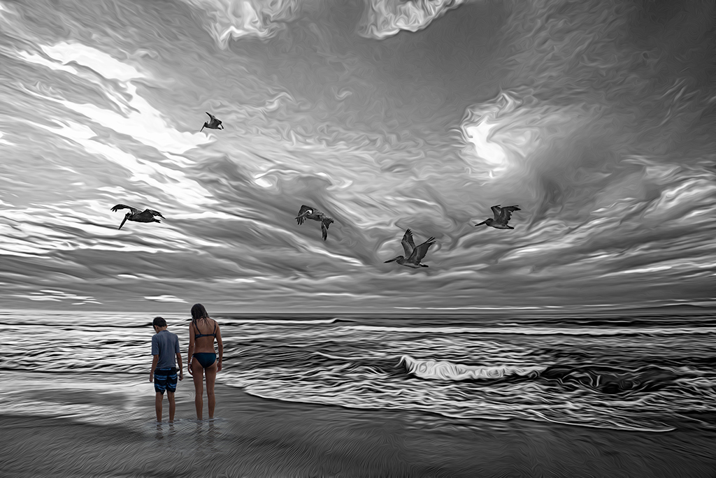
Kirsti, What a beautiful and provocative image. I love your handling of the sunset and placement of the birds. Your granddaughter is lovely in this image but her handling doesn't feel complete to me. I sense a type of emerging into the frame and I might suggest further developing this theme. I also might further increase contrast of her head and return the scepter to a darker tone as in the original(tying it in some visually with the birds- although I could see how this might draw the eye down). I personally might move her a little back to the left for a slightly different balance but that is purely personal preference. |
Jun 4th |
| 54 |
Jun 24 |
Comment |
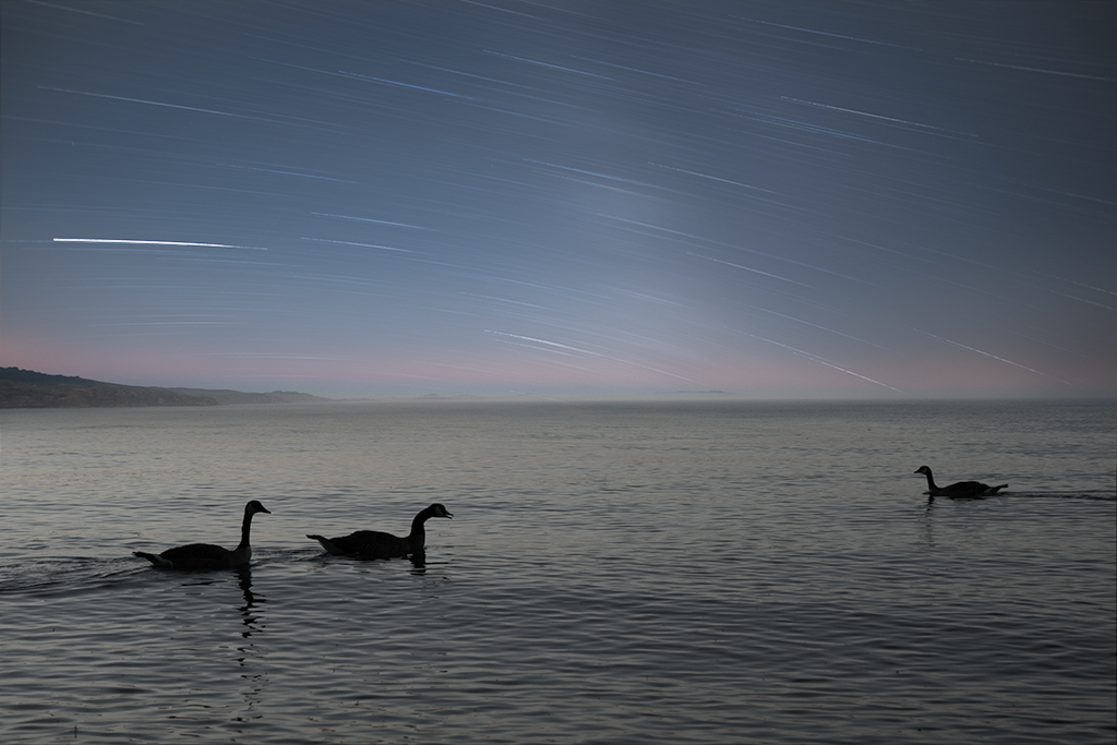
Peggy, You've done a really nice job creating texture in this image. My first reaction was a deep fondness for the original image. It is so good, I feel like the textures take away from the beauty of the original. One compromise which may add some punch to the image would be to subtract the textures from the swans (and reflections) to make them pop. |
Jun 4th |
5 comments - 5 replies for Group 54
|
10 comments - 10 replies Total
|