|
| Group |
Round |
C/R |
Comment |
Date |
Image |
| 41 |
Sep 22 |
Comment |
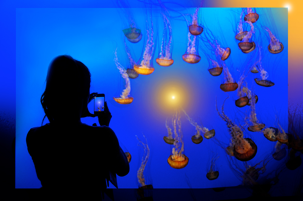
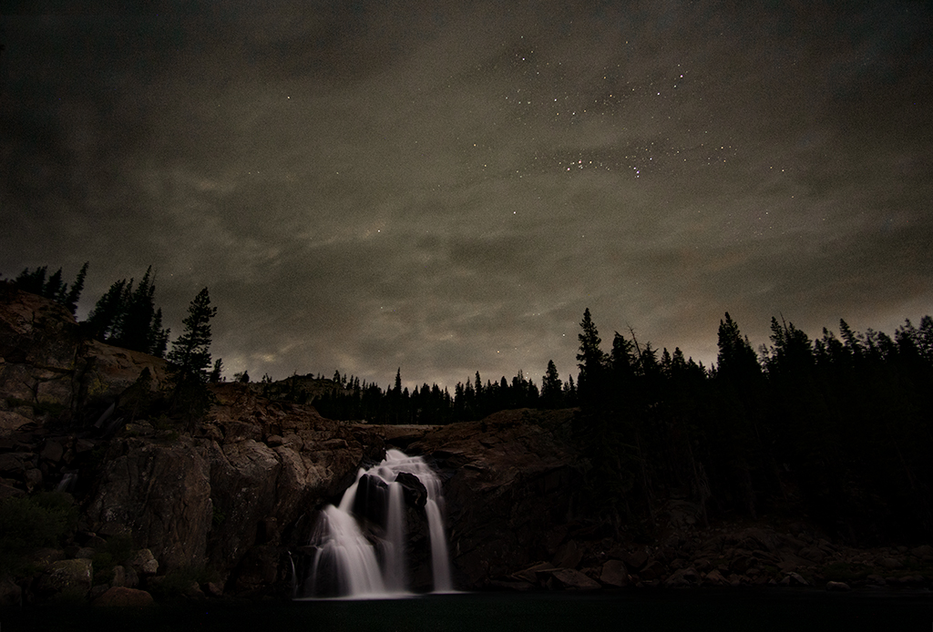
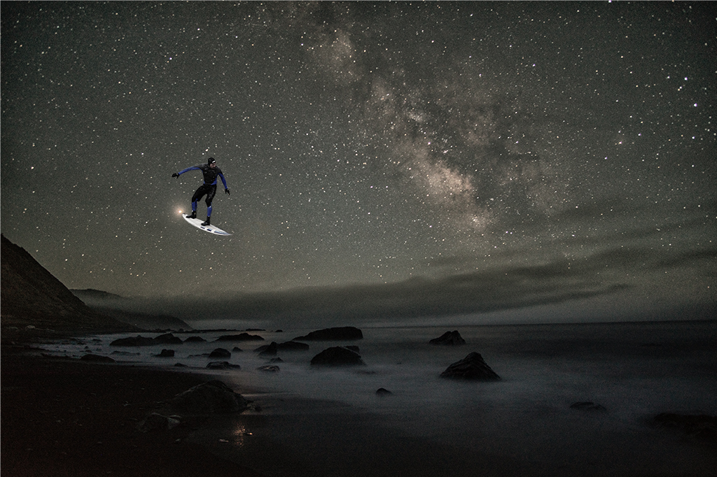
Brian, Thanks for the explanation. I understand now, not a problem with the image, just a problem with a dark image on a black background. Your attention to details is admirable. looking forward to learning more from you. |
Sep 21st |
| 41 |
Sep 22 |
Comment |
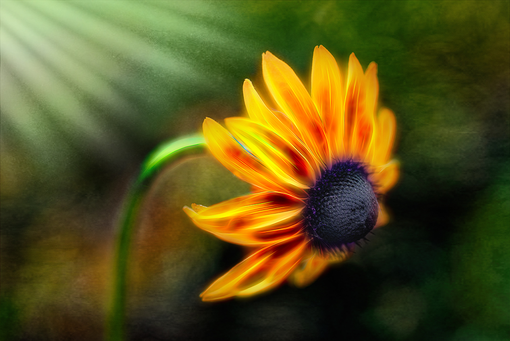
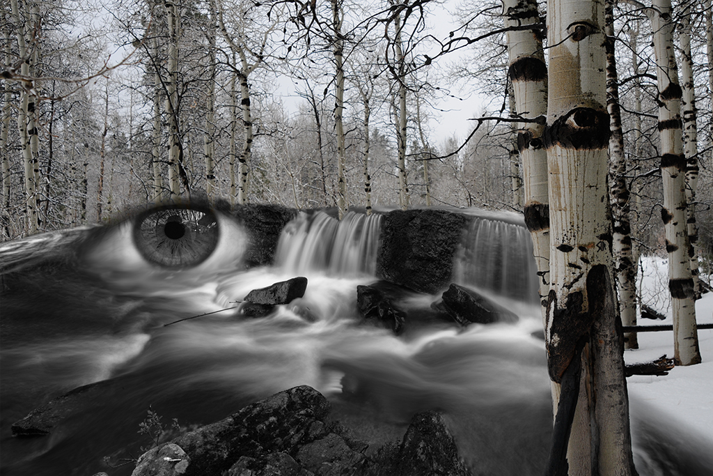
Lisa, I agree with what has been shared and do like Brian's tweaks. I do see some artifacts on the upper left side of the image, not sure if they are a pulling in of the edges that occurred when you liquified or just an artifact from the lower resolution file on the PSA site. |
Sep 18th |
| 41 |
Sep 22 |
Reply |
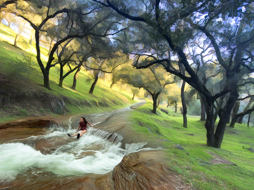
Brian, I just made that tweak and it is so much better, thanks. I wasn't clear on the dark area bleeding into the image you are referring to, I don't see it on my version. |
Sep 18th |
| 41 |
Sep 22 |
Reply |
Brian, Thank you for this reworking of the image. I like how you've brought out the foreground elements, very nice. |
Sep 18th |
| 41 |
Sep 22 |
Reply |
Julie, Thanks, that I will. |
Sep 15th |
| 41 |
Sep 22 |
Reply |
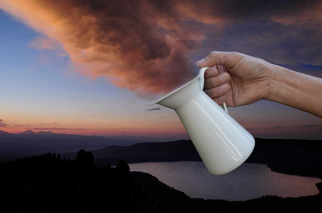
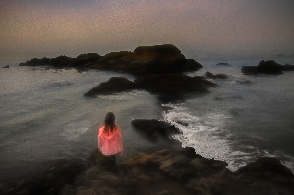
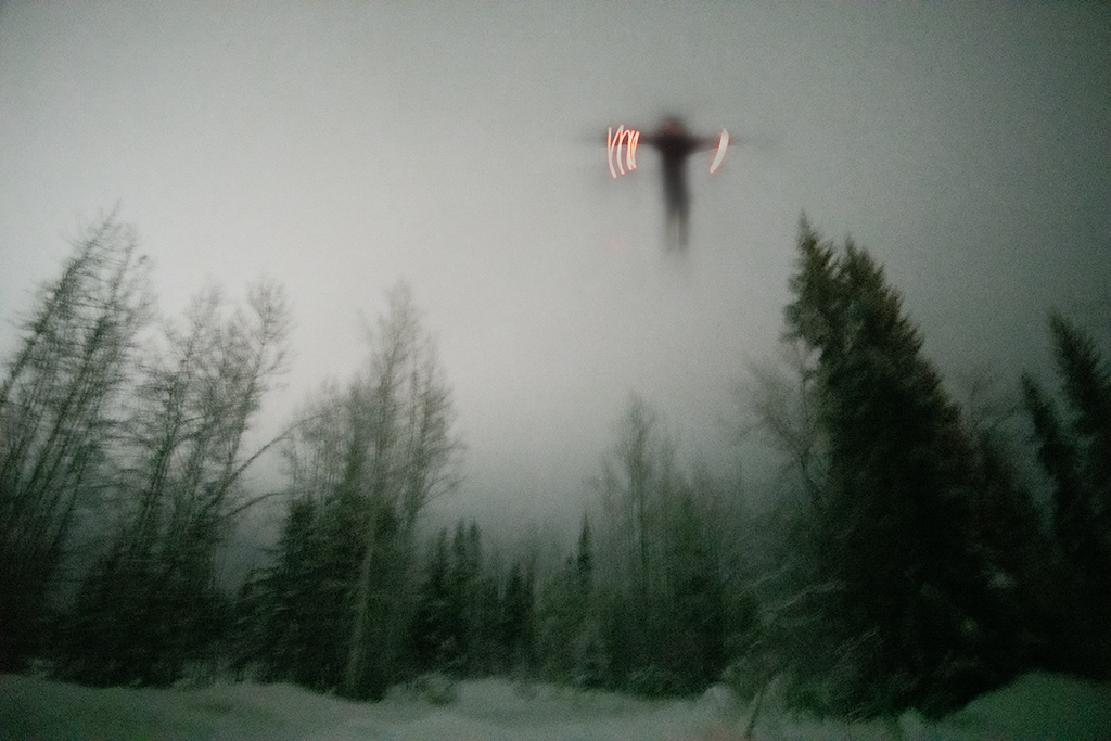
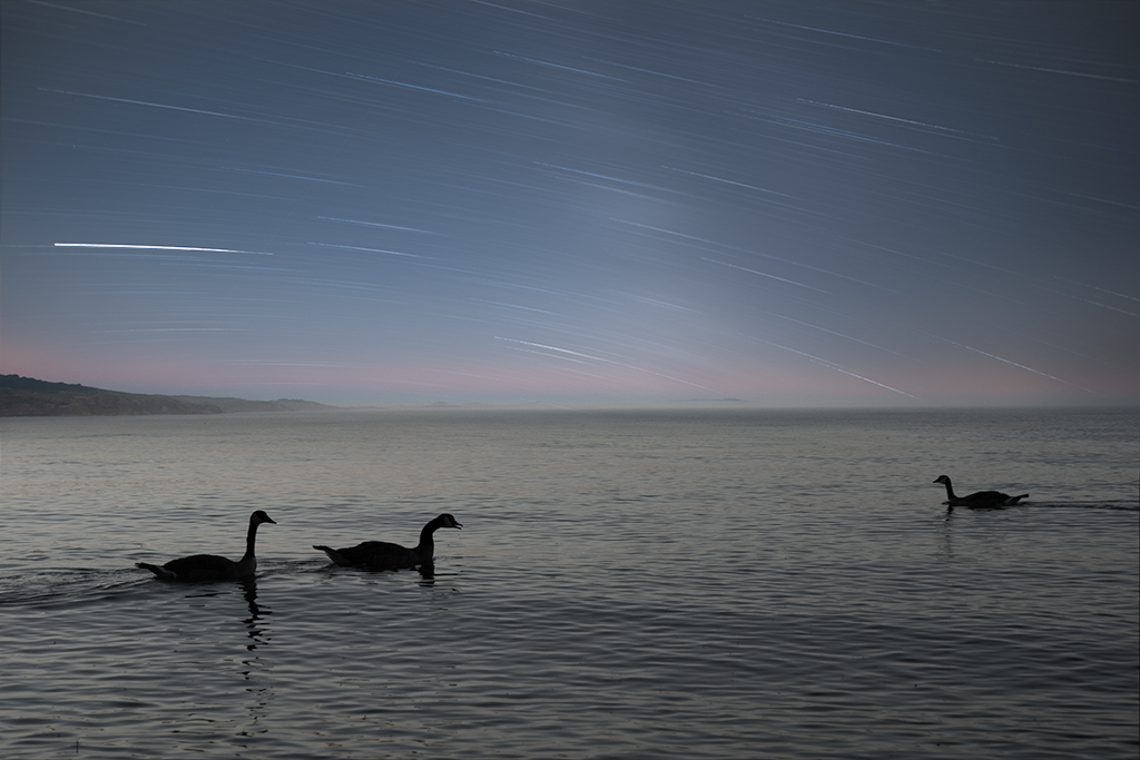
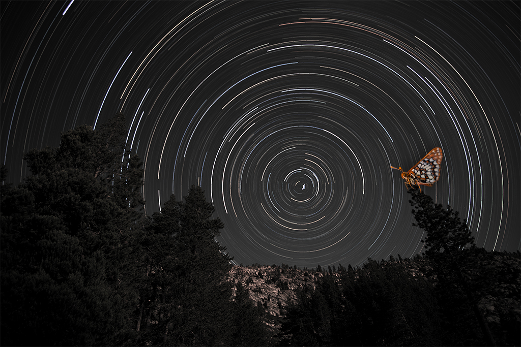
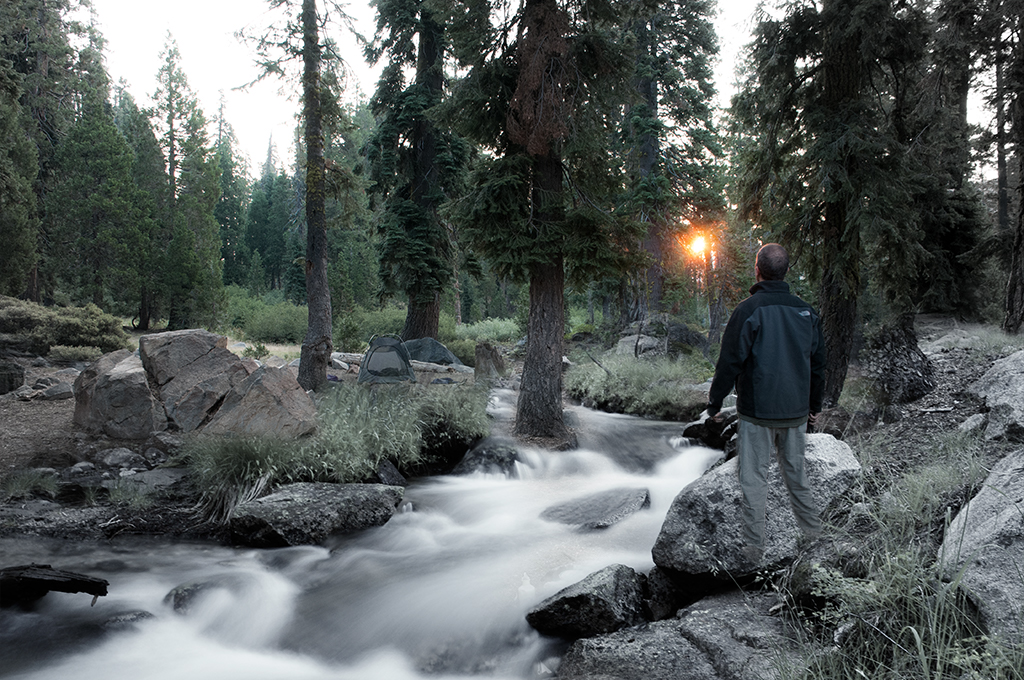
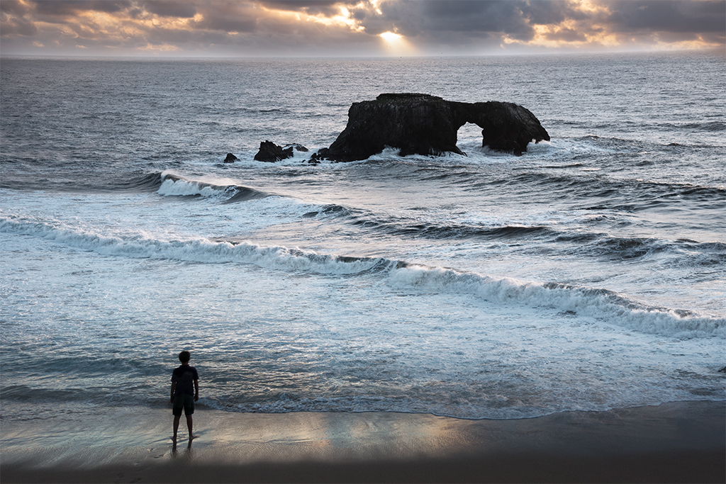
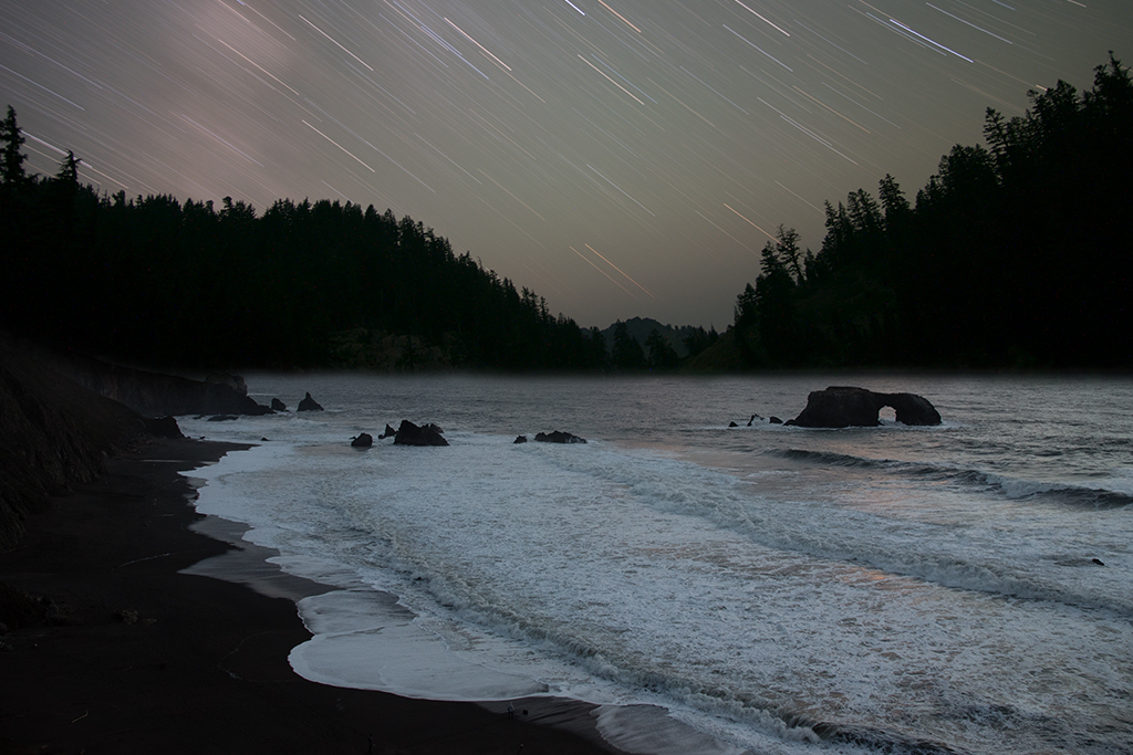
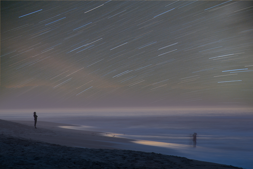
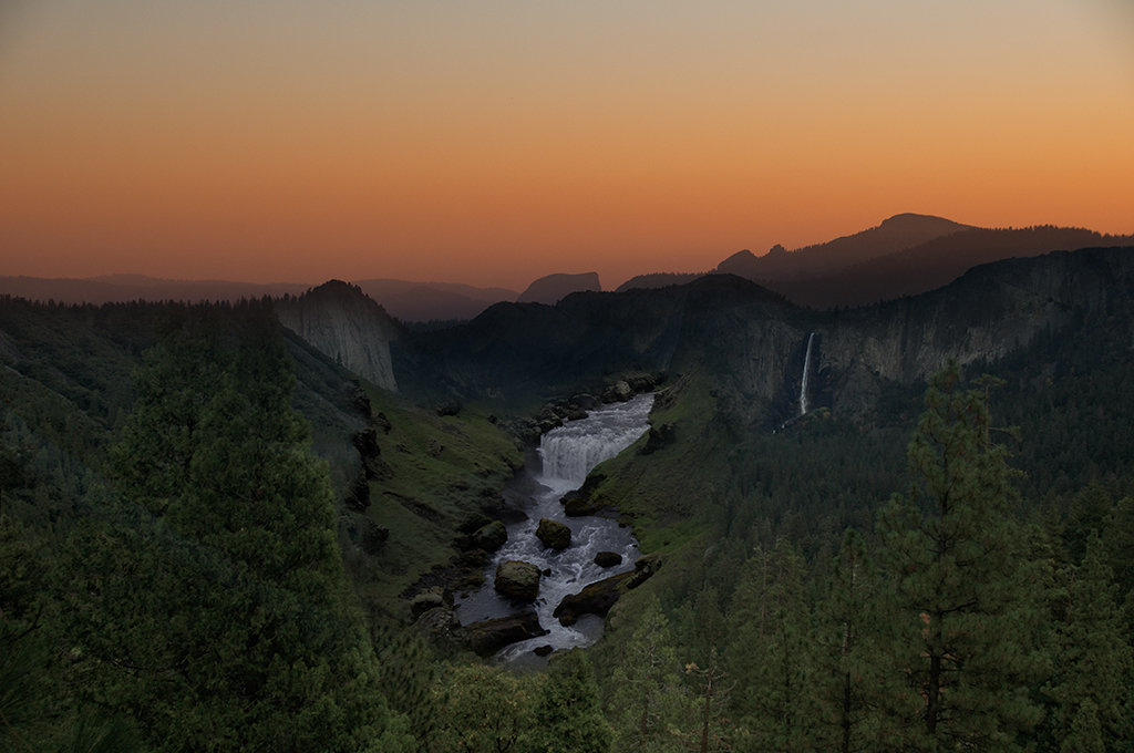
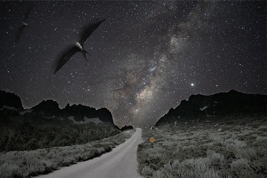
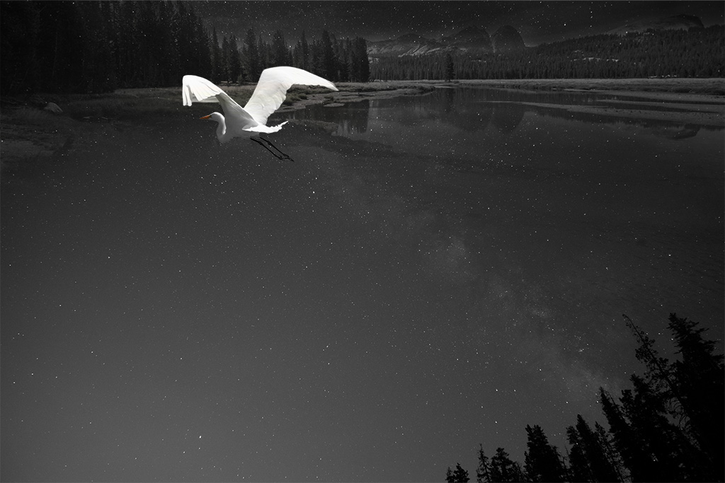
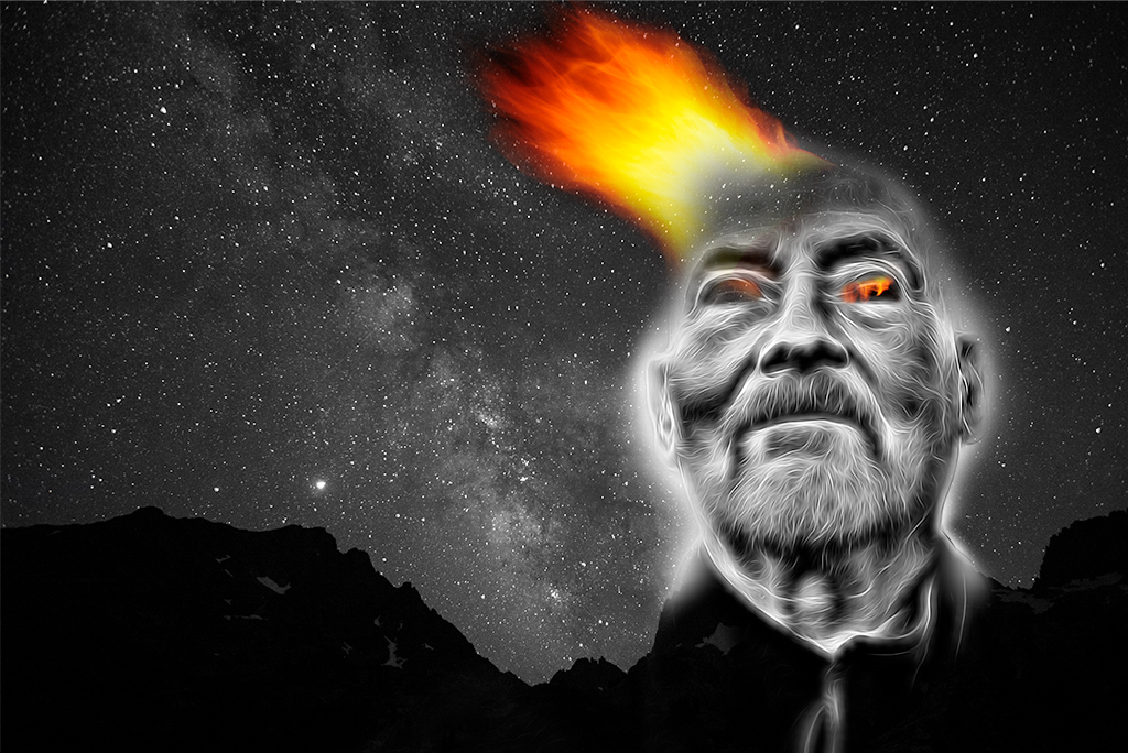
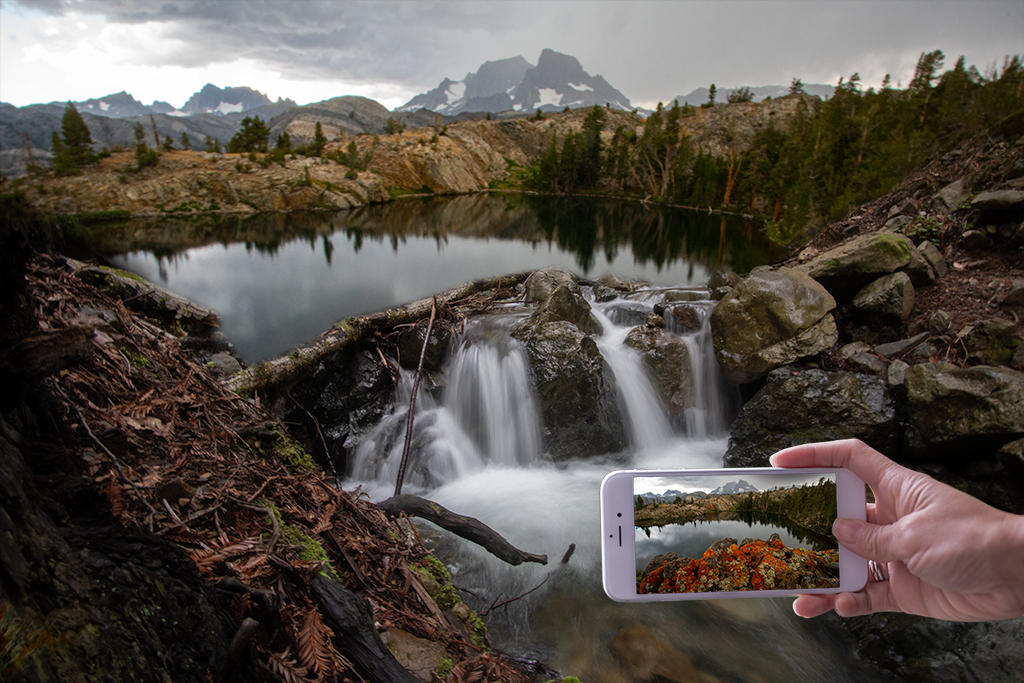
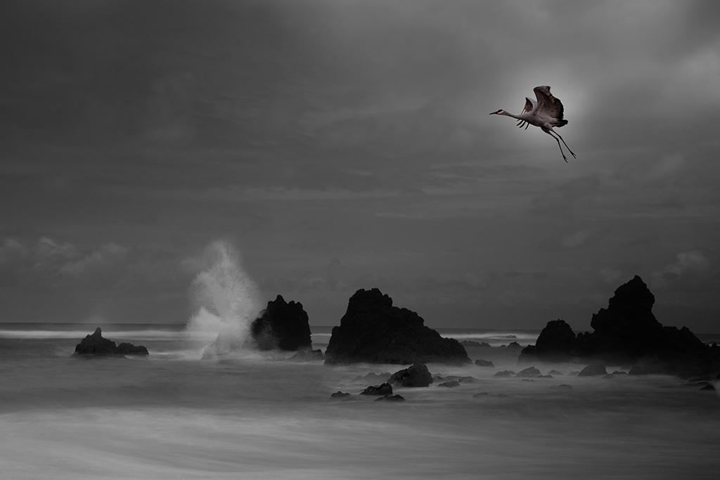
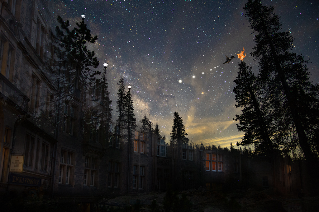
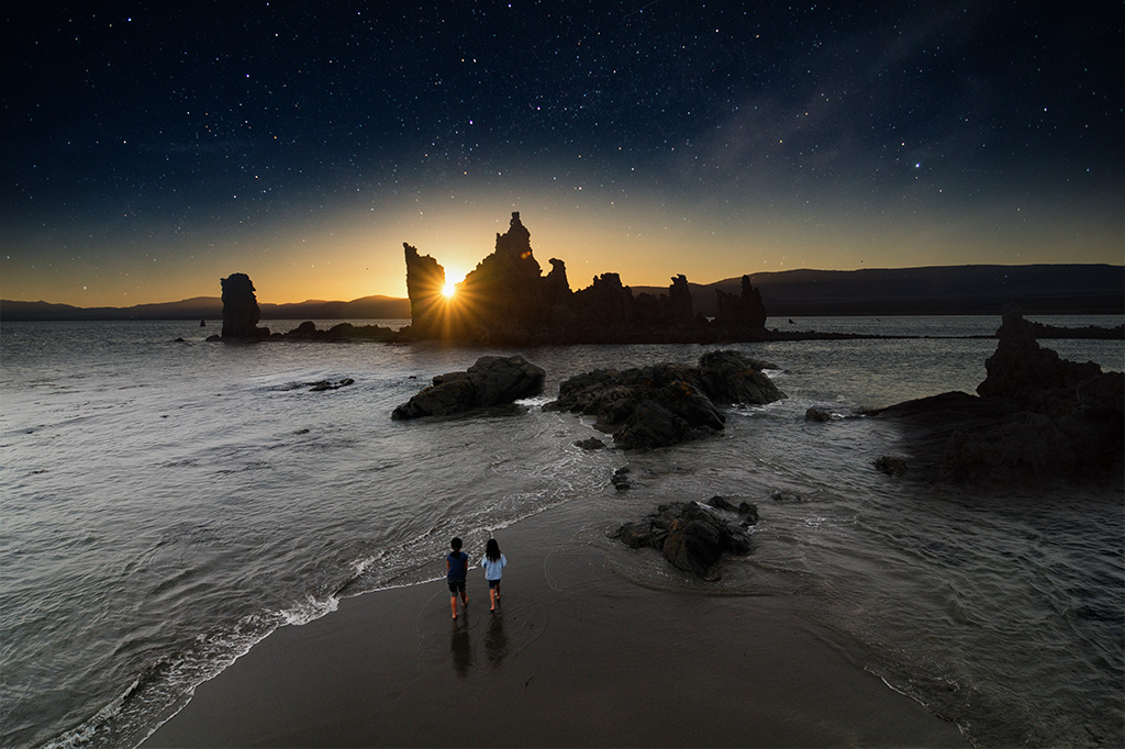
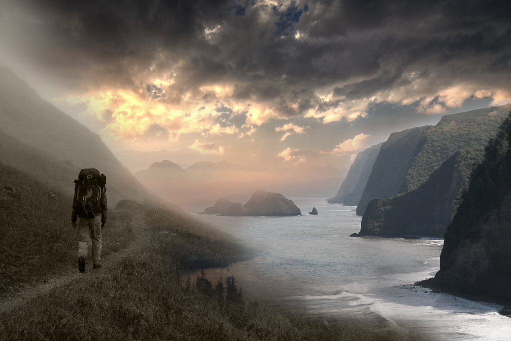
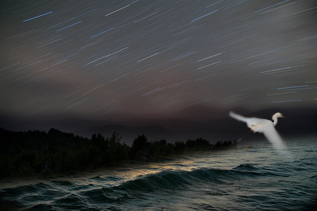
Henry, I have a very sharp wide angle lens I use for all of my night photography. Since my goal was to emphasize the sky, I didn't see a way to avoid the upward tilt. In reality I had equipment failure on this backpacking trip, my other lens has something wrong making focusing impossible so I was limited to one lens. |
Sep 15th |
| 41 |
Sep 22 |
Reply |
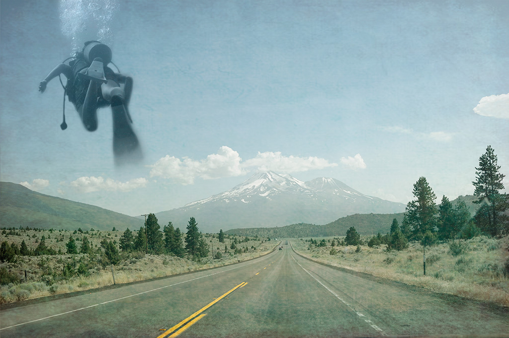
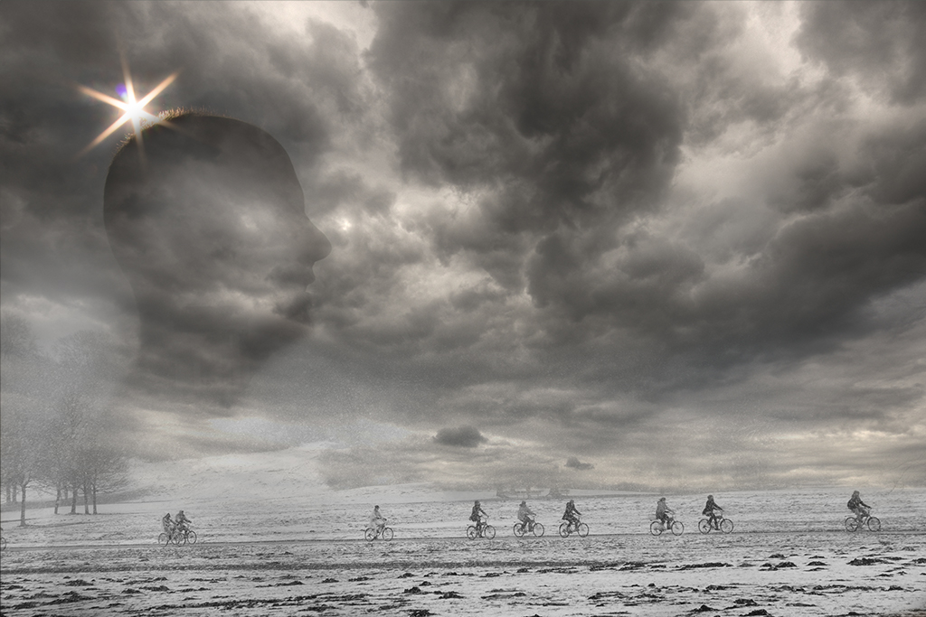
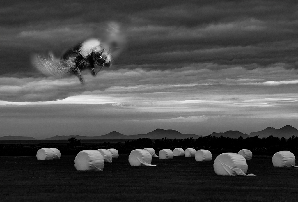
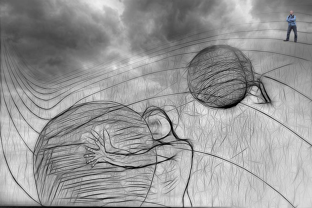
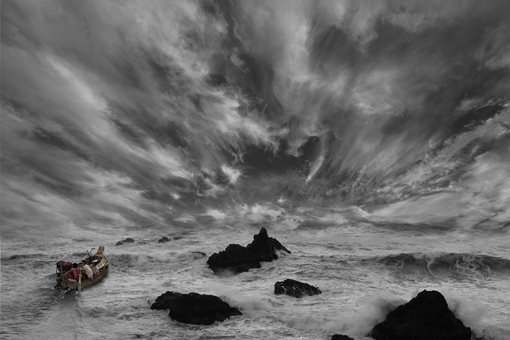
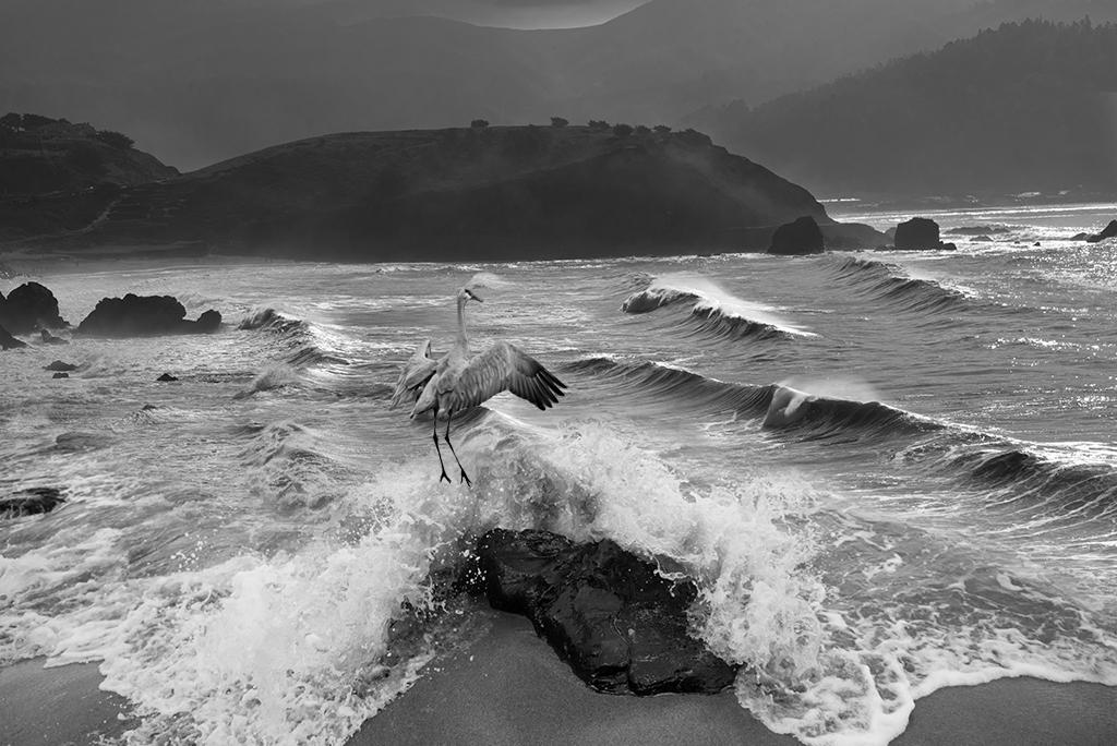
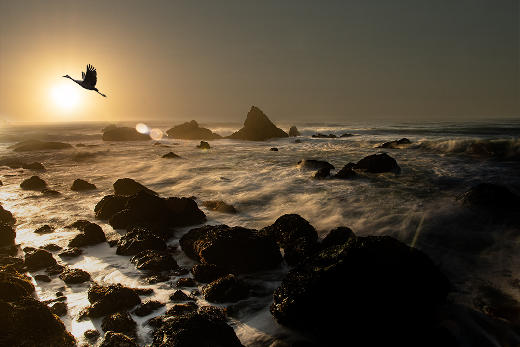
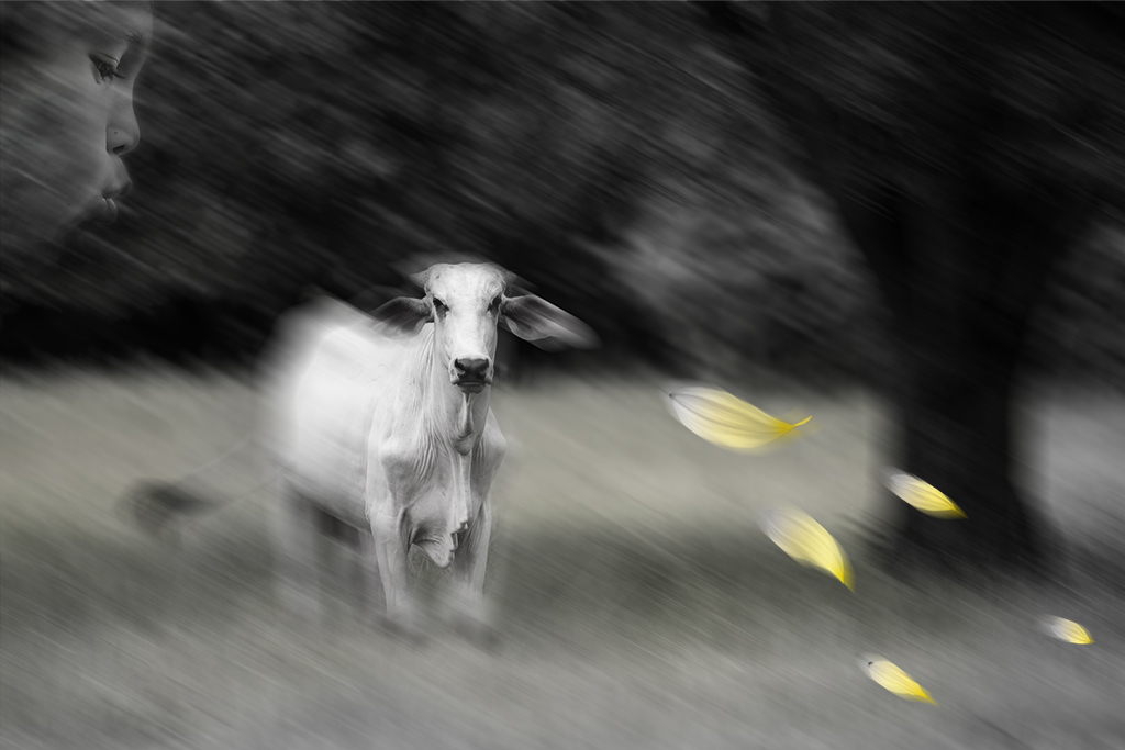
Tom, Thanks for your suggestion, I had hoped the dead space would balance the star trails I had planned. I agree this is more of an enhanced landscape than a "creative" image but I wanted to share the image and didn't have another more photoshop type image to share this month. |
Sep 15th |
| 41 |
Sep 22 |
Reply |
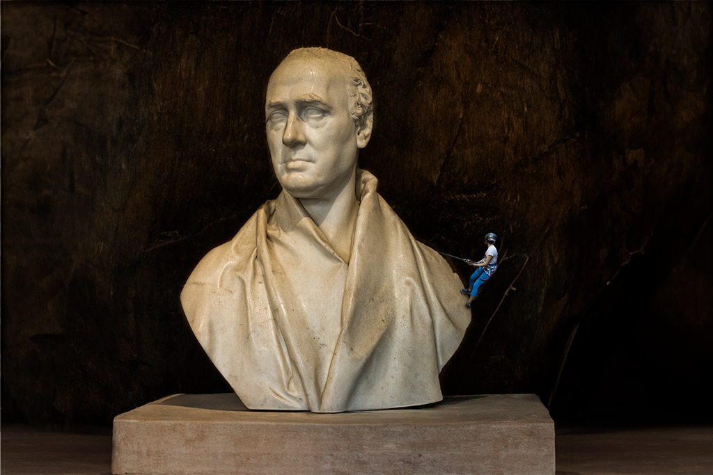
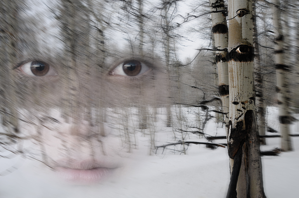
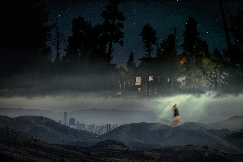
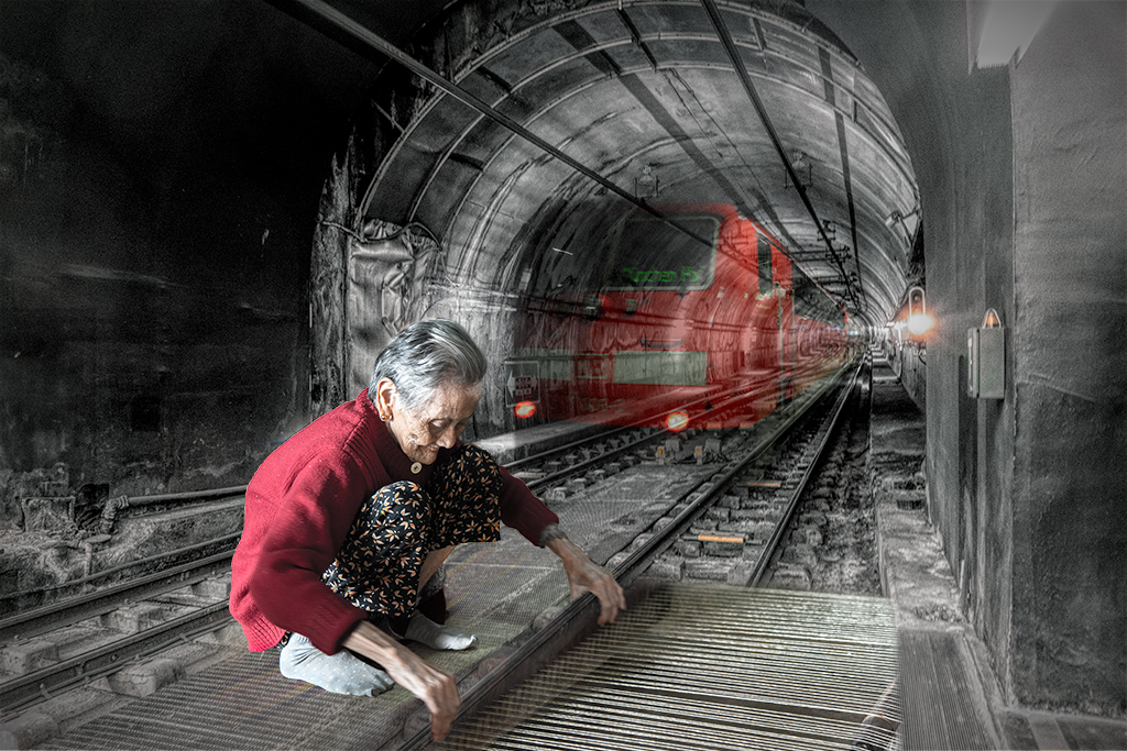
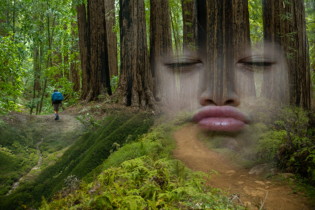
Nadia, You might consider simplifying the elements to draw attention to depth of field and the stove. The yellow green stained bricks create a distracting element to my eye that confused me about what I am looking at. Maybe consider darkening that element and centering the stove more. I also wonder if you were to shrink the stove if it might create even greater depth of field. Ultimately it is your image and you should take it in the direction you find pleasing. This website is designed for dialogue so I hope you never take offense with suggestions I give as they are just suggestions. |
Sep 11th |
| 41 |
Sep 22 |
Comment |
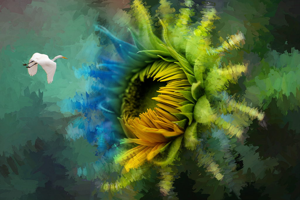
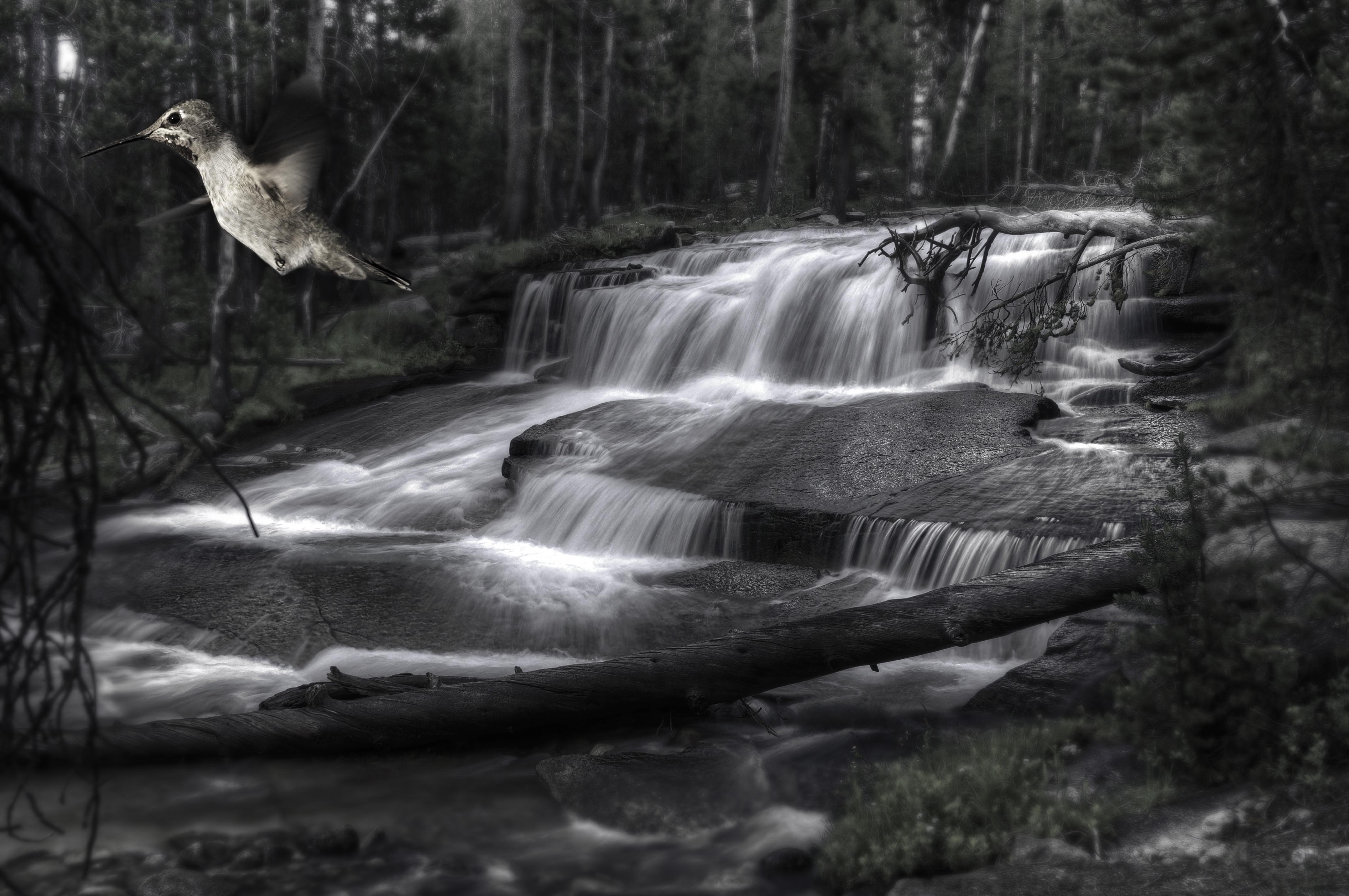
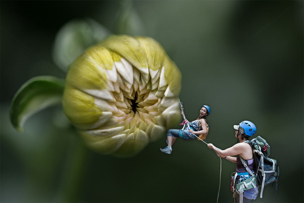
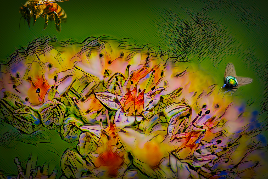
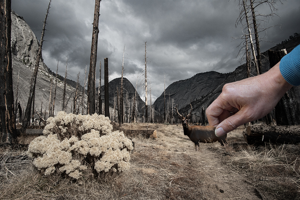
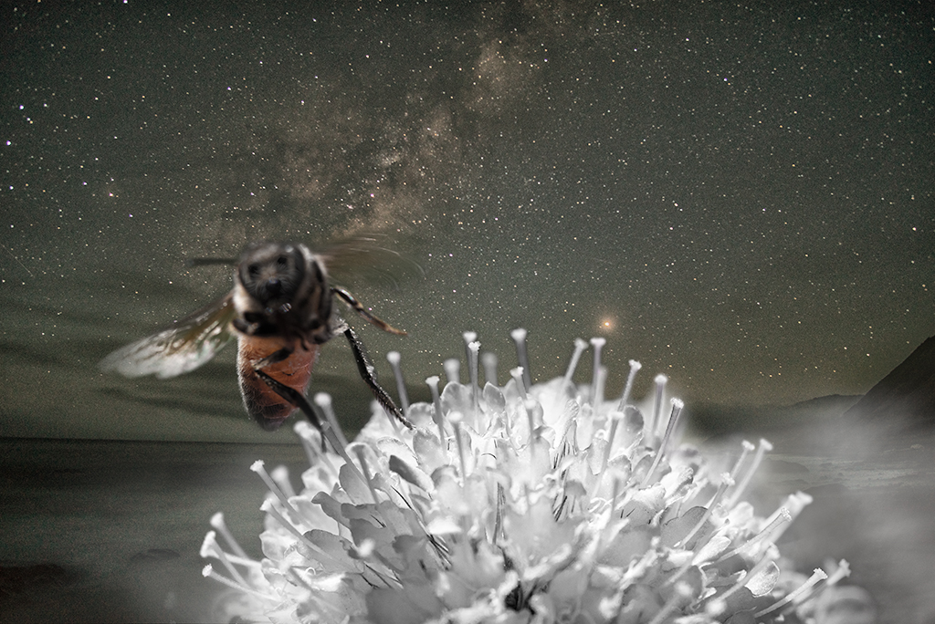
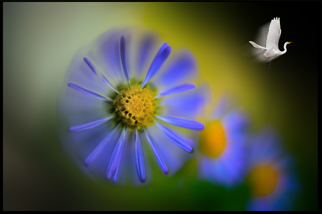
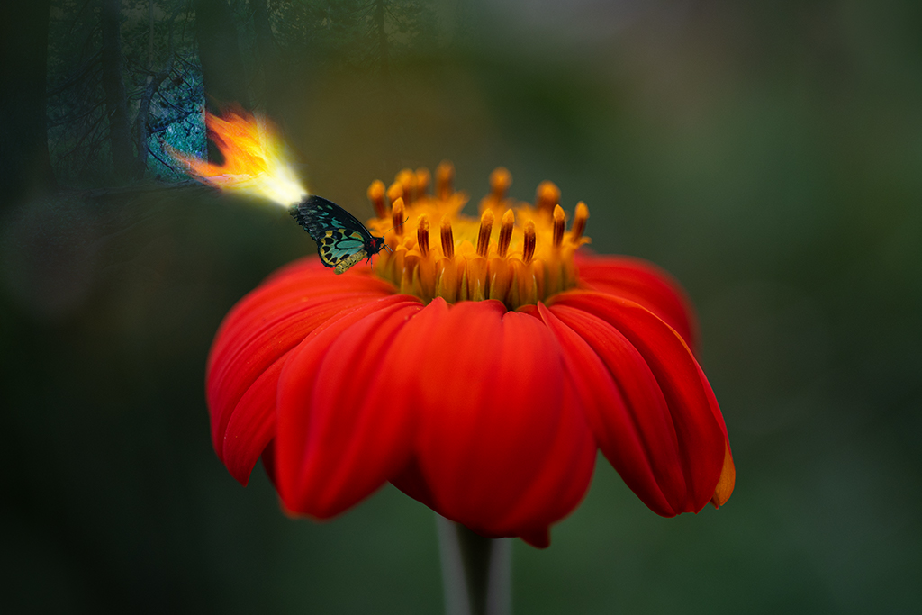
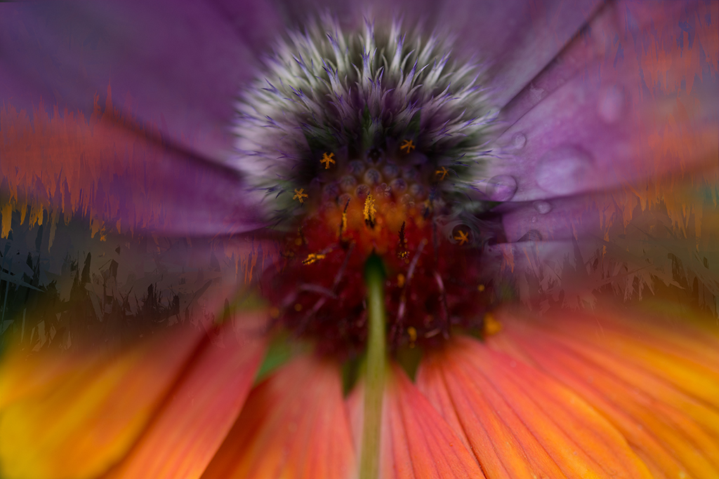
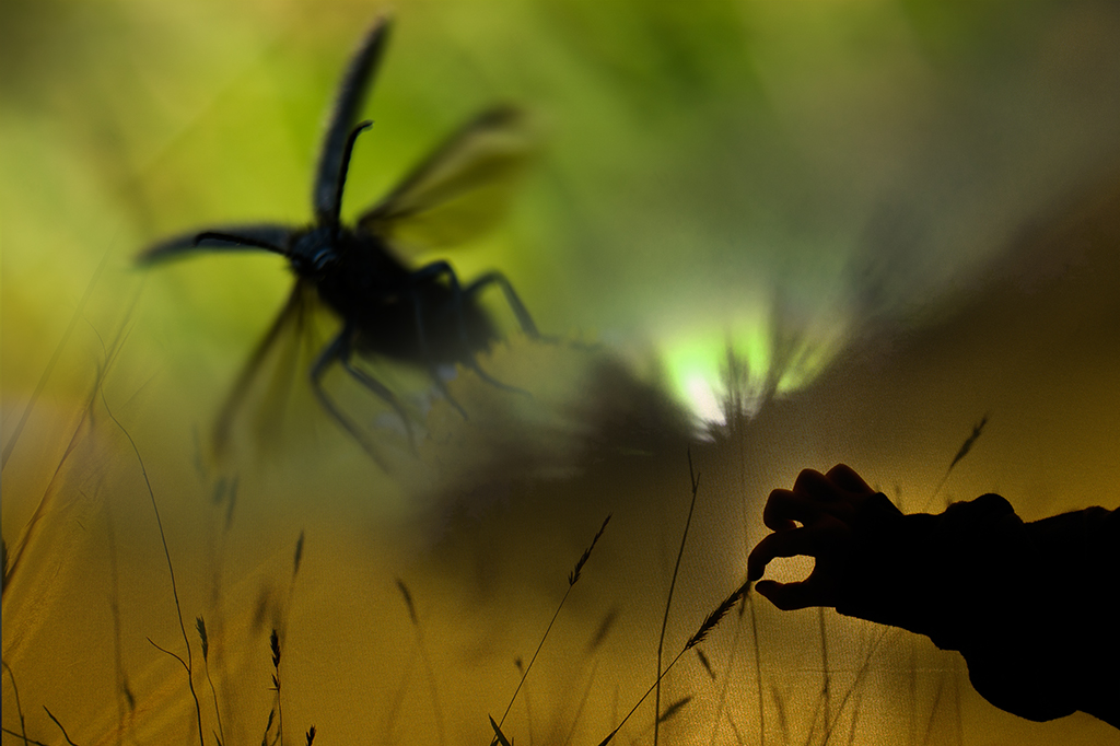
Henry, I admire your continued explorations. Can you clarify what problems you are having with the filter gallery? Feel free to reach out to me by email if you prefer. I really like your "original" image with the zoom. The final Flower Seed doesn't feel as strong. If it were my image I might take another sharply focused flower image and play blending it with your very cool zoomed image to bring the focus to the beauty of the flower. Brad |
Sep 7th |
| 41 |
Sep 22 |
Comment |
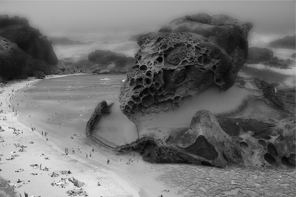
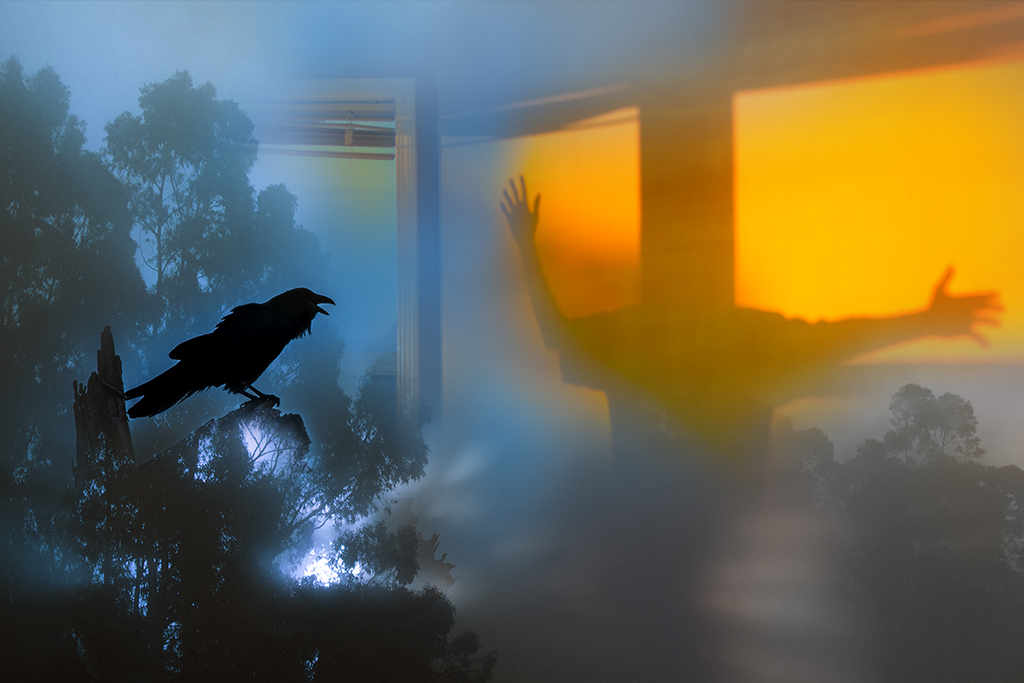
Nadia, I like the general feel of this image. The muted tones and strong tree create a pleasant energy. I personally find the image too complicated. The doorway leading to a brick wall and stove is hard to interpret on first viewing. I might suggest focusing on a story with the cat and birds and downplay the stove part. Definitely an image with many possibilities. Brad |
Sep 7th |
| 41 |
Sep 22 |
Comment |
Tom, You've created a very compelling image here. I think it has a nice balance of sizes and placement of the various subjects. I really like the face on the Original 2 ask it has more contrast, I wonder if you were to swap the entire head if it might be even more strong |
Sep 7th |
| 41 |
Sep 22 |
Comment |
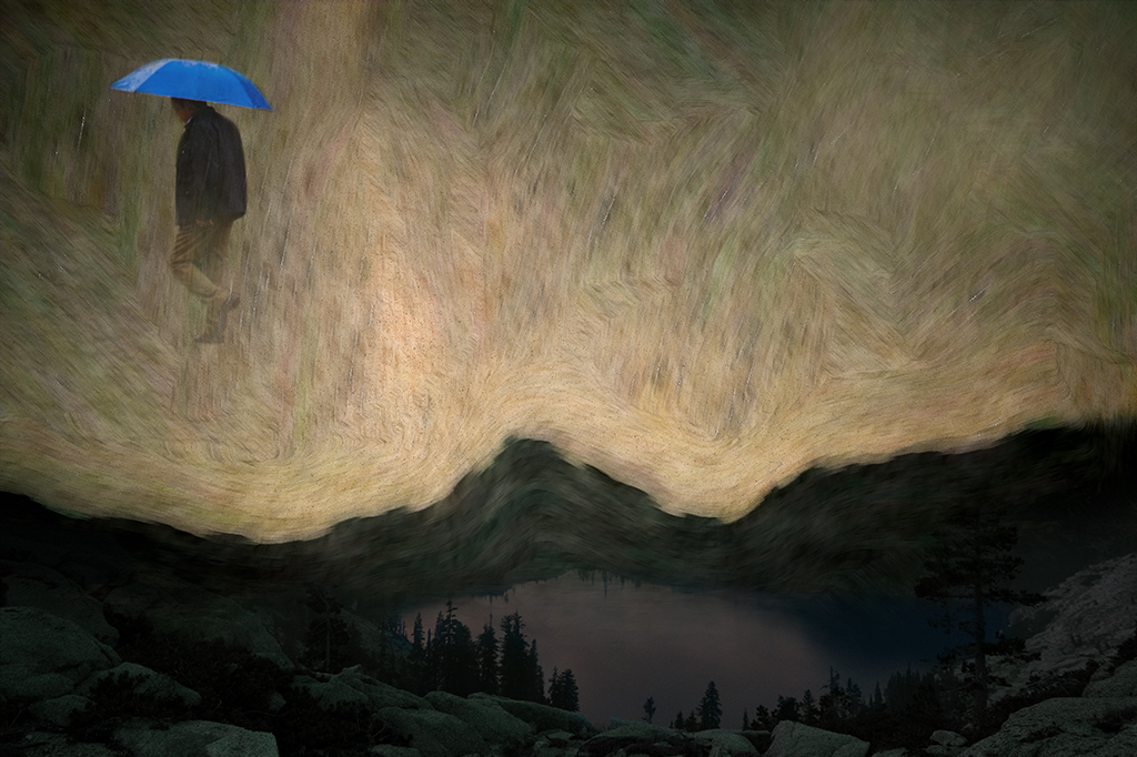
Julie, You've successfully animated an umbrella in a most interesting way. The color all movement all feel well done to my eye. My only suggestion would be to consider reducing some of the notes/flowers as it might benefit from less objects. |
Sep 6th |
6 comments - 6 replies for Group 41
|
| 54 |
Sep 22 |
Reply |
Aavo, Thank you for your suggestion. I will take another look. |
Sep 10th |
| 54 |
Sep 22 |
Reply |
Kirsti, Thank you for your suggestion. I did try a tighter cropping and felt it created less balance for the image. I agree the white blotch at the bottom right might benefit from being toned down, thanks. |
Sep 10th |
| 54 |
Sep 22 |
Reply |
Alan, thanks for your suggestions. I played with these details some and ultimately erased the filter from the orange portion of the flower to make it somewhat more realistic and tie things together some. Erasing more seemed to remove the magic. |
Sep 10th |
| 54 |
Sep 22 |
Reply |
Peggy, Sorry to disappoint you but the dot was created with one of the ordinary fuzzy brush presets. I adjusted the color some to balance the image with a layer adjustment. |
Sep 10th |
| 54 |
Sep 22 |
Comment |
Alan, I really like this change of pace. I agree with Kirsti's suggestion, otherwise it is very strong. One other consideration on further thought would be to darken the details outside of the house in the windows some as they distract the attention some from the subjects. |
Sep 10th |
| 54 |
Sep 22 |
Comment |
Maria, You succeeded in transporting us to an older time. Everything about this image is outstanding. I would keep it as is. |
Sep 10th |
| 54 |
Sep 22 |
Comment |
Sorry I'm a little late to the party. Looks like you've already received excellent suggestions for further explorations. I like what you've done and where the group has suggesting you go. I do not have any additional guidance to offer, just enjoyment of the process. |
Sep 9th |
| 54 |
Sep 22 |
Comment |
Aavo, I really like your image as well. Your version and Maria's version are excellent. Nice work. |
Sep 7th |
| 54 |
Sep 22 |
Comment |
I love what you've done here Peggy. The black and white version feels much stronger to me. I like it as is. There is room for playing with contrast and darkness and like Kirsti's exploration but your original is quite nice and balanced. |
Sep 7th |
5 comments - 4 replies for Group 54
|
11 comments - 10 replies Total
|