|
| Group |
Round |
C/R |
Comment |
Date |
Image |
| 41 |
May 22 |
Reply |
Tom, Thank you for these additional suggestions, very helpful. I appreciate your attention to these details. |
May 31st |
| 41 |
May 22 |
Reply |
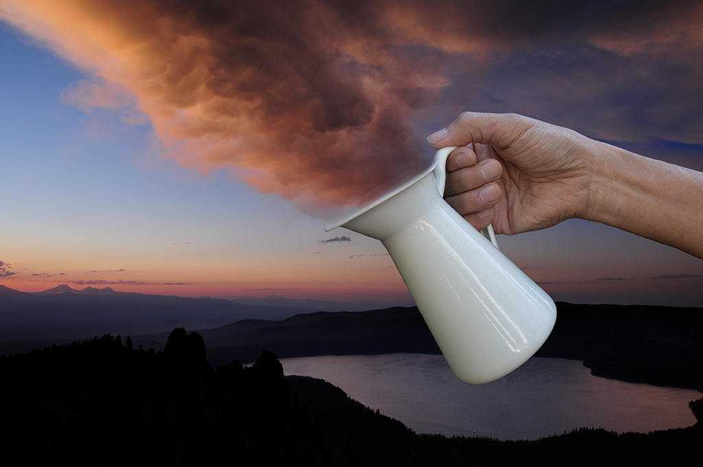
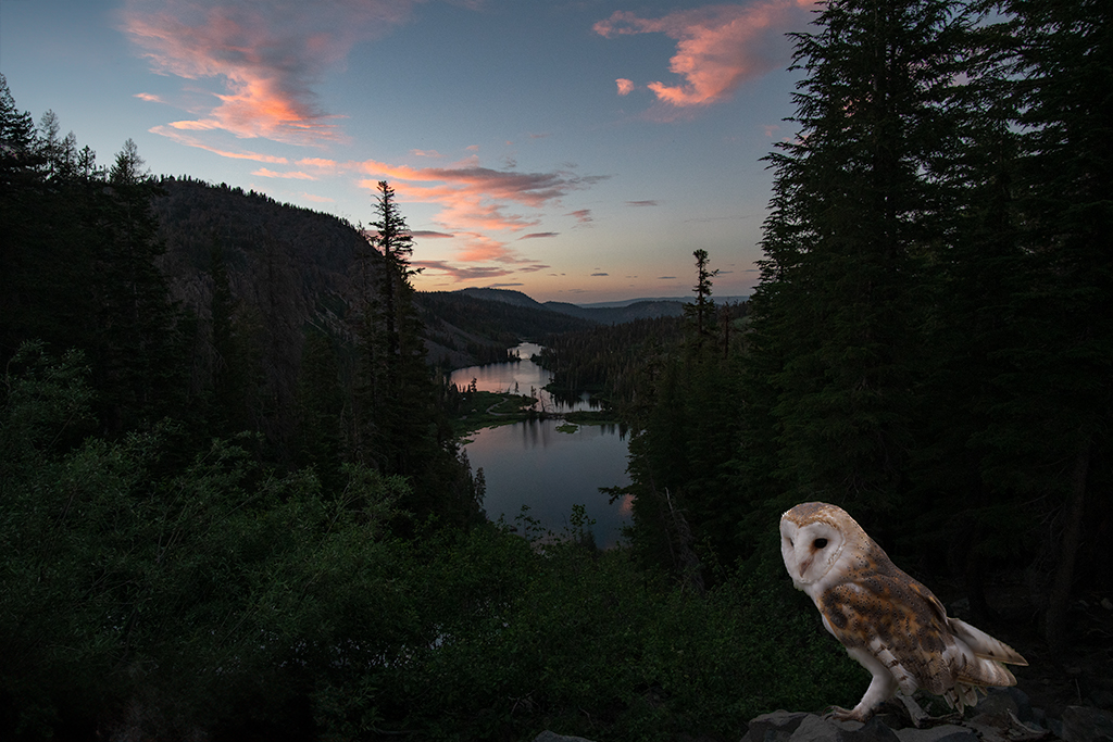
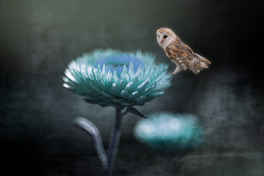
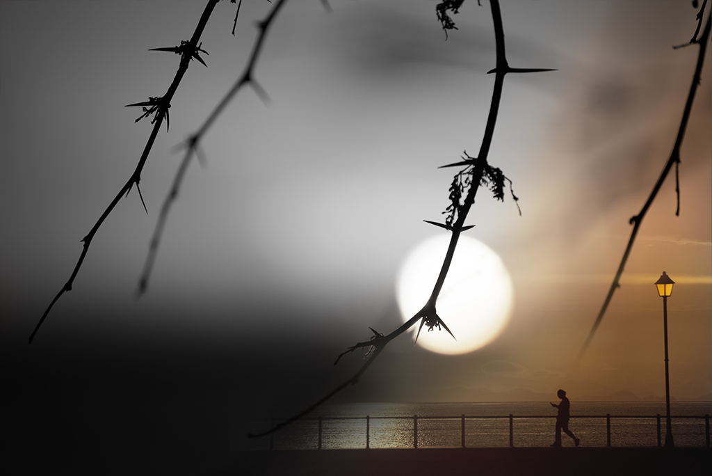
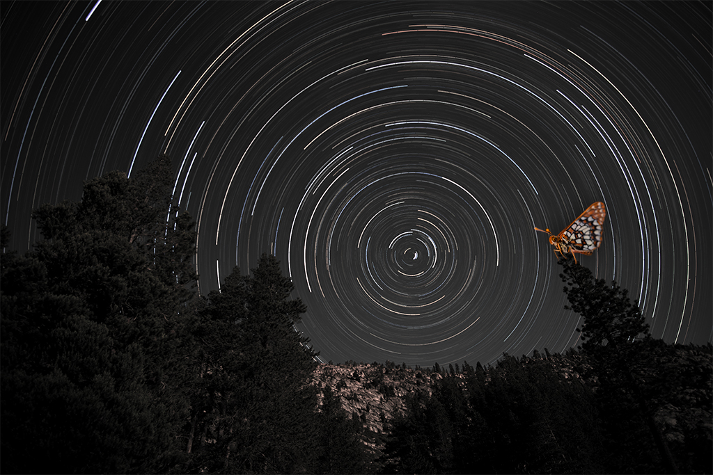
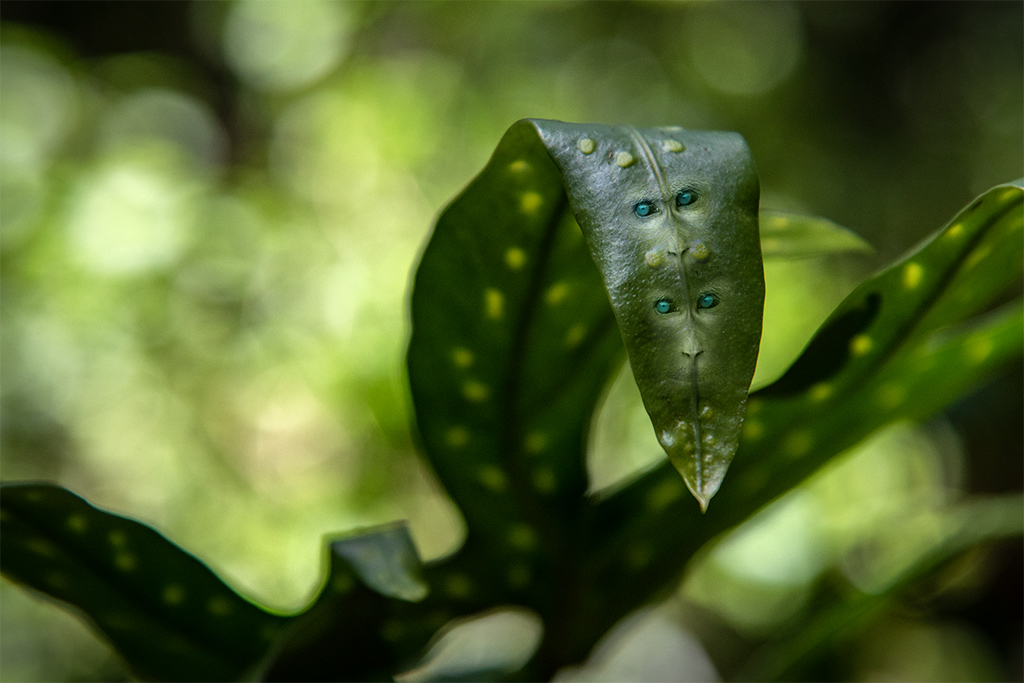
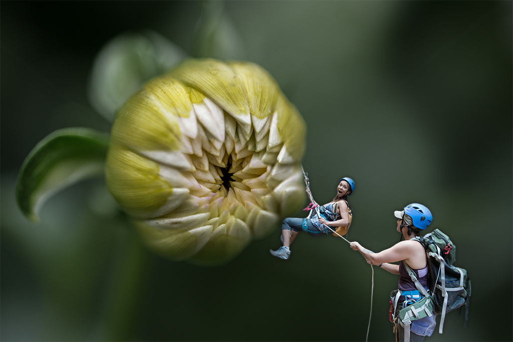
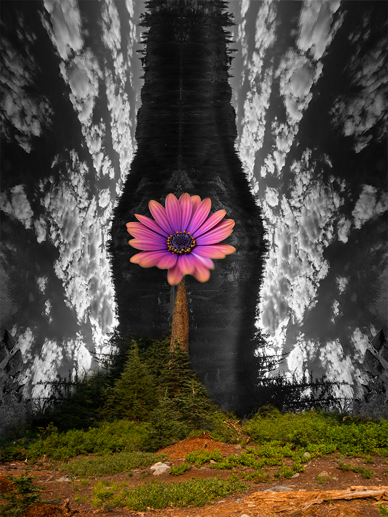
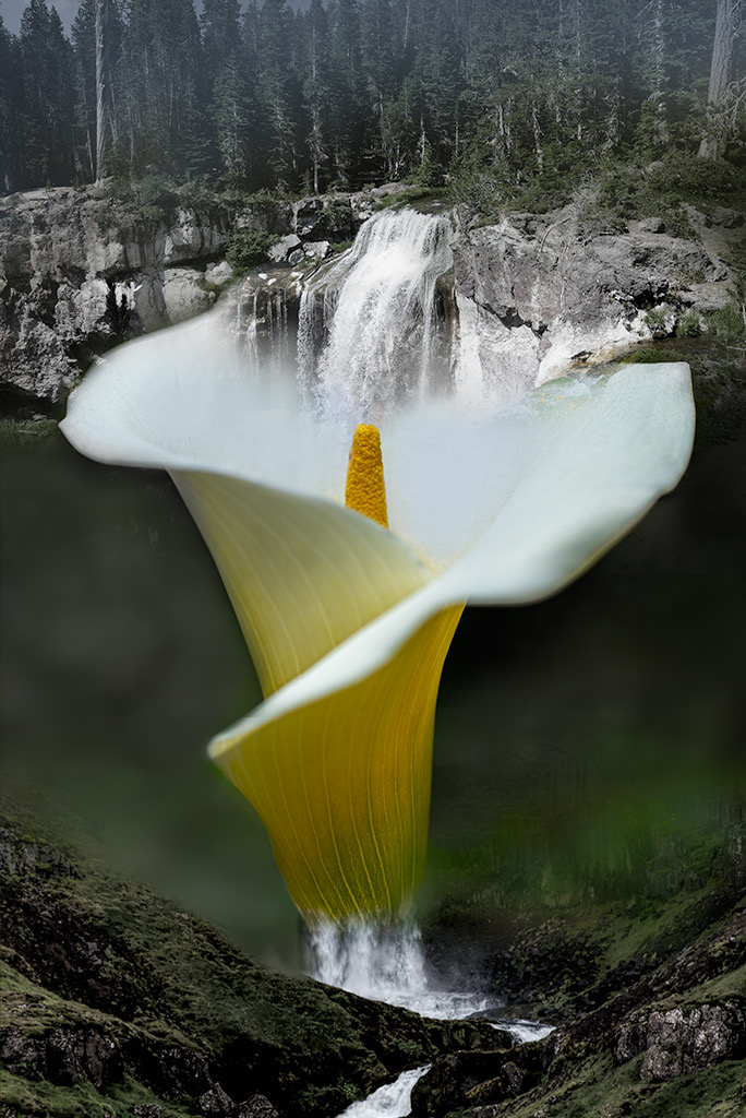
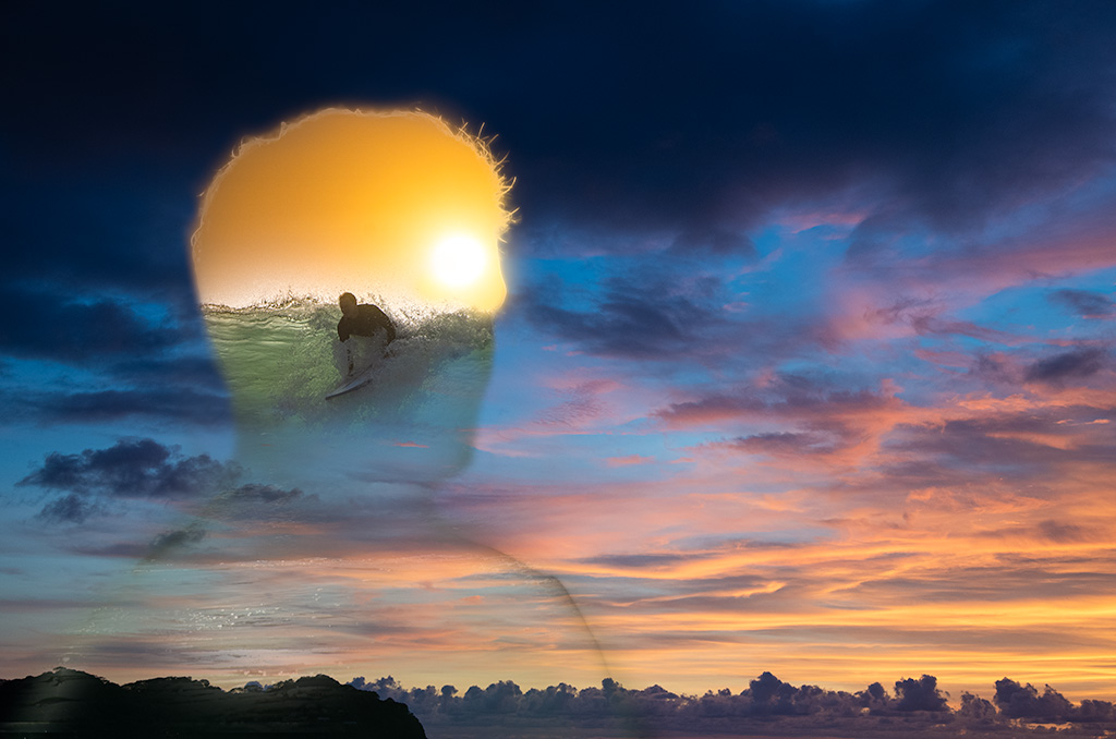
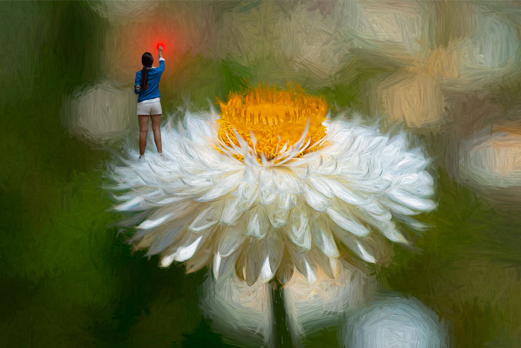
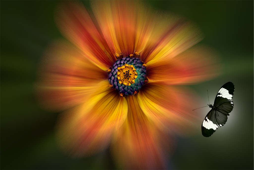
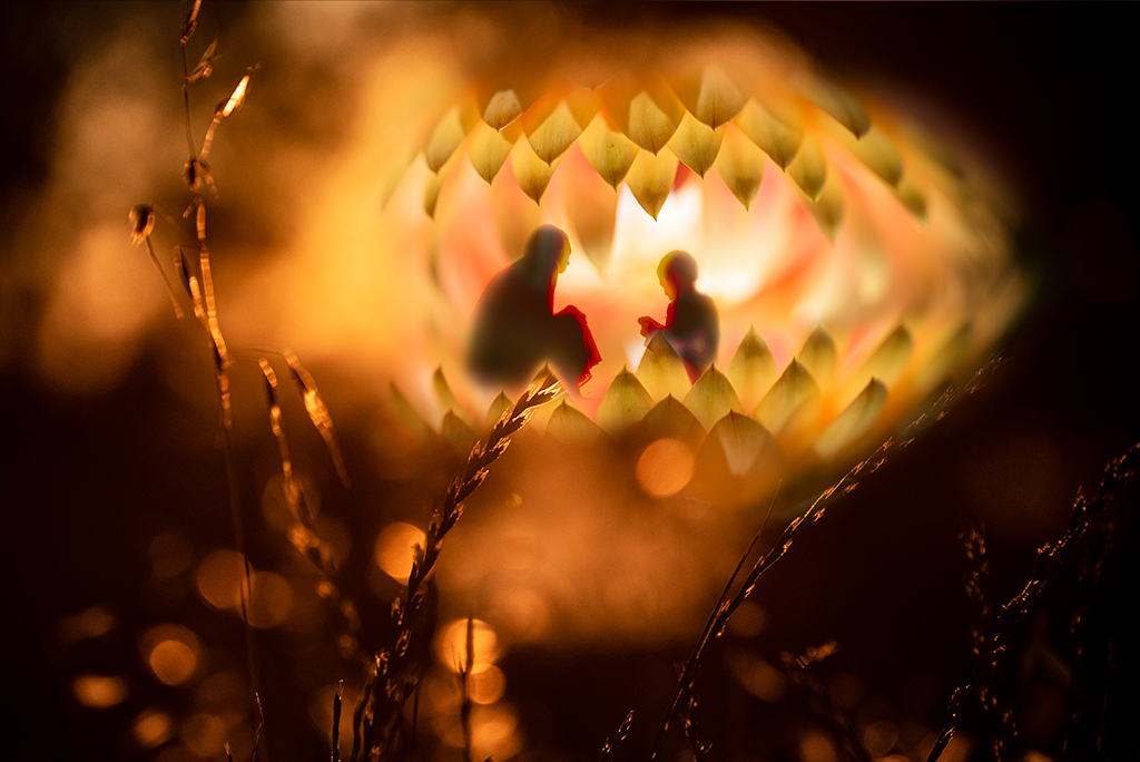
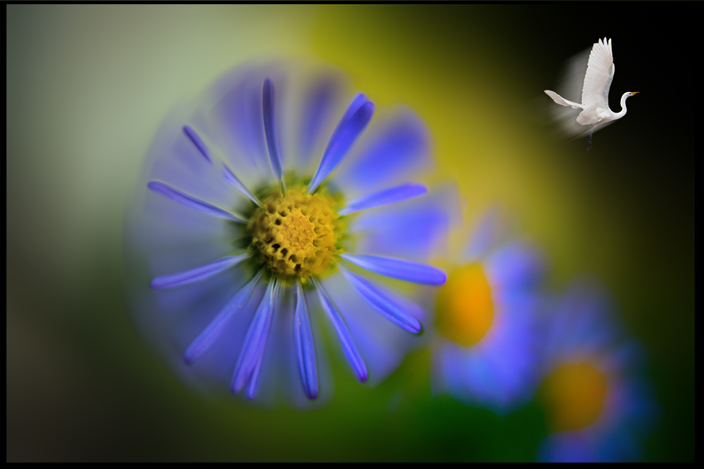
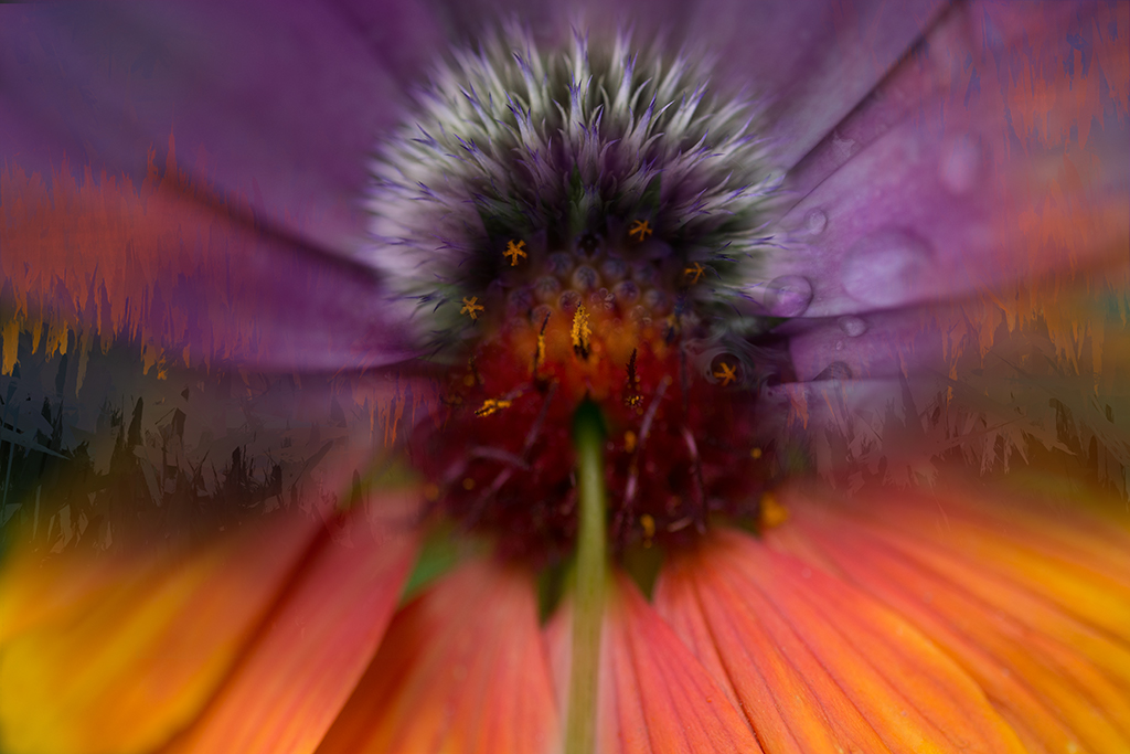
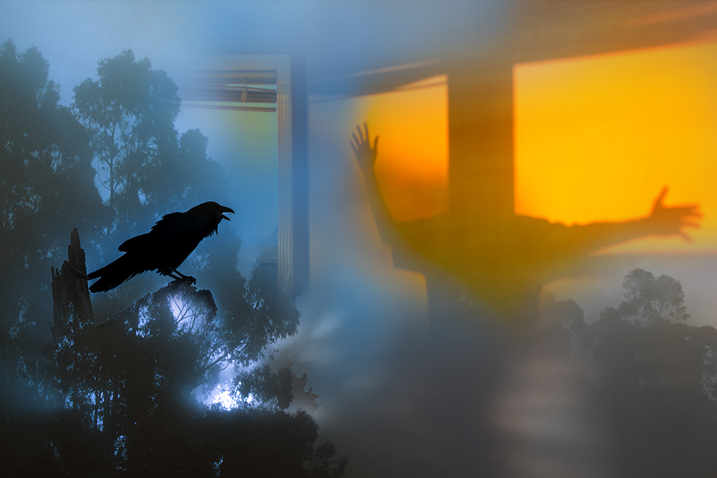
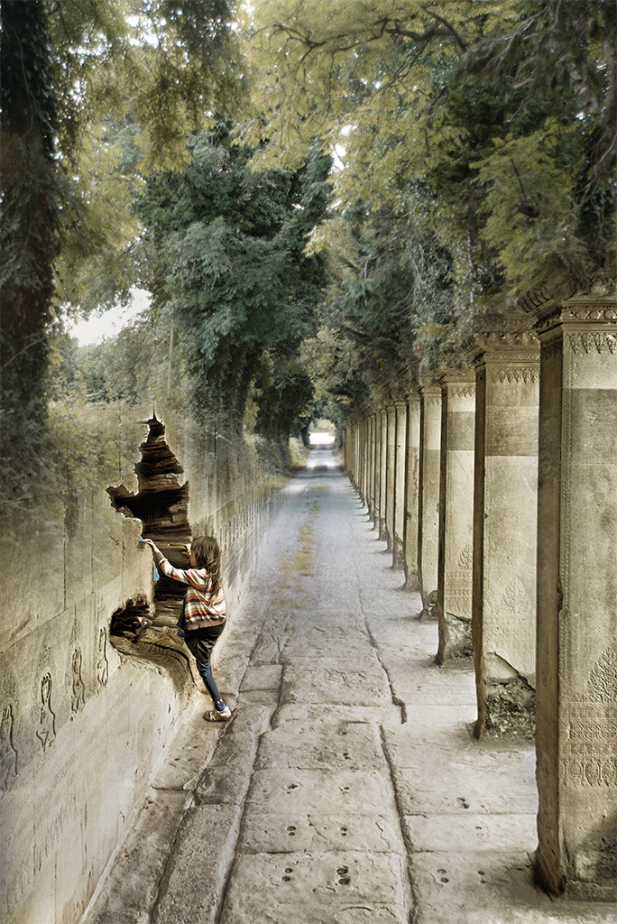
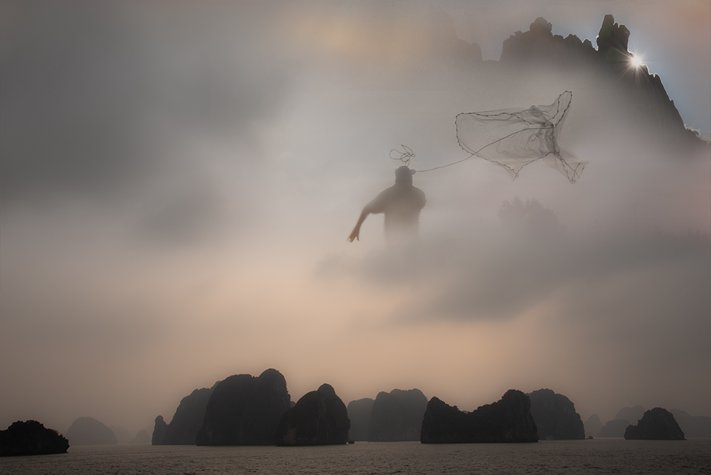
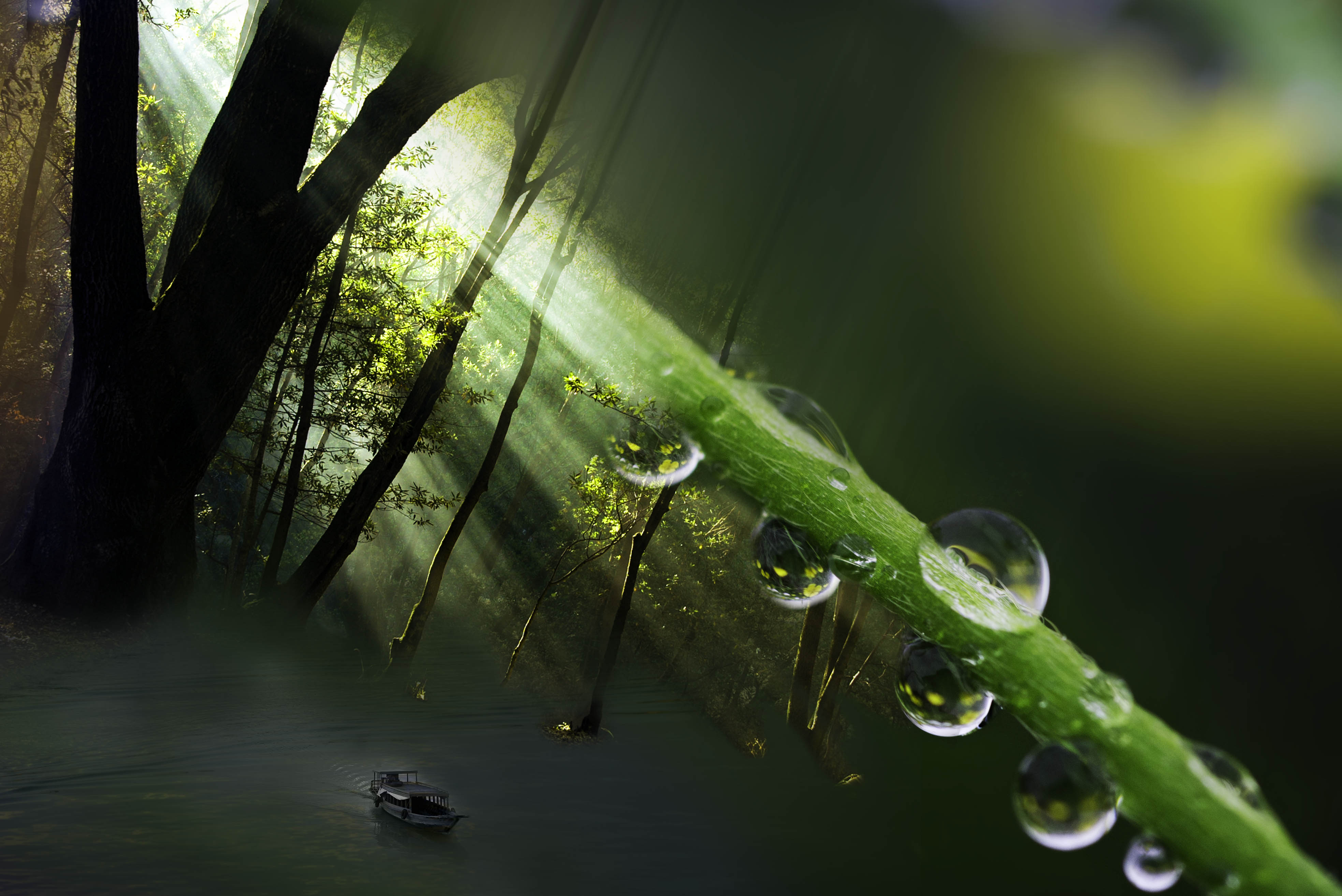
Lisa, i'm not sure about the proportions either. I've experimented with smaller and larger owl. Bending the rules on owls and flowers so I'm just trying to find the sweet spot. The halo was a blurry drop shaddow I added to try and mirror the blurring I saw on some of the petals. I will do some experimenting to see if Ican use texture to tie the owl to the scene as I agree it is a bit too crisp. |
May 25th |
| 41 |
May 22 |
Reply |
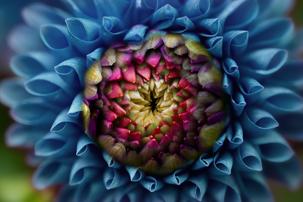
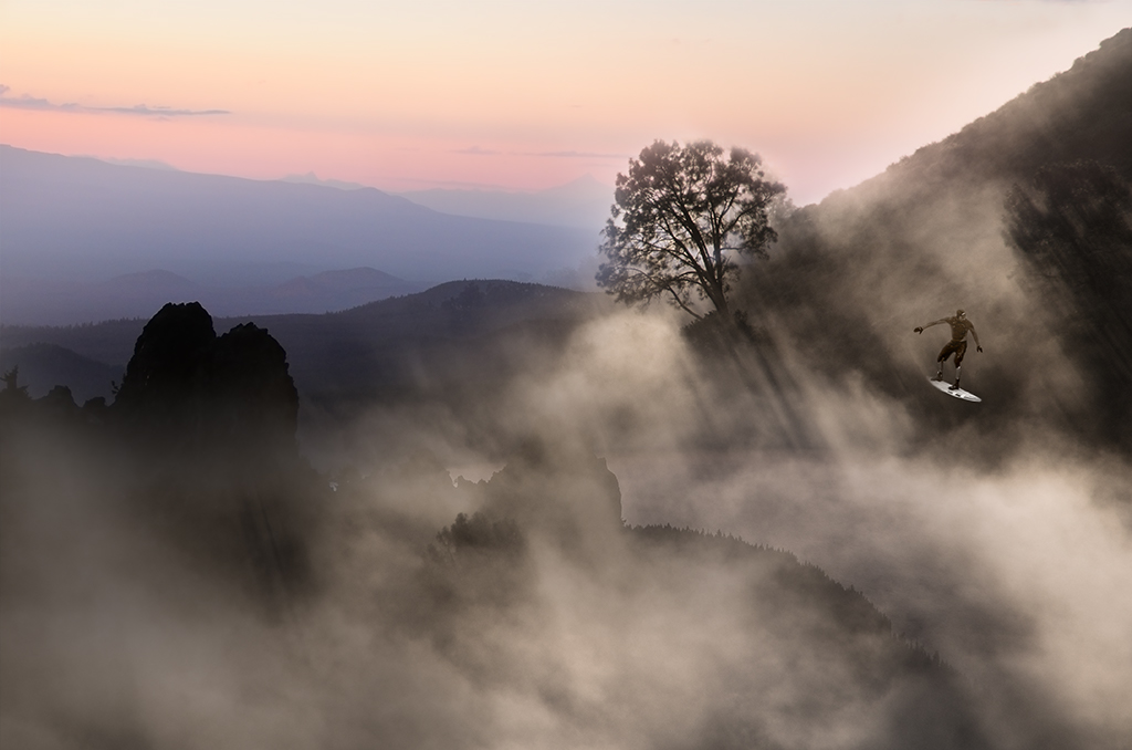
Nadia, Yes, I respect different people's focus. I used to be very much interested in technique, lately concepts are what drive me. I do try to honor some degree of realism, i.e. make the image fit with the fantasy I construct. I chose to position the bird to the right as it felt more balanced to me. I will definitely play around some with placement and size to see if I can sell it even better. |
May 25th |
| 41 |
May 22 |
Comment |
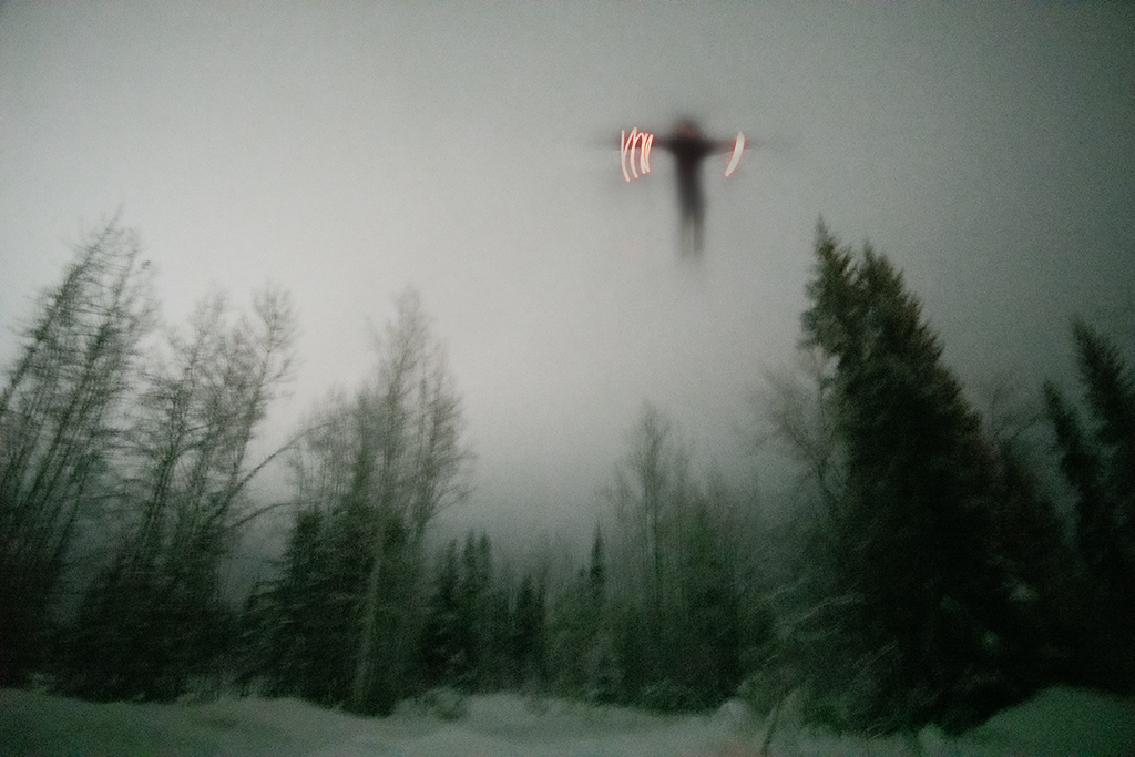
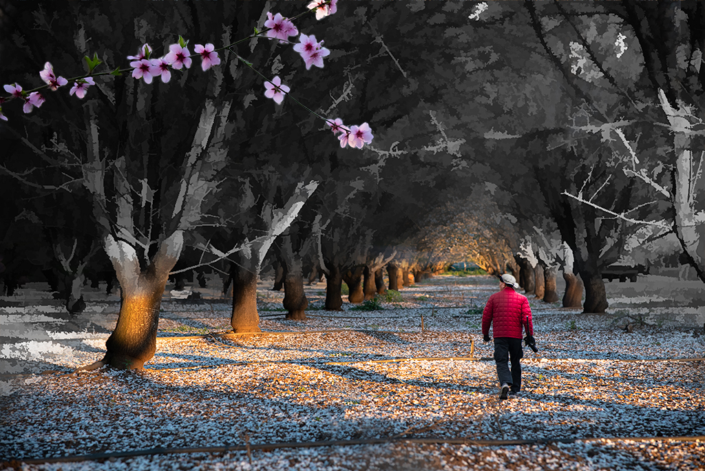
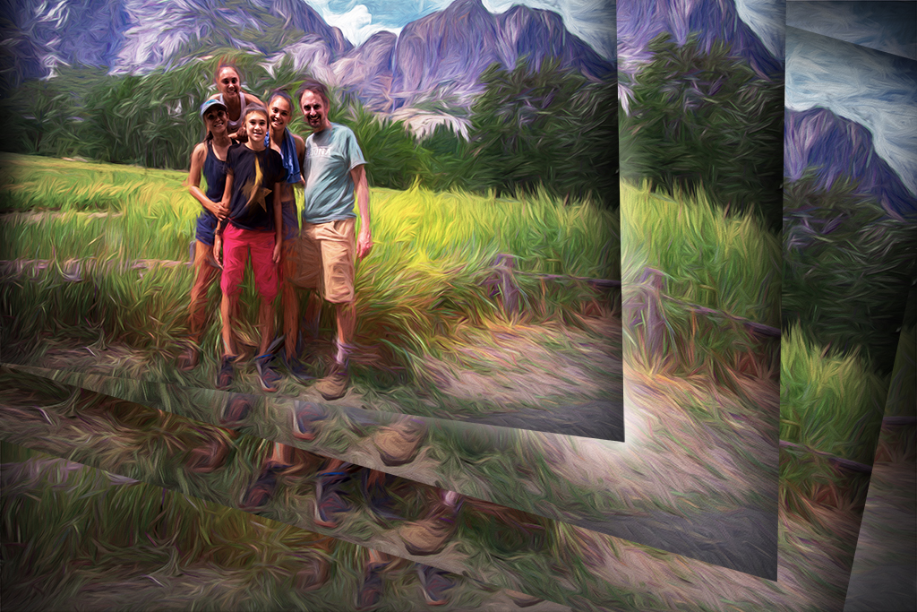
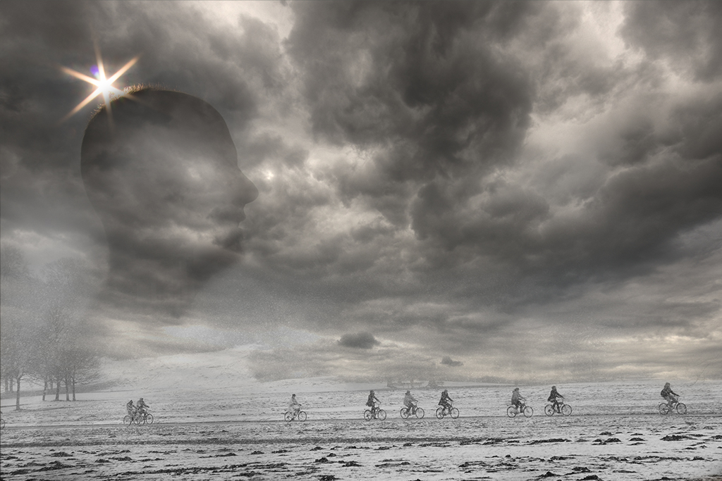
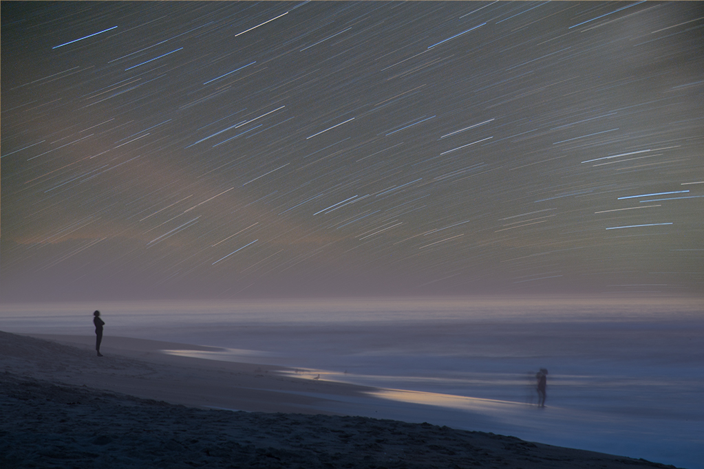
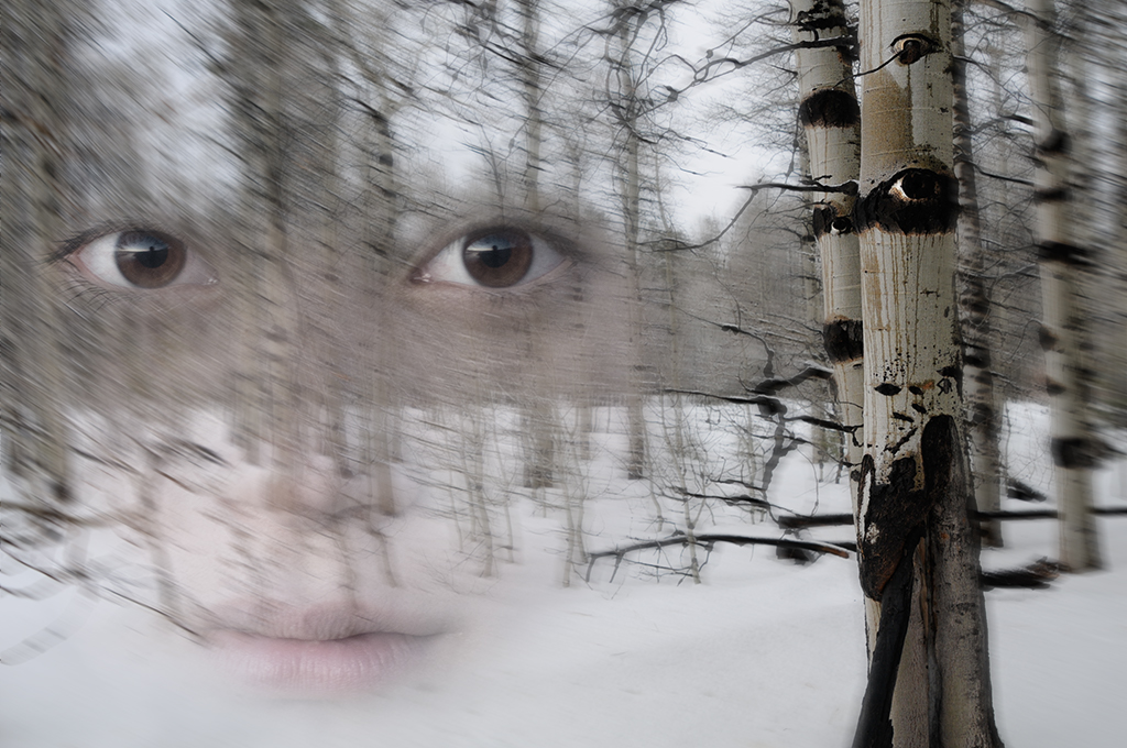
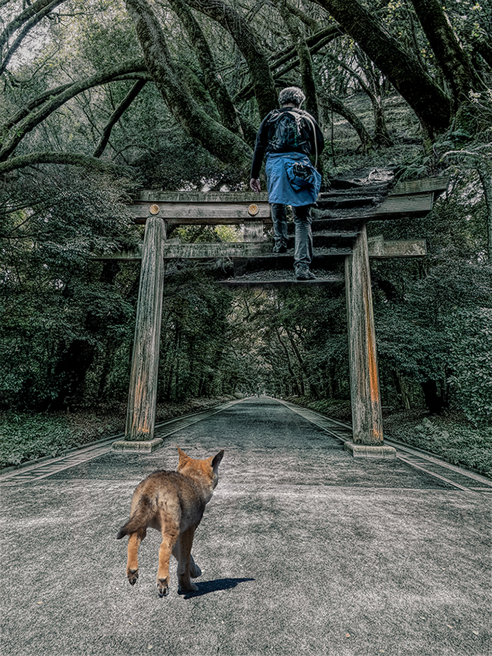
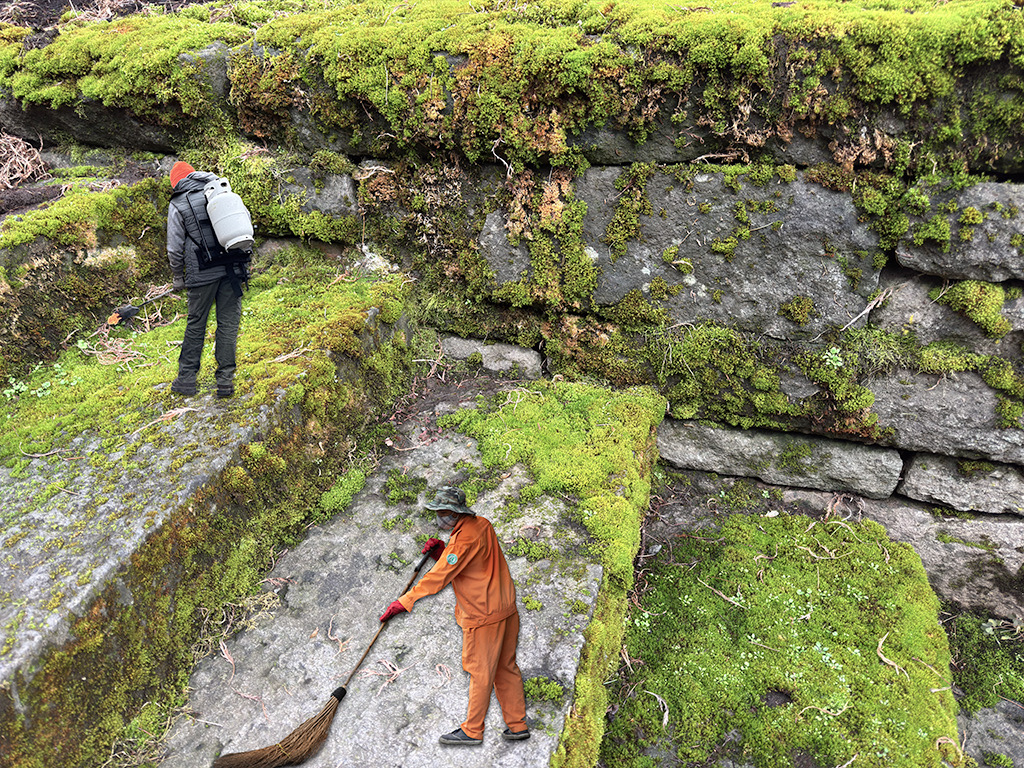
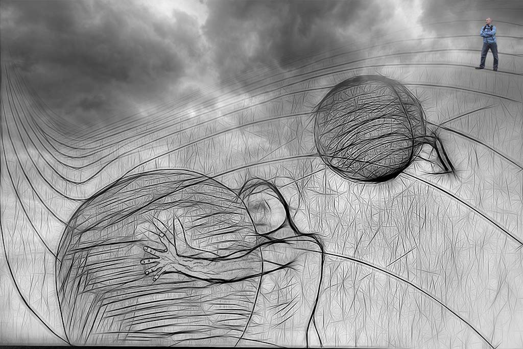
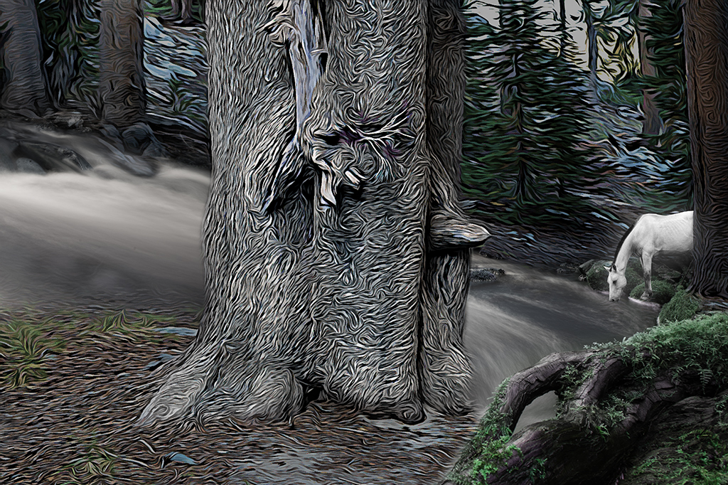
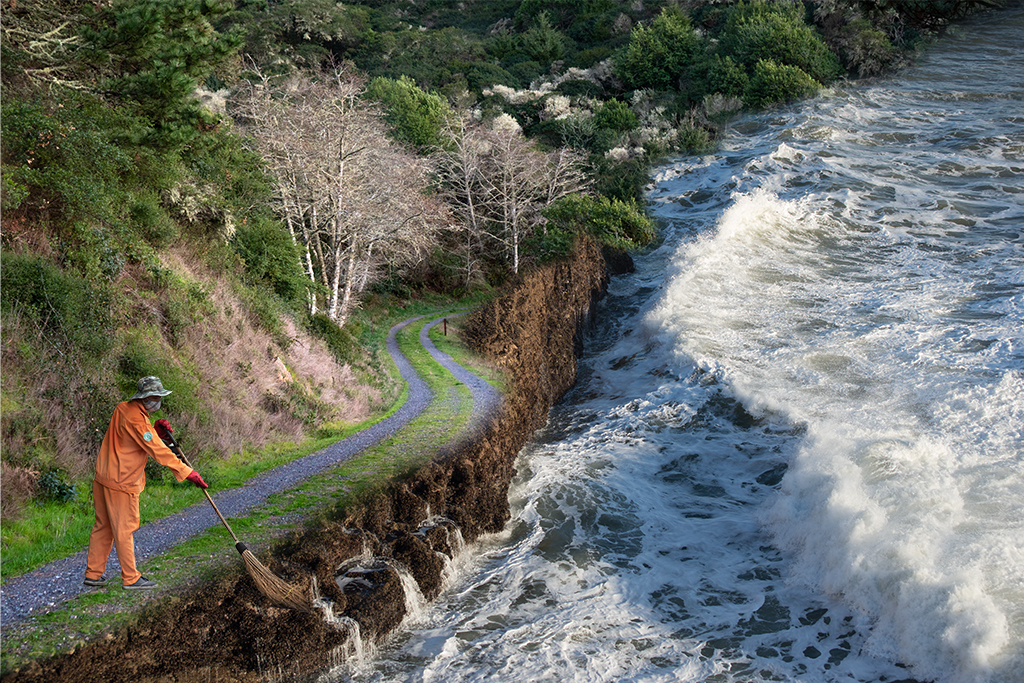
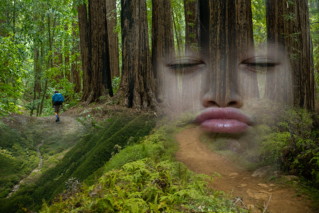
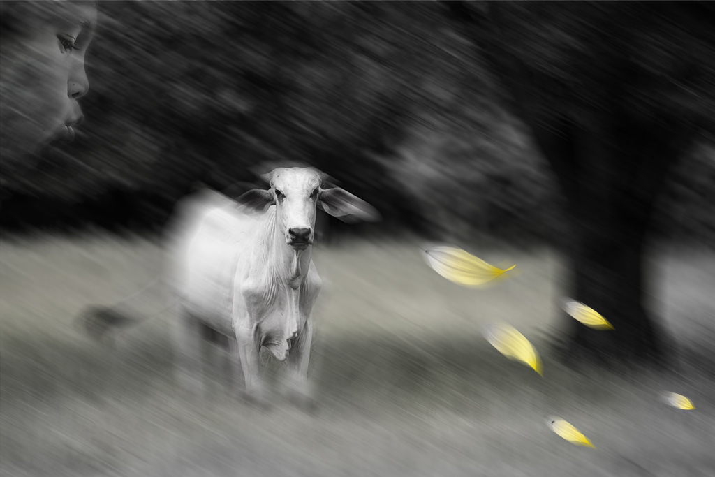
Lisa, I like how the winter weather and leaning branches resonate with the figure with the cane. I wonder if the winter scene without the additional texturing might be more powerful. The leaning figure appears too sharply demarcated making it feel pasted on unnaturally. The absence of feet create a floating quality that doesn't fit with the feel of the image. The footprints, which I didn't notice till a second viewing also feel unnaturally placed. |
May 6th |
| 41 |
May 22 |
Comment |
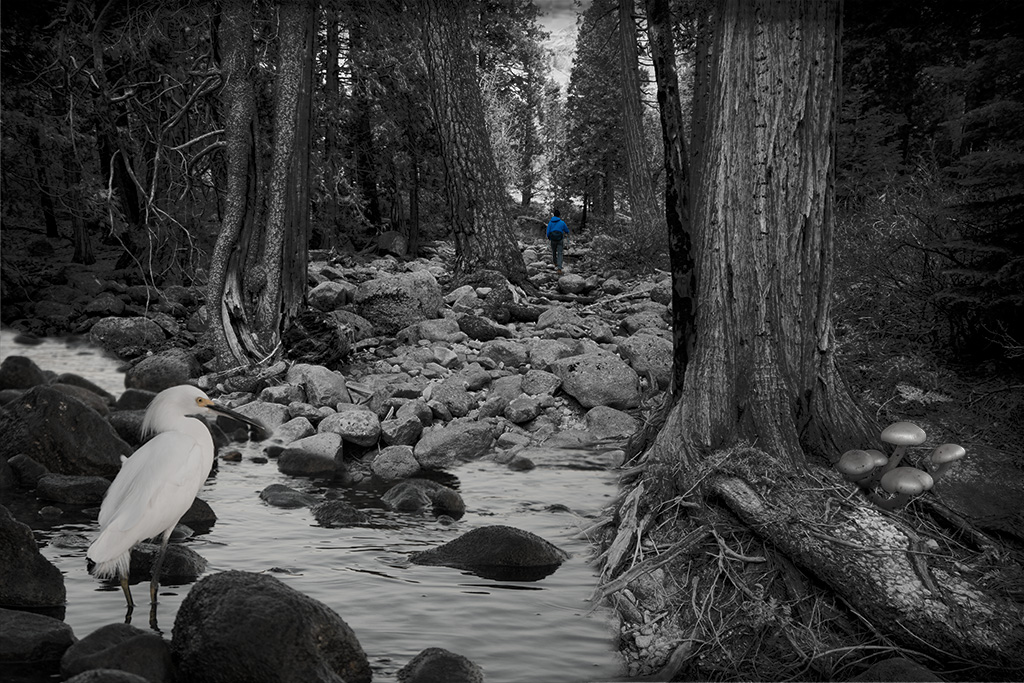
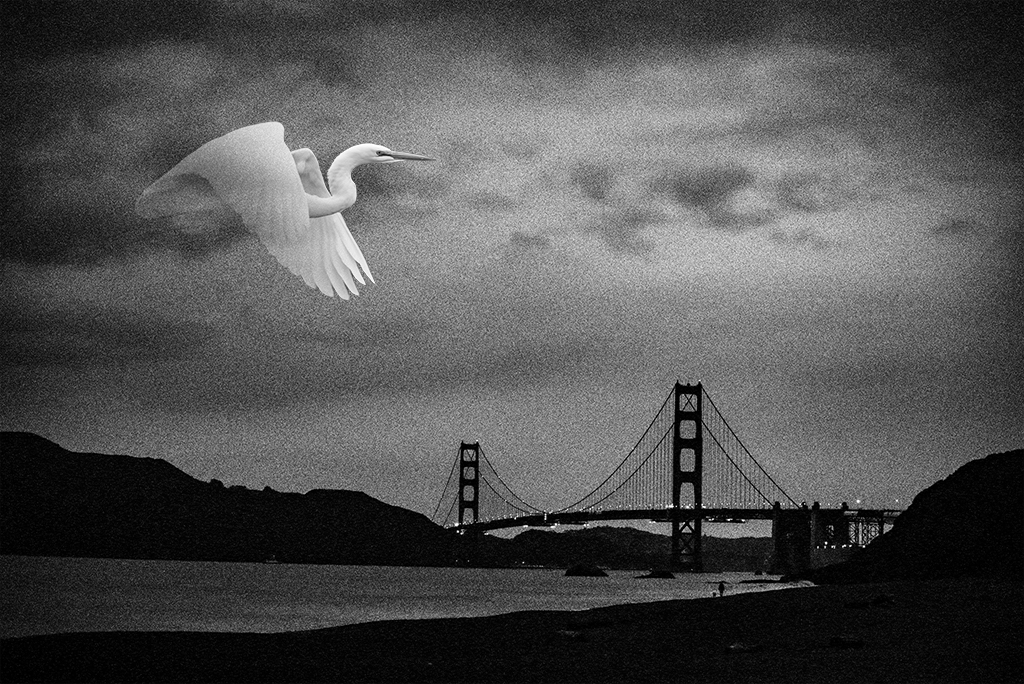
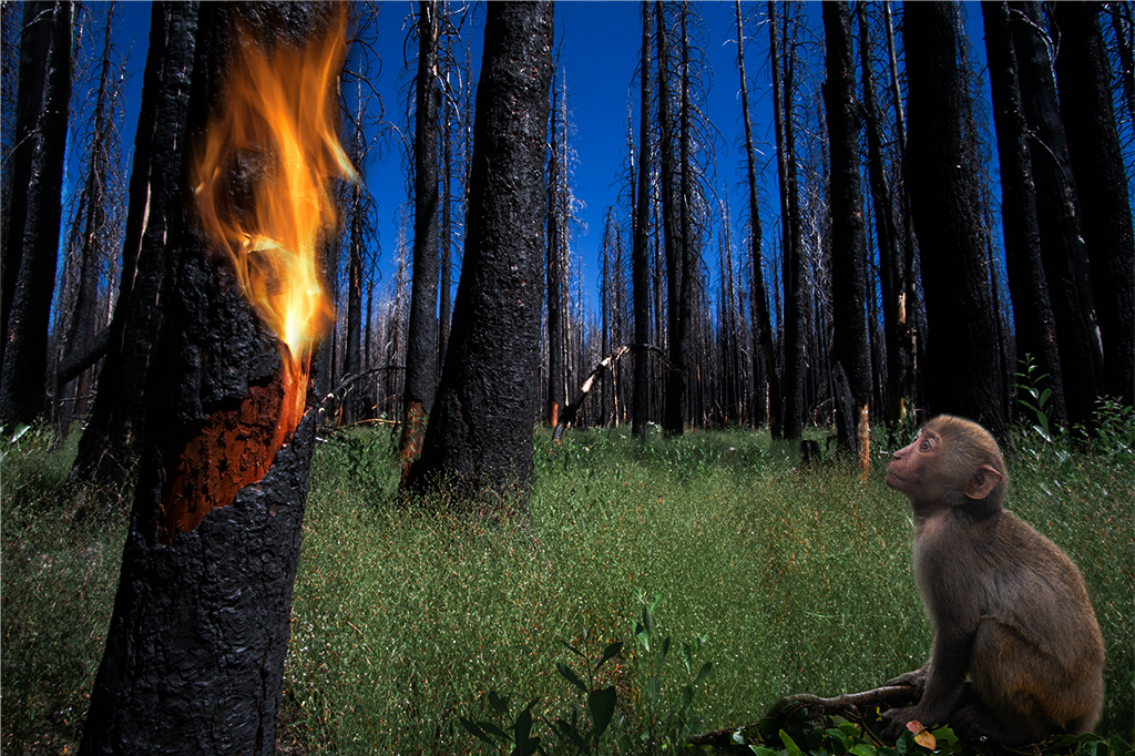
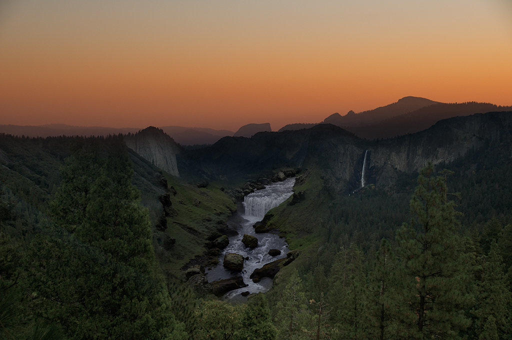
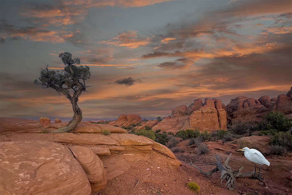
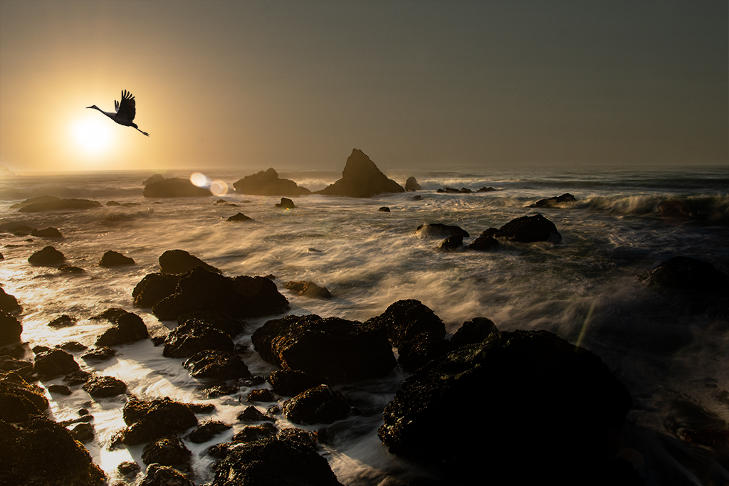
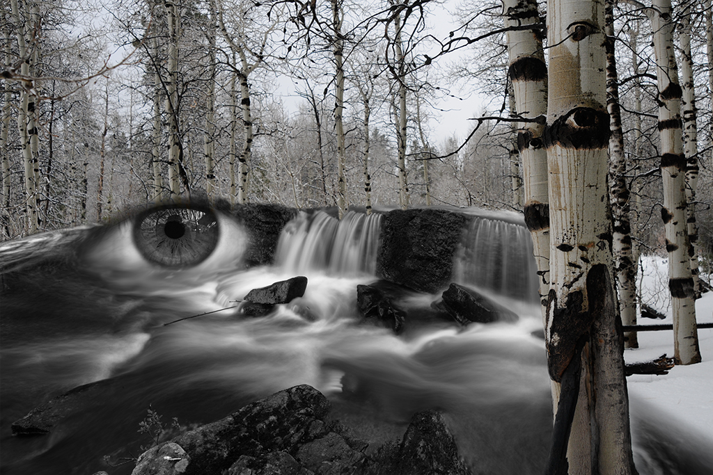
Nadia, I really like the coloring and proportions you've created here. There is tremendous power having this beatiful creature so prominently placed in the foreground. I agree with Tom, I didn't notice the bunny on first viewing. I personally don't feel the texture you've used adds anything to your image and would encourage you to create something more naturalistic. I don't have an easy fix for the bunny situation but wonder if you were able to paint some golden light creating a halo behind it that matches the color from the sunset and what is illuminating the eagles head. |
May 6th |
| 41 |
May 22 |
Comment |
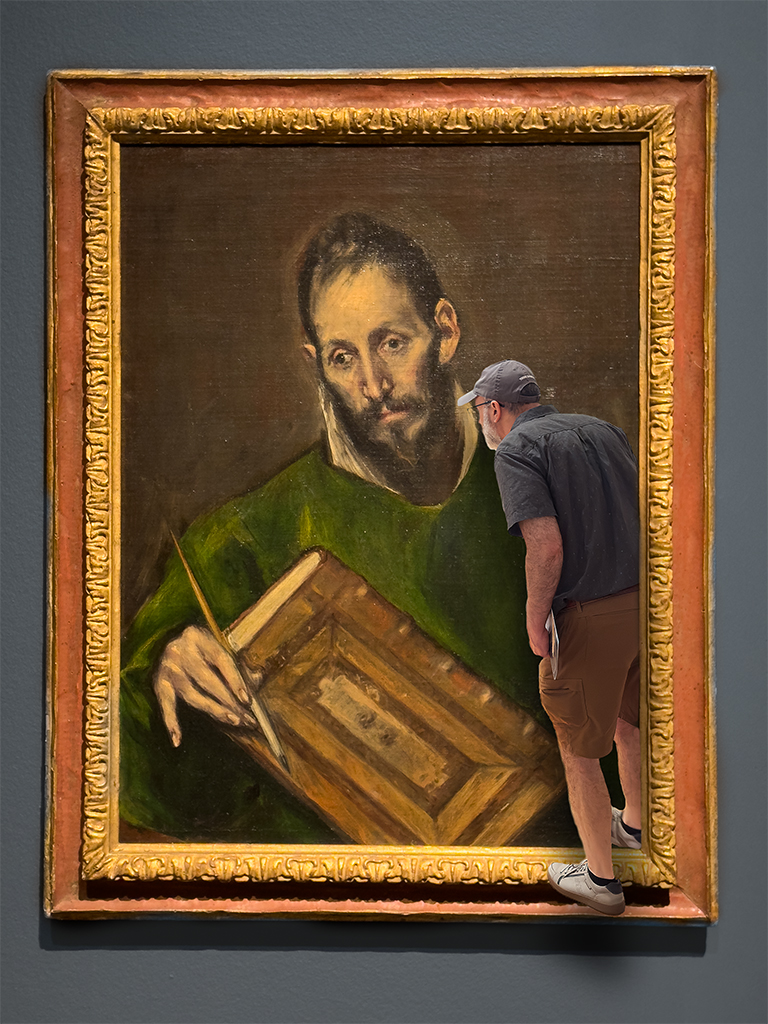
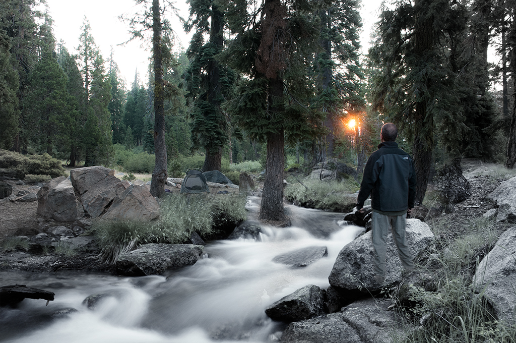
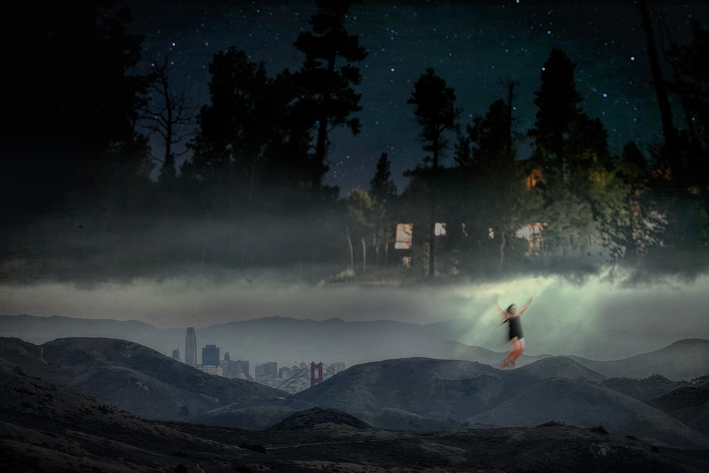
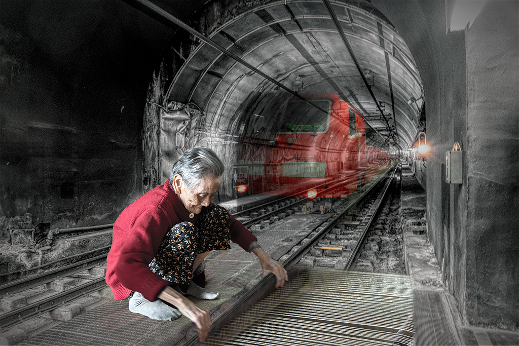
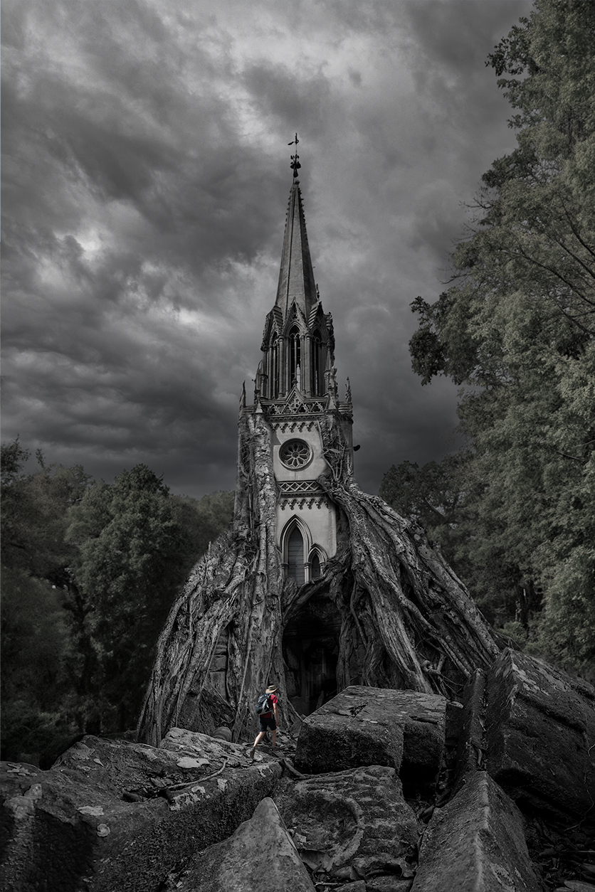
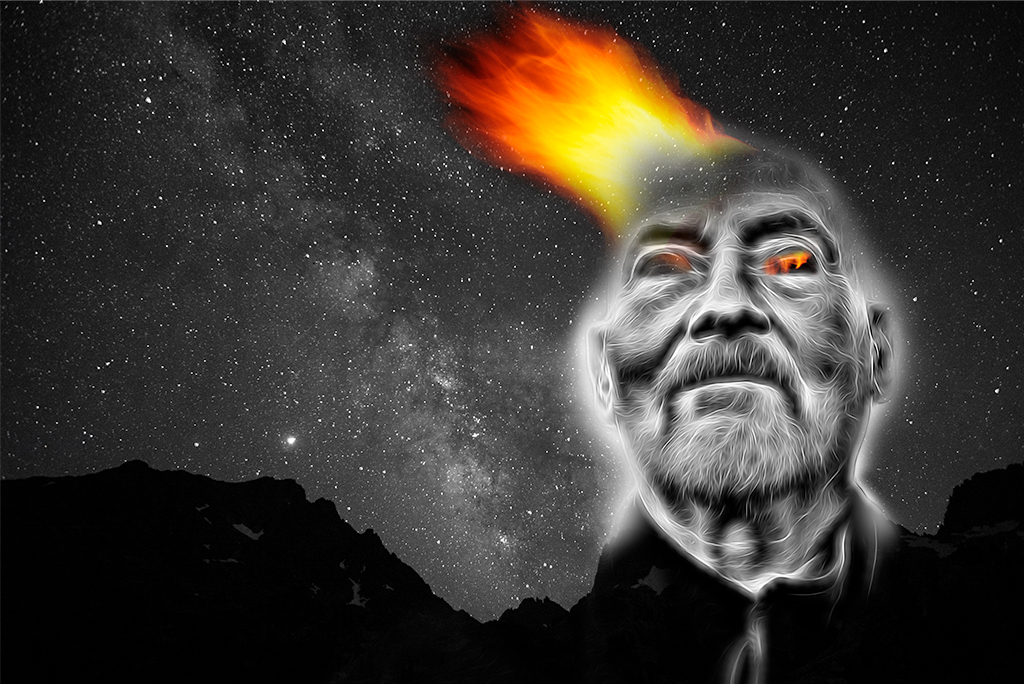
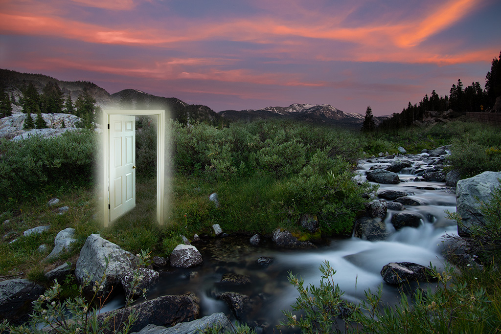
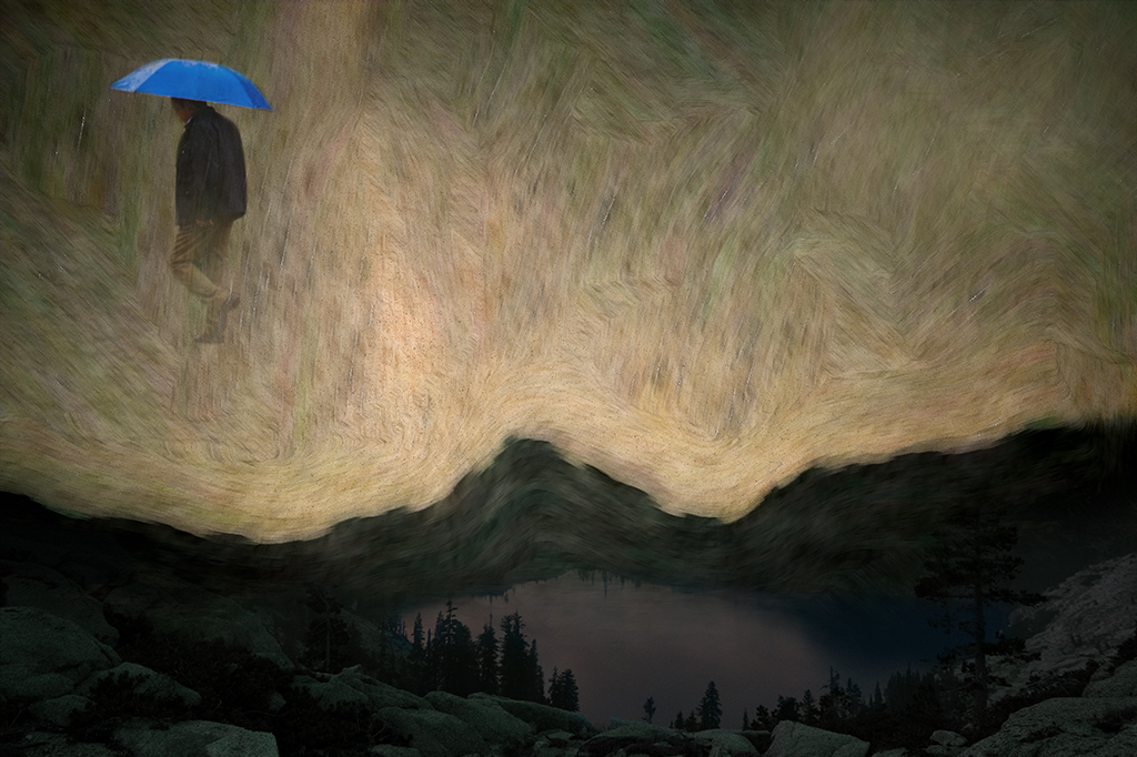
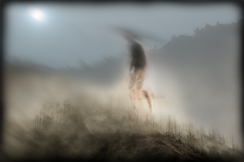
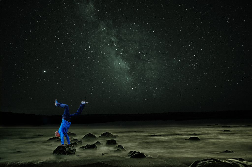
Tom, Another evocative image that tells a wonderful story. Your self portraits are iconic, reminding me of Magritte and Hitchcock. The title is nice. You could simplify it to "Refuge". I like how you play with light to tell a story of hope. The choice of black and white is excellent. The addition of rain nicely ties the elements together. If it were my image I might continue playing with light, possibly adding a surreal glow emanating more from the building but the image feels complete as it is. |
May 6th |
| 41 |
May 22 |
Comment |
Tom, One thing I'd like to promote on site 41 is more "dialogue". I appreciate your engagement and would like your permission to respond to your comments and request additional feedback both to share my perspective and learn more from you.
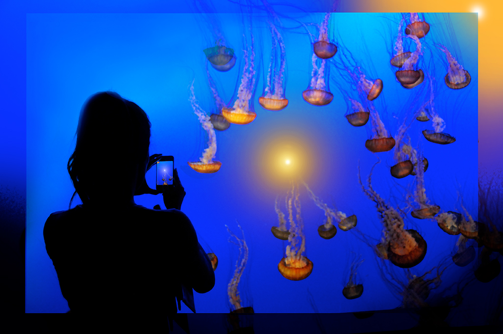
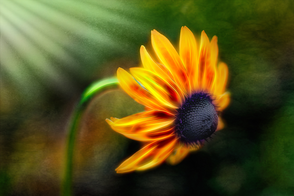
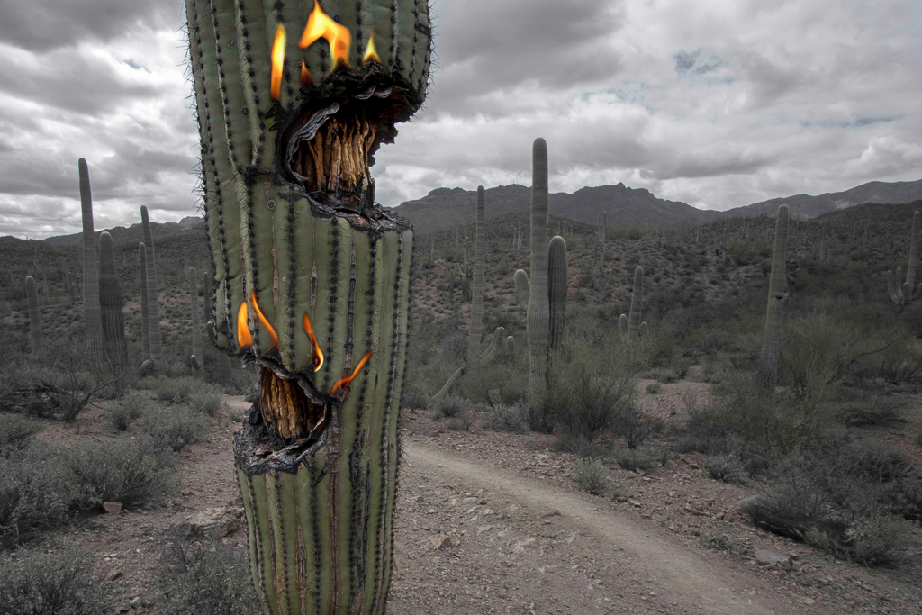
I intentionally chose a contrasting color scheme to highlight the owl. If I were to make it tonally blue I think it would make the image more dull. Likewise I did add a gausian blur behind the bird to match the fuzziness of the distant petals that were blurry while keeping the bird sharp to match the sharp petals more in the front of the image. Again, blurring the bird would make it less clearly a focal point. This, in the end, may be personal preference, but I wanted to challenge you along these lines to get your thoughts. |
May 6th |
4 comments - 3 replies for Group 41
|
| 54 |
May 22 |
Reply |
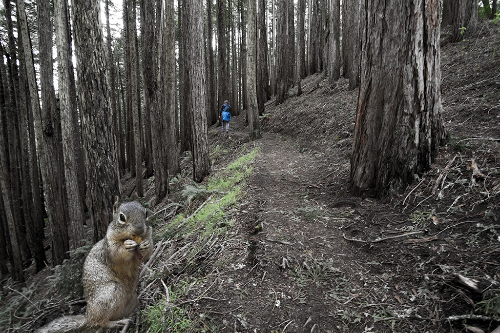
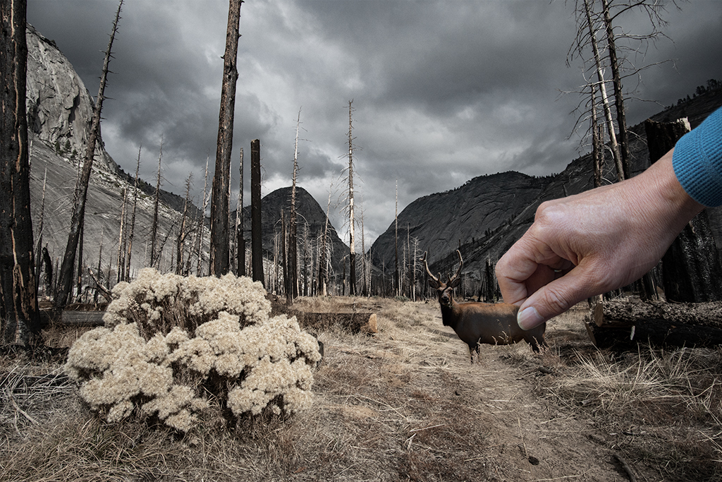
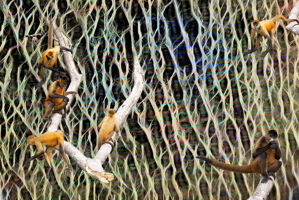
Aavo, I do a lot of cut and paste too. I've noticed many of your final images have the subjects more pixelated or less natural looking after you paste them. I wonder if this is intentional or if you are loosing image quality when you transfer the files or if the files, such as the animals, are of a much lower resolution than the backgrounds. Just something that would be worth discussing if its not intentional. |
May 25th |
| 54 |
May 22 |
Comment |
Just cycling back and enjoying the additional work you've done. I do like the various experiments you've done, especially your final instagram version which adds a little more punch to the cloak bringing the subject into focus even better. |
May 25th |
| 54 |
May 22 |
Reply |
Alan, I appreciate you revisiting this image. I will certainly consider further blurring and exploring an alternate fantasy world. One could literally spend months working on variations on one image. |
May 25th |
| 54 |
May 22 |
Reply |
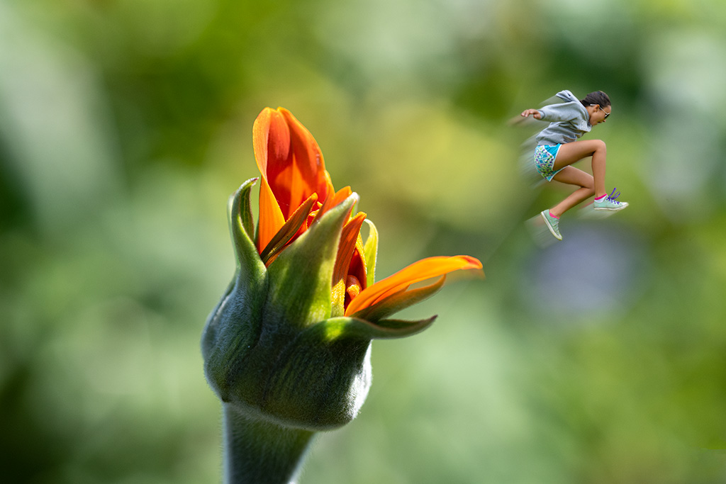
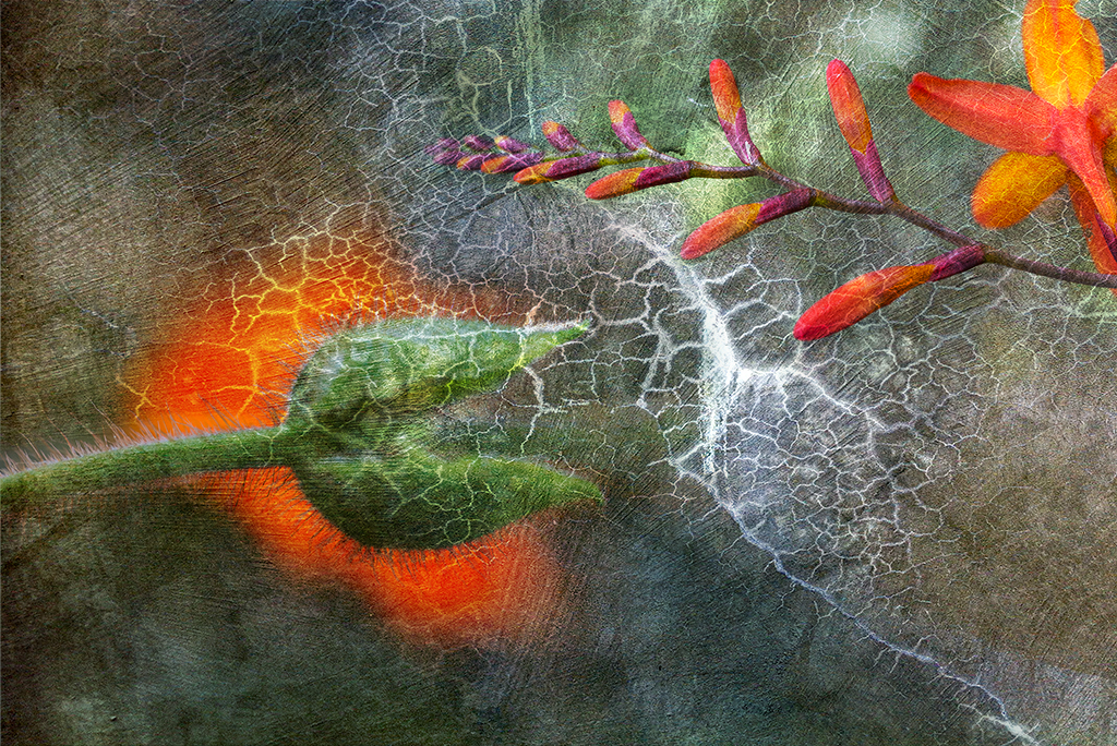
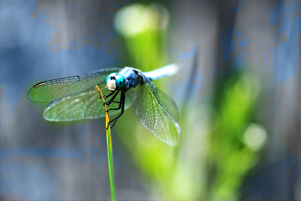
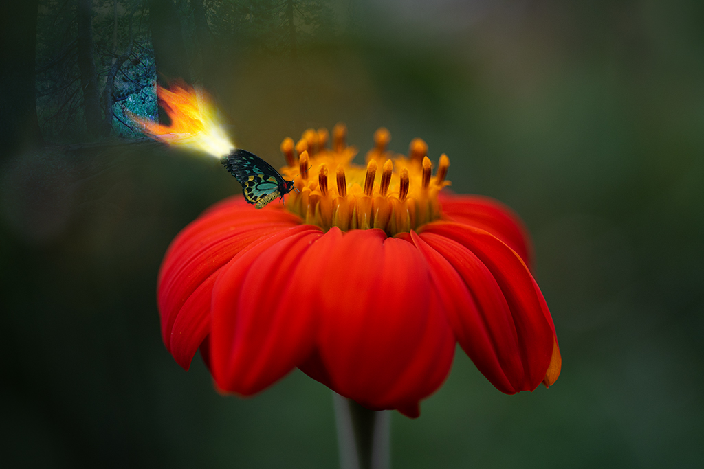
Maria, Thank you for your feedback. I do like a blurry background to help focus the image. I personally prefer keeping the orange color of the adjacent flowers as it supports the narrative. |
May 25th |
| 54 |
May 22 |
Reply |
Kristi, Thanks for taking the tie to review my prior images and for the very positive feedback. I am definitely in a flower period, will end up being a nice series once I finish. |
May 21st |
| 54 |
May 22 |
Reply |
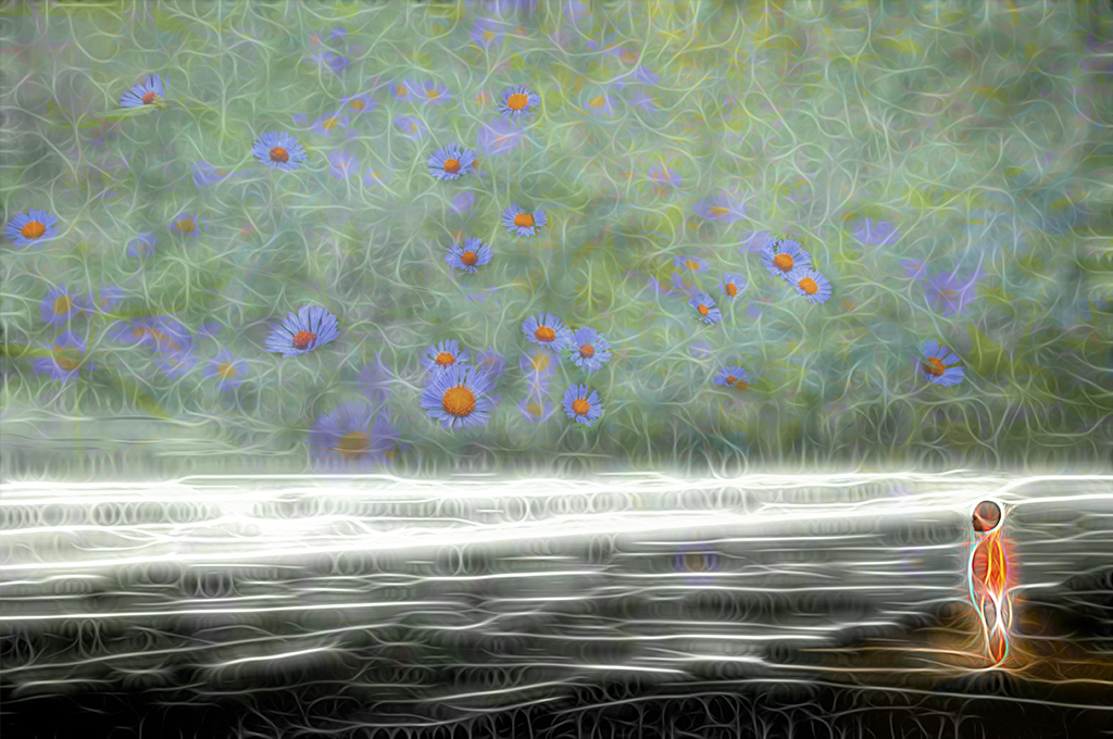
What do you think of this one? |
May 15th |
 |
| 54 |
May 22 |
Comment |
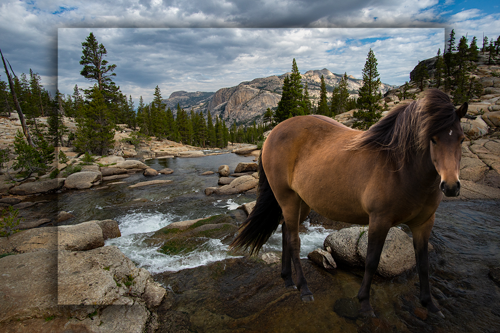
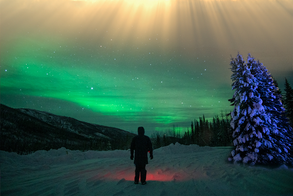
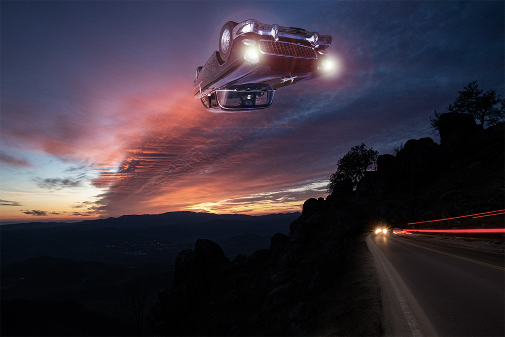
Alan, I like the lighting you have created on the foreground, it has an HDR type quality given the time of day. The horse and buggy do not feel "natural" based on how you've rendered. I like the feel but not sure if your goal is to create a naturalisic setting. |
May 13th |
| 54 |
May 22 |
Comment |
Maria, This does feel like a nicely balanced composition. I like the addition of the buildings but wonder if they could be toned down a touch, maybe adding a hint of fog so they blend more realistically |
May 13th |
| 54 |
May 22 |
Comment |
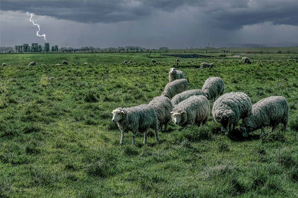
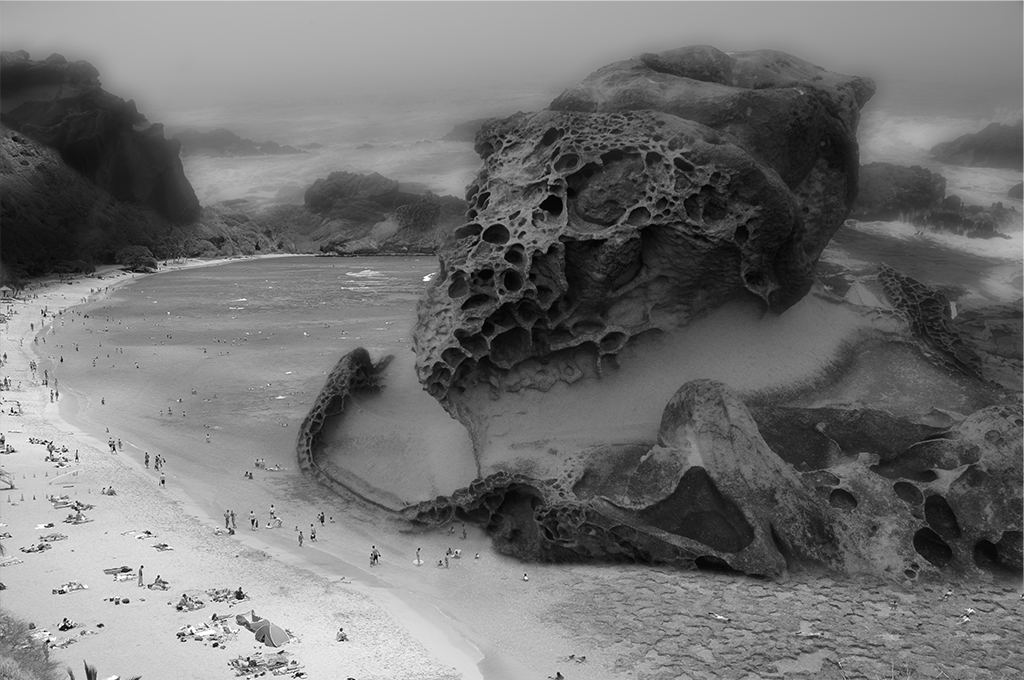
Aavo, I like the composition and reflection. I agree with Alan regarding the cut and paste look. I wonder if you are reducing the size too much loosing image sharpness. If you are attempting realism, the dark swatch of land between the animals and the water makes this look less like a true reflection so i'd consider matching the distance as in your original 3 image. |
May 13th |
| 54 |
May 22 |
Comment |
Peggy, I like the darker image you posted over the lighter one. I might try playing with different color schemes if you want to explore more, maybe a darker blue tone but it seems nicely done as is. |
May 13th |
5 comments - 5 replies for Group 54
|
9 comments - 8 replies Total
|