|
| Group |
Round |
C/R |
Comment |
Date |
Image |
| 41 |
Mar 21 |
Reply |
Lisa, This reminds me a little of my initial infatuation with HDR. Only looking back on those images now do I see how over the top my handling was. I've been enjoying playing with topaz for the last few months. I will likely settle back in at some point soon. Missed your image this month! |
Mar 27th |
| 41 |
Mar 21 |
Reply |
Henry, It's funny how the majority of the suggestions indirectly suggest not relying on the topaz filter in this image, especially given my comments to you this month! |
Mar 27th |
| 41 |
Mar 21 |
Reply |
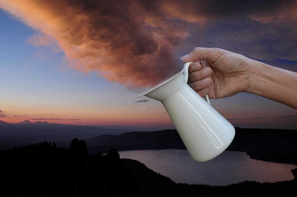
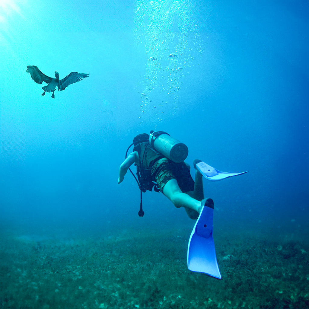
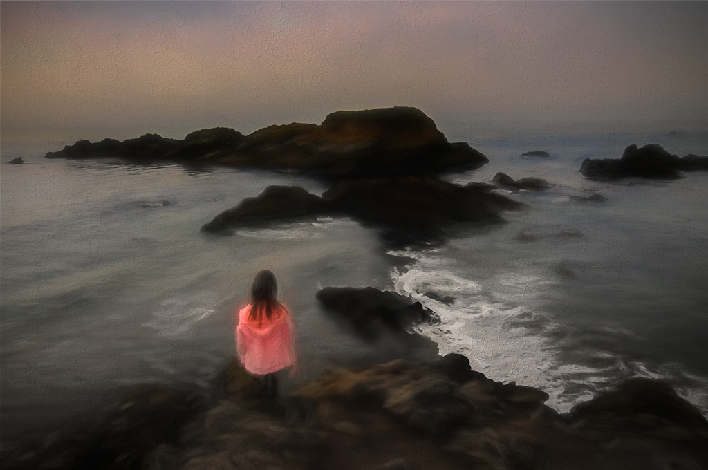
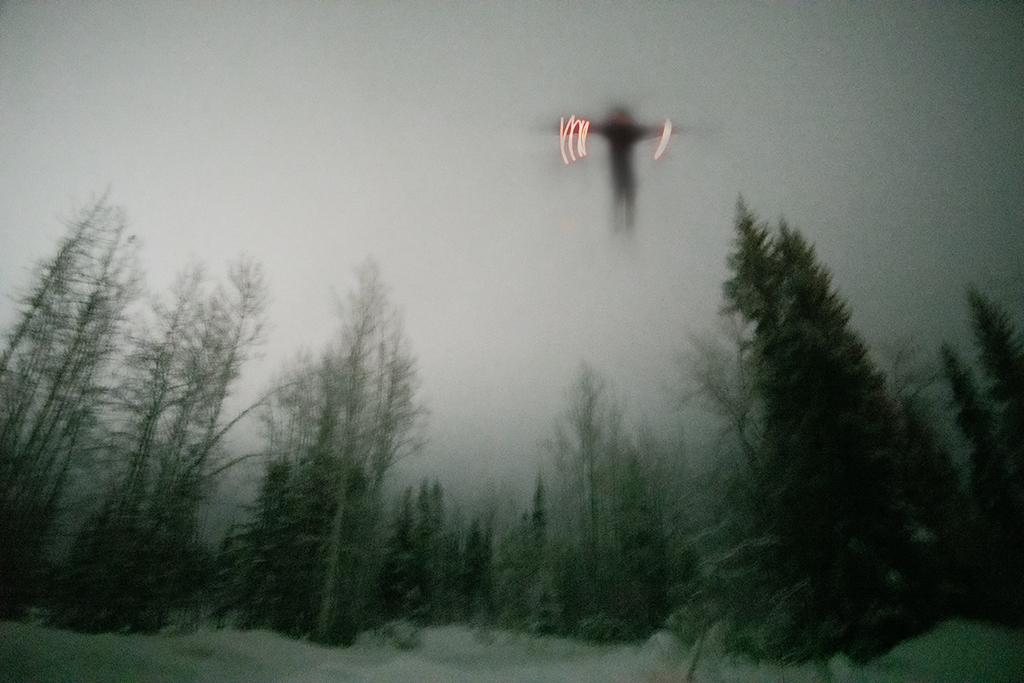
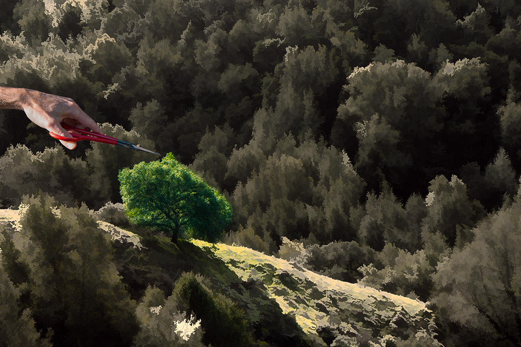
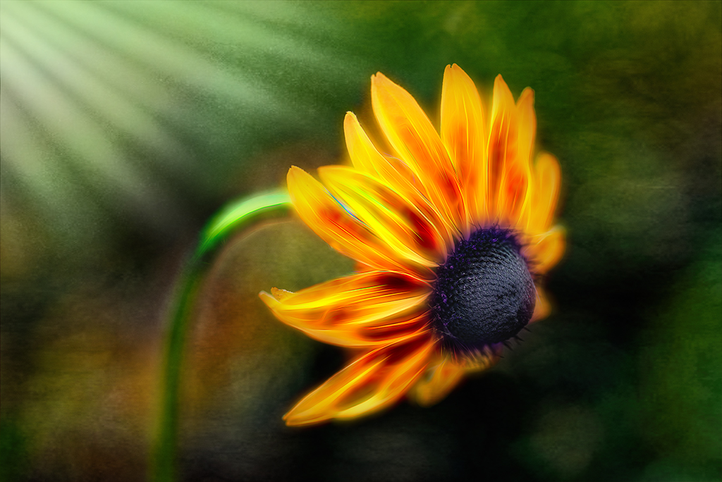
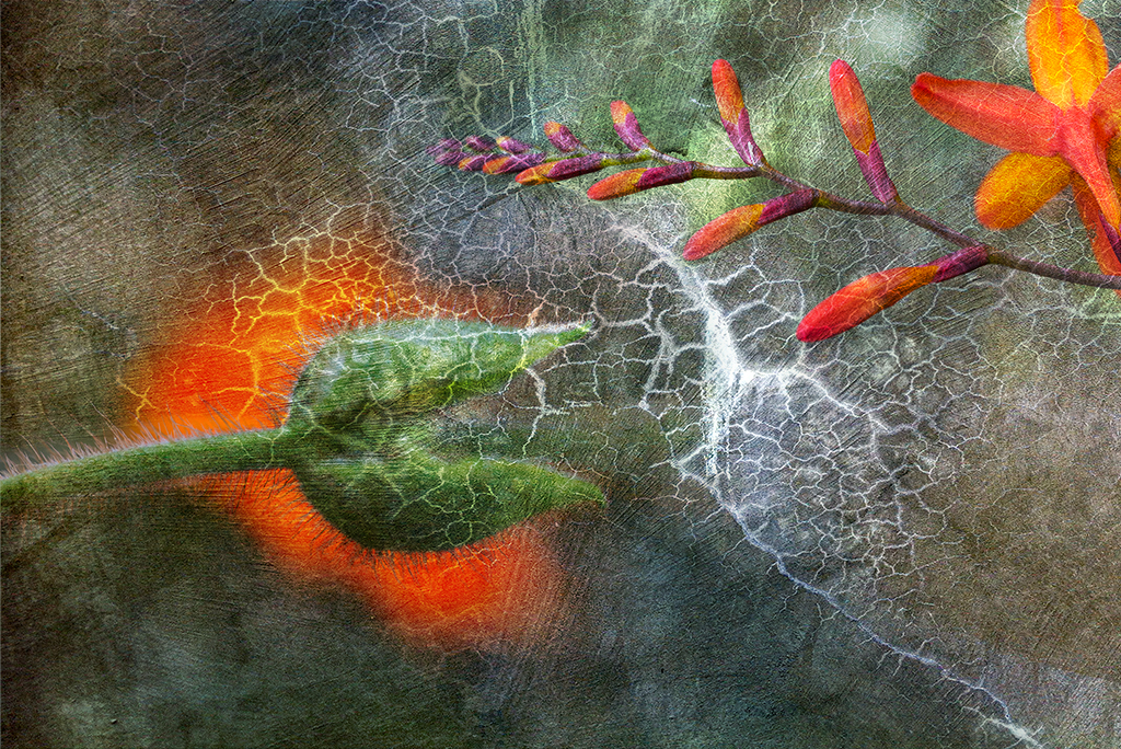
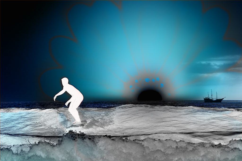
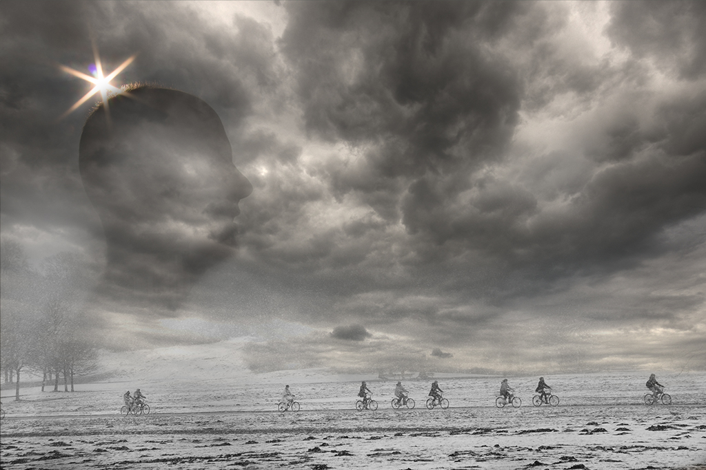
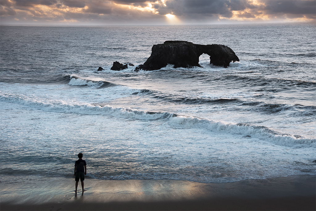
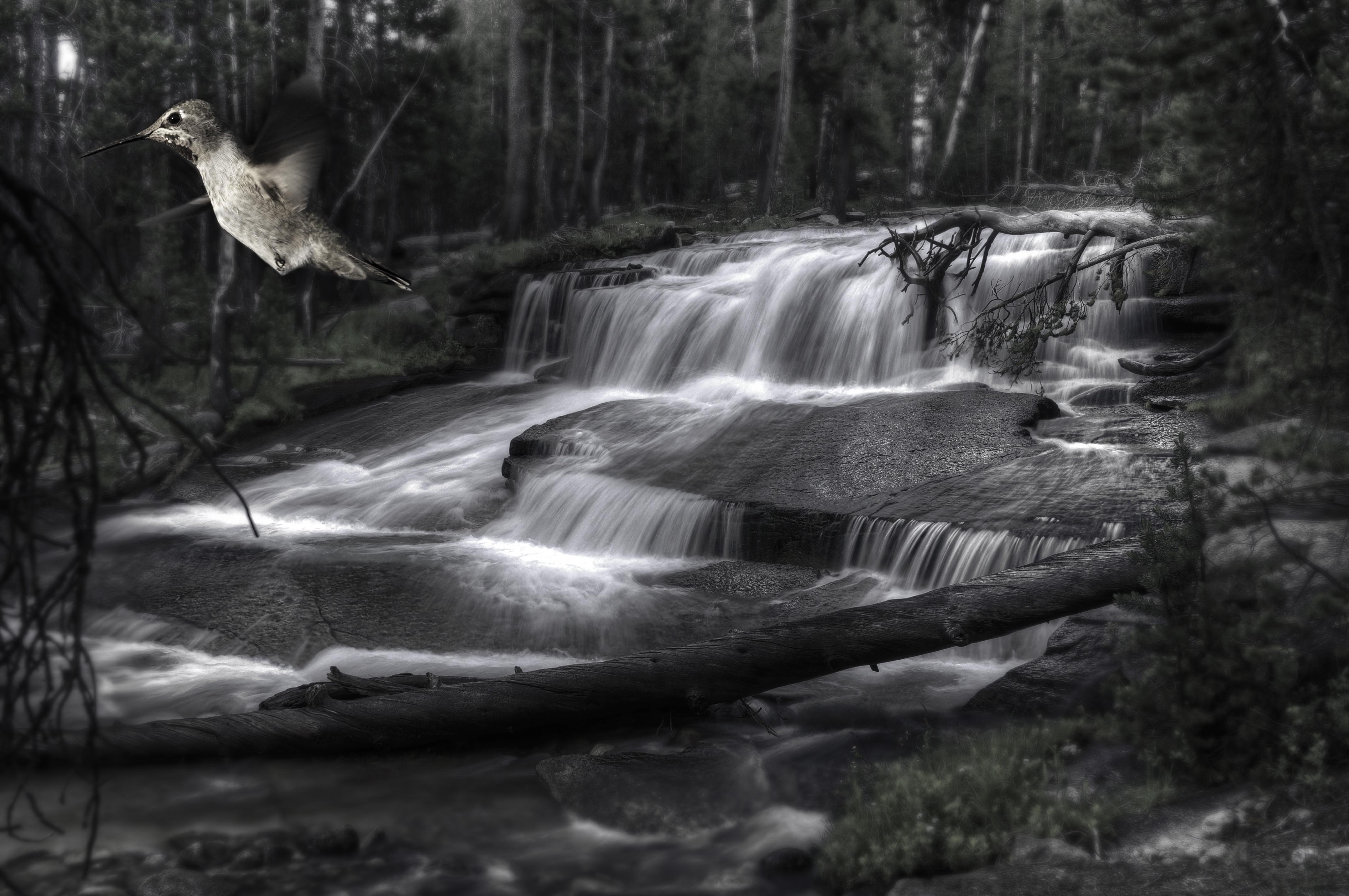
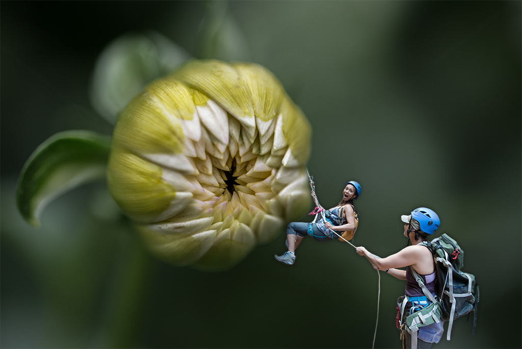
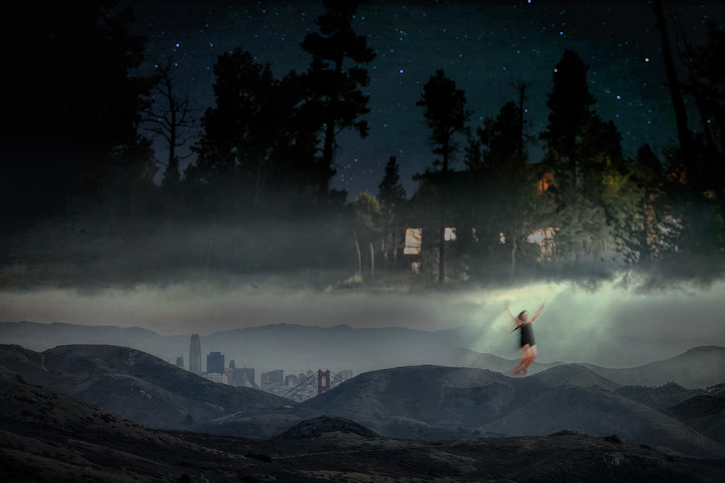
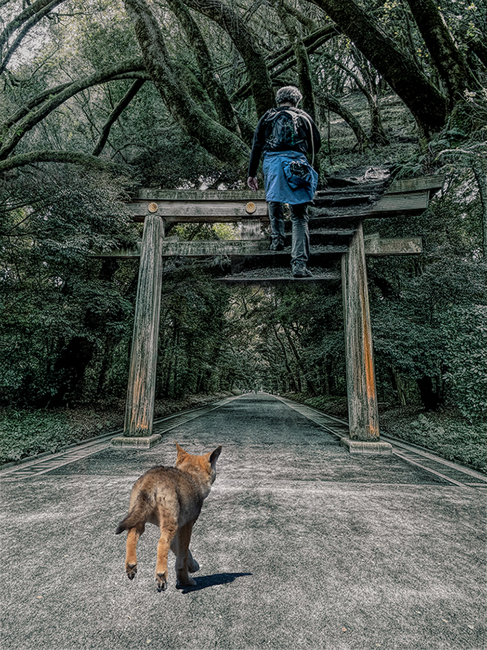
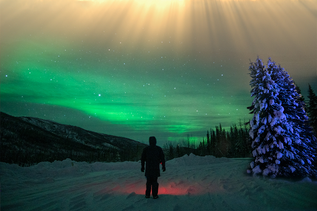
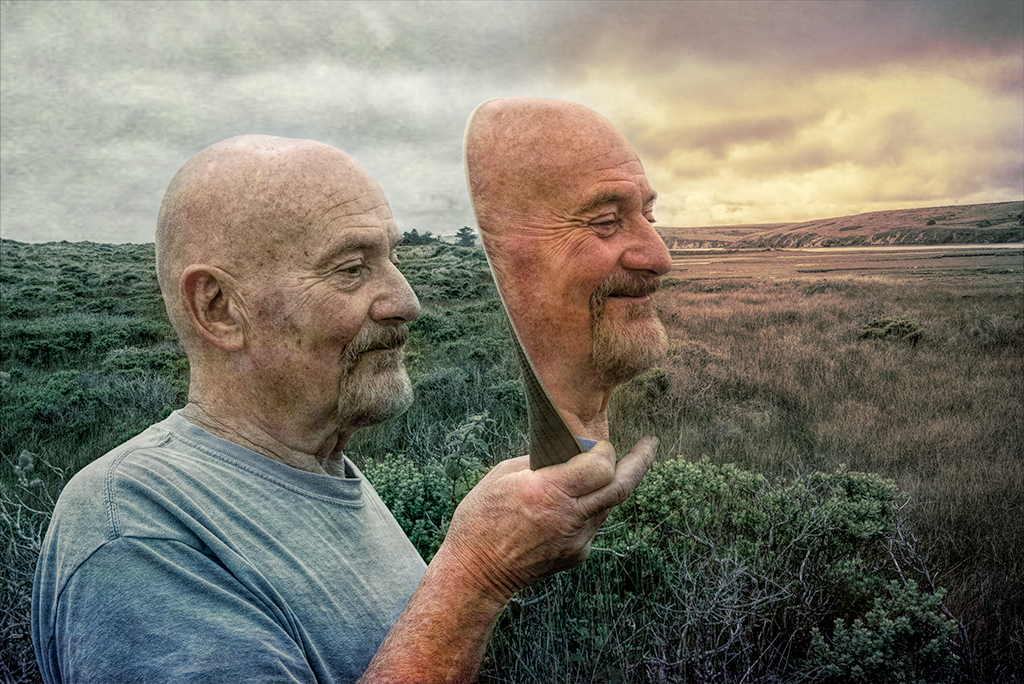
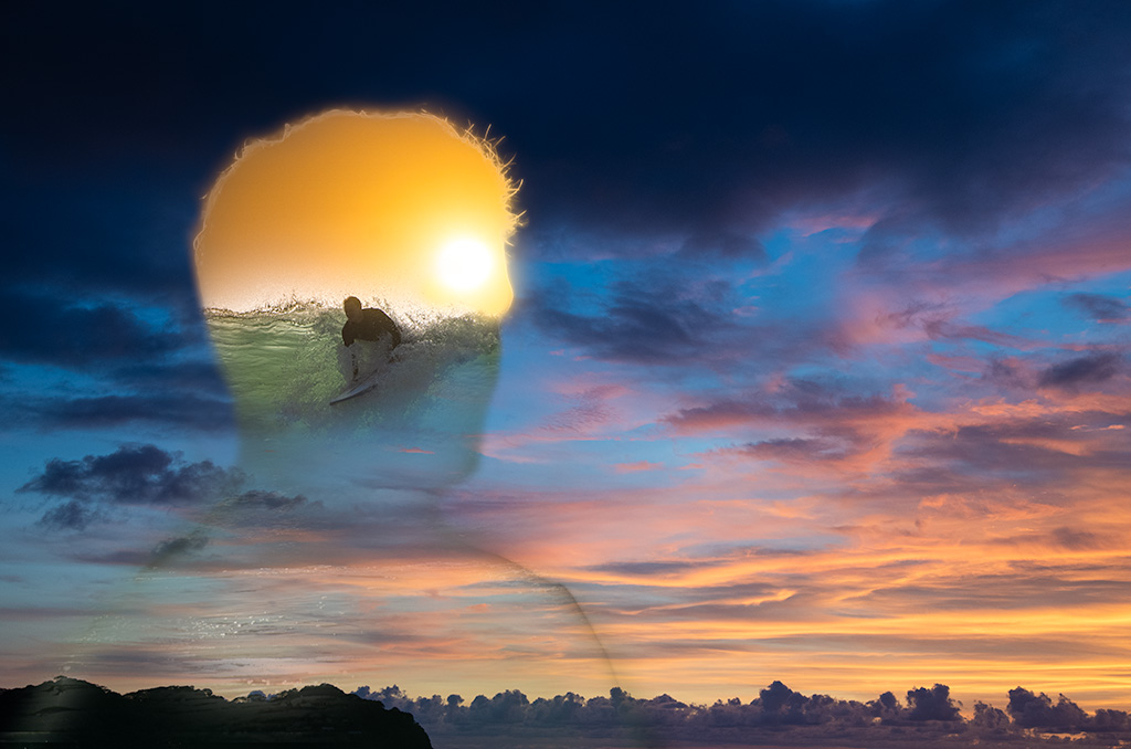
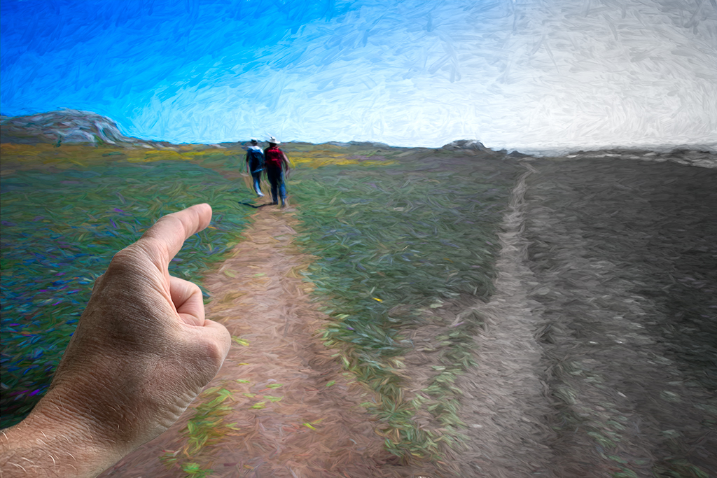
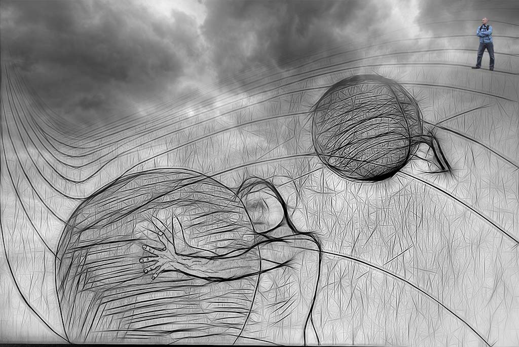
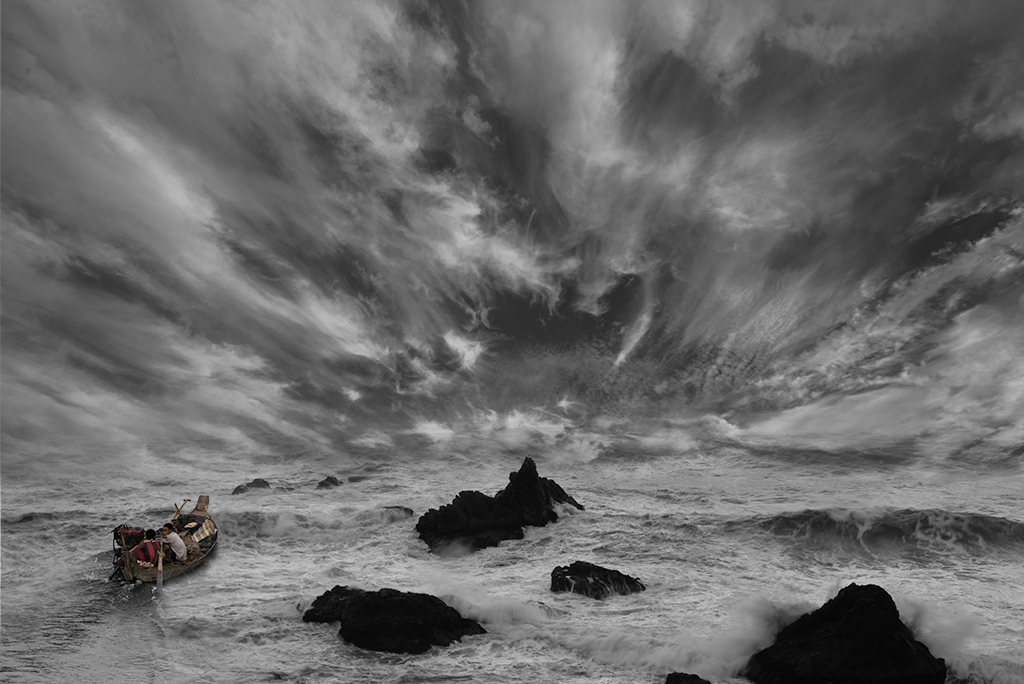
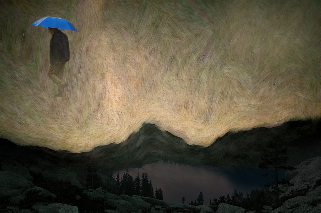
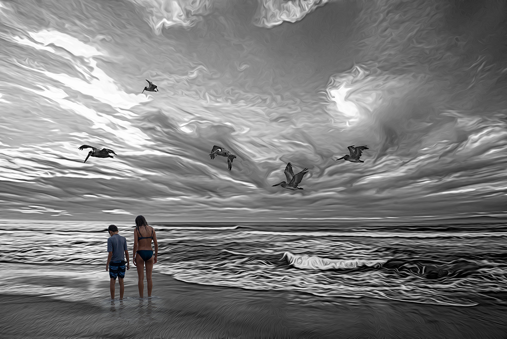
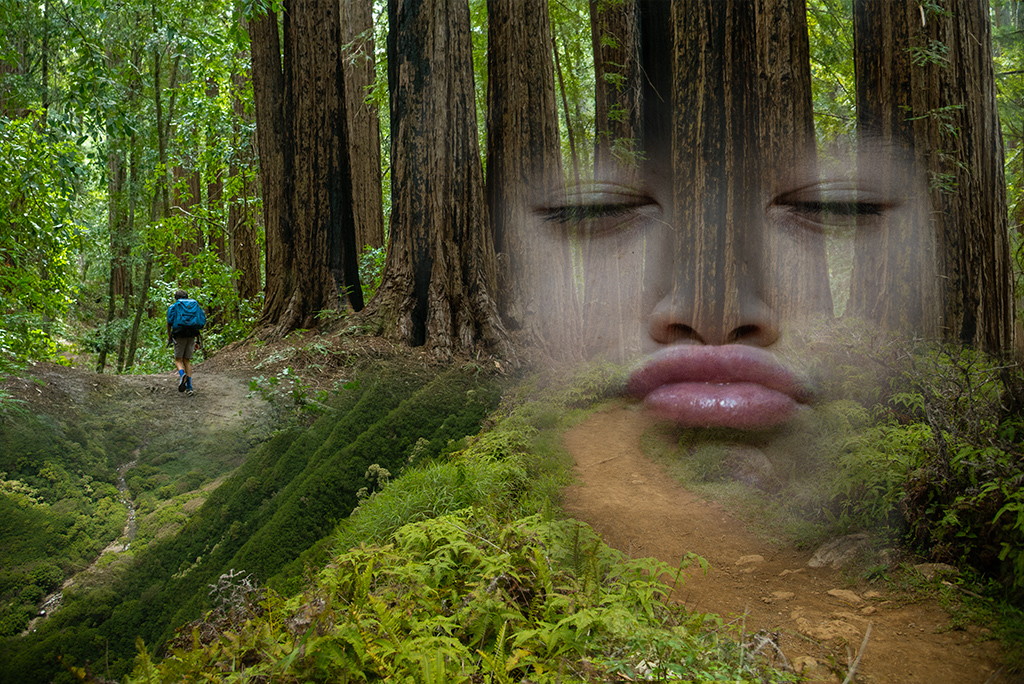
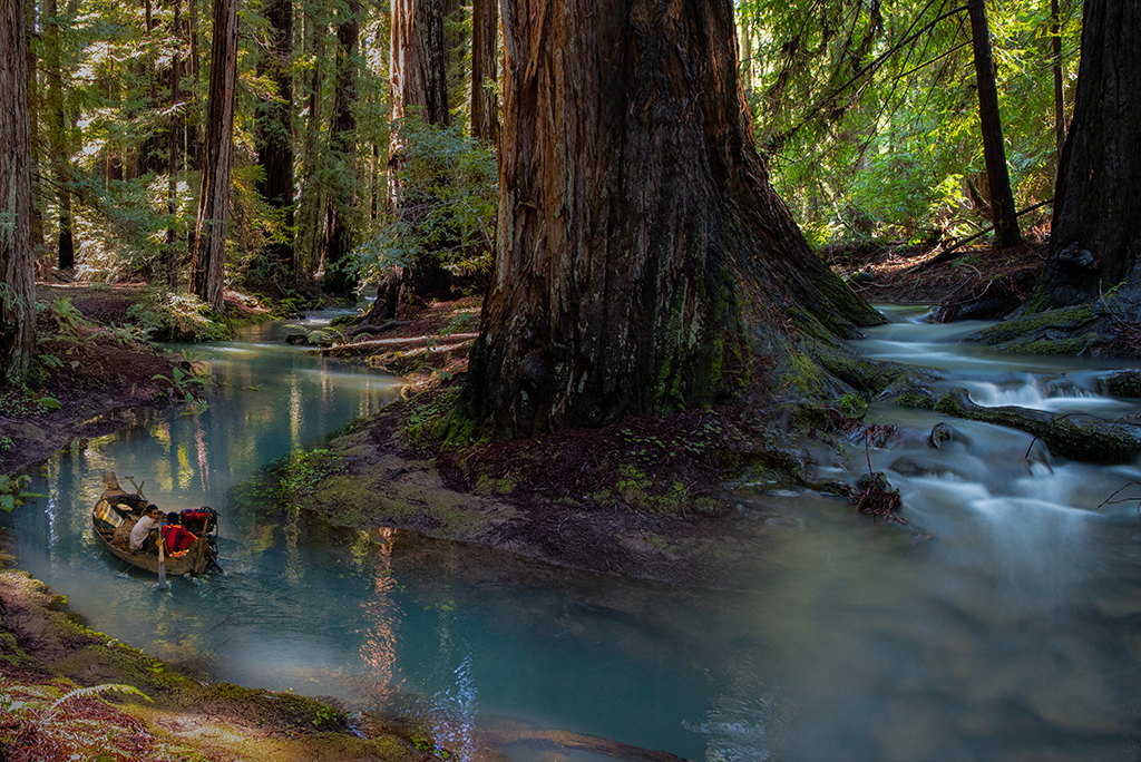
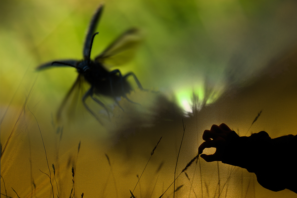
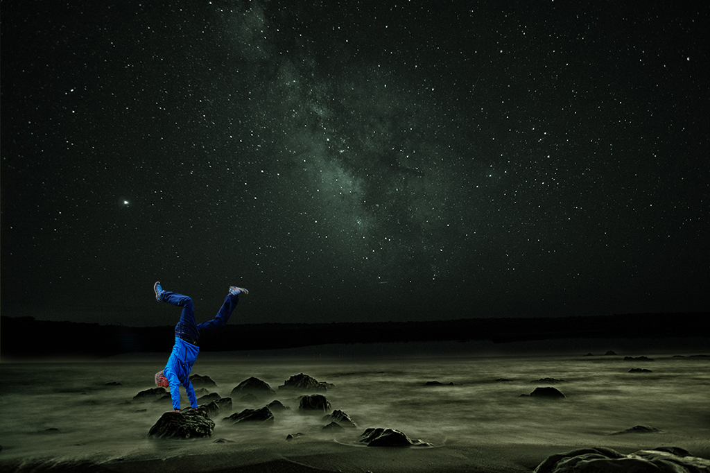
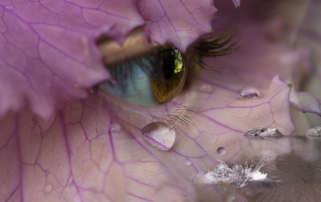
Tom, Getting someone to take a picture of my hand last minute was challenging so I had to settle with suboptimal lighting for this image. Usually I try to craft things a bit more tightly. My choice to differentiate foreground and background with and without the filter was intentional. Based on the consensus opinion it sounds like this group isn't a fan of the use of the filter in this image. I usually try to stick with more subtle strategies for focusing attention. Topaz has been a bit of a distraction but a fun thing to play with. |
Mar 27th |
| 41 |
Mar 21 |
Reply |
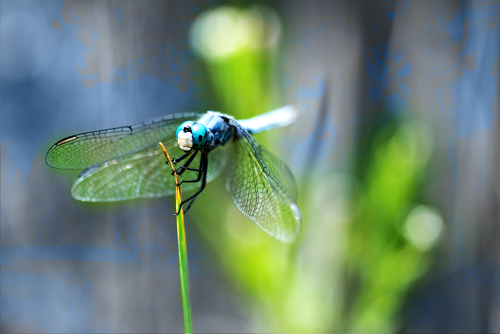
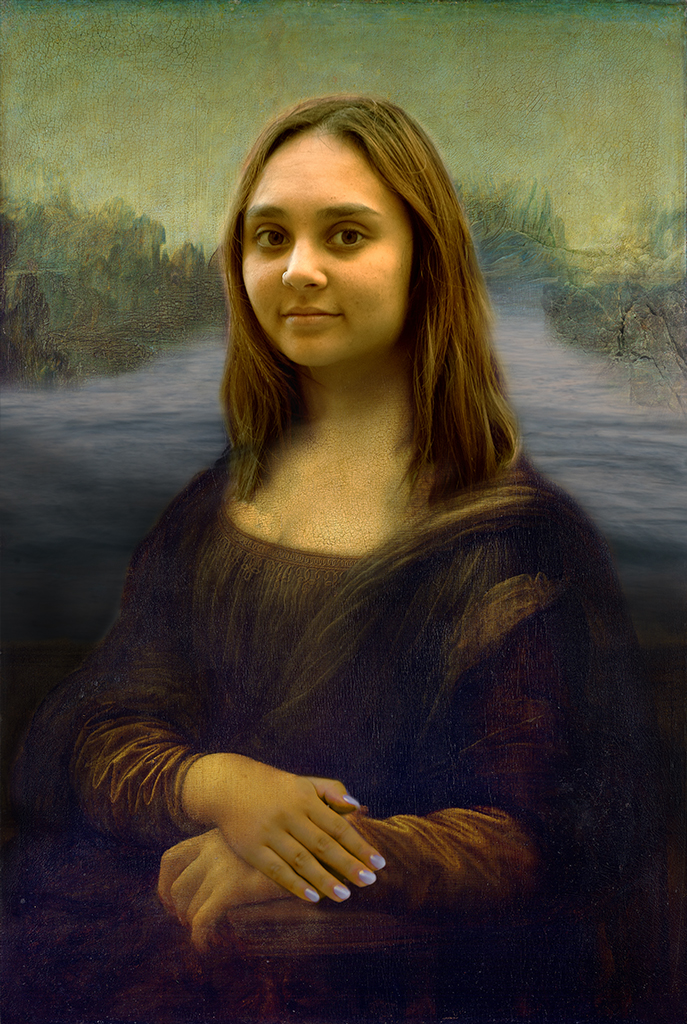
Kathy, Thanks for your feedback. When I first started doing photoshop I did a lot of these hand images. Something fun about playing with the hand of god theme. |
Mar 27th |
| 41 |
Mar 21 |
Comment |
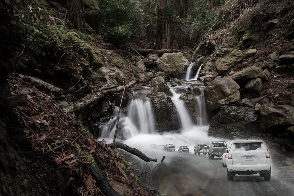
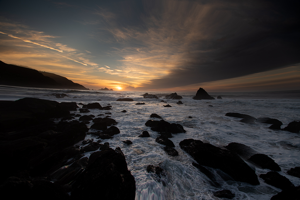
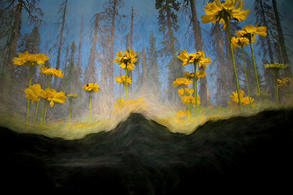
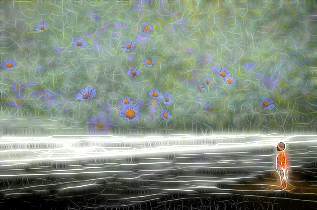
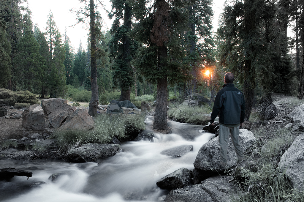
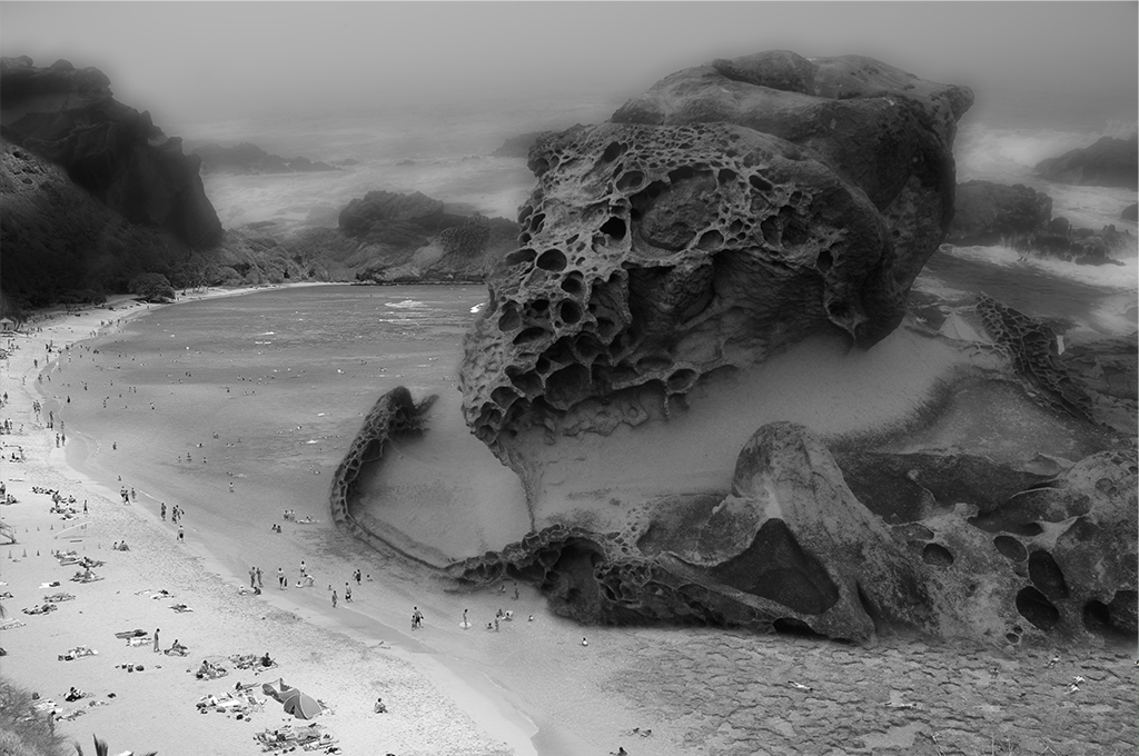
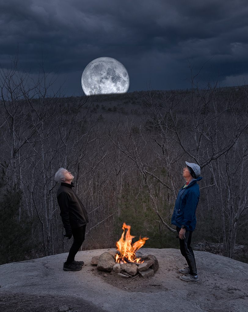
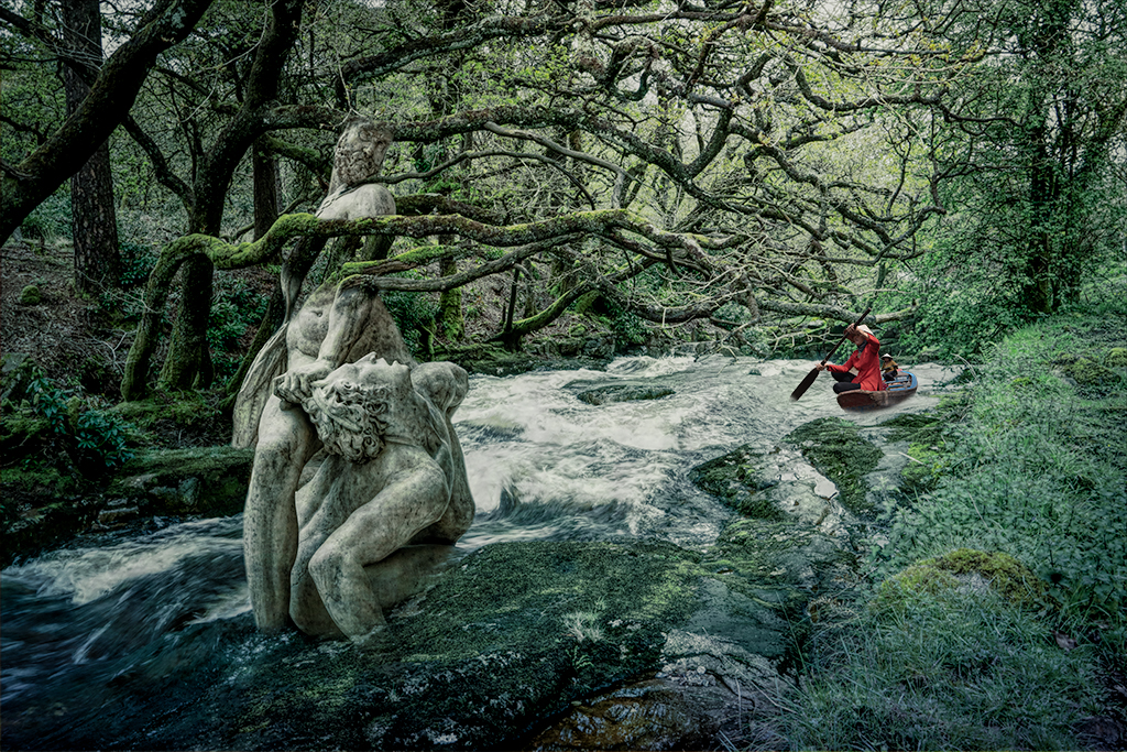
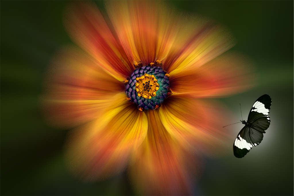
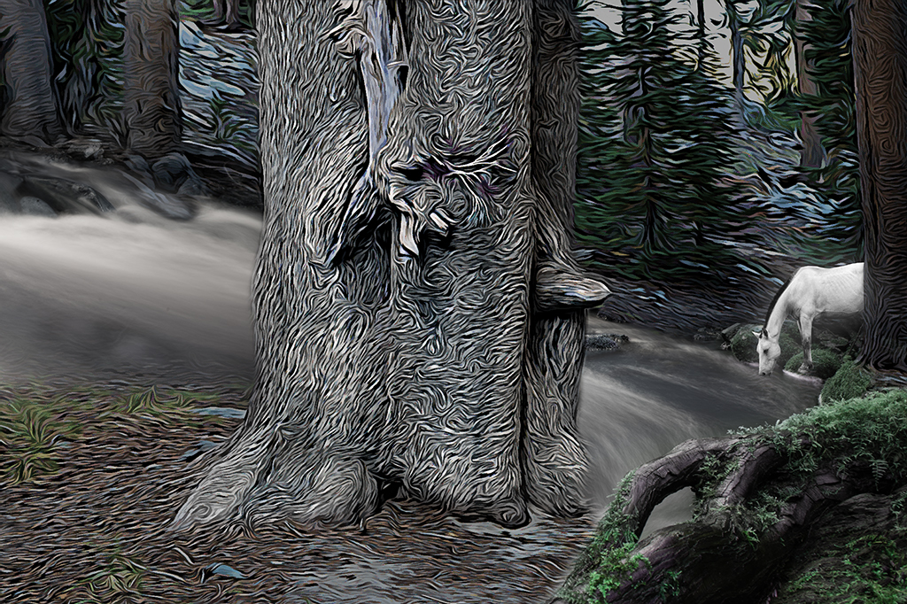
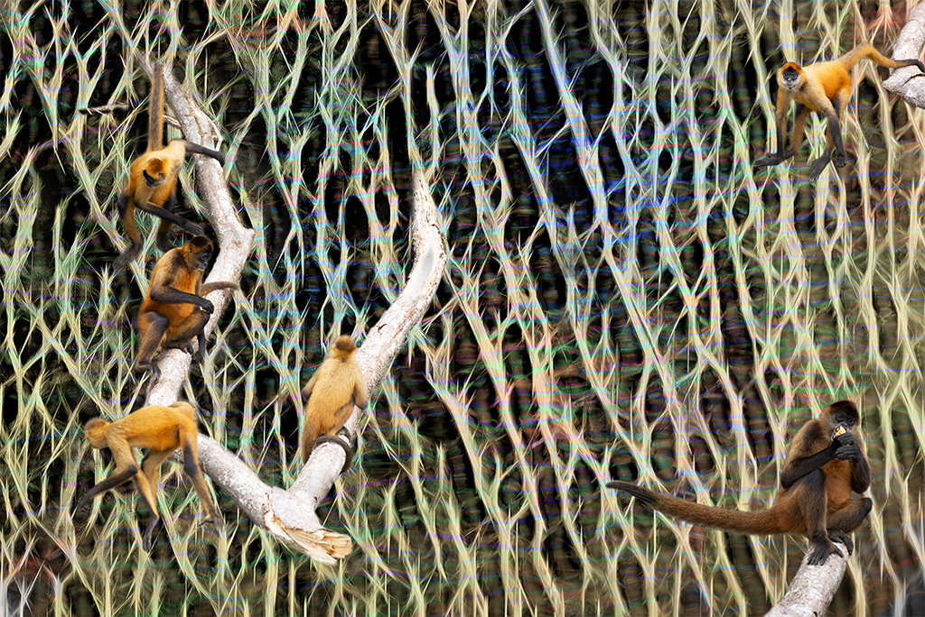
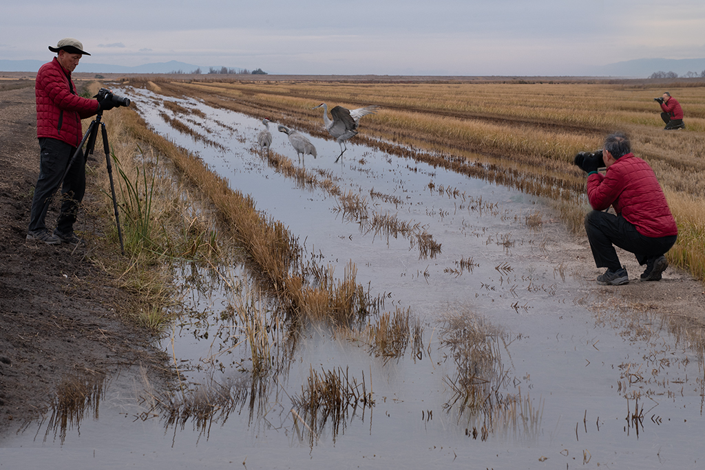
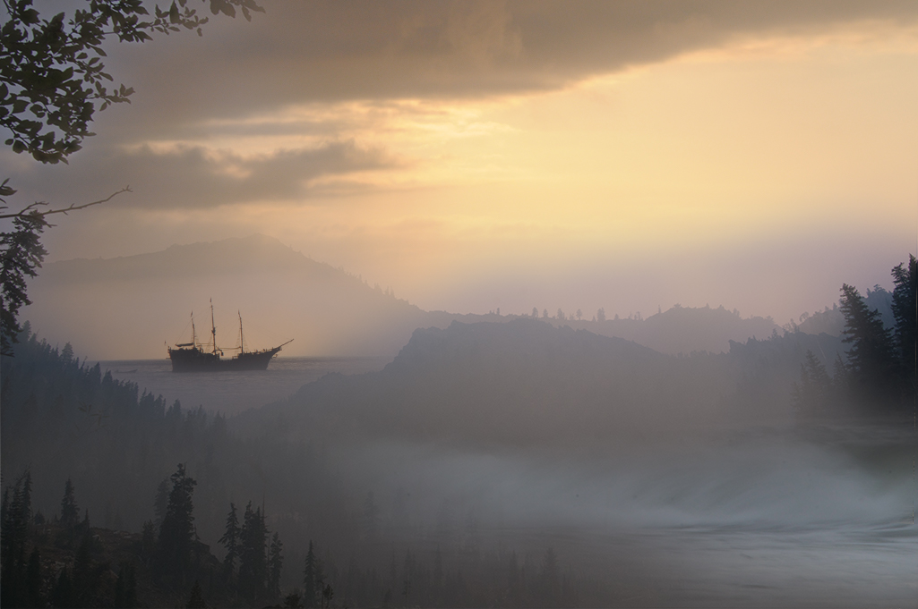
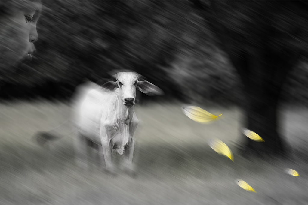
Looks like we both have a tree theme this month. I like the static movement in this image but do find it lacks a specific point of interest. I could certainly see this being part of a larger series of images at a show focusing purely on texture. |
Mar 8th |
| 41 |
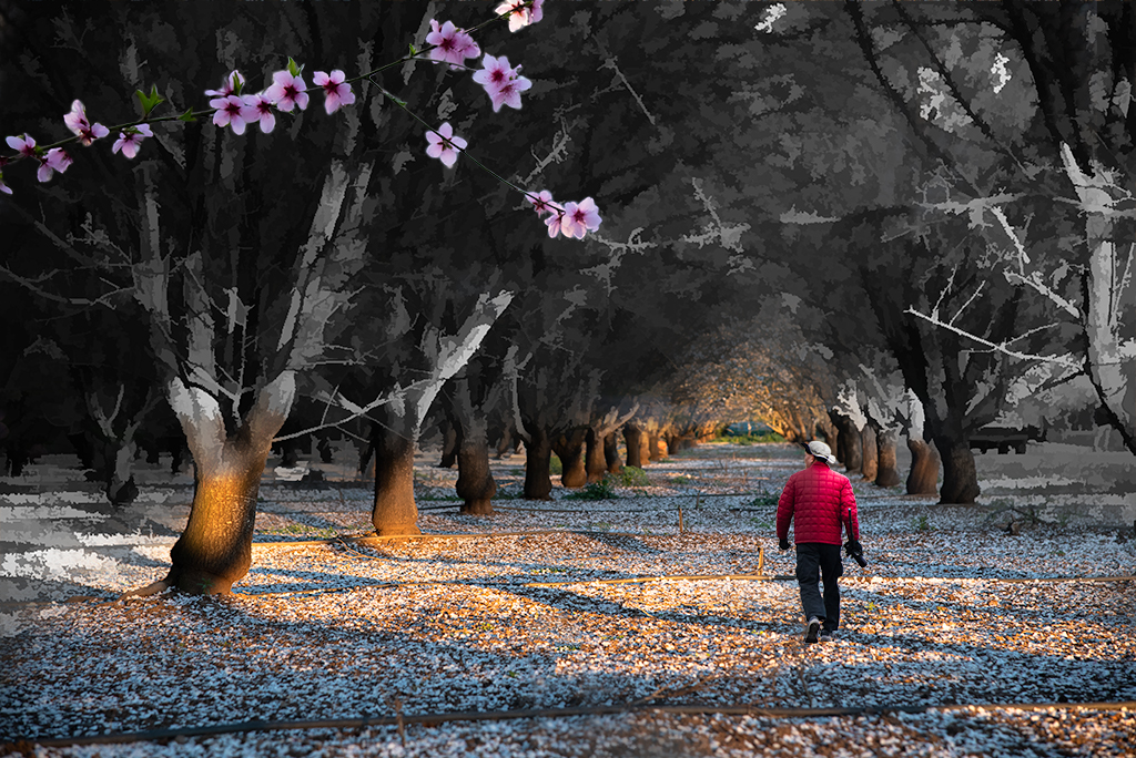
Mar 21 |
Comment |
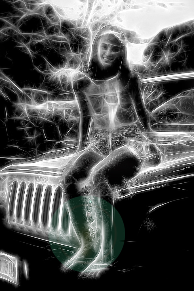
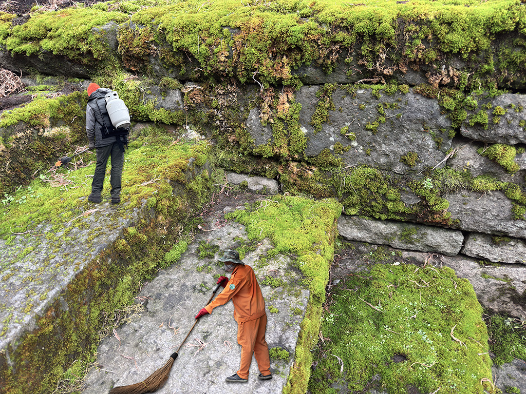
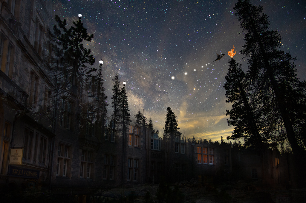
Henry, You've done a nice job with this composition. I personally like the original cropping too but find this version very strong as well. My only suggestion to you is to not rely too much on Topaz. I have to admit I enjoy playing with it but it can, in the long run, stifle creativity. |
Mar 8th |
| 41 |
Mar 21 |
Comment |
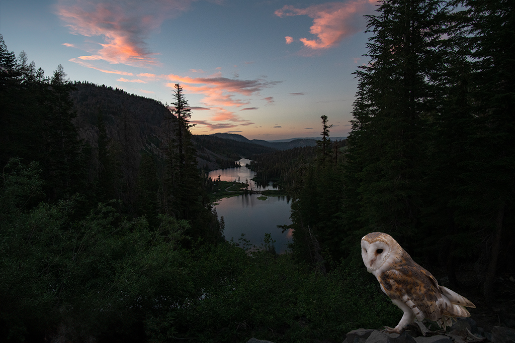
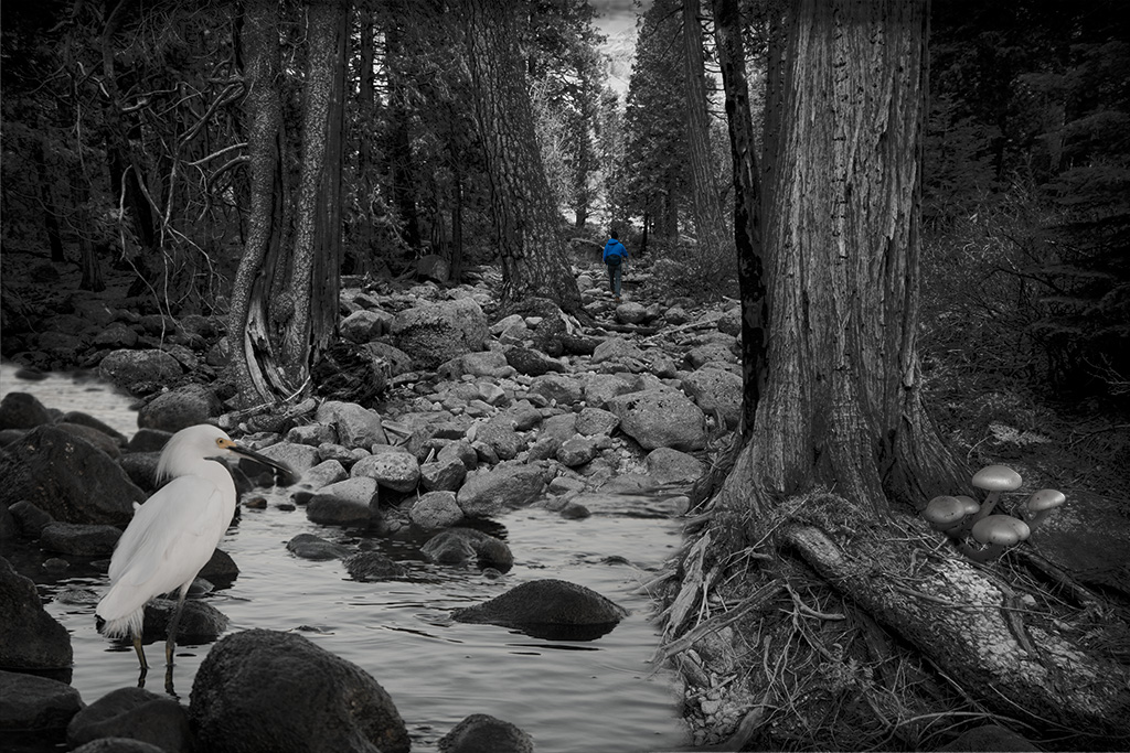
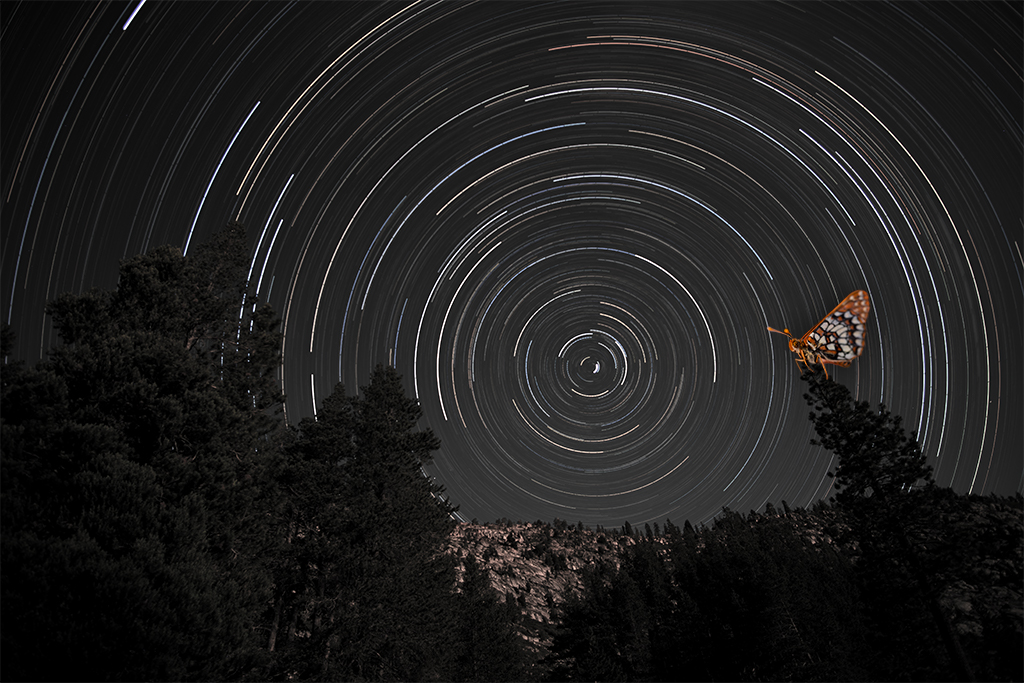
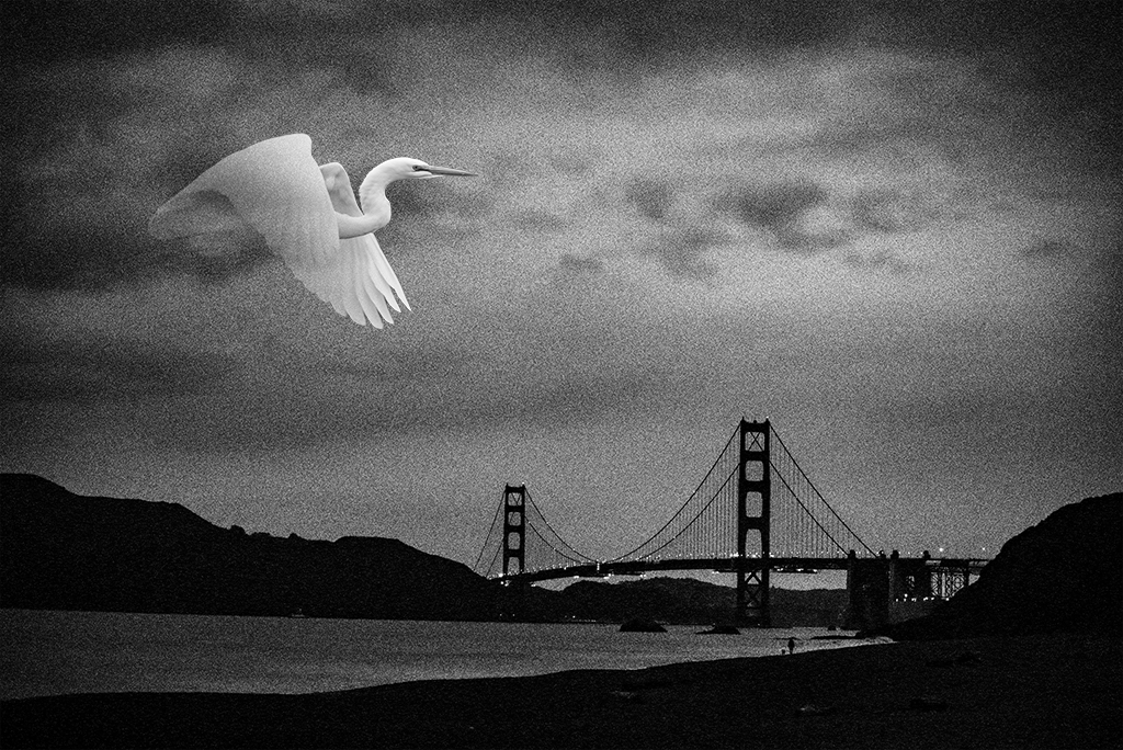
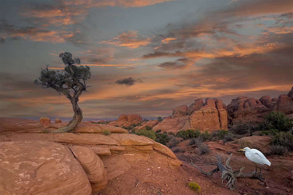
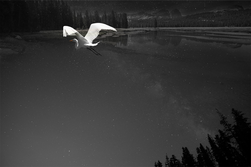
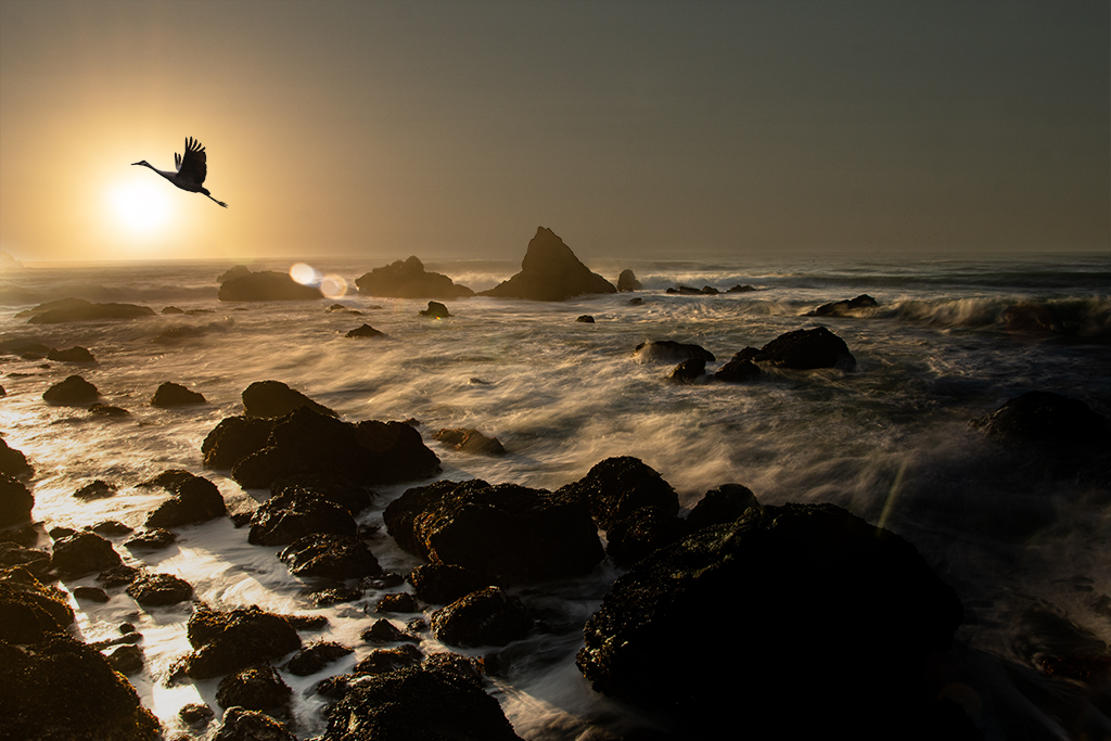
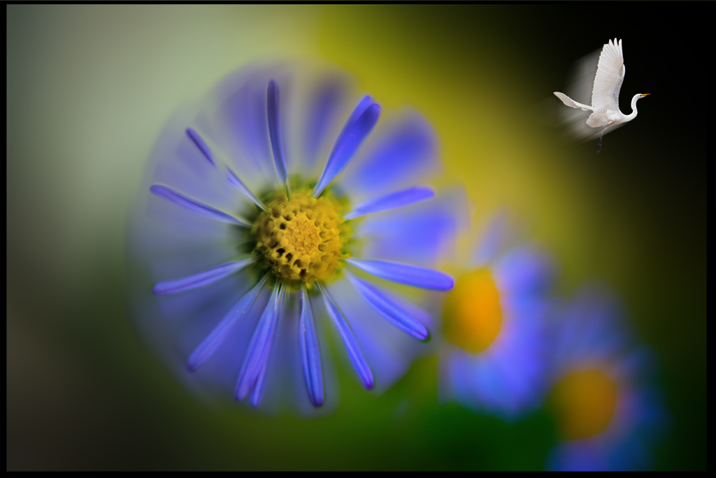
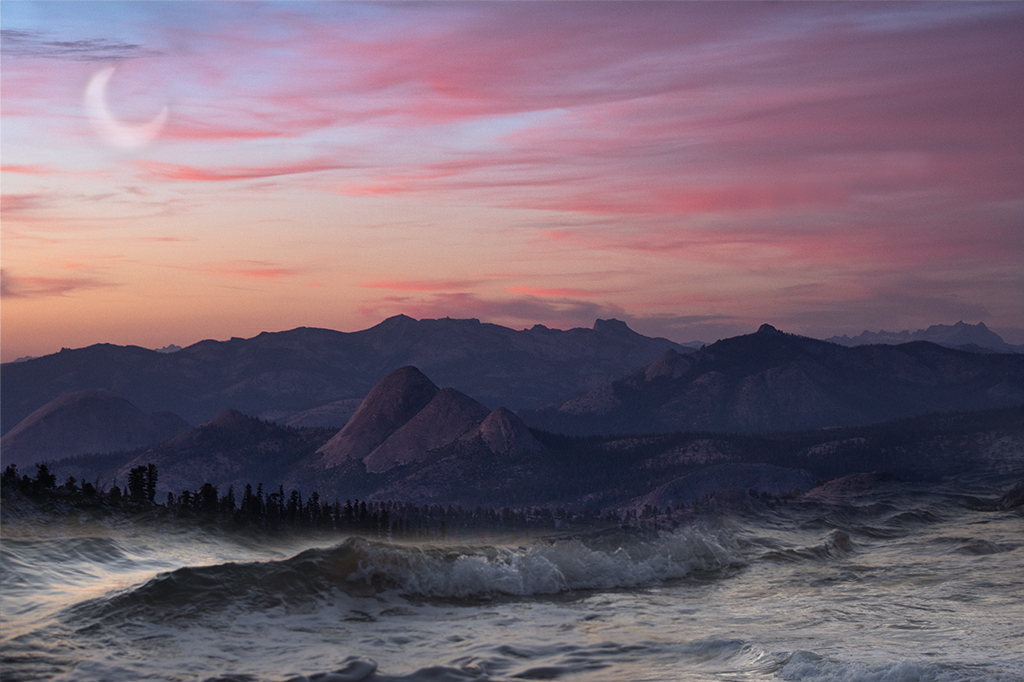
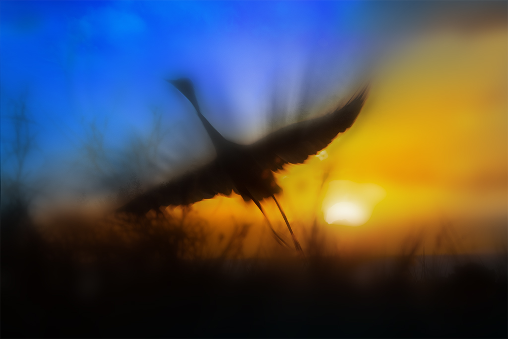
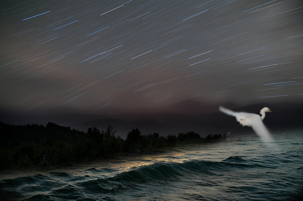
Jan, This is a beautiful image that has a very soothing and dynamic energy. I love your handling of the lighthouse with the bold colors which are nicely enhanced by the texture you've added. The bird is also nicely handled and adds a very strong foreground element. I personally feel like the placement/size of the bird might benefit from further exploration as it feels a bit cramped to me. I also wonder if a subtle drop shadow might add a greater 3D effect separating the subject slightly from the background to create more impact. |
Mar 6th |
| 41 |
Mar 21 |
Comment |
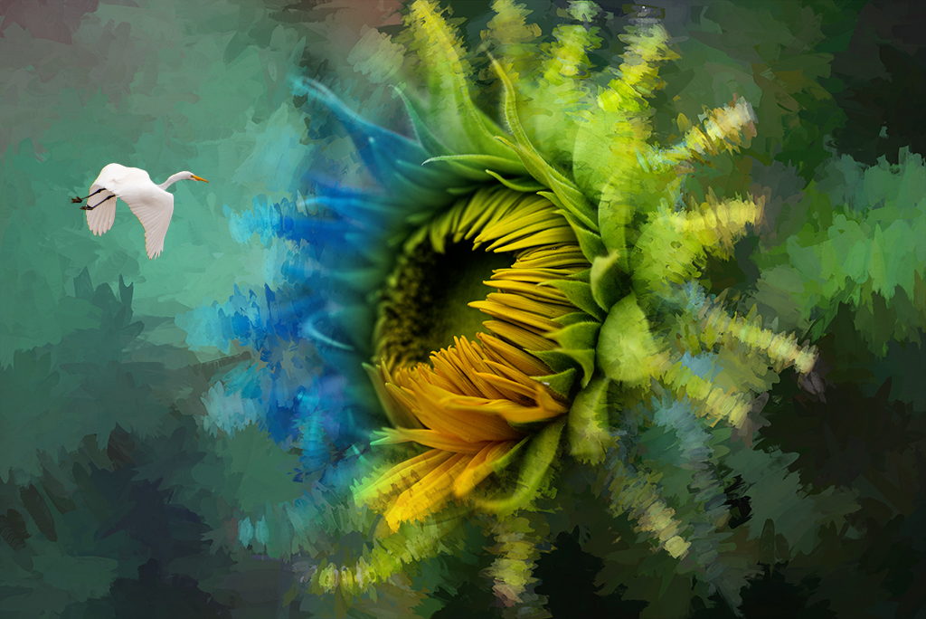
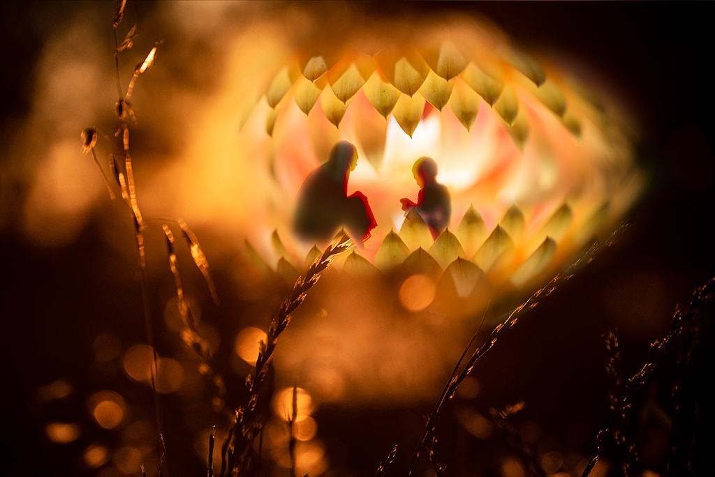
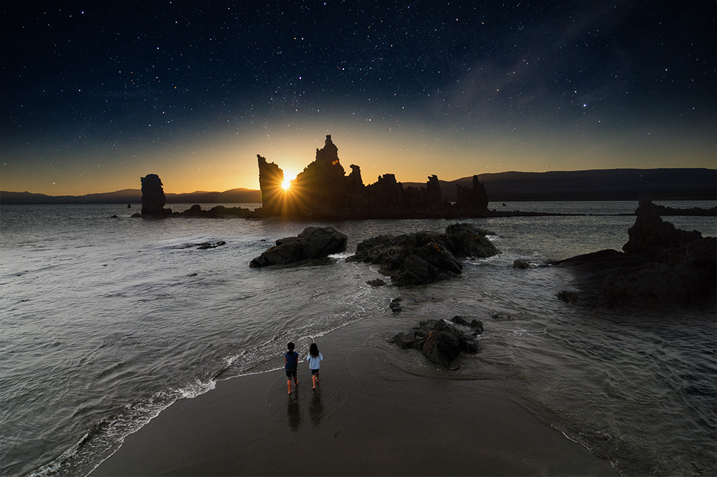
Tom, Welcome to the group, I love your first image. The composition, colors and story have a real resonance and speak to something more profound. I personally might play more with the content within the orb. I'm not sure the spherules add to the mystery. I wonder if a starburst or using more of the white center from the original 3 may be more visually strong. As you will learn I like sharing suggestions, they are personal preference and hopefully not experienced as judgment. I certainly like hearing supportive comments but joined this group to learn from my fellow photographers. |
Mar 6th |
| 41 |
Mar 21 |
Comment |
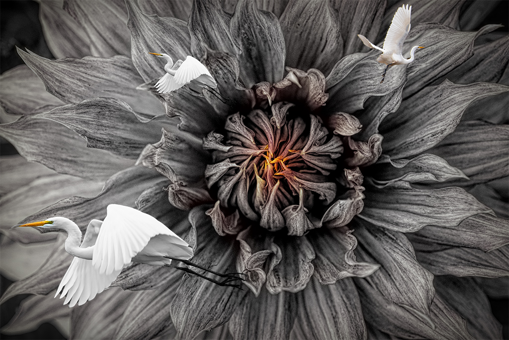
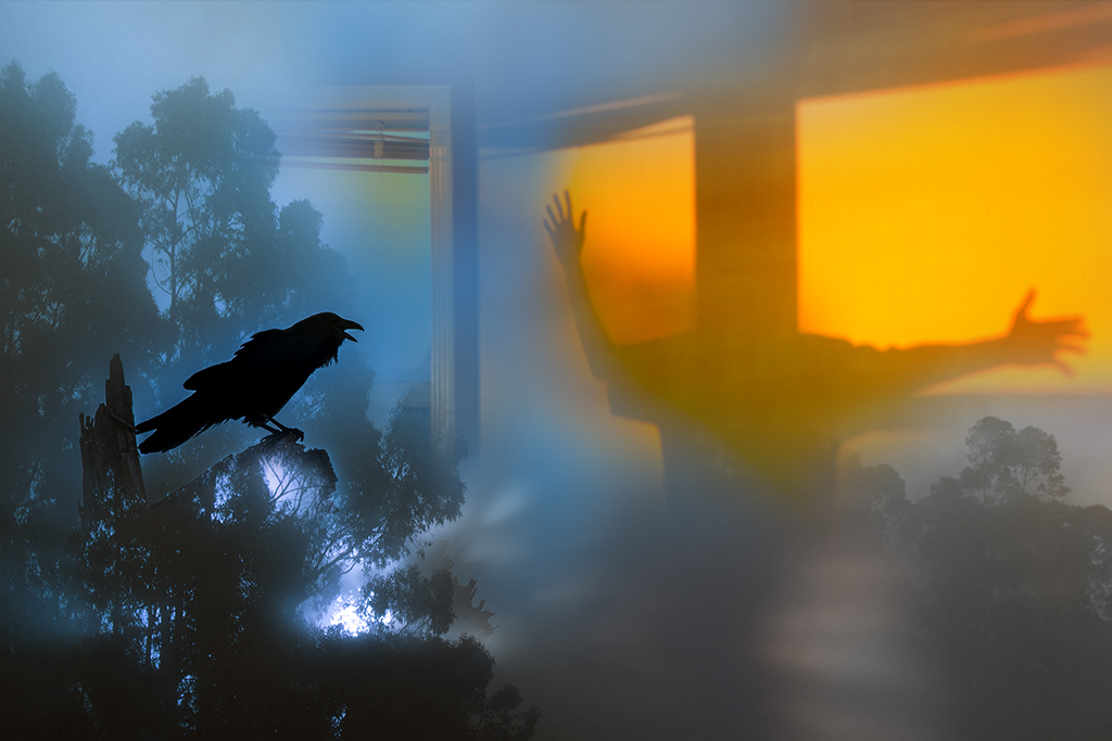
Kathy, You've crafted a beautiful and thematically intriguing image. Your handling of the background, framing, water elements, lighting, composition and story are all top notch. My only suggestion, a very picky one, would be to clean up the edges of the bird. When I zoom in I can see subtle elements remaining. I typically will zoom in and use a paint brush on a layer to paint away the stray elements. |
Mar 6th |
5 comments - 4 replies for Group 41
|
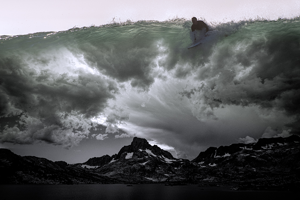
| 54 |
Mar 21 |
Reply |
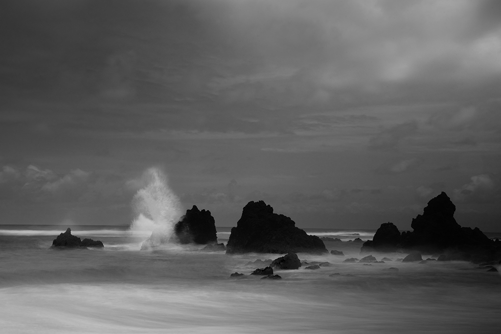
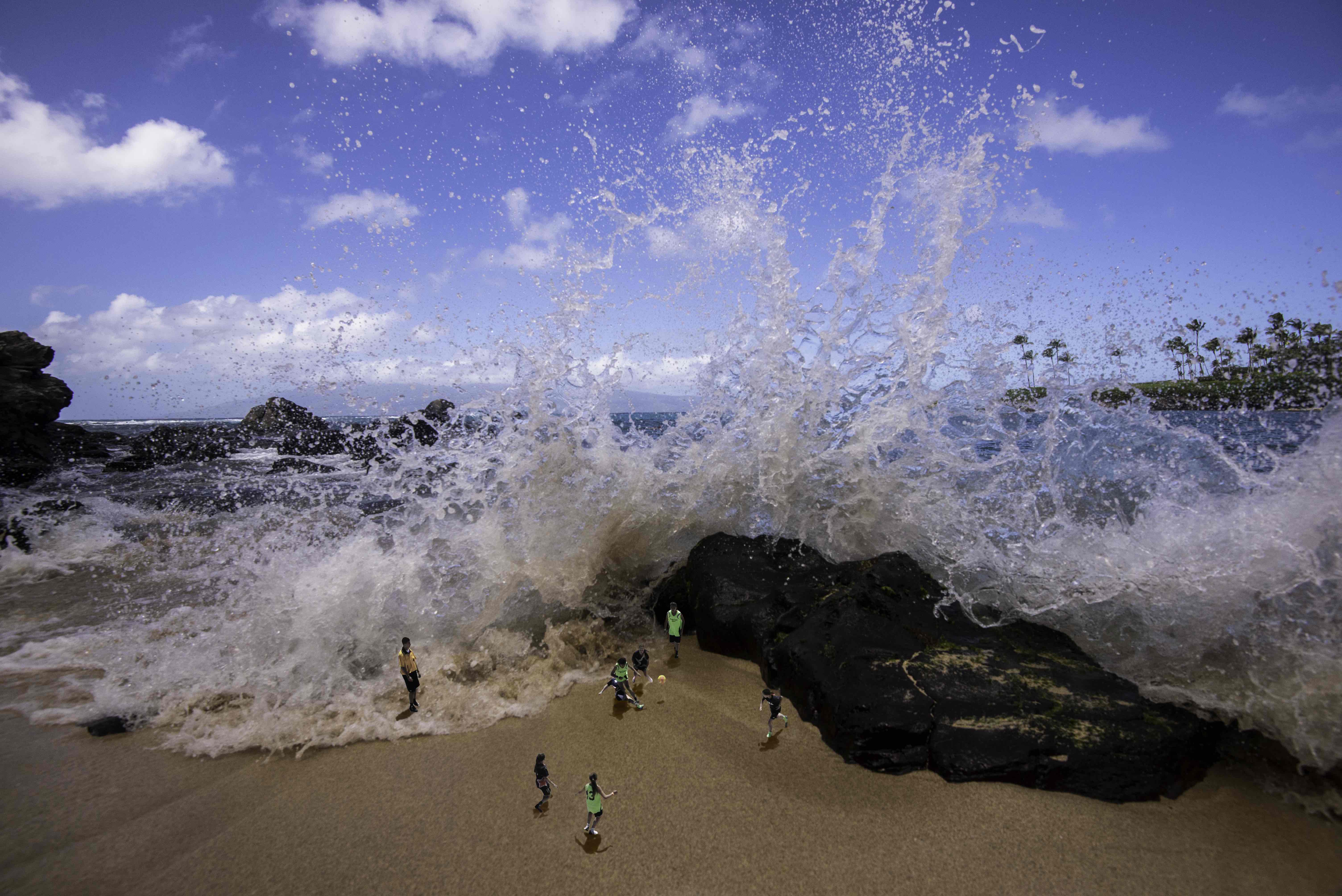
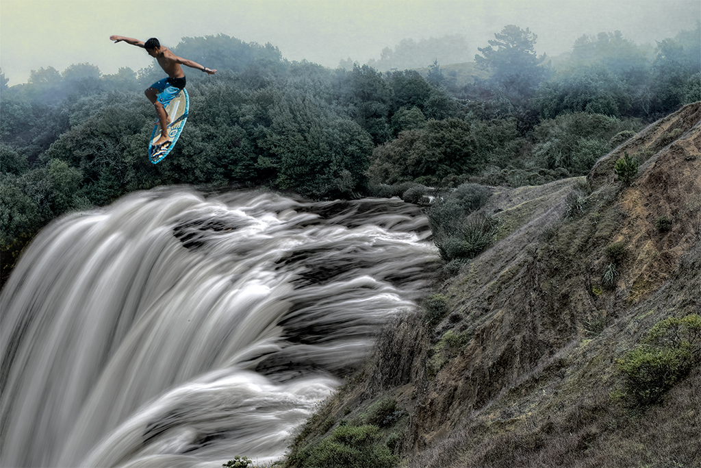
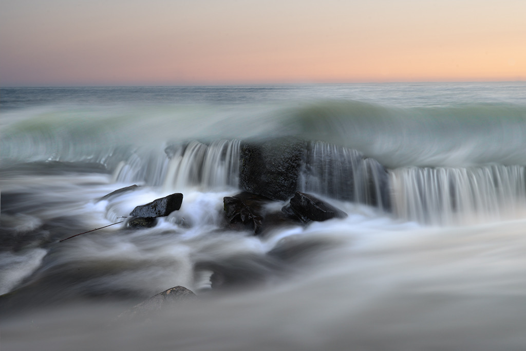
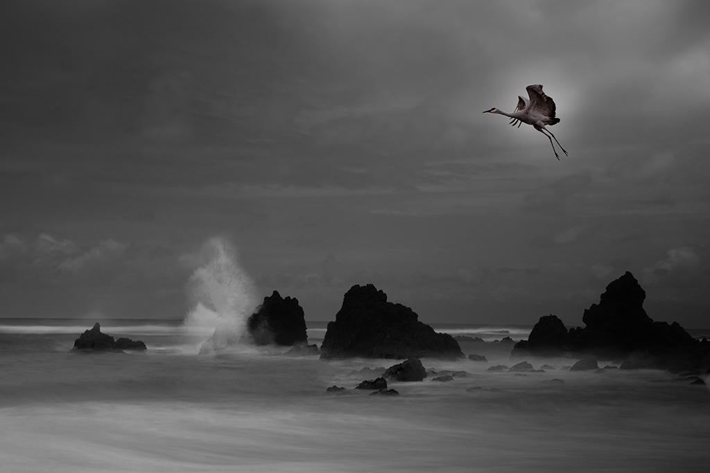
Alan, Thanks for your suggestions. I find waves very soothing and it is fun trying to capture that visually. I will likely look back on this period of my photoshop images and wonder why there were so many birds in my images. I do have a version with no bird and it is nice. I liked the idea of having the bird sell the splash more. |
Mar 14th |
| 54 |
Mar 21 |
Reply |
Aavo, Thanks for your input. Cropping always alters the overall proportions but I do agree with the heavy centered nature of the image as several have commented. |
Mar 14th |
| 54 |
Mar 21 |
Reply |
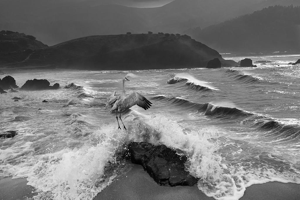
Peggy, As usual thanks for the deep thought you gave to my image. I have done two versions of the image, one with the bird and rock on the left as you suggest. I went with this one as it was my original and in the end looked a little better. Every change we make has repercussions in the overall balance. Although I liked the balance of the rock and bird, it had challenges with the waves. I do like the balance in your image extending the right side of the image. I will see if i can do that in some way that looks natural. |
Mar 14th |
| 54 |
Mar 21 |
Comment |
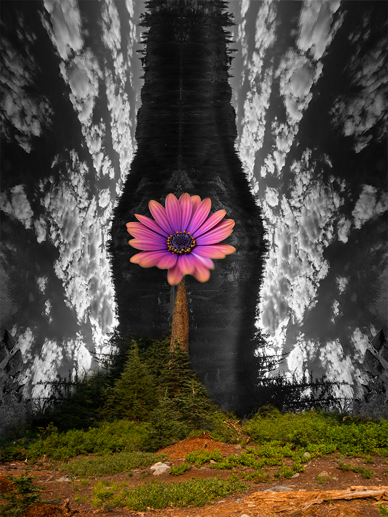
Marilyn, This is a very cute and playful image. I personally like the anthropomorphic qualities of the orchid and would think the image would be more dramatic if you kept the "arms" and "hat" in the final image, although it would take this from being a cute image to possibly more on the surreal end of the spectrum. Something about the orchid reminds me of the Wizard of Oz and I would be drawn to fully developing the scarecrow like feel. |
Mar 6th |
| 54 |
Mar 21 |
Comment |
Alan, I like this image very much. It has a nice balance of shapes and sizes of the subjects. I wonder if a slightly less transparent handling of the cauldron and possibly the bottom skull figures might add a nice contrasting theme and focal point for the eye. |
Mar 6th |
| 54 |
Mar 21 |
Comment |
Neil, I have fond memories of going to the Fringe festival in the days when traveling was a thing. This is a wonderful image that is perfectly executed . I think it is a success with or without the ear. |
Mar 6th |
| 54 |
Mar 21 |
Comment |
Kathy, Masterfully done. I could see a future business in this. You should show this at a quilter's convention. You will have people lining up to have you do this with them. |
Mar 5th |
| 54 |
Mar 21 |
Comment |
Aavo, I am enjoying your image this month as well. I have nothing more to add to the excellent suggestions you've already received. |
Mar 5th |
| 54 |
Mar 21 |
Comment |
Peggy, I also am enjoying your images this month. I agree the second image feels more 3D and has more impact on initial viewing, yet, as soon as I went back to the original I realized it is an equally compelling image and I really like the rich colors. Fortunately this is not a Sophie's choice dilemma as you can enjoy both. |
Mar 5th |
| 54 |
Mar 21 |
Reply |
Marilyn, I appreciate your attention to this detail. I will give the crop a try. |
Mar 4th |
| 54 |
Mar 21 |
Reply |
Kathy, Thanks for taking the time to do your magic with my image. I like your results. |
Mar 4th |
| 54 |
Mar 21 |
Reply |
Thanks Neil, I've actually stitched 4 wave images together. |
Mar 4th |
6 comments - 6 replies for Group 54
|
11 comments - 10 replies Total
|