|
| Group |
Round |
C/R |
Comment |
Date |
Image |
| 41 |
Feb 21 |
Reply |
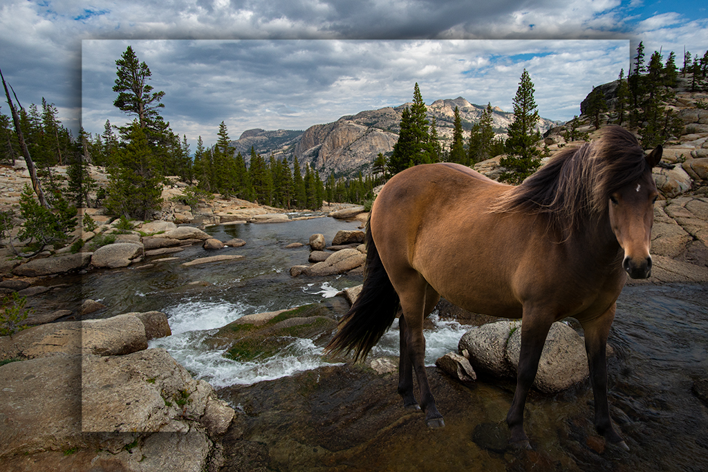
Jan, I agree that one area of the image was hard to know how to blend realistically. I'll give it another try. |
Feb 22nd |
| 41 |
Feb 21 |
Reply |
Henry, Thank you for your suggestions. The little details are where we tweak our images, thanks. |
Feb 22nd |
| 41 |
Feb 21 |
Reply |
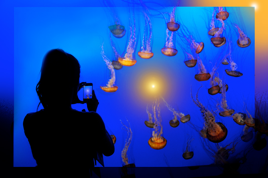
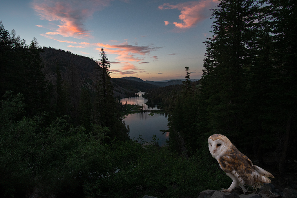
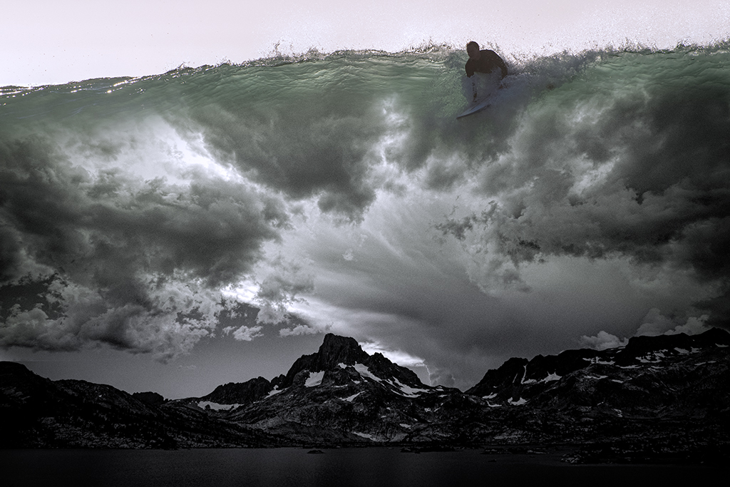
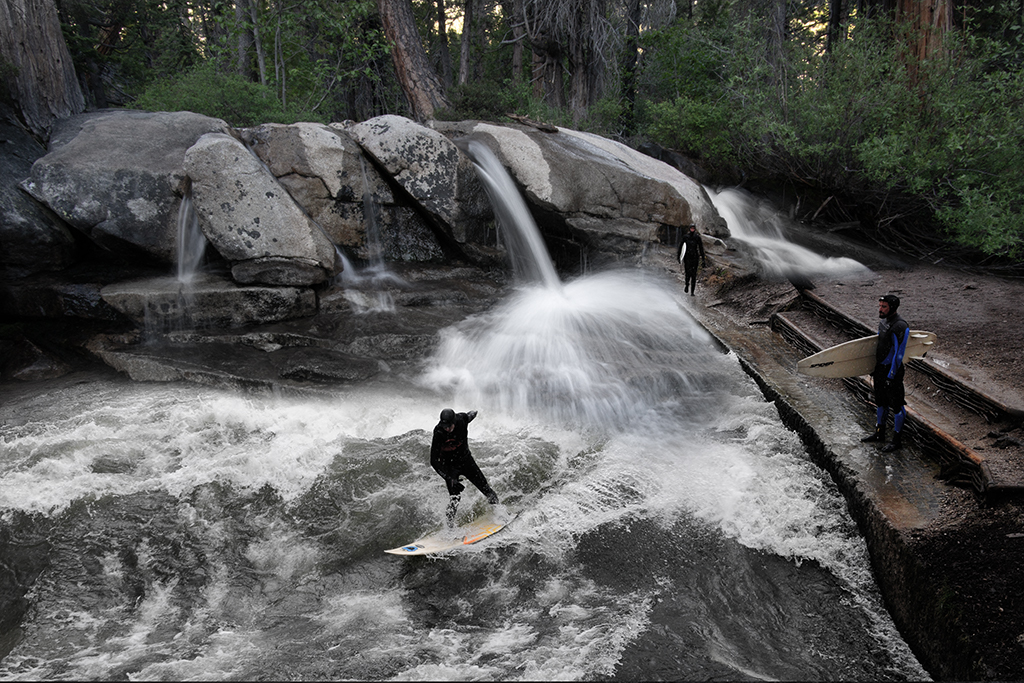
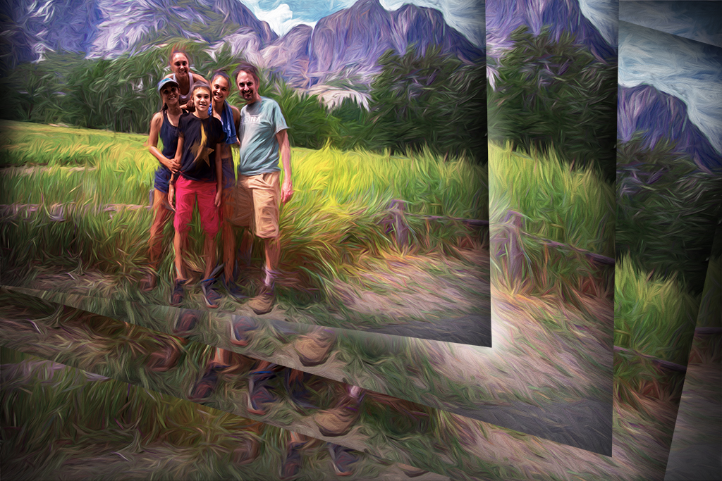
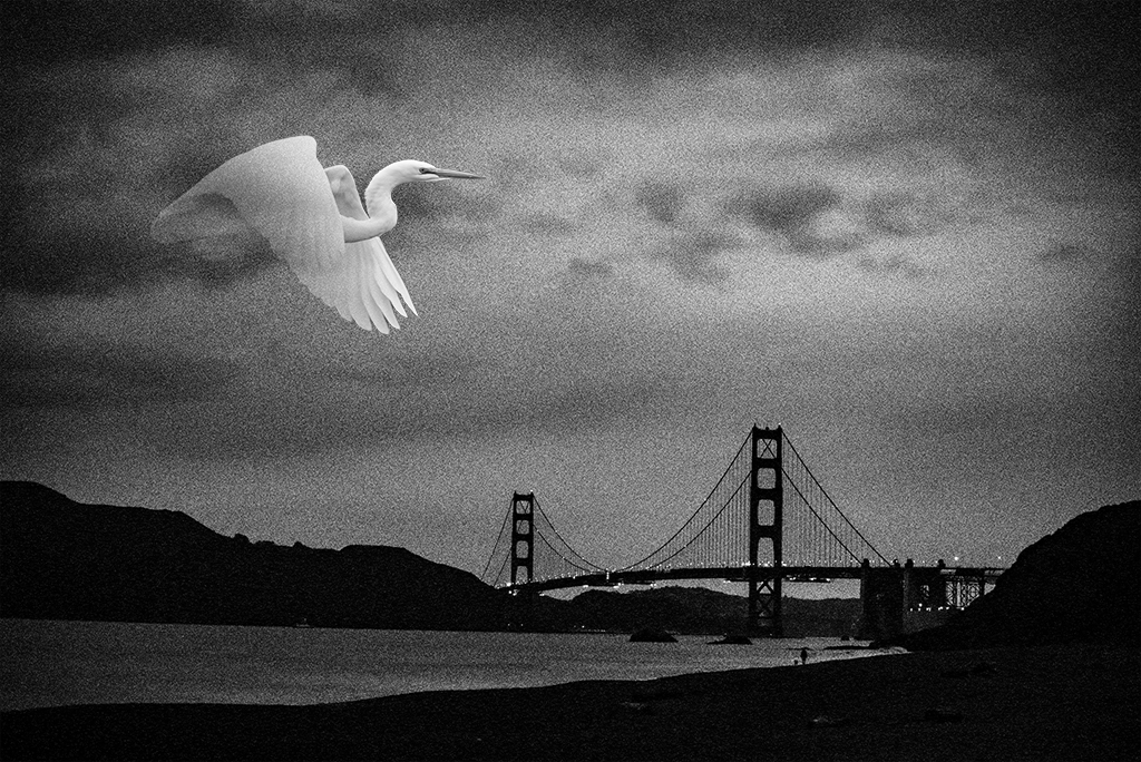
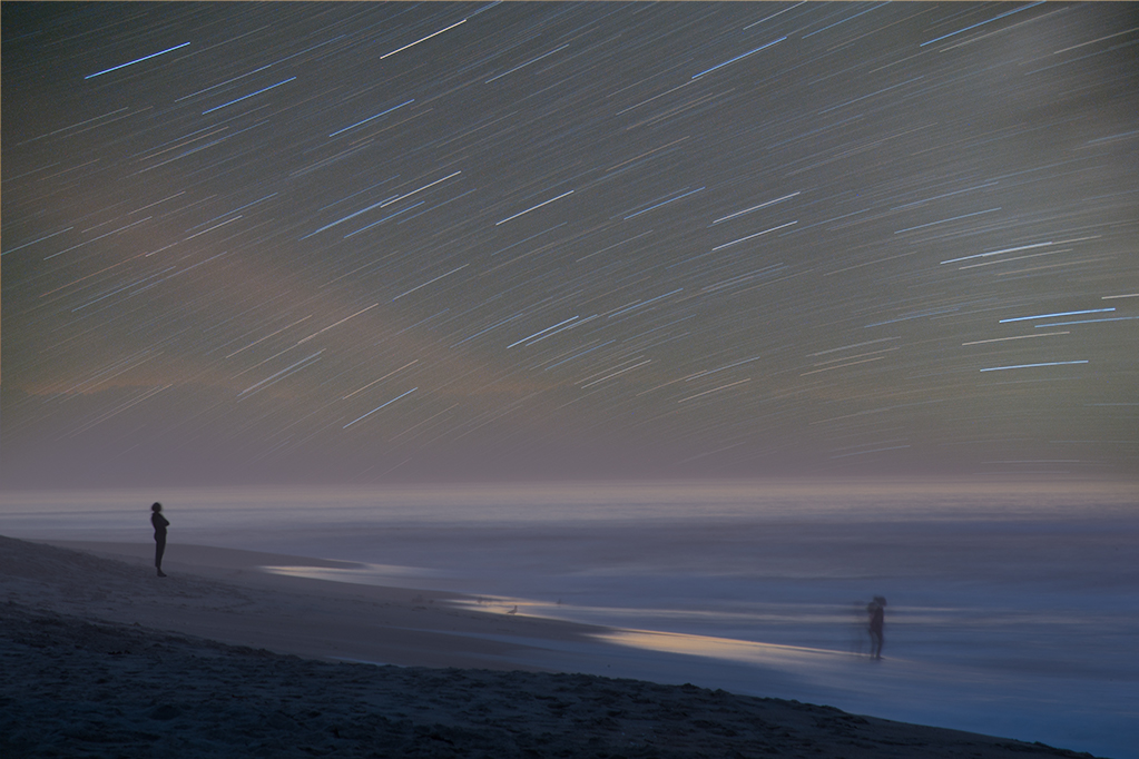
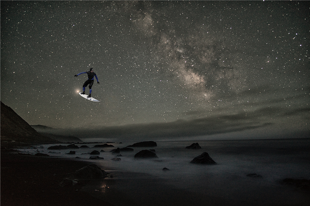
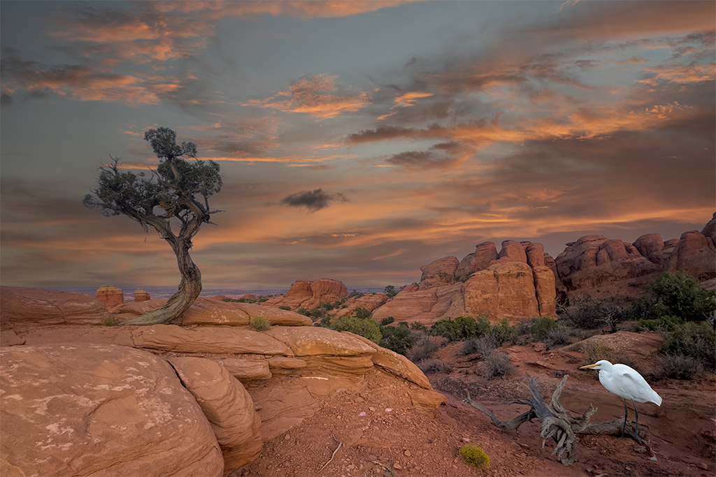
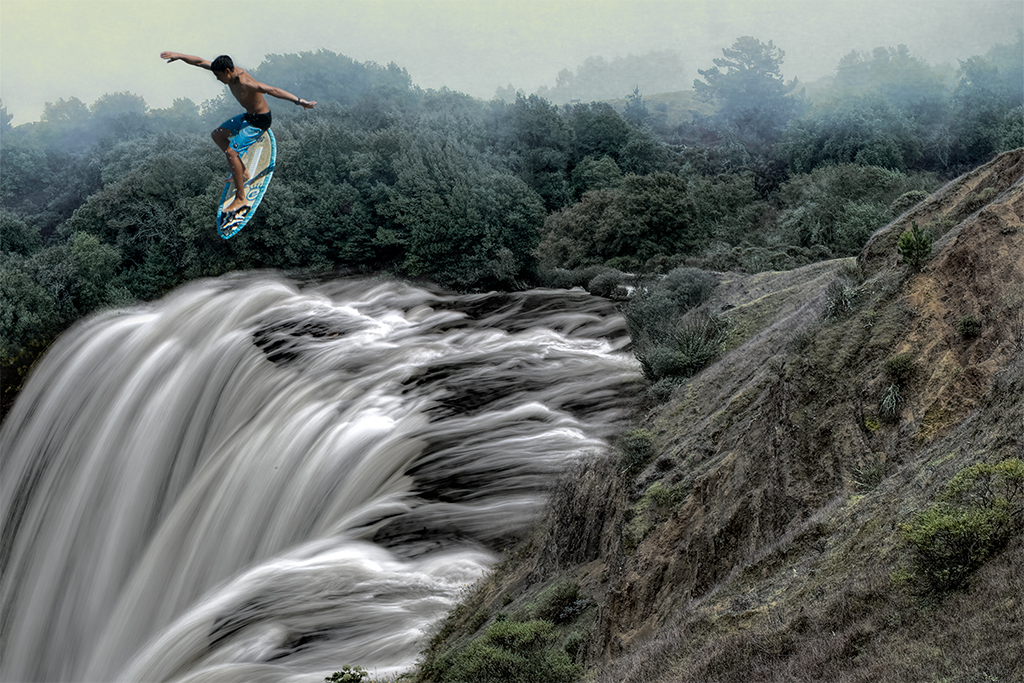
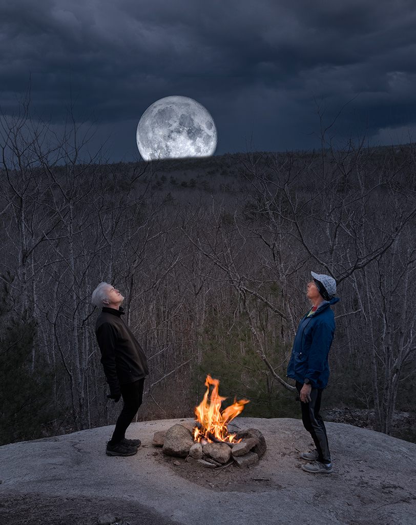
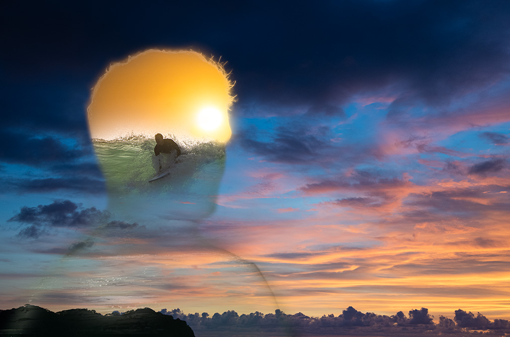
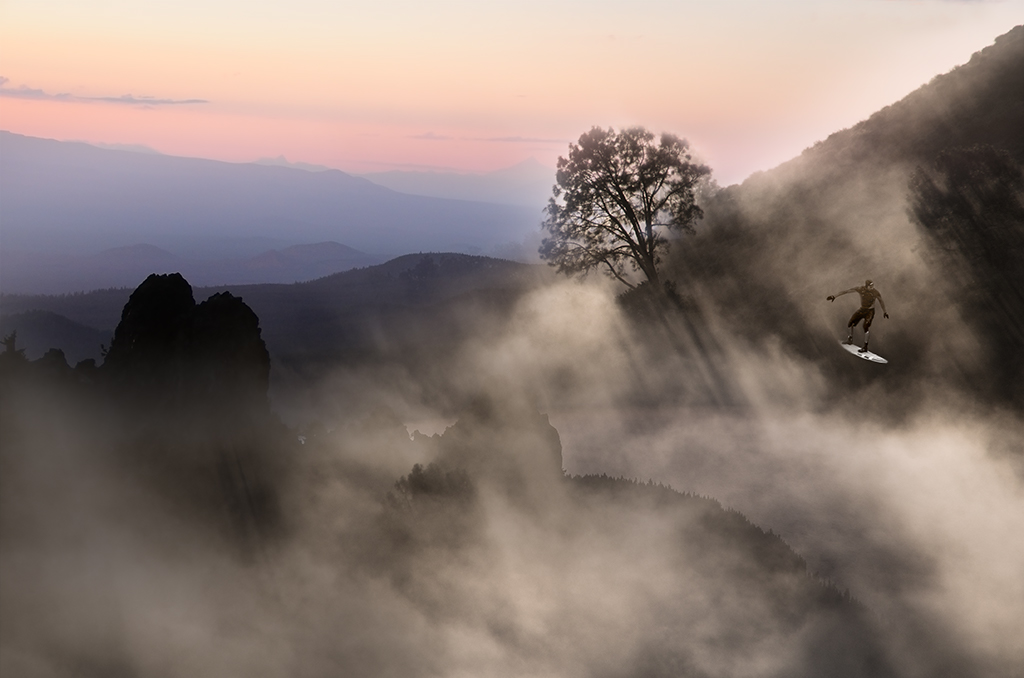
Kathy, Thanks. I recall being surprised there was snow in Munich in the spring but more surprised by the surfers |
Feb 22nd |
| 41 |
Feb 21 |
Reply |
Lisa, Thanks for the excellent suggestion. |
Feb 22nd |
| 41 |
Feb 21 |
Comment |
Jan, I love this image. Your color choice and composition are very pleasing. I have no suggestions this month |
Feb 22nd |
| 41 |
Feb 21 |
Comment |
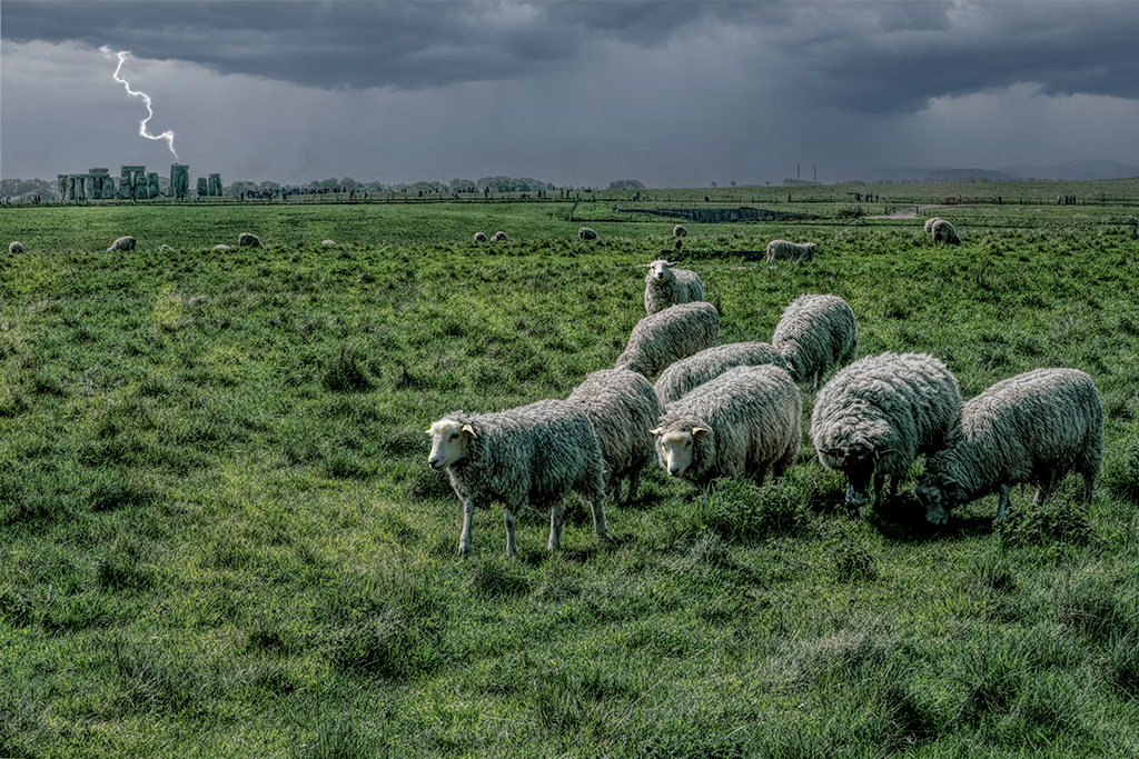
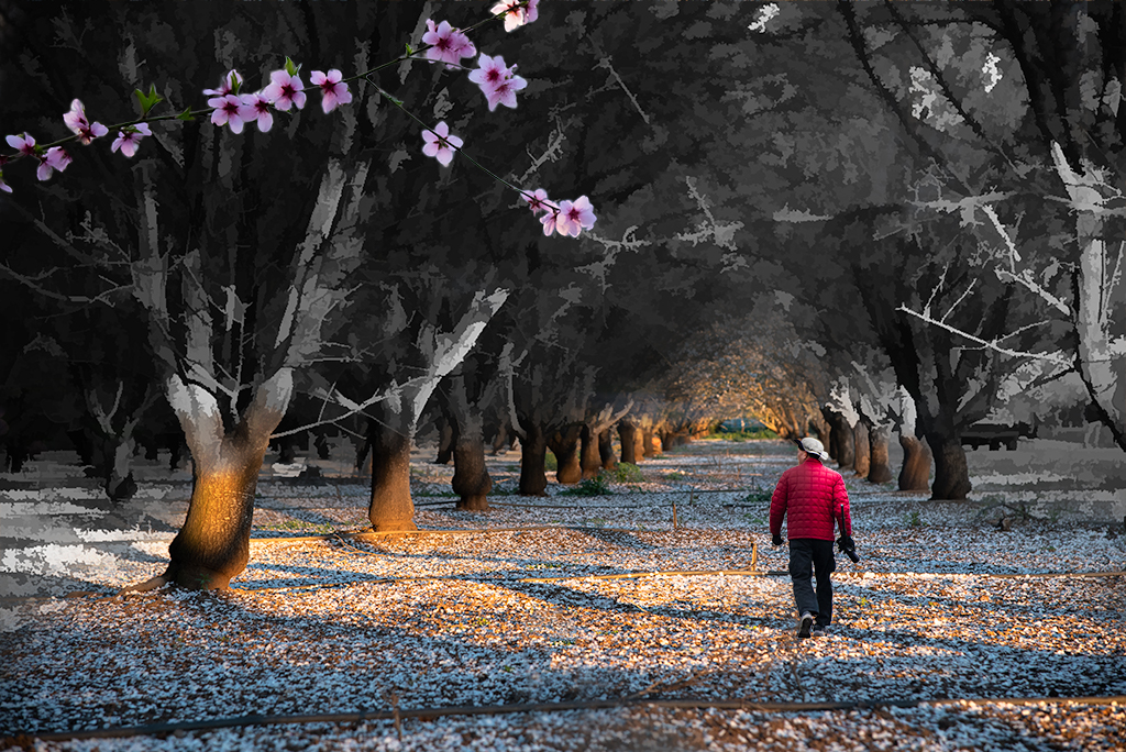
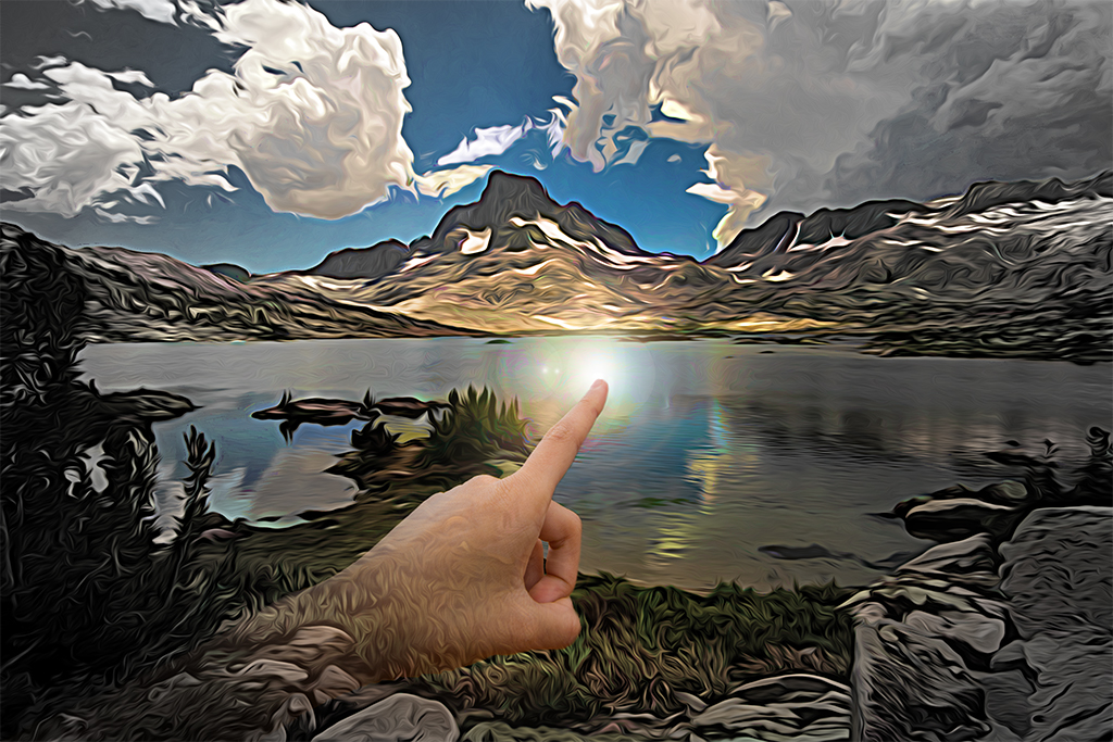
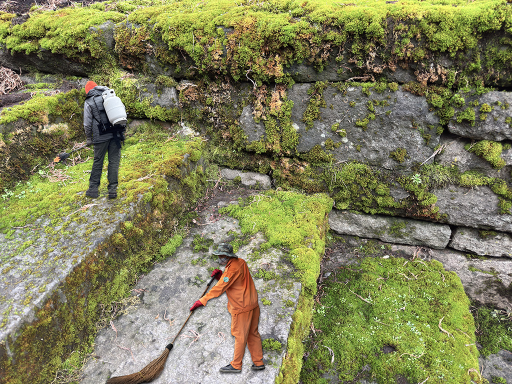
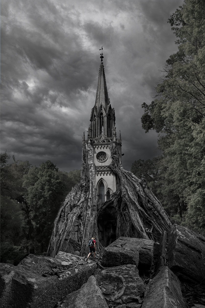
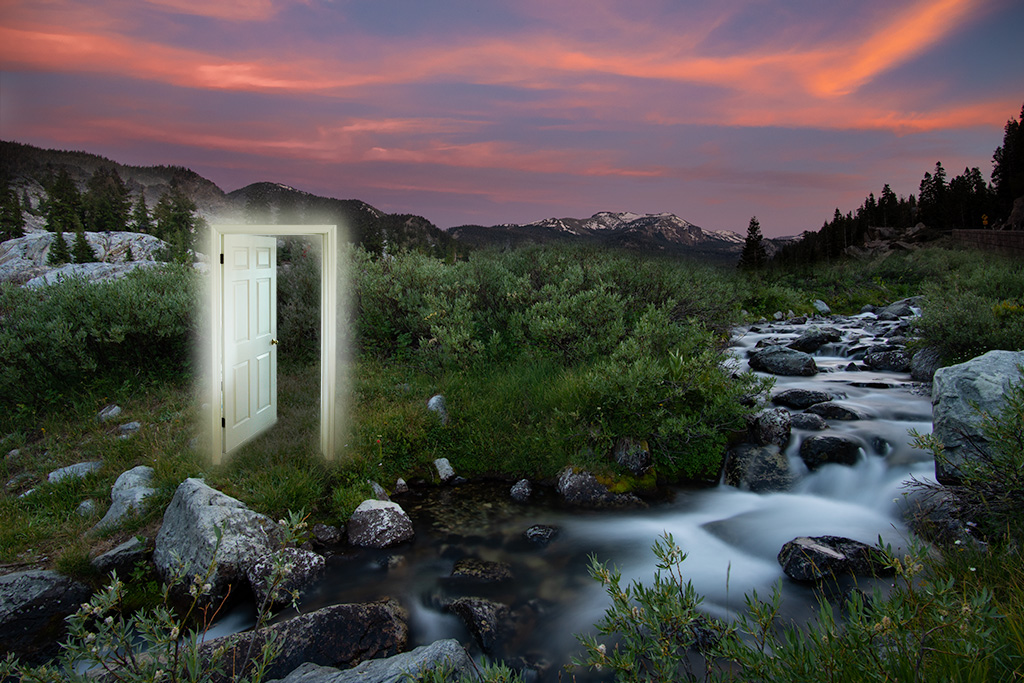
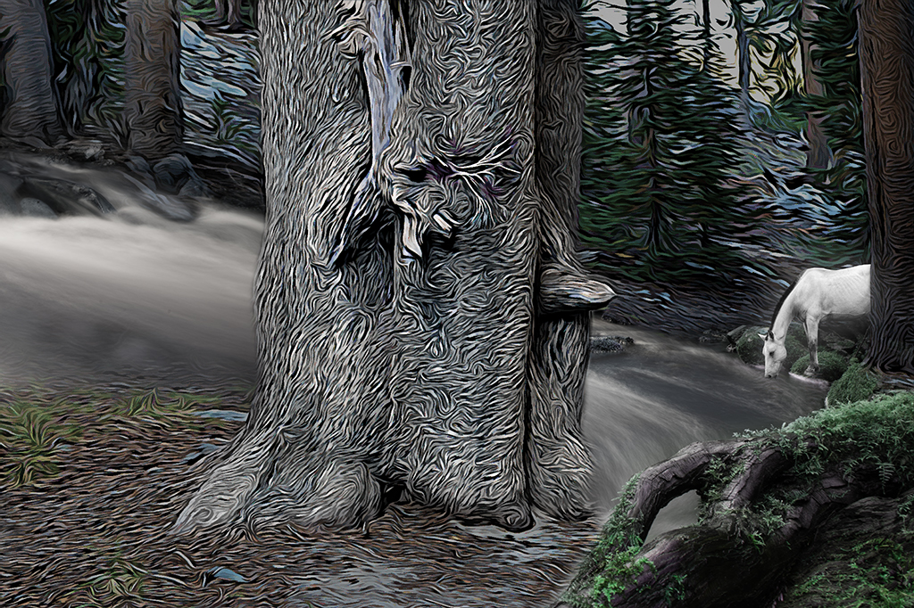
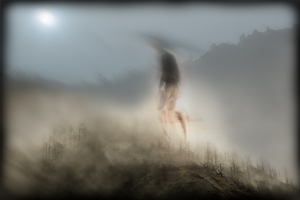
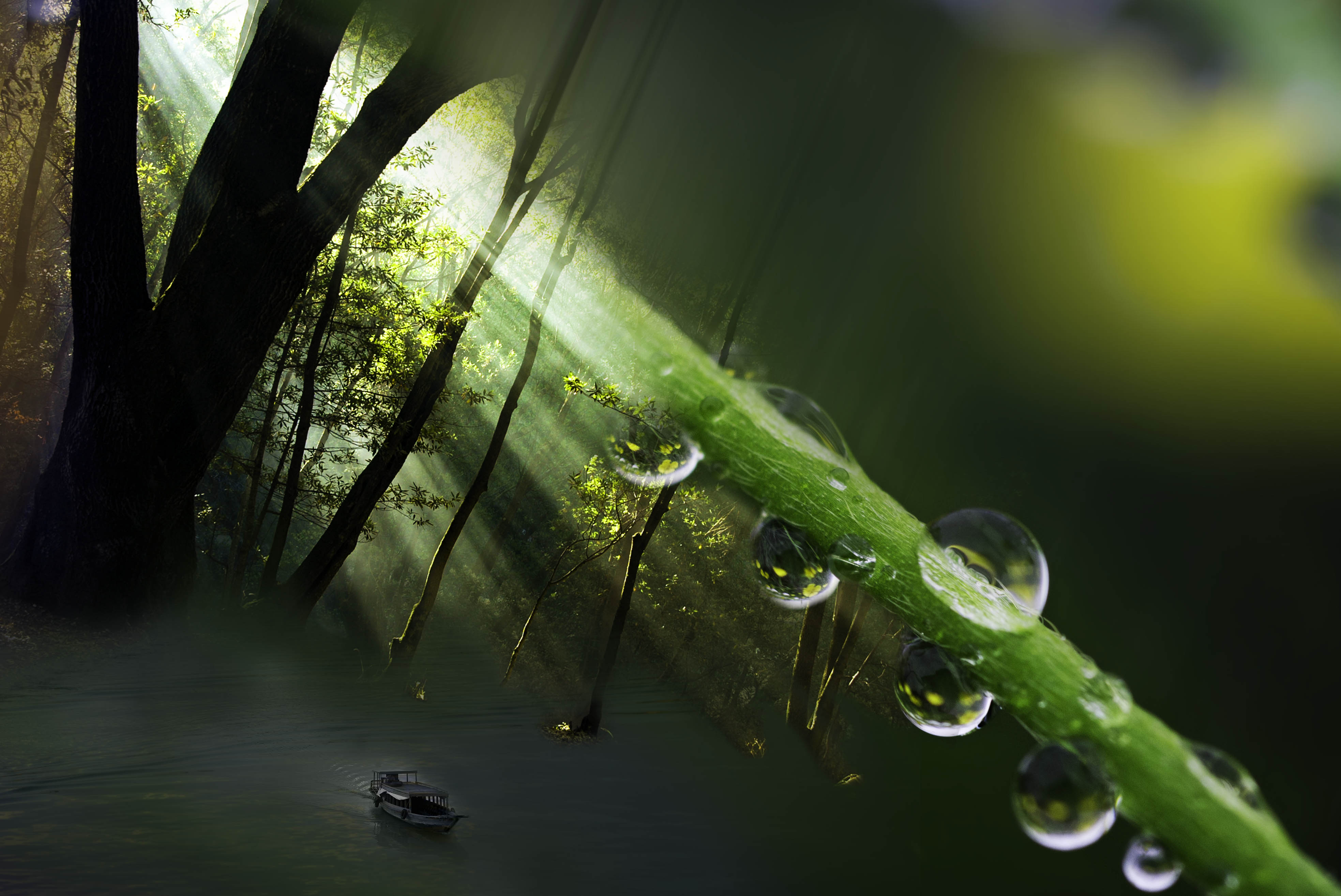
Lisa, I am intrigued by this in camera stacking. I do not believe my camera has that functionality. Your choice of subject matter works on a couple levels. The static building enhances the movement of the clouds and the choice of a church adds a bit of a mystical dimension. |
Feb 8th |
| 41 |
Feb 21 |
Comment |
Maryellen, This is a beautifully rendered image. This would make a nice framed image or I could see people buying card sized versions of this image. I have nothing to add this time. |
Feb 7th |
| 41 |
Feb 21 |
Comment |
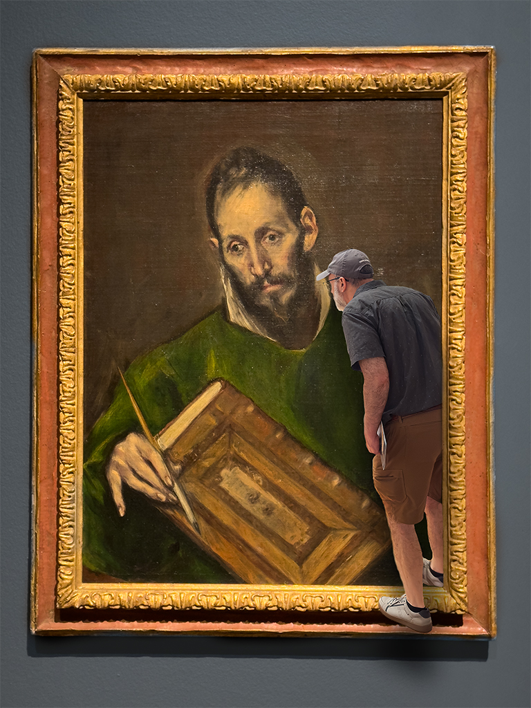
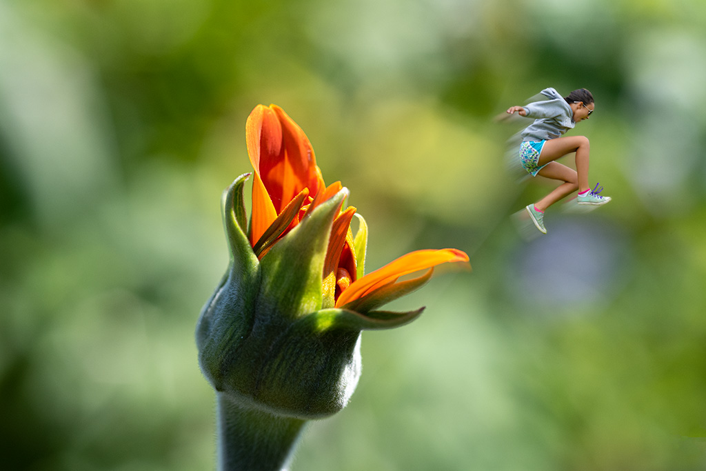
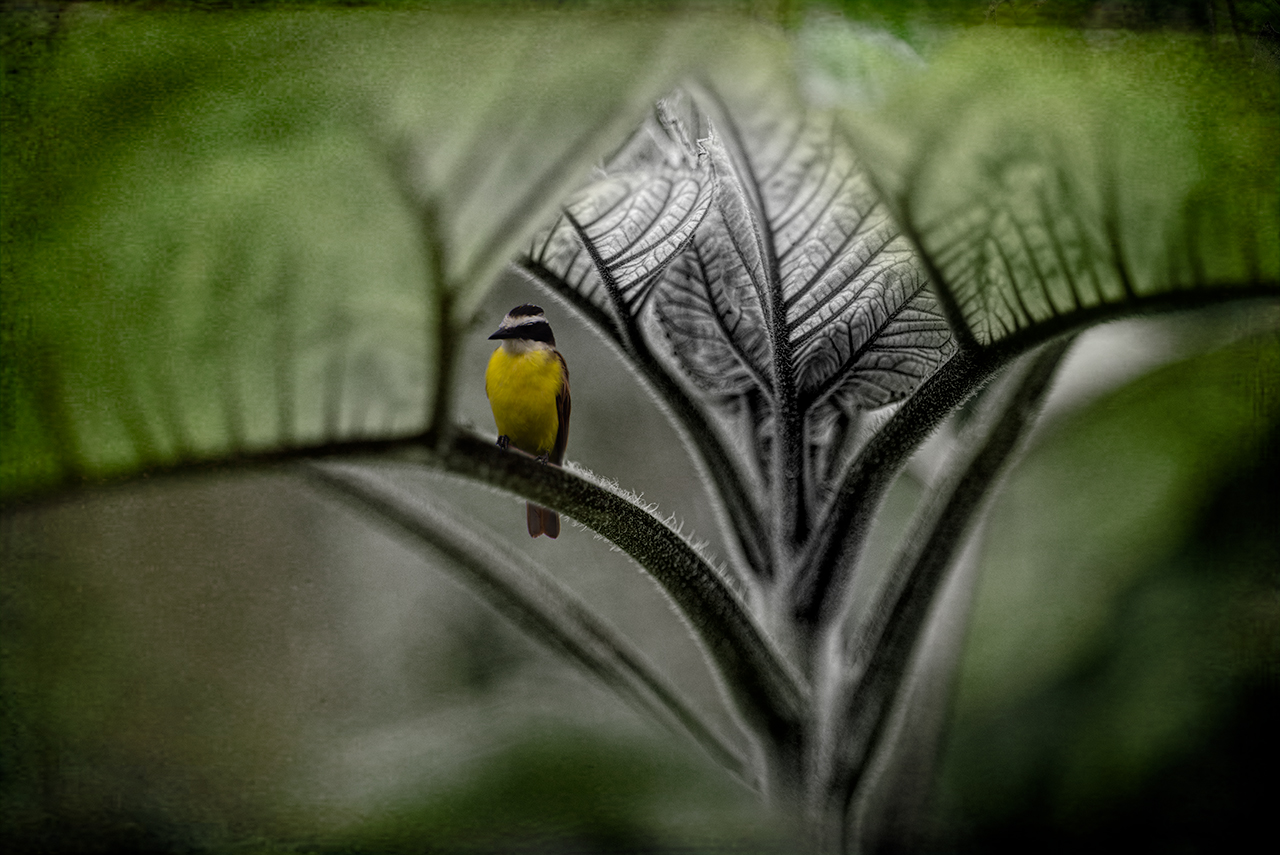
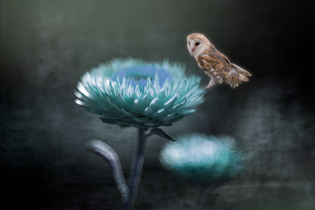
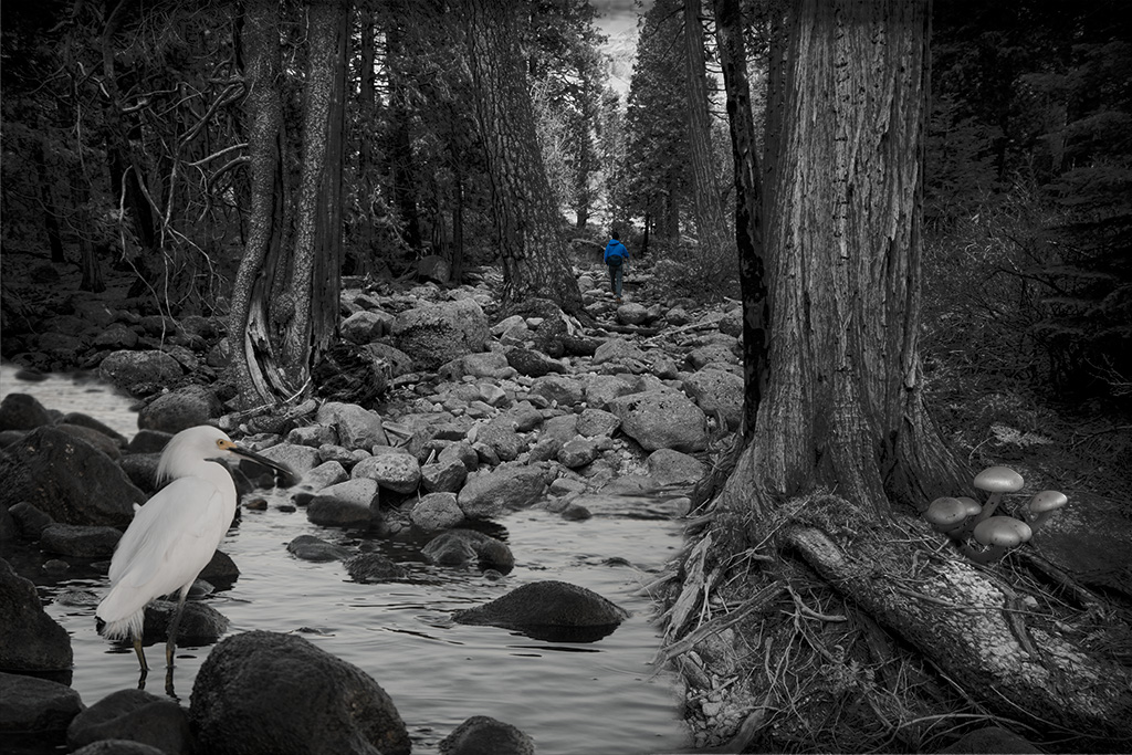
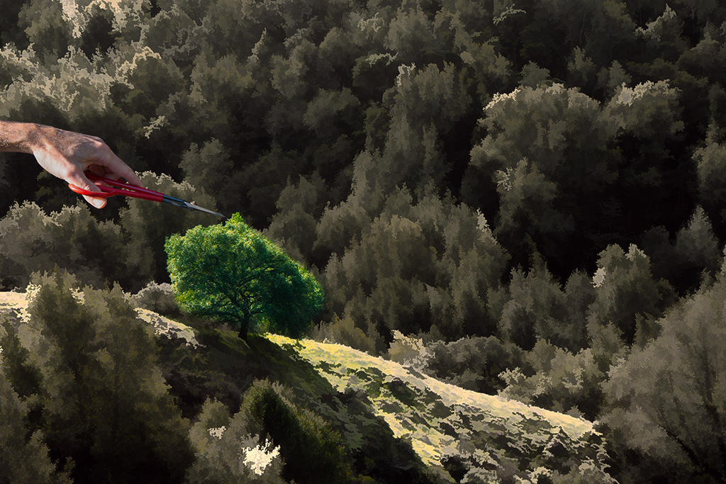
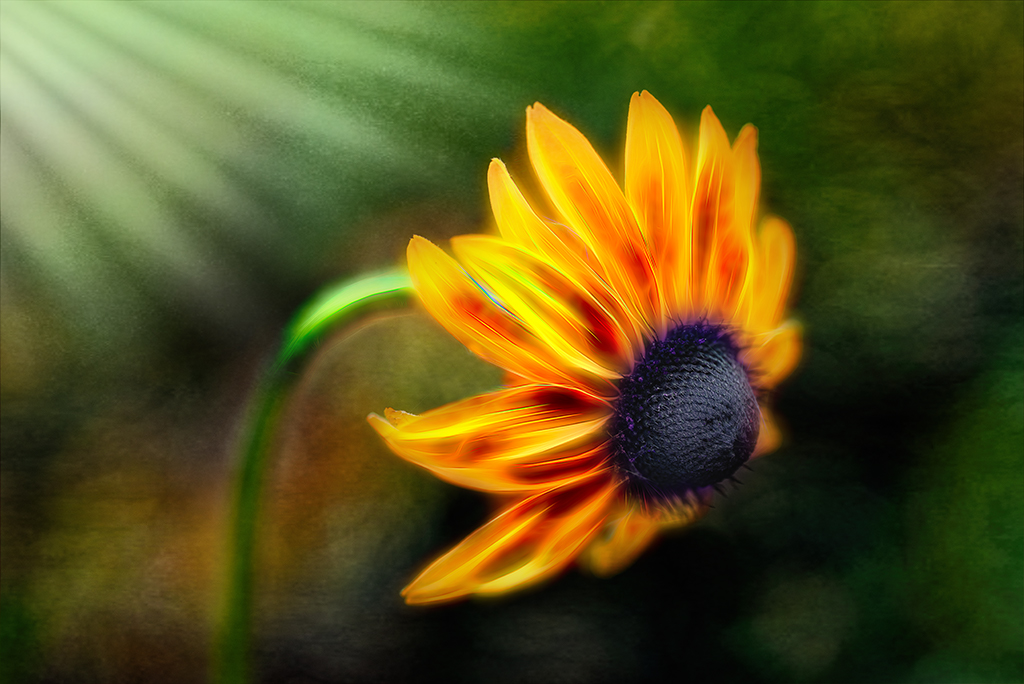
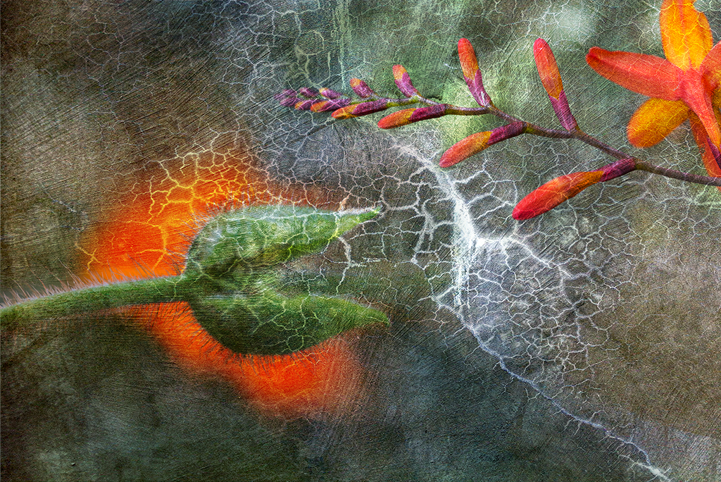
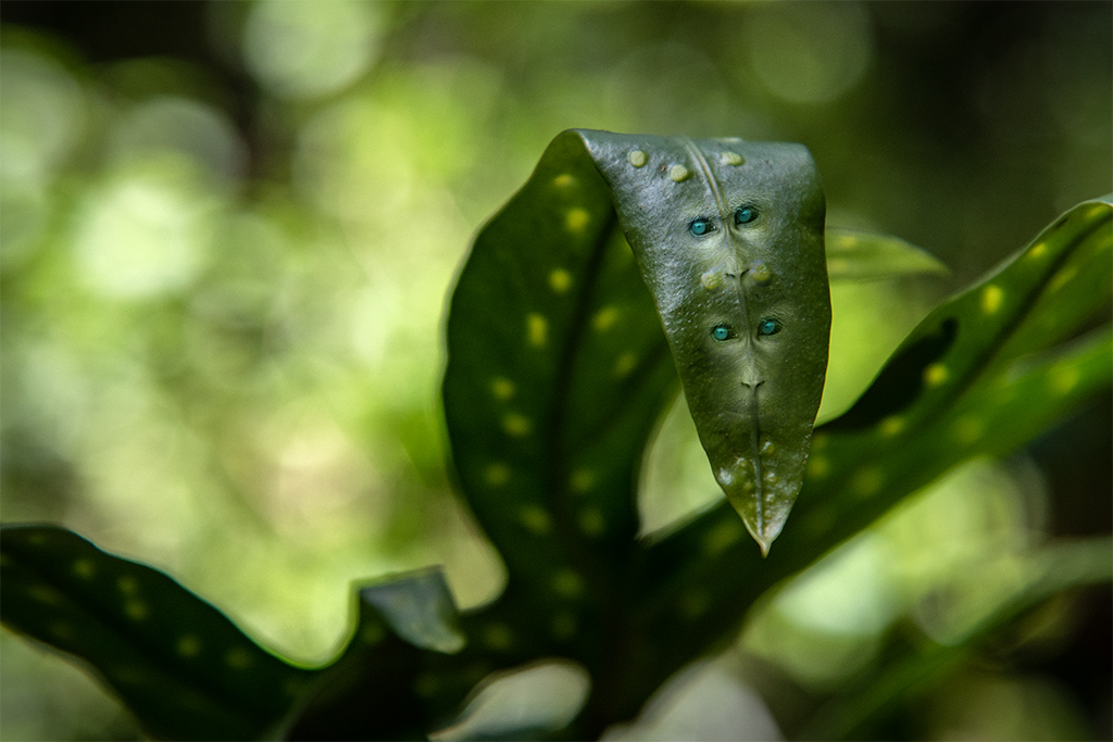
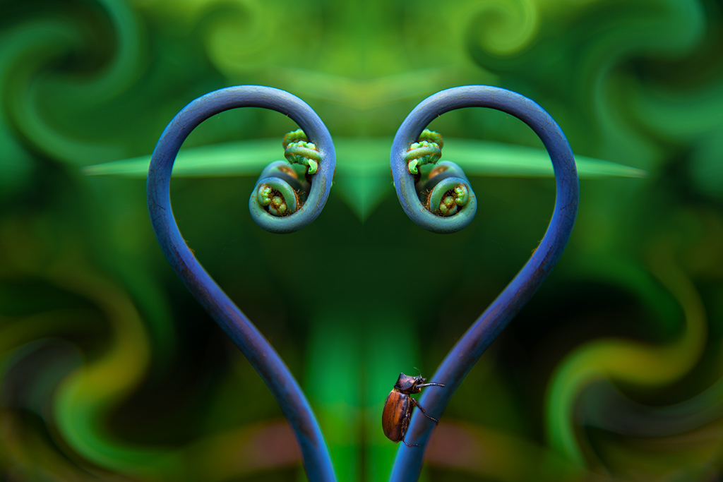
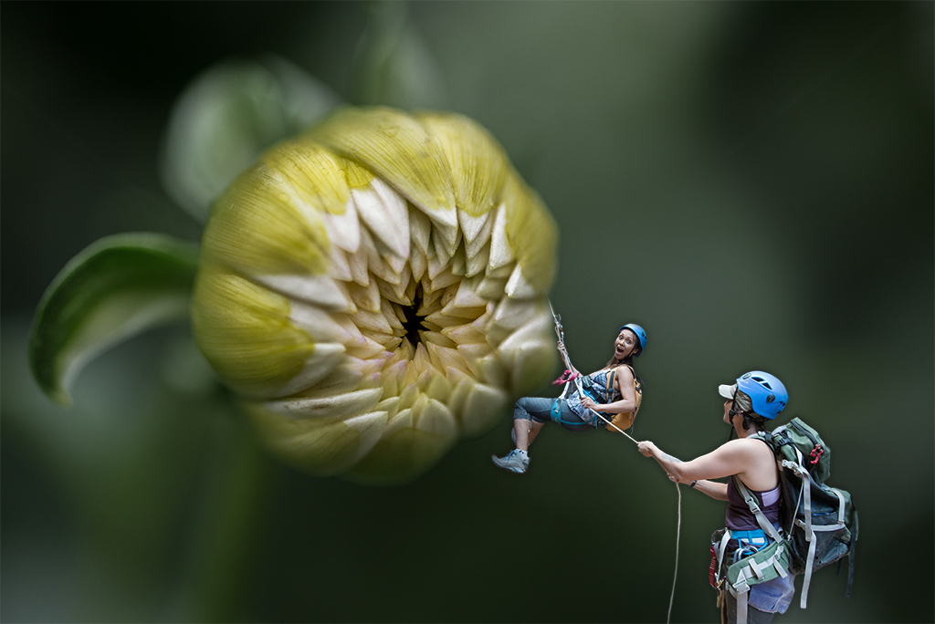
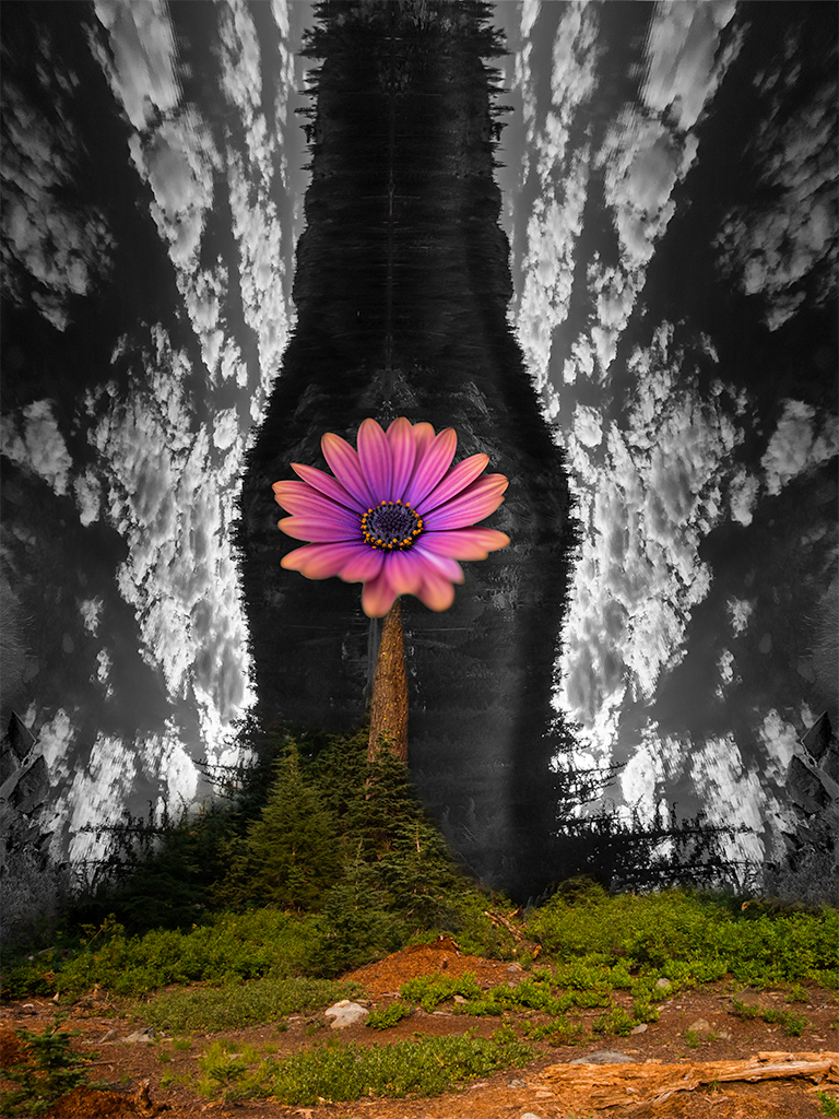
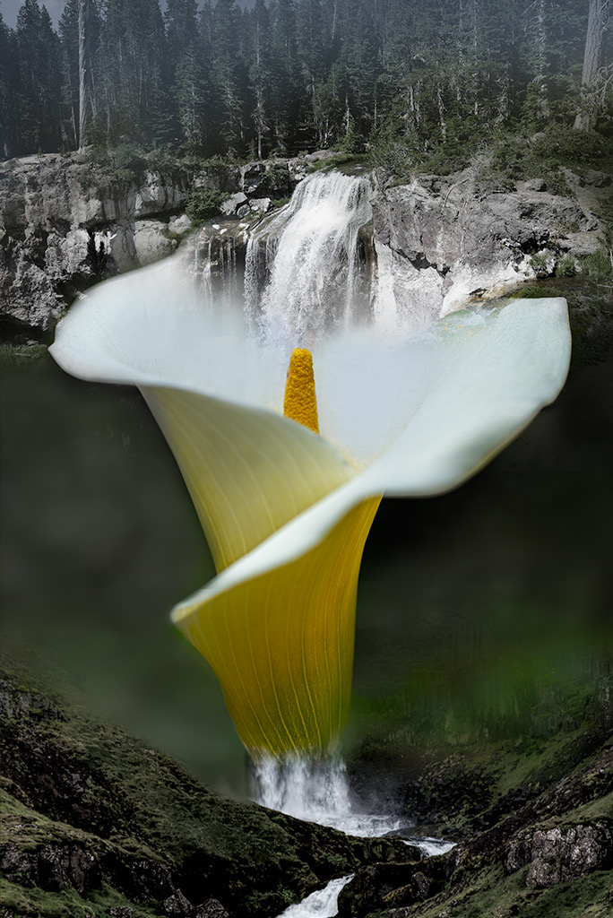
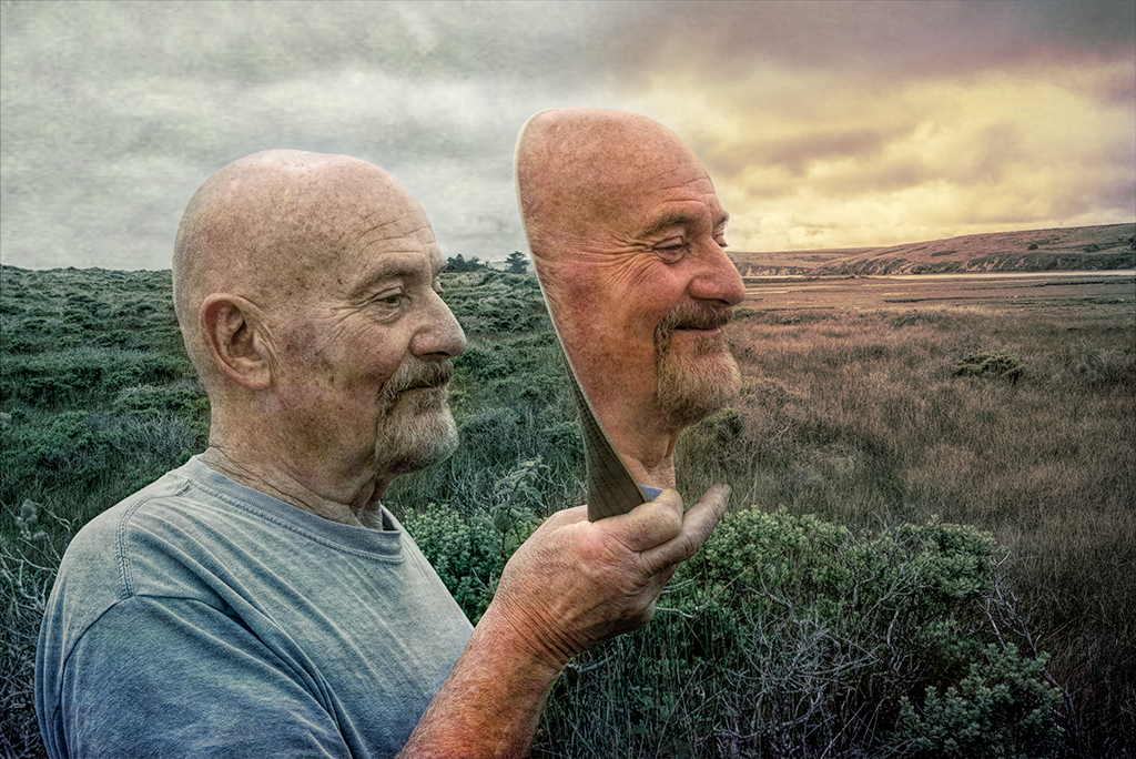
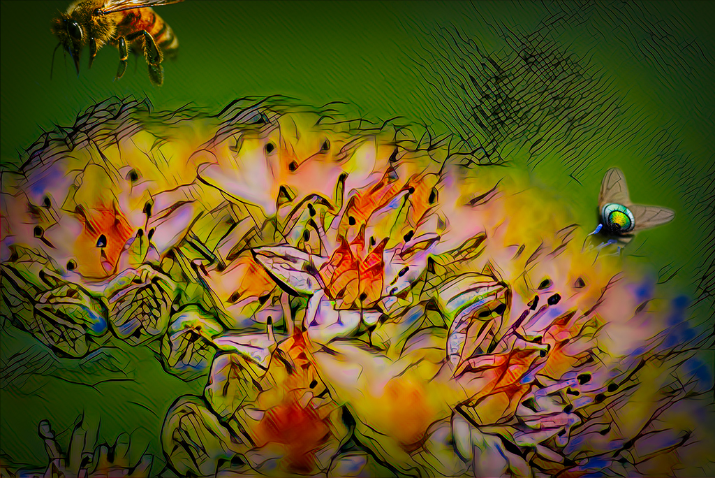
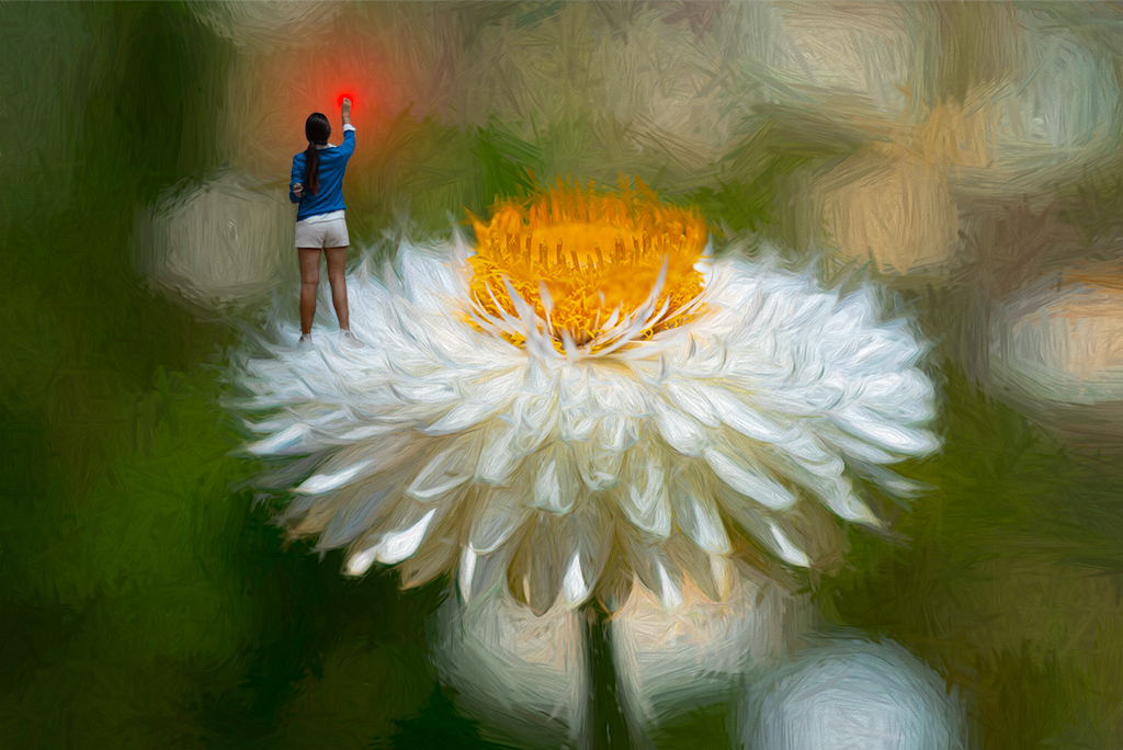
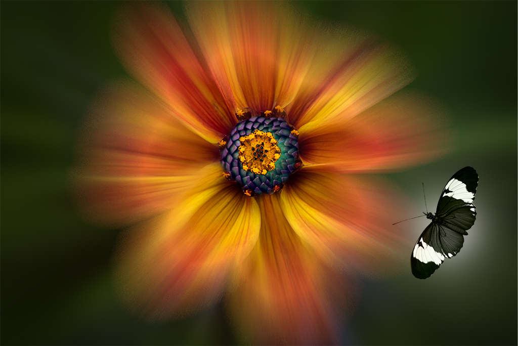
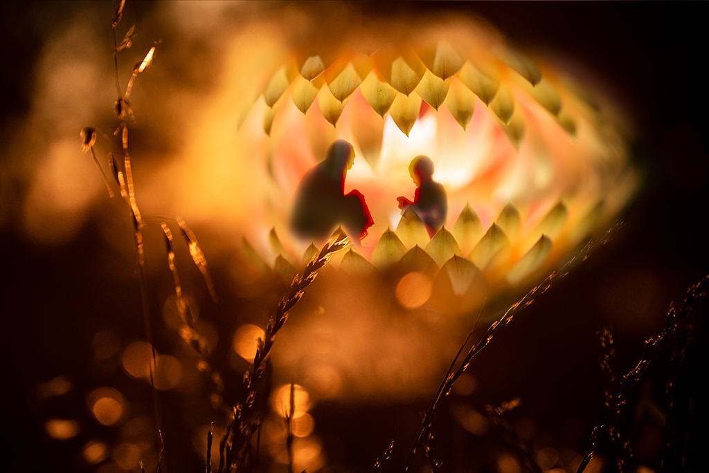
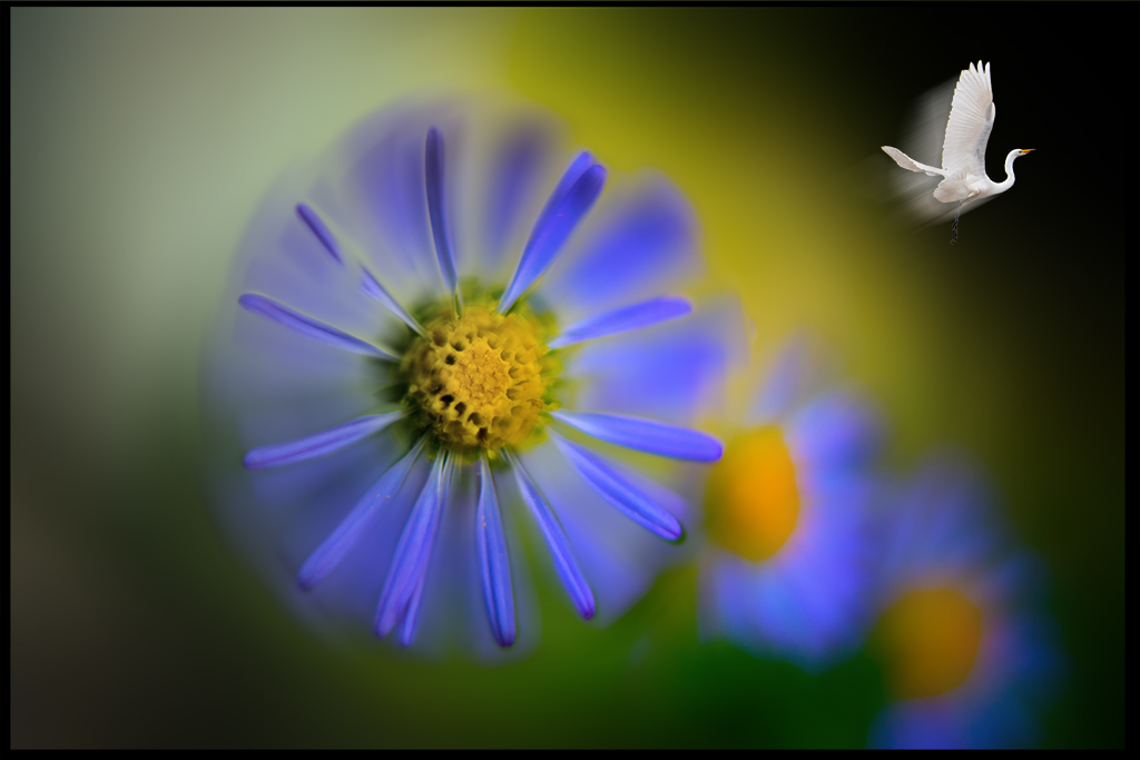
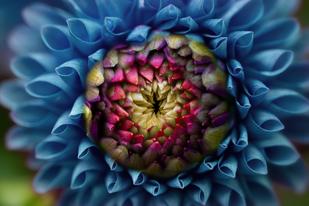
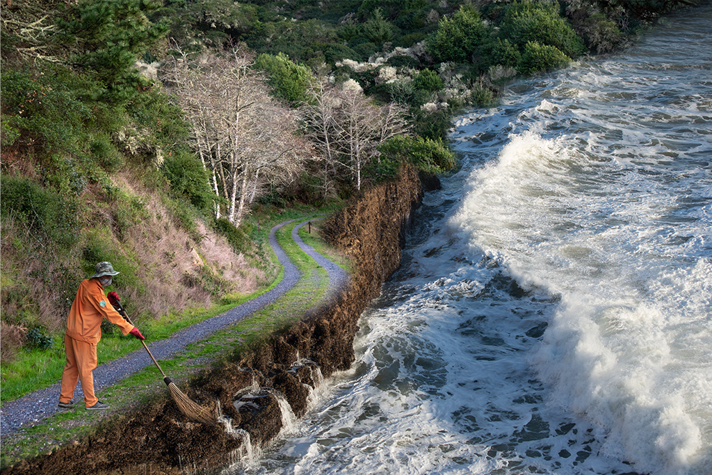
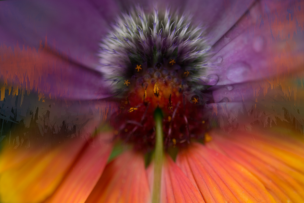
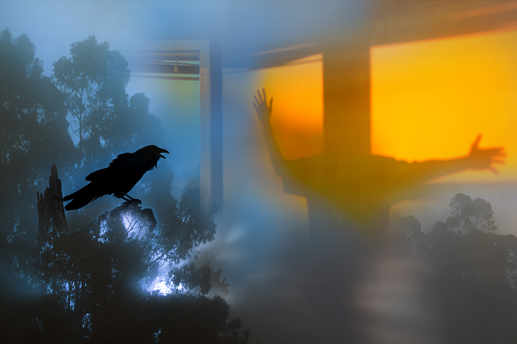
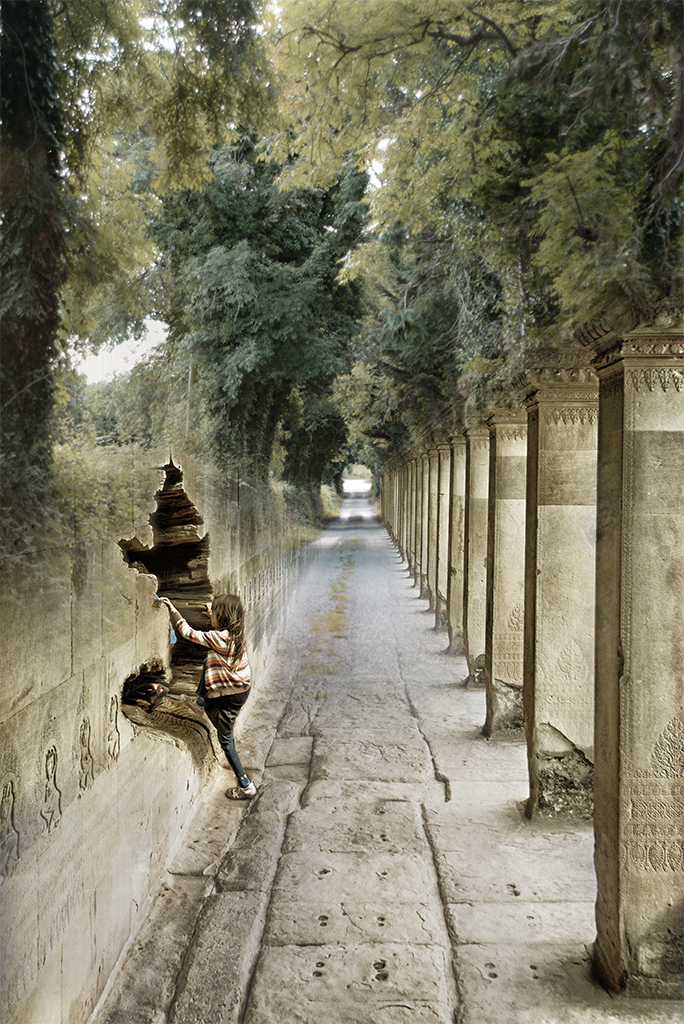
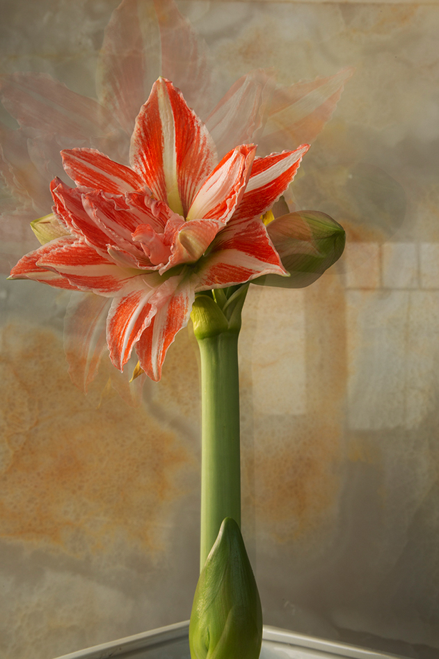
Henry, This is another wonderful exploration. I personally love the original image as it has a beautiful balance between the flower, the magical iterative reflections and the atmospheric window. I hope you don't mind me playing a little with your image as it inspired me. I cropped it slightly and added a little selective brightness/contrast and vibrance. As to your submitted version it is visually very strong. I like the commanding strength of the widened and angular stem and the strong vibrating petals. |
Feb 7th |
 |
| 41 |
Feb 21 |
Comment |
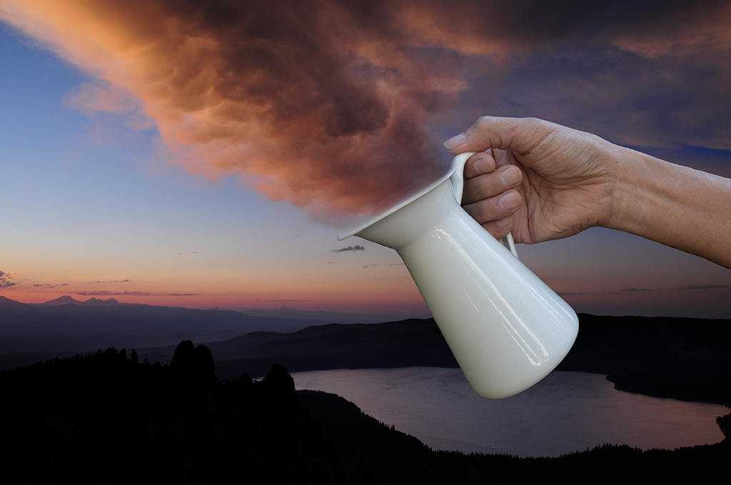
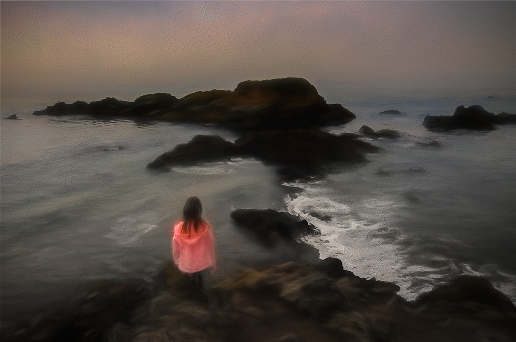
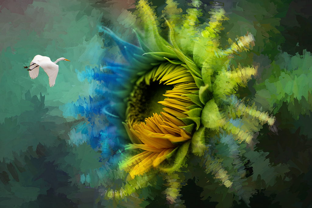
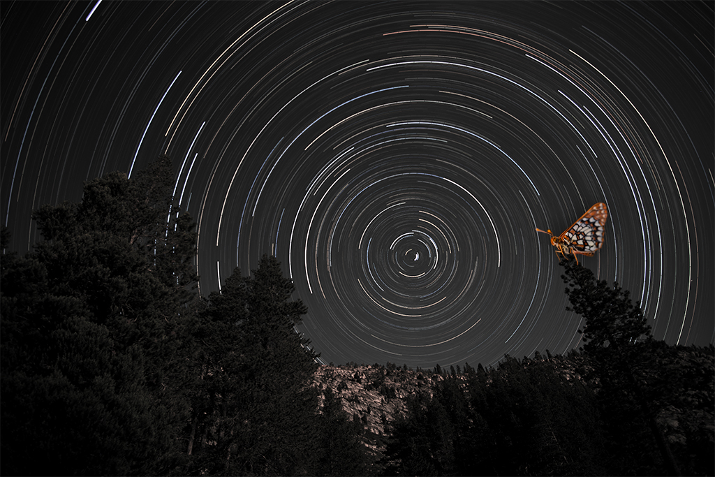
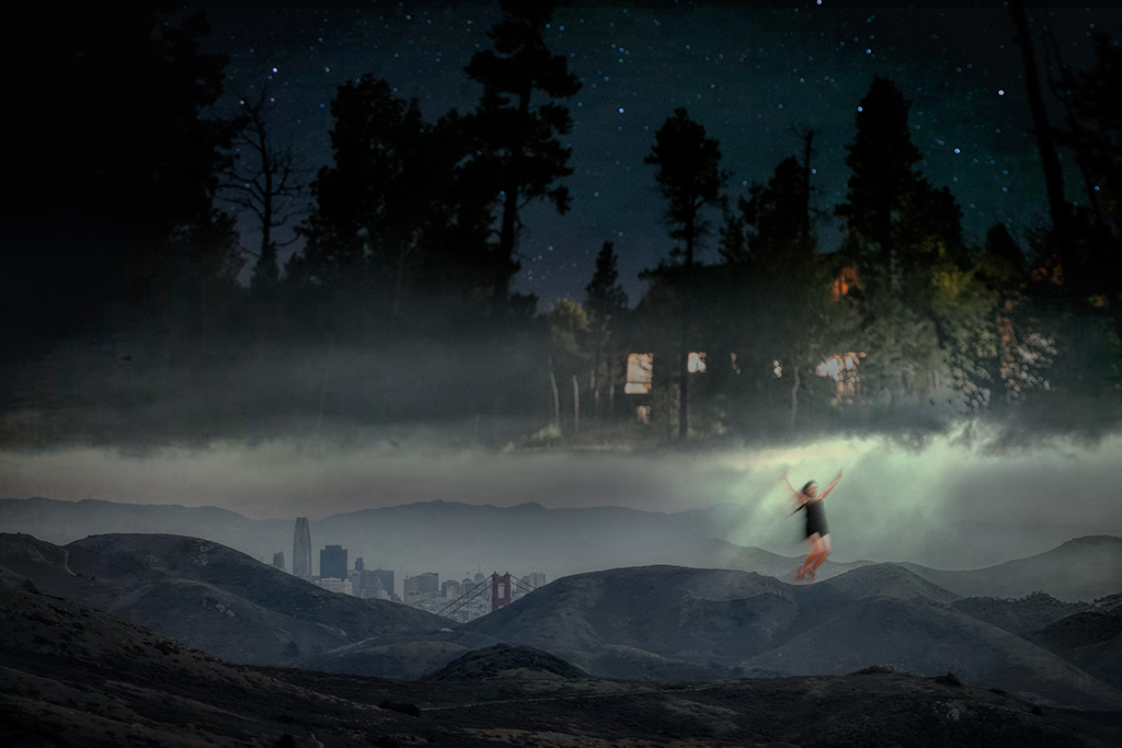
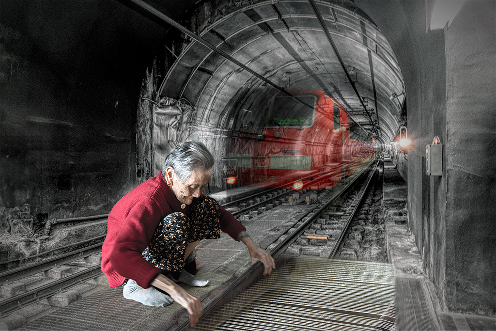
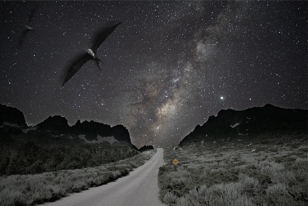
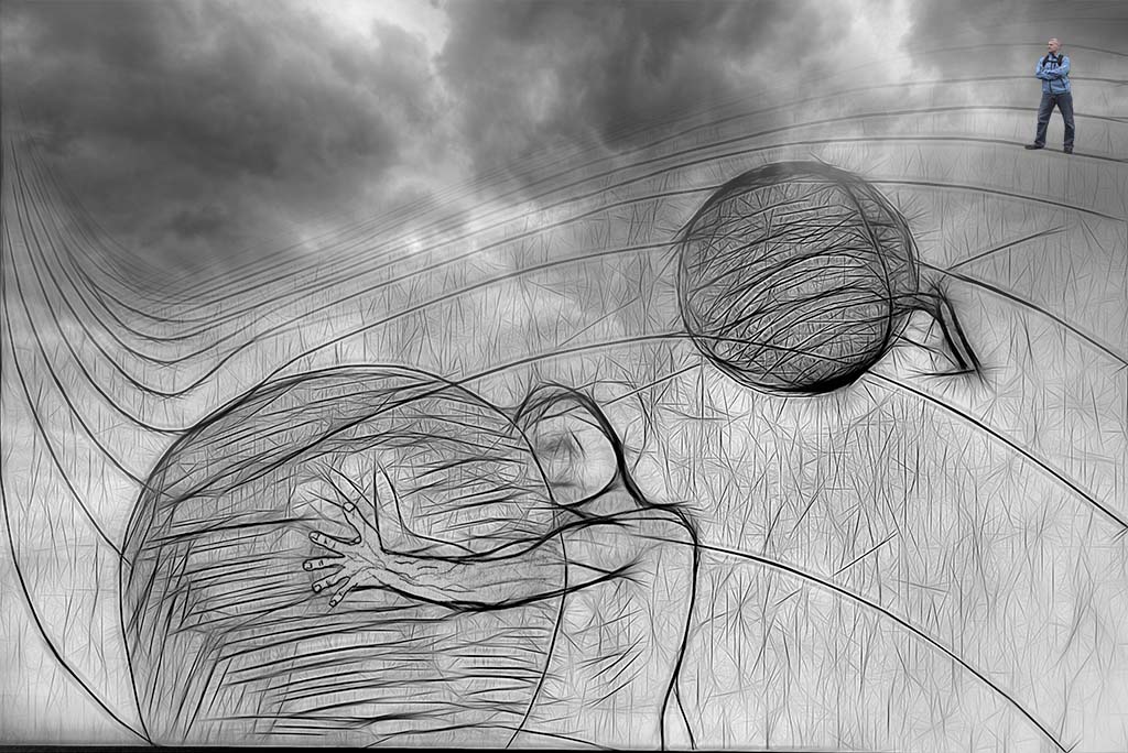
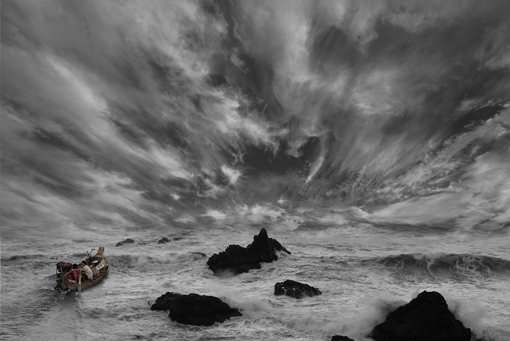
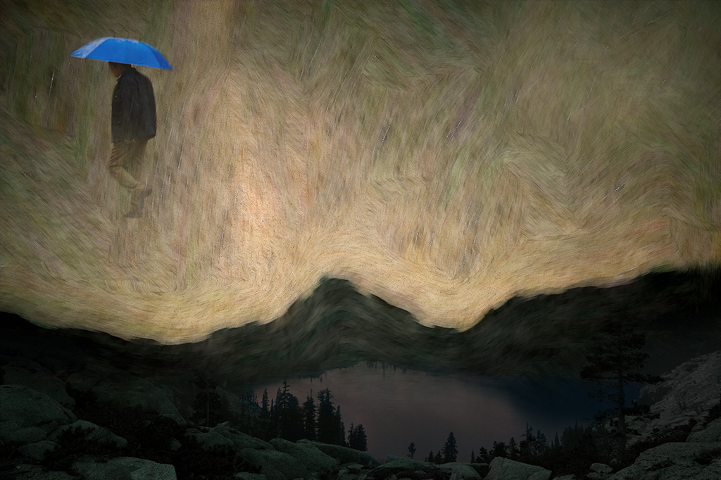
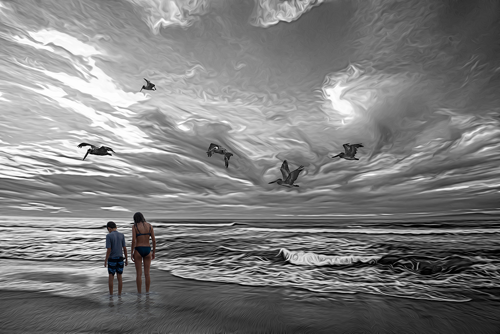
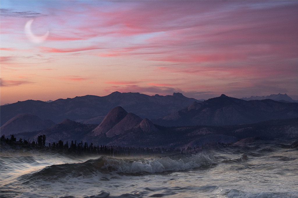
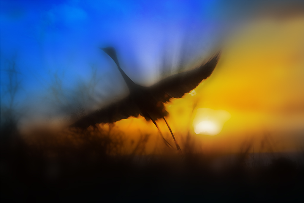
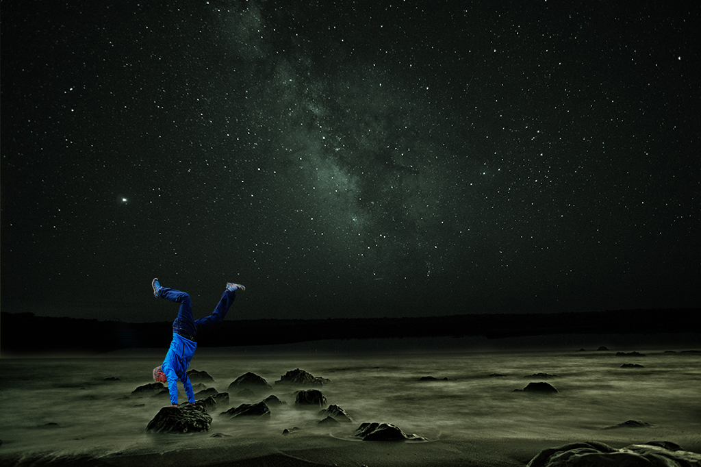
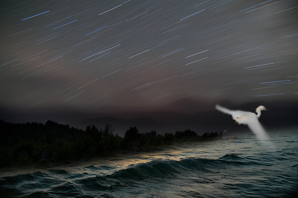
Kathy, You've created an image here that conveys a feeling of movement in a very compelling way. I love the purple and orange hues. Your choice of a subtle painterly filter works nicely to accentuate the movement. My only suggestion is more of a challenge to work with this image further. What could take this from the excellent image it is to one that might be iconic would be creating more of a story. If it were my image I would try to create more space in the upper left with a single bird as a focal point. One that is in sharper focus as if it escaped the pack in liberation. |
Feb 7th |
5 comments - 4 replies for Group 41
|
| 54 |
Feb 21 |
Reply |
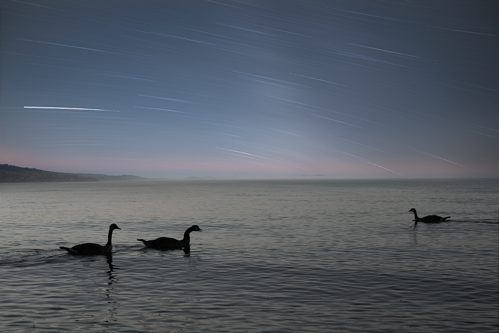
Thanks Alan. I cloned out some of the lens flare and I agree removing the remaining 2 don't add a lot. |
Feb 22nd |
| 54 |
Feb 21 |
Reply |
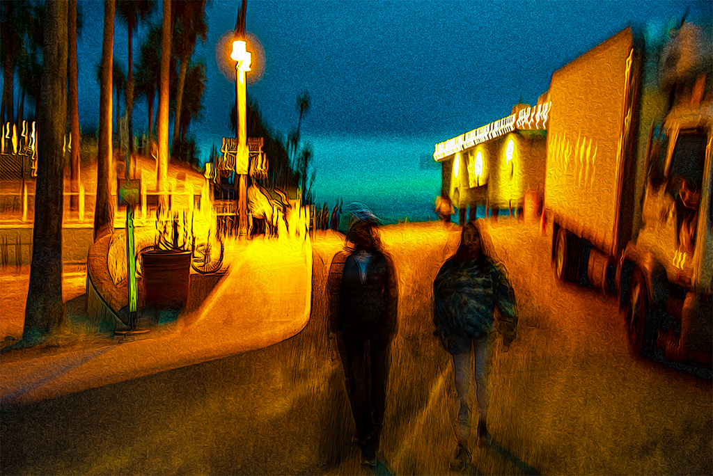
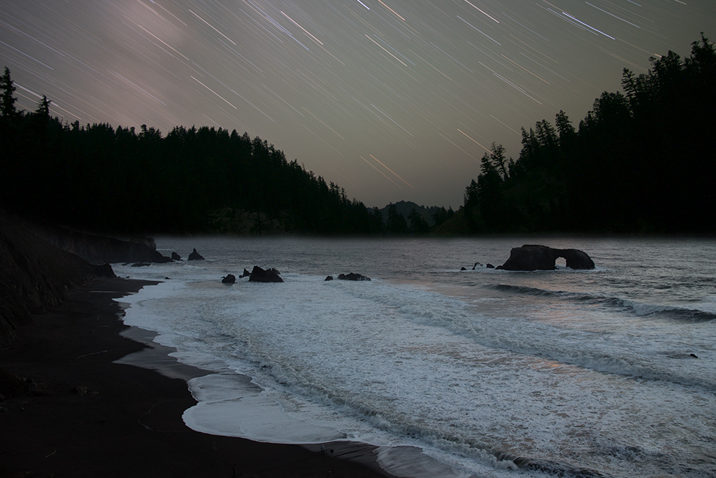
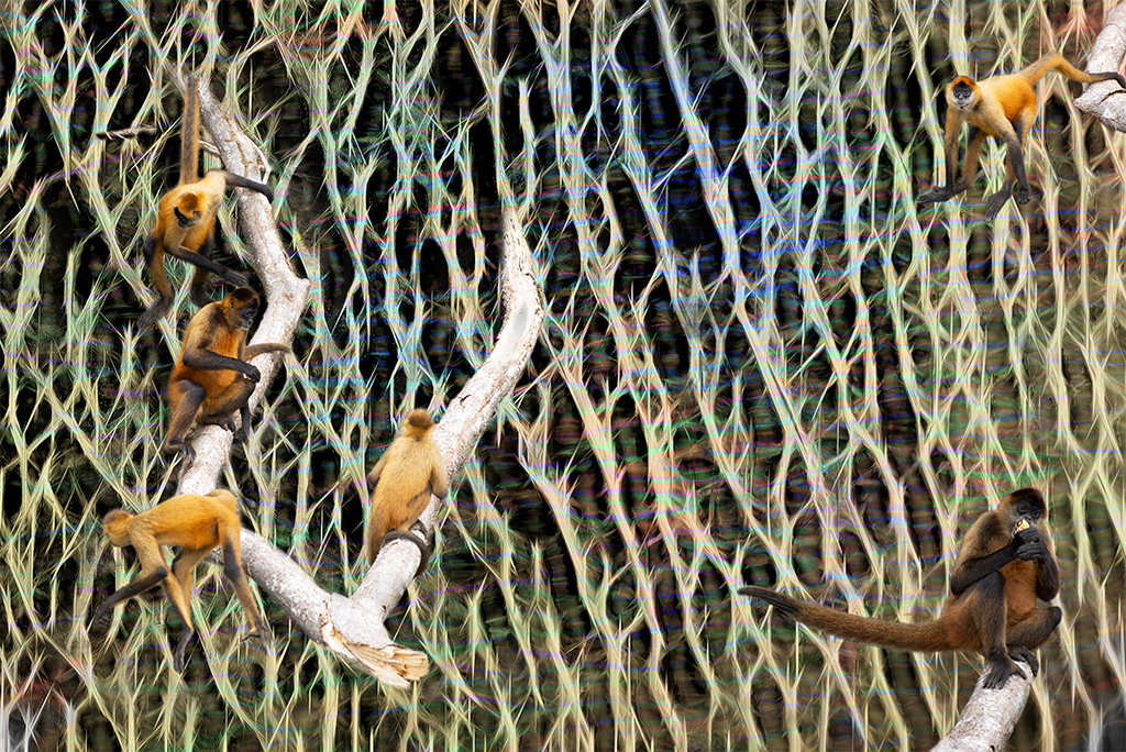
Kathy I chuckled when you wrote "I don't think you need the right third of the photo". I tried cropping it out and the picture didn't feel balanced to me. I appreciate your detailed exploration of alternative handlings. |
Feb 22nd |
| 54 |
Feb 21 |
Reply |
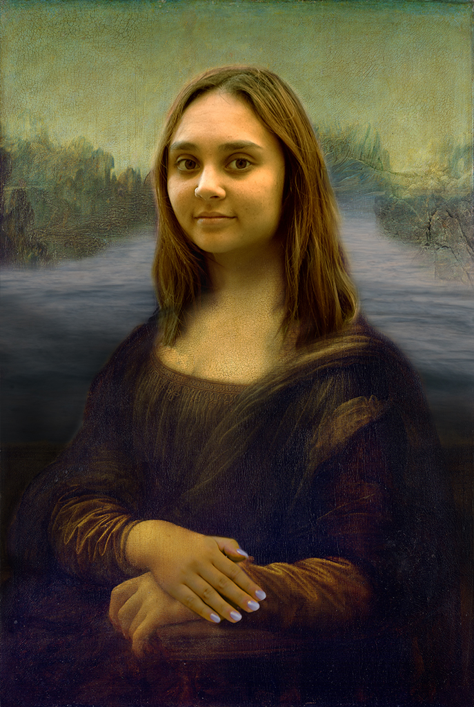
Aavo, I wasn't suggesting you use the Mona Lisa face, just one with a smile. You can use the liquify tool in filters to draw the corners of the mouth upward but you would still need to use different eyes if you consider spending the time doing those changes as this type of intense stare will not look like a smile even if the mouth is upward turning. |
Feb 7th |
| 54 |
Feb 21 |
Reply |
Neil, Thanks for your feedback and welcome to the group. |
Feb 7th |
| 54 |
Feb 21 |
Reply |
Aavo, Thanks for your feedback. I had struggled with that element quite a bit. As it is I had set the opacity to 92%. Silhouetted elements are often much more contrasty than other elements but I may try dialing back the opacity a bit. |
Feb 7th |
| 54 |
Feb 21 |
Reply |
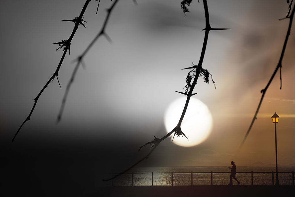
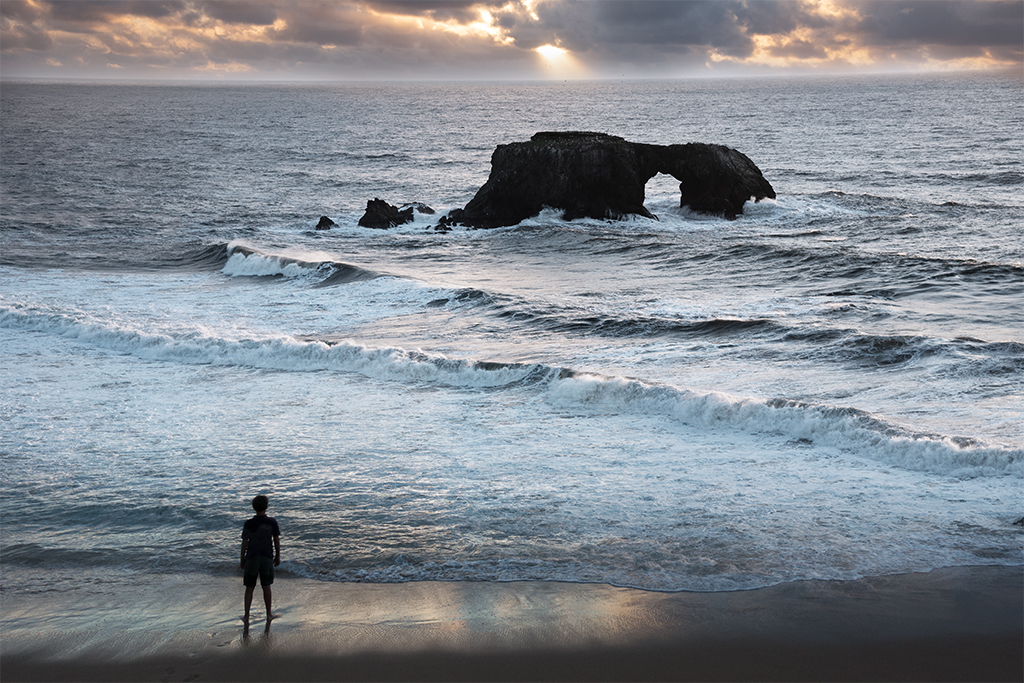
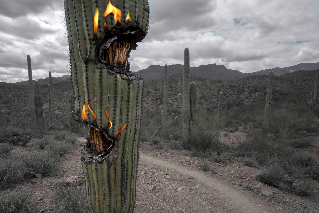
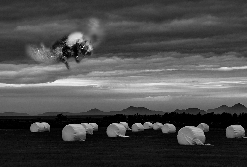
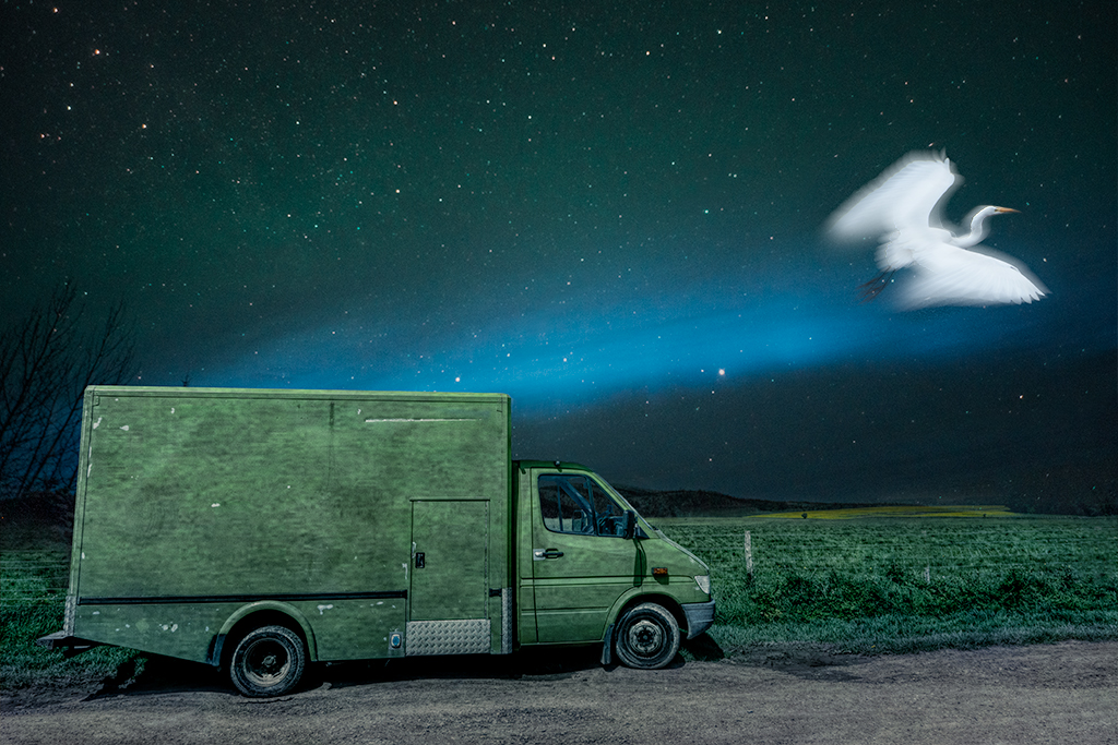
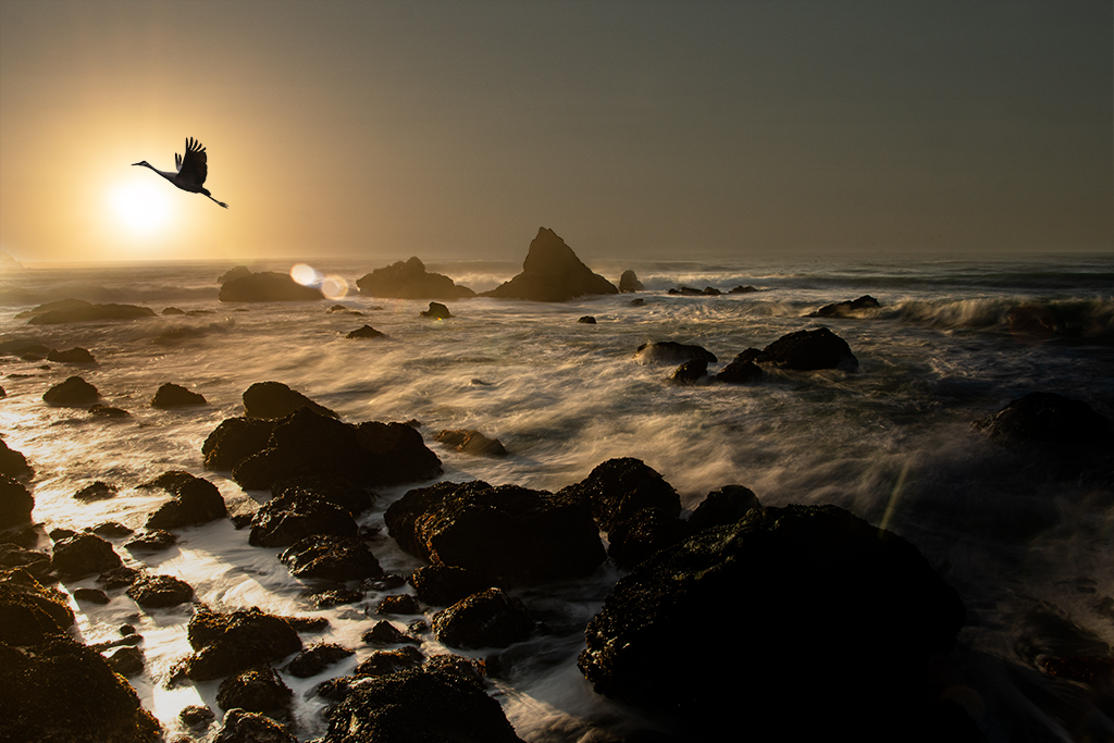
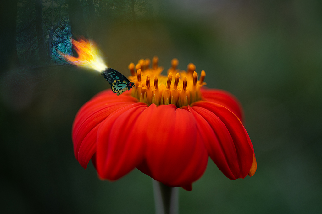
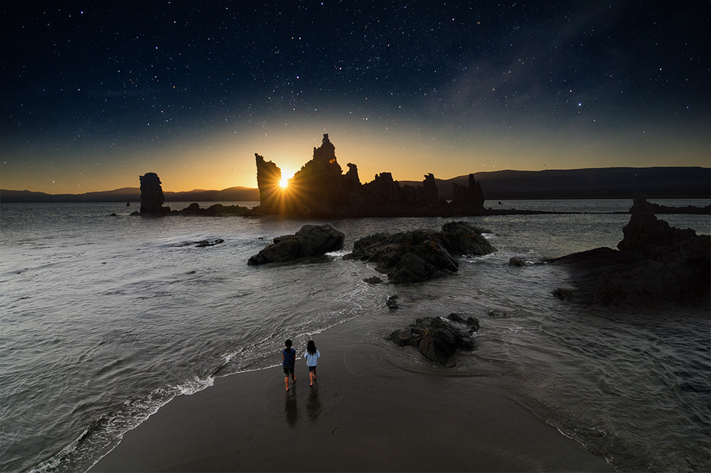
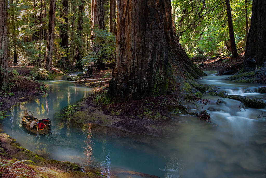
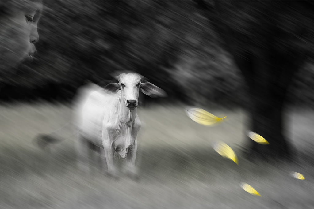
Marilyn, Thank you for your feedback. That poor bird got moved a lot during the creation of this image. Ultimately I put it there as I liked the contrast with the sun and thought it tied the lens glare/flare elements into the image more. I'm with you on the glare issue. This was one of those images I knew from the start wouldn't be my favorite but it was fun to try to salvage it some. As I look at the image more I may crop out some of the right side of the image to reduce some of that dead space, thanks for helping me see the "empty" space. |
Feb 7th |
| 54 |
Feb 21 |
Comment |
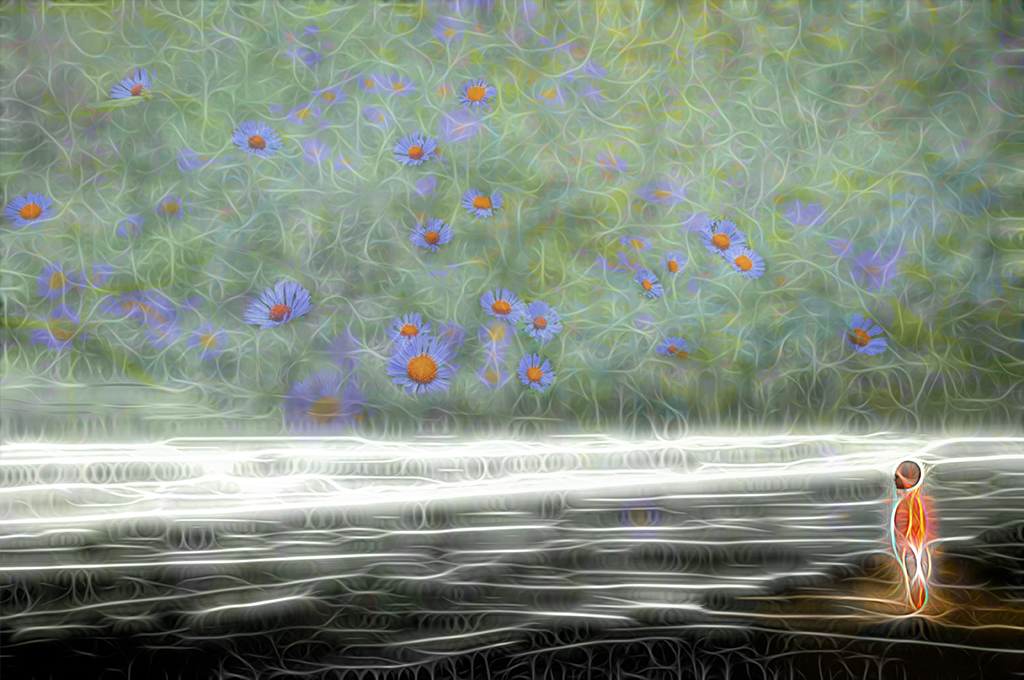
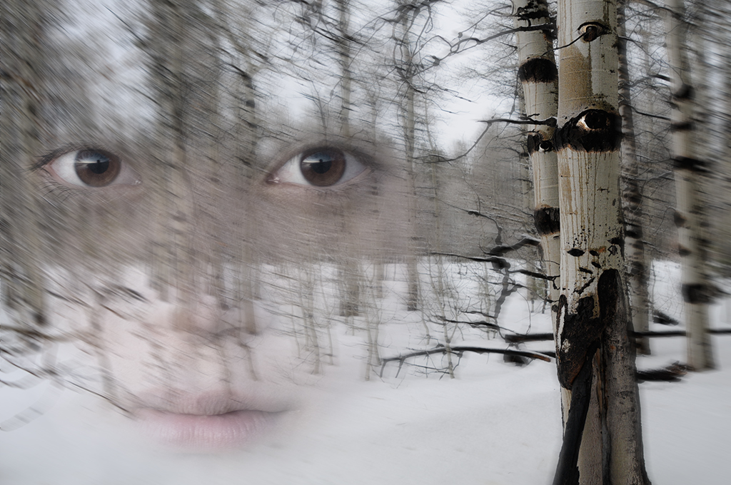
Kathy, I love where your imagination has taken us this month. I personally find the coloring of her hair and wings distracting. I wonder if you were to make her all white, and maybe a little brighter, she would become a more central figure in the image. |
Feb 7th |
| 54 |
Feb 21 |
Comment |
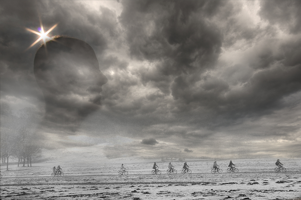
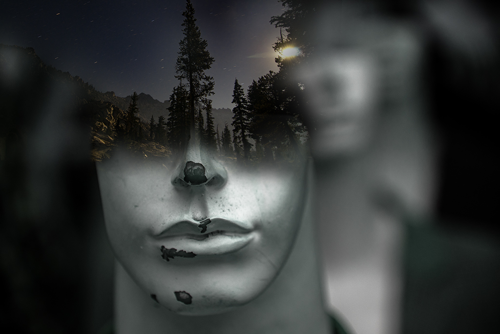
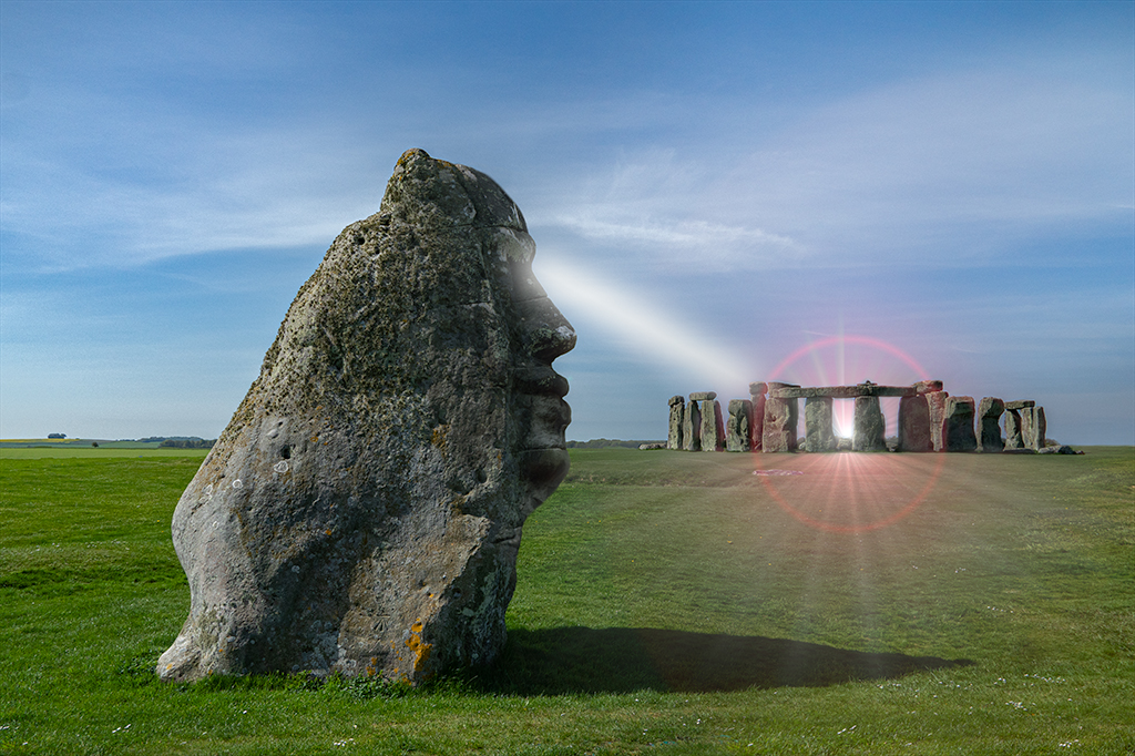
Aavo, Bold of you to go political this month. Hard not to be affected by the recent events. I wonder if your message is a little muddled by your handling of the statue of liberties face in the second version. It is pretty clear you are showing a disapproval in the version associated with Trump. The second version appears stunned. If that is your intention, great. If you meant to communicate a more happy demeanor I think a subtle Mona Lisa type look might be more resonant. |
Feb 7th |
| 54 |
Feb 21 |
Comment |
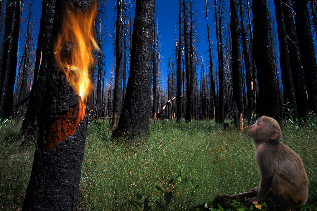
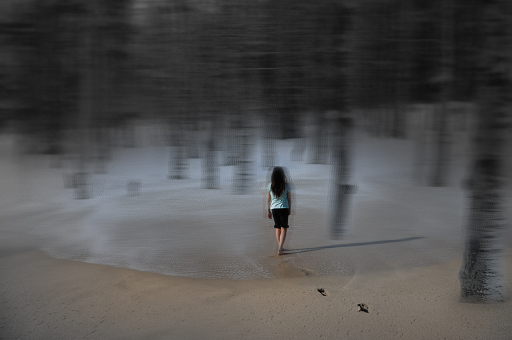
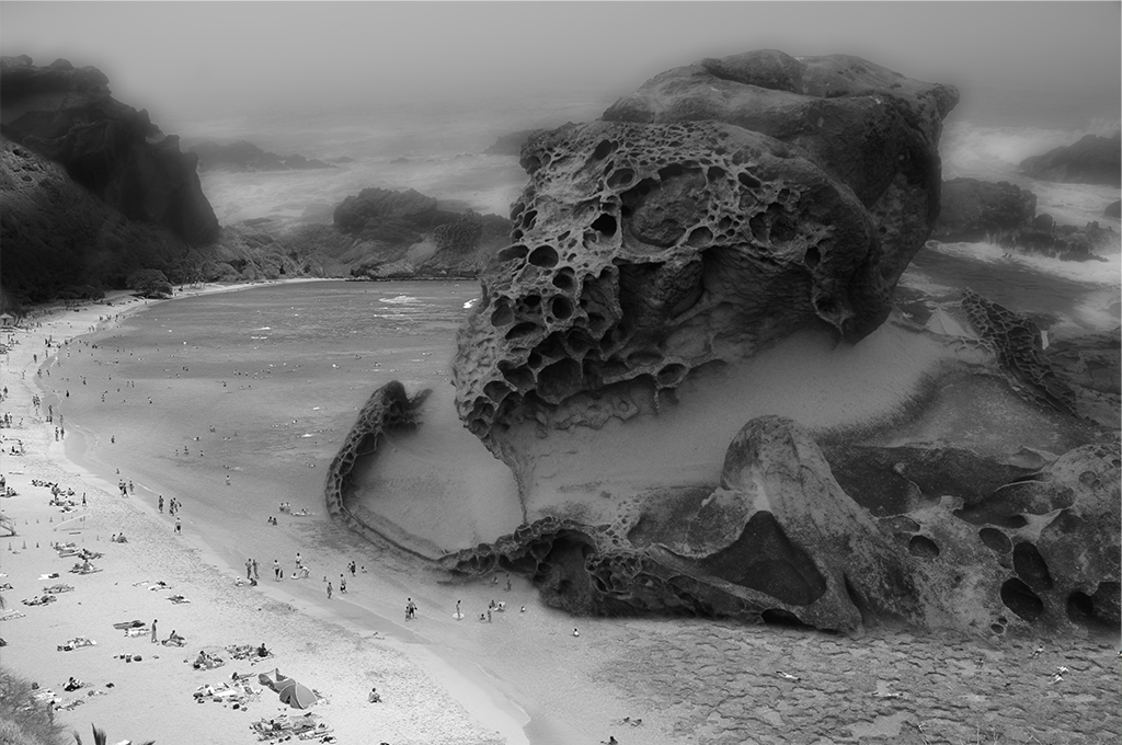
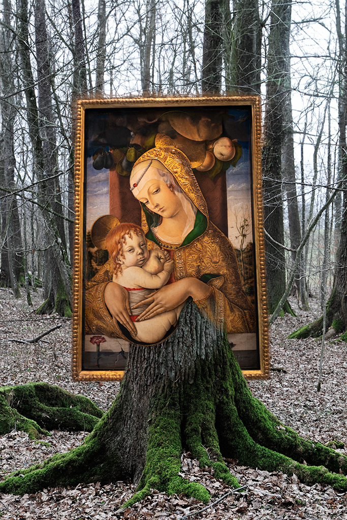
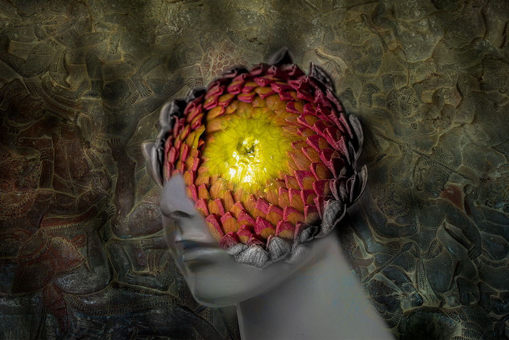
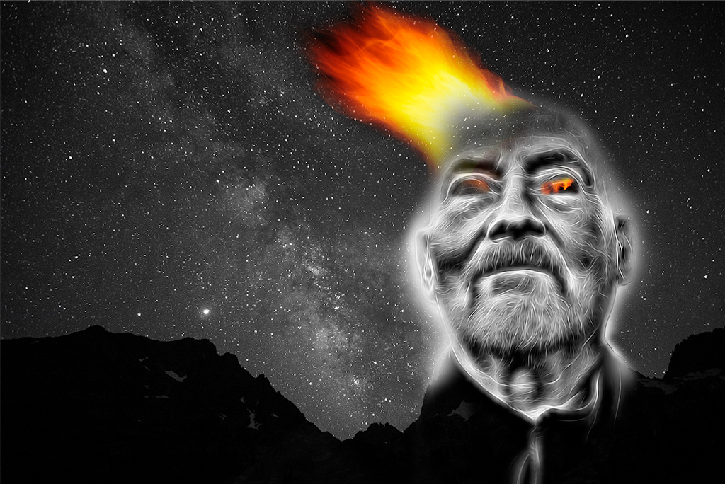
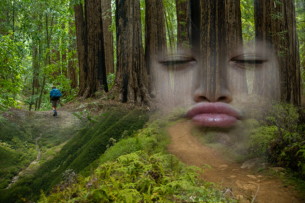
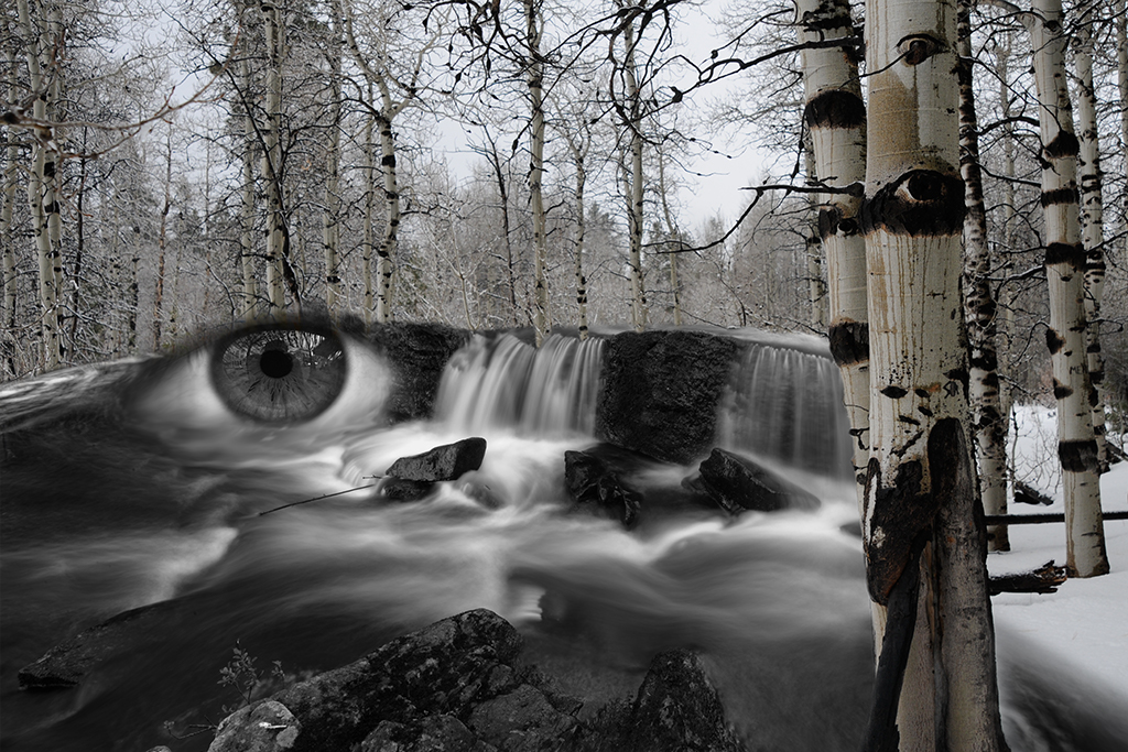
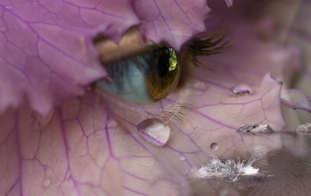
Marilyn, You've ventured into a world I am obsessed with, pareidolia. I have done quite a bit of this type of blending over the years. Although I like your image a lot, I feel some minor tweaks may make it more powerful. I recommend erasing more of her forehead as I don't think it adds anything to the image. My preference would be to increase the contrast so the face is more apparent and erasing distracting elements from in the mouth. I also feel there are too many distracting elements making it hard to know where to focus one's attention. I might also increase the contrast of the tree along with the face and create some more separation of the foreground and background. There are so many possibilities with this image I would encourage you to keep working on it. |
Feb 7th |
| 54 |
Feb 21 |
Comment |
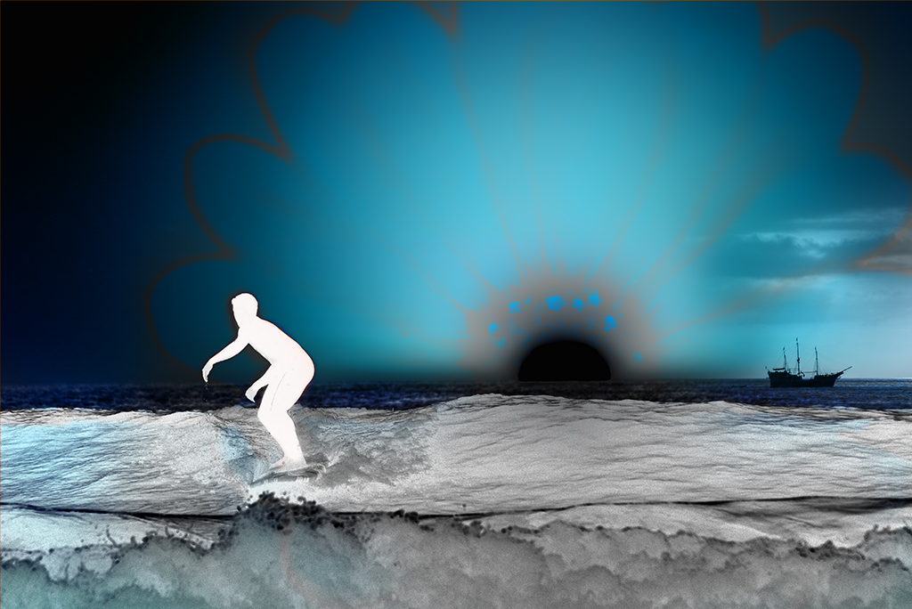
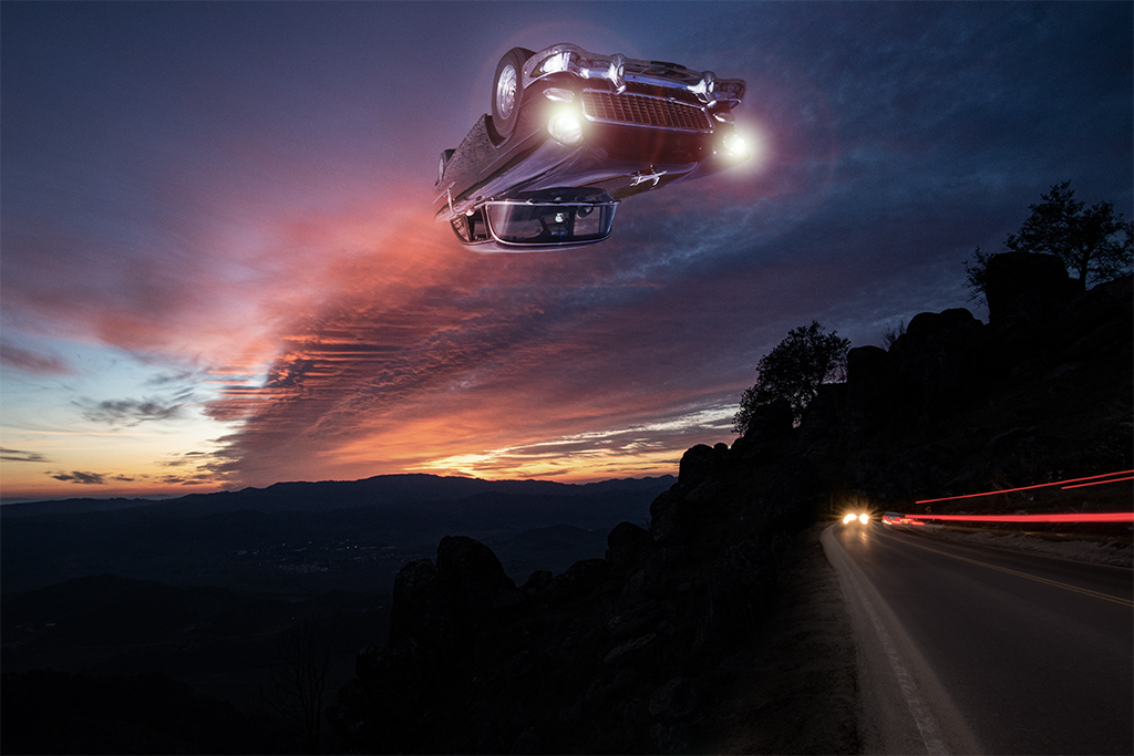
Alan, You have crafted another strong image that is beautifully executed. I see nothing to suggest although my immediate reaction on viewing the image is there was a dissonance between the happy coloring and the odd juxtaposition of the elements. I wonder if the bottom of the image were to get darker rather than lighter if it may be more resonant. Then again it reminds me a little of how many film directors contrast a playful songs with grim fight scenes. Nice job. |
Feb 7th |
| 54 |
Feb 21 |
Comment |
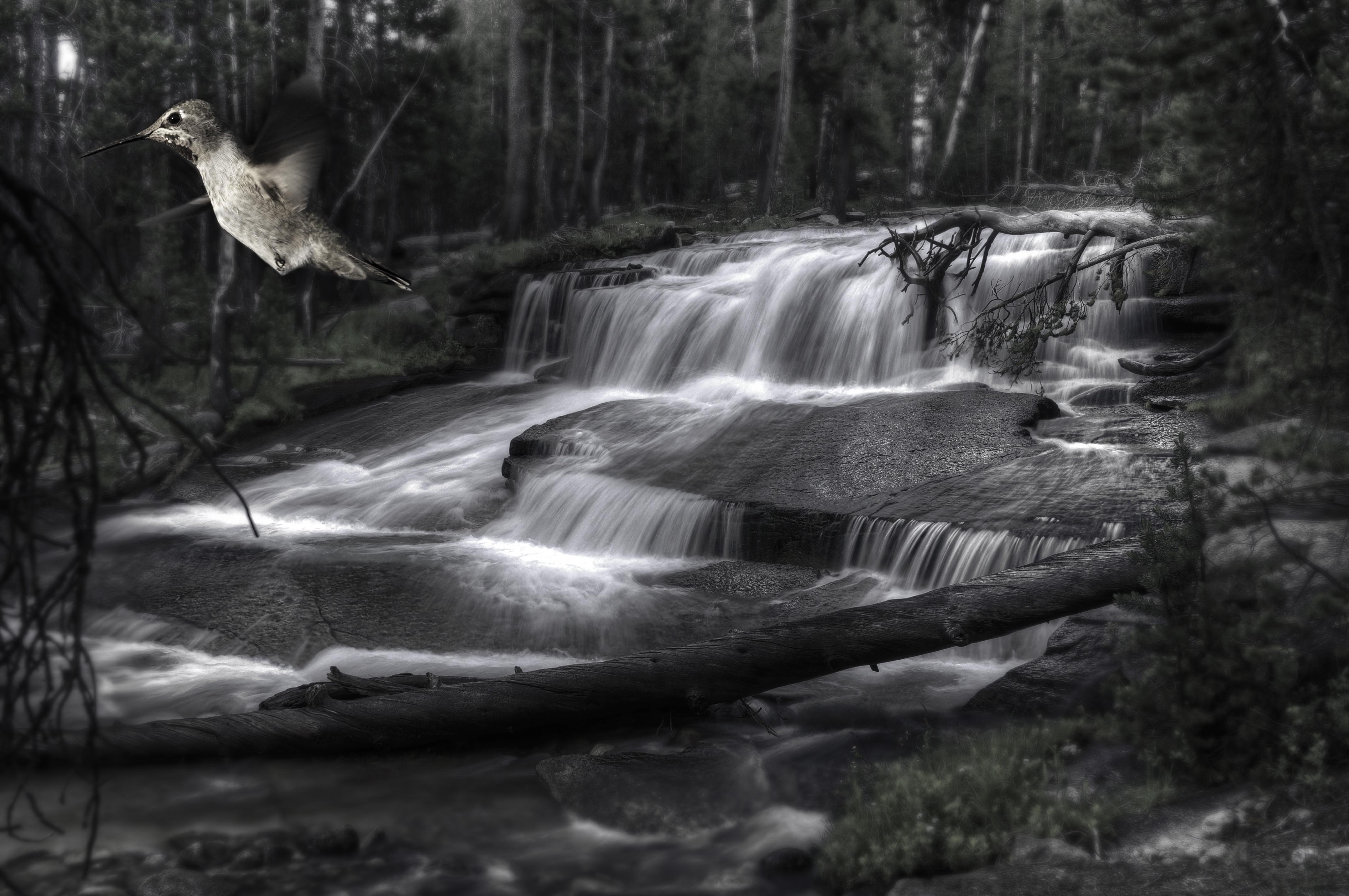
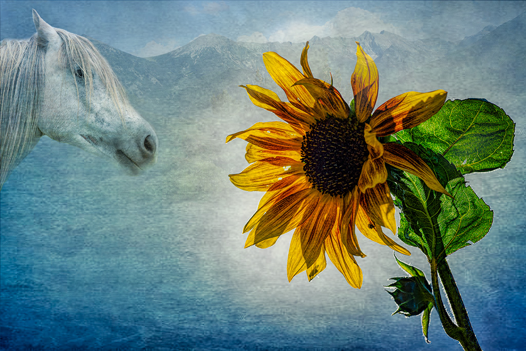
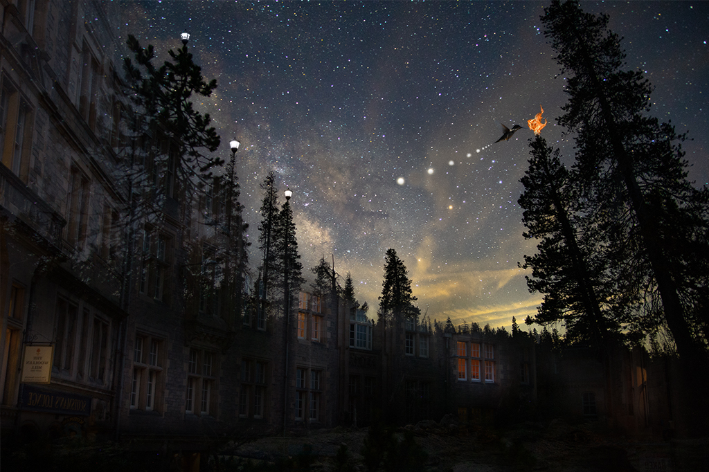
Neil, Welcome! What a wonderful image to introduce yourself to the group. It is whimsical, timely and playful. I like it a lot. Three minor suggestions. I would take the cap off the bottle :). Second, your left shoulder (right as we view it) distracted my eye as I moved across the image. It is likely due to the fact your armpit hair is partially cut off. Not sure if "erasing" your shoulder to show the armpit would look better or more distracting or if you cloned away the armpit hair if that may reduce the distraction, just a thought. And a super subtle third item is the shadow behind your right shoulder. Since you don't have other shadows like this, I might just remove it. |
Feb 7th |
5 comments - 6 replies for Group 54
|
10 comments - 10 replies Total
|