|
| Group |
Round |
C/R |
Comment |
Date |
Image |
| 41 |
Oct 20 |
Comment |
Thanks, I knew I asked the right person! |
Oct 31st |
| 41 |
Oct 20 |
Reply |
Thanks Lisa. I will reach out to Barbara to see what is possible. |
Oct 31st |
| 41 |
Oct 20 |
Reply |
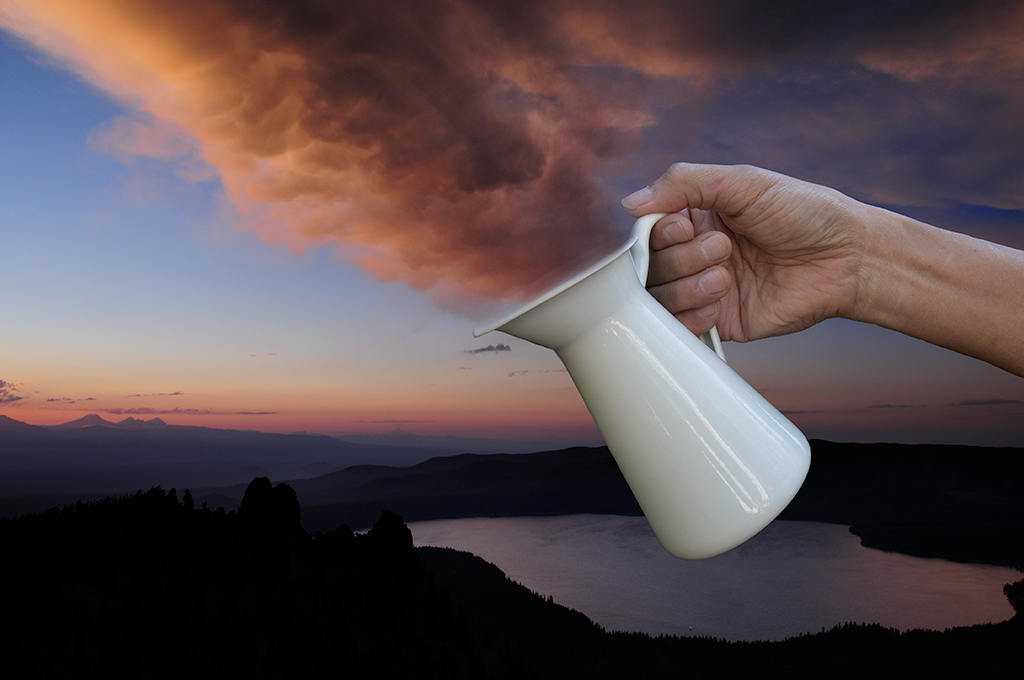
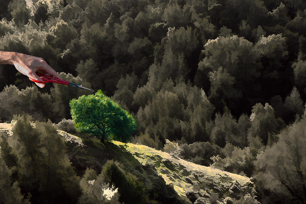
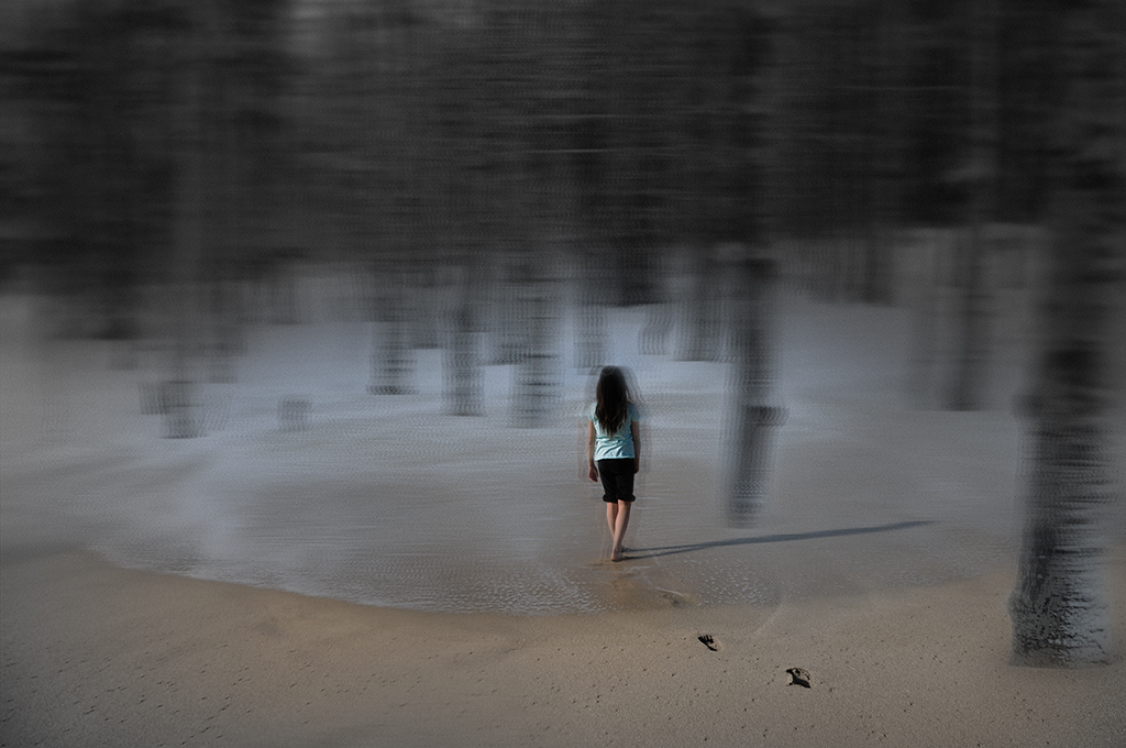
Thanks Lisa. I'm sorry I don't keep track of which filters I use as I often add a few and erase away stuff and then adjust with add layer adjustments. One day I'd like to do a video of the creative process showing the transformation of the image over time. (Do you happen to know a program that allows for that?). I can say it was in Topaz studios 2 |
Oct 31st |
| 41 |
Oct 20 |
Reply |
Maryellen, I am open to trying that at some point, it may be hard to orchestrate. I could definitely announce this option sometime in the coming months and anyone interested could do it. The hard part is choosing which images to work with that everyone would enjoy. Any suggestions? |
Oct 30th |
| 41 |
Oct 20 |
Reply |
Kathy, Thank you for taking the time to share your vision. Always fun seeing what other people do with my photos. It would actually be super fun to give everyone a few of the same images one month and see what creations come from that exercise. |
Oct 15th |
| 41 |
Oct 20 |
Reply |
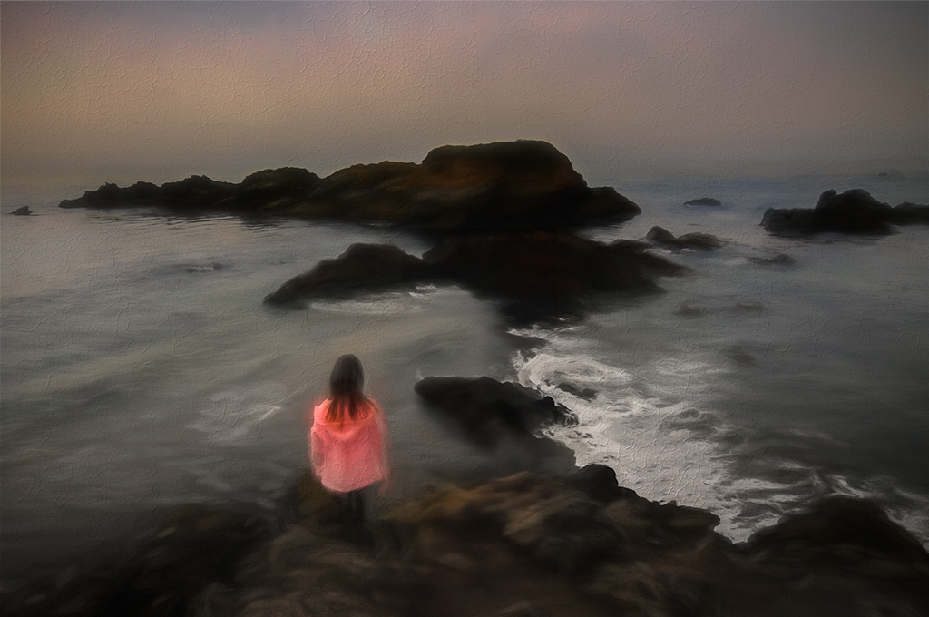
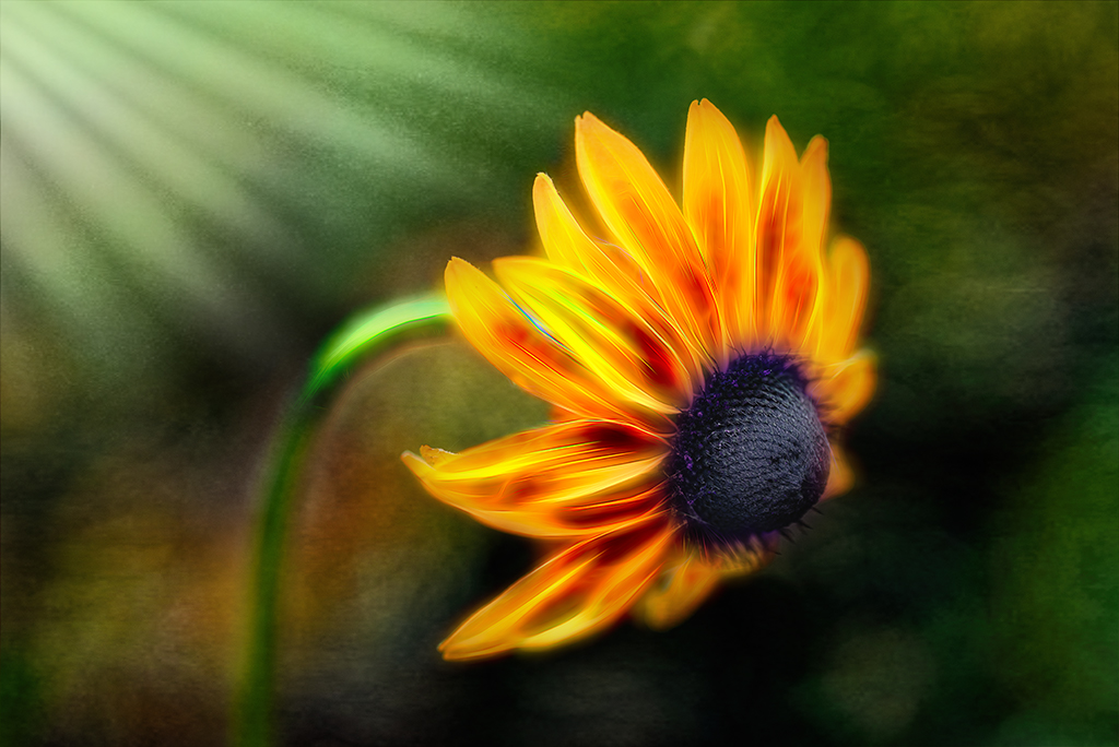
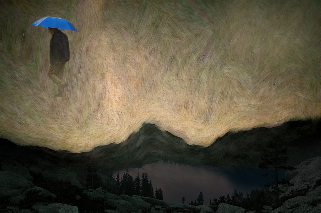
Henry, Thank you for your kind words. The rekindled love part is more about the feelings that were behind the creation of the photo. I realize it doesn't specifically speak to that in content. I chose the title "return" to signify a coming home of sorts. |
Oct 12th |
| 41 |
Oct 20 |
Reply |
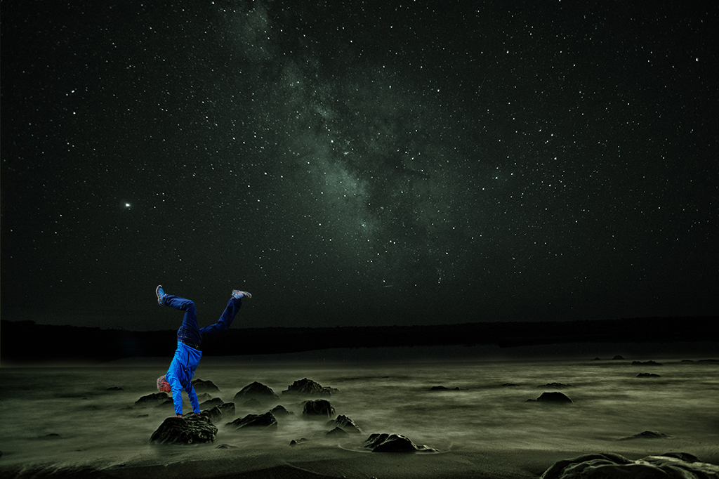
Henry, Don't let me discourage you from exploring your splashy color mood. I believe the main reason to do art is to express what's inside you, not to please your audience. I always hesitate to share suggestions for fear of offending. I joined this group to learn from other photography enthusiasts and hope my suggestions are received in that light. |
Oct 12th |
| 41 |
Oct 20 |
Comment |
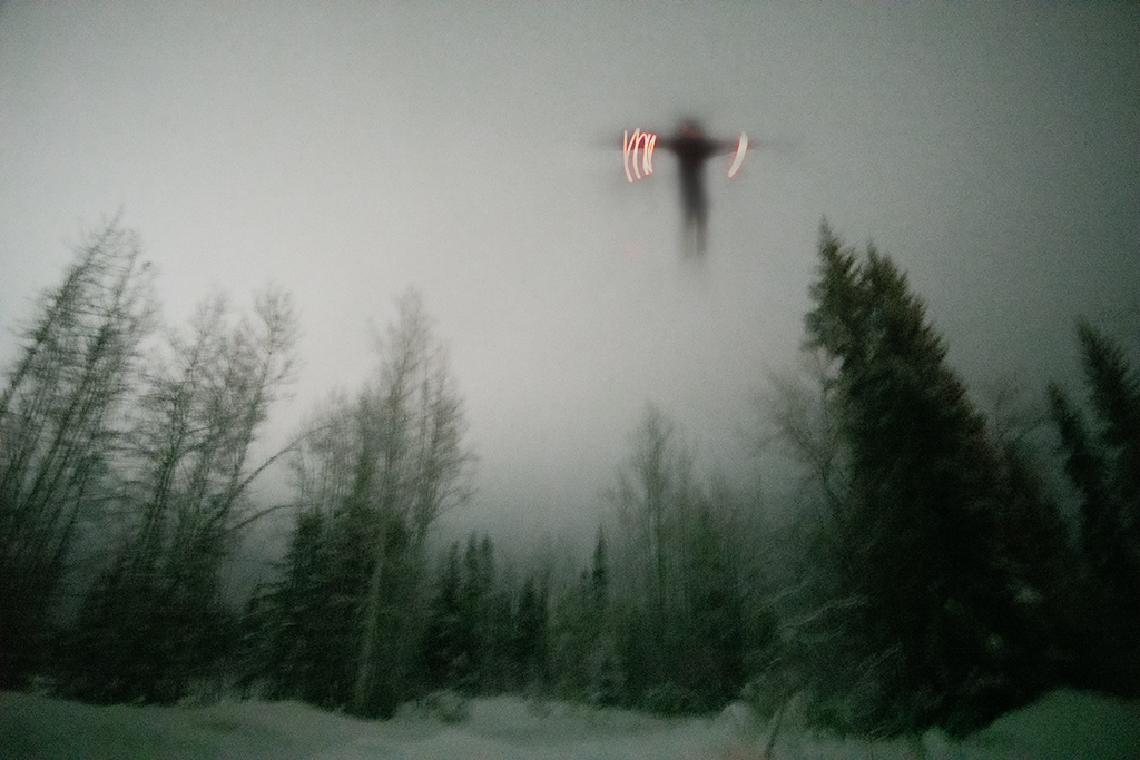
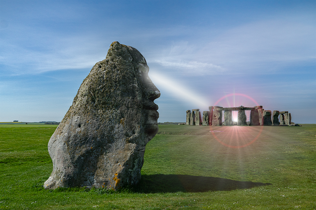
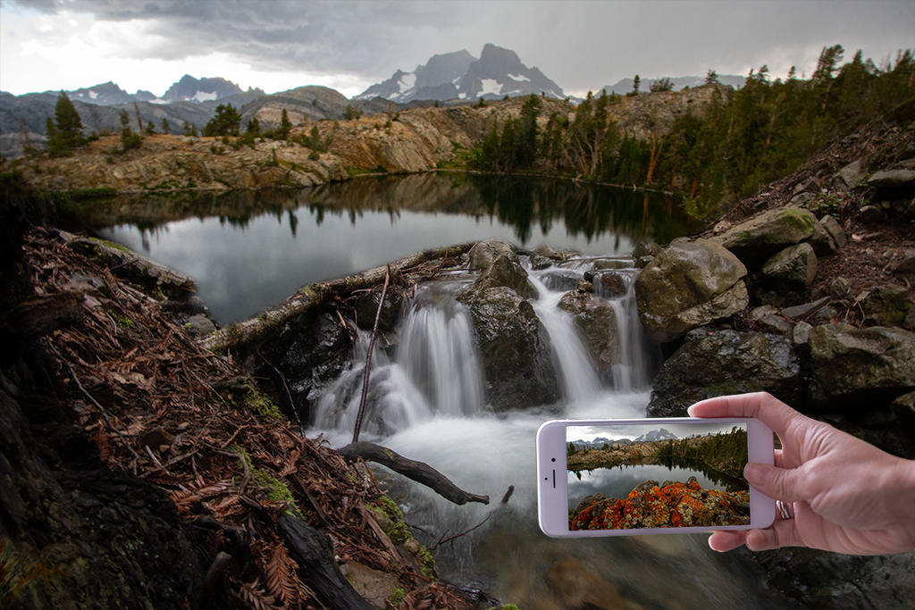
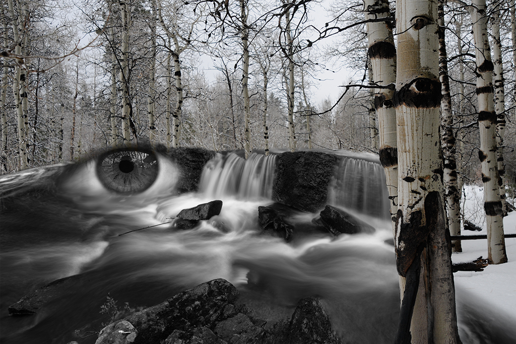
Lisa, I love how you continue to explore the boundaries of technology. Do you have a link on this technique, I've never heard of it? |
Oct 10th |
| 41 |
Oct 20 |
Comment |
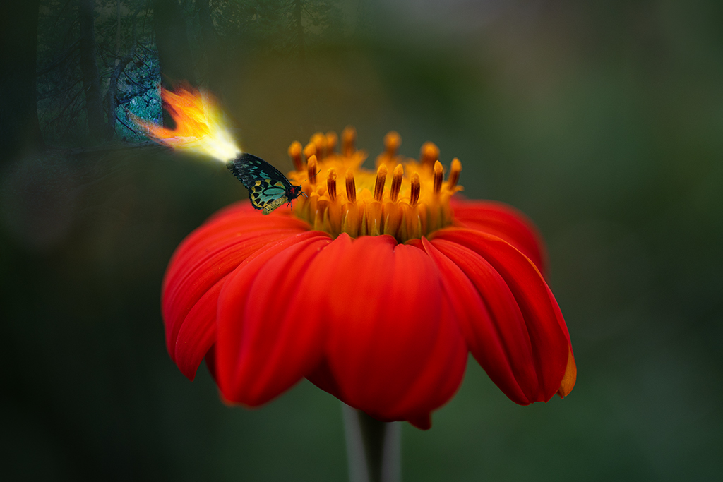
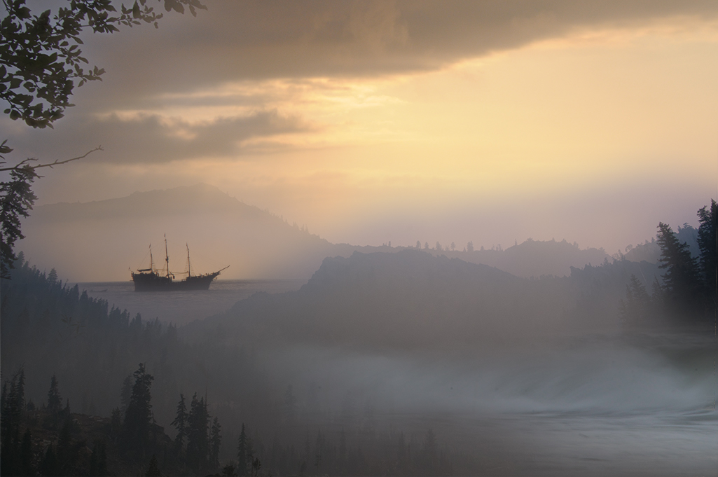
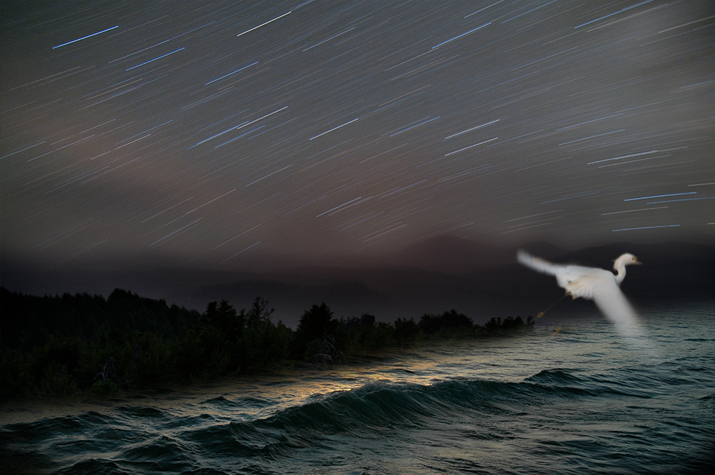
Jan, This is a beautifully successful image on many levels. The surrealistic handling of the ship with the butterfly wings is a clever and effective idea and the colors and reflections are deeply soothing. Well done. |
Oct 10th |
| 41 |
Oct 20 |
Comment |
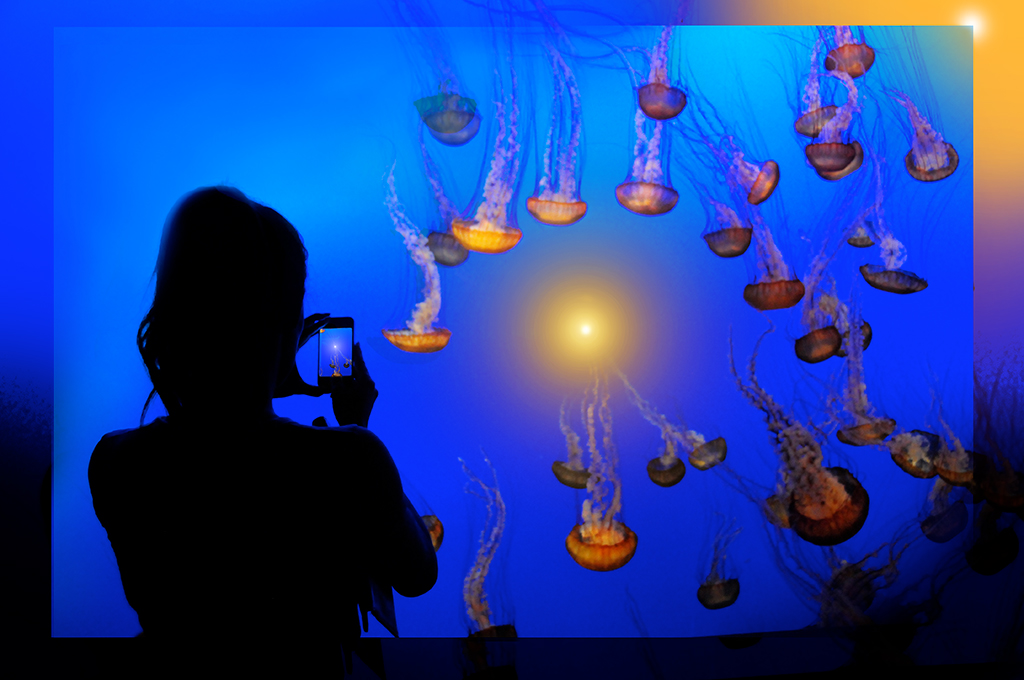
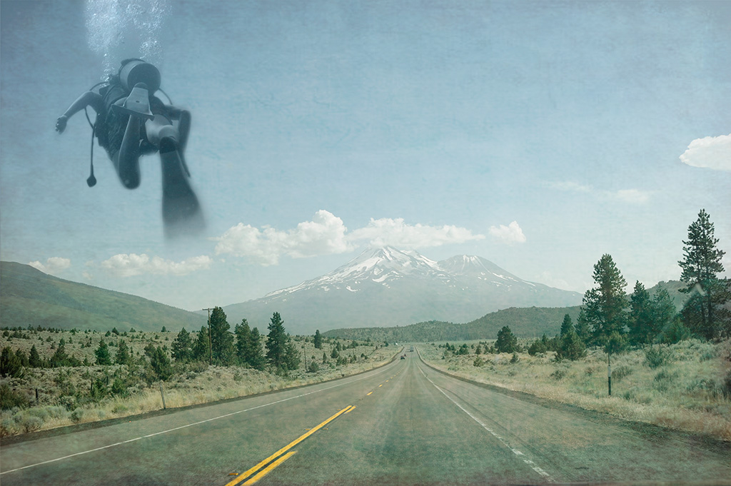
Lisa, You've chosen a nice subject matter to show off this nice effect. Thanks for sharing the tutorial! |
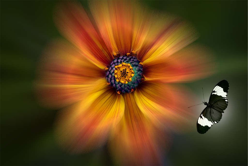
Oct 10th |
| 41 |
Oct 20 |
Comment |
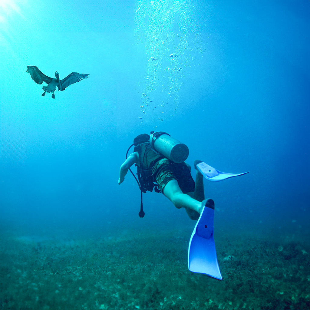
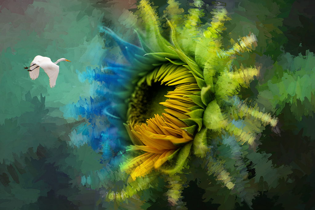
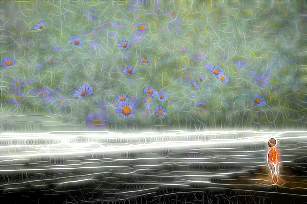
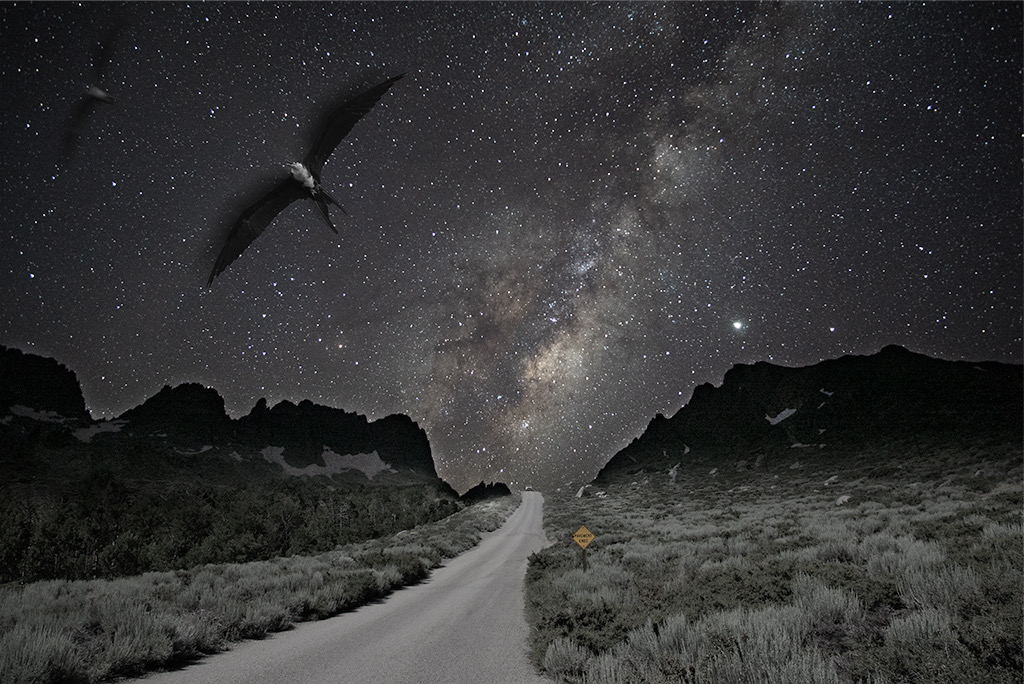
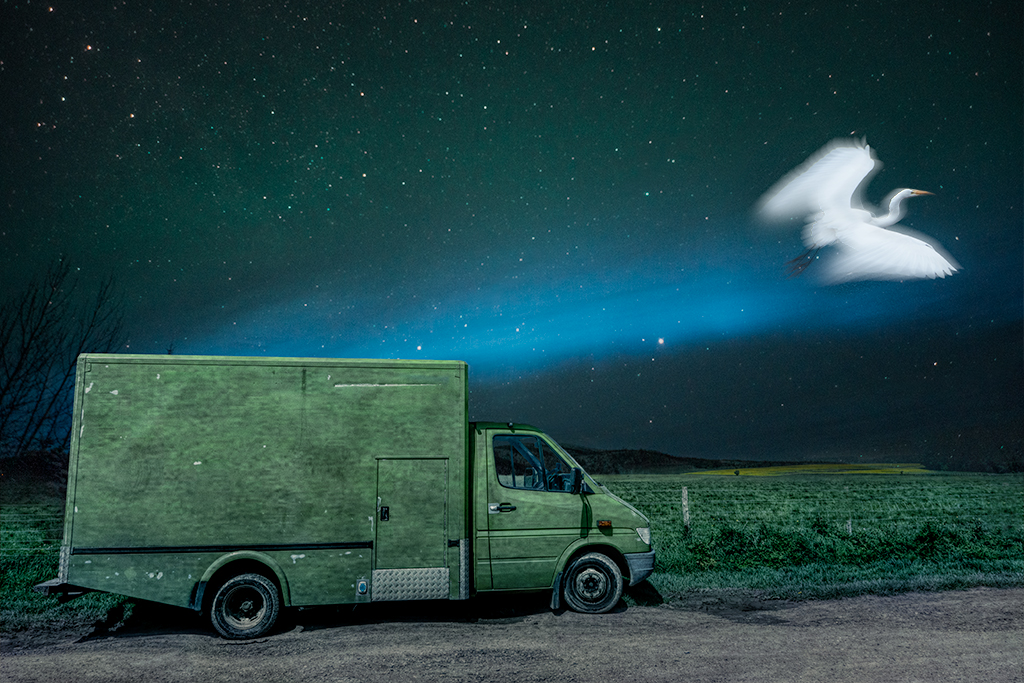
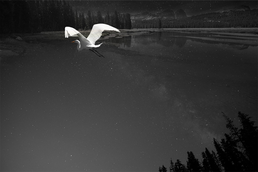
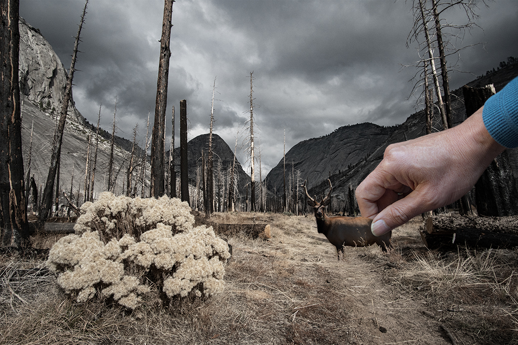
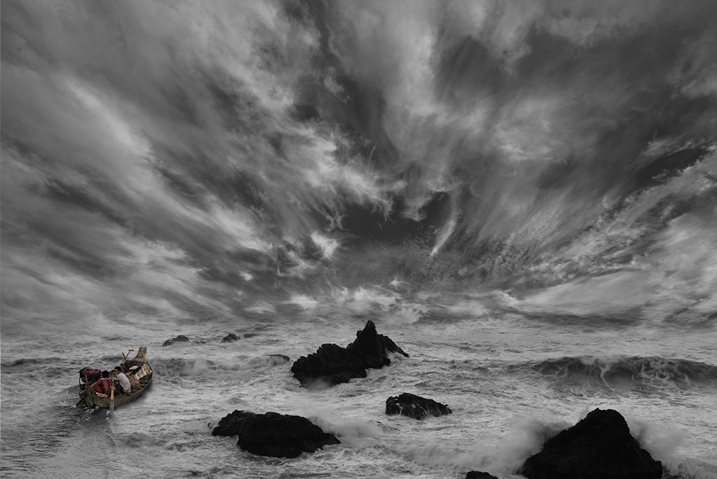
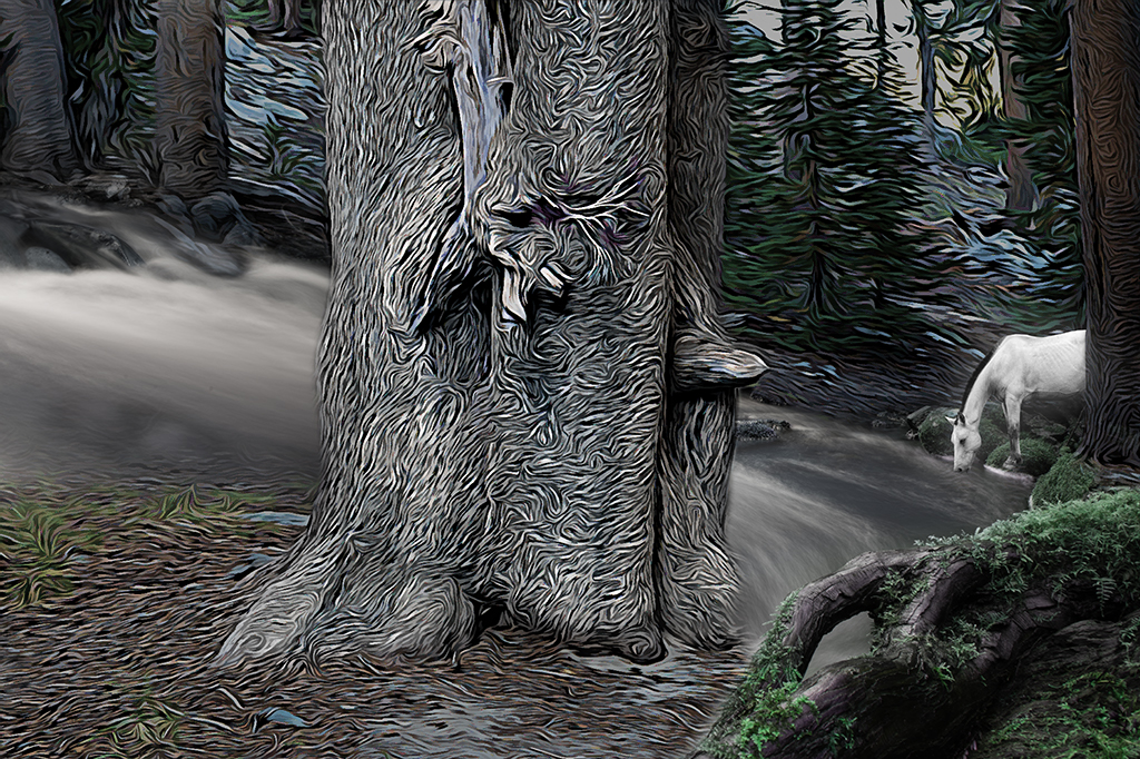
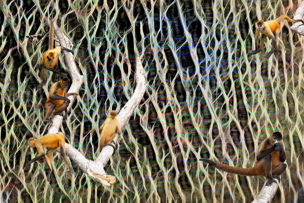
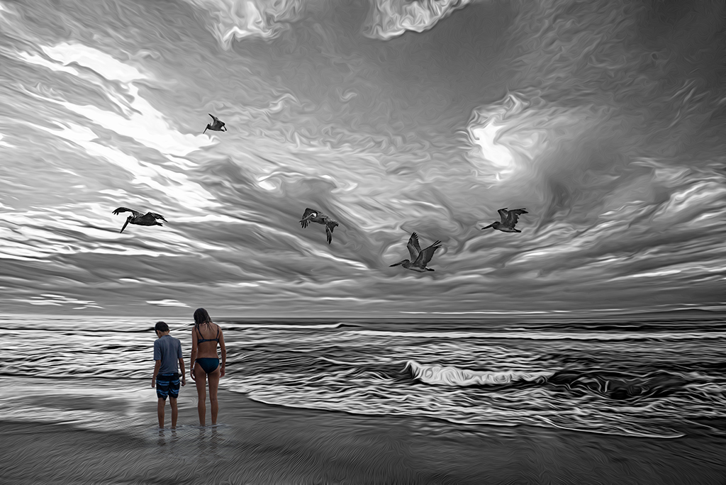
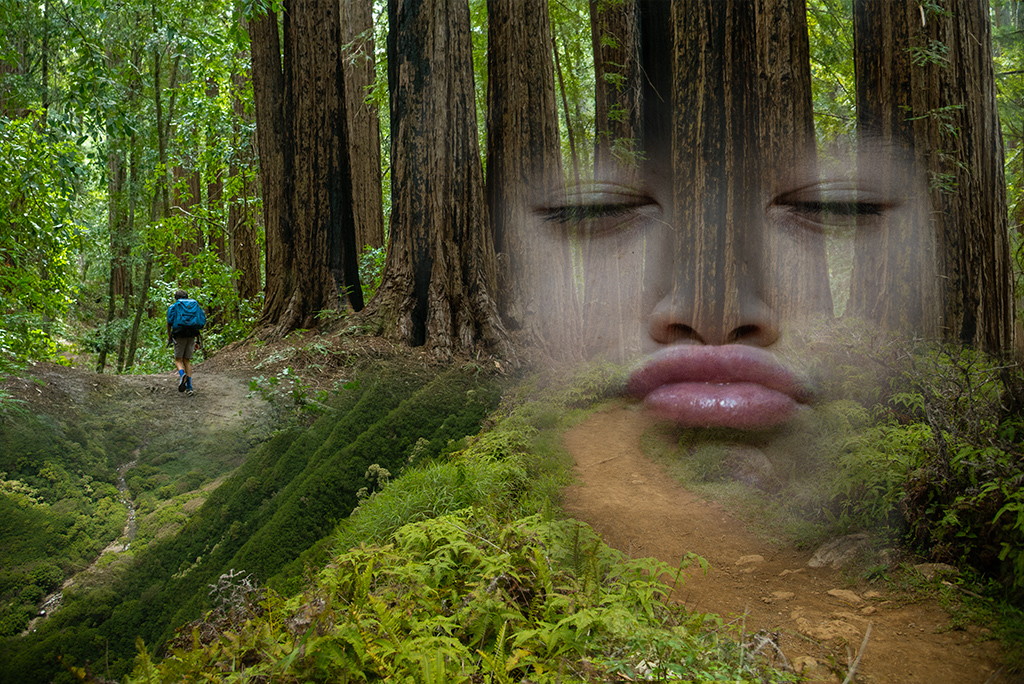
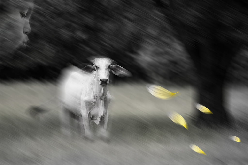
Maryellen, This is a fun exploration. I really like your handling of the skies/reflections in the water. Overall the image feels a bit crowded to me. I would invoke the adage "less is more" for this image. I might consider removing the bird at the bottom left. |
Oct 10th |
| 41 |
Oct 20 |
Comment |
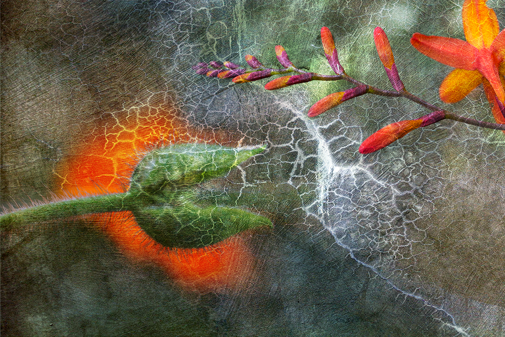
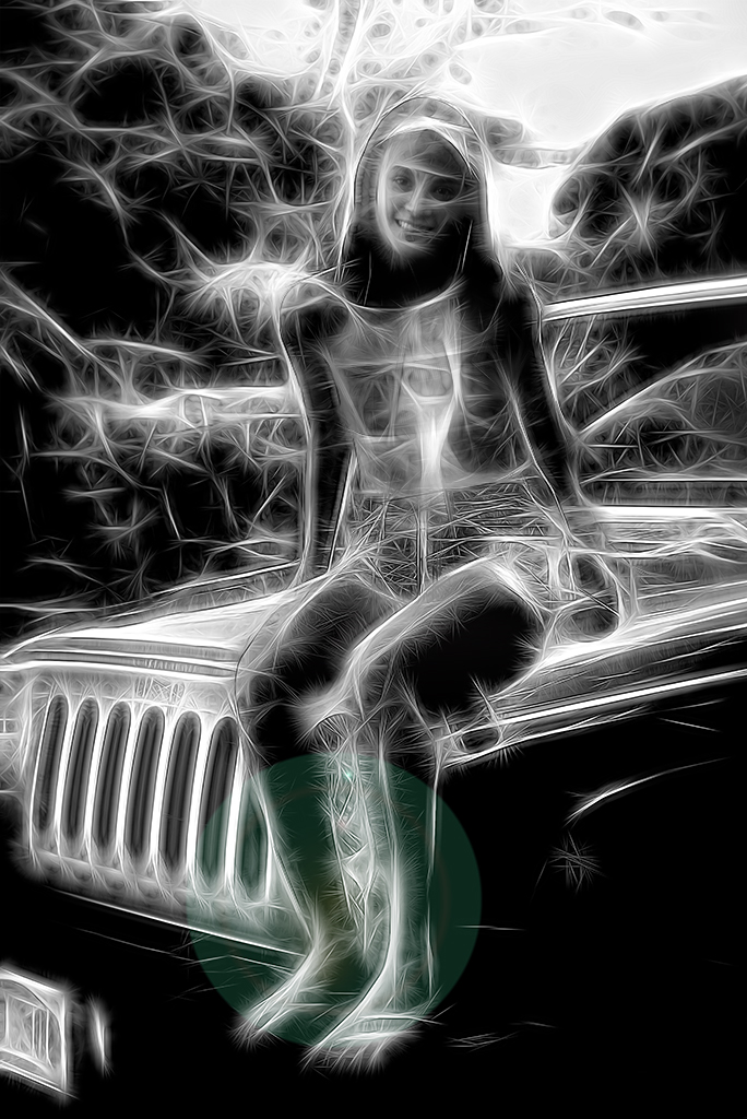
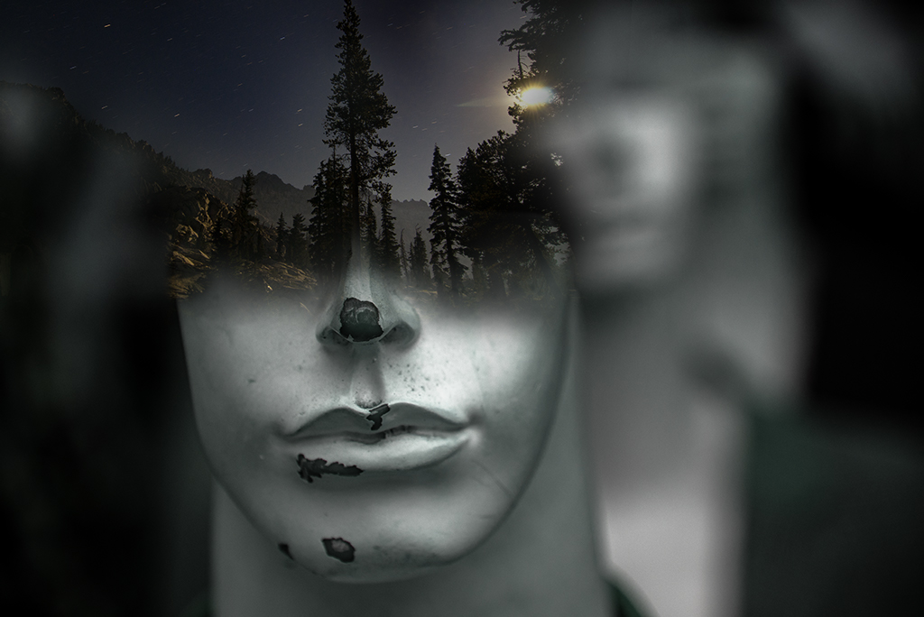
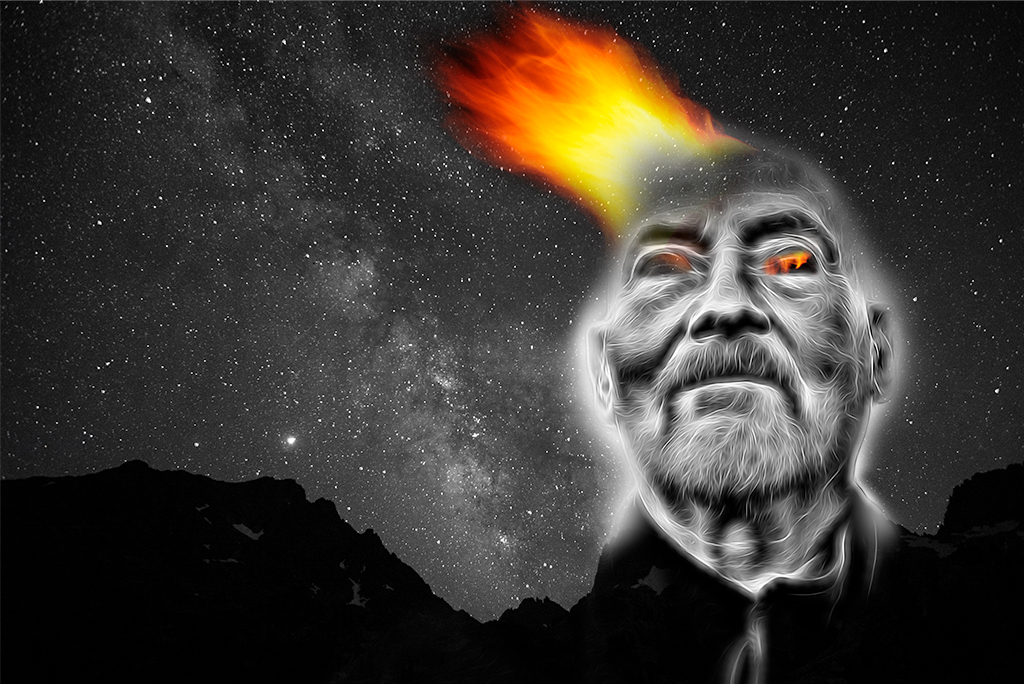
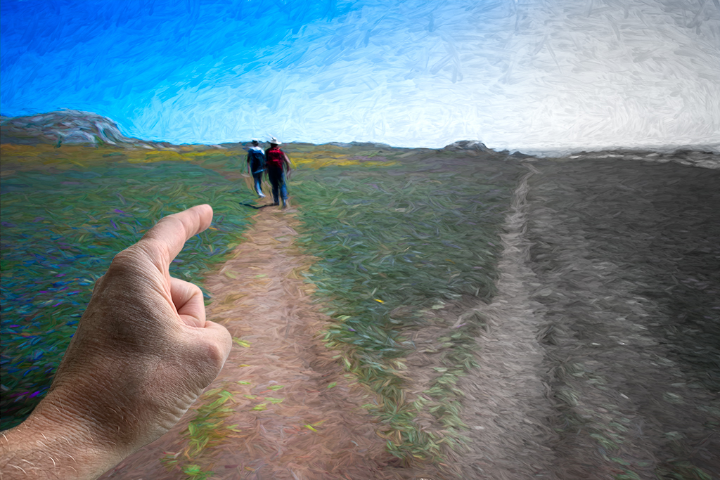
Henry, I too am enjoying the topaz filters. Although your image has a little more punch with the bright red tones I personally don't feel it adds much to the original image. I try to use filters to create a mood or tie themes together rather than just make things different. I did a quick black/white color adjustment to help focus on the clothing as that grabbed my attention in the original just as an example. |
Oct 10th |
 |
| 41 |
Oct 20 |
Comment |
Kathy, I hope Catherine is pleased with this enhanced holiday card. You've done a great job tweaking it in a believable way that takes nothing away from the original and creates a warm and cozy greeting card. |
Oct 10th |
7 comments - 6 replies for Group 41
|
| 54 |
Oct 20 |
Reply |
Peggy, Thanks for the suggestion, that's an easy fix. |
Oct 16th |
| 54 |
Oct 20 |
Reply |
Thanks Marilyn |
Oct 16th |
| 54 |
Oct 20 |
Reply |
Thanks Kathy |
Oct 15th |
| 54 |
Oct 20 |
Reply |
Thanks Aavo |
Oct 15th |
| 54 |
Oct 20 |
Reply |
Thanks Alan |
Oct 15th |
| 54 |
Oct 20 |
Comment |
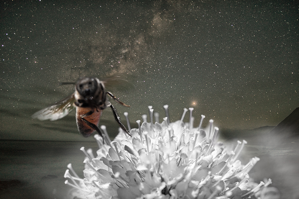
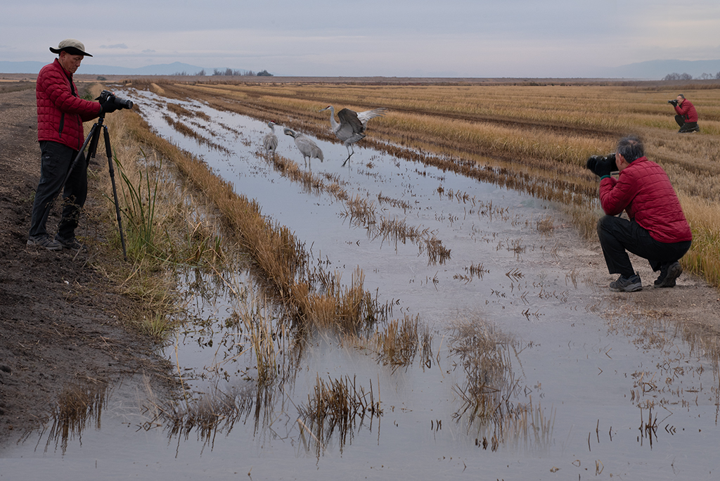
Marilyn, This is a very pleasing image. I didn't notice the snail at all with my first viewing so I wonder if it adds anything. I might try increasing the contrast or saturation of the turtle to further draw attention to this main subject, especially since you have rays of light illuminating him. |
Oct 11th |
| 54 |
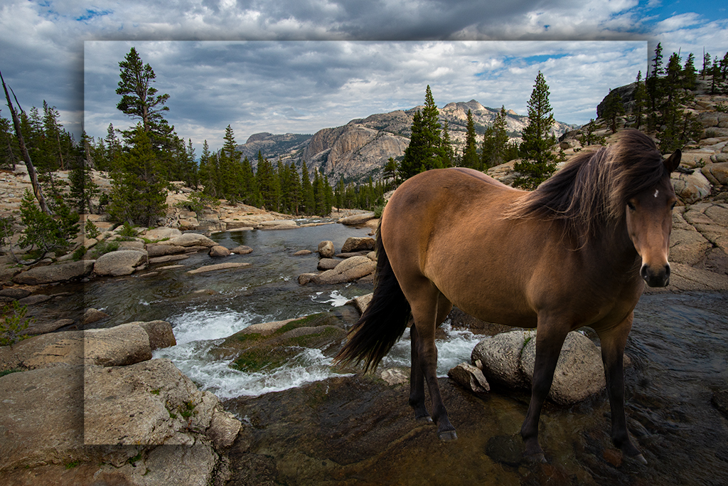
Oct 20 |
Comment |
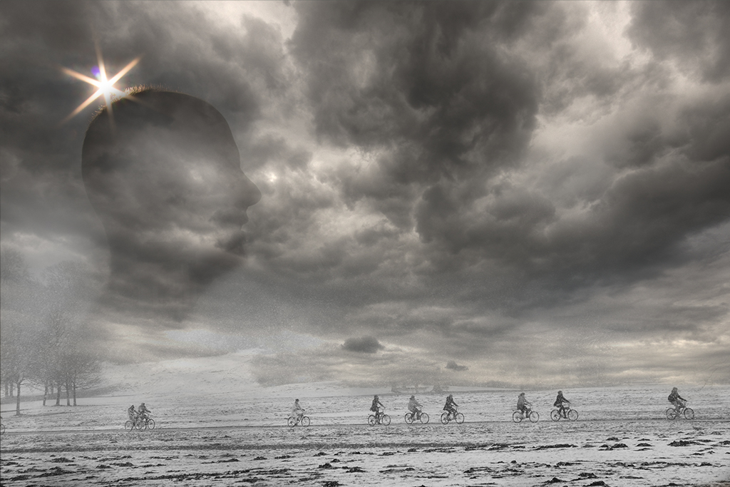
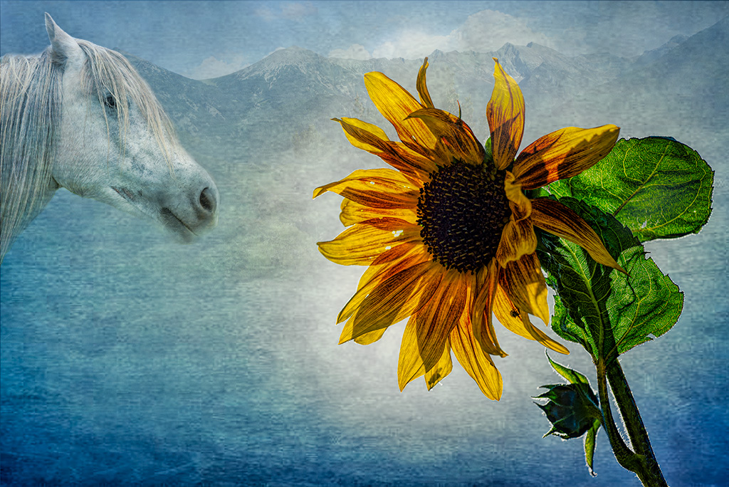
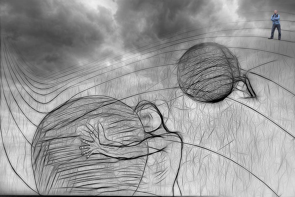
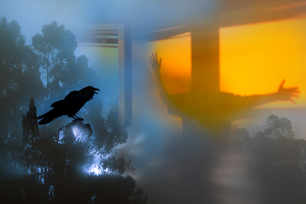
Alan, This is another really interesting image. I love how you challenge the viewer to explore meaning, denying an explanation. This image will likely haunt me for quite some time (in a good way). I am having trouble offering helpful constructive criticism. I do find the desaturated man at the bottom a little unsettling. I wonder if you increased the contrast in the horses eyes if that might signal a progressive fading as the eye tracks to the left and down. Since the horse stares out at you but the women looks away from you and the man completely disregards you in his own inner struggle, using a fading contrast may signal the significance of this more. I also wonder if cropping out the horses leg would change the feel some as my eye goes down the leg and gets lost. |
Oct 11th |
| 54 |
Oct 20 |
Comment |
Kathy, I agree with Alan, this is a beautifully constructed, very effective image. Your use of space, tonal range, and visual elements all come together very well. Nice job! |
Oct 11th |
| 54 |
Oct 20 |
Comment |
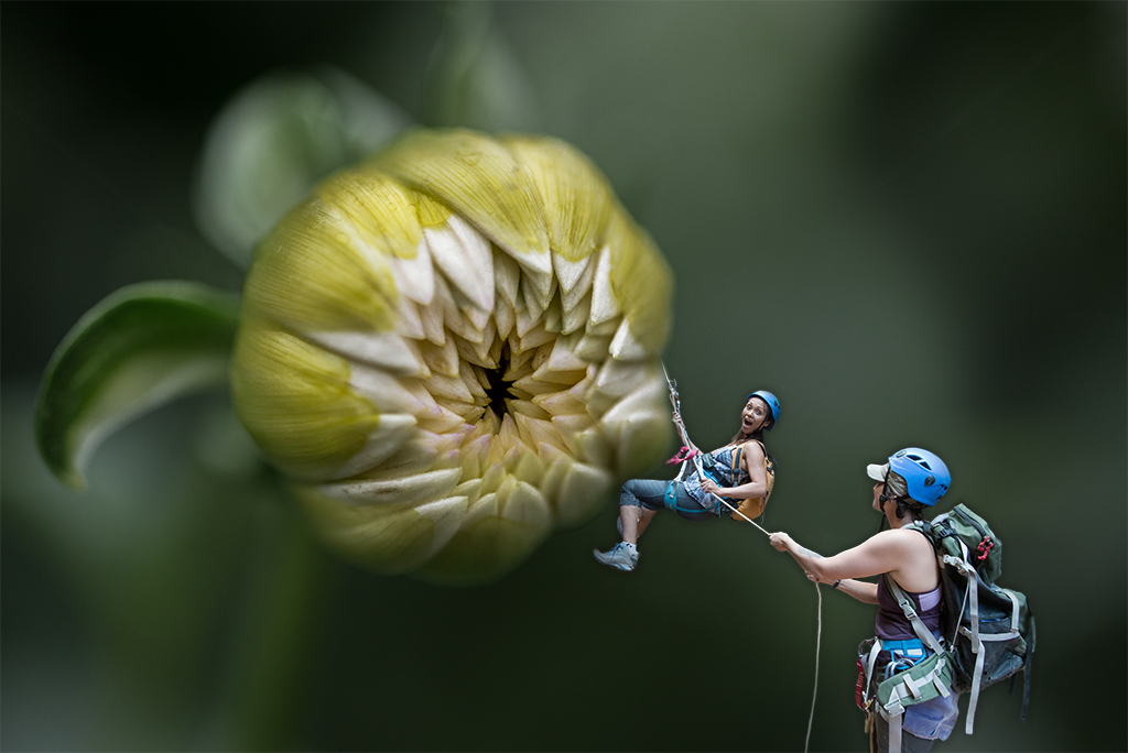
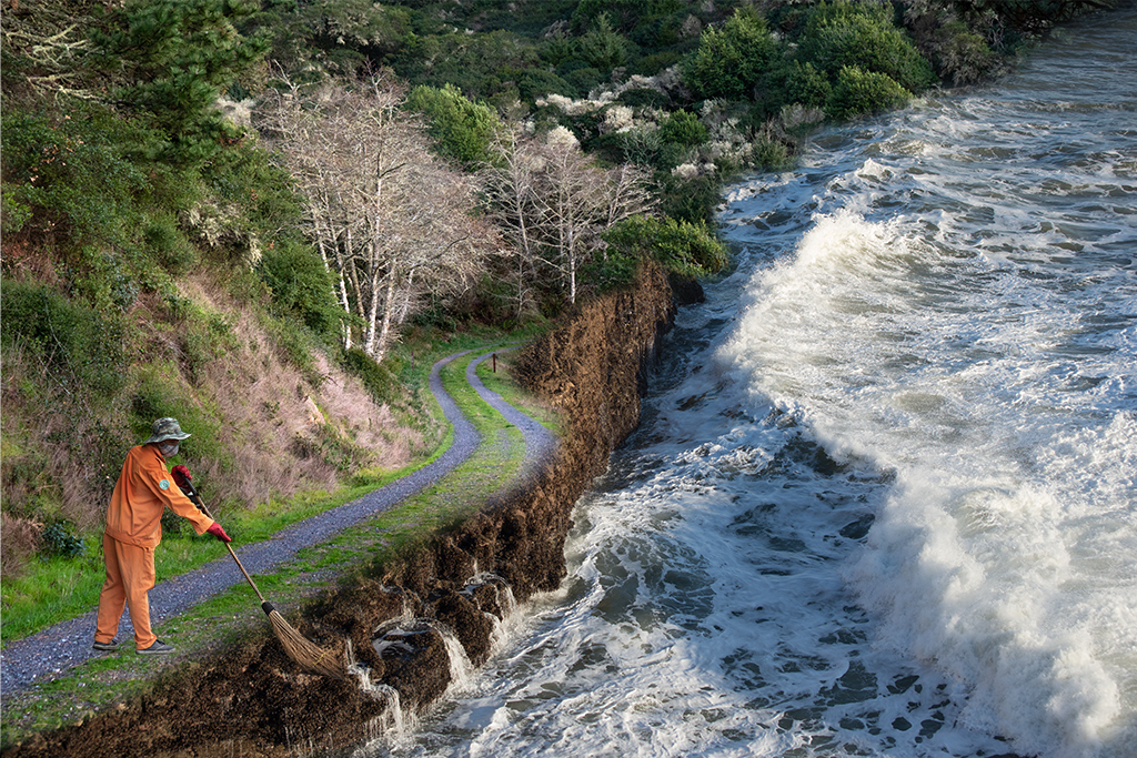
Aavo, I like this image quite a bit. The juxtaposition of the in this desert landscape is quite powerful and evocative. I agree the man on top of the pumpkin is distracting but for different reasons. The higher contrast and greater saturation feels strong to me. If you kept him in a similar tonal and saturation range to the other climbers his victory pose and position may be enough to sell the story. I also might consider getting rid of the back right pumpkin as I don't know if it adds to the composition. If you consider that, I might nudge the large pumpking/people to the right a little to balance then. Ignore these suggestions if they don't resonate, its a fun image. |
Oct 11th |
| 54 |
Oct 20 |
Comment |
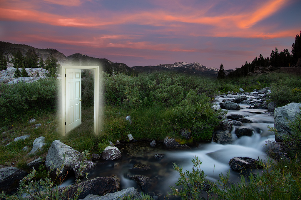
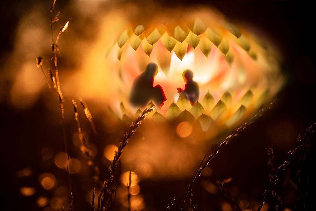
Peggy, I like this fantasy image quite a bit. It's great you were able to exploit the "accident" so well. I love how all the elements come together in this magical way. I have no suggestions to add this month. |
Oct 11th |
6 comments - 5 replies for Group 54
|
13 comments - 11 replies Total
|